UX Design: Best Practices on Preventing Errors in User Interfaces
UX Design: Best Practices on Preventing Errors in User Interfaces The article shares a bunch of popular UX design practices that improve interactions, navigation and help to prevent users from making errors with websites and apps.
No doubt, the best mistake is the one that wasn’t made. However, life isn’t like that, and user experience as well: mistakes are an integral part of both. In our previous article, we shared some handy tips on dealing with error screens and messages, but is there a way to prevent users from making at least some of those errors? Yes, and today’s article is all about them.
Directional Cues
Directional cue is an element of the user interface that gives a visual hint on specific interaction or content to let the user see it faster and easier. As well as road signs and signposts do in the physical world. They guide a visitor or user to the key elements, text lines, and call-to-action elements, thus making the conversion reachable and solving users’ problems quickly. Arrows, pointers, and other visual prompts help users navigate the interface, making it easier to avoid unnecessary clicks and interactions.
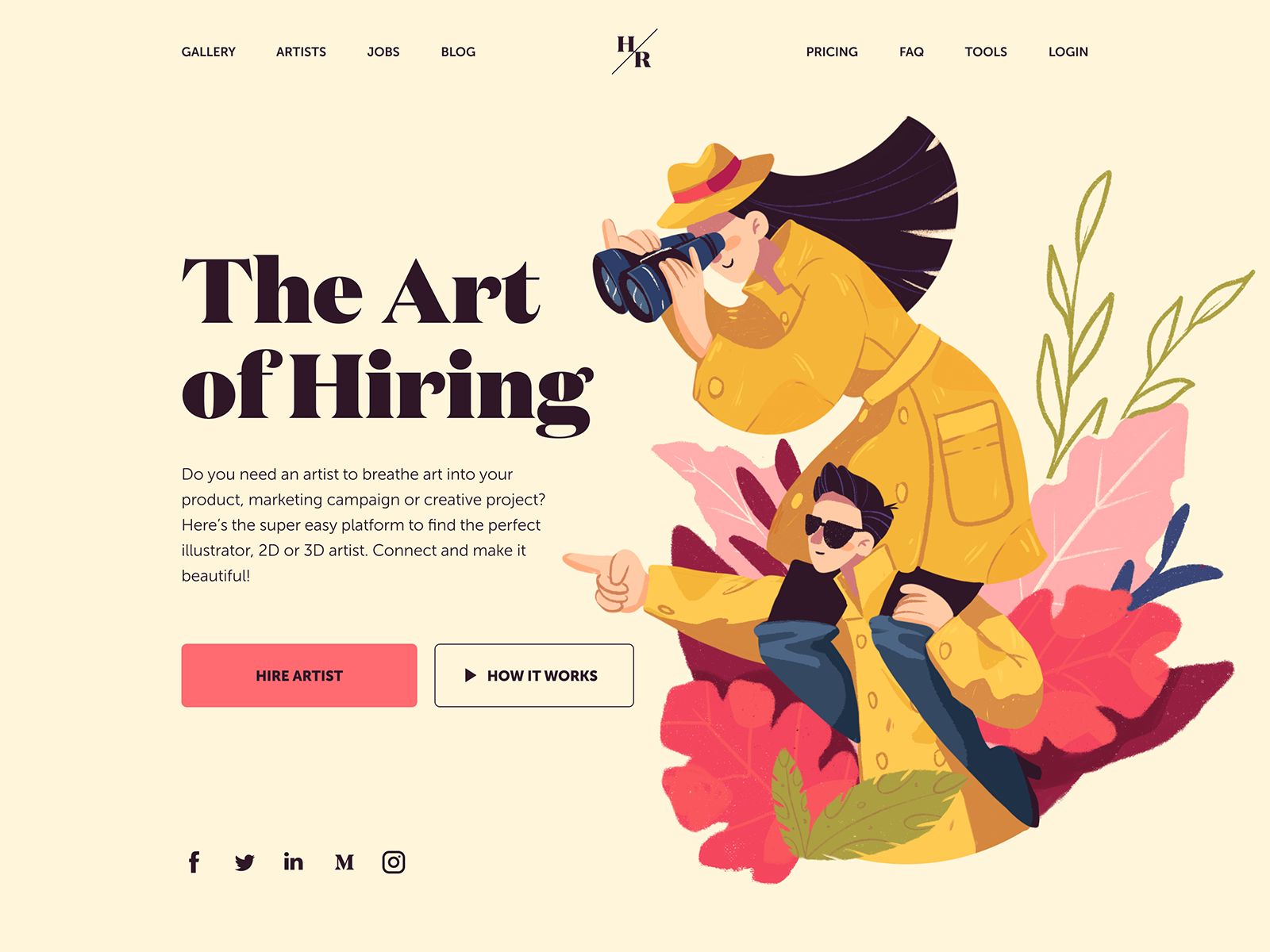
The landing page for the service of hiring digital artists uses pointers as a directional cue, focusing users’ attention on the CTA button and tagline.
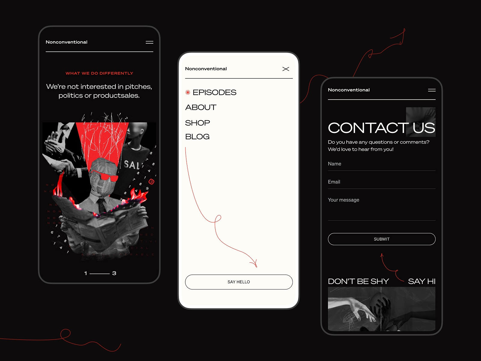
The Nonconventional Show website uses elegant and playful arrows to show the shortcut to the buttons
Onboarding Tutorials and Tooltips
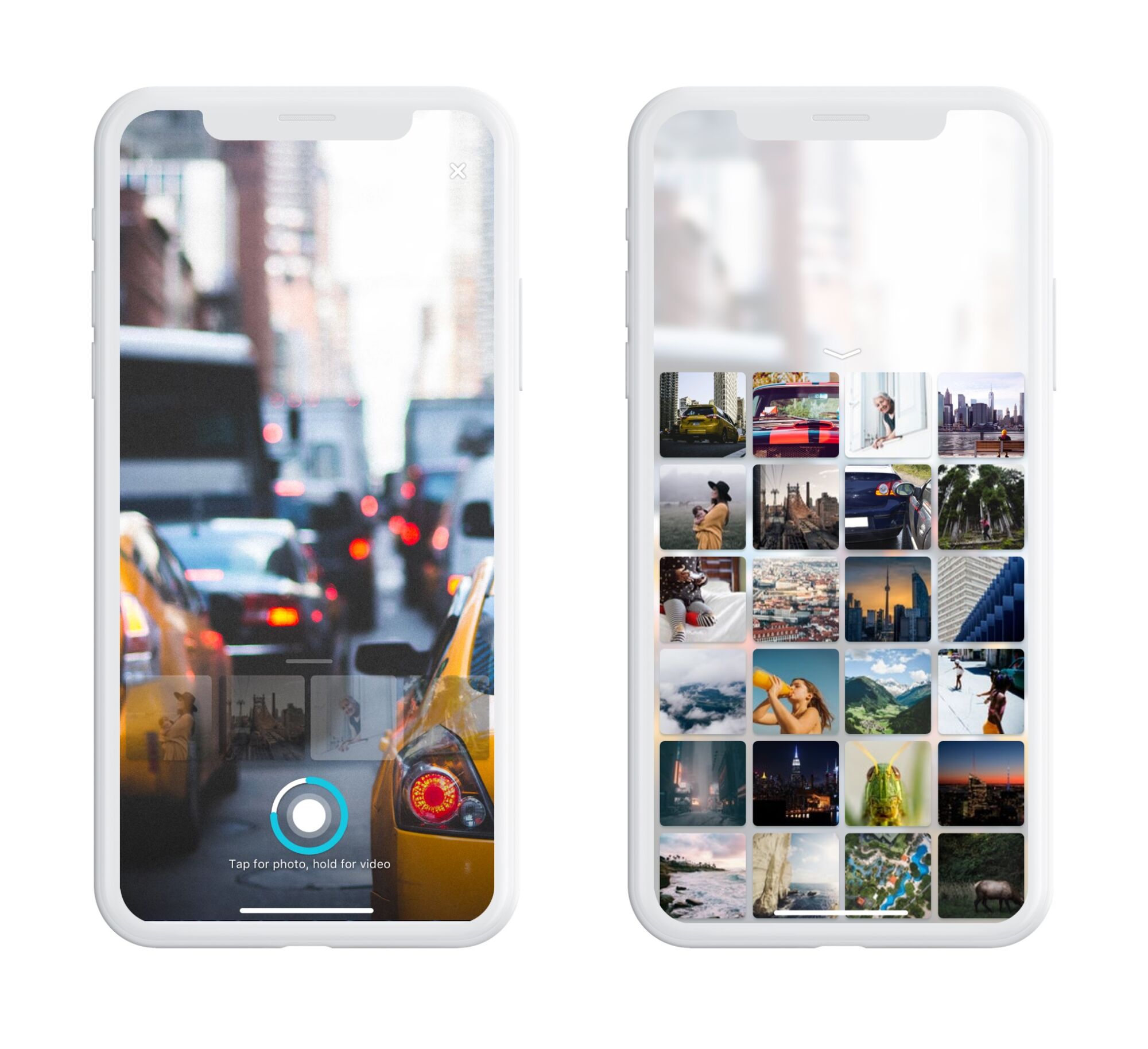
Onboarding is a set of techniques and interactions whose objective is to comfort the user and give a concise introduction to the product. One of the ways to quickly introduce the app to the user is through the onboarding tutorial, a set of several screens that are shown to first-time users and explain the benefits and functionality. Here, you can highlight some key features that differentiate the interface from others, thereby preventing errors that could arise later.
Onboarding screens for the Flower Store application
Another onboarding technique that has a significant impact on error prevention is the use of tooltips. These are prompting messages tied to particular layout elements or user actions. They usually appear in modal windows rather than separate screens. Tooltips offer a proactive way to guide users to the correct option and prevent misunderstandings.
Visualized Limitations
Another way to prevent users from wasting their time and effort is to show visual limitations, if they exist, right in the process. One of the classical examples is Twitter. There is a 140-character limitation per tweet, and the platform clearly indicates when you exceed this number: the extra characters are highlighted in color, the number of extra characters is displayed, and the tweet button becomes inactive. Such an approach saves users time and effort and prevents unnecessary clicks.

Text Prompts
UX designers know much more about user interfaces and interactions than an average user, but that knowledge can sometimes play a dirty trick on them. Why? Because what’s obvious for designers may appear confusing to users. The function behind the particular field or button may seem super clear to you, but not for users of an app or a website. Keep that in mind and support them with short and clear text prompts. Usability testing will help you identify the pain points where they are needed most. One of the popular examples is a text prompt in the search field or simple clues in the fields of a contact form.
The education app uses a text prompt integrated into the search field
However, keep in mind that text prompts and fillers should be evident as examples. Try using a lower contrast for them compared to the real input text, or integrate words indicating that, such as “e.g.” or “example.” If the text filler appears too realistic, it may create the wrong impression that the field is already filled with information.
Calorie Calculator app shows the text prompts that help users log in.
Previews
Preview functionality lets a user review the results before the feature is activated. For example, if you offer the user to choose between several color themes or different font sizes, show the preview during the process of choice so that the user can be sure he or she wants that change. That may also touch on more complex aspects: CMS platforms, email services, and showcase platforms usually allow users to preview a piece of content before publishing or sending it to ensure that everything is just right.
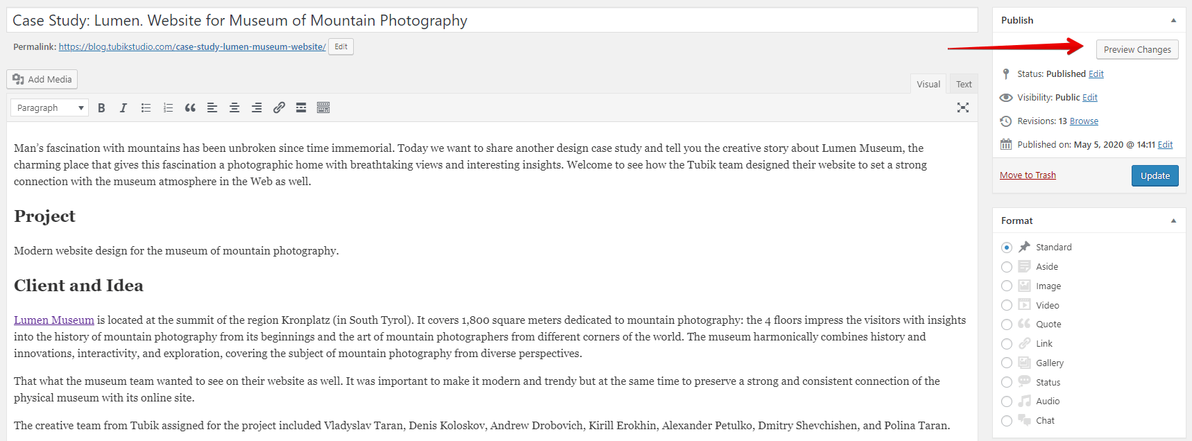
The WordPress CMS enables writers to preview all changes to a post before publishing or updating it.
Suggestions
Autocomplete and other suggestions present another popular feature that helps users quickly find what they want and avoid unnecessary interactions or extra clicks. Here’s how it looks in the process of search in Tubik Blog. When the user starts typing the search query, the website offers some relevant options immediately, and the full list is shown after the request is completed.

Clear Explanation
One of the vital points behind UX writing is guiding users through interactions with clear, concise instructions and updates. Use this checklist to review the texts you write to support interactions. It should be:
- clear (users understand what you talk about, the core message isn’t blurred or complicated)
- concise (the piece of text is meaningful, laconic, and concentrated on the goal; no empty talk is included)
- useful (the copy gives users necessary information or helps with interactions)
- consistent (the copy within the interface of one digital product keeps the same style, tone, voice, and terminology).
Focus on informing users and explaining what’s going on and how to address it, rather than diving into technical details or claiming it isn’t your fault. Make your explanations slang-free and eliminate all secondary information. This way, you will guide users to what they need and help them avoid errors.
The screen of a camera in the Pazi app features a clear text instruction
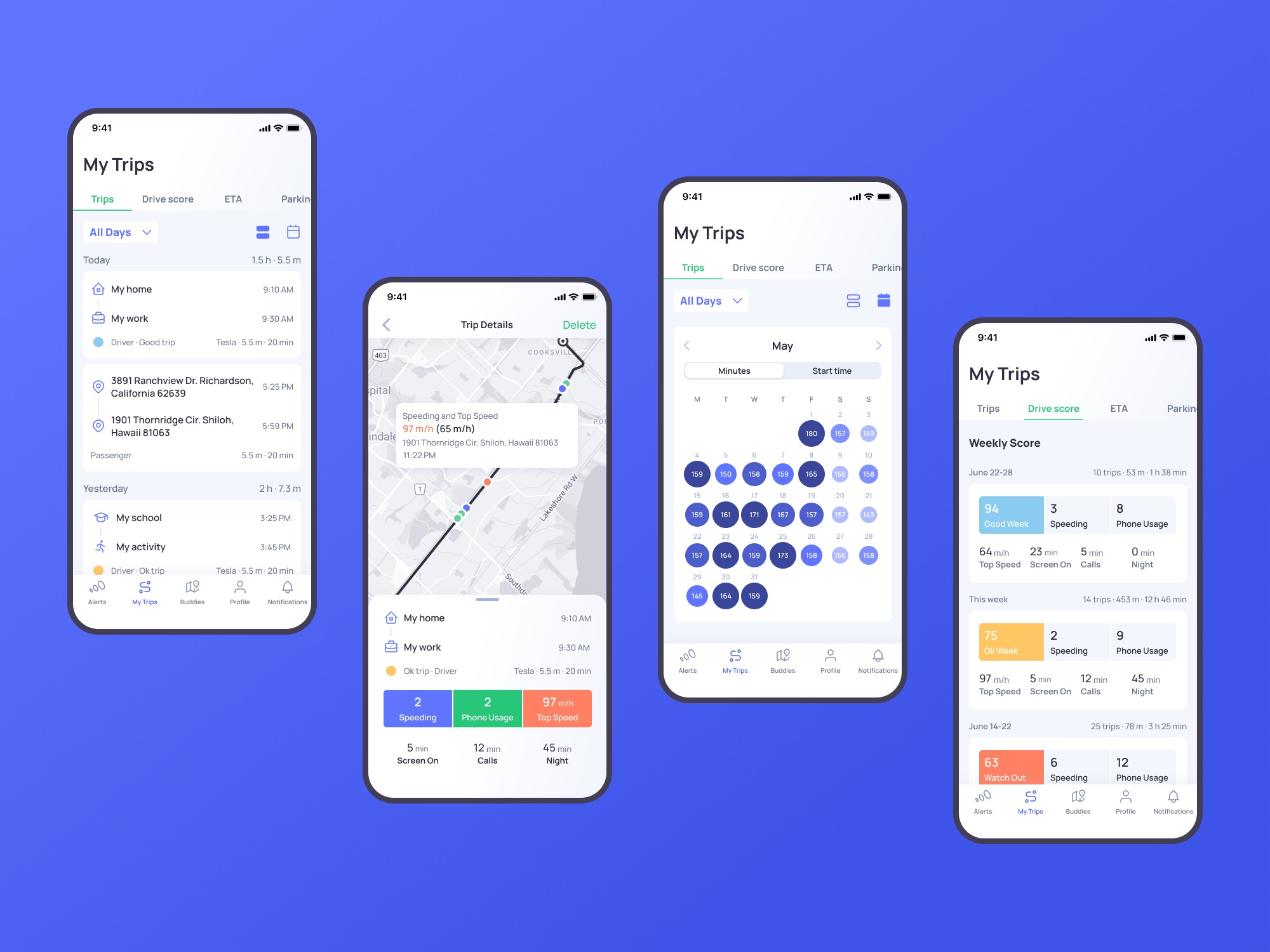
Inline Validation
In basic terms, inline validation is a method that informs the user of an error or successful completion of the required action immediately during the interaction. Most often, users deal with it in the process of filling in different forms (registration, login/signup, contact form, subscription form, etc.) Such an approach is efficient, especially for long forms with many fields: you update the user at every step instead of requiring them to fill out all the numerous fields and then informing them that “something went wrong.”
However, there are some important points to remember:
- don’t integrate premature validation: it happens when the user just puts the cursor into the empty field, and it immediately gets marked as “wrong” before the user even has a chance to type something in. It will have a bad effect as you create an additional distraction and evoke negative emotional feedback on users being blamed for something they didn’t even start doing.
- don’t just mark the error; explain it: it’s not enough to show there is an error and leave the user confused about what is going on. Don’t just say “error” or “something went wrong,” but give a short and clear explanation letting users understand how to make it right.
- use color and visual markers known to most users: whatever your personal association with red color as a marker of an error, it seems there is a way or pattern better recognized globally to instantly let users understand that error is made. As well as the sign of a tick or a thumbs up marking the successful action. Think about markers that won’t require much cognitive load and won’t distract users much.

Inline validation of filling a subscription form on the Tubik website
Another way to prevent the user from making an error is to make controls inactive until the error is resolved. It should be done by providing the user with a clear understanding of how to solve the problem.
Here’s how Buffer app, the tool for automation of social media posting, does it:
- When you open the window for a Twitter post to plan for publishing, the text prompt informs you that there’s nothing to publish. The button for scheduling the post is inactive.

- When you start adding the content, the button gets active. You can add up to four images to the post, so if you haven’t reached that number, you can see a free slot for media.

- If you added all four possible images, there is no more space for another one. Suppose you exceed the number of possible characters. In that case, the button becomes inactive again, and the extra part is marked by both color and filled lines – this way, the error will be more accessible to people with color blindness.

Just this simple case shows how many details and scenarios should be considered to prevent users from making mistakes.
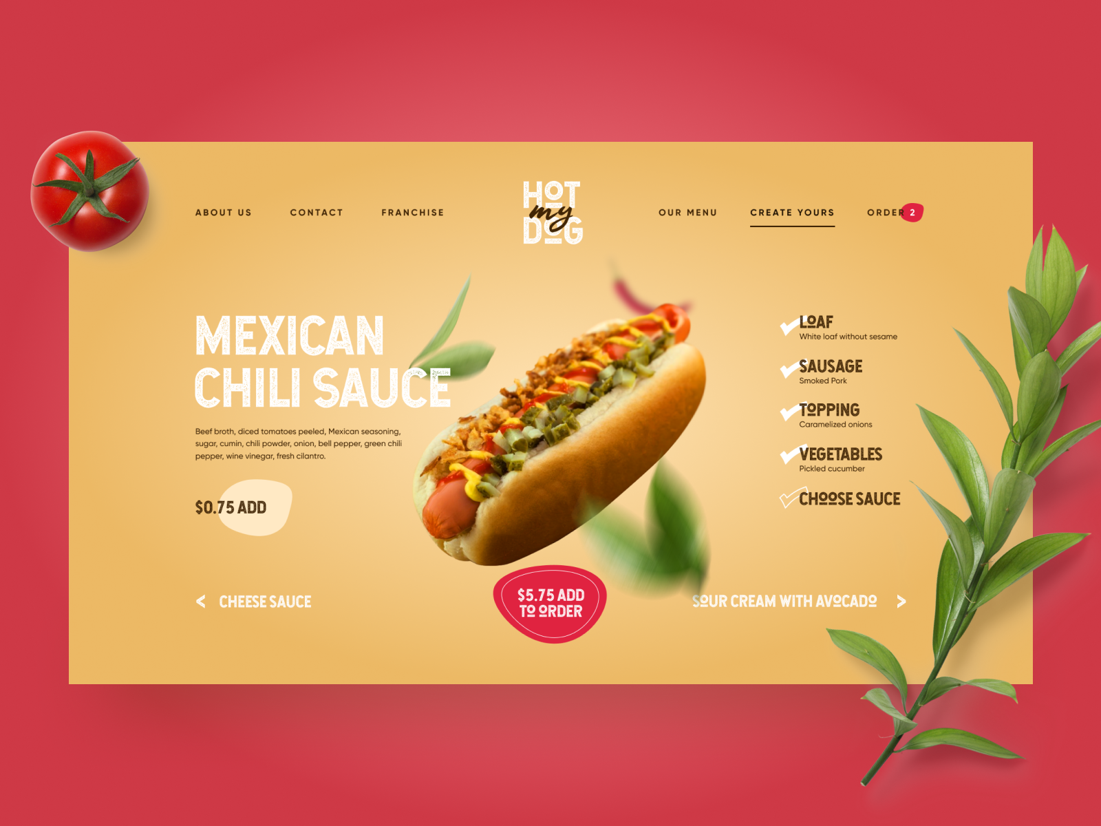
Here’s another interesting example of inline validation for the user flow of item customization: that’s the ecommerce service where users can customize their hot dogs before buying them. Tick symbols in the checklist show what stages are already done, keeping the user updated and confident. This way, it prevents the errors connected to missing something before making an order.
Color Accents
Color is one of the most powerful factors of visual communication with users and visitors, so it seems to be quite logical to employ it and help users avoid mistakes. Consider applying color accents as part of navigation, guiding users, and drawing attention to the core interactive details or zones. This way, you increase the chances of correct clicks and taps instead of getting lost between a bunch of homogeneous layout elements.
Color contrast helps users quickly define active tabs in the Drink Recipe app layout.
The website for a food delivery service uses the color accent to inform the user about the current number of items in the cart, thus preventing unnecessary interactions and getting back to the shopping cart page to check if the item is in it.
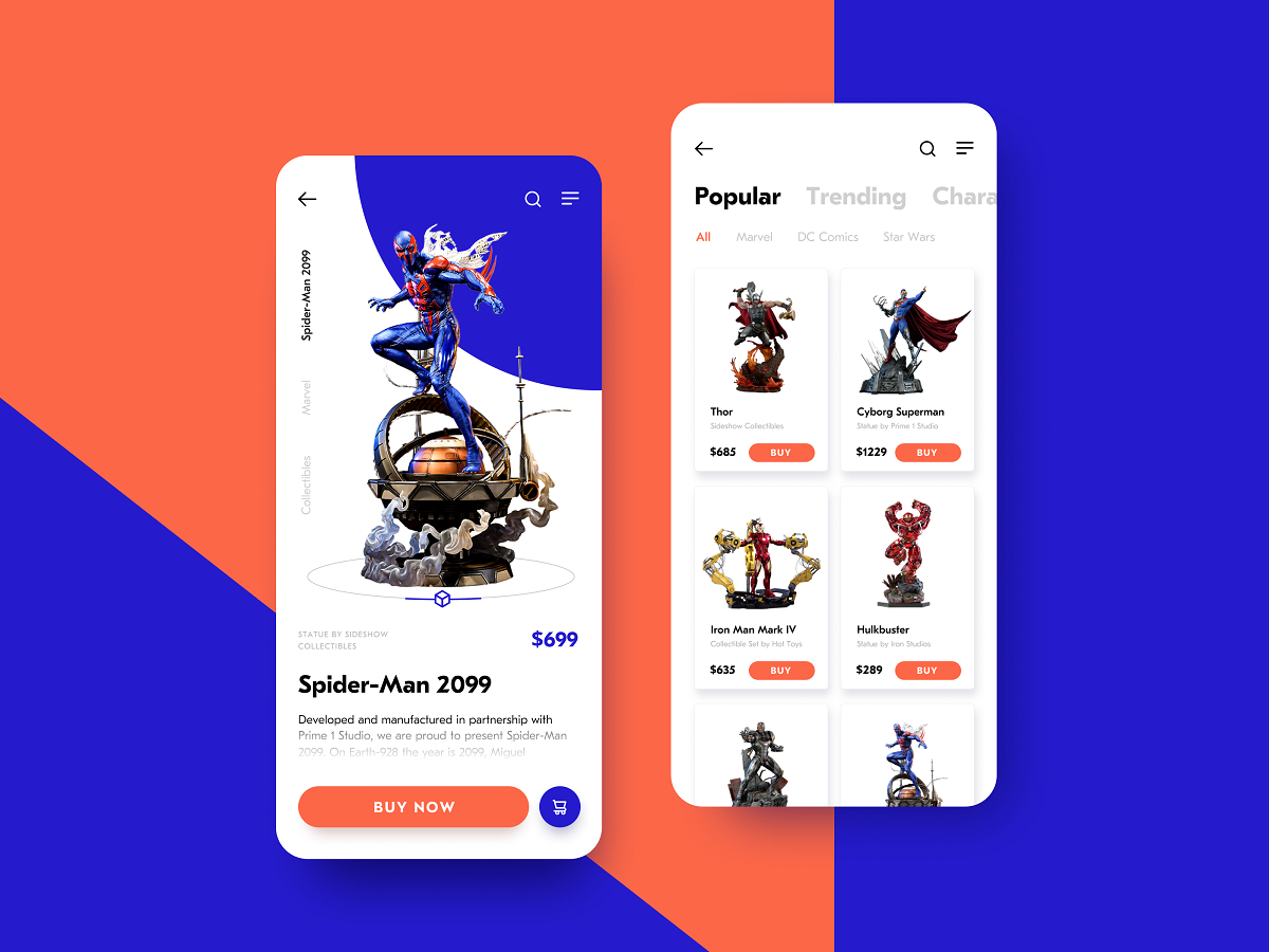
The ecommerce app concept for buying action figures uses high color contrast for the CTA button to make it the most noticeable element, and this way reduces users’ effort in searching for it in the app layout.
Otozen app for safer driving uses color marking as a part of user experience design, helping users quickly scan and understand different categories of data.
Familiar Icons
Choosing icons, especially for very basic interaction elements, always think twice before diving into a sort of creative experiment. Although icons are small, their impact on usability is huge: they give users quick visual clues, especially in the case of users with poor reading skills or disabilities, environments inconvenient for reading text, or not-that-perfect knowledge of a particular language. What’s more, icons are processed by the brain much faster than words, so they can make interactions faster and reduce cognitive load. Yet one of the reasons for that is the integration of icons that are instantly associated with particular functions or actions.
For example, make no mistake that needing to search through the content of your website, users will be looking for an icon of a magnifying glass. If you start experimenting with it, the risk of errors, mistaps, and misclicks gets higher. Familiar icons make the product feel like home for users and give them more confidence.
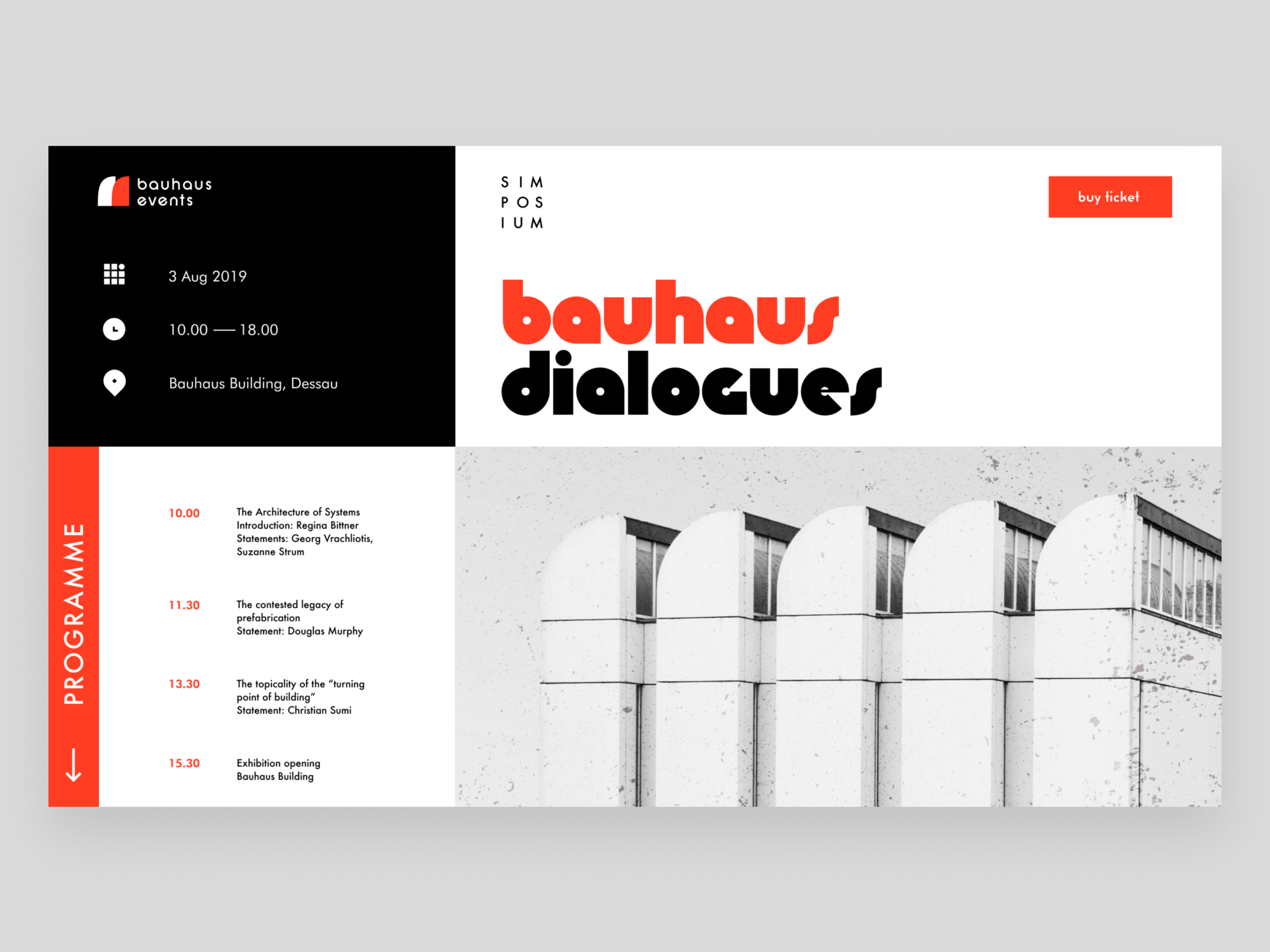
Bauhaus Event page uses well-recognized icons to mark the core information (date, time, and location) and make it easily found on the page.
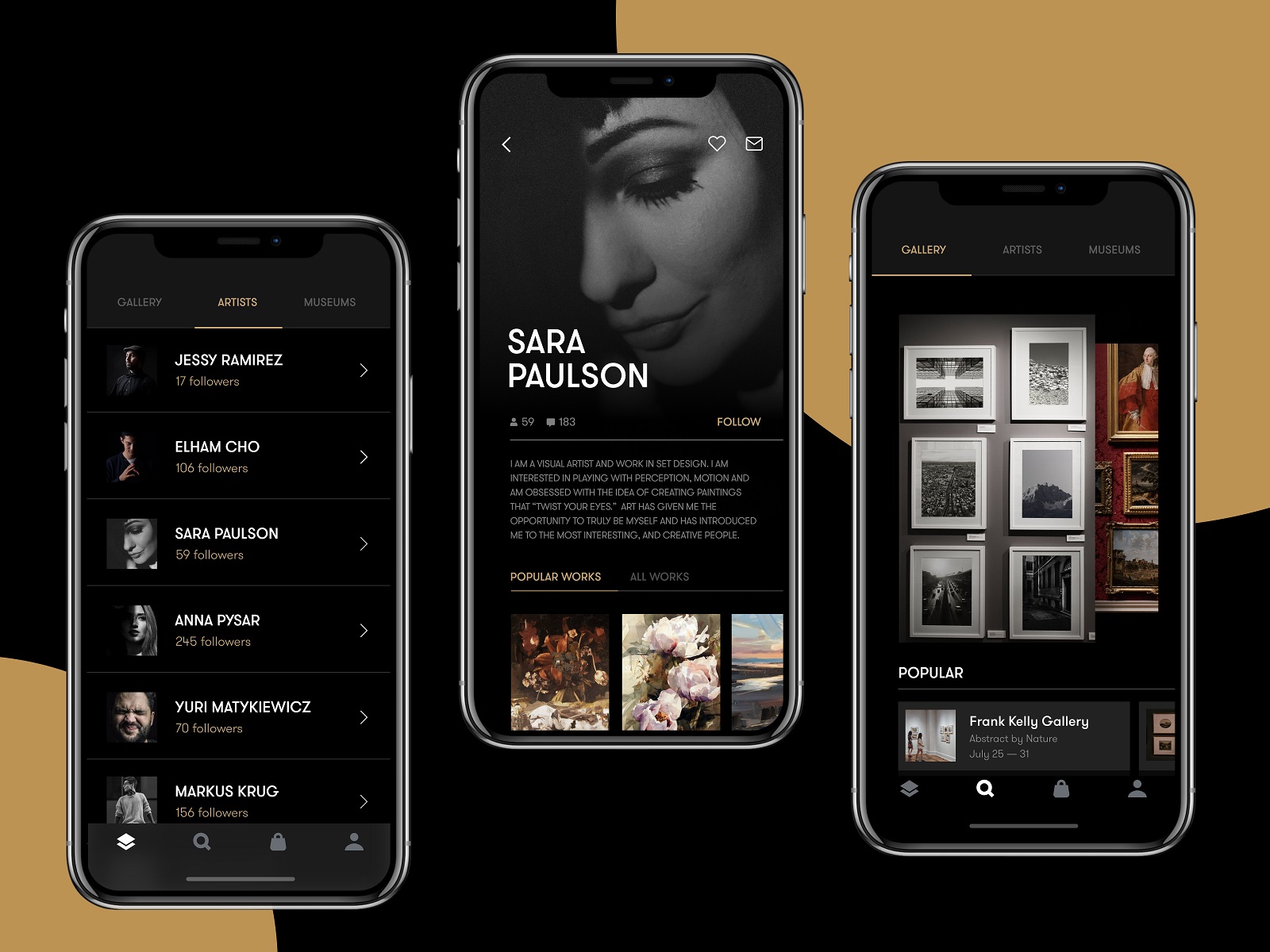
The Gallery App features a set of easily recognizable icons, including search, user profile, and shopping bag, in the tab bar. As well, the icons for followers, comments, adding to favorites, and sending a message are integrated into artists’ profiles.
Recognizable Patterns
This point continues the previous: not only icons but also other interaction patterns sticking to typical mental models may prevent app or website users from making errors. For example, consider the following points:
- study typical scanning patterns and use them to make the core navigation intuitive and instantly visible
- put contact information into the website footer where users tend to look for it
- apply breadcrumbs on a website to let users trace their journey and get back when needed
- consider lazy registration via social network accounts
- make the logo in the header clickable and returning the user to the home page
- make the text links underlined to show that they are clickable
- put a cart button into the header on the ecommerce websites
- use plus icons for controls aimed at adding items
These and many more options for patterns that are well-known to users and make interactions easier and error-proof. Thoughtfully conducted user research and usability testing will help you select the ones that provide the most user-friendly solutions.
GNO Blankets website features the cart icon in the very typical place, the left corner of the website header, the buttons look clickable, and the subscription form, site map, and links to social networks are easily found in the footer.
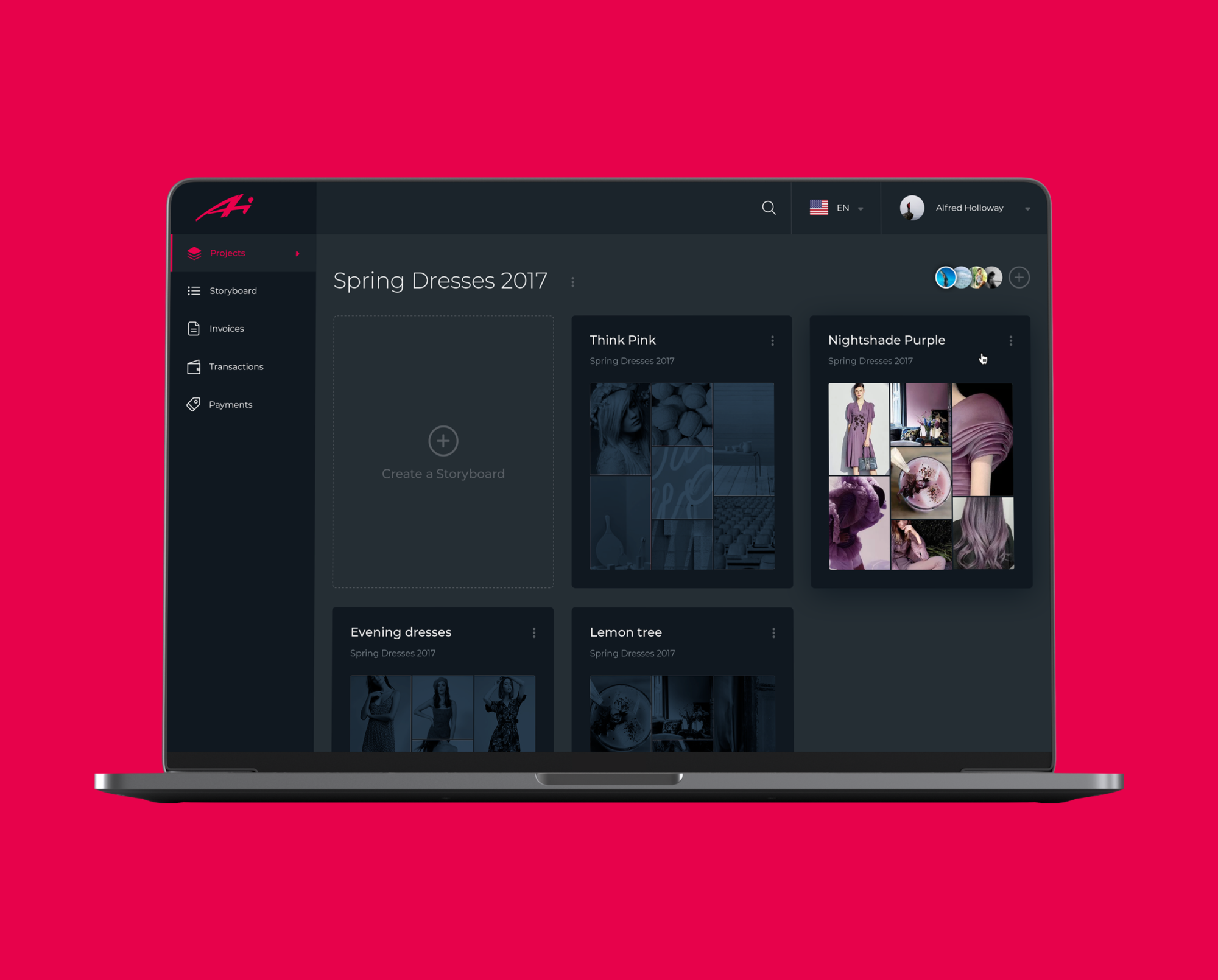
The control for creating a new storyboard in the Designer AI tool features a plus button supported by a text instruction
Icon Labels
Even though icons are a powerful element of usability and are perceived faster than words, there is another side to the coin: the aspect of meaning. People can perceive icons extremely quickly, but if the message they convey is unclear and requires double-reading, this speed will not yield a positive user experience. Rapidly capturing the icon, which can lead to a misperception, cannot be defined as recognition; it’s merely a rapid noticing. Recognition means not only speed but also the proper action or information that this icon should bring to the user. Only in this case will it work as a factor preventing users from errors.
There are tons of easily recognized icons such as a telephone receiver for a phone call, an envelope for mail, a magnifier for a search, and so on. Sure, using these icons, you create a much faster perception of the UI functionality than using copy instead of them. Nevertheless, in cases where the image of an icon is not immediately apparent, its use should be thoughtfully considered. If the icon doesn’t correspond with the goal and meaning it is assigned for, the speed of recognition doesn’t matter. That’s why there are cases when text transfers the idea or data more clearly, and sometimes it is more effective to use the double scheme when the icon is supported by the text label.
Watering Tracker application uses icons with text labels in the tab bar to make sure that double meanings are excluded and avoid mistaps.
The Finance App design features icons with text labels for each expense category.

The field for creating a new post on the LinkedIn feed features the icon supported with a clear text label for a core interaction. The icons for adding media, like images or videos, are secondary and aren’t supported by the text. Anyway, the icons chosen for them are easily recognizable to most users without a copy.
Progress Animation
When users interact with a digital product, they want to know what is happening at every step. Making users wait in uncertainty is a risk of losing them. Still, when users are informed, waiting can be less annoying and stressful, and they don’t take extra actions, making mistakes. Therefore, this aspect should always be taken into account, and there are several ways to support it through interface animation and text explanations.
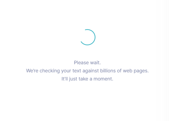
Grammarly Plagiarism Checker tool supports the process of searching with a loading animation and text explanation of what is going on.
The fitness tracker app features a stylish loading animation
Here, we’ve listed some popular error-prevention practices. More ideas and examples on this and other UX design aspects will be presented in our upcoming articles, so stay tuned for updates.
Design Articles
Here’s a set of articles covering additional aspects and best practices in user experience design.
Error Screens and Messages: UX Design Practices
5 Basic Types of Images in Web Design
The Anatomy of a Web Page: Basic Elements
6 Elements of Efficient Company Website Design
UX Practices on Product Page Design
How to Design Effective Search
Web Design: 17 Basic Types of Web Pages
Guide to 6 Effective Types of Web Animation
Negative Space in Design: Tips and Best Practices
Basic Types of Buttons in User Interfaces
Originally written for Tubik Blog
 https://design4users.com/ux-design-preventing-errors-in-user-interfaces/
2026-01-09
© by
Marina Yalanska
,
https://design4users.com/ux-design-preventing-errors-in-user-interfaces/
2026-01-09
© by
Marina Yalanska
,
- English
- Ukrainian