User Experience: How to Design Effective Call to Action
User Experience: How to Design Effective Call to Action CTA button design is one of the keys to high conversion rate. The article describes vital components of powerful CTAs for web and mobile interfaces.
An effective interaction system of a digital product consists of small elements that have their tasks and functions. To make a sufficient system, it’s vital to pay attention to all the details.
Buttons are core interactive components of user interfaces which play a significant role in the quality UX as well as conversion rates of websites and applications. UI buttons vary according to their features and can be divided into different types. A new article is devoted to the type called call-to-action (CTA) buttons covering their essence, role in the intuitive navigation and the importance of business goals. Let’s see what makes a call-to-action design stand out from the crowd, learning from the best practices.
What’s a CTA Button?
A call-to-action (CTA) button is an interactive element of any user interface, both web and mobile: its major aim is to induce people to take certain actions that present a conversion for a particular page or screen, for example, purchase, contact, subscribe, etc.
Traditionally, effective call-to-action buttons are easy to notice; moreover, designers intentionally create them that way so that people cannot resist clicking. That’s why they are usually bold buttons containing microcopy with a particular call-to-action (e.g. “Learn more” or “Buy it now”) which encourages us to push it.
Lead generation and purchase rise are the basic business goals which calls-to-action can be created for. When a button design is compelling enough to immediately attract the attention of potential clients, it can entice them to click and go to the next stage such as filling a short contact form or making a preorder of a product.
This way, website visitors and app users can be led through a sales funnel from one stage to another, helping them to learn the details about the product or service. Even professionally worked out content may not guarantee a high level of user engagement. Without CTA buttons, people are more likely to scan content quickly and just leave it untouched.
Some may think that a sufficient call-to-action button design simply uses a large size and bright color to accomplish all its objectives. Still, there are many more aspects ensuring the effectiveness of CTAs. Let’s see what they are, along with the practical examples of their appropriate usage.
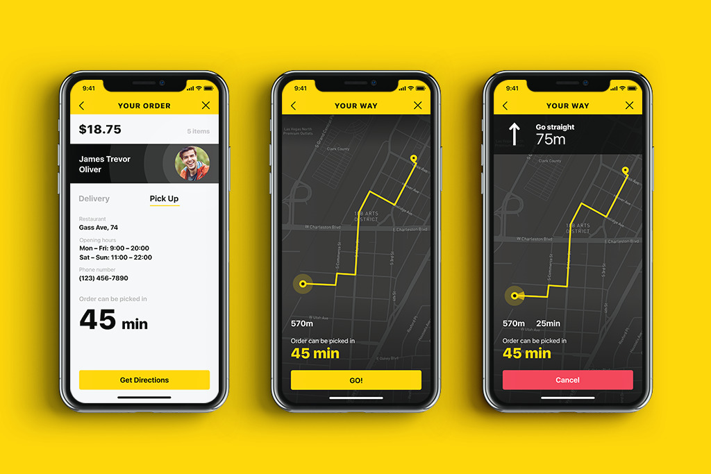
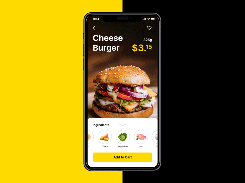
Tasty Burger mobile app screens
What Makes an Effective CTA Button Design?
Size
Size is one of the most common tools helping to divide UI components according to their importance. The bigger an element is, the more noticeable it becomes. Since CTAs’ prior goal is to draw users’ attention, designers usually try to make them stand out among the other buttons on the screen, especially via noticeable size.
Large buttons have high chances to be noticed and clicked still you have to keep some limits. A compelling call-to-action button is usually big enough to be quickly found but not too big so that the visual composition and hierarchy of the layout wouldn’t be spoiled. Market leaders often provide recommendations on the effective sizes of buttons in their guidelines. For example, Apple says that CTAs in mobile UI should be at least 44Х44 pixels, while Microsoft recommends 34Х26 pixels.
Tasty Burger mobile app interactions
Color and shape
Visually attractive size is only one aspect of a powerful call-to-action button design. To make the buttons even more noticeable it’s vital to choose sufficient color and shape. The thing is that human mood and behavior are highly related to the visual surroundings. Our mind reacts to colors and shapes while we usually do not notice it. The moment our eyes perceive color, they connect with the brain, which gives signals to the endocrine system, releasing hormones responsible for the shifts in mood and emotions. Psychology science has specific branches devoted to the influence of different colors and shapes on our consciousness. In our previous articles, we described the role of this impact on the design solution. Here are brief guides on the common meaning which colors and shapes have.
Color meanings:
- Red. Confidence, youth, and power.
- Orange. Friendly, warm, and energetic.
- Yellow. Happiness, optimism, and warmth.
- Green. Peace, growth, and health.
- Blue. Trust, security, and stability.
- Purple. Luxurious, creative, and wise.
- Black. Reliable, sophisticated, and experienced.
- White. Simple, calm, and clean.
Shape meanings:
- Squares and rectangles meanings: discipline, strength, courage, security, reliability.
- Triangles meanings: excitement, risk, danger, balance, stability.
- Circles, ovals, and ellipses meanings: eternity, female, universe, magic, mystery.
- Abstract shapes meanings: the duality of meaning, uniqueness, elaborate.
Traditionally, CTA buttons look like horizontal rectangles since people got used to perceiving this shape as clickable buttons. In addition, it is recommended to design CTAs with rounded corners because they are thought of as pointing inside the button, drawing attention to the copy.
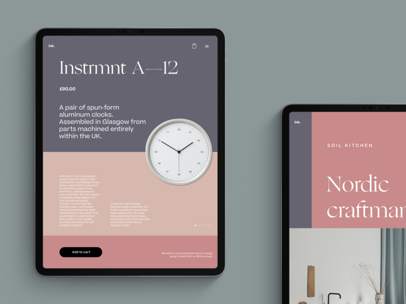
Product card design for an eco-goods online store
Color choice depends on various aspects, which make the process more complicated. Designers need to consider such factors as the basic color of the composition as well as potential preferences and psychological peculiarities of the target audience. There is one condition that is vital to keep in mind while choosing colors for CTA: buttons and background colors should be contrasting enough so that CTAs would stand out from the other UI components.
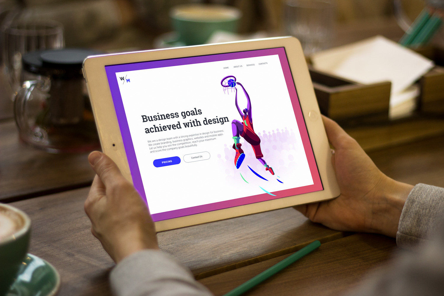
Website design for an AI-based marketing platform
Placement
The placement of CTA buttons is crucial for their capability. If they are located in the areas where users’ eyes can’t catch them, other visual aspects such as color and size might not work efficiently. But how to understand which placement is more prosperous?
Lots of studies have shown that before reading a web page people scan it to get a sense of whether they are interested. Considering this fact, designers may learn the most prominent scannable areas and place call-to-actions within the user’s path.
According to different studies, including the publications by Nielsen Norman Group, UXPin team, and others, there are several popular scanning patterns for web pages, among which “F” and “Z” patterns.
F-pattern is the most common for web pages with a large amount of content, such as blogs and news platforms. A user first scans a horizontal line on the top of the screen, then moves down the page a bit and reads across the horizontal line, which usually covers a shorter area. And the last one is a vertical line down on the left side of the copy where they look for keywords in the paragraphs’ initial sentences.
Z-pattern is a typical model of scanning for landing pages or websites not loaded with copy and not requiring scrolling down the page, which means that all the core data is visible in the pre-scroll area. A user first scans across the top of the page starting from the top left corner, looking for important information, and then goes down to the opposite corner at a diagonal, finishing with the horizontal line at the bottom of the page, again from left to right.
These patterns allow designers to place CTAs in the spots of highest attention, such as top corners and put the other points requiring attention along the top and bottom lines. Also, it is a good idea to place CTA buttons at the center of the layout, especially when it isn’t overloaded with other UI elements.
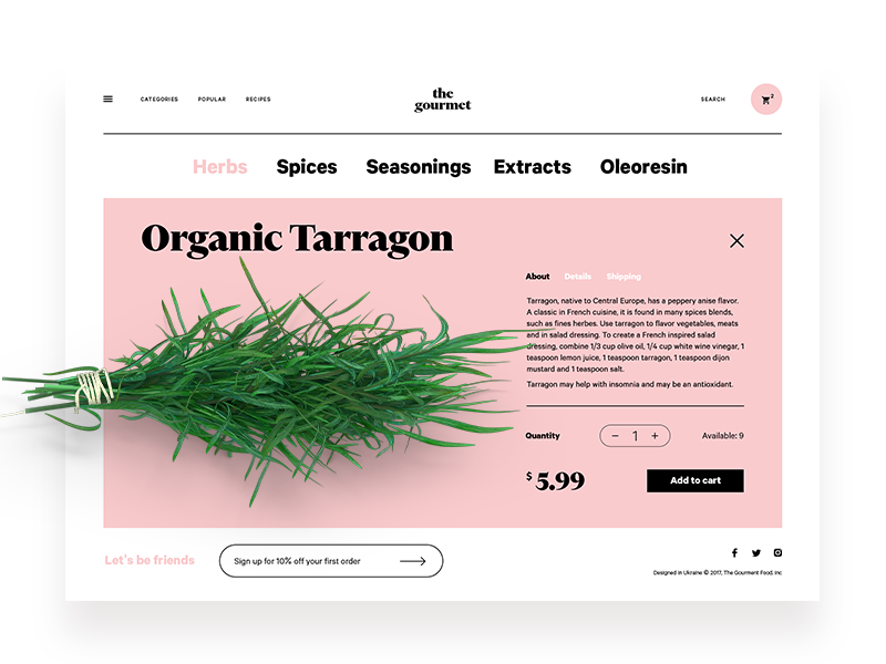
Ecommerce website design for selling herbs and spices
Microcopy
Microcopy plays a significant role in the effectiveness of the call to action. It is defined as the small components of text that serve as hints for users. To be more specific, microcopy includes buttons and menu copy, error messages, security notes, terms and conditions, and any product usage instructions.
CTA microcopy is actually a call which tells users what action they will take if they click the button. The powerful CTA microcopy is usually short but consistent so that it could quickly catch users’ attention.
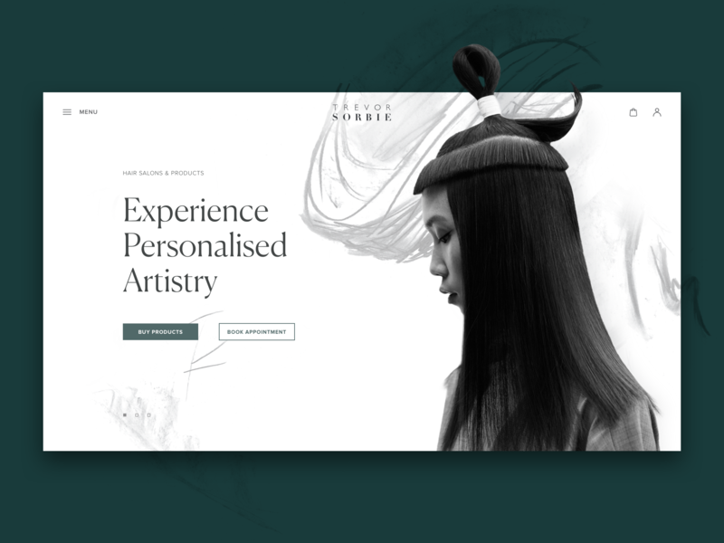
Hair beauty company website
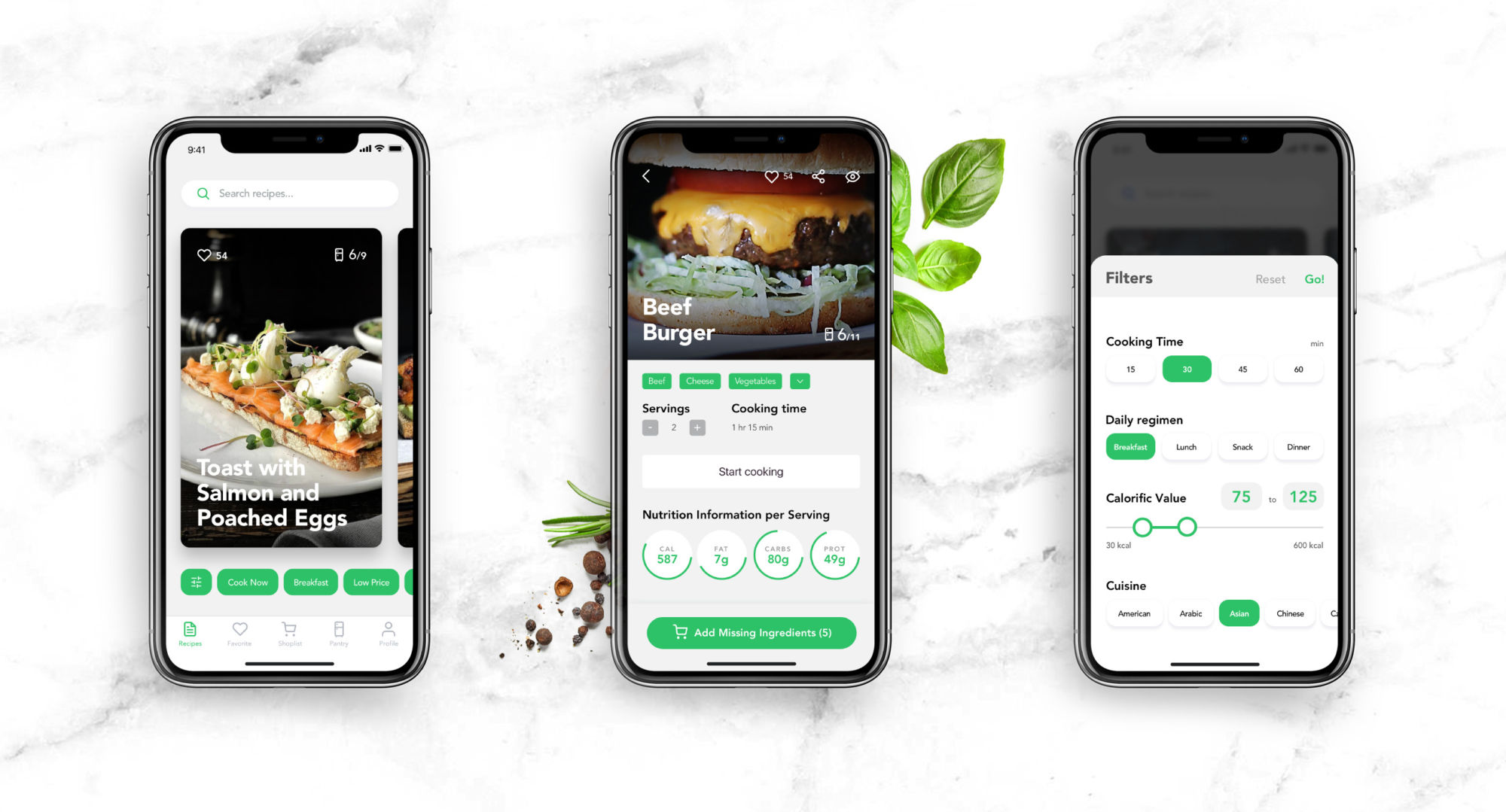
Perfect Recipes mobile app design
Call-to-action buttons are among the most powerful sales tools in e-commerce and a key factor in a page or screen’s conversion rate. Designers need to understand the importance of CTAs and pay close attention to all the details that affect their performance.
Recommended Articles
UX Design Glossary: Interface Navigation
UX Design Glossary. Navigation Elements: Icons, Search, Tags
7 Tips to Improve Mobile Interactions
3C of UI Design: Color, Contrast, Content
9 Effective Tips on Visual Hierarchy
How to Make the Interface Effort-Saving
Originally written for Tubik Blog
 https://design4users.com/how-to-design-call-to-action/
2026-01-18
© by
Marina Yalanska
,
https://design4users.com/how-to-design-call-to-action/
2026-01-18
© by
Marina Yalanska
,
- English
- Ukrainian