
How to Design Search in User Interfaces: Tips and Practices
How to Design Search in User Interfaces: Tips and Practices The article provides handy insights and UX design practices on making an internal search for websites and mobile applications intuitive and easy to use.
Search usability is one of the crucial factors of positive user experience for websites and mobile apps. Especially, the ones that contain a lot of items to choose from, be it news, blog articles, ecommerce goods, pieces of art, or anything else. Our today’s article provides some handy insights and design practices for making internal search intuitive and easy to use.
What Is Internal Search
Internal search is the process of browsing content within a website or app and displaying it to the user based on their search query. Tuned correctly, it shows the relevant content and provides a shortcut to what the user needs. Thus, the internal search saves users time and effort, enhances the usability and desirability of the digital product, supports user retention, and increases conversion rates. Easy to see that this element is vital.
The interactive element responsible for the internal search in the user interface is a search field. A search field, which is also called a search box or search bar, presents the interface element that enables a user to type in the search query and, in this way, find the pieces of content that are needed.
Physica Magazine website features the search control in the header
When to Use Internal Search
Whatever great you find the navigation of your interface, if your website or app is made of 50+ pages, it’s high time you considered applying the internal search. A well-designed, easily found search field enables users to jump to the required point without browsing through numerous pages and menus. This approach is a common pattern of user behavior now, it respects the user’s time and effort, so it is highly demanded in user-friendly interfaces.
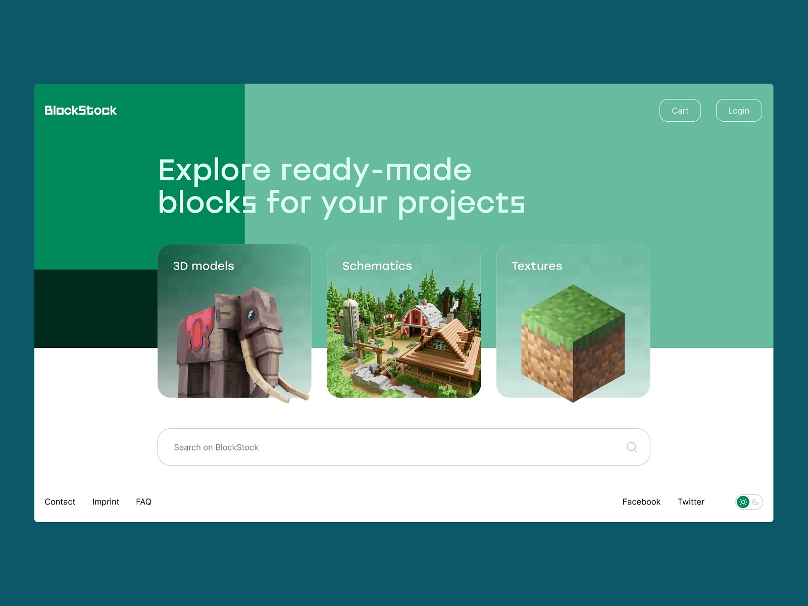
The home page of the BlockStock website features a big search field in the above-the-fold area to let users quickly find the Minecraft assets they want
Why is it essential to have a search inside? Earlier, the recommendations about applying the internal search started from 100-200 pages on the website, but now we find them a bit outdated. Modern users are spoiled with various choices and options offered by a constantly growing number of resources on the Web and in the app stores. If a visitor has already come to your website, your task is to give them what they want as soon as possible. In most cases, users (especially those led by external search engines) come to a resource with a specific goal or query without the wish to spend much time looking for it. Search enables them to make their journey focused and effective.
The Crypto Blog makes a search control one of the core CTA elements on the page: placed in the website header, it features the form of a clickable button, uses the well-known search icon and the textual explanation together, so that it is super fast for users to find it.
In case you have a single-page website, if your app or website is concise and not heavily packed with content, an internal search is not needed. Well-thought-out navigation will be enough, for example, for a corporate or portfolio website highlighting core information and services.
However, designing search usability, don’t make the opposite mistake: don’t prioritize search over navigation in a user interface. Based on everything mentioned above, designers may think that search is the best and only interactive element worth their attention. And that’s a big mistake. Although many users do try getting closer to their aim via search, there are also others who may have problems with search interactions. For example, they don’t know a language well enough to form the correct query, it’s not convenient for them to type something in, or they just hate thinking over the textual queries, and they would prefer to follow the already existing navigation and cues rather than the cognitive load of communicating to the system via the search.
Take that into account and strive for a good balance of navigation and search.
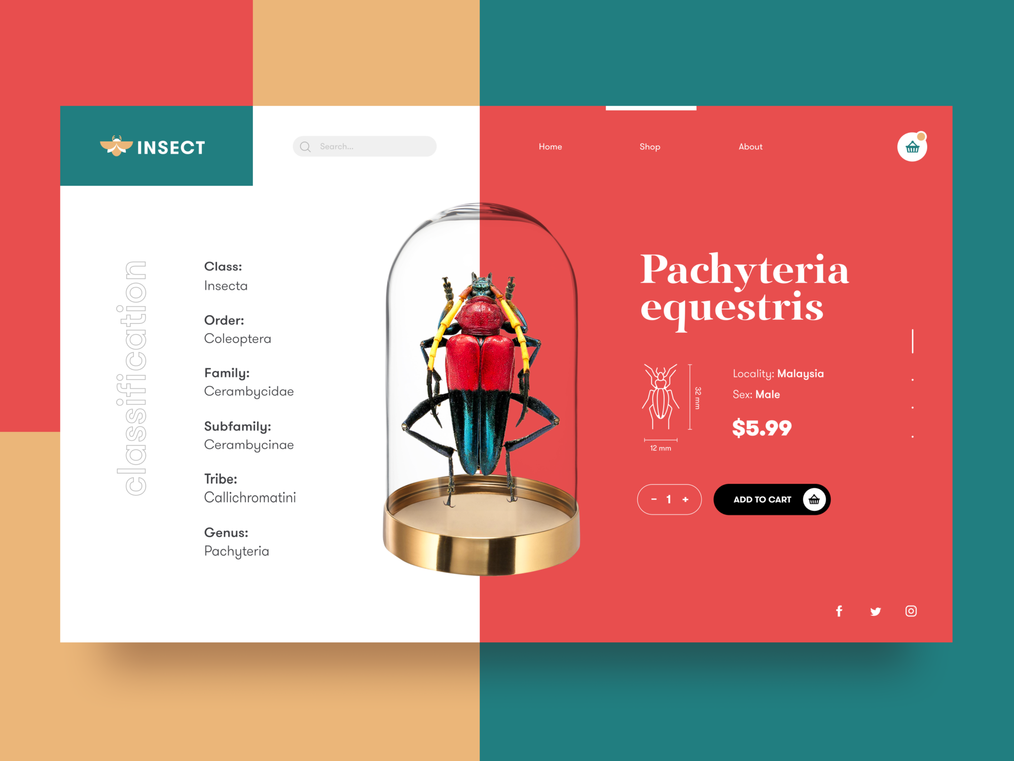
The ecommerce platform selling insects features an open search field in the header
Core Features of Effective Search
There are different nuances of making the search interactions clear and intuitive, yet the three features below are core points to consider for the internal search:
- it should be instantly visible
- it should be clear as a search functionality
- it should show relevant content
The tea e-commerce website includes the search control in the header, which is sticky and easily accessible from any point of interaction
UX Design Practices for Search
Place a search field in the most visible interactive zone
One of the key design issues is the placement of the search graphic control in the interface. In web design, the search field can be often found in a header of a website and this is a good choice: as we mentioned in the article devoted to design practices for website headers, for any website it is the zone of the highest visibility, so putting a search field there enables users to quickly get transferred to the pages they really need without wandering through the website and scrolling down.
For example, it is actual for big e-commerce websites often visited by users who have a particular goal, a specific item they are looking for – if they can’t find it quickly and conveniently, the risk is high that they will leave decreasing the profitability of the resource. Moreover, the power of habit and mental models should also be taken into account. As numerous websites include search in their headers, users are accustomed to looking for it there when they need it.
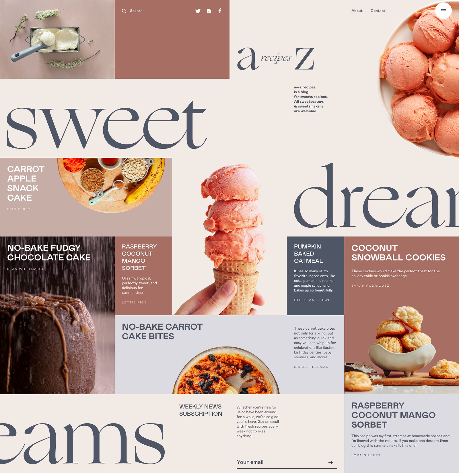
The blog devoted to dessert recipes features the search icon in the header
Hiding the search field in the below-the-fold area (the part of the page visible only after scrolling down the page) or in the footer increases the risk that most users won’t see it at all. However, using a search control in both the header and footer can be effective, especially if the website doesn’t use a sticky header. In this case, scrolling down to the footer, users won’t need to go back to search for something.
Talking about the search field in mobile interfaces, the situation differs as the designer is much more limited in the usable space. If the app is based on a lot of content and search is one of the central elements of interaction, it can be found in the tab bar and easily reached. In case the search is not crucial for the user goals and usability of the app, it can be hidden in menus or shown only on the screen where it’s potentially needed.
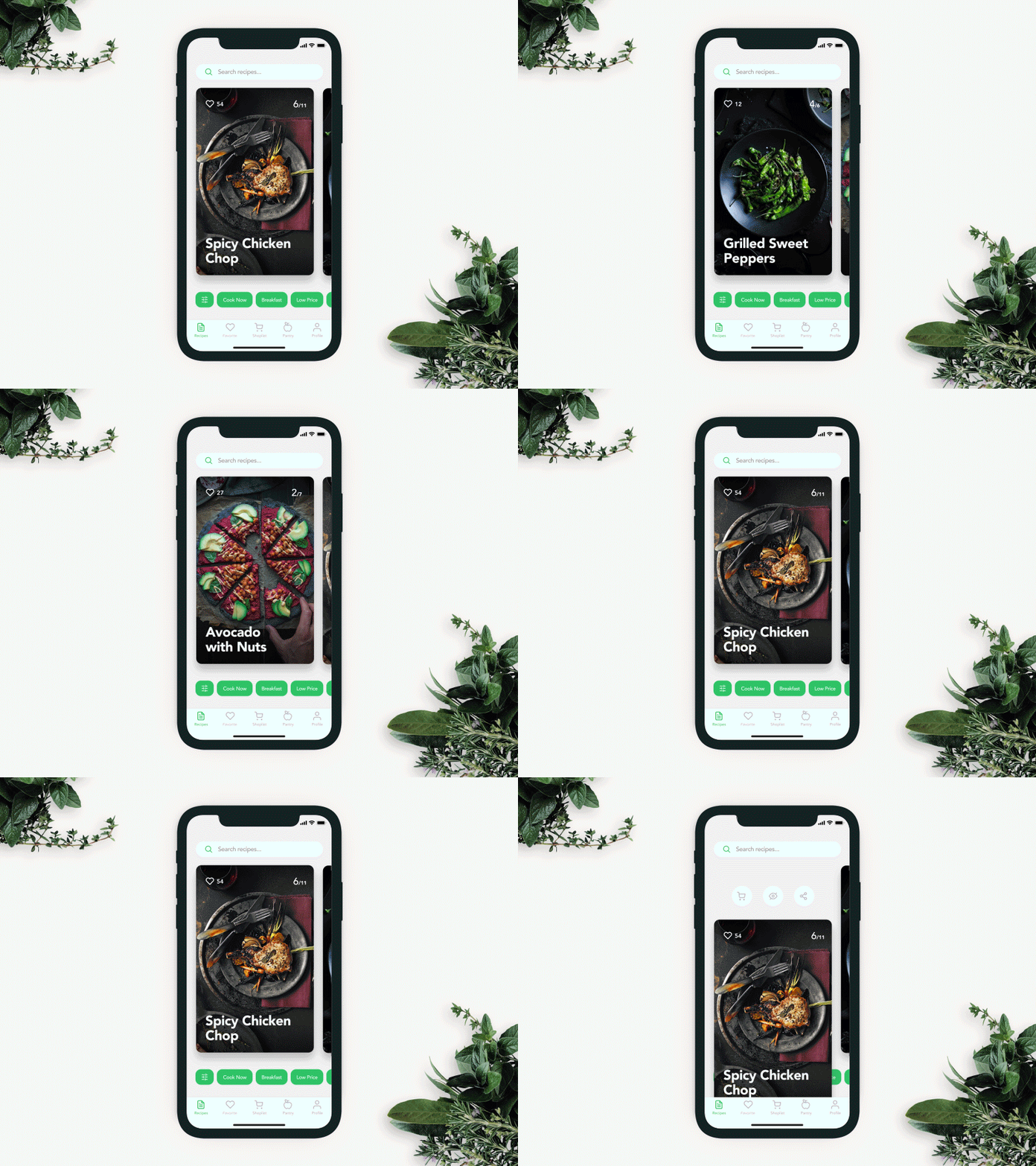
The recipe app is full of content and features a search field in the top part of the screen, with both a search icon and a textual prompt to make its functionality super clear. Also, the tags below help refine the search.

The concept of search interactions for a mobile app
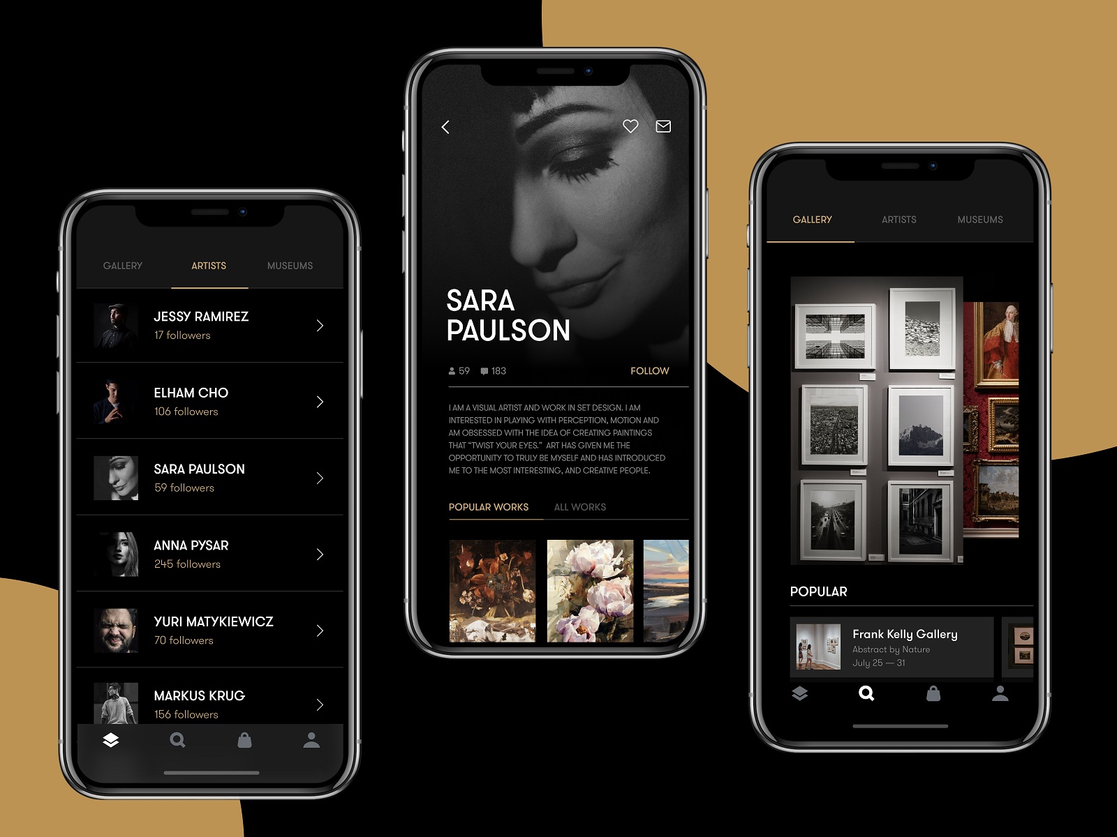
The Gallery App features the search icon in the tab bar, allowing a user to reach it quickly
Use a clear recognizable icon and be careful about experiments
In terms of interaction design, the search field can be presented in different ways, from a framed tab to an interactive input line or even a minimalist clickable icon. In the vast majority of cases, the search field is marked with the icon featuring a magnifying glass. This symbol is recognizable to a wide variety of users, so it has proven itself effective for intuitive navigation and is quickly recognized when users scan the webpage.
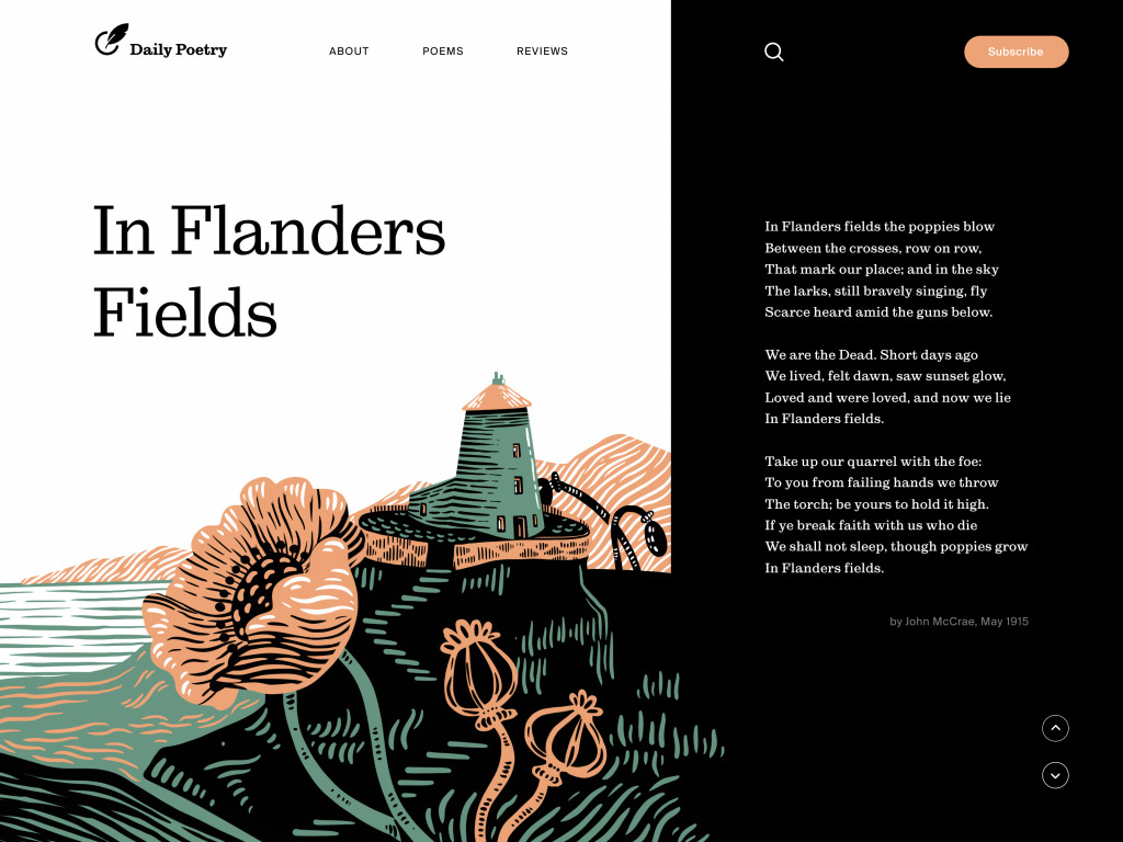
Daily Poetry website features the search icon in the header and makes it super visible due to the color contrast
Experiments with this icon can influence badly interactions and usability of the layout, so if other symbolic images are applied, they should be carefully tested. However, if you deliberately don’t want to draw users’ attention to the search functionality, different design solutions may work, sure.
For example, the ecommerce website above features the search option in the header, but makes it with a text link instead of a quickly visible search icon. There are two reasons for that: firstly, the design approach is built on sophisticated typography and an irregular grid with minimal use of visuals such as icons; secondly, the shop doesn’t offer thousands of items, so it wants to navigate users to goods and offers. Such an approach makes the only icon of the shopping bag more noticeable among the text links in the header; still, the search is readily available to users who want to reach it.
Give textual prompts and auto-filling
Textual prompts are a good way to give users a hint about the interactivity and functionality of a particular interface element. The classical example everyone knows is the Google search, which offers options as soon as you input your query. This reduces the time spent filling in the search field and lets the user start actual interaction with the content quicker. Of course, it is quite logical to tune auto-filling according to the most popular and relevant queries.
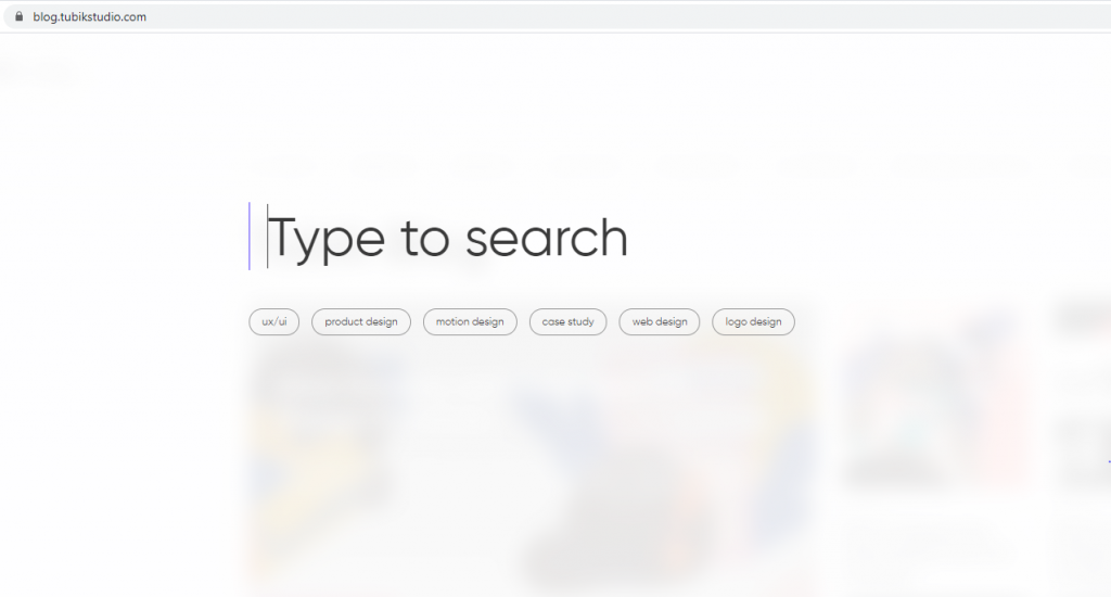
The search in Tubik Blog opens a minimalistic new page blurring the blog home page as a background. The user gets the big search field with a text prompt “Type to search” and pulsing cursor showing that the form is interactive. Also, there are clickable tags with popular queries.
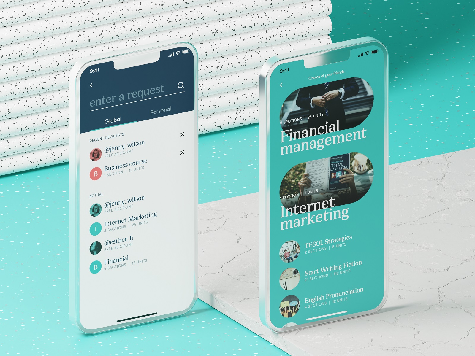
Search screen of the education courses app
Offer the options immediately
The flow of interaction can also be supported, with the dropdown menu offering possible options while the user is typing the query. Going further from auto-filling, these can be fully featured preview snippets of the relevant shop items, news, blog articles, etc.
Search interactions for Calorie Calculator App
Use filters to tune search
In case of very high content intensity on the website (imagine Amazon with thousands of items), even an exceptionally well-crafted search query may not be enough as it will bring out too many options in search results. In this case, filters can support the interaction flow and allow users to fine-tune their search: for example, on an e-commerce platform, filters can narrow down search results by price range, specific brands, or particular product characteristics.
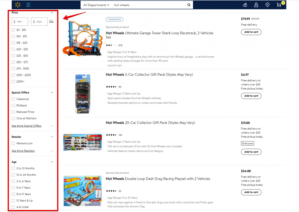
Here’s what search filters look like on the Walmart website: the page of search results has a sidebar on the left to allow users to narrow down the list of options with fine-tuning.
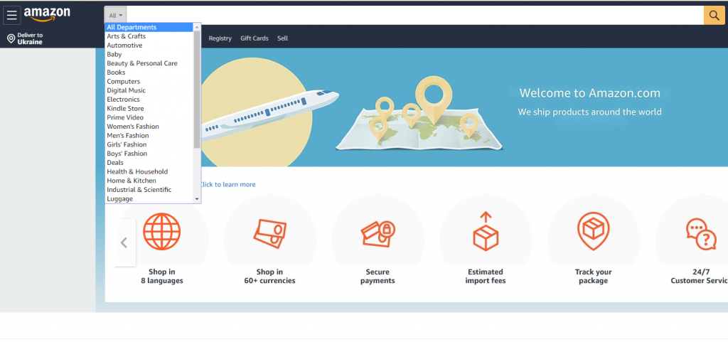
Another option is to integrate additional tuning directly into the search field. For example, the search field on Amazon uses the built-in dropdown menu of core goods categories, so you can start searching inside a specific section right from the search.
Filters also work well in mobile search interactions because they are easily tuned, saving time and effort in finding the perfect item.
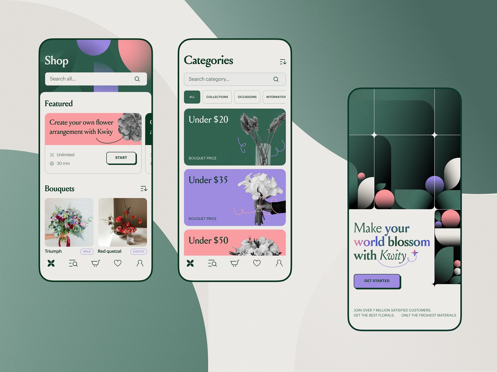
The flower store mobile application uses a noticeable search field at the top of the screen and makes the search process tuned with filters
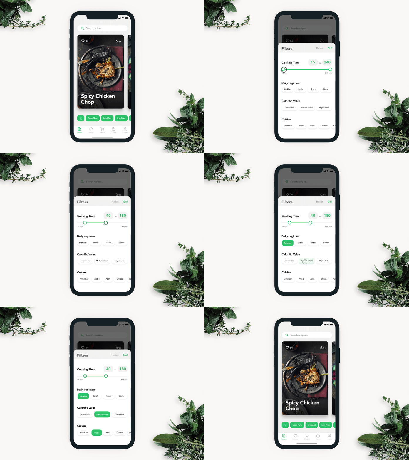
Recipe app filters interaction designed to tune the search among the hundreds of recipe options in the mobile app.
So, internal search is a critical component of delivering a good user experience for website or app visitors. Make it intuitive, use the power of habits, consider the points above to improve the search experience of your user interface, and strive for a good balance of search and all the other navigation. And don’t forget to analyze the internal search results: they will tell you what the users need and look for on your resource.
Useful Articles
Here’s the set of articles on more aspects and best practices of user experience design.
Error Screens and Messages: UX Design Practices
Guide into 6 Effective Types of Web Animation
The Anatomy of a Web Page: Basic Elements
Visual Dividers in User Interfaces: Types and Design Tips
Directional Cues in User Interfaces
How to Make User Interface Readable
Basic Types of Buttons in User Interfaces
Negative Space in Design: Practices and Tips
How to Make Web Interface Scannable
UI/UX Design Glossary: Navigation Elements
Originally written for Tubik Blog
 https://design4users.com/design-search-in-user-interfaces/
2026-01-10
© by
Marina Yalanska
,
https://design4users.com/design-search-in-user-interfaces/
2026-01-10
© by
Marina Yalanska
,
- English
- Ukrainian