
Best Design Practices for Website Headers
Best Design Practices for Website Headers The set of insights on the definition, structure, and composition of a website header as a strategic part of the website: a variety of examples and approaches.
Everyone knows: there is no second chance to make the first impression. In the digital products sphere, this eternal truth holds true amid high competition and incredible diversity. No doubt, some zones of the webpage or mobile screen are particularly important and effective in this aspect. Today, we are going to discuss one of them in depth: the website header.
In the article unveiling the anatomy of a web page, we have already provided a brief overview of what a header is. This time, let’s look a bit closer at this interaction element and discuss what the functions of a header are and recommendations for its design. In addition, we will show a bunch of web design concepts applying different approaches to header design.
What Is a Header?
In web page layout, the header is the upper (top) part of the web page. It is definitely a strategic part of the web page as the area that people see before scrolling the page in the first seconds of introduction to the website. Being somehow a sign of invitation, the header should provide the core navigation around the digital product so that users can scan it in split seconds. From a design perspective, the header is also the area that makes a broad field for creative design solutions that should be catchy, concise, and useful. Headers are often referred to as «Site Menus» and are positioned as a key element of the website’s navigation.
Neat, well-organized header for the website for Kreisson by Spark Interact
What Can a Header Include?
Headers can include a variety of meaningful layout elements, for example:
- basic elements of brand identity: logo, brand name lettering, slogan or company statement, corporate mascot, photo presenting the company or its leader, corporate colors, etc.
- copy block setting the theme of the product or service presented
- links to basic categories of website content
- links to the most important social networks
- basic contact information (telephone number, e-mail, etc.)
- switcher of the languages in case of a multilingual interface
- search field
- subscription field
- links to interactions with the product, such as trial versions, App Store downloads, etc.
It doesn’t mean all the mentioned elements should be included in a single web page header; in that case, the header section would be overloaded with information. The more objects attract the user’s attention, the harder it is to concentrate on the vital ones. Based on design tasks, designers, sometimes in collaboration with marketing specialists, select the strategic options from the list or add others.
Let’s look at a couple of examples to see which of the mentioned elements designers placed in the header for specific websites.
Minimalist header design with a call-to-action button for the Wickside landing page by Society Studios
An interesting design solution for the header for the Cula website by Refokus: it stays sticky for part of the interaction flow and then disappears to free space for more actual navigation at the specific stage.
Why is the header important?
There are several issues why the header is a vital element of many websites.
The first thing to consider is eye-scanning models, which show how users interact with a webpage in the first seconds. This significant domain of user research is massively supported by Nielsen Norman Group and provides designers and usability specialists with a better understanding of user behavior and interactions.
In brief, when people visit the website, especially the first time, they do not carefully and in detail explore every part of the page; they scan it to find a hook that will catch their attention and convince them to spend some time on the website. Different experiments collecting user eye-tracking data have shown that visitors typically follow several typical paths as they scan the website. In the article about 3 design layouts, the author Steven Bradley mentions the following common models: Gutenberg Diagram, Z-Pattern, and F-Pattern. Let’s check what are the schemes provided for them in the research.
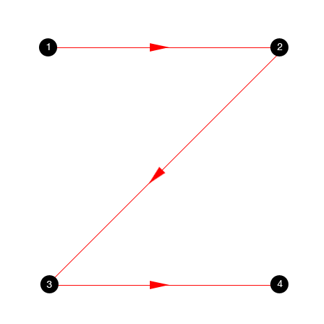
Gutenberg Pattern is quite typical of web pages, with a uniform presentation of information and a weak visual hierarchy. As can be seen from the scheme we found in Steven Bradley’s research, it identifies four active zones, two of which cross the typical header area.
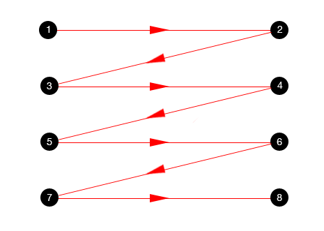
Another scheme features a Z-pattern, and the zigzag version shown is typical for pages with visually divided content blocks. Again, the reader’s eyes go left to right, starting from the upper left corner and moving across the page to the upper right corner, scanning the information in this initial zone of interaction.
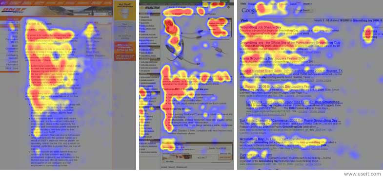
One more model is the F-pattern presented in the explorations by Nielsen Norman Group, and showing that users often demonstrate the following flow of interaction:
- Users first read horizontally, usually across the upper part of the content area. This initial element forms the F’s top bar.
- Next, users move down the page a bit and then read across in a second horizontal movement that typically covers a shorter area than the previous movement. This additional element forms the F’s lower bar.
- Finally, users scan the content from left to right in a vertical motion. Sometimes this is a fairly slow and systematic scan that appears as a solid stripe on an eye-tracking heatmap. Other times users move faster, creating a spottier heatmap. This last element forms the F’s stem.
All the models show that, whichever model a particular user follows, the scanning process starts in the top horizontal area of the web page. Using it to show core information and branding is a strategy that supports both sides: readers can scan the key data quickly, while the website has a chance to retain them if it’s presented properly. That is the basic reason why header design is an essential issue for UI/UX designers as well as content and promotion specialists.
In one of the articles devoted to practices of header design, its author, Bogdan Sandu, mentions an important point that should be kept in mind: “People judge the quality of a website in just a few seconds, and a second impression is something absent on the Internet. In conclusion, a website must be eye-catching else, it would be nothing more than a big failure”.
Another thing to consider is that the header can become a great help in presenting the essential data to the user quickly and providing positive user experience via clear navigation. However, that doesn’t mean that every website needs a header. There are many creative solutions providing designs applying typical header functionality in other zones of the layout. Every case of website design needs analysis and research of the target audience for the product or service.

Clear and informative website header designed as a united tab at the top part of the web page for Pilot’in website
Design practices
Readability and visual hierarchy
The choice of typefaces for headers and the background color should undergo rigorous research and testing, as header readability is vital. The user must be able to scan and perceive this basic information as quickly as possible, with no additional effort. Otherwise, you risk providing a non-user-friendly interface.

Elegant header design saturated with various important navigation points for the Heimdall Power website by Refokus

CTA button in the header on the website for Fresha Restaurant by Wybe
Hamburger menu
Another design solution that is quite popular for header functionality is hiding basic links to data categories behind the hamburger button. It is called so as its form, consisting of horizontal lines, looks like a typical bread-meat-bread hamburger.
Hamburger menu interactions on the Wondermake website
This button is usually placed in the header, and nowadays it is a typical element of interaction. Most users who visit and use websites on a regular basis know that this button hides the core categories of data, so this trick does not need additional explanations and prompts. Hamburger menus free up space, making the interface feel more minimalistic and full of air, and leaving room for other important layout elements. This design technique also provides additional benefits for responsive and adaptive design, hiding navigation elements and making the interface look harmonious on different devices.
Hamburger menu interactions for TOMORE website by Prime Cross
Although hamburger menus remain a highly debated issue in modern web and app design, they are still widely used as header elements. The arguments against the hamburger menu are that this design element can be confusing for people who do not use websites regularly and can mislead them because it features a high level of abstraction. So the decision about applying the hamburger button should be made after user research and definition of the target audience’s abilities and needs.
Hamburger menu interaction in the header design for the EA Financial website by Buzzworthy
Fixed (Sticky) header
Sticky headers present another trend able to boost usability is applied effectively. Actually, it enables providing users with a navigation area available at any point of interaction, which can be helpful in terms of content-heavy pages with long scrolling.
Sticky header for the Obsidian Assembly website by Fiddle Digital
Double menu
Double menu in the header can present two layers of navigation. We have shown the example of such a trick in one of the recent case studies for a bakery website.

Double-layer navigation header design for the Visit Shropshire website by Reech
The bottom line is simple: the header of any website is a strategically vital interaction zone. Each particular case requires its own approach, which will be informative and usable for the specific target audience. User research can provide a solid basis for design solutions that can take quite traditional forms or require a completely new perspective.
UX Design Articles
Here’s a bunch of articles to dive deeper into the theme of usability and user experience design.
Aesthetic Usability: How Beauty Improves User Experience
UX Design: Types of Interactive Content That Boosts Engagement
5 Basic Types of Images in Web Design
The Anatomy of a Web Page: Basic Elements
6 Elements of Efficient Company Website Design
UX Practices on Product Page Design
How to Design Effective Search
Web Design: 17 Basic Types of Web Pages
Guide to 6 Effective Types of Web Animation
 https://design4users.com/best-design-practices-for-website-headers/
2026-08-18
© by
Marina Yalanska
,
https://design4users.com/best-design-practices-for-website-headers/
2026-08-18
© by
Marina Yalanska
,
- English
- Ukrainian