
The Anatomy of a Web Page: Basic Elements
The Anatomy of a Web Page: Basic Elements Check essential elements of a web page, learn what impact each element has and how it contributes to the general user experience
“The details are not the details. They make the design,” Charles Eames once said, and that has never stopped being true. Starting to design a web page, we have to consider what it should consist of to solve the task set for it and be both usable and beautiful. Today’s article is devoted to those vital details that create an effective web page. Let’s briefly review what elements can be essential for a typical web page, what impact each element has, and how it contributes to the general user experience.
Theme illustration by Yaroslava Yatsuba
Header
Header is the upper (top) part of the webpage. As the area people see before scrolling the page in the first seconds on the website, the header is a strategic element. It is expected of the header to provide core navigation around the website so that users can scan it in a matter of seconds and jump to the main pages that can help them. Headers are also referred to as site menus and positioned as an element of primary navigation in the website layout.
Headers may include a bunch of meaningful layout elements, for example:
- basic elements of brand identity, usually a logo
- call-to-action button
- links to basic categories of website content
- links to the social networks
- basic contact information (telephone number, e-mail address, etc.)
- switcher of languages in the case of the multilingual interface
- search field
- subscription field or button
- links to interaction with the product, such as a trial version, downloading from the App Store, etc.
This doesn’t mean that all the mentioned elements should be included in a single web page header; in this case, the header would be overloaded with information. The more objects attract the user’s attention, the harder it is to concentrate on the vital ones. Based on design tasks, designers and marketing specialists sometimes decide on the strategically important options and pick them from the list or add others.

Elegant header design saturated with various important navigation points for the Heimdall Power website by Refokus
What makes a header a vital element contributing to web usability is the fact that it is placed in the most scannable zone of a web page. Whatever the scanning pattern users stick to on a website, it starts from the top part of the page, scanned from left to right for languages that use the same reading and writing pattern. This means that what is placed in the header won’t be missed, especially the elements placed in the left and right corners. That’s why you will often find the main CTA button in one of them. What’s more, the power of habit and the idea of external consistency of user experience should also be considered here. For years so far, visitors have been used to finding core navigation in headers, so mostly, the main question is to decide what to put into it rather than to use a header or not.
Some of the popular design practices for web headers include:
- hamburger menu: hiding the set of links to different pages or sections behind the hamburger button called so as it consists of horizontal lines looking like a typical bread-meat-bread hamburger.
- sticky header: a header that doesn’t hide away but sticks to the top part of the page when users are scrolling the page down. This way, the core navigation area is available at any point of interaction, which can be helpful in terms of content-heavy pages with long scrolling.
- two-layer navigation: a sort of double set of navigation sites in the header to separate two different routes of navigation that are both important for web usability.
One more widely-used pattern for website headers is making a logo clickable and opening or refreshing the home page after it’s clicked.
Sticky header for the Obsidian Assembly website by Fiddle Digital
CTA Button
A call-to-action (CTA) button is an element of a user interface aimed at encouraging a user to take a specific action. This action presents a conversion for a particular page or screen (for example, buy, contact, subscribe, etc.). In other words, it turns a passive user into an active one. So, technically, it can be any type of button that is supported with a call-to-action text. This type of button differs from all the other buttons on the page or screen due to its engaging nature: it has to catch attention and stimulate users to do the required action.
Effective call-to-action buttons are easy to notice; designers intentionally create them so that website visitors could see them in split seconds and respond. That’s why they are usually bold buttons containing microcopy with a particular call to action (e.g., “Learn more” or “Buy it now”), which explains the main action for this page and encourages a user to do it. If CTA buttons are not clearly defined and don’t attract attention, visitors are likely to scan the content quickly and leave it untouched.

CTA button in the header on the website for Fresha Restaurant by Wybe
Hero Section
The hero section is the above-the-fold (pre-scroll) area of the web page that presents a strong visual hook: a hero image, slider, catchy piece of typography, video, or anything else that attracts visitors’ attention and conveys a needed message. Make no mistake, the term doesn’t require that all images of this kind should include a human, animal, mascot, or any other kind of character. Don’t get tricked by that “hero” part. It can also be the product photo or the theme image featuring a landscape, a device, a building – anything, even an abstract model or composition. The main idea is that the visual hook in the hero section instantly grabs attention and allows for setting a quick visual, emotional, and informative connection with the users, engaging them to scroll or push the buttons to learn more.
Hero section for the home page of the Nesma&Partners website by Origin catches attention and impresses visitors with an animated 3D illustration.
Footer
The footer is the lower (bottom) part of the web page that usually marks its end. Another common zone of global website navigation, the footer provides an additional field for useful links and data users may be interested in finding.
Footers can include:
- brand identity signs, usually the name and logo of the company or product
- links to user support sections, for example, the FAQ page, the About page, the Privacy Policy, the Terms and Conditions, the Support Team, etc.
- credits to website creators
- contact forms and information
- links to company or product accounts in social networks
- testimonials and badges
- certification signs
- subscription field or button.
As well as the header, the footer is not an element found on all websites that users can come across on the web. For instance, when infinite scrolling is applied, the traditional footer is not an effective navigation zone. However, in the case of infinite scrolling, the idea of a fixed footer can also be applicable and support navigation not losing this area. For most users, the footer is a common place to search for contact information, credits, and sitemaps, so playing on this pattern can be beneficial. The decision to use a footer is always based on the goal of supporting general usability and navigability. Anyway, if the footer is applied, it should harmonize with all the other design solutions of the website layout and the general stylistic concept.

Footer design for the website of Continental Shoppe by Zeitler Design
Slider
Slider is an interactive element that applies a technique of a slideshow or carousel to present different products, offers, etc. It is especially popular as a part of e-commerce and business websites to present a sort of gallery of products or services.
Sliders present controversial interactive elements that often become an object of hot debates. Among the benefits, we could mention the following:
- saving space on the page
- user engagement
- attractive visual hook
However, even though the advantages sound really good, there are also obvious pitfalls:
- page speed decreasing due to slider functionality, this way influencing SEO
- display of several equal options together, which may hurt usability and get distracting as people do not observe priorities, and that makes it harder to focus
- possible problems of sliders in the mobile adaptation of the website
- as well as banners, sliders can be perceived as ads and skipped
So, deciding upon slider integration into the web layout, designers must consider all pros and cons for each particular case.
Sliders integrated in the More Nutrition website by Future Three
Search
Internal search is a functionality that enables a visitor to browse the website’s content and display results based on the search query. Tuned correctly, it shows the relevant content, and this way provides the shortcut to what the user needs. Thus, the internal search saves the user’s time and effort, amplifies usability and desirability of the digital product, helps retain users, and increases conversion rates. The interactive element responsible for the internal search in the user interface is a search field, also called a search box or search bar: it enables a user to type in the search query and, this way find the pieces of content that are needed.
If your website has 50+ pages, it’s high time you considered implementing an internal search. Well-designed and easily found search field enables the user to jump to the necessary point without browsing through the numerous pages and menus. This approach is a common pattern of user behavior now, it respects the user’s time and effort, so it is highly demanded in user-friendly interfaces.
Another vital point to mention is that designers shouldn’t prioritize search over navigation in a user interface. Although many users do try getting closer to their aim via search, others may have problems with search interactions. For example, they don’t know a language well enough to form the correct query, it’s not convenient for them to type something in, or they just hate thinking over the textual queries, and they would prefer to follow the already existing navigation and cues rather than the cognitive load of communicating to the system via the search.
In case you have a single-page website, if your app or website is concise and not heavily packed with content, the internal search is not needed. Thought-out navigation will be enough, for example, for a corporate or portfolio website highlighting core information and services.
Search interactions for the Ekomia website
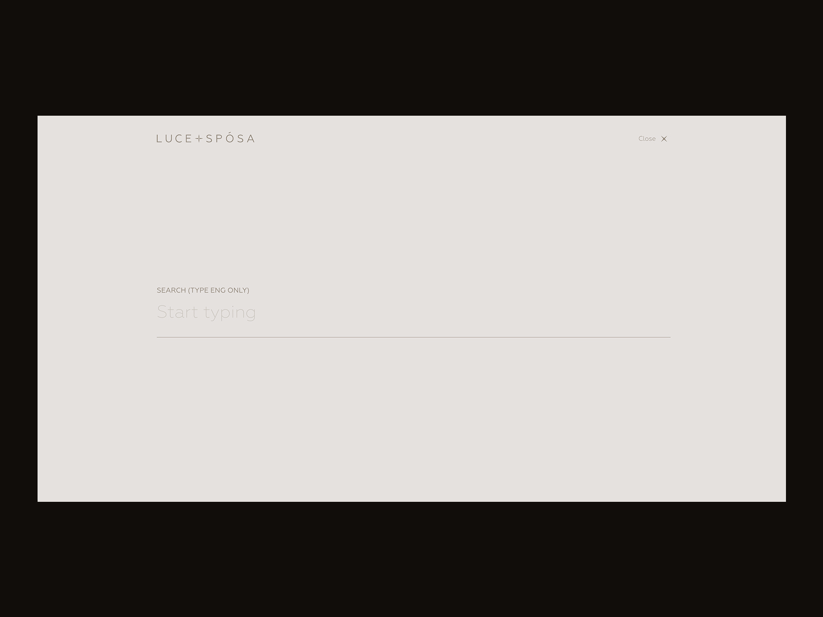
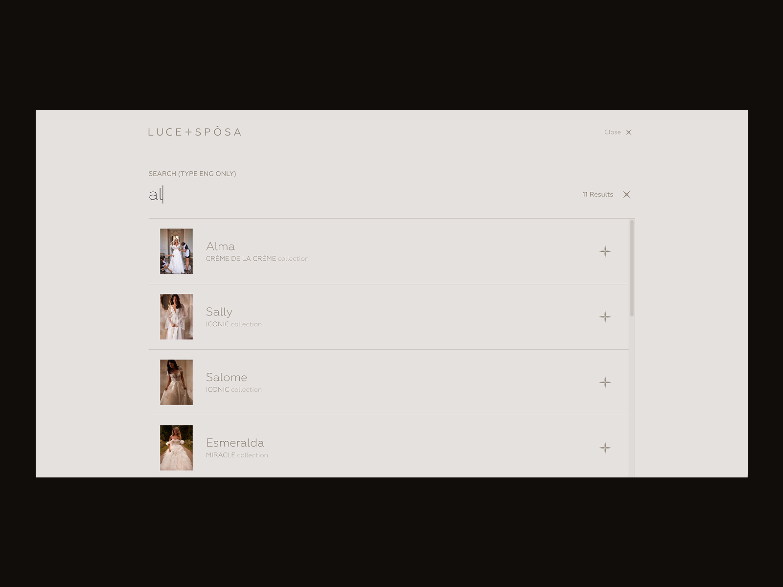
Search interactions for LuceSposa website by Zentixsoft
Menu
The menu is one of the core navigation elements in user interfaces. It is a graphical control that presents the options for interactions with the interface. Basically, it can be a list of commands – in this case, options will be presented with verbs that mark possible actions, such as “save,” “delete,” “buy,” “send,” etc. A menu can also present the categories along which the content is organized in the given interface, and this may be the right time to use nouns and mark them.
Menu interactions for OddRituals website by Malvah
Menus can have different locations in the interface (side menus, header menus, footer menus, etc.) and different ways of appearance and interaction (drop-down menus, drop-up menus, sliding menus, etc.) Any solution that a designer makes about menu functionality, appearance, and placement in the general layout should be based on thoughtful user research, analyzing not only the potential wishes and expectations of the target audience but also their tech literacy and possible environments in which the digital product could be used. A well-designed menu can significantly accelerate goal achievement and the satisfaction of needs, laying a solid foundation for a positive user experience.
Menu interactions designed for the Sunday website by Standard Projects
Menus can be organized horizontally or vertically. Some popular types found on diverse websites are:
Classic horizontal menu: the most common and well-recognized type of menu, which presents the core navigation organized as a horizontal line in the website header, mentioned above
Sidebar menu: quite a classic type, presents a vertical list of options sticking to the left or right side of the web page
Dropdown menu: a more complex type of menu for content-heavy websites; here, the list of additional options opens below the primary one when it’s clicked or hovered. Another similar option is the dropup menu, when the list opens up, not down, but the essence is the same.
Megamenu: that’s the complex expandable menu in which the big list of multiple choices is presented in a two-dimensional dropdown layout; this approach is effective for cases with a vast number of options.
Hamburger menu: when the hamburger button (typically marked with three horizontal lines) is clicked, the menu expands. This option saves space and is often applied to mobile versions of websites.
Navigation menu for the Hyperbolic website by Studio Freight
Hamburger menu on the Wondermake website
Breadcrumbs
Breadcrumbs are navigation elements used to support users in a journey around the website: they get aware of where they are on the website and can get used to the website structure more easily. So, breadcrumbs present a tool for better wayfinding, yet, they don’t replace the primary navigation menu; they present the secondary level of navigation and increase website usability in case it has lots of pages.
Some of the benefits of breadcrumbs are:
- increased findability: breadcrumbs give users another touchpoint to the content and help to catch the structure of the website
- fewer clicks needed: with breadcrumbs, website visitors can jump from one level of the hierarchy to any previous step with no effort and no need to take all the way back
- effective use of screen space: crafted well, breadcrumbs take a narrow horizontal line with plain-looking text elements that don’t need much space
- no misinterpretation: breadcrumbs are hardly ever misunderstood by users: the behavior pattern for them has solidified over years, and people rarely mistake this element for anything else
- lower bounce rate: breadcrumbs are a great support for first-time visitors or people that have no everyday experience of dealing with complex websites, so the more confident they feel, the slimmer is the chance of them bouncing the page.
As well as with internal website search, breadcrumbs are helpful in cases when the website has multiple pages and a complex hierarchy consisting of multiple layers. Breadcrumbs are common – and expected by users – in big e-commerce websites and platforms, media and news websites, blogs, and magazines covering a wide range of topics, etc. Yet, if that’s not your case and your website has a simple hierarchy, primary navigation will be enough to let the users effectively interact with it.

Breadcrumbs design for an education website design concept by Maxym Kovalishin

The product page on the Ekomia website uses a breadcrumb trail as a secondary navigation level.
Form
Form is an interactive element that allows users to send information to the system or server. In a nutshell, it is a digital version of any real paper form we have to fill in to provide someone with the required information; however, digital forms can have more options and functionality to make this process smoother, more transparent, and user-friendly. As it is a traditional and well-recognized pattern of collecting the data, users deal with forms quite often in their digital lives, starting from the process of registration, adding personal or financial details, making payments, sending feedback, subscribing to a newsletter, etc.
As forms present the actual point of communication between the user and the digital product, they have to be super simple and easy to use. And the simpler the UI element should be, the more designers’ thoughts and effort should be put into it, right? Make the logic of data input thought-out, the navigation of the form intuitive, and the number of required actions minimized. And don’t forget about the visual prompts and tips to support the user in the process of form filling.
Contact form interactions on the Somerville website by Eyekiller
Cards
Cards, also called tiles, are layout elements that help arrange and visualize homogeneous data or content in a scannable and easy-to-use way. Cards are usually organized in a grid, but each card appears as a separate piece in this system. Cards can combine different types of content about a particular item. For example, a product preview card on a catalog page can include an image, a title, and basic functionality for adding it to a shopping cart or saving it to the wishlist.
Interactive cards for portfolio website by Marco Franko
Cards design for FunParque website by Duall Studio
Video
Video is not a really basic part of a web page, but with the progress of web development solutions and technical abilities, we can find it more and more often on the websites of different kinds these days. As mentioned in the article about video content in UX design, a catchy video crafted with an understanding of the target audience is a tool attracting customers’ attention as well as a well-checked method of informing them quickly and brightly. Video content activates several channels of perception – audio, visual, motion – simultaneously, and usually does that wrapped in telling a story. Such a combination of factors often makes a video presentation strong, emotional, and memorable.
Video in the design for the website of 1820 Production by Carter Ogunsola O
Videos have become a popular visual hook applied to the hero section mentioned above. As well, we can come across many other types of videos that help users quickly catch the idea of a product, set the atmosphere, send the needed message, engage in trying the service, demonstrate how the tool, app, or software works, share feedback from users, and so on, and so forth. However, there are essential points to consider, such as loading time, contrast issue, responsiveness, and other pitfalls that can spoil user experience in the case of video integration into a web page.
Video as a part of website design on the Darknode website by Qream
Progress Indicator
Progress indicator is a small but helpful element that helps the visitor to understand the current point in the general volume of information or set of actions. It is beneficial on the pages loaded with text content and supposing long scrolling, like long-read articles or guides, for example. Due to this indicator, users don’t get lost and can estimate the time needed for reading or browsing better.
Also, progress trackers support users in cases of long and complex forms or processes that demand a set of steps or actions. Seeing what part of the way is covered and what is ahead, users feel more confident.
Progress bar design for the Integrated Bio website by Eliott Mangham
Favicon
Favicon, also known as URL icon or bookmark icon, is a special type of symbol representing the product or brand in the URL line of the browser and in the bookmark tab. It allows users to get a quick visual connection with it while they are browsing. This interface element proved itself effective for productive website promotion and good recognizability of its visual identity. Being super small, it makes a great contribution to web usability.
Favicon for the C-14 Design website by Su Liang
Tags
That’s another element of the secondary navigation level, often found in blogs and websites with plenty of homogeneous content. Tag is presented with a keyword or phrase that enables users to jump directly to the items marked up with it. Tags are actually pieces of metadata that provide quick access to specific content categories, so they support navigation with an additional way of content classification. Moreover, tags are often the elements that users create by themselves, so they become an alternative to the names of categories that are fixed by the website and can’t be changed by users.

News tags on the website Universal Music Italia by FV Digital Creative Agency
The choice of elements to add to a specific web page should be based on the harmonic combination of user and business goals, and it is crucial to test the solutions and update them based on feedback from real interactions. Sure, this article was just an introduction to the anatomy of a web page, so keep up with new posts to dive deeper.
Design Articles
Here’s a bunch of articles to dive deeper into web usability and user experience design.
5 Basic Types of Images for Web Design
UX Design: How to Make Web Interface Scannable
6 Elements of Efficient Company Website Design
Guide to 6 Effective Types of Web Animation
How to Design Effective Search
UX Practices on Product Page Design
Directional Cues in User Interfaces
Negative Space in Design: Tips and Best Practices
 https://design4users.com/anatomy-of-web-page-basic-elements/
2026-09-27
© by
Marina Yalanska
,
https://design4users.com/anatomy-of-web-page-basic-elements/
2026-09-27
© by
Marina Yalanska
,
- English
- Ukrainian