
7 Elements of Efficient Company Website Design
7 Elements of Efficient Company Website Design Learn about key elements that help to make a company website design effective and set positive user experience.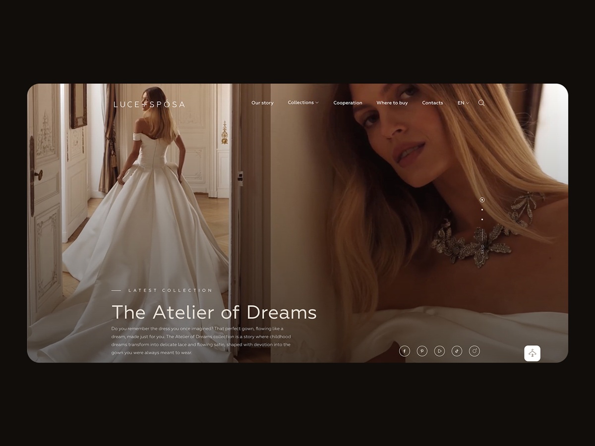
“A satisfied customer is the best business strategy of all,” Michael LeBoeuf once said. And customer happiness, as well as personal happiness, is not a destination; it’s a journey. In the modern era of active online communication, a company website is one point on this journey, often the starting point. So, in this article, let’s discuss some key elements that help to make a company website design effective.
What Is a Company Website
Company websites (or corporate websites) present the company, its activity, history, and mission. Their core target audience is usually clients who buy company services or products, so depending on the type of business, the conversion leads to the purchase, deal, or contract. Therefore, a website of this kind usually provides information about the services and workflow, shares the key benefits and company philosophy, and shows the portfolio and signs of trust.
The company website should present the corporate brand as credible, reliable, and professional, directly connecting potential clients to the company representatives. What’s more, another segment of target users may include those who want to work at the company. In this case, the website also features information about the team, available vacancies, requirements for the personnel, and company activities and events.
The company website becomes a vital touchpoint, sharing the brand’s positioning, tone, and voice. How would you describe your brand? Is it friendly? Fun or serious? Mass or luxury? Readily available or exclusive? Does it communicate to potential buyers in a formal, informal, or semi-formal style? Does it open much or mostly keep reserved silence, creating the mystery around the offered services or goods? These questions may sound far from the business, which has to be all about finance, profits, points of sales, and other stuff; still, the answers influence the features that set the brand image. The website design will be a sort of its face, outfit, make-up, voice, and invitation card, all together simultaneously.
The type of business relations also deeply influences the core aspects of UX design for the company website structure and content: setting B2C, B2B, or B2C relations type, the business lets the creative team find a proper layout and common mental patterns of interaction, and predict possible user behavior.
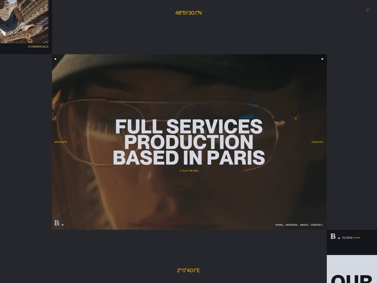
Hero section of the home page for Bloom company website by Beacoup
Let’s check the essential points to include in a company website to reach the objectives described.
Clear Value Proposition
A value proposition is a straightforward and crisp presentation of the problems the company solves and the benefits it provides to its customers. Make no mistake, the company website structure and content should revolve around it from the first seconds of interaction. And each and every detail should serve the point of uncovering the essence.
One of the practical approaches is to go from the core to the details, the trick called the Inverted Pyramid Principle in writing. The idea is that you go from what’s needed to know to what’s nice to know, from the core message to the details, which may not be that vital. By arranging the content around this idea, website creators can unveil an engaging experience where visitors can catch the key information immediately and then plunge deeper if they want or move to direct communication if everything they need is up and plunging deeper is unnecessary. The major types of content that come into play include text, visuals, and video.
The home page for the company website of the wedding atelier LuceSposa by Zentixsoft uses a prominent tagline supported by a brief description text block in the hero section and eye-catching photos, giving an immediate, concise introduction to what they offer to clients. More details are uncovered as the visitor scrolls down the page.
Text content plays a crucial role in communication with the user. Not only is its effective visual presentation significant for high page performance, but the style, structure, and vocabulary should also correspond to the user’s expectations from a page. The text style and manner should follow business goals and the habits and needs of the target audience. User research will be effective for this issue to see how users want to communicate, while a professional copywriter will help strengthen the design with the power of words. According to the Inverted Pyramid principle mentioned above, in texts, instructions, and messages used for the company website, it is a good idea to focus on valuable information from the start and not distract users with too much lead-in and warm-up text. Sure, it doesn’t mean that you have to come up with dry, unemotional, information-only texts, yet try to minimize the supportive part and maximize the active one.
Also, it is important to remember that the text itself is a part of the design. So, the fonts used to present it, its size, composition, arrangement, and placement in the web page layout also significantly impact how the information is perceived, which associations are set, and how convincing the message looks.

Neat home page hero section with concise, readable, and clear value proposition supported by the prominent theme photo for the website for Kreisson by Spark Interact
Another effective tool to effectively present the value proposition is different types of images, as it is not a secret that, in many cases, an image is worth a thousand words. For diverse kinds of websites, company websites in particular, pictures are highly supportive and effective in conveying the needed message. They are usually the part of the content that is not only informative but also aesthetically and emotionally appealing, which is crucial for the first impression many businesses strive to make with their website. Original illustrations, prominent hero banners, and engaging photos can satisfy multiple goals:
- catch users’ attention
- transfer the message visually
- support the general stylistic concept
- set the needed theme, mood, or atmosphere
- demonstrate the core benefits or items effectively.
The company website for Elicyon by HNDRX employs the power of visual content to present the projects the company creates
Hero image on the home page of the KS Architectes website by AKIS Studio
Animated graphics are used as engaging visual support for the presentation of the company approach on the website for company website of GKC Architecture Design by Locomotive
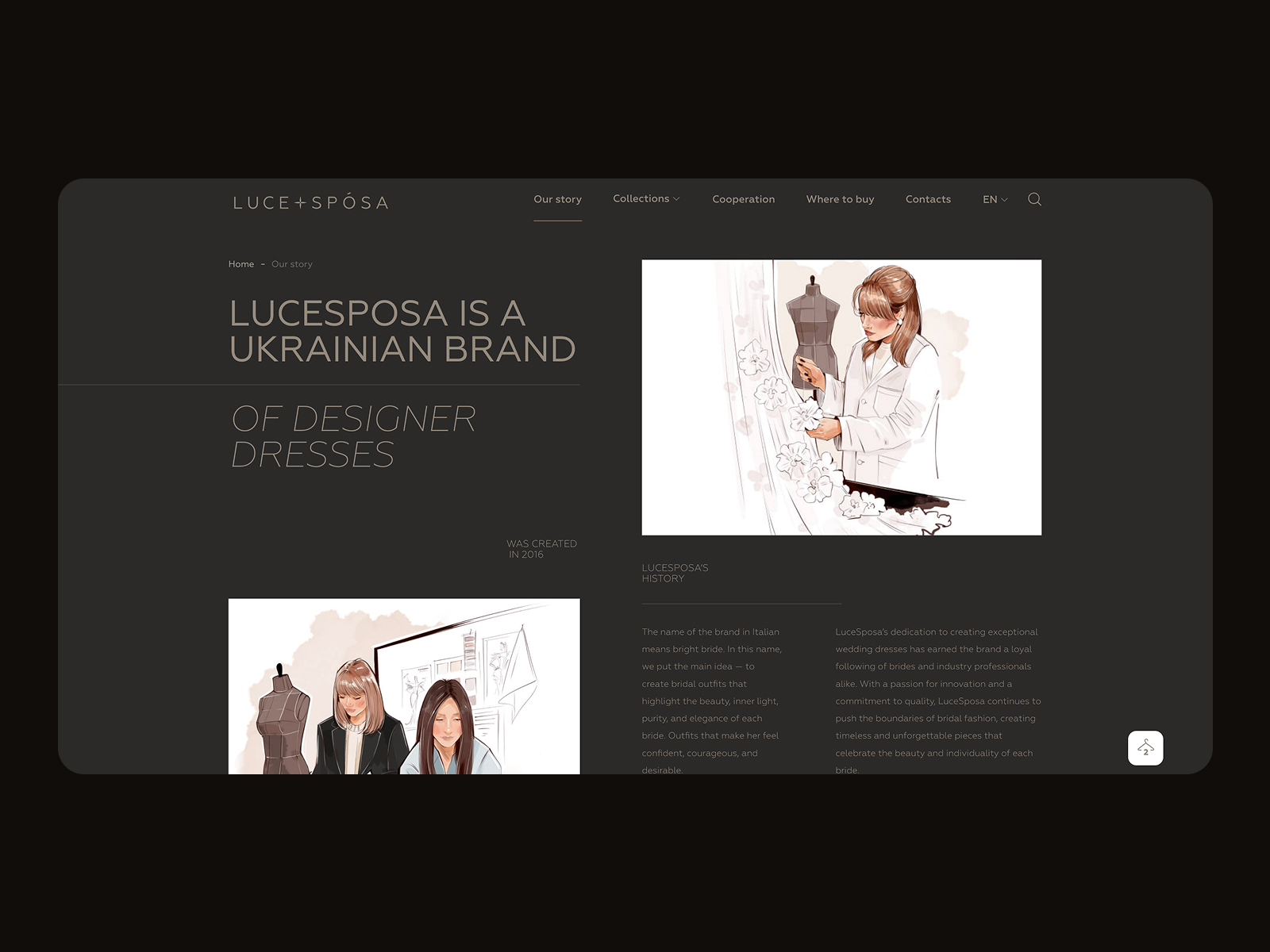
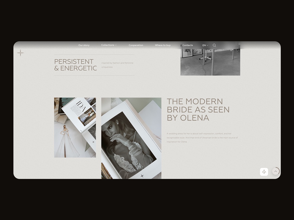
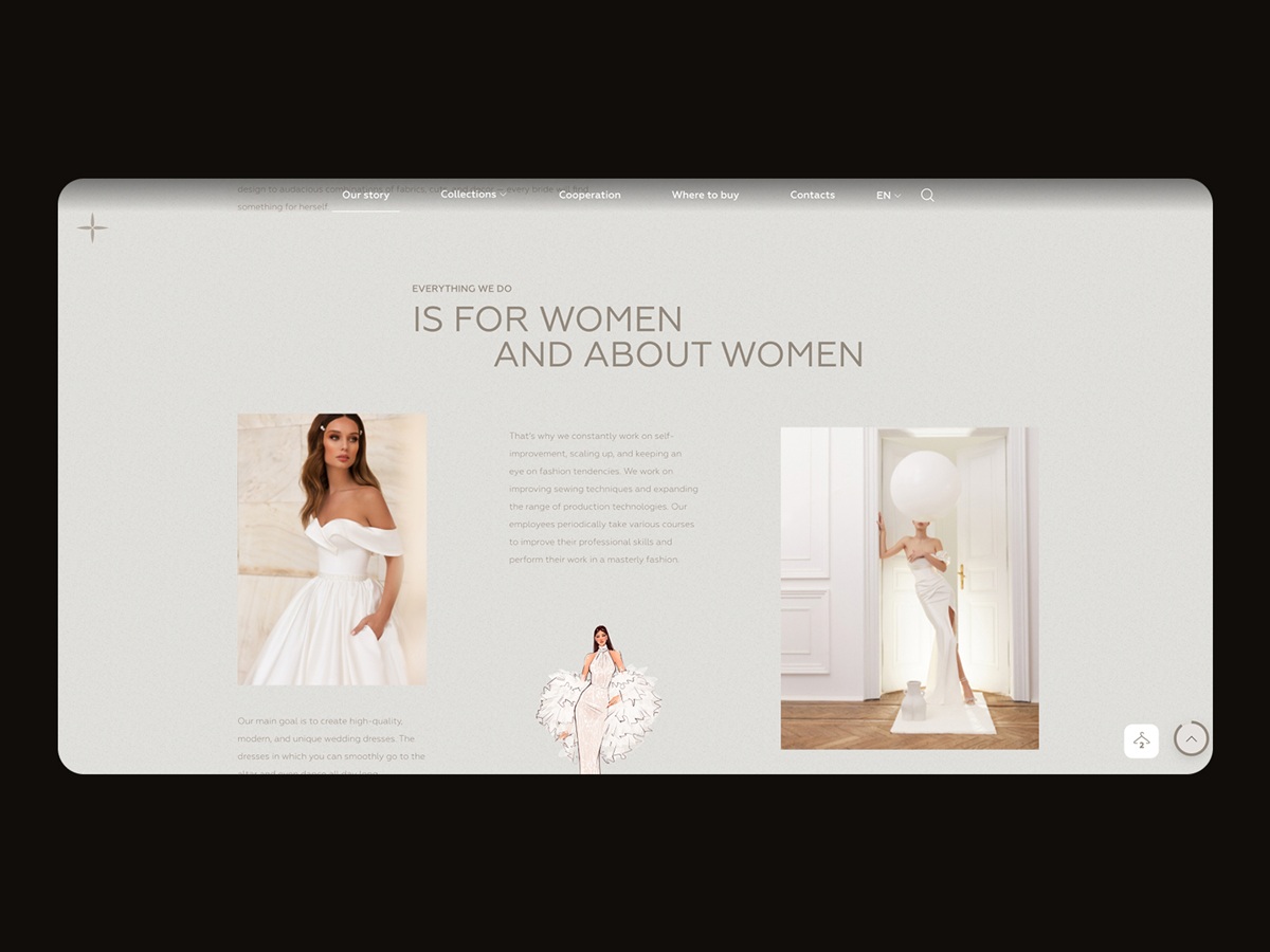
The company website of the wedding atelier LuceSposa by Zentixsoft uses a mix of custom illustrations and photos, setting the artistic vibe and immersing the visitor into the atmosphere and style of the designs created by the team, which contributes to the aesthetic appeal of the website design
Another efficient tool for demonstrating the value proposition is video content integrated into the company website. Now, people are overloaded daily with diverse information from various channels, so most visitors to a website aren’t going to spend much time learning about products or services, especially those new to them. Therefore, video can become another way of communication that is informative, dynamic, and attractive.
A catchy video crafted with an understanding of the target audience attracts customers’ attention and works as a well-checked method of informing them quickly and smartly. Video content activates different channels of perception simultaneously, usually by telling a story. This combination often makes a video presentation strong, emotional, and memorable.
Prototype studio website by Beacoup employs a vibrant mix of video and photo content to impress and engage visitors to learn more about the company
Consistent Visual Identity
A solid visual identity is an image created through distinguishing features that promote awareness and recognizability of the business in the market. In design, branding mainly works through a set of visual elements that define the brand style, such as the logo, typography, brand colors, and the like. Together, they are powerful tools for creating visual recognizability of the company brand. Being based on the analysis of the target audience and marketing/customer research, branding plays a vital role in product promotion, as visual perception is very fast and easy for most people, much easier than reading text and much more memorable than listening to speech. Moreover, if the brand is already well-established, the recognizable visual identity observed in the first seconds of seeing a website increases trust. So, the visual identity should be used consistently on the website and other company communication and promotion touchpoints.
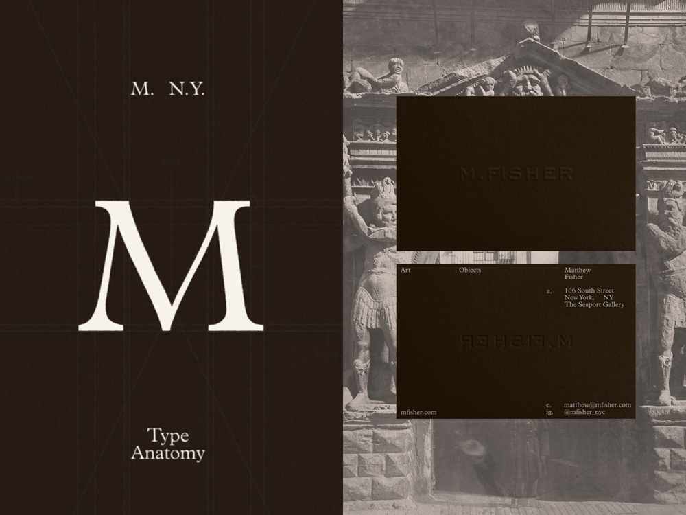

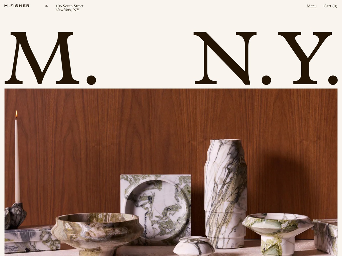
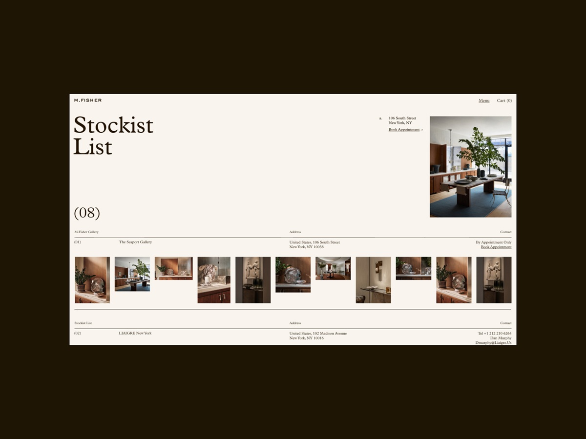
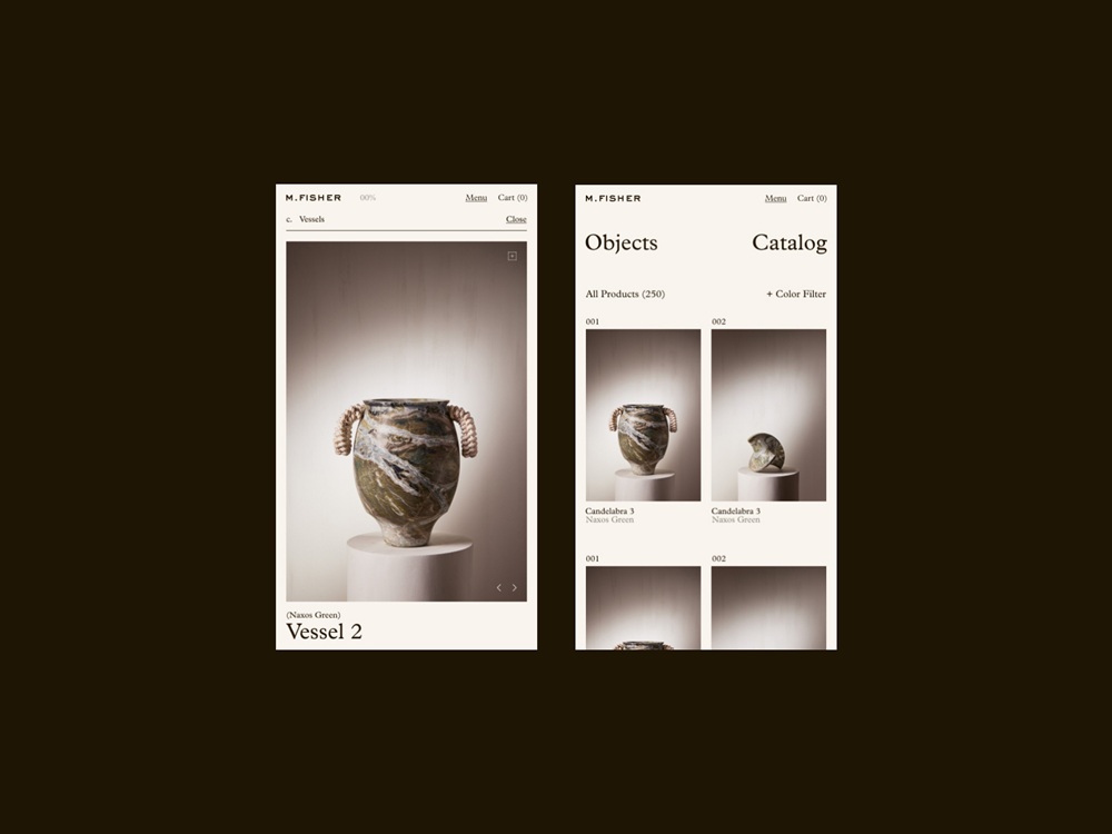
Consistent approach to brand visual identity and web design for Matthew Fisher website by CUSP
Noticeable Call to Action Elements
A call to action (CTA) is actually a word or phrase stimulating users to interact with a digital product, in our case, a company website, in a way and according to the aim it is designed for. CTA elements are the interactive controls that enable users to do the action they are called to. Common types of such interactive elements in the layout are buttons, tabs, or links. In interfaces of all kinds, CTA elements are a core factor in effective interaction with the product and play a crucial role in usability and navigability. When the entire path of interaction and transitions is built clearly for users, but the CTA element is not thought out, placed, or designed well, users can get confused and need to make additional effort to achieve their goals. That sets a high risk for poor conversion rates and general user experience. That’s why this navigation element is crucially important for a company website. It should be one of the most prominent and quickly noticeable parts to inform users how the product can be helpful or useful for them.

Hero section with a clear call-to-action setting a quick and easy way for interaction as a part of the Verity and Co Homes website design by Adaptable
Clear Insights into Provided Services
Once the visitor is interested, it’s essential to give them an opportunity to dive into what your company offers, what the approach to the services is, and what types of projects in what niches have already been implemented for clients. So, make it clear how to quickly jump into the pages that describe the company services and present the portfolio of work. The typical approach is to include noticeable text buttons in the website header and/or footer.
Services page and portfolio for Bloom company website by Beacoup
Projects page that allows for either a full list or jumping into a specific niche for the company website of GKC Architecture Design by Locomotive
Home page and functional menu interaction design for the Aitkin Turnbull website by Harrison Carloss enables visitors to quickly overview the value proposition and dive into deeper insights
Trust and Achievement Signs
Undoubtedly, one of the essential factors of business success is trustworthiness. So, when designing and developing a company website, we have to think about how to present to website visitors information that demonstrates public or expert recognition, client opinions, partnerships, achievements, and anything else that could increase understanding of the company’s trustworthiness and reliability.
The most popular points for that objective are:
- customer testimonials
- partners and clients
- reviews
- awards
- badges and seals
- social presence
- infographics and stats
- about page
The list of clients as a factor increasing trust for the Bloom company website by Beacoup
In the article about effort-saving interface design, I mentioned one of the investigations of user behavior provided by Nielsen Norman Blog, which is especially applicable to corporate website designs. The exploration shared an interesting finding that, based on eye-tracking studies, while users scan web pages, numerals often stop the wandering eye and attract fixations, even when embedded within a mass of words that users otherwise ignore. People subconsciously associate numbers with facts, stats, sizes, and distances – things that are potentially useful to them. So, they are hooked on the numbers in the copy, while words representing numerals can be missed in the bulk of the text. Even more, whatever numbers represent, they are more compact than their textual variant, which allows for making the content more concise and saving time for skimming the data.
Favicon
Favicon, also known as a URL icon or bookmark icon, is a type of symbol representing the product or brand in the URL line of the browser and in the bookmark tab. It allows users to get a quick visual connection with it while they are browsing. It makes a significant contribution to web usability. Small but meaningful, this interface element proved effective for productive website promotion and good recognizability of its visual identity.
Favicon for the C-14 Design website by Su Liang
Easy Way to Contact
One of the core things to keep in mind when designing a company website is giving visitors a shortcut to direct communication. It is quite common to make the link to the contacts page or form quickly visible and place it in the website header, which is the most scannable zone, and most users usually expect that button or link there. One more place on the company website where users can expect to see the Contacts link is the website footer. So, it’s a good idea not to waste these mental models that many users are accustomed to.
The Contacts page is usually quite simple but is of great importance. It shows how the user may contact the sales or support team or people responsible for different issues. Don’t overdesign this page: it should be fast to load, informative, and functional. In many cases, a contact form is also added to the page to let the visitor send the message right from there.
Transition to contact page for Bloom company website by Beacoup
New articles on user experience design are coming soon; stay tuned.
Useful Articles
Here’s a bunch of articles to dive deeper into the theme of usability and user experience design.
The Anatomy of a Web Page: Basic Elements
Web Design: 18 Basic Types of Web Pages
Negative Space in Design: Tips and Best Practices
UX Practices on Product Page Design
Types of Interactive Content That Boosts Engagement
Guide to 6 Effective Types of Web Animation
How to Design an Effective Home Page and Let Users Feel Like Home
5 Types of Images for Web Content
How to Make Web Interface Scannable
Error Screens and Messages: UX Design Practices
 https://design4users.com/company-website-design/
2026-08-03
© by
Marina Yalanska
,
https://design4users.com/company-website-design/
2026-08-03
© by
Marina Yalanska
,
- English
- Ukrainian