Color Theory: Brief Guide for Designers
Color Theory: Brief Guide for Designers The article focused on the basics of color theory and color combinations in design: learn more about color wheel, RGB, CMYK and models of color harmony.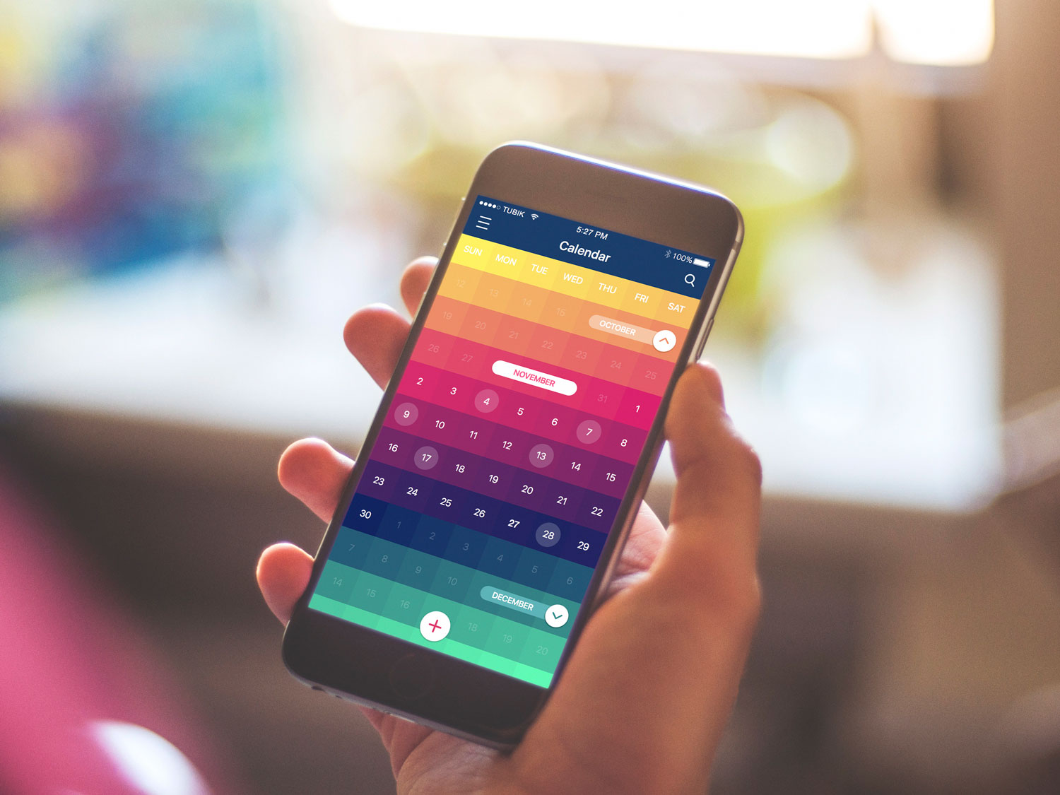
Many people think the choice of colors for UI mostly depends on the designer’s taste and sense of beauty. However, the process of color selection is more complicated than it seems and plays a significant role in the design. In one of our previous articles devoted to color psychology, we’ve found out that colors have a great impact on our mood and behavior. That’s why the success of the product depends largely upon the colors chosen for the design. The research provided by Colorcom showed that it takes only 90 seconds for people to make a subconscious judgment about a product and between 62% and 90% of that assessment is based on color alone. So, the appropriately chosen colors can be useful in improving conversion for your product as well as advancing the usability of the product.
To create good design and employ colors more effectively, you need to understand how colors are formed and how they relate to each other. That’s why students at art schools, colleges, and universities study the science of color theory devoted to colors’ nature. Today, we invite you to remember (or maybe even learn) the basics of color theory about the color combination that can be effectively applied in your design creation process.
Color Wheel
If you had any lessons related to painting, you must have seen the circle consisting of different colors. It is called the color wheel which helps to understand how different colors relate to each other and how they can be combined. The color circle is usually built of primary, secondary, and tertiary colors. The primary are those three pigment colors that can not be formed by any combination of other colors. Combining primary colors, we get the secondary ones, and the mix of the primary and secondary colors gives us the tertiary colors which usually have two-word names such as red-violet.

The color circle was first proposed by Isaac Newton in 1666 as a schematic model, and since then it has undergone numerous transformations but remains the primary tool for color combination. The main idea is that the color wheel must be made that way so that colors would be mixed appropriately.
Color models
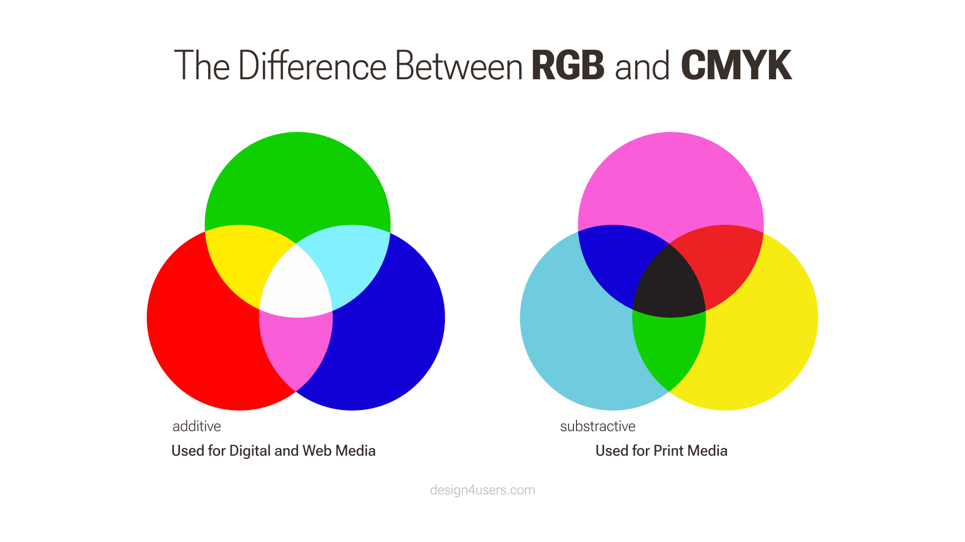
Before you start mixing colors, you need to understand that color has two different natures: the tangible colors, which are the surface of objects, and the others, which are produced by light, such as the beams of TV. These types create two color models that form the color wheel: additive and subtractive.
The additive color model considers red, blue, and green as primary colors so it’s also known as RGB color system. This model is the basis of all colors used on the screen. The combination of primary colors in equal proportions of this system produces secondary colors which are cyan, magenta and yellow, but you need to remember that the more light you add, the brighter and lighter the color becomes. Results obtained by mixing additive colors are often counterintuitive for people accustomed to the subtractive color system of paints, dyes, inks and other tangible objects.
The subtractive color model obtains colors by the subtraction of light. It consists of two color systems. The first is RYB (red, yellow, blue) also known as artistic system often used in art education, especially in painting. RYB was the basis for the modern scientific color theory which determined that cyan, magenta, and yellow are the most effective set of three colors to combine. This is how the color model CMY has been formed. It was mostly used in printing and when the photomechanical printing included black ink, the key component, the system was named CMYK (cyan, magenta, yellow, and black). Without this additional pigment, the shade closest to black would be muddy brown.
Additive vs subtractive
You should remember the significant difference between these two systems: additive is for digital screens and subtractive for print media. If the design project you are working on is meant to be printed, don’t forget the crucial but straightforward rule: colors you see on the screen never look the same in print. The additive color spectrum is broader than the CMYK color model; therefore, designers are advised to convert their projects to the subtractive color system before printing, so they can see the result more closely match what they would obtain. However, if you work with digital products, the RGB color system is the wise choice because it allows creating amazing things with its broad color spectrum.
Color Harmony
The word “harmony” usually associates with something orderly and pleasing. The color harmony is about the arrangement of the colors in design in the most attractive and effective way for users’ perception. When colors are organized, viewers feel pleased and calm, while disharmony in design gives the feeling of chaos and disgust. The color balance is vital in design since users make their impression of the website or application by the first look, and colors have a big influence. Designers distinguished the basic color schemes that work effectively.
Monochromatic
It is based on one color with various tones and shades of it. The monochromatic harmony is always a winning choice since it’s hard to make a mistake and create a distasteful color scheme.

Deetu Business Cards
Analogous
To create analogous harmony, you need to use colors located right next to each other on the color wheel. This type of color scheme is used for the design where no contrast is needed including the background of web pages or banners.
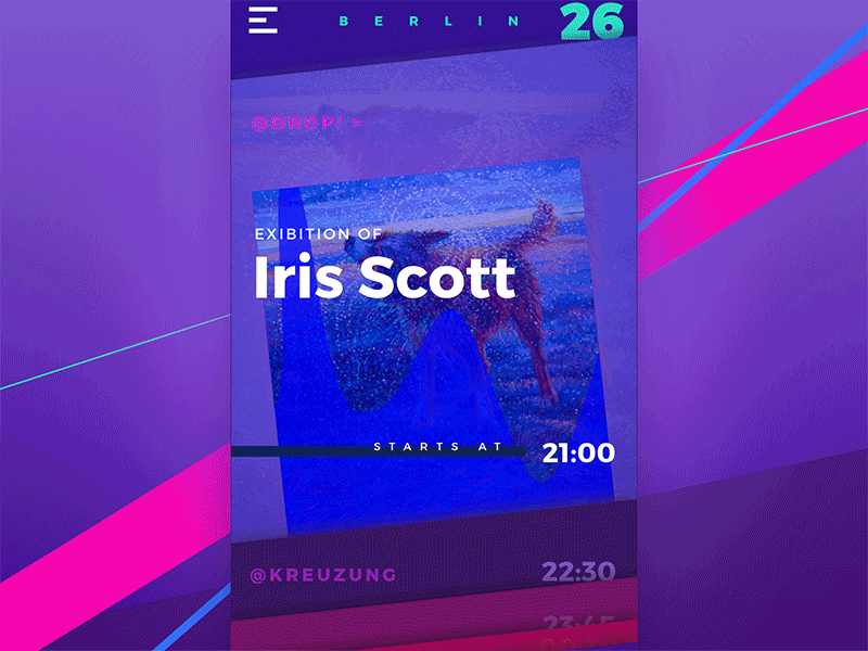
Night in Berlin App
Complementary
The complementary scheme is a mix of colors placed next to each other on the color wheel. This scheme is opposite to analogous and monochromatic since it aims to produce high contrast. For example, the orange button on the blue background is hard to miss in any interface.

Rome Illustration
Split-Complementary
This scheme works similarly to the previous one, but it employs more colors. For instance, if you choose the blue color you need to take two others which are adjacent to its opposite color meaning yellow and red. The contrast here is less sharp than in the complementary scheme, but it allows using more colors.

Be Bright App
Triadic
When the design requires more colors you can try triadic scheme. It is based on three separate colors which are equidistant on the color wheel. To save the balance in with this scheme, it is recommended to use one color as a dominant, the other as accents.

Toonie Halloween Stickers
Tetradic/Double-Complementary
The tetradic color scheme is intended for experienced designers, as it is the most difficult to balance. It employs four colors from the wheel, which are complementary pairs. If you connect the points on the chosen colors, they form a rectangle. The scheme is hard to harmonize, but if you do everything right, the results may be stunning.
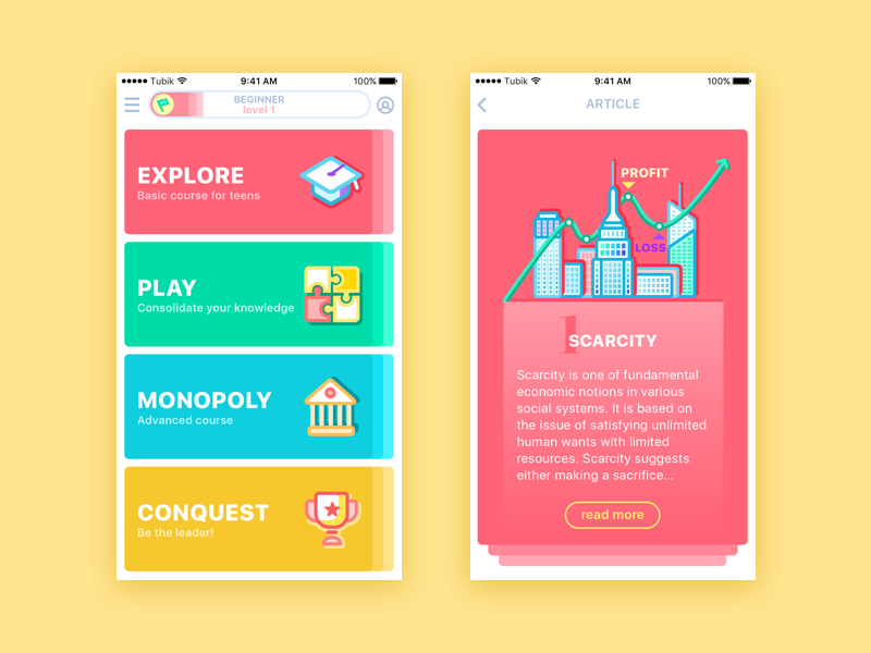
MoneyWise App
Color theory is a complex science that requires more than one day to learn. However, it is vital to understand the basics so that you can create an effective design with the knowledge of what you’re doing.
Recommended reading
Here are some materials we could recommend for those who would like to get deeper into the topic:
Design for Diversity of Cultures: Color Perception
Color in Design: Influence on User Behavior
Design Tips: How to Choose Colors for Interface
3C of UI Design: Color, Contrast, Content
How Shape and Color Work in Logo Design
Originally written for Tubik Blog
- English
- Ukrainian