User Experience: How to Improve Website Scannability
User Experience: How to Improve Website Scannability The article explains what's scannability, eye-tracking patterns and shares 10 tips for UX designers on enhancing scannability of web user interfaces.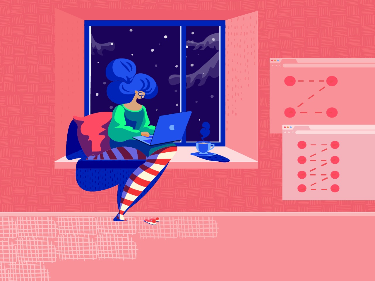
Day by day we are overwhelmed with massive information flow both offline and online. Due to new technologies and a fast internet connection, people can produce more content than they are physically able to consume. Dealing with numerous websites and apps, users don’t read everything they see word by word – they first scan the page to find out why and how it’s useful for them. So, scannability is one of the essential factors of website usability today. Today’s article explores the phenomenon and gives tips on how to make a digital product scannable.
What Is Scannability?
Applied to a page or screen, the verb “scan” means to glance at/over or read hastily. So, scannability is the way to present the content and navigation elements, like the layout, that can be scanned easily. When interacting with a website, especially on the first visit, users quickly scan the content to determine whether it’s what they need. Any part of the content can serve as a hook in this process: words, sentences, images, or animations.
By the way, this behavior is nothing new: for many decades, people often do the same with a new magazine or newspaper, looking through them before they start attentive reading of the articles. What’s more, reading from a screen is much more tiring than reading on paper, so users are more selective about when and where they read.
Why is that important? About a decade ago, Jacob Nielsen answered the question “How people read on the Web?” simply: “They don’t. People rarely read Web pages word by word; instead, they scan the page, picking out individual words and sentences.” Since then, it hasn’t changed much: we aren’t ready to invest our time and effort into exploring the website if we aren’t sure it corresponds to our needs. So, if an eye has nothing to catch it in the first minutes of the introduction, the risk is high that the user will go away. Whatever the type of website, scannability is one of the key factors in its user-friendliness.
How can you check if the webpage is scannable? Try to look at it as a first-time user and answer two questions:
– Does what you see in the first couple of minutes correspond to what the target audience expects from this page?
– Can you understand what kind of information is on the page for the first minute or two?
If you aren’t sure that both answers are positive, perhaps it’s time to think about how to strengthen the website’s scannability. It’s worth investing time because well-scanned pages become much more efficient in the following aspects:
- users complete their tasks and achieve their goals quicker
- users make fewer mistakes in the search of content they need
- users understand the structure and navigation of the website faster
- the bounce rate is reduced
- the level of retaining users gets higher
- the website looks and feels more credible
- the SEO rates are affected positively.
Popular Scanning Patterns
The vital thing an interface designer has to consider is eye-tracking patterns that show how users interact with a webpage in the first few seconds. When you understand HOW people scan a page or screen, you can prioritize the content and place WHAT users need in the most visible zones. This domain of user research is supported by Nielsen Norman Group and provides designers and usability specialists with a better understanding of user behavior and interactions.
Different experiments collecting user eye-tracking data have shown that visitors typically follow several typical paths as they scan the website.
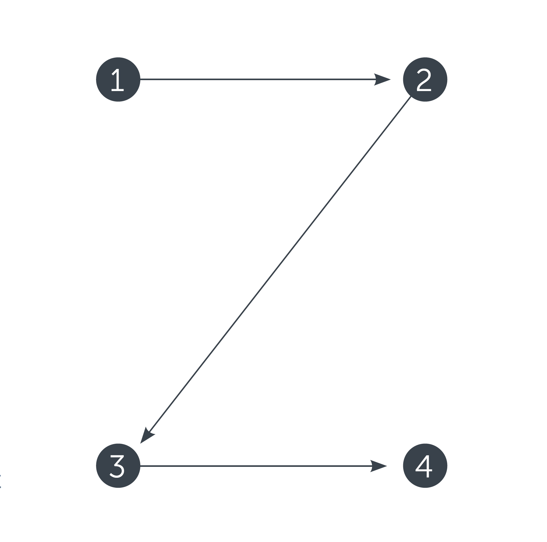
Z-Pattern is quite typical for web pages with a uniform presentation of information and a weak visual hierarchy.
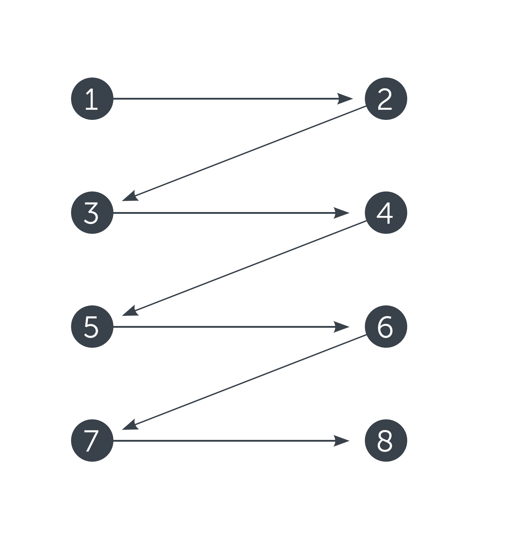
Another scheme features a zig-zag pattern typical of pages with visually divided content blocks. Again, the reader’s eyes go left to right, starting from the upper left corner and moving across the page to the upper right corner, scanning the information in this initial zone of interaction.
![]()
One more model is the F-pattern presented in the explorations by Nielsen Norman Group and showing that users often demonstrate the following flow of interaction:
- Users first read in a horizontal movement, usually across the upper part of the content area. This initial element forms the F’s top bar.
- Next, users move down the page a bit, then read across in a second horizontal movement that typically covers a shorter area than the previous one. This additional element forms the F’s lower bar.
- Finally, users scan the content from left to right in a vertical motion. Sometimes this is a fairly slow and systematic scan that appears as a solid stripe on an eye-tracking heatmap. Other times, users move faster, creating a spottier heatmap. This last element forms the F’s stem.
Tips on Improving Scannability
1. Prioritize the content with visual hierarchy
Basically, visual hierarchy is the way to arrange and organize the content on the page in a way that is most natural for human perception. The main goal behind it is to let users understand the importance level of each piece of content. So, if the visual hierarchy is applied, the users will see the key content first.
For example, when we see the article in the blog, we’ll get the headline first, then subheadings, and only then copy blocks. Does it mean that the information in the copy blocks has a low level of importance? Well, no, but this way users will be able to scan the headline and subheadings to understand if the article is useful and interesting for them instead of trying to read all the text. And if the headline and subheadings are done properly and inform the user about the article’s structure and content, this will be the factor that convinces the reader to read more. On the other hand, if users see the huge and long sheet of text not separated into chunks, they will be literally scared, not able to understand how long it will take to read this article and if it is worth investing their time and effort.
There are several main factors helping to build up the visual hierarchy:
- size
- color
- contrast
- proximity
- negative space
- repetition.
All of them help designers transform the set of elements, links, images, and copy into a harmonious, scannable page layout system.
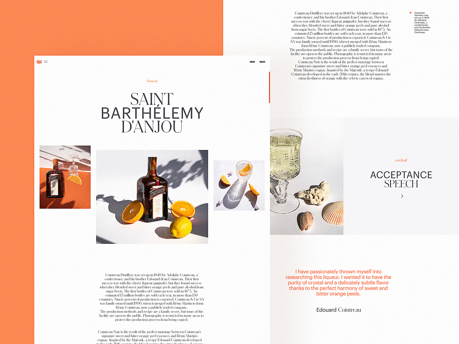
Bartending Encyclopedia Website
2. Put the core navigation into the website header
All the mentioned eye-scanning patterns show that, whichever pattern a particular user follows, the scanning process starts in the top horizontal area of the webpage. Using it for showing the key zones of interaction and branding is a strategy that supports both sides. That is the basic reason why website header design is considered as an essential issue by not only UI/UX designers but also content managers and marketing specialists.
On the other hand, the header shouldn’t be overloaded: too much information makes it impossible to focus. The attempt to put everything into the top part of the page can transform the layout into a mess. So, in every particular case, it’s a must to analyze the goals of the core target audience, how they align with the business goals behind the website, and, based on that, what information or navigation should be placed in the header as the most important. For example, on a large e-commerce website, search functionality must be instantly visible and is often in the header, accessible from any point of interaction. For a small corporate website, search functionality may be unnecessary, but the immediately visible link to the portfolio will be crucial.
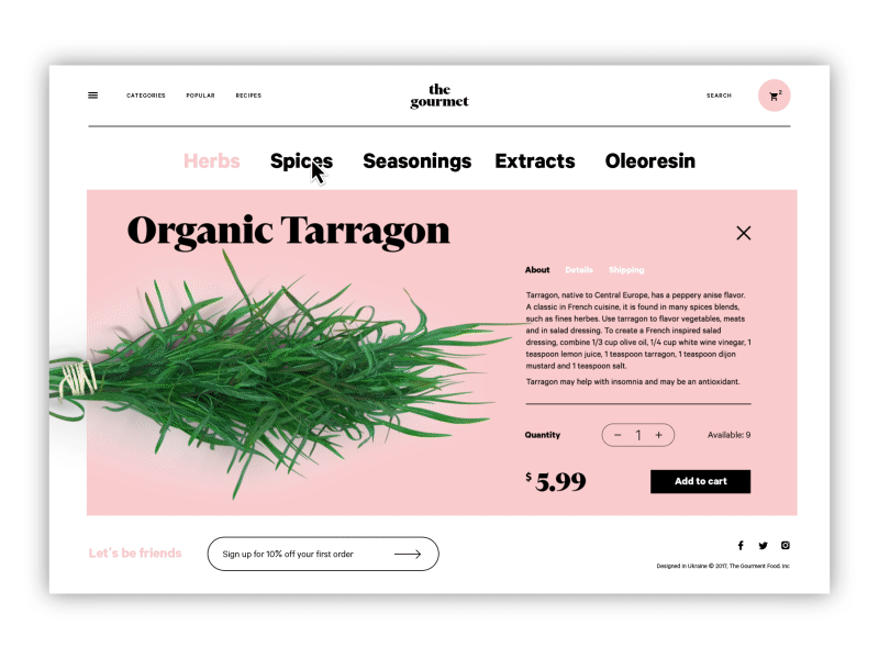
The Gourmet Ecommerce Website
3. Keep the balance of negative space
Negative space — or white space, as it’s often called — is the area of the layout that is left empty, not only around the objects in the layout but also between and inside them. Negative space is a kind of breathing room for all the objects on the page or screen. It defines the limits of objects, establishes the necessary bonds between them according to Gestalt principles, and produces effective visual performance. In UI design for websites and mobile apps, negative space is a key factor in the interface’s navigability: without enough breathing room, layout elements aren’t clearly visible, so users risk missing what they really need. It may be a strong contributor to eye and brain tension, though many users won’t be able to pinpoint the problem. A proper amount of negative space, especially microspace, solves the problem and makes the process feel more natural.
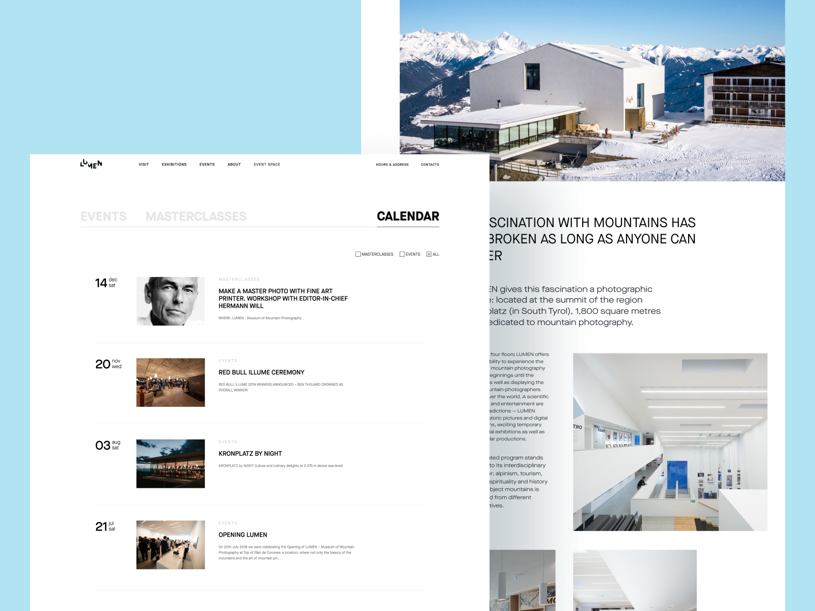
Lumen Museum Website
4. Check that CTA is seen at once
Obviously, the vast majority of web pages are designed to prompt users to complete specific actions. The elements that contain the call to action (CTA), usually buttons, should be seen in split seconds to let users understand what actions they can take on this page. Among the good tests is checking the page in the black-and-white and blurred modes. If in both cases you can distinguish CTA elements quickly, they are done well. For example, on the webpage of the bakery website shown below the CTA button of adding the item to the list is easily seen among the other elements.
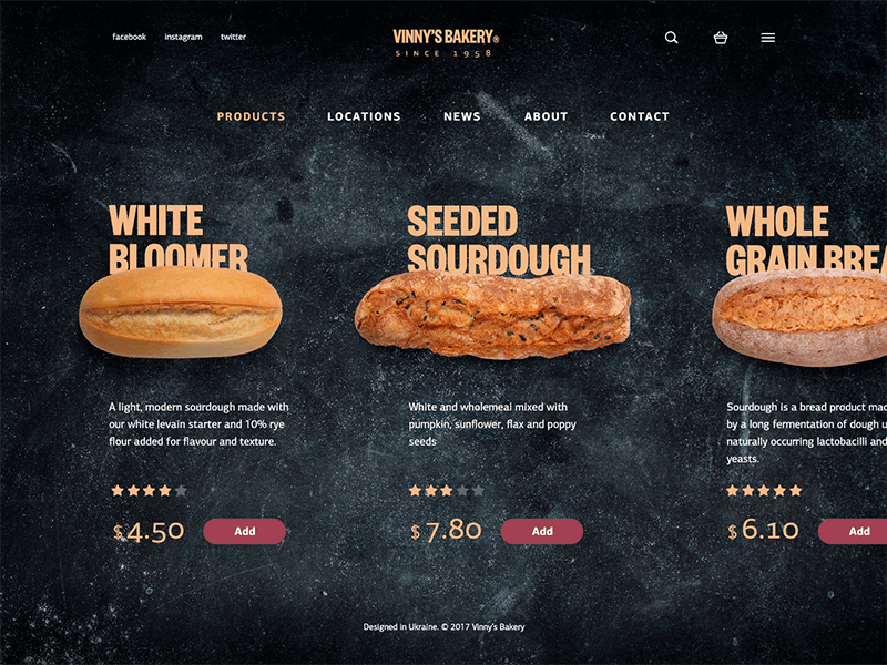
Vinny Bakery Website
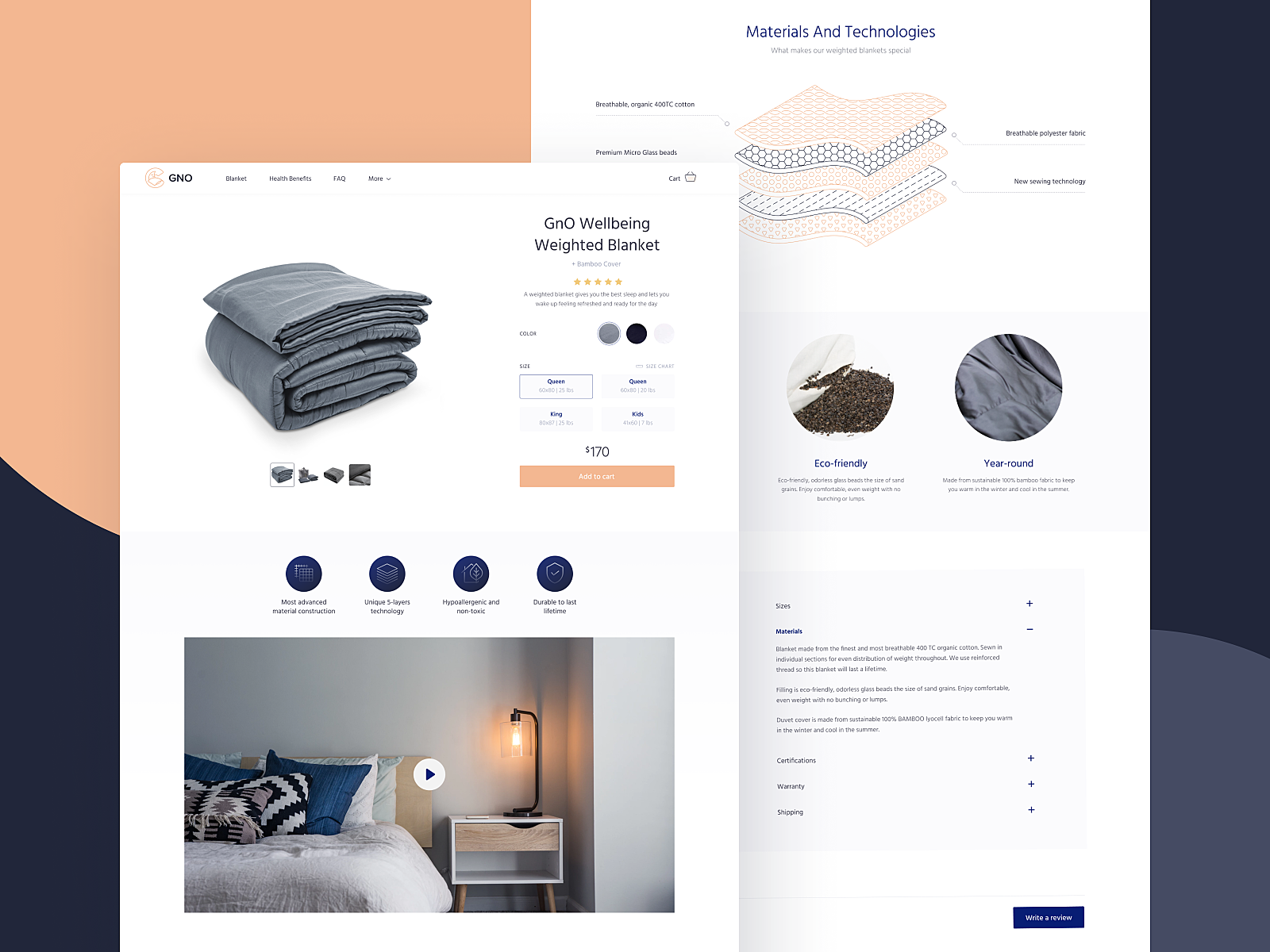
Product Page for GNO Blankets Website
5. Test the readability of the copy content
Readability refers to how easy it is for people to read words, phrases, and blocks of copy. Legibility measures how quickly and intuitively users can distinguish the letters in a particular typeface. These characteristics should be carefully considered, especially for interfaces with a lot of text. The color of the background, amount of space around copy blocks, kerning, leading, type of font, and font pairing – all these factors influence the ability to quickly scan the text and catch the content, convincing users to stay. To prevent the problem, designers must ensure that typography guidelines are followed and that the chosen fonts support a clear visual hierarchy and readability. User testing will help to check how quickly and easily users are able to perceive the text.
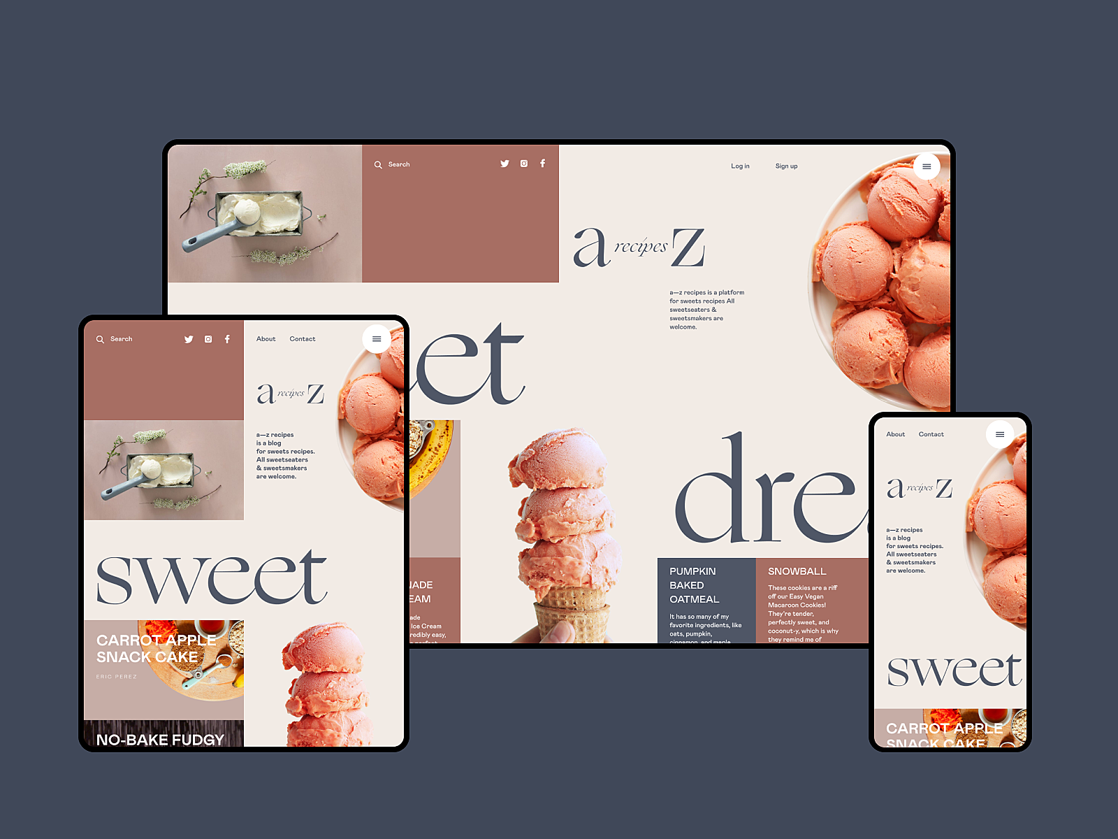
Dessert Recipe Website
6. Apply numbers, not words
This piece of advice is based on another investigation by Nielsen Norman Blog. They shared a vital finding: eye-tracking studies showed that, during web page scanning, numerals often stop the wandering user’s eye and attract fixations, even embedded in a mass of words that would be ignored without numbers. We subconsciously associate numbers with facts, stats, sizes and distance — data that is potentially useful. So numbers in the copy catch the reader’s attention, while numerals can be missed in the bulk of the copy. What’s more, numbers are more compact than the textual numeral, so it makes the content more concise and time-saving for scanning.
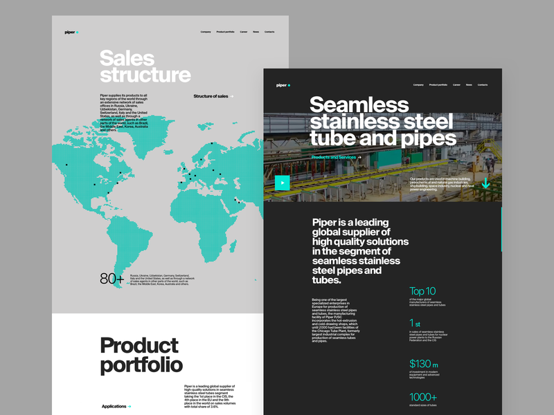
Metallurgy Plant Website
7. Place one idea in one paragraph
When processing copy content for scannability, avoid making the bulk of the text too long. Short paragraphs are more digestible and easier to skip if the information is not valuable to the reader. So, follow the rule when you present one idea in one paragraph and start another one for a new thought.
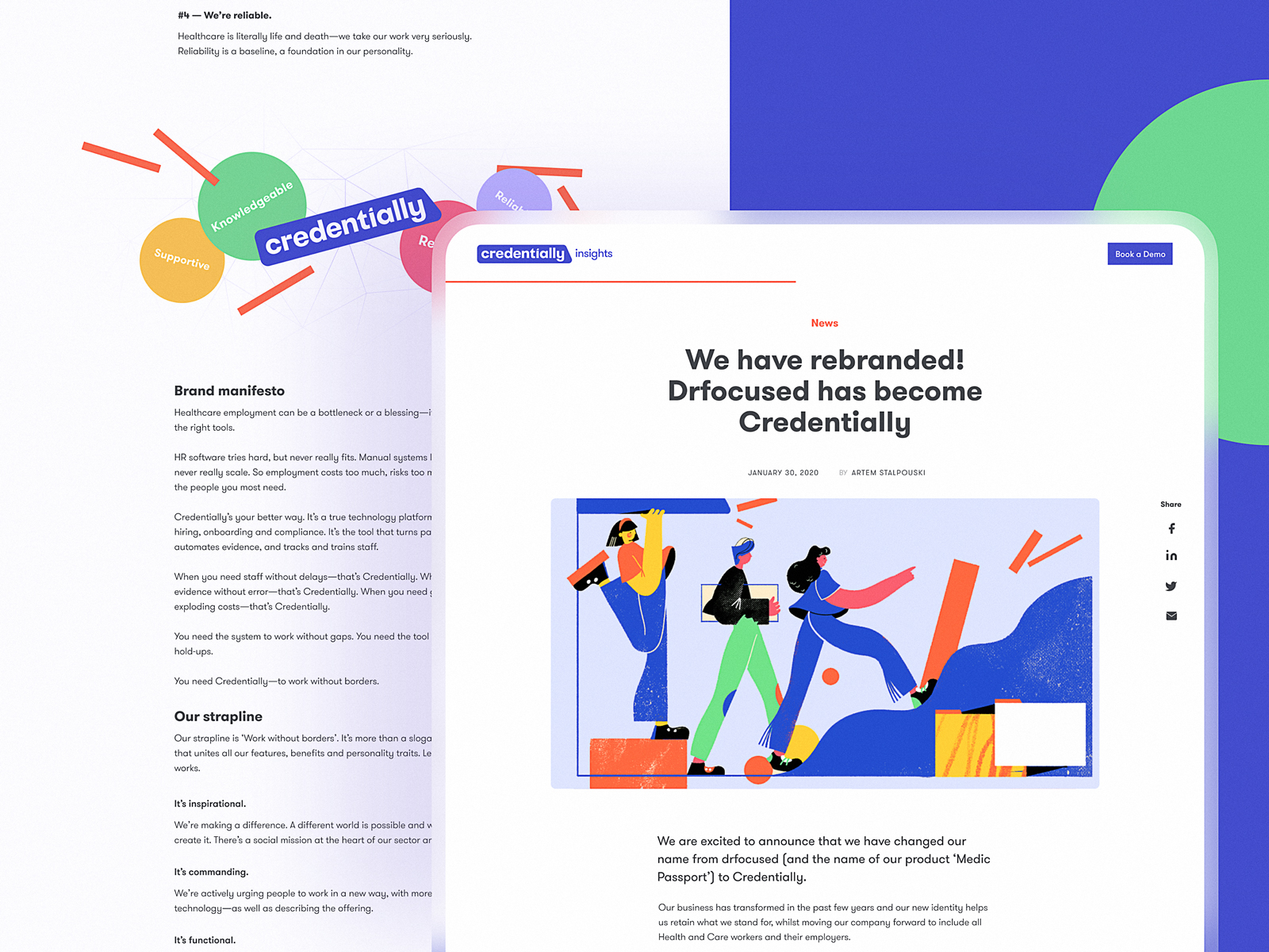
Article page design for Credentially website
8. Use numbered and bulleted lists
One more good trick to make the text more scannable is using lists with numbers or bullets. They help to organize data clearly. Also, they catch the user’s eye, so the information won’t get lost in the general body of the text.
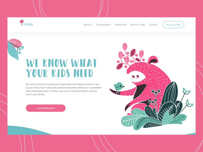
Babysitting Service Landing Page
9. Highlight the key information in the text
Good old bold, italics, and color highlighting are old school, but they still work successfully. This way, you may attract attention to the significant idea, definition, quote, or another type of specific data included right into the paragraph. What’s more, the clickable part of the text (links to other pages) must be visually marked. We are used to seeing them underlined; highlighting them additionally with color or a bolder font is even more effective.
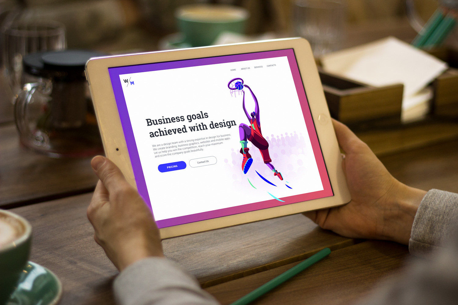
10. Use images and illustrations
In web user interface design, images are highly supportive in setting the mood or conveying the message. They are the content that is both informative and emotionally appealing. Original illustrations, prominent hero banners, and engaging photos can easily catch users’ attention and support the overall stylistic concept. What’s more, they play a big role in building visual hierarchy and make the copy more digestible when combined with illustrations or photos. People perceive images faster than words, which is an important factor for increased scannability.
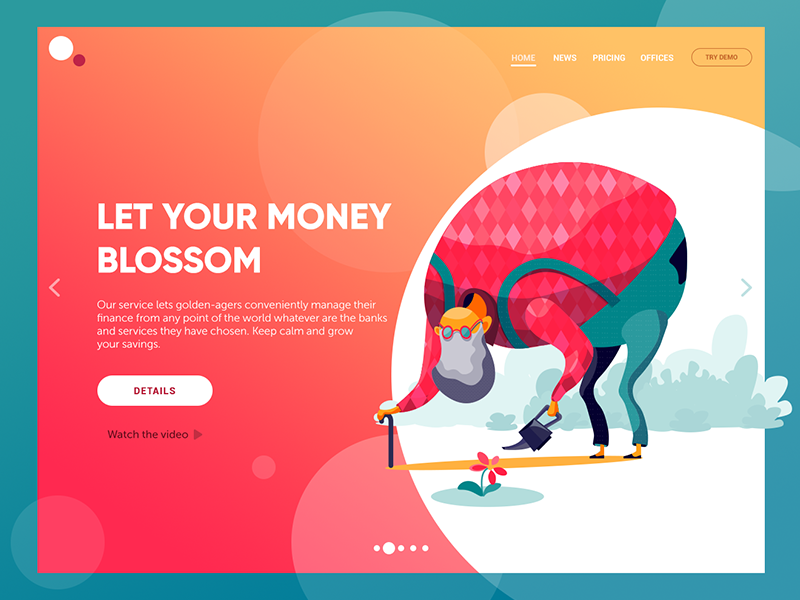
Financial service website
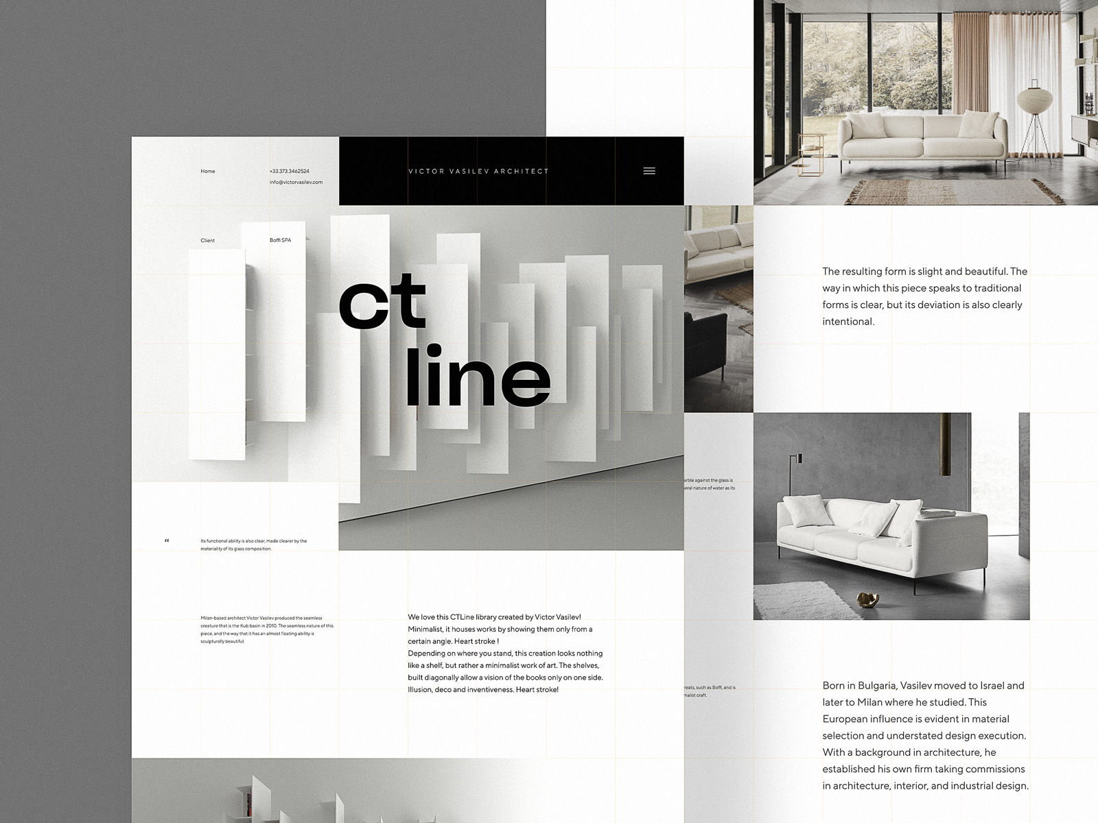
Interior Design Website
By improving the scannability of webpages, designers and content creators show real respect for website users. This way, we save users’ time and effort by providing them with organized, harmonic, valuable, and attractive content.
Useful Articles
Scannability: Principle and Practice
How to Make a User Interface Readable
Scanning Patterns on the Web Are Optimized for the Current Task
Visual Hierarchy: Effective UI Content Organization
3C of UI Design: Color, Contrast, Content
Gestalt Theory for UX Design: Principle of Proximity
Gestalt Theory for Efficient UX: Principle of Similarity
Negative Space in Design: Tips and Best Practices
Originally written for Tubik Blog
- English
- Ukrainian