Design Glossary: Basic Color Terminology
Design Glossary: Basic Color Terminology A handy glossary of key terms from color theory helping graphic and UI designers to work with colors effectively for strong and attractive designs.
Color is one of the fundamentals that design is built of. It can be a powerful tool in the expert’s hands, affecting numerous factors that are vital for compelling visual perception. Color has a significant impact on our minds. It changes the way we feel about an object within a few seconds, as well as makes people react and even take certain actions.
At first sight, color science may not seem that difficult to master, but diving into the details, it’s obvious that there are many peculiarities that need to be comprehended. In the article Color Theory: Brief Guide For Designers, we touched upon the basics of the science helping designers in their craft. Today we gathered a handy glossary with the essential terms of the color theory which will help graphic and UI designers get a better understanding of how color works.

Color
Before we go any further, it’s important to understand the essence of color itself. The Merriam-Webster dictionary defines it as a phenomenon of light (such as red, brown, pink, or gray) or visual perception that enables one to differentiate otherwise identical objects. Simply put, color is a quality of an object which is caused due to the light being reflected or emitted by this object. Color can be verified visually by measuring its properties, such as hue, saturation, chromaticity, and value. To gain proper awareness of color meaning let’s define its characteristics.
Color Properties
Hue
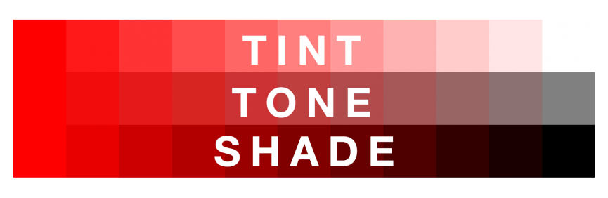
The term ‘hue’ is often mistaken for the color, so it needs clarification. First, we should understand that “color” is a general term used to describe all hues, tints, and tones. On the other hand, a hue is exactly what we mean when we ask “what color is it?” Basically, it is a family of twelve pure and bold colors presented on the color wheel.
A hue serves as a basic material that can be transformed in three different ways: tinting, shading, and toning. Depending on the applied technique, a hue is modified into tint, shade, or tone.
They are easy to distinguish. A tint is created by mixing a hue with white, while a shade is a mix of a hue and black. Toning is a more delicate process because it requires adding both black and white the reason why the results may seem more natural than shades and tints.
Value
As we said above colors have certain characteristics by which they can be recognized. Value is a property telling how light or dark a color is. The characteristic is defined by the level of whiteness. The more white has been added to a hue, the higher the value it receives.
Chromaticity
Chroma, or chromaticity, shows the purity of a hue. The characteristic is measured by the presence of white, grey, or black in a color. Twelve basic hues described above have the highest level of chromaticity since they don’t contain any additional elements. High-chroma colors usually look bold and vivid.
Saturation
This characteristic has much in common with value and chroma, so sometimes they may be mistaken. Still, it’s vital to understand the differences. Unlike two previous properties, saturation doesn’t apply to mix hues with any other colors. It is about how a color looks under different lighting conditions. Saturation describes how bold or pale color is according to its look in the daylight and weak light. The property is also known as the intensity of a color.
Color Wheel
If you had any lessons related to painting, you must have seen the circle consisting of different colors. It is called the color wheel and helps explain how different colors relate to one another and how they can be combined. The color circle is usually composed of primary, secondary, and tertiary colors, also known as hues.
The color circle was first proposed by Isaac Newton in 1666 as a schematic device, and since then it has undergone numerous transformations but remains the primary tool for color combination. The idea is that the color wheel must be made that way so that colors would be mixed appropriately.

Color Types
Primary colors
They are three pigment colors that cannot be formed by any combination of other colors. The primary colors serve as the basis of a whole system. The primary colors vary depending on the type of color system. A subtractive system is based on cyan, magenta, and yellow, while red, green, and blue colors form the additive system. And the painting system RYB includes red, yellow, and blue.
Secondary colors
These colors appear by the combination of two primary colors. Since each system has different basic colors, the secondary colors vary too. Here is a schematic explanation of secondary colors appearing in each system.
RGB:
- green+red=yellow
- red+blue=magenta
- blue+green=cyan
CMYK:
- yellow +magenta=red
- magenta+cyan=blue
- cyan+yellow=green
RYB:
- yellow+red=orange
- red+blue=purple
- blue+yellow= green
Tertiary colors
The mix of the primary and secondary colors gives us the tertiary colors, which usually have two-word names such as red-violet or yellow-orange.
Cool, warm and neutral colors
All the colors we described above can also be divided into three types: cool, warm, and neutral.
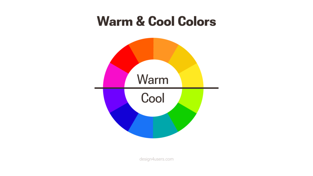
Cool colors are the ones on the green-blue side of the color wheel. They are called cool since they bring the feeling of cold. Warm colors are opposite to the previous due to the warm associations which they possess. Yellow, orange, and red are the hues relating to the warm type. Last but not least, neutral colors are absent on the color wheel, including gray, brown, and beige.
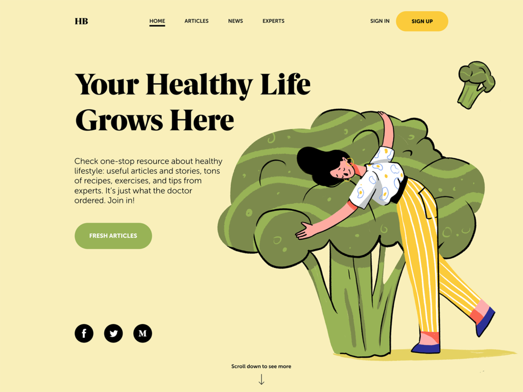
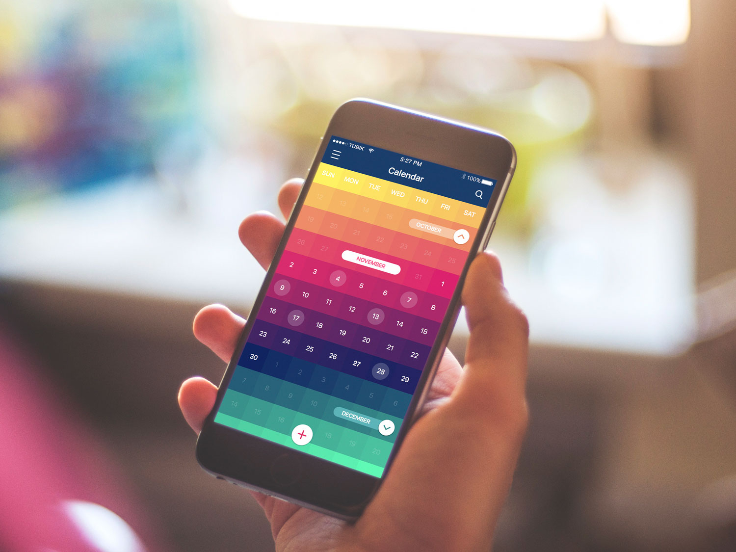
Health Blog using a warm palette
Color Systems
RGB
RGB color system considers red, blue, and green as primary colors. The system is the basis of all colors used on the screen. The combination of primary colors in equal proportions of this system produces secondary colors which are cyan, magenta and yellow, but you need to remember that the more light you add, the brighter and lighter the color becomes. Results obtained by mixing additive colors are often counterintuitive for people accustomed to the subtractive color system of paints, dyes, inks and other tangible objects.
RYB
RYB (red, yellow, blue) is also known as a painting color system often used in art education, especially in painting. It served as a foundation for the modern scientific color theory which determined that cyan, magenta, and yellow are the most effective set of three colors to combine. This is how the color model CMY has been formed.
CMYK
The system CMY has been modified with the appearance of photomechanical printing. It received the key component meaning black ink and the system was named CMYK (cyan, magenta, yellow, and black). Without this additional pigment, the shade closest to black would be muddy brown. Today this color system is mostly used in the printed design.

Color schemes
The color balance is vital in design since users make their impression of the website or application at first glance, and colors have a big influence. Designers distinguished the basic color schemes, aka color harmony, which works effectively.
Monochromatic
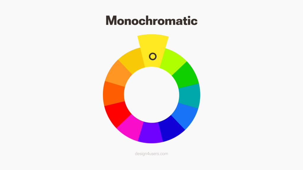
It is based on one color with various tones and shades of it. The monochromatic harmony is always a winning choice since it’s hard to make a mistake and create a distasteful color scheme.

Deetu Business Cards
Analogous

To create analogous harmony, you need to use colors located right next to each other on the color wheel. This type of color scheme is used for the design where no contrast is needed, including the background of web pages or banners.
![]()
Binned Logo Animation
Complementary

The complementary scheme is the mix of colors placed in front of each other on the color wheel. This scheme is the opposite of analogous and monochromatic since it aims to produce high contrast. For example, the orange button on the blue background is hard to miss in any interface.

Home Budget Dashboard
Split-Complementary
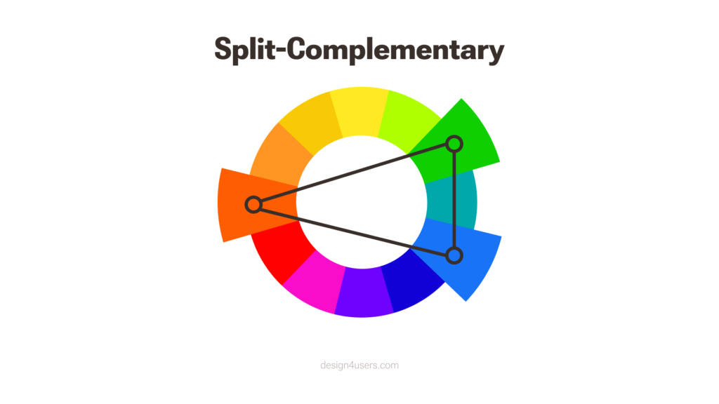
This scheme works similarly to the previous one, but it employs more colors. For instance, if you choose the blue color, you need to take two others, which are adjacent to its opposite color, meaning yellow and red. The contrast here is less sharp than in the complementary scheme, but it allows for the use of more colors.

Financial Service Website
Triadic

When the design requires more colors, you can try a triadic scheme. It is based on three separate colors that are equidistant on the color wheel. To save the balance in this scheme, it is recommended to use one color as a dominant, the other as an accent.

Dating App Landing Page
Tetradic/Double-Complementary

The tetradic color scheme is for experienced designers since it is the most difficult to balance. It employs four colors from the wheel which are complementary pairs. If you connect the points on the chosen colors they form the rectangle. The scheme is hard to harmonize but if you do everything right, the results may be stunning.

Business Card App
Let’s sum up with the prosaic quote by RyPaul: “The whole point is to live life and be – to use all the colors in the crayon box.” Learn how to use colors effectively both in your life and work and the results will please you.
Useful Articles
Color Theory: Brief Guide For Designers
Design for Diversity of Cultures: Color Perception
Color in Design: Influence on User Behavior
Design Tips: How to Choose Colors for Interface
3C of UI Design: Color, Contrast, Content
How Shape and Color Work in Logo Design
Originally published in Tubik Blog
- English
- Ukrainian