
UX Design Practices for Error Screens and Messages
UX Design Practices for Error Screens and Messages Handy insights on UX design of error screens and writing error messages: learn how to smoothen the negative effect of dealing with errors.
Any way to success is made of not only achievements but also failures and errors. With digital products, it works the same way: only in a perfect world do people and apps communicate without errors, misunderstandings, technical faults, or unpredictable scenarios. Well, none of us is there; we are in the real world. Here, diverse errors present an integral part of any user experience, so there is no chance for designers and developers to avoid dealing with them. Let’s get well-prepared: today, we’ve gathered a post on common errors in web and mobile user interfaces. Here we’ll talk about types and reasons for errors as well as design strategies and practices for reducing the adverse effects they may bring up.
What Is an Interface Error
An interface error is a state or condition in which the app cannot do what the user wants. It usually happens in three typical cases:
- the app fails to do what’s requested (literally, like there is no such technical possibility or function)
- the app cannot understand the input from the user (or the input is invalid)
- the user tries to combine operations that cannot work together (that usually happens because the user isn’t aware of the processes inside the app)
Sure, errors present a kind of annoying or even frustrating part of the user experience. Yet there is no way to avoid them, so designers, developers, and UX writers have to find ways to make that kind of interaction more user-friendly and smoother. Why is that important? Because, as well as in real life, virtual mistakes make a significant psychological impact and form a negative emotional background. For example, research measuring the psychological stress caused by smartphone interactions showed a direct connection between the appearance of error messages and cortisol levels, a known biomarker of stress. It can increase anxiety feeling and provoke a user to stop trying to interact with the product before they even start analyzing what’s the reason. So, let’s see what to do with those situations.
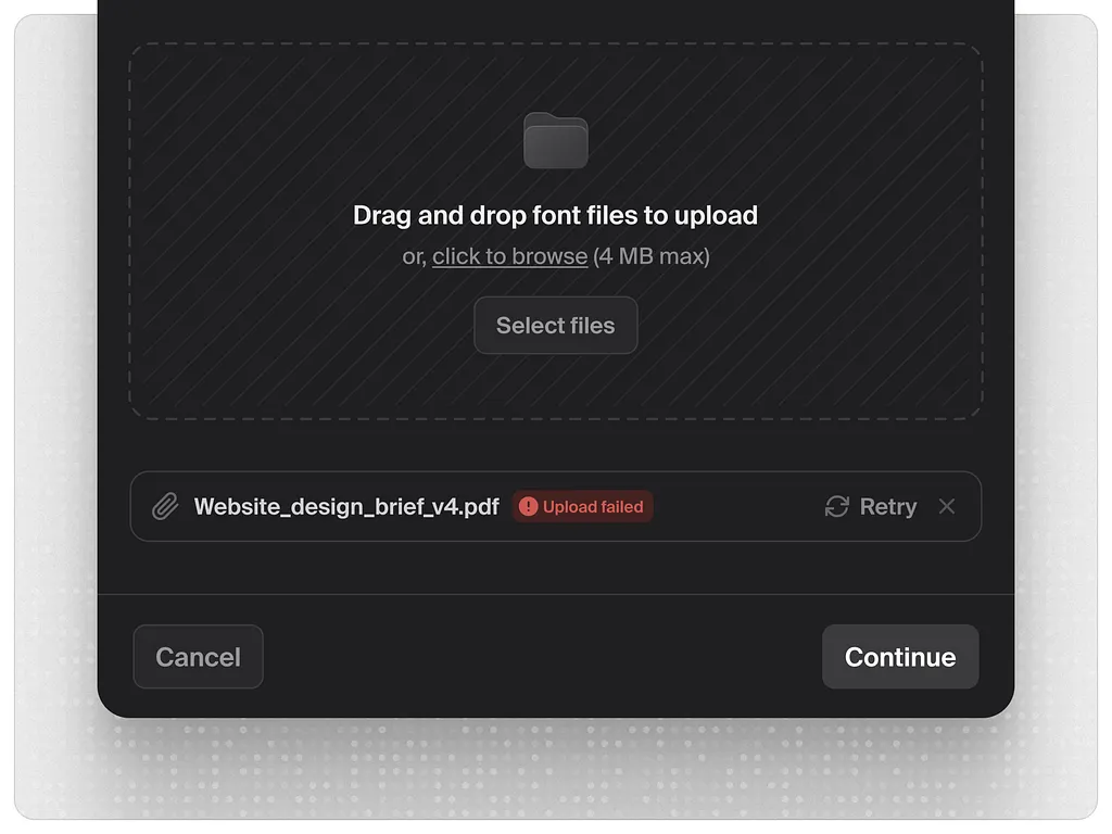
Super simple error state for a file upload modal for the Untitled UI project by Jordan Huges
Best UX Practices for Errors
Errors are like fights: the best one is the one that never happened. There are various strategies for error prevention, such as tooltips, prompts, tutorials, directional cues, suggestions, highlights, and limitations. Yet what should you do with users who are already experiencing the error? Let’s cover some points that are effective in designing errors that wouldn’t make the user instantly turn their back on your app or website.
Make the error instantly noticeable
It may seem obvious, but don’t get tricked by it: what seems obvious has to be thought about twice. The worst thing that can happen with the error is when the user is completely unaware of what’s going on and gets lost in the process. Always be honest with the user, and don’t try to mask the error. Even if the interface is super minimalist and any alien inclusion hurts your perfectionist designer’s eye and soul. Beauty doesn’t matter if it doesn’t work.
For example, if the user is filling the form made of 10 different fields, don’t just inform them that the form is not filled correctly; don’t make them search from one field to another where they made a mistake, and don’t hope they will do it. Make the field with a mistake super-visible to save users’ energy and time.
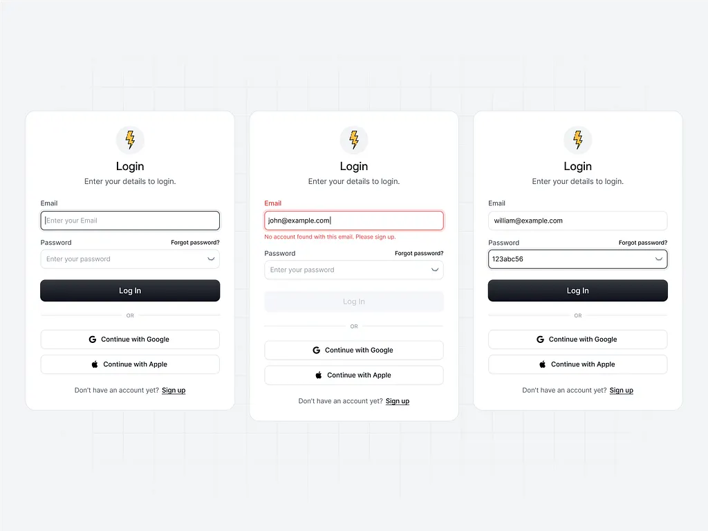
The example of a login form error handling by Dmitry Sergushkin
Use well-recognized visual markers
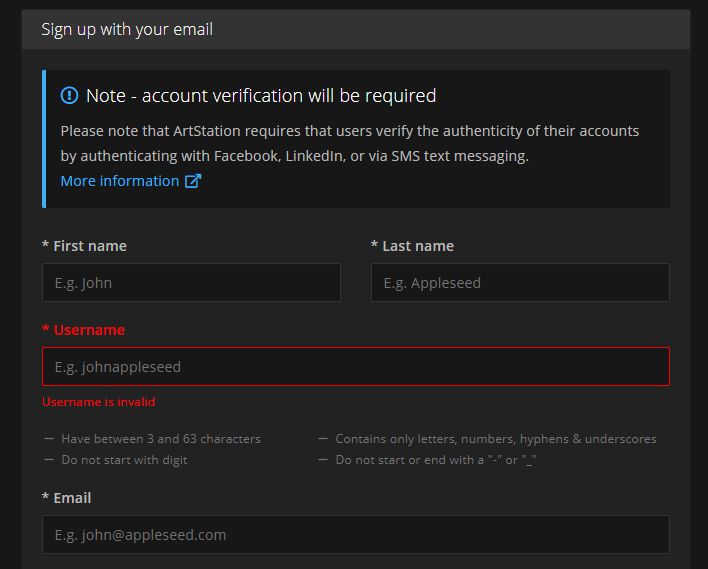
Knowing mental models and well-known patterns of user behavior, user experience designers can reduce the cognitive load. That’s particularly essential in error situations that are quite unpleasant by default. Error screens and messages may not be the best place for experiments, so consider markers that are quickly recognized by most users. The red color and exclamation marks are still among the most popular ways to attract users’ attention to errors. Yet, be careful using the color as the only way to mark the error: check if it works for color-blind users. Also, mind the high level of readability on different devices.
Here’s how the registration error is marked on ArtStation: the system marks the field with color and explains the issue with a text prompt.
Explain what happened
Whatever the reason for the error, you may feel the urge not to explain anything, just to proceed with solving the issue. And that’s a mistake. Firstly, you risk getting a user back in this error situation again and again as they don’t understand what is wrong with their actions or app response. Secondly, we’ve already mentioned that errors literally provoke a psychological state of anxiety, and you may not predict if this error becomes a part of the wrong interaction pattern. So, be sure to find a way to quickly explain the nature of the error and keep users informed. For instance, instead of just informing (“You cannot log in to the app”), make the message explanatory like (“The username or password do not match”).
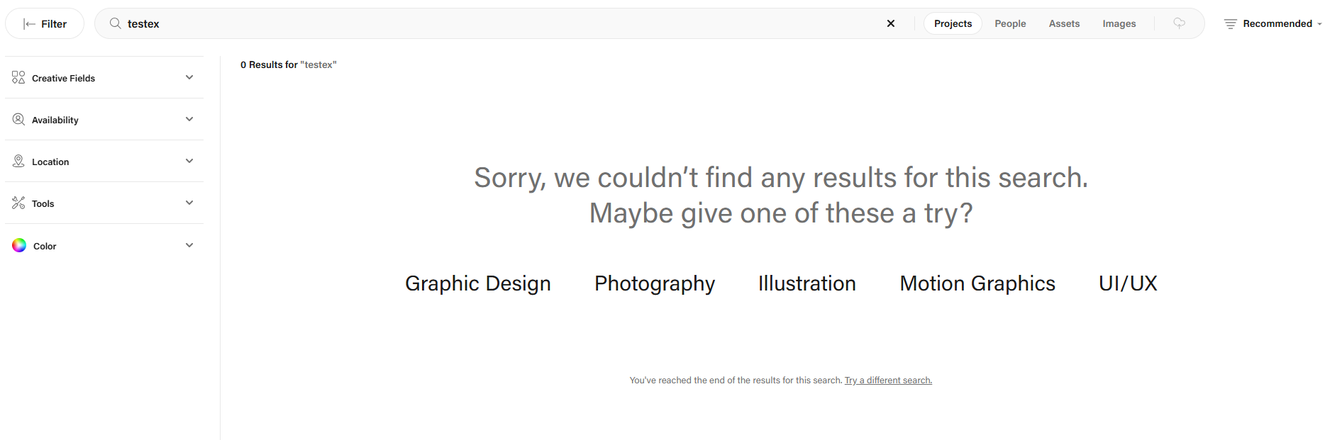
Search page when it’s empty because of the inquiry error on Behance offers the option which would keep the user interacting with the website
Don’t add more actions than needed
Another thing you may feel like doing is putting all the errors on separate pages or pop-up windows to make them as catchy as possible. Don’t overplay with it: in most cases, it’s enough just to make a color contrast marker in the interactive zone instead of popping up the additional modal window with the message requiring another unnecessary click to get the user back to the same page. Imagine that you are filling in the registration form and get that kind of pop-up for errors; no doubt, you will hate it very fast. Don’t make your users experience that: aim at providing inline validation and keep the message close to the field in error.
Yet, a pop-up window will be helpful if the user needs to be redirected to another page because of the error. So, for each case, take into account all pros and cons and target your solutions well.
Write simply
It’s crucial to make the error message as simple and clear as possible. Clear for the target user, not for the designers or developers creating that product. Avoid special terminology and jargon which you may use with QA engineers, for example (Like “Error 4.7 occurred” or “syntax error happened”). Don’t use long, complex sentences. Don’t make long and ornate introductions; it’s not the best place for them. Go quick to the point and make it decent.
Don’t blame a user
There’s an easy way to make a bad situation even worse: just tell the users that they are not clever enough to interact with this app, and that is why the errors happen. Offensive, isn’t it? Whatever form you wrap this message in, it will hurt the user who is already worried about things not going the way they wanted. So, don’t blame a user; be polite, friendly, and helpful; that’s important for setting the right emotional background of the situation. Try using clear instructions instead of blaming: for example, say, “Enter the valid email address” instead of “You’ve entered the invalid email address.”
Be constructive
Informing the user about the error correctly is not enough: whatever friendly information you got lost, it isn’t super worthy if you don’t know what to do next. So, be quick to let the user know how to solve the issue. Some of the popular practices are the following:
- If that’s a web interface, give the options to move to other pages of the website, first of all, the home page
- In the mobile interface, make it easy to take a step back or quickly connect to the spot of the error
- In case of complex forms and processes, do it for each step instead of at the end of all the processes

This 404 page of the Continental Shoppe by Zeitler Design gives the visitor various options to jump to, marking the ability to get back to the home page as the primary call-to-action
Consider using images and icons
It’s not a secret that people perceive and decode images faster than words. So, thoughtful use of an icon or image on the error screen can make communication faster, saving the users’ energy and a good mood. What’s more, images have a big potential for emotional appeal, which can reduce the tension of dealing with an error.

404 error page by Darius Dan employs a cute illustration
Test and analyze
Don’t have the illusion that work on error presentation is finished with the UI/UX design stage of the project. It never stops because feedback from real users is the best way to improve user flow. A/B test different options, analyze carefully what are the most vulnerable zones and interactions, and use the findings to prevent errors where possible and smoothen the process where mistakes are unavoidable.
Add fun if that’s appropriate
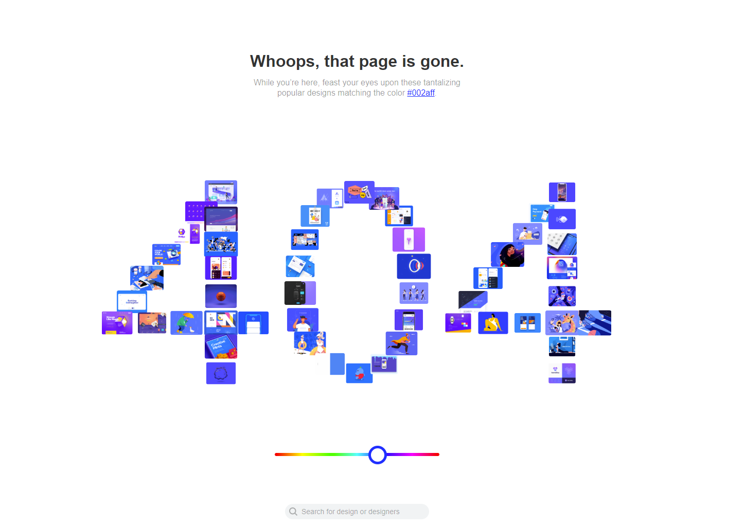
The page or screen of error messages can use gamification, interactive content, or other ways to add fun, and this way reduces the negative effect. One of the good examples is the 404 page on Dribbble: as its target audience is designers, the resource uses their natural creative curiosity to add fun to the error situation, so users can see the collection of popular designs organized along with a similar color palette. On the page, users can continue the game and try other colors or search for what they need using the search field integrated into the error page.
Well-Done Errors Checklist
So, to sum up, well-crafted errors would rather stick to the following points:
- readable and clear
- easily noticed
- constructive
- effort-saving
- polite and friendly
- reasonably emotional
Useful Articles
Here’s a set of articles on more aspects and best practices of user experience design.
How To Use Visual Dividers in User Interfaces
Guide to 6 Effective Types of Web Animation
How To Make Text Improve User Experience: Insights Into UX Writing
The Anatomy of a Web Page: Basic Elements
Directional Cues in User Interfaces
How to Make User Interface Readable
Basic Types of Buttons in User Interfaces
Negative Space in Design: Practices and Tips
Meaningful Error: 404 Page Design. Inspiration for Page Not Found
 https://design4users.com/ux-design-error-screens-and-messages/
2026-06-12
© by
Marina Yalanska
,
https://design4users.com/ux-design-error-screens-and-messages/
2026-06-12
© by
Marina Yalanska
,
- English
- Ukrainian