Icons vs Copy. Visual Perception in UI
Icons vs Copy. Visual Perception in UI The article about relations between text and icons in app and web user interfaces in the perspective of natural visual perception, with practical UI design examples.Our eyes are a powerful instrument for getting a great deal of information in split seconds. What is more, we do not need to apply too much effort: most of the data is absorbed unconsciously. And that puts the issue of visual perception in the top significant concerns in the sphere of design, especially in product design which solves user’s problems and satisfies needs.
We have already shared our ideas about the role of icons in interfaces in the article describing their most important advantages. Today’s article deals with one of the aspects initiated by Quora question “In UIs, do people recognize icons faster than words?”
![]()
The aspect of speed
Visual perception is one of the most productive and quick ways through which people are able to obtain information and get it processed by the brain. It influences so many aspects of life that neglecting the issue while creating products for users would be extremely unwise. That is why the aspect of applying visual elements of high functionality in the interfaces, such as icons and their impact on the general efficiency of the product, has been an actual topic in the global design community for a long time.
In the scientific research about visual perception, after theoretic analysis and a set of practical experiments, A. Santella made a conclusion: “The fact that eye tracking is sufficient for some level of abstraction in our context makes an interesting point. It suggests that the understanding underlying abstraction, and perhaps other artistic judgments, is not some mysterious ability of a visionary few, but a basic visual competence. Though not everyone can draw, everyone it seems can control abstraction in a computer rendering.” People, in general, have incredibly broad abilities to perceive visual marks, recognize and proceed data even transformed in images of a high level of abstraction. That is an important fact designers widely use to improve the usability and navigability of their solutions.
If the only aspect a designer is interested in using icons is speed, then the idea in the original question will work positively. Yes, in the vast majority of cases, people fix and perceive pictorial elements like icons and illustrations faster than words. A great proportion of users are visually-driven creatures by nature, so the following mechanisms of visual perception often work and should be considered in the design process:
- the human eye fixes images much faster than written text
- as psychologists claim, people need about 1/10 of a second to get a general perception of a visual scene or element (that speed is indeed impossible for textual items)
- visuals are transmitted to the brain much faster, and important pieces of information are often fixed by the brain as visual images, even if they were obtained via text perception
- images are less vulnerable in combination with the background and surrounding elements, while text is highly dependent on the aspect of readability
- images have a tendency to stick better in long-term memory, which means that in interactions with the interface, people will not need to process and remember more data than it’s really necessary, so interactions get faster.
Moreover, icons and other sorts of visuals in the interface can make it more universal in cases when an app or a website is used by people from different countries. So, we can claim that using icons improves general comprehension. In addition, pictures push the limits of perception for users who have natural problems with text recognition, such as, for instance, the dyslexic or non-reading preschoolers.
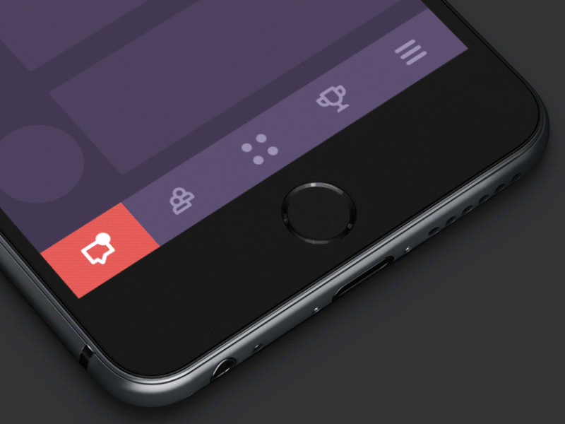
Tab Bar Interactions
One of the popular elements of the layout where icons play a highly practical value is a tab bar. Featuring interactive elements, it has limited space capacity; therefore, icons as the visual symbols of available interactions become an efficient design solution. The concept provided above shows that interface animation can liven up the visual elements and enhance microinteractions.
![]()
Weather Icons Presentation
Here’s one more example showing how icons provide a user with the necessary information by visual means. Symbolic images of weather conditions are easy to understand, and at the same time they save a lot of space and give the opportunity to make the layout of the screen informative but not overloaded.
In user interfaces, where in many cases, basic interactions should take seconds, this aspect is highly important, and it is the essential reason to turn hell out of everything into graphic material. All the things mentioned above feature great advantages of visual elements of the layout, for example, icons, as a tool for fast and easy interaction with the product. However, there are some more aspects to analyze before making final design decisions.
The aspect of meaning
Diverse design projects and concepts make designers believe that speed should not be the only reason to consider and analyze in the process of creating a user interface layout. People can perceive icons super fast, but if the message they convey is not clear and can have double-reading, this speed will not bring a positive user experience. Fast capturing of the icon bringing wrong understanding cannot be defined as recognition; it’s just fast noticing. Recognition means not only speed but also the right action or information, which this icon should bring to the user.
There are numerous widely recognized icons, such as a telephone receiver for a phone call, an envelope for mail, a magnifier for search, and so on. Certainly, using these icons, you create a much faster perception of the UI functionality than using copy instead of them. Nevertheless, in cases when the image of an icon is not so obvious, its usage should be thoughtfully contemplated. If the icon doesn’t correspond with the goal and meaning it is assigned, the speed of recognition doesn’t matter. That’s why there are cases when text transfers the idea or data more clearly, and sometimes it is more effective to use a double scheme when the icon is supported by the text.
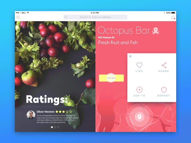
iPad App Interactions
Here is the concept showing the mutual support of copy and icons. This technique activates multiple perceptual processes within a single interaction and enhances the recognizability of call-to-action elements. People who instantly understand the symbol transferred with the icon won’t pay much attention to the text. The same will happen to those who have problems with fast copy recognition. However, using the copy alongside the icon reduces the risk of misunderstandings or unintended interactions for individuals who may misinterpret the image’s meaning.
One more case when icons are often used together with copy is diverse side menus. Depending on the general stylistic concept of the interface, icons can imply a different level of complexity, from simple stroke icons to sophisticated and detailed ones.
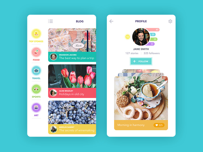
Blog App
This design concept of the blog app shows how icons can become a multipurpose visual element. In the presented interface, they support the titles of the categories for blog posts. Textual presentation of the category is visually supported with a good-looking and memorable image. At the same time, copy removes the possibility that different users can see different meanings of the images. What is more, in this case, icons support another important function providing color markers for the categories. This technique makes interaction with the app faster and easier for users and at the same time, enhances usability and navigation.
Anyway, the decision on applying icons, text, or both in the layout should be based on thoughtful analysis of the target audience and understanding the goals and conversions which have to be obtained via the interaction.
Reasons for applying icons in the interface
Summing up the points mentioned above, we can define several popular reasons for using icons in the interface:
- speeding up data perception
- enhancing the memorability of the element via visuals
- improving navigation with visual markers
- saving up space on the screen or page when the long words or phrases are replaced with icons
- supporting copy material and providing its additional visual explanation
- supporting the general stylistic concept and its harmonic expression in a broad perspective.
User interface design solutions for PassFold project
Points to consider
Obviously, it is impossible to satisfy any user and consider every existing cognitive scheme, but still, there are some general aspects that have to be thought out in terms of design with high visual perception:
- target audience (physical abilities, age, cultural background, general development, and education level)
- typical user’s reading skills
- typical environment of product use
- level of global or local product spread
- level of recognition for the chosen graphics
- level of distraction/concentration provided by the graphics
All the points mentioned concern how human cognitive abilities influence the quality and efficiency of visual data perception. For designers, it’s essential to bear in mind that it’s not enough to make users see the elements of the layout; it’s vital to make them recognize their meaning and quickly understand the message. Copy and icons should not compete against each other to see which one is stronger; they should support each other for a better user experience.
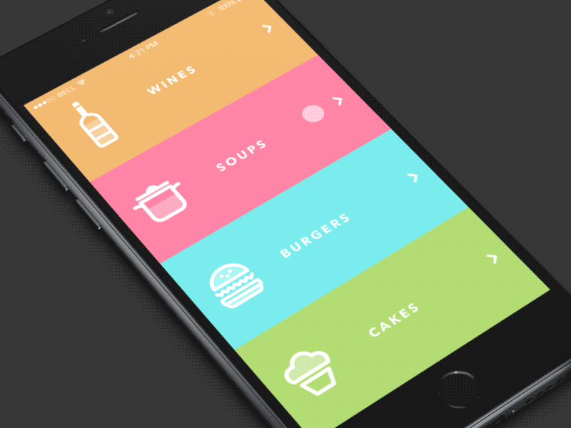
Restaurant Menu
Recommended materials
Diverse issues of visual perception have been the object of scientific and applied research for many decades. In terms of design issues, we could recommend the following articles for those who would like to know more :
What Designers Should Know About Visual Perception and Memory – the article by VanseoDesign analyzing basic aspects of visual perception in design perspective;
Design Principles: Visual Perception And The Principles Of Gestalt – the article by SmashingMagazine considering the principles of Gestalt theory essential for design practice;
Studies Confirm the Power of Visuals in eLearning – the set of ideas in Shift’s eLearning Blog based on the analysis of visual perception in interaction;
37 Visual Content Marketing Statistics You Should Know in 2016 – the article by HubSpot about trends on visual content with some stats;
From Icons Perception to Mobile Interaction – the scientific article about icons perception in mobile interfaces;
Visual Perception – the list of books on general aspects of visual perception which can possibly be helpful for those who are interested in the topic;
The Art of Seeing: Visual Perception in design and evaluation of non-photorealistic rendering – the theses of scientific research by Anthony Santella.
Originally written for Tubik Blog
Useful Articles on UX Design
Here’s a set of articles on more aspects and best practices of user experience design.
Error Screens and Messages: UX Design Practices
Visual Dividers in User Interfaces: Types and Design Tips
How to Design Search in User Interfaces
Directional Cues in User Interfaces
How to Make User Interface Readable
Basic Types of Buttons in User Interfaces
Negative Space in Design: Practices and Tips
- English
- Ukrainian