
7 Handy Elements of Web Usability
7 Handy Elements of Web Usability Let's check the list of details of the web user experience that may seem not primary but have a great impact on website usability
“It’s the little details that are vital. Little things make big things happen,” John Wooden once said. In design, it works that way independently of the theme and type of project: those who pay attention to details create user interfaces that help users solve their problems and help businesses achieve their goals. Today’s article continues the topic of designing user-friendly interfaces: let’s discuss the details that may not seem primary but significantly impact the website’s usability.
Below, we will cover the following web design elements:
- visual dividers
- directional cues
- breadcrumbs
- internal search
- icons
- UI animation
- in-context tooltips
Illustration by Yaroslava Yatsuba
Visual Dividers
A visual divider is a layout element that helps separate content pieces into clear groups, sections, options, or parts. Visual dividers help organize the page according to the typical patterns of visual perception and make the layout more straightforward and digestible for users.
Together with other elements on the page, dividers help establish a strong visual hierarchy: with them, users can more easily define the relationships among content, such as whether pieces are the same, similar, or related; whether any are subordinate to others, etc. Dividers are essential for usability: in many cases, they create visual containers that look clickable or tappable.
Talking about dividers, we can analyze them in two aspects: their appearance and their functions. As for the visual part, there are five basic widely used methods of dividing content in user interfaces:
- lines
- color
- negative space
- shadows/volume
- images.
THT website uses lines as visual dividers in the section of company services

The Nibble Health website uses color as a type of visual divider separating different content sections.
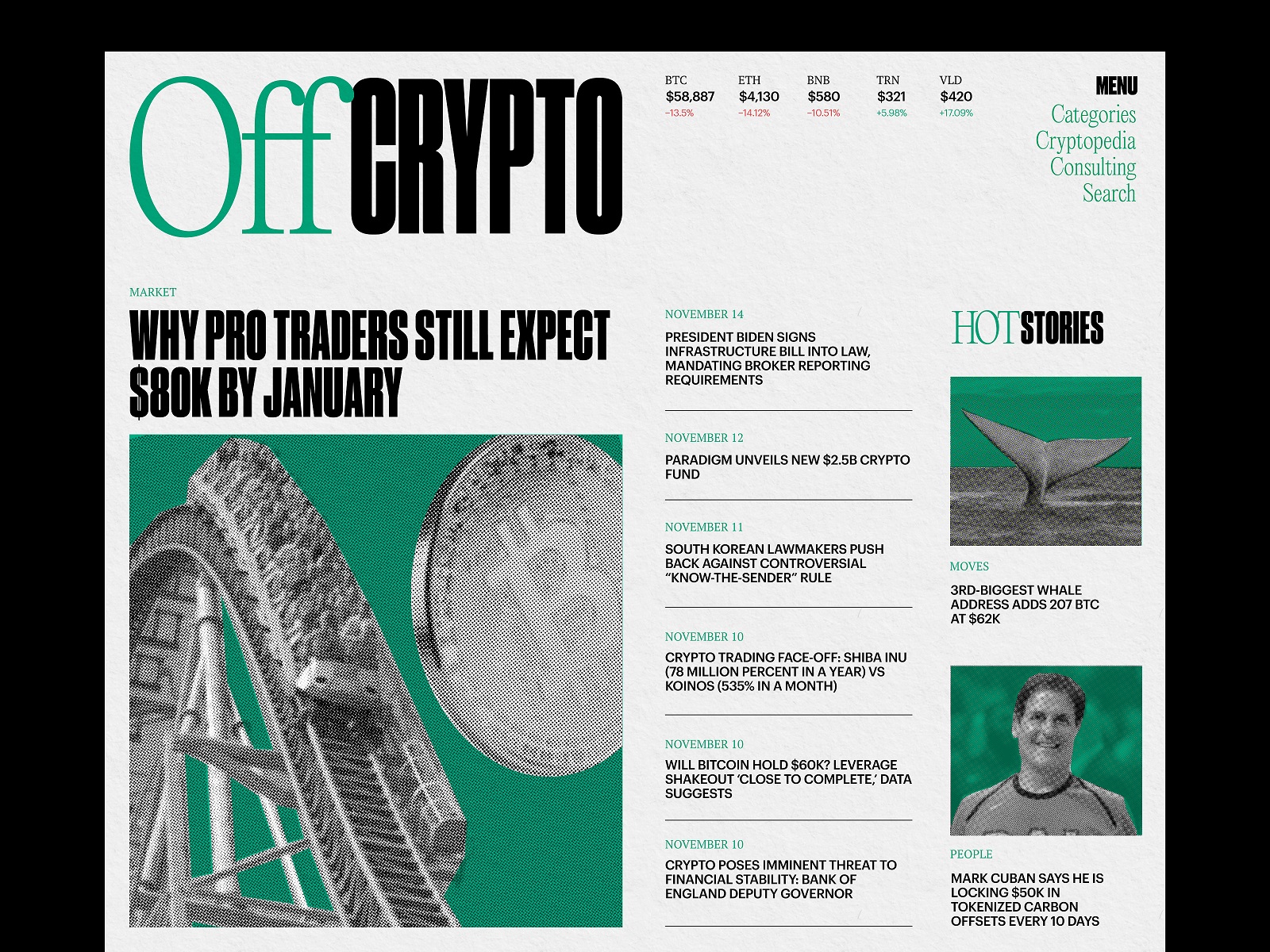
The Crypto Blog uses lines as a visual divider separating article titles in the list.
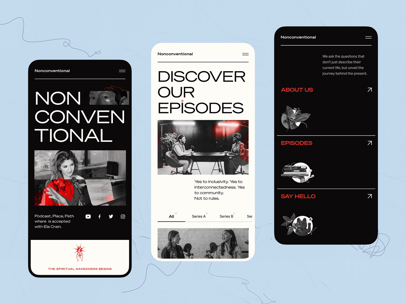
The mobile version of the Nonconventional Show website uses lines to divide different sections in the menu.
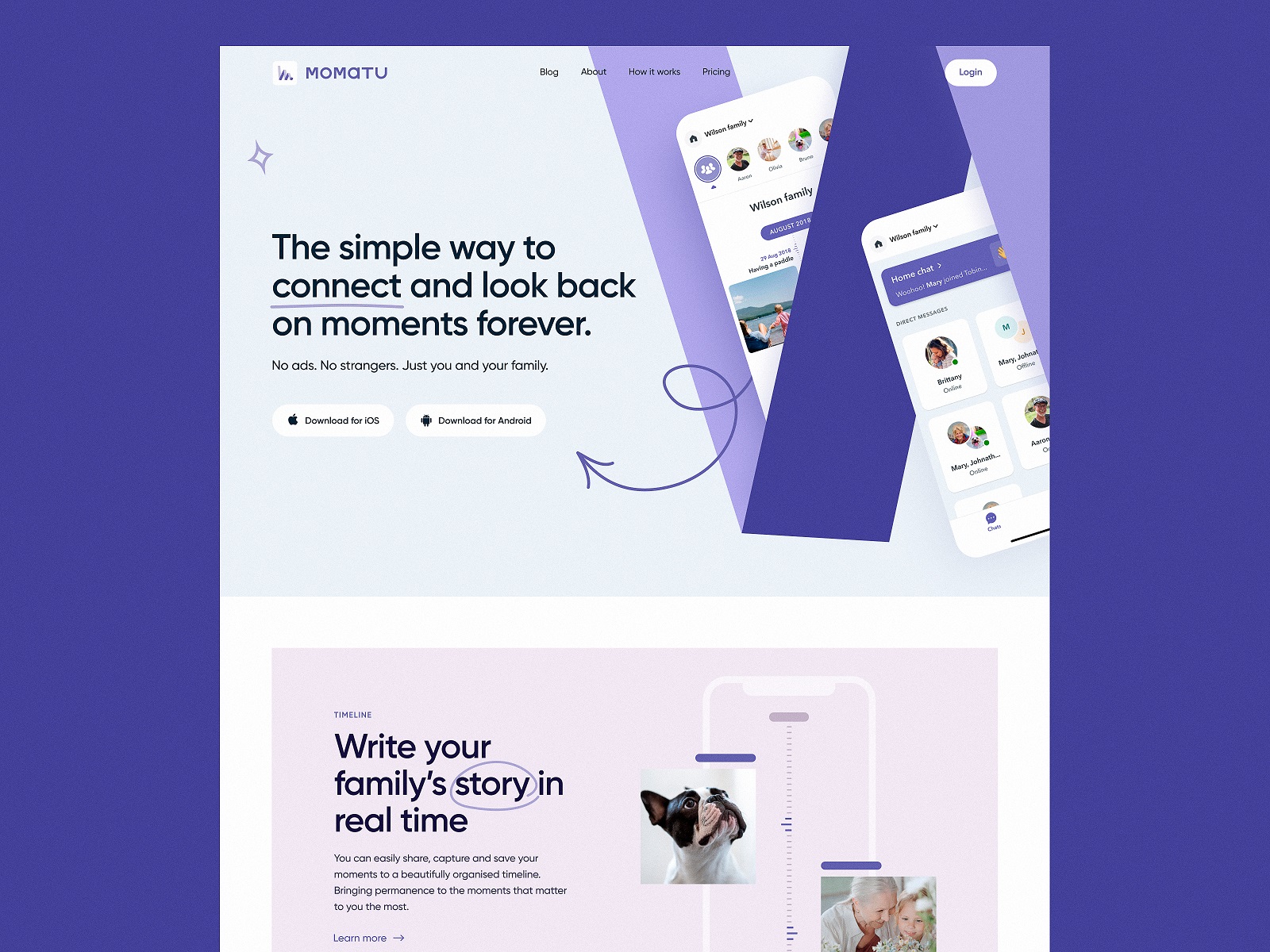
The landing page concept for Momatu divides content with different color backgrounds.
The university website uses images and videos not only to set the atmosphere but also to divide different blocks of content.
The functional types of visual dividers depend on the hierarchy levels they work at:
- full bleed dividers are the ones that separate the sections and span the whole length of the screen layout
- inset dividers separate the items of related content, anchored by elements that align with the app bar title or adjust to the specific kind of text content on the page
- middle dividers are usually placed somewhere in the middle of a layout, for example, to separate related content, such as prices on a receipt.
Read more about design practices for visual dividers in the article.
Breadcrumbs
Breadcrumbs present navigation elements used primarily in web design to support users in a journey around the website. Breadcrumbs let users know where they are on the website and get used to the website structure more easily, so breadcrumbs are a tool for better wayfinding. Yet, they don’t replace the primary navigation menu; they present the secondary level of navigation and increase website usability if it consists of many pages.
The benefits of breadcrumbs as a navigation element are the following:
- increased findability: the more complex the website architecture, the more content it has, and the better organized it should be to be found quickly. Breadcrumbs give users another touchpoint to the content and help to understand the structure of the website more easily
- fewer clicks needed: with breadcrumbs, website visitors can leap from one level of the hierarchy to any previous step with no effort and no need to take all the way back, which means it takes fewer clicks and transitions to reach the page they want
- effectively used screen space: crafted well, breadcrumbs take a narrow horizontal line with plain-looking text elements that don’t need much space, so users get navigated, but designers have no need to overload the page
- no misinterpretation: breadcrumbs present an element that is hardly ever misunderstood by users: the behavior pattern for them has solidified through the years, and people rarely mistake this element for anything else
- lower bounce rate: breadcrumbs are a great support for first-time visitors or people with no everyday experience of dealing with complex websites, so the more confident they feel, the slimmer the chances of them bouncing the page.
Neon Signs store website uses breadcrumbs on the product page to support primary navigation.
Read more about design practices for breadcrumbs in the article.
Directional Cues
Directional cue is any element of the user interface that gives a visual hint on specific interaction or content to let the user see it faster and easier. As well as road signs and signposts in the physical world, they guide a website visitor to the key elements, text lines, and call-to-action elements, making the conversion faster and users’ problems solved quickly.
As in most cases, you have only a few seconds to convince users to interact with your product, making it clear that the core pieces of content and interactive zones are instantly visible may be crucial for decision-making.
Directional cues:
- enhance the page or screen scannability
- strengthen the visual hierarchy
- improve navigation
- increase conversion rates.
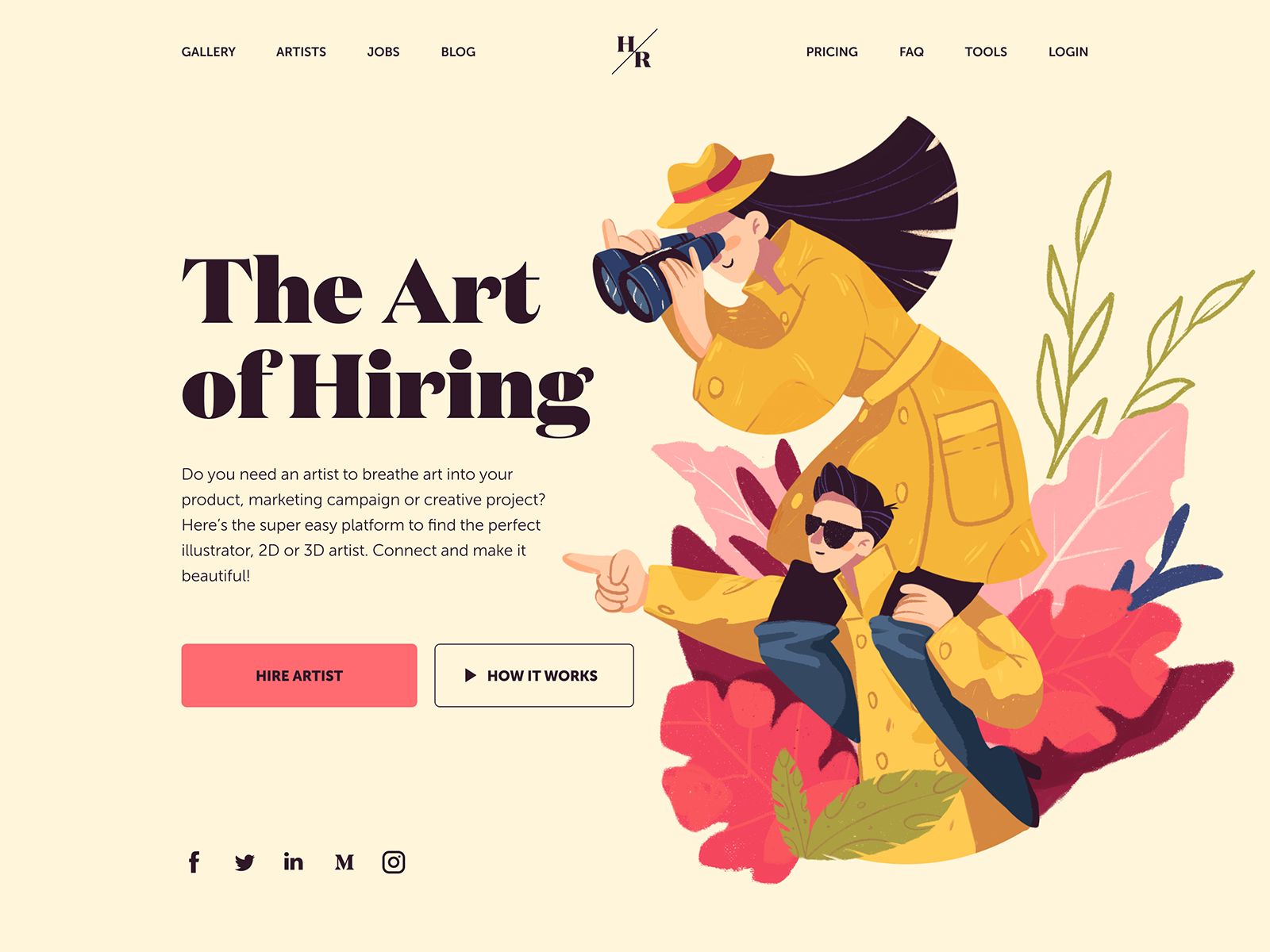
This landing page for the platform to hire artists uses a hero illustration that not only conveys the idea but also makes the page more attractive. It also works as a pointer: the composition of characters points to the zone with information and CTA.
Popular types of directional cues include:
- arrows
- pointers
- gaze direction
- visual prompts
- part of the following content
Gin School website uses arrows and visual prompts to help users navigate the page quickly and not miss anything.
The clinic website uses various arrows as directional cues to support visitors in going through the content on the page.
The ShipDaddy website uses a mascot image as a pointer to attract attention to the list of benefits for service clients.
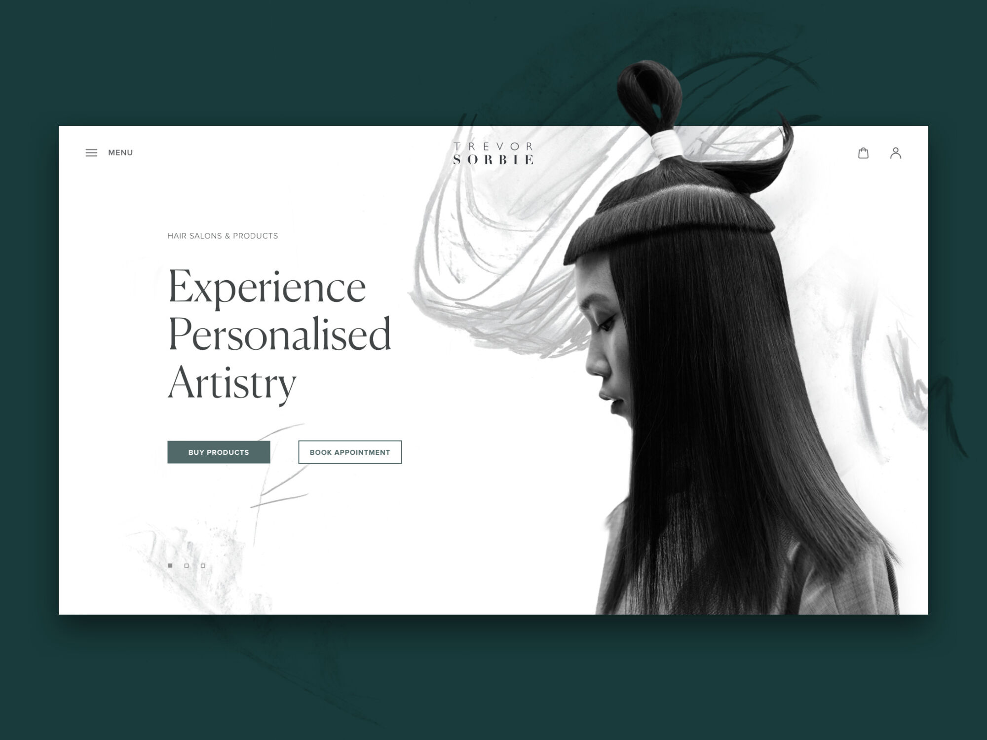
The hair beauty company website uses a hero image on the home page that works as a directional cue: the model’s eyes attract your attention to the zone of CTA elements.

The home page of the food delivery service shows a part of the menu in the bottom part of the screen to show that there is more content in the below-the-fold area. Also, the layout uses arrows as a directional cue, indicating that horizontal interaction will open another information block.
Read more about design practices for directional cues in the article.
Internal Search
Internal search is the function of browsing the content inside the website or app and showing it to the user according to their search query. Tuned correctly, it shows the relevant content and provides a shortcut to the user’s needs. Thus, the internal search saves the user’s time and effort, amplifies the usability and desirability of the digital product, supports user retention, and increases conversion rates. The interactive element responsible for the internal search in the user interface is a search field. A search field, also called a search box or search bar, presents the interface element that enables a user to type in the search query and, this way, find the pieces of content that are needed.
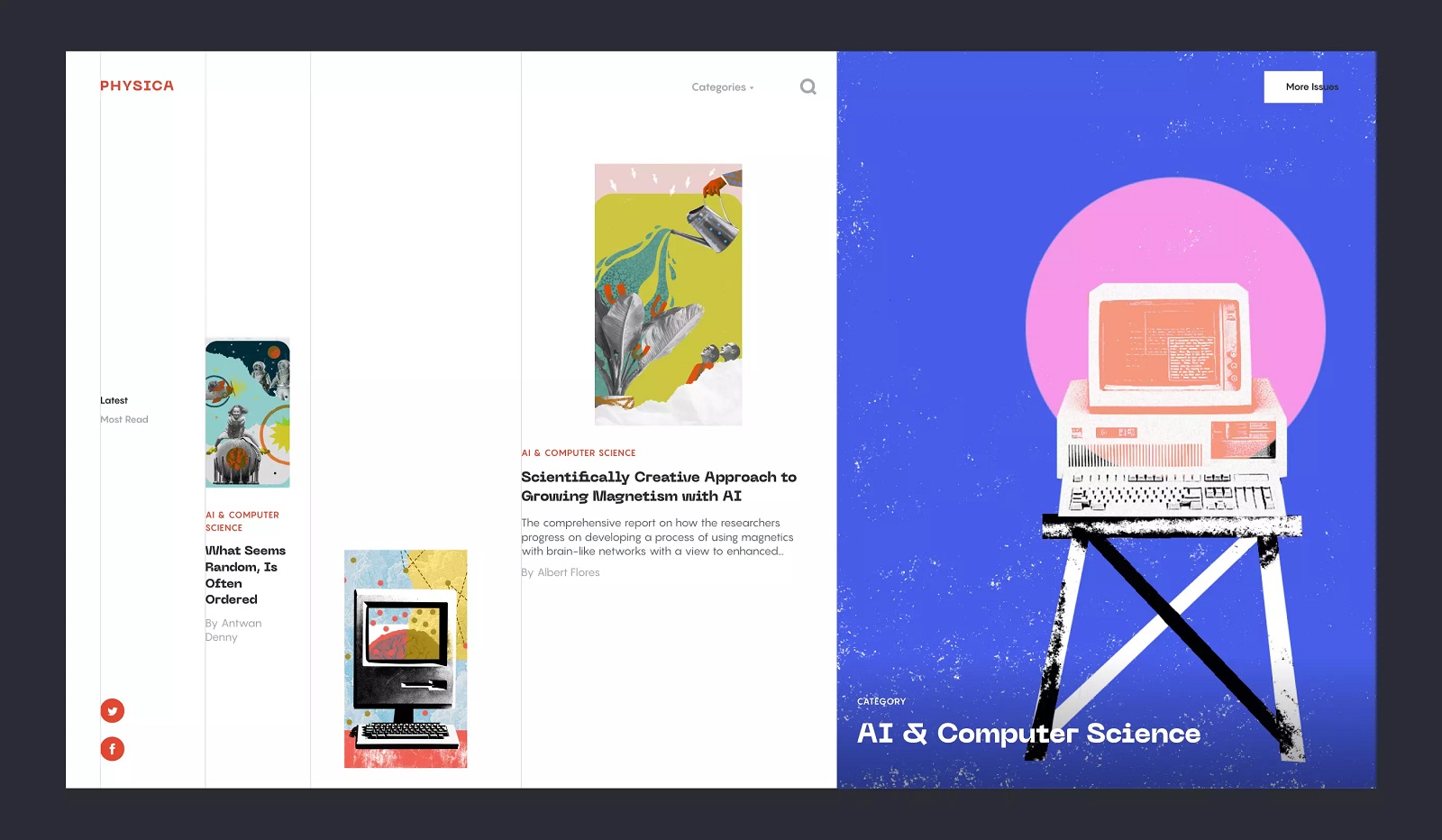
Physica Magazine website features the search control in the header.
Whatever great you think the navigation of your interface is, if your website or app is made of 50+ pages, it’s high time you considered applying the internal search. A well-designed and easily found search field enables the user to jump to the necessary point without browsing the numerous pages and menus. This approach is a typical user behavior pattern, especially on e-commerce platforms, as it respects the user’s time and effort.
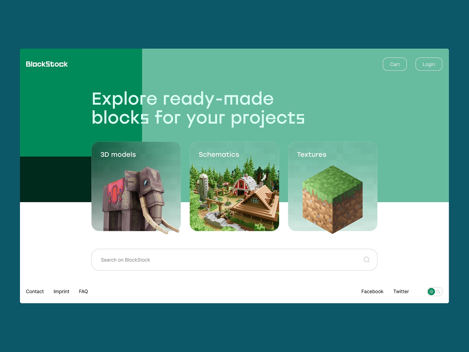
The home page of the BlockStock website features a big search field in the above-the-fold area to let users quickly find the Minecraft assets they want
However, designing search usability, don’t make a mistake: don’t prioritize search over navigation in a user interface. Thinking that search is the best and only interactive element worth designers’ attention is not the way to go. Although many users try getting closer to their aim via search, others may have problems with search interactions. For example, they don’t know a language well enough to form the correct query, it’s not convenient for them to type something in, or they just hate thinking over the textual questions, so they would prefer to follow the already existing navigation and cues rather than the cognitive load of communicating with the system via the search. Think it over and strive for a good balance between navigation and search.
There are different nuances of making the search interactions clear and intuitive, yet the three features below are core points to consider for the internal search functionality:
- it should be instantly visible
- it should be clear as a search functionality
- it should show relevant content
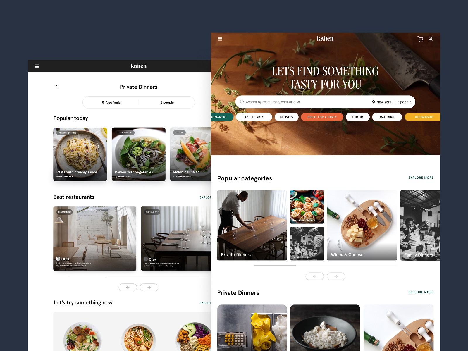
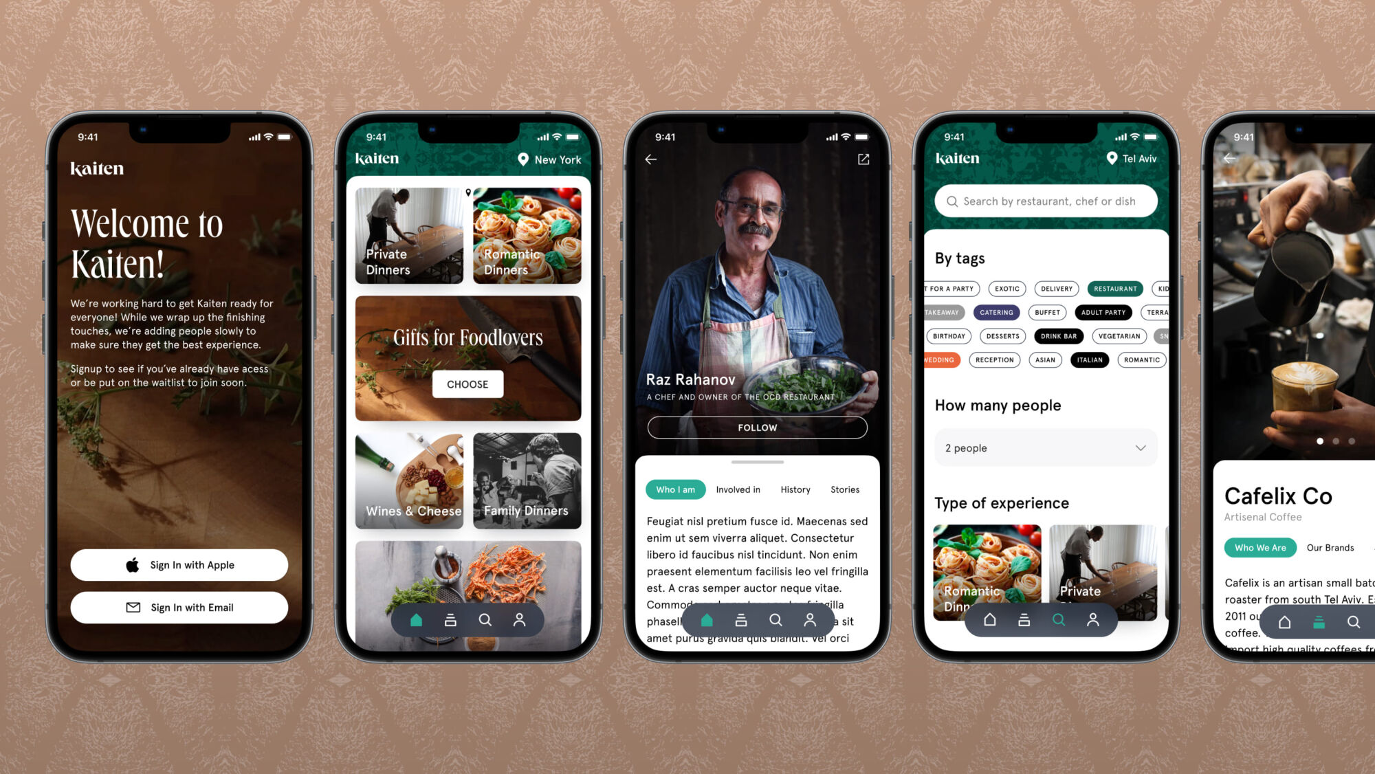
Here’s how Kaiten food marketplace website and application help users tune their search process
Read more in the article devoted to design practices for effective internal search in user interfaces.
Icons
Icons are simple images with a high symbolic value that enhance communication. Icons present informative signs and support data exchange between the informer and addressee alongside words and sentences: while the copy is conveyed in letters or characters, icons communicate via images that depict the physical world. In computing and digital design, icons are pictograms or ideograms used in web and mobile interfaces to enhance usability and support a smooth flow of human-computer interaction.
Different types of icons can be helpful to users and increase web usability, for example:
- favicon: also known as a URL icon or bookmark icon, a favicon is a particular type of symbol that represents the product or brand in the URL line of the browser as well as in the bookmark tab. It allows users to get a quick visual connection with it while they are browsing. This interface element proved effective for productive website promotion and good recognizability of its visual identity.
- interactive icons: icons of this type are directly involved in the interaction process and are the core supporters of navigation. They are clickable or tappable and respond to the user’s request by doing the action symbolized by them. Their main goal is to inform users about the functions or features behind the buttons, controls, and other interactive elements.
- explanatory or clarifying icons: these are visual markers explaining particular features and benefits or marking out different content categories. In some cases, they are not the layout elements of direct interaction; also, you can often find them in combination with text pieces whose meaning they support.

ProAgenda website uses icons to make different themes in which users may need support on the page of the Help Center.
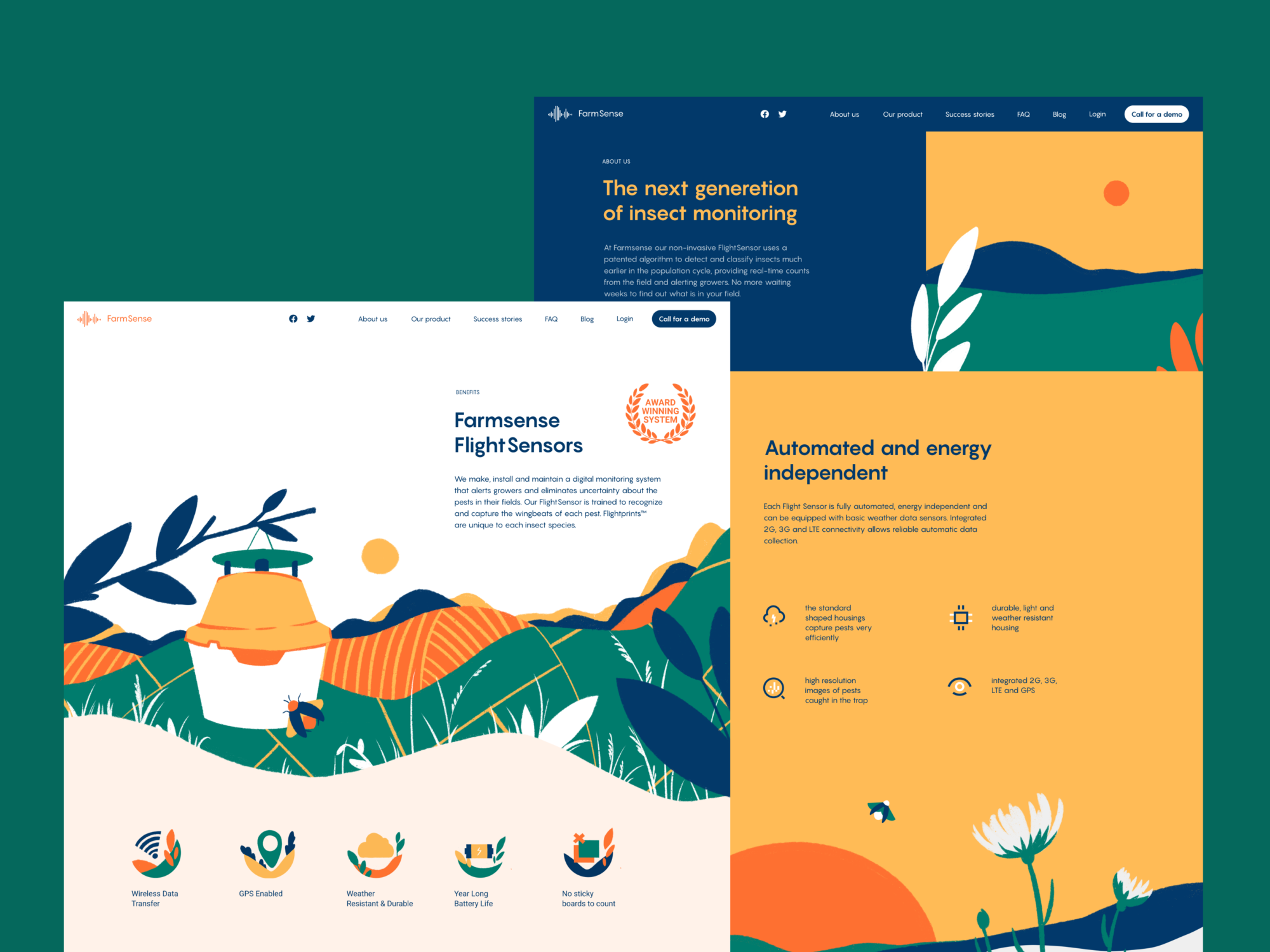
The FarmSense website features different types of explanatory icons that visually support the benefits and features of the service.
Read more in the article about the types of icons and their functions in user interfaces.
UI Animation
Web interface animation is presented with different types of motion involved in the interaction process, and supporting navigation and usability of the web pages. Among them, the ones which may have a significant impact on making the website more usable and clear are the following:
- loading animation: it lets the user instantly understand that the process is going on and sometimes even show what stage of the process is
- hover animation: one of the basic types of web animation expected by default. It is used when a website visitor hovers (moves a cursor on a particular element but doesn’t click it) over a web layout element, and it responds with motion, letting the user know it’s clickable. So, this web animation type is one of the ways to support easy navigation and quickly inform website visitors about the interactivity of particular elements.
- accent animation: this kind of motion meets the objective of drawing visitors’ attention to specific layout details, for example, keywords or phrases, information blocks, directional cues, brand signs, or interactive elements such as buttons, menus, cards, etc.
- interactive animation: interactive animation can provide users with instant feedback on their actions; it can support the search or choice process by visualizing different options, enhancing the informativeness of the web product, etc.
The web page for the egg product e-commerce website uses the counter to show page loading progress.
This page of the website, which tells about art galleries and events around the world, uses a captivating and artistic loading animation that imitates painting on the screen.
This website page for fintech service Crezco uses accent animation to draw attention to the key phrase in the text block that informs visitors about one of the core benefits, free payments.
The website for hiring yachts uses accent color and animation to make the CTA elements instantly visible.
The shipping company’s website uses an interactive map page visualizing the destination countries in an engaging and informative way.
The home page of the pet shop website uses a creative approach to hover that enlarges the image of the hovered item and even allows users to interact with the card right on the spot.
Nonconventional Show website uses hover animation supported with custom images.
Read more in the article about the types and functions of web animation.
In-Context Tooltips
In-context tooltips are contextual messages that provide additional information about specific features, actions, or options and improve the overall user experience. They are a good way to support the users in the process of trying the interface functionality: the tooltips appear in the process of web page exploration one after another, feature after feature, in one-time dismissible modal windows to explain the ways to use a particular function or highlight a specific benefit. In-context tooltips are one of the popular steps for effective user onboarding.
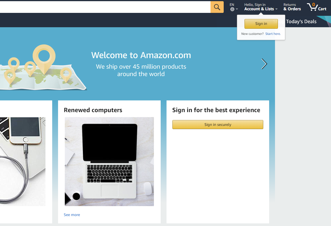
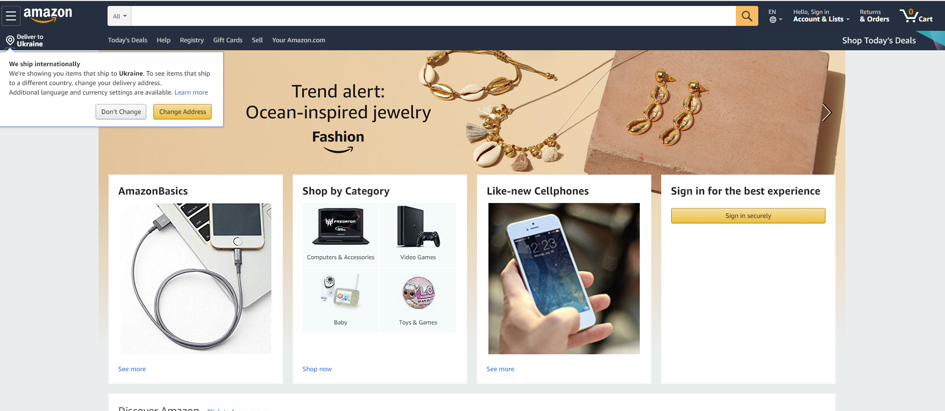
Amazon uses tooltips to drive the non-registered users to sign in, and in the same way, informs them about the vital benefit (international shipping) that may have a great impact on decision-making.
The list is not exhaustive, as the elements mentioned are not the only factors in making websites user-friendly. We will continue this theme in our following articles. More posts about user experience design terminology, processes, and practices are coming soon. Stay tuned!
Design Articles
Here are several articles to delve deeper into the theme of usability and user experience design.
User Experience Design for 7 Essential User Abilities
UX Design: Types of Interactive Content That Boosts Engagement
Negative Space in Design: Tips and Best Practices
5 Basic Types of Images for Web Content
Types of Contrast in User Interface Design
5 Pillars of Efficient Landing Page Design
The Anatomy of a Web Page: Basic Elements
Error Screens and Messages: UX Design Practices
Web Design: 17 Basic Types of Web Pages
Originally written for Tubik Blog
 https://design4users.com/elements-of-web-usability/
2026-01-20
© by
Marina Yalanska
,
https://design4users.com/elements-of-web-usability/
2026-01-20
© by
Marina Yalanska
,
- English
- Ukrainian