How to Use Visual Dividers in User Interfaces
How to Use Visual Dividers in User Interfaces The article tells about visual dividers, the layout elements that help to organize content on the screen clearly. Check how they work in UI and what types of them are popular.
The thoughtful design of content performance in web and mobile user interfaces means much for amplifying the utility and usability of the product. Our today’s article is devoted to visual dividers, the layout elements that help to organize content on the screen and separate its parts clearly. Let’s check how visual dividers work and what types of them are popular.
What Is Visual Divider?
The visual divider is a layout element that helps to separate pieces of content into clear groups, sections, options, or parts. This way, it helps a designer organize the page according to the typical patterns of visual perception and makes the layout clearer and more digestible for users.
Together with other elements on the page, dividers play a great role in setting up a solid visual hierarchy. For example, with them, users can easier define the relations of content, like if the pieces of content are the same, similar, or related; if any of them is subordinate to the others, etc.
Dividers are also important for usability: in many cases, they create visual containers that look clickable or tappable, which is particularly crucial for mobile interfaces.
Kinds of Visual Dividers
Talking about dividers, we can analyze them in two aspects: their appearance and their functions. Starting with the visual part, there are five basic and broadly used methods of dividing content in user interfaces:
- lines
- color
- negative space
- shadows/volume
- images.
Lines
Lines have belonged to the top methods of separating the pieces of content since time immemorial, both in print production and in digital interfaces. They are recognized easily in this role, so users won’t need to think twice.
On the other hand, this type seems to be super simple and far from original. So, quite often, designers strive to find other ways of content separation. What’s more, it is recommended to use lines only if the content cannot be effectively divided in another way. Too many lines can overload the screen with visual noise and create unnecessary visual tension.
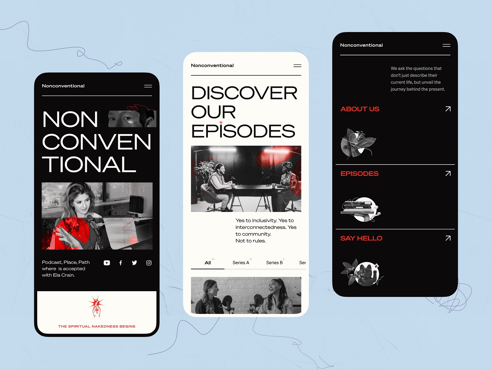
The mobile version of the Nonconventional Show website uses lines to divide different sections in the menu.
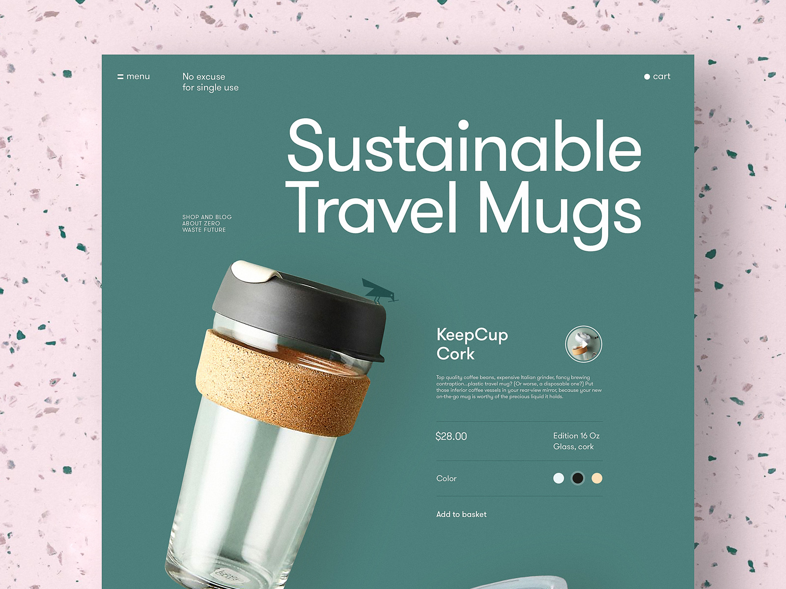
The product page for a website devoted to zero-waste living uses horizontal lines as visual dividers to clearly organize different information about the item.
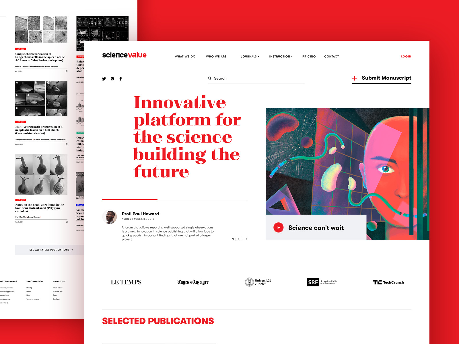
The webpage of the scientific platform uses horizontal lines to separate different content blocks and make their structure easily scanned.
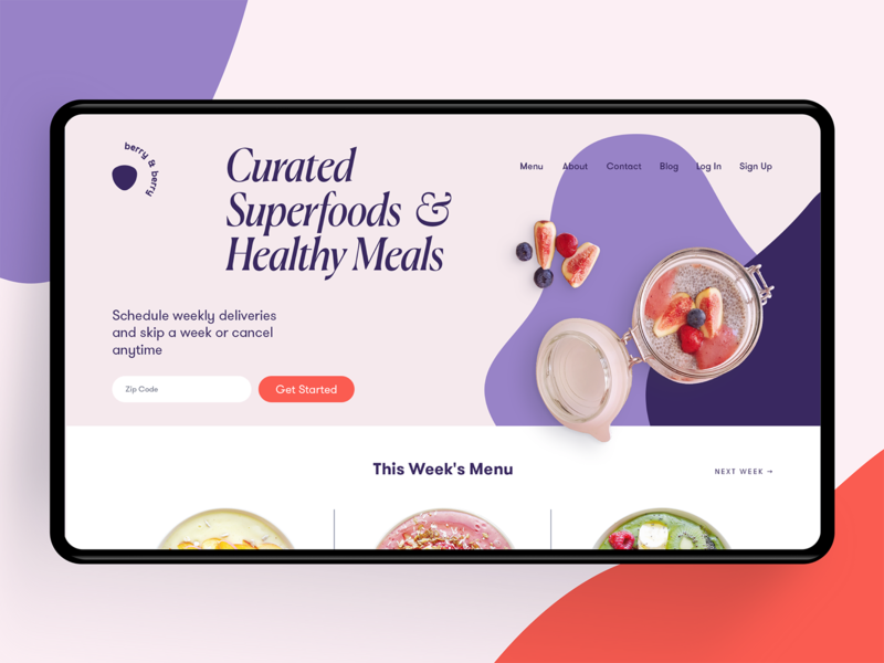
The ecommerce website of a tea brand uses different levels of visual separation of the content, from the simple horizontal line to separate the pricing and CTA element to a kind of table with an irregular grid look for the information about the item, a regular table look for the items in the website header and color contrast to separate visual content from text content.
Negative Space
Negative space (aka white space) means empty space on the screen around and often inside the elements. Yet, empty doesn’t mean passive or wasted: as well as any other element of the screen, it works supporting a positive user experience. Negative space is one of the most popular kinds of visual dividers, especially in interfaces built on the idea of minimalism and simplicity. Spiced with the knowledge of Gestal principles of visual perception, for example, proximity and similarity principles, negative space turns into a practical and elegant visual divider that also lets the interface breathe and avoid clutter.
Education app design demonstrates the elegant approach to unit arrangement via a well-balanced negative space.
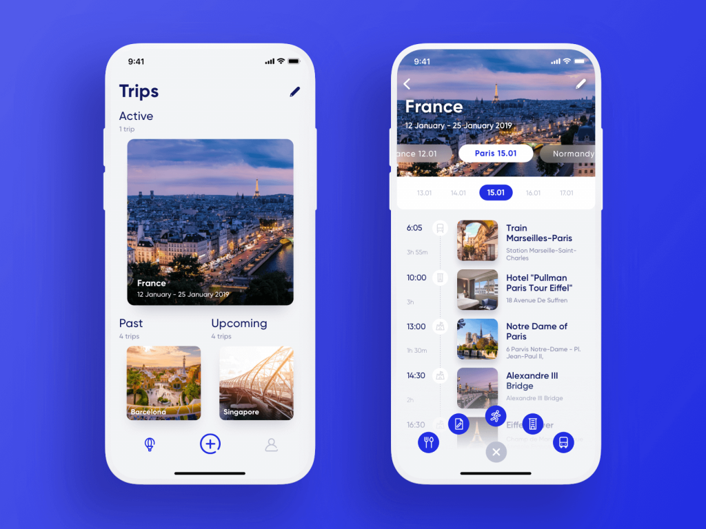
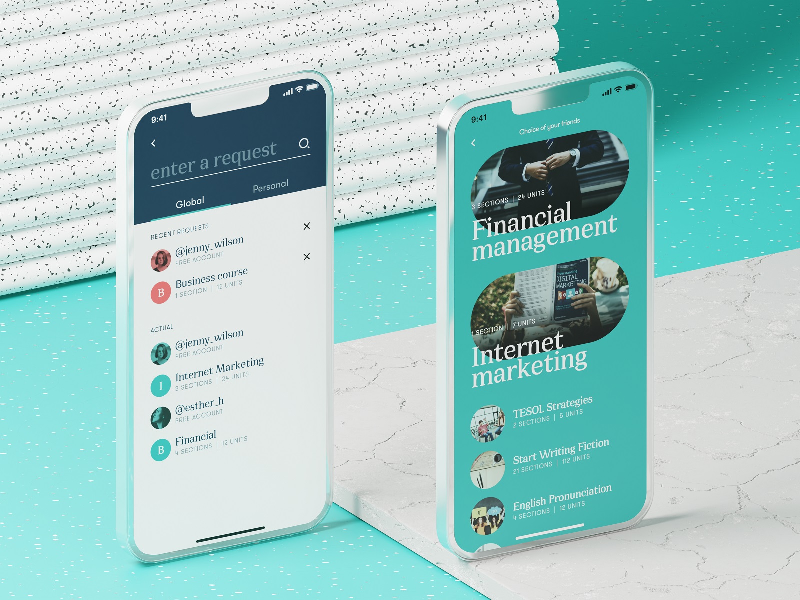
The travel planner app separates the items in the list without any additional visual elements, just with white space.
The Health Blog list of articles is based on typographic hierarchy and negative space to make them look like a clear set of items without stealing the air from the layout.
Color Contrast
Another effective type of visual divider is color contrast. Color choice and combinations in UI design have great psychological potential: they can strengthen the message and content of the website, creating the appropriate mood. Contrast is one of the key factors influencing the scannability and visual hierarchy of the page or screen. With all that, color contrast can effectively separate different options, items, or interactive zones, which means working as a visual divider. That is the reason why split screens have been so trendy in recent years. And that may explain the popular approach of organizing landing pages and single-page websites along the content blocks presented on contrasting color backgrounds.
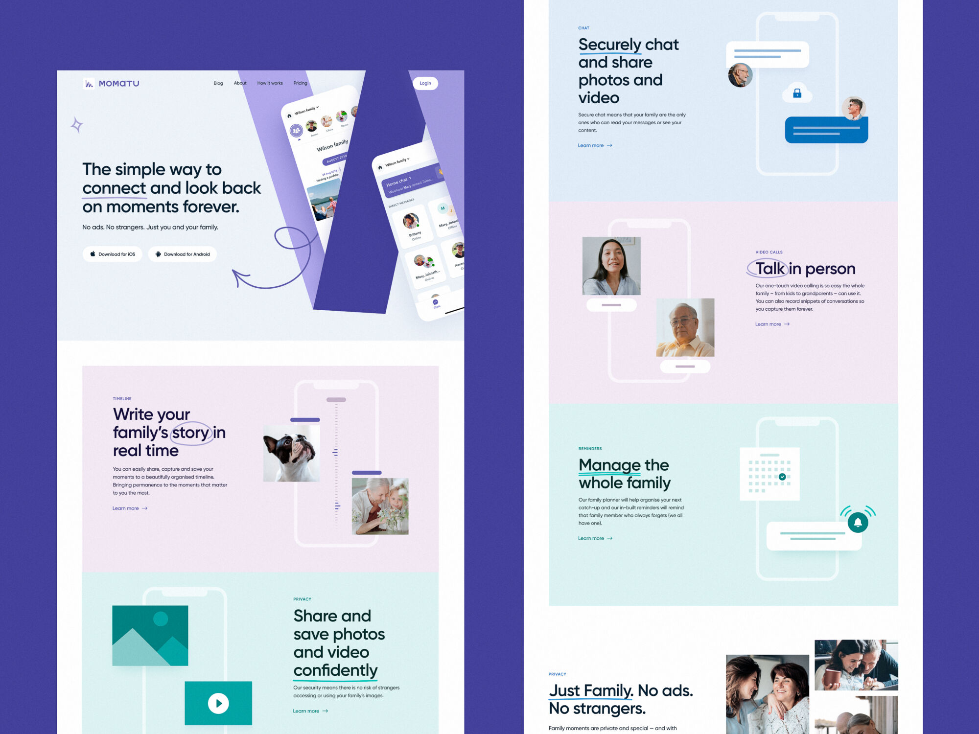
The landing page concept for Momatu divides content with different color backgrounds.
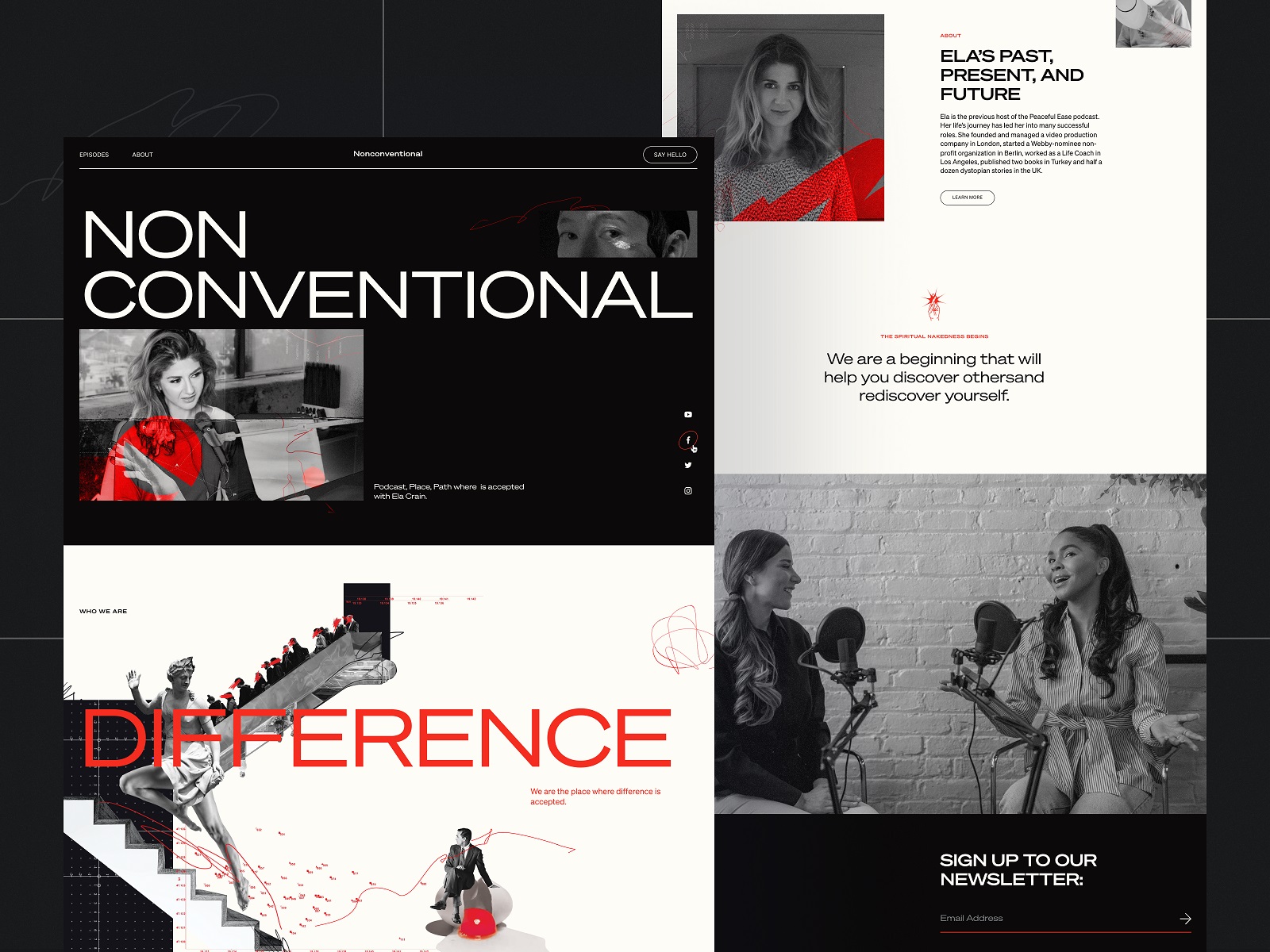
The Nonconventional Show website design employs bold color contrast to arrange the content more engagingly and dynamically.
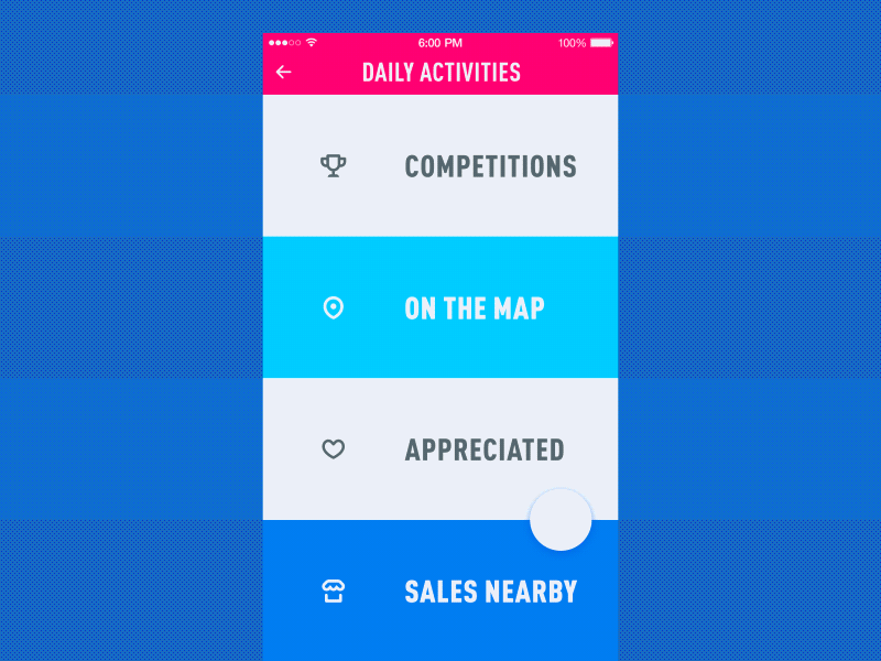
The mobile menu concept is based on color contrast to make the items clearly distinguished.
Even in pastel elements like this one, the power of color contrast is clear: it helps to divide the page into the hero section with the CTA and the active section of the menu. Also, pay attention to the vertical lines used as visual dividers for menu items: together with slightly seen images, here they also work as directional cues and help to avoid the illusion of completeness on the page.
In the website design for GNO blankets, the color contrast helps to divide the long webpage into digestible and elegant blocks of content.
Shadows and Volume
Shadows and volume, which are usually reached with the effect of visual elevation of a part of the content, may also work effectively as dividers. They create a feeling of depth and separate the page into several layers that often look natural and harmonic to the human eye. On the other hand, it looks less obvious and noticeable than lines, so this approach may be helpful in achieving balance and legibility of the particular items without too much visual noise or distraction.
Music Learning application uses the effect of volume to make items look clearly divided in a list of tracks.
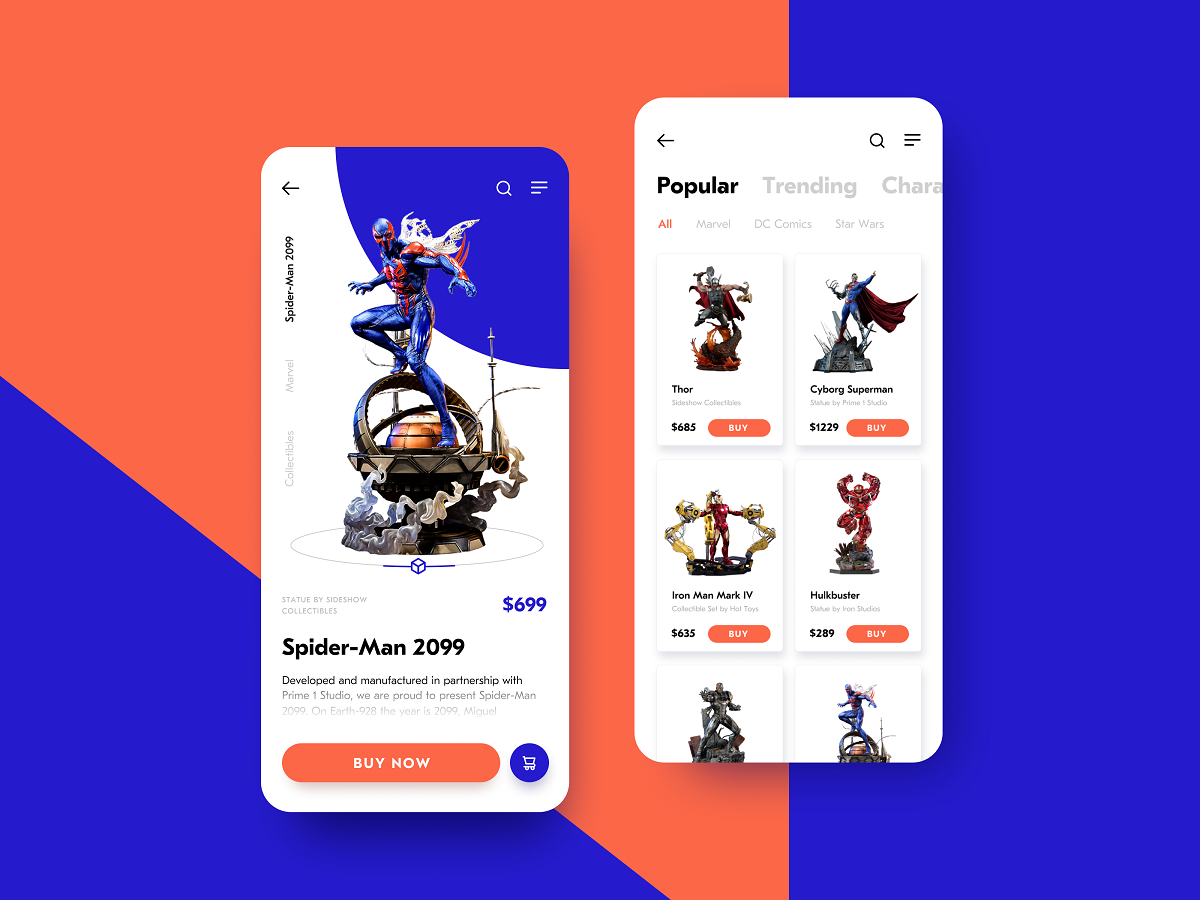
The catalog screen presenting the items in stock uses drop shadows, this way giving the layout more depth and clearly separating the cards from each other.
Images
Images of all kinds present one more effective visual divider. In this role, they are especially popular in the interfaces with lots of text content, for example, blogs, online media, and text-based landing pages. Photos, illustrations, 3D graphics, as well as animated images, help to balance the text content, increase scannability and readability levels, effectively divide the visual blocks, as well as add fun and emotional appeal.
The university website uses images and videos not only to set the atmosphere but also to divide different blocks of content.
The landing page for the cryptocurrency report uses catchy blocks of 3D graphics with an animated Learn More call-to-action. This way, the theme blocks are also clearly separated.
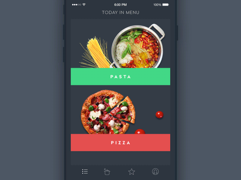
The menu screen for the restaurant app uses images as a crucial element in dividing the options.
Functional Types
The functional types of visual dividers depend on the hierarchy levels at which they work.
Full bleed dividers
Full bleed dividers are the ones that separate the sections and span the whole length of the screen layout.
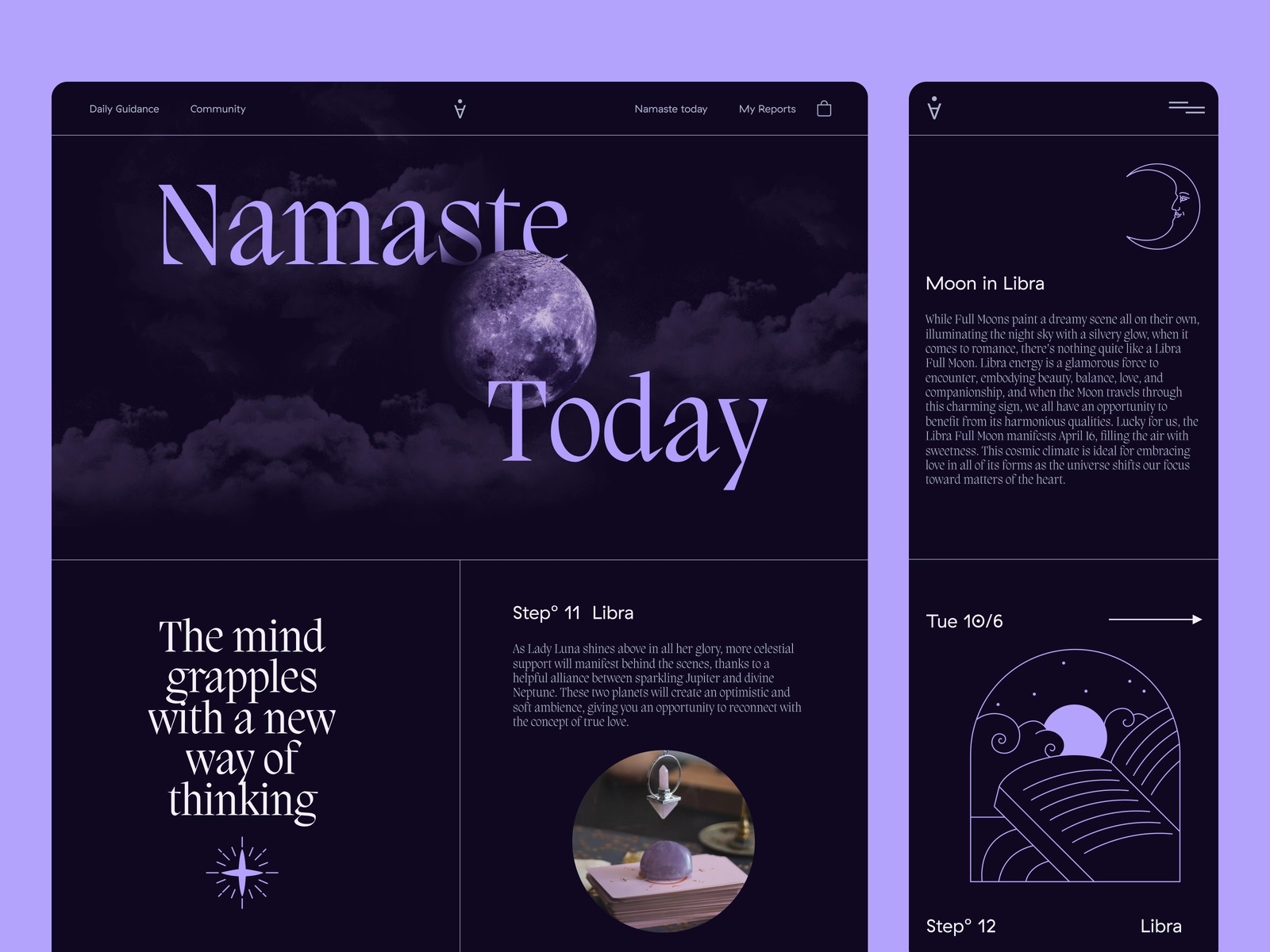
Astrology website uses full-bleed dividers to separate blocks of content.
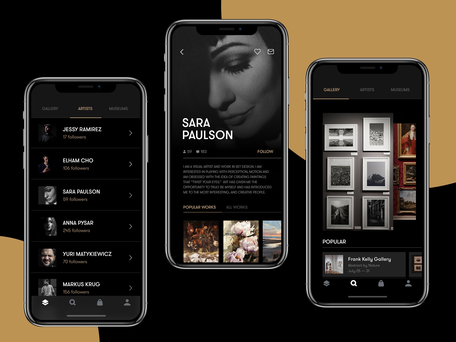
The gallery app uses horizontal lines as dividers in the catalog of artists.
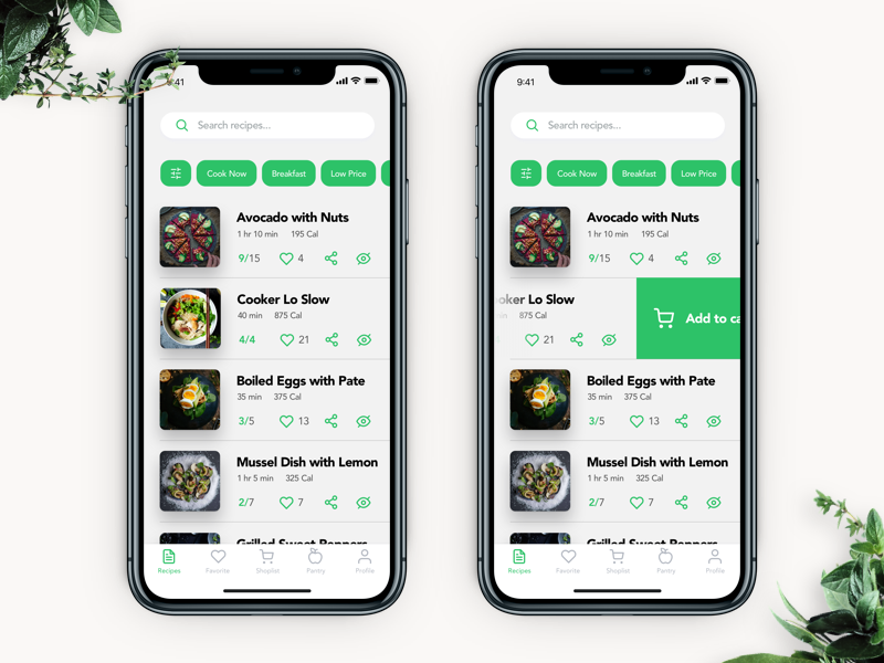
The Perfect Recipe app uses full-bleed dividers to separate the recipes.
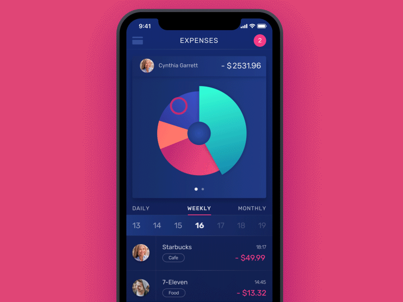
The finance app uses slight, barely seen full-bleed dividers to separate the items in the list of expenses.
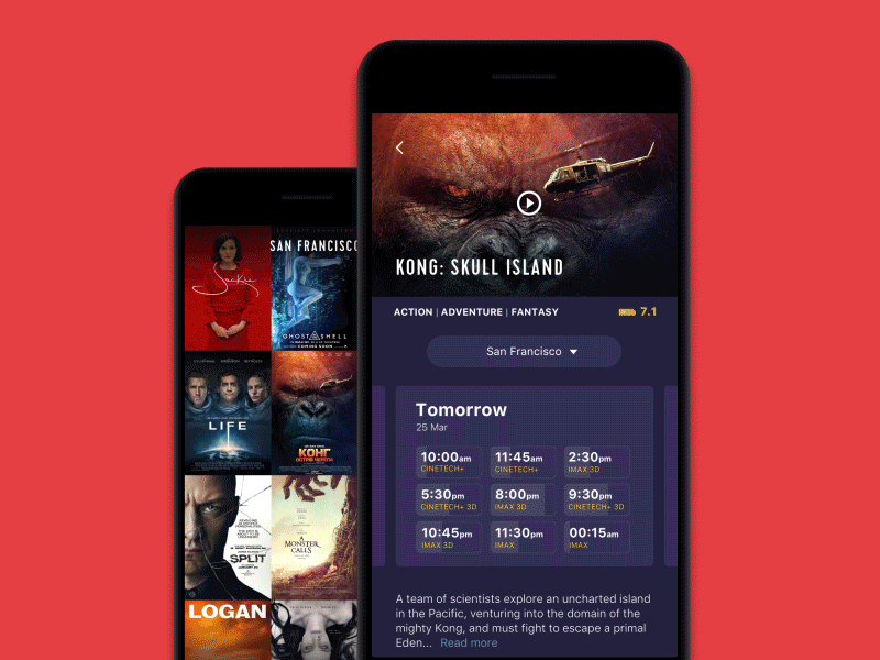
The cinema app uses full-bleed dividers on the check-out screen.
Inset dividers
Inset dividers separate related content items, anchored by elements that align with the app bar title or adjust to the specific kind of text content on the page.
The construction website features the part with specs that uses horizontal lines as inset dividers.
The Spa Space website uses lines to organize the options on the menu page elegantly.
Dividers with subheaders
In some cases, you can pair dividers with subheaders to identify a block of grouped content. In this case, the divider should be placed above the subheader to make the subheader’s connection to content more obvious.
Middle dividers
These are usually dividers placed somewhere in the middle of a layout, for example, to separate related content, such as prices on a receipt.
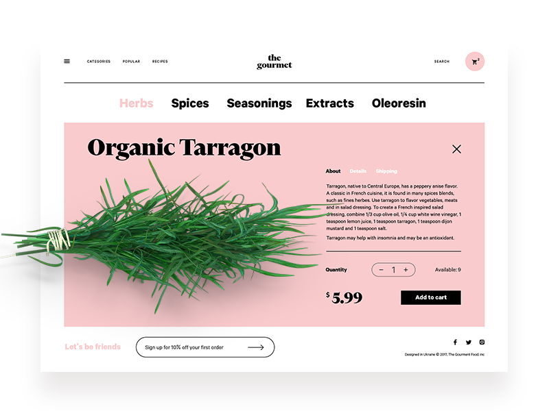
The product page for an ecommerce website selling herbs uses a middle divider to clearly separate the checkout interactive zone from the product description.
Points to consider
When choosing the type of visual divider for your design layout, you’d rather consider two essential factors.
Subtlety: Dividers shouldn’t yell for users’ attention and shouldn’t distract users from the content itself. The goal behind the divider is to support and clean up the layout, not to catch attention. So, make them noticeable but not annoying.
Moderate Frequency: as mentioned above, too many visual dividers, especially if they add elements to the layout like lines do, can create visual noise and make the user interface tiring. So, thinking over the type, think twice or seven times more. Prefer negative space to lines where it’s possible; don’t overplay with colors; strive for harmony and consistency.
As the examples above show, designers tend to find an effective combination of visual dividers to organize content on webpages or mobile screens.
Useful Articles
Here’s a set of articles covering additional aspects and best practices in user experience design.
Directional Cues in User Interfaces
How to Make User Interface Readable
Basic Types of Buttons in User Interfaces
The Anatomy of a Web Page: Basic Elements
3C of Interface Design: Color, Contrast, Content
Negative Space in Design: Practices and Tips
How to Make Web Interface Scannable
How to Use Hero Images in Web Design
Light or Dark UI? Tips to Choose a Proper Color Scheme
Originally written for Tubik Blog
 https://design4users.com/visual-dividers-in-user-interfaces/
2026-01-10
© by
Marina Yalanska
,
https://design4users.com/visual-dividers-in-user-interfaces/
2026-01-10
© by
Marina Yalanska
,
- English
- Ukrainian