10 Hot UI/UX Design Trends To Start 2024
10 Hot UI/UX Design Trends To Start 2024 Check a concise review of some hot UI/UX design trends for web and mobile, packed with a massive bunch of web and mobile design examples.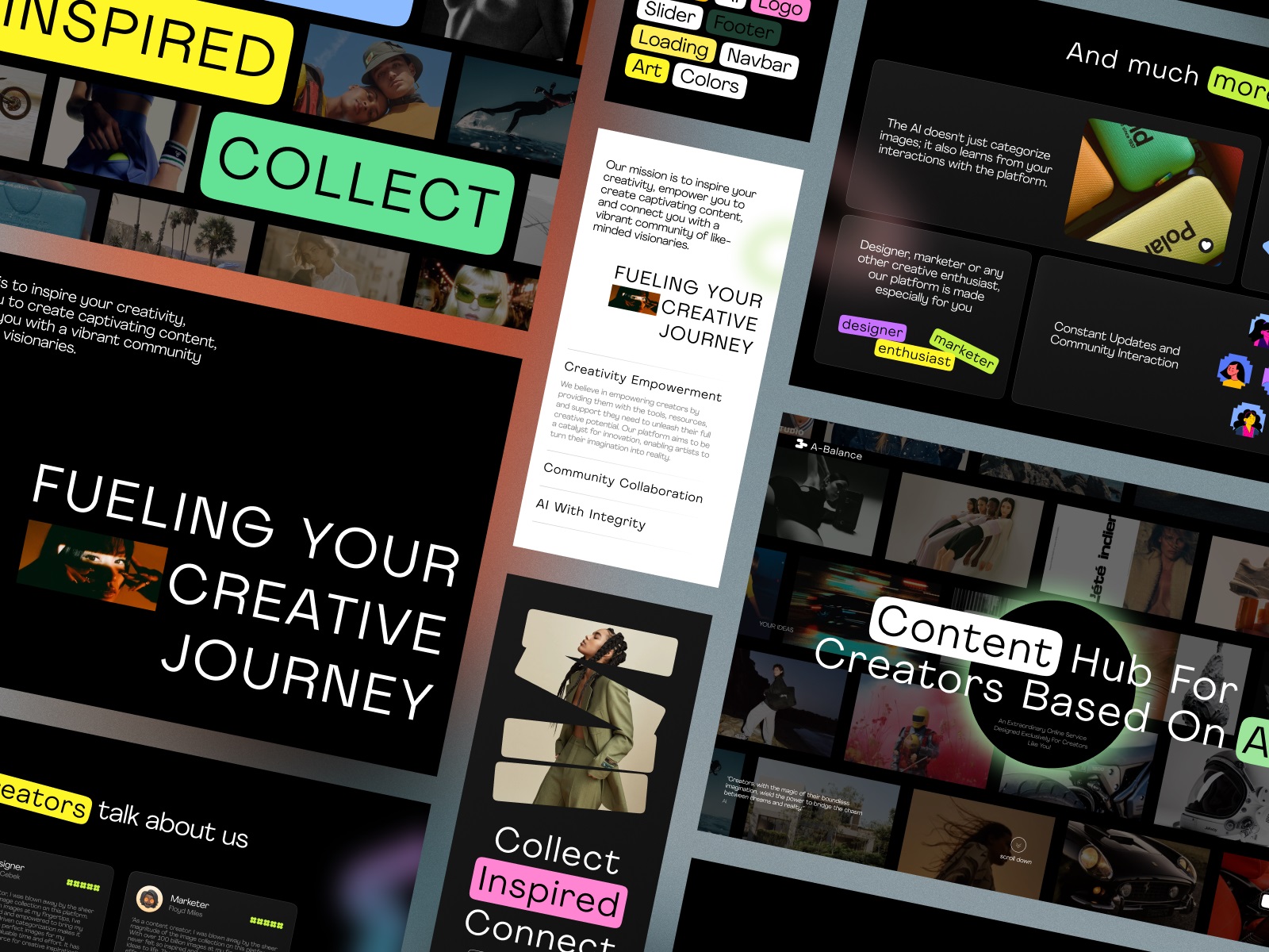
Before starting a new year of creative work, let’s take a little glance at what’s popular in design at the moment. So, welcome to a brief review of some current hot UI design trends for web and mobile. Traditionally, it is packed with a massive bunch of UI/UX design examples by the tubik team.
Complex 3D Graphics
With the rocketing evolution of modeling tools, 3D graphics and animation have started getting increasingly popular in recent years and have taken a well-deserved place on different lists of design trends. Still, for the last year, the complexity and detailing of 3D images integrated into user interfaces have reached levels not expected before. Although modeling and rendering can take quite a long time, using this type of visuals helps push the horizons of creative approaches and get more flexible in demonstrating specific objects that are hard to visualize in any other way or getting the modern look for web pages or mobile screens.
The company website for the prosthetics producer uses a complex animated 3D model to make the product demonstration impressive and lively.
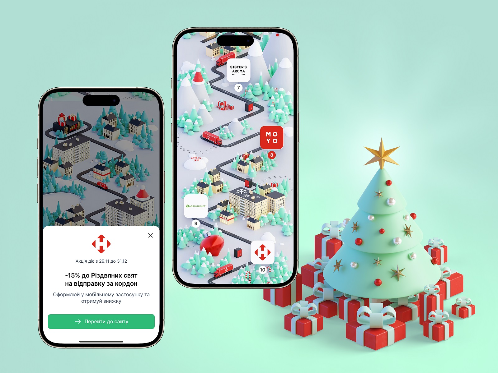
The interactive advent calendar interface for the Nova Post Christmas campaign presents the long-scroll map with tons of beautiful 3D images, setting the festive mood and enhancing visual storytelling.
Creative Motion Design
Animation in user interfaces also moved to the next level this year, with designers in a non-stop search for applying it to various stages of interaction with websites and apps. Creative motion graphics not only support the usability and accessibility of the interfaces but also spice them with eye-pleasing details and amplify emotional appeal. Moreover, creative approaches to animation in UI play a big part in activating the power of the aesthetic-usability effect.
The hero animation for the poster store app landing page works as an impressive presentation of the product and strengthens immediate aesthetic appeal.
From the background full-screen animation on the hero section to slight motion added to numbers and copy blocks and unobtrusive motion graphics, all animation on this business consultancy website home page works as one system, engaging users in learning more without getting bored or tired.
The animated explainer illustration for the Synthesized website helps to visualize highly technological processes as well as becomes an integral part of the general visual style concept for the service website.
The web platform for bartending courses uses a variety of motion effects to make the user experience intuitive and engaging and amplify the website’s elegance.
Web design for an AI-powered content hub uses a variety of web animation effects to turn the scrolling process into a captivating experience and make necessary visual accents.
Diverse Video Content
One more aspect that grows its presence and diversity in user interfaces of all kinds is video content. Realizing the effectiveness of videos for modern users, stakeholders and creative teams find more and more ways and formats of integrating them into the user experience, from full-screen background videos to small ones on some tabs or screen sections. That’s especially brightly seen for digital marketing, with websites and landing pages quickly setting the needed atmosphere and demonstrating service or items to their audience.
Hales Freight website features video content in the hero section of the web page to instantly uncover the essence and benefits of the service to the visitors.
The website for the niche water brand supports the atmosphere and sets the association of their water’s refreshing naturalness with video pieces integrated across website pages.
The home page of the virtual reality studio employs prominent atmospheric video pieces to make an impressive and emotional presentation of the service.
The website of a mental health guide uses a block of changing video fragments sharing positive vibes.
Scrollytelling
One of the currently popular approaches we have already had the chance to realize within our recent projects is scrollytelling. Basically, it is turning the process of scrolling the page or screen into captivating storytelling with the right balance of visuals and text design and spiced with animation to make it even more dynamic. This approach is also applied in the form of various timelines telling the story of a brand or company development.
Advocacy Through Walls website, an interactive guide for public defenders, community-based organizations, and other social justice advocates on how to ethically and intentionally engage with people currently incarcerated or directly impacted by systemic advocacy, is based on the scrollytelling approach.
The business consultancy website uses the approach of engaging scrolling on the About page to uncover the stages and milestones of the company’s development and achievements.
Emotional Hero Section
One more trend showing the steady growth of popularity is using the potential of a hero section to make the first seconds of contact with the user not only informative and functional but also emotional. Prominent visuals and videos, captivating motion graphics, and bold, concise typographic parts featuring taglines and/or brand names greatly help achieve that goal.
The MOVA Brewery website home page has a hero section setting an instant emotional connection with the visitor via the party-vibe full-screen photo with branded beer glasses and the tagline uncovering the idea behind the beer space connecting people.
Posse website hero section sets the instant feeling of cheerful and sincere communication.
The color palette, solid massive typography, ultra-minimalistic layout, and atmospheric full-screen photo background in the hero section set the starting point for the adventure emotion offered on the website of the service organizing sledding expeditions.
Mental health guide website uses the emotional hero section, combining a bright, bold typographic part with black-and-white background video.
The landing page for the fitness application builds an emotional connection in the hero section via the catchy, prominent typography of the tagline and engages in scrolling down with the visual hint of the mobile interface, which is presented via eye-pleasing animation when the visitor scrolls.
Typography Experiments
Typography in user interfaces has always presented a field for experimentation, and recently, app and web designers have been demonstrating new levels of creativity in font choice and combinations. Playing with decorativeness, original graphic details, and motion, they continue pushing the borders of making the interface design look unique, elegant, and aesthetic with the help of chosen typefaces.
The ecommerce marketplace website design uses a beautiful decorative font for taglines, headings, and primary text blocks.
The music instrument producer’s website plays with a bold sans-serif font for headings and an original all-caps font for the text block, setting the visual connection to modern music technologies.
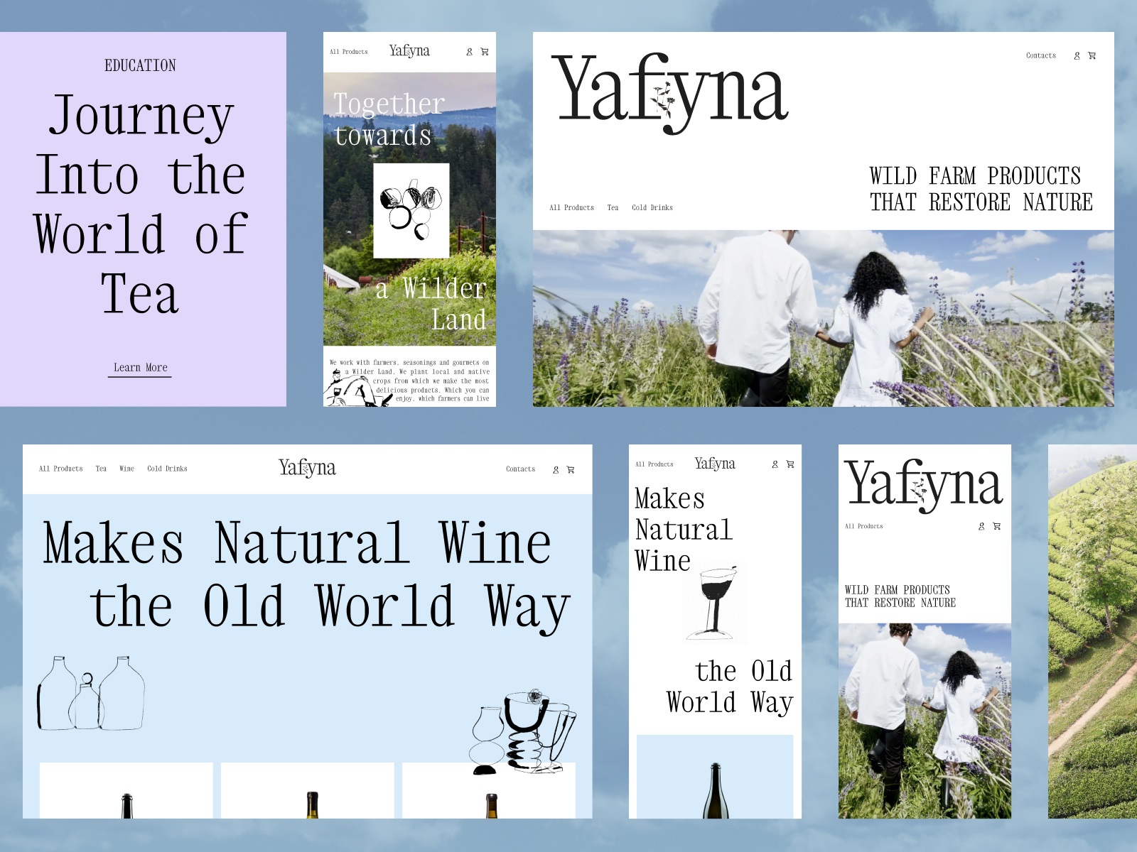
The light and airy website of the niche wild farm drinks producer uses a neat decorative primary font that plays well with the idea of wildflowers and grasses.
Interactive Menus and Catalogs
Having checked the benefits of interactivity and its contribution to positive user experience, today, designers and developers don’t limit themselves to the well-established types of interactive content but constantly experiment with new approaches and ideas. That results in new kinds of cool interactive details we can find on modern websites and apps, and trendy interactive menus and catalogs are among them lately, making the websites and mobile apps more desirable and handy.
The winery website home page features an interactive menu showing the photos on hover of the specific position.
Interacting with the menu, the visitors of the clinic website get to the page that uses a split screen layout and changes the photo depending on the chosen position.
The water brand website uses an interactive catalog with text-labeled vertical tabs, allowing users to switch between product pages.
Immersive Experiences
With the technological advancements of AR and VR in recent years, more and more brands are integrating immersive experiences into their communication and marketing campaigns. Immersive digital marketing involves users in an experience that merges elements of the surrounding environment with personalized digital content connected to the specific customer journey and purchase needs. So, that means creatives also have to think of new approaches to design this kind of user experience and make it a factor that amplifies the positive result.
The poster store application allows users to fine-tune the search of the poster and try the chosen item in their specific interior.
Mix of Visuals
More and more interface designers tend not to make a choice upon one type of visual content but employ a mix of different visuals, finding the balance of effective combinations. So, websites and apps can feature photos and videos, illustrations and collages, and major and minor motion graphics working as one system and supporting each other to make the pages and screens more usable, informative, and eye-pleasing.
The bartending school website uses a combination of various visual content, from full-screen video to atmospheric photos and neat line illustrations.
The mental health guide combines photos, videos, and illustrations for emotional and diverse communication of the ideas to the reader.
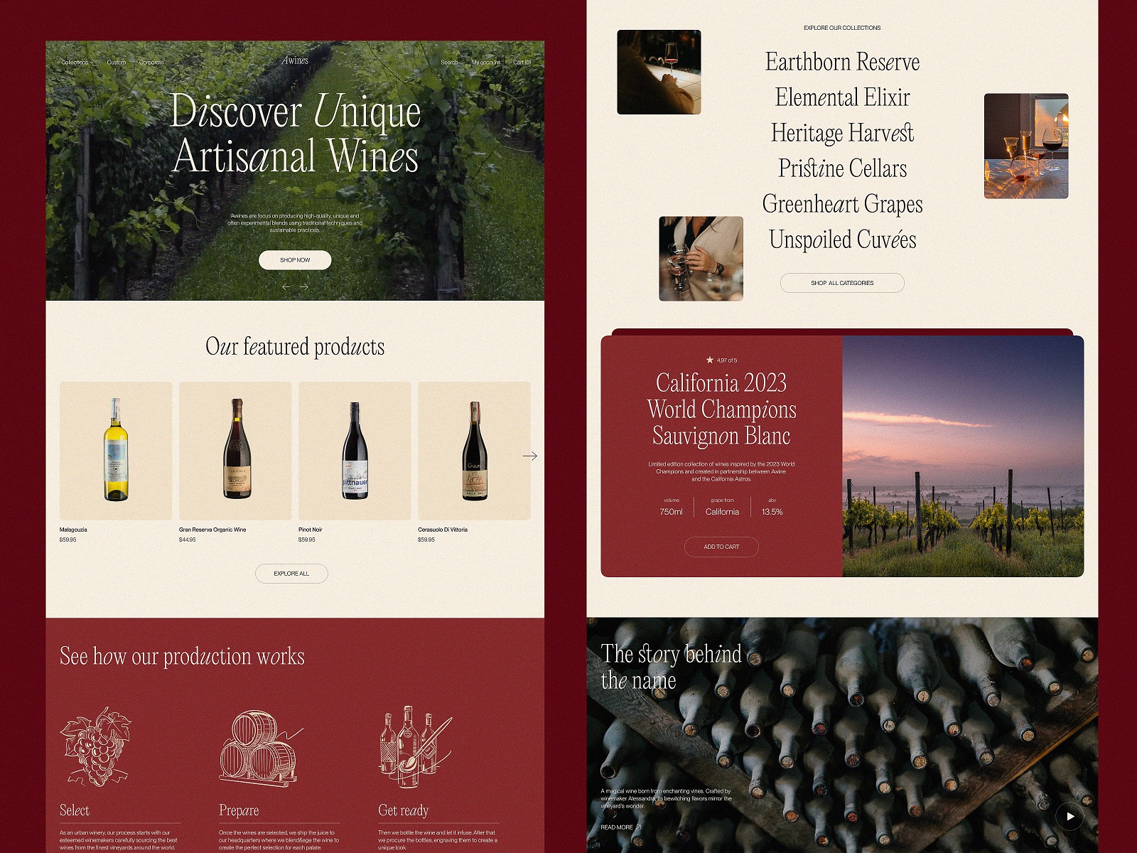
The winery ecommerce website features a combination of beautiful vineyard photos, product presentation photos of bottles, and sophisticated line illustrations to visualize the production stages.
High-Level Conceptuality
One more trend of the recent months in UI design is the creation of high-fidelity concepts to think over user experience for future technological advancements, gadgets, and devices that are not massively used or affordable yet but are already talked about actively enough to consider interaction design for them.
Here’s an elegant design concept for a product manager application created to be used effectively on a foldable device; in this project, our team set the challenge to think over both additional limitations and possibilities that foldable devices open for the user experience.
Some UI/UX and interaction design solutions for the vibrant and engaging mobile application concept of the AR-based social network.
Sure, these are only some of the actual trends in web and mobile design at the moment, so let’s move on and see what the new year of design will bring.
Useful Articles
Here’s a bunch of articles to dive deeper into the theme of usability and user experience design.
Negative Space in Design: What It Is and How To Use It
5 Types of Images for Web Content
How to Make Web Interface Scannable
User Experience Design for 7 Essential User Abilities
Error Screens and Messages: UX Design Practices
Originally written for Tubik Blog
 https://design4users.com/ui-ux-design-trends-2024/
2025-12-03
© by
Marina Yalanska
,
https://design4users.com/ui-ux-design-trends-2024/
2025-12-03
© by
Marina Yalanska
,
- English
- Ukrainian