Small Stars of Interaction Design: Interactive UI Elements
Small Stars of Interaction Design: Interactive UI Elements The article tells about small but essential elements of UI design: buttons, icons, tags, filters, tabs and the like, with a bunch of UI design examples.
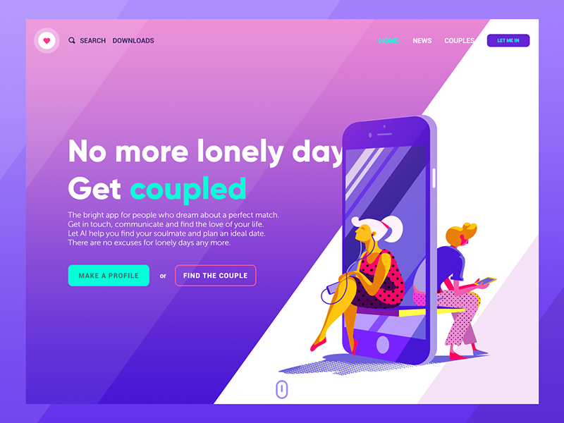
Powerful, user-friendly product designs are built on carefully crafted details. Web and mobile user interfaces are all packed with small elements of big impact. Today, we offer you to revise some of the UI elements found in the vast majority of layouts, consider their functionality and role, and check them in various UI design examples by Tubik Studio designers.
Button
A button is one of the most popular elements of any interface. It roots deeply in the world of physical things and existed much before the GUI appeared: push-buttons, later simplified to just buttons, are simple switch mechanisms enabling the control of a process or machine. Pushing, pressing, hitting, or punching (great synonym row was developed for buttons over time), a button actually sends a signal to the machine indicating the action the user wants to perform. Used in a variety of devices, from simple home appliances, telephones, and calculators to complex dashboards. Being a clear element of interactions, buttons were later successfully transferred to graphical user interfaces.
In UI, a button is an interactive element that enables a user to send a particular command to the system. Basically, with this control user directly communicates to the website or application and forward the necessary commands to achieve a particular goal: turn on the player, send an email, buy a product, download some data, add items to the cart and plenty of other possible interactions. Buttons are extremely popular as elements of user-friendly interfaces because they successfully imitate interactions with physical buttons so their functionality is clear even for users with a low level of tech literacy.
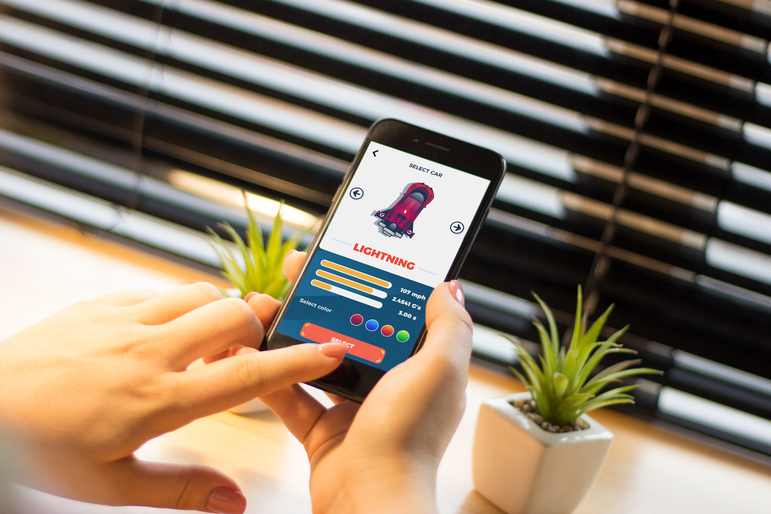
Button design in a mobile game, Real Racing
Today, diverse UI buttons serve plenty of purposes. Typical buttons are designed to be instantly visible: designers apply contrasting colors, shapes and even animation to make buttons noticeable in the layout. Buttons are often supported with the copy that explains the action done with the button. Designers have to invest considerable time and effort to create effective buttons that look consistent with the overall stylistic concept but are contrasty enough to stand out in the layout.
There are several frequently-used types of buttons with additional functionality.
Hamburger button hides a menu. After a click or tap on it, the menu expands. It is called a hamburger due to its form, which consists of three horizontal lines – it looks like a typical bread-meat-bread hamburger. Although today it is quite a typical element of interaction, hamburger menus are still highly debatable due to the number of pros and cons.
Most users using websites and apps on a regular basis know that hamburger hides the links to core categories of content so they don’t need additional explanations and prompts. The essential advantage is that hamburger menus free space: this way the interface becomes minimalist and airy as well as provides room for other important layout elements. Also, it provides additional benefits for responsive and adaptive design hiding navigation elements and making the layout usable on different devices. The arguments against the hamburger menu are based on the fact that this design element can be confusing for users having little experience with websites: they can get misled with the sign which is rather abstract. Thus, the decision about applying the hamburger button should be based on user research, setting a target audience’s abilities and rigorous testing.
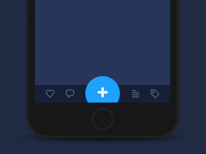
Plus button enables to add new content, for instance, a new contact, post, note, position in the list, and the like. Sometimes, tapping this button, users are directly transferred to the modal window of creating content, in other cases, there is also a medium stage when they are given additional options to choose from and make adding the particular piece of data more focused. In this case, the plus button is also an expandable button.
An expendable button opens a variety of options when clicked or tapped. It is another way to maintain the proper flow of interactions without overloading the screen, which is particularly important for mobile interfaces with limited screen space.
Ghost button is a transparent button that looks empty – that’s why it is also called “empty”, “hollow” or even “naked”. Their visual recognizability as a button is typically provided with a shape bordered by quite a thin line around the button copy. This kind of buttons helps to set the visual hierarchy in case there are several CTA elements: the core CTA is presented in a filled button while the secondary still active is given in a ghost button.
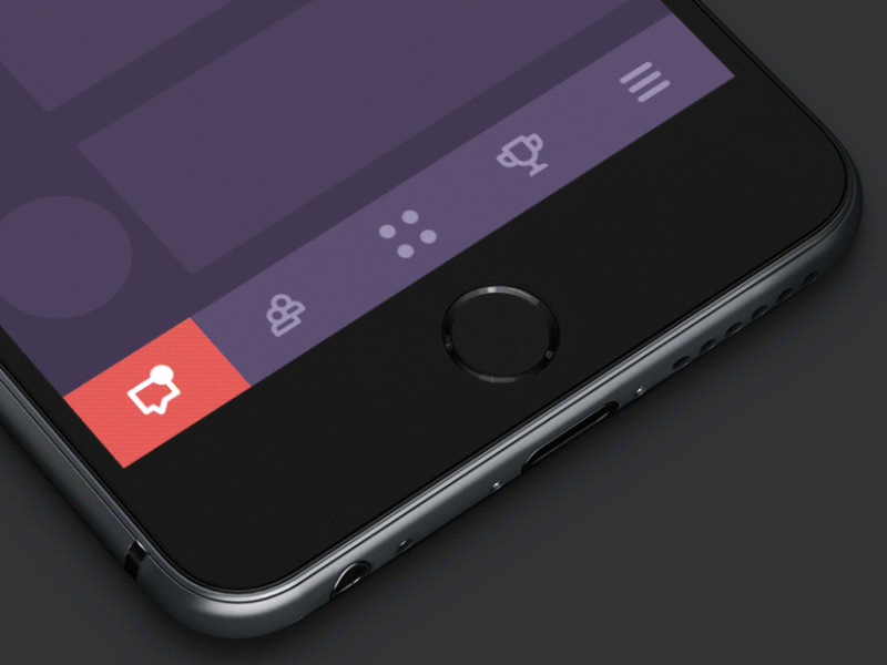
Bar
Bar is a UI section of the user interface with clickable elements enabling a user to quickly take some core steps of interaction with the product. Also, it can inform the user about the current stage of a process. Among the basic types of bars, let’s check the following.
Tab bar — in mobile applications, it appears at the bottom of a screen and provides the ability to quickly switch between core sections of content.
Loading bar is the control that informs a user about the current stage of the action or process. In most cases, users can see the flow with timing or percentage shown in progress.
Progress bar provides feedback on a result of the current process so far, for example, showing how much of the planned activity has been done. You may often see in musical players, for example.
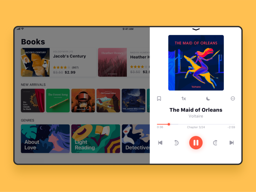
Audiobook store app design
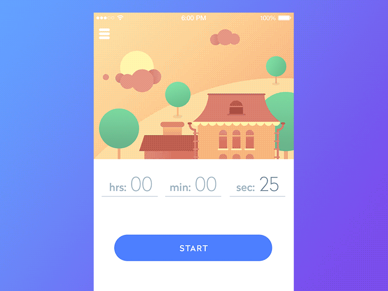
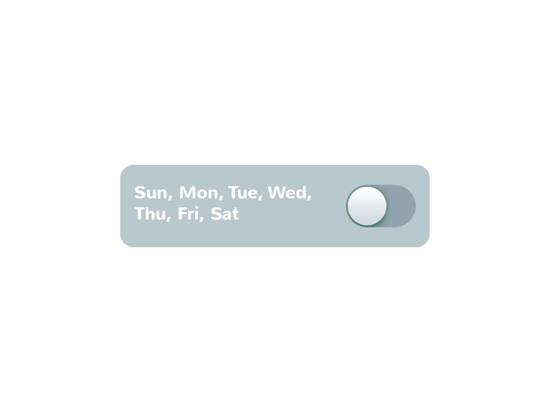
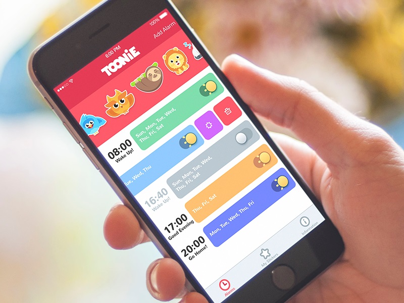
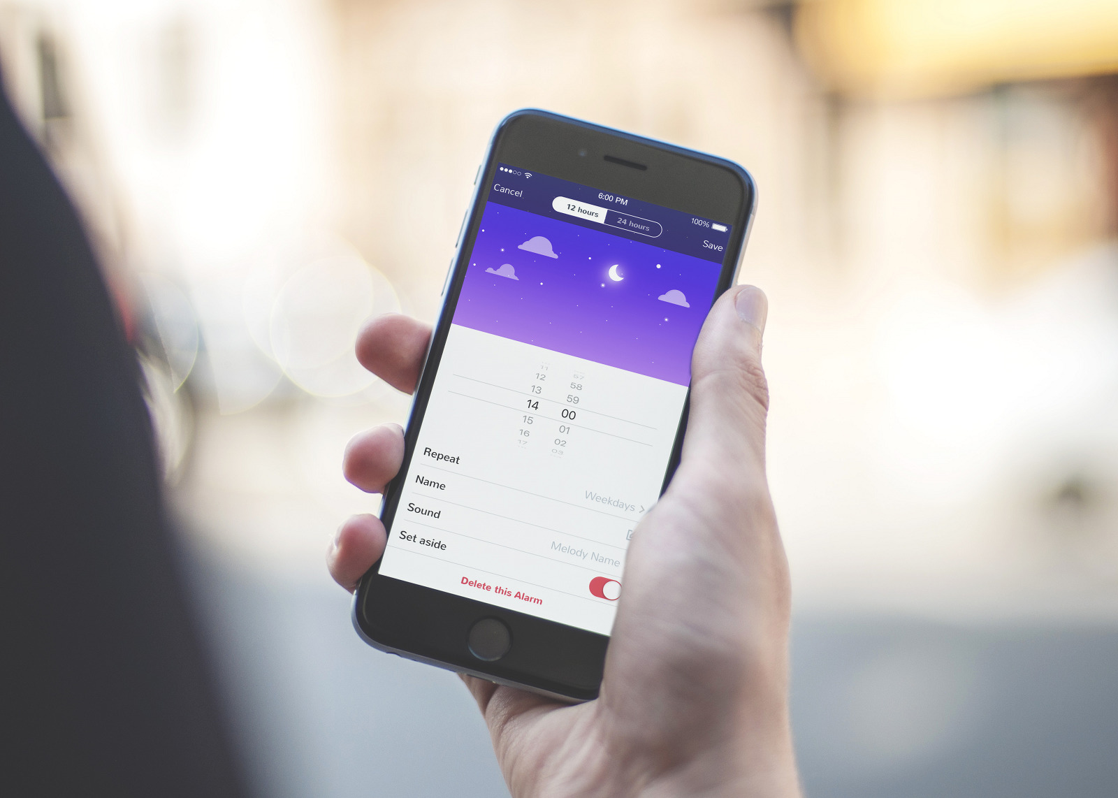
Switch
A switch is a control that enables users to turn the option on/off. As well as buttons, it is also applied effectively in modern interfaces, as it mimics the direct experience of switches people are accustomed to in real life. The important point is that the switch states should be clearly visible and distinctive so the user can easily tell whether the option is active. Contrast and subtle animation can make the experience simpler and more user-friendly. Here’s how it was solved in Toonie Alarm app.
Picker
As it’s clear from its name, picker allows for picking the point from the row of options. It usually includes one or more scrollable lists of distinct values, such as hours, minutes, dates, measurements, and currencies. Scrolling the list, users choose and set the needed value. This type of interactive element is widely used in the interfaces which have the functionality of setting time and dates.
Checkbox
Checkbox is a graphical UI element that marks a particular piece of content, usually setting the choice for the binary options. It is one more element setting the bridge with the real world as it looks similar to the process of filling in tests, questionnaires, and other stuff of this kind when you have to put a tick or color the box to mark the option. Checkboxes and switches can be found in any type of user interface, especially in sections for user, screen, or page settings. Also, checkboxes present a common part of navigation in apps and websites with the functionality of task managers, to-do lists, time trackers, and the like.
Icon
An icon is a symbolic image used for the purpose of communication. They are informative signs supporting data exchange between the informer and addressee together with text: icons communicate via the images often showing pictorial resemblance with an object of the physical world. In digital design, icons are pictograms or ideograms used in the web or mobile interface to support its usability and provide a successful flow of human-computer interaction.
One of the most valuable benefits of icons is the ability to effectively replace the text. This feature is able to boost usability and strengthen navigation as most users tend to perceive and decode images faster than words. However, even the slightest misperception or double meaning can become the reason for poor UX, so the solutions for the type of icons should be carefully tested to reach a good balance of icons and copy for a particular target audience. One of the effective variants is using both copy and icon so that different categories of users could feel good with that: this approach is particularly popular in various catalogs of e-commerce websites where different positions are presented by both words and pictures giving the user double support for quick and clear navigation. Here is an example of this approach in the Watering Tracker app.
Based on their functions, icons can be classified as:
- interactive icons directly involved in the interaction process. They are clickable or tappable and respond to the user’s request, doing the action symbolized by them. They inform users about the functions and features of buttons, controls, and other interactive elements. In many cases, they are obvious and don’t need the copy support.
- clarifying icons aimed at explanation, visual markers explaining particular features or marking out categories of content. They may not be the layout elements of direct interaction; also, they are often found in combination with copy supporting their meaning.
- entertaining and decorative icons aimed at aesthetic appeal rather than functionality often used to present seasonal features and special offers. They present an effective way of attracting users’ attention and enhancing the general stylistic concept of a digital product.
- app icons: interactive brand signs that present the application on different platforms supporting the original identity of the digital product.
- favicons represent the product or brand in the URL-line of the browser as well as in the bookmark tab. It allows users to get a quick visual connection with it while they are browsing.
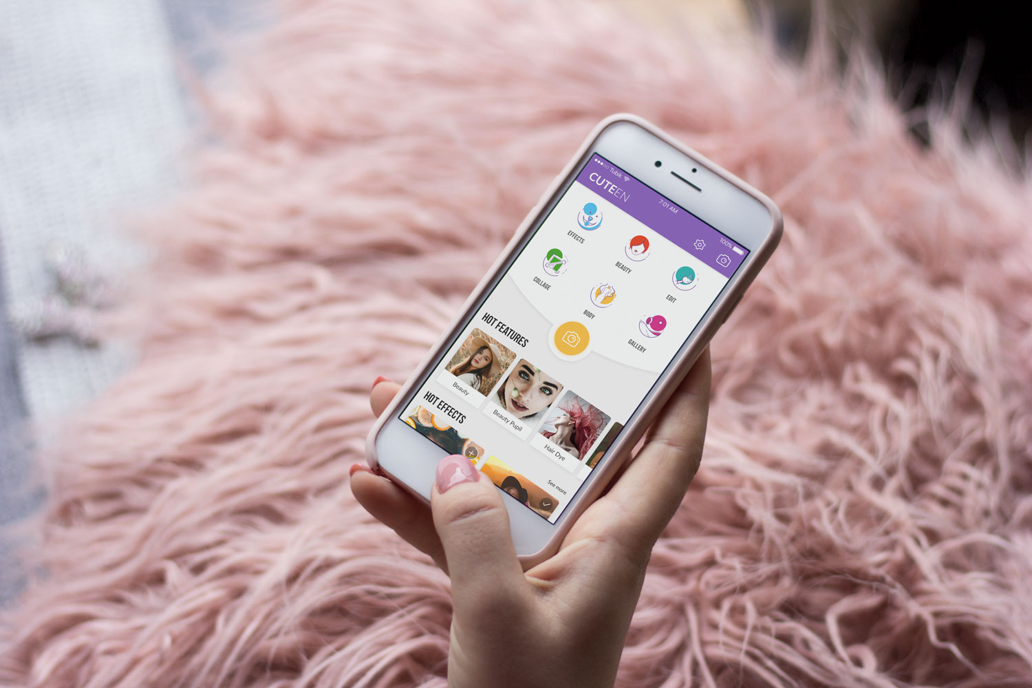
Cuteen app using custom icons for content categories
Search Field
A search field, also called a search box or search bar, is an interface element that enables a user to type keywords and, in this way, find the content they need. It is one of the core navigation elements for websites or apps with a large amount of content, particularly blogs, e-commerce, and news websites. Well-designed and easily found, the search field enables the user to jump to the necessary point without browsing through the numerous pages and menus: as this approach respects user’s time and effort, it is highly demanded in user-friendly interfaces.
In terms of design, this element can be presented in different ways, from the framed tab to the interactive input line, or even minimalist clickable icon. In the vast majority of cases, the search field is marked with a magnifying glass icon. This symbol is recognizable by a wide variety of users so it has proved itself effective for setting intuitive navigation. Experiments with the icons can significantly affect the layout’s interactions and usability, so if other symbolic images are used, they should be carefully tested. The flow of interaction can also be supported with the drop-down menu offering possible options or auto-filling functionality.
Placement of the search graphic control is a significant concern. In web design, a search field can often be found in the header of a website: it is the zone of the highest visibility, so putting a search field there enables users to quickly get transferred to the pages they really need without wandering through the website and scrolling down. For example, it works well for big e-commerce websites often visited by users who have a particular goal, a specific item they are looking for — if they can’t find it quickly and conveniently, the risk is high that they will leave decreasing the profitability of the resource. Moreover, the power of habit should also be taken into account: as numerous websites include a search in their headers, users are accustomed to looking for it there when they need it.
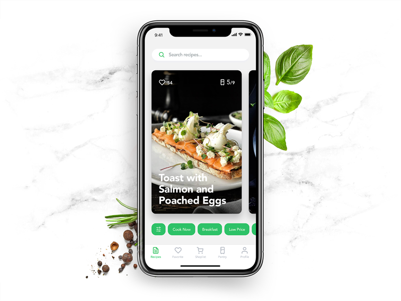
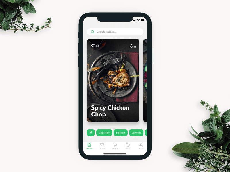
When discussing the search field in mobile interfaces, the situation differs, as the designer has much less usable space. If the app is based on a lot of content and search is a central element of interaction, it should be in the tab bar or the header and easily accessible. In case the search is not crucial for the user goals and usability of the app, it can be hidden in menus or shown only on the screen where it’s potentially needed. Recipe app shown below applies a search field with a textual prompt in the top part of the screen.
Tag
A tag is an interactive element that presents a keyword or phrase, enabling the user to quickly move to the items marked up with it. Tags are actually pieces of metadata that provide quick access to specific categories of content, so they support navigation with an additional way of content classification. Moreover, tags are often the elements users create themselves, whereas category names are fixed by the website and can’t be changed by users.
Tags are widely used on the platforms based on user-generated content: when you upload a photo to the stock, post on the social networks, or write on the blog, you can mark your content with particular keywords, which will then unite all the pieces of content marked with the tag. In terms of interaction, click on a tag moves the user to the webpage collecting all the content marked with this tag. Also, tags are an SEO-friendly technique increasing the chances that the content will be found via search engines.
Loader
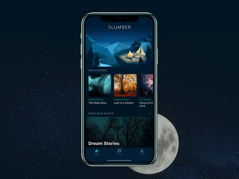
A loader is an animated, interactive element that informs the user about the process of content loading. As the process takes some time, this way the system shows that it’s working while users understand what is going on. It plays an important role in usability. Moreover, stylish animation and graphics may add beauty and fun to the process. The example below shows how the loader works on pull-to-refresh in the Slumber app.
Filter
Filters are graphical controls that enable tuning the necessary settings. They are effective in personalization for better UX: users can choose and adjust the settings they need. Here you can see how it was realized in the Recipe app.
Planning information architecture and interface navigation is not an easy challenge, which demands a good knowledge of psychology and interaction patterns, user testing, and serious analysis from the earliest stages of an app or website design. Still, it becomes the solid ground for a positive user experience, which will solve users’ problems and motivate them to get back to the product again and again. Small interactive details become guiding stars, making interactions smooth and easy.
Recommended reading
Here is the set of recommended materials for further reading if you would like to learn more about the theme.
iOS Human Interface Guidelines
The Anatomy of a Web Page: Basic Elements
UX Design Glossary: Affordances in User Interface
How Human Memory Works: Insights for UX Designers
Best Design Practices for Website Header
5 Basic Types of Images for Web Content
UX Design: How to Make Web Interface Scannable
Web Design: 17 Basic Types of Web Pages
Guide to 6 Effective Types of Web Animation
Originally written for Tubik Blog
 https://design4users.com/interactive-ui-elements/
2026-01-18
© by
Marina Yalanska
,
https://design4users.com/interactive-ui-elements/
2026-01-18
© by
Marina Yalanska
,
- English
- Ukrainian