19 UI Design Trends for Web and Mobile Worth Your Attention
19 UI Design Trends for Web and Mobile Worth Your Attention Keep up with the trends in user experience design for websites and mobile applications this year: check what's popular in multiple UI design examples.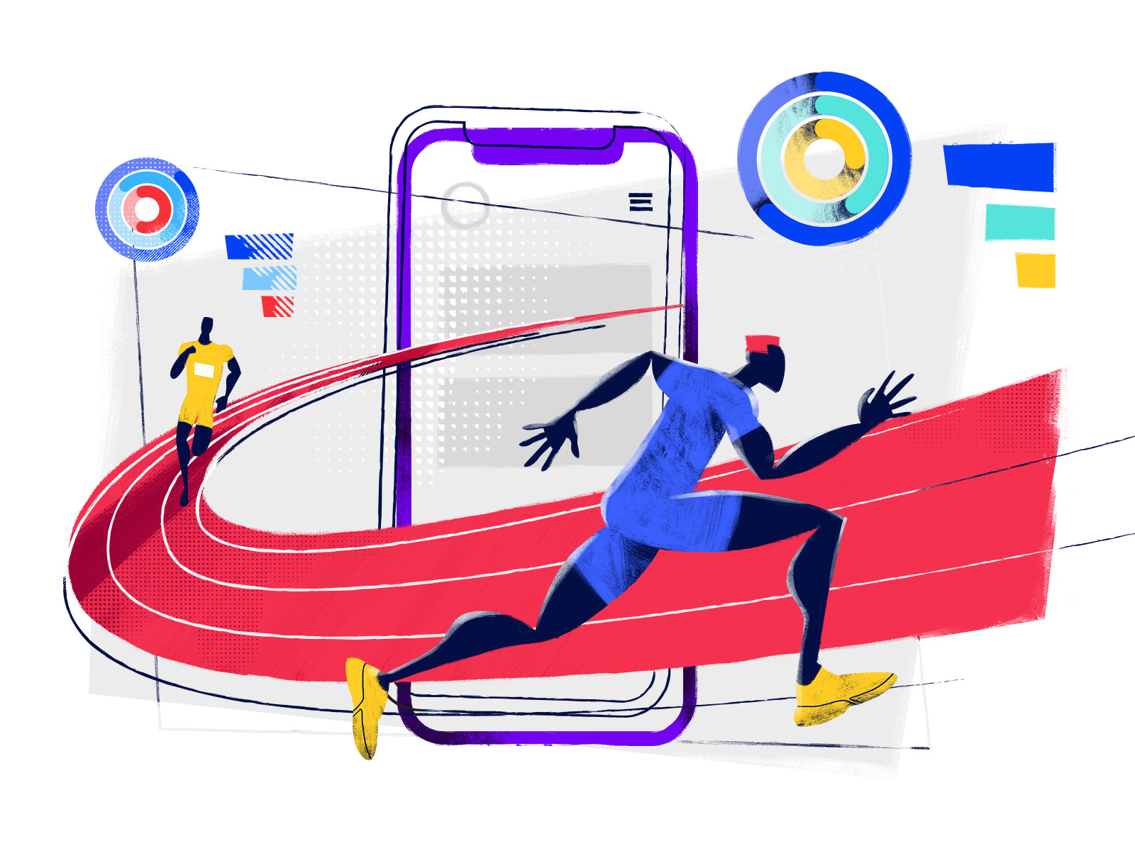
The holidays are over, the new season of creative challenges is open, and that’s a good time to take a look back at what has been popular in UI design for websites and mobile applications this year. Here we’ve gathered a quick review of hot UI design trends in 2019. Some fresh trends are just taking their positions while the others have already solidly established themselves and got new faces this year. The article is packed with UI design examples.
Hero Illustrations
Hero images are not a kind of modern-day invention: for recent years, they have been used for making web pages clear, elegant, catchy and meaningful. No wonder: hero images improve perception as most users notice and decode images much faster than words, so the picture is not only an element of attraction but also an informative part of the page, providing a quick visual message about the content.
The correct composition of the hero image can strengthen navigation and bring more attention to the call-to-action button. Yet, talking about trends, for the recent year we are seeing the wide and diverse digital illustrations in contrast to photos that were much popular before. It can be explained, perhaps, with the higher flexibility of illustrations for user experience design goals. Digital art opens limitless possibilities on styles, characters, environments, compositions, and perspectives, and a combination of them with all the other layout elements into one design.
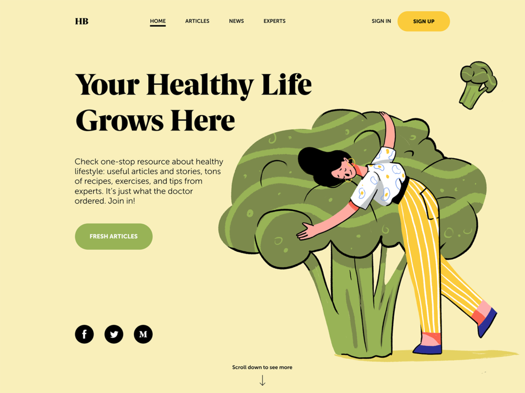
The web page, where the hero image and copy present a strong composition, creates a positive atmosphere, and informs users about the theme of the Health Blog’s content.
The landing page for the illustration conference builds the composition around the original and eye-pleasing animated hero image.
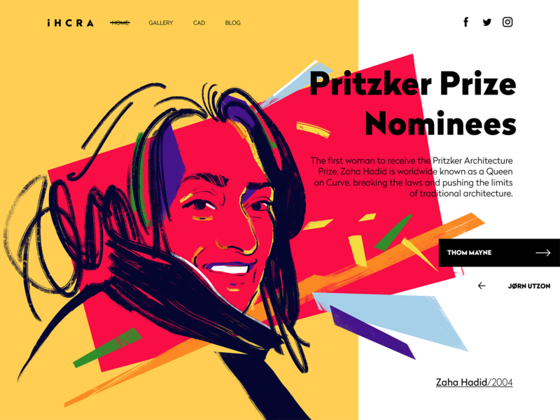
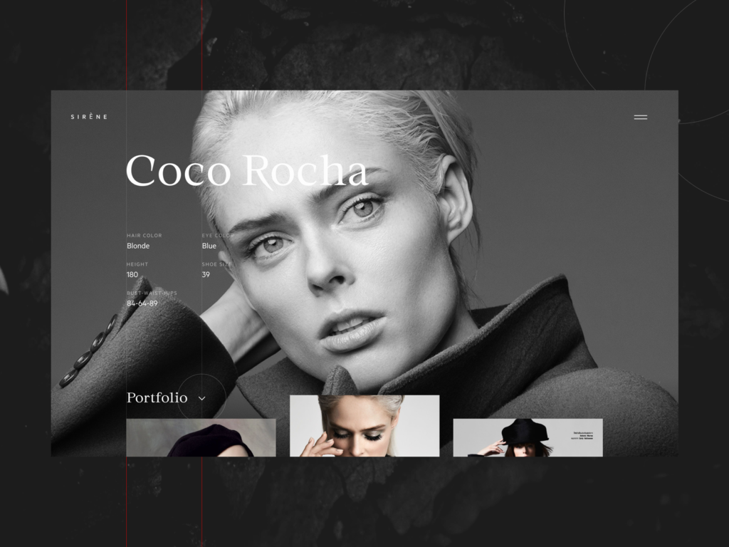
The gallery page of the online architecture magazine features the artistic digital portrait of Zaha Hadid.
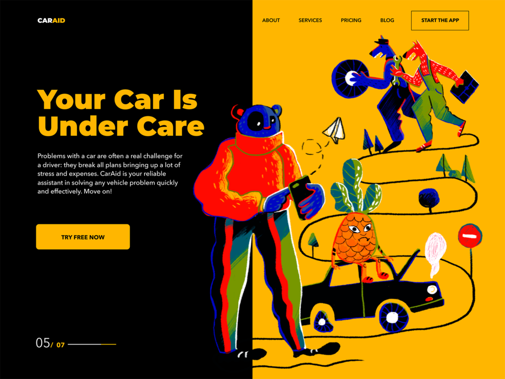
The landing page of the kindergarten uses a big funny and cute monster designed and animated as a hero image to entertain users and set the needed emotional background.
Typography-Based Webpages
Bold and catchy typography as a crucial part of any design concept continues to keep its high presence in web and mobile layouts. It’s even hard to call it a trend as it should be seen as a default and vital part of the UI design process. Designers pay much attention to keeping it not only beautiful but also readable and scannable with typographic hierarchy and choice of proper fonts. Yet, there is a noticeable trend contrasting to the previous one: more and more websites and apps are based around typography as the core of the user experience design and attractiveness, with no images at all. The visual and emotional appeal, in this case, is reached with not only the search for interesting and original fonts but also with animation, color contrast, filled and outline letters in one piece of text and other tricks. What’s more, design approaches now demonstrate deeper care about text content itself and its integration into the layout. For example, informative and catchy taglines have shown growing presence as a part of web interfaces, especially in landing pages.
The website of a construction company features animated interactions and a color contrast with its tagline. The color also works as a way to unite the company logo, tagline, and CTA button into one harmonic system of the layout.
Typography-based home page for the website of the urban digital conference, with catchy animation for the text content.
Transparency Behind Navigation
Many examples in this post feature another popular trend this year: transparent backgrounds for navigation elements. Now designers use a good level of contrast to make the navigation visible and legible, rather than marking out special zones with a different background. Such an approach supports the feeling of the integrity of the layout.
Fashion portfolio website features a transparent header navigation
The ecommerce website selling insects uses a transparent background for header navigation and social buttons in the bottom part of the page
3D Graphics and Animation
In recent years, the integration of various 3D graphics into mobile and web interfaces has demonstrated the rocketing growth. As well as the diversity of styles and approaches. What’s more, many designers move from static images to 3D animation to make webpages and app screens even more dynamic and engaging.
Creating this kind of graphic is quite a challenge that requires specific skills and an artistic eye; it’s also time-consuming. Nevertheless, it’s worth the effort: 3D is always eye-catching, and users never pass it by without noticing it. 3D images are a kind of flexible visual content. On the one hand, they often look photorealistic, which is a big advantage for user interface design: this kind of graphics may save the game in cases when the photo content you need is impossible to get or highly expensive. On the other hand, designers have room for creative experiments and may create non-realistic images, increasing the originality of the user interface.
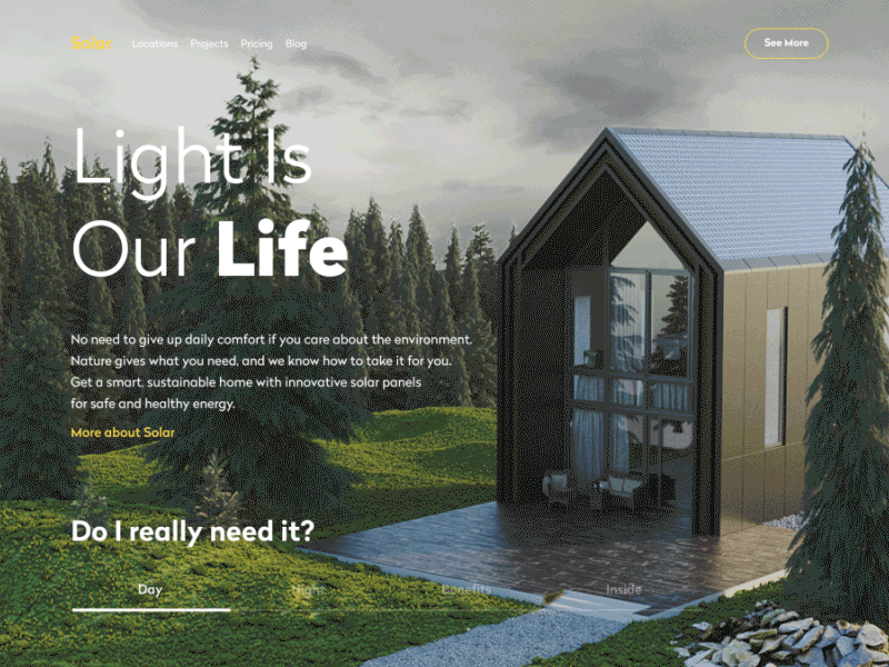
The company’s website for building sustainable houses integrates 3D product visualization in day and night views.
The health blog applies the 3D animation of body parts as the core visual element on the page
The landing page for the flying school features the animated 3D hero image of a plane in low-poly style
The welcome screen of the restaurant app features a complex and realistic 3D animation to engage users from the first seconds of interaction
Full-Screen Background Visuals
Another trend, gaining ground on a wide variety of websites, is full-screen background images. These can be all types of visuals: photos, illustrations, abstract compositions or specially rendered visualizations. The approach makes the screens visually and emotionally appealing as well as informative, as the image instantly captures users’ attention much faster this way. Also, it supports the feeling of the integrity of all the layout elements. However, it requires much skill and effort to find the right contrast and hierarchy of elements and integrate the navigation and text content properly so that the page wouldn’t turn into an illegible mess.
The model portfolio page uses her full-screen photo as a basis of the layout, the navigation and text information are harmoniously put on it and don’t spoil the impression from the photograph.
The website of the company selling hot-air balloon rides uses full-screen theme images as an impressive and catchy background and adds a dynamic feeling of flight with slight, unobtrusive animation.
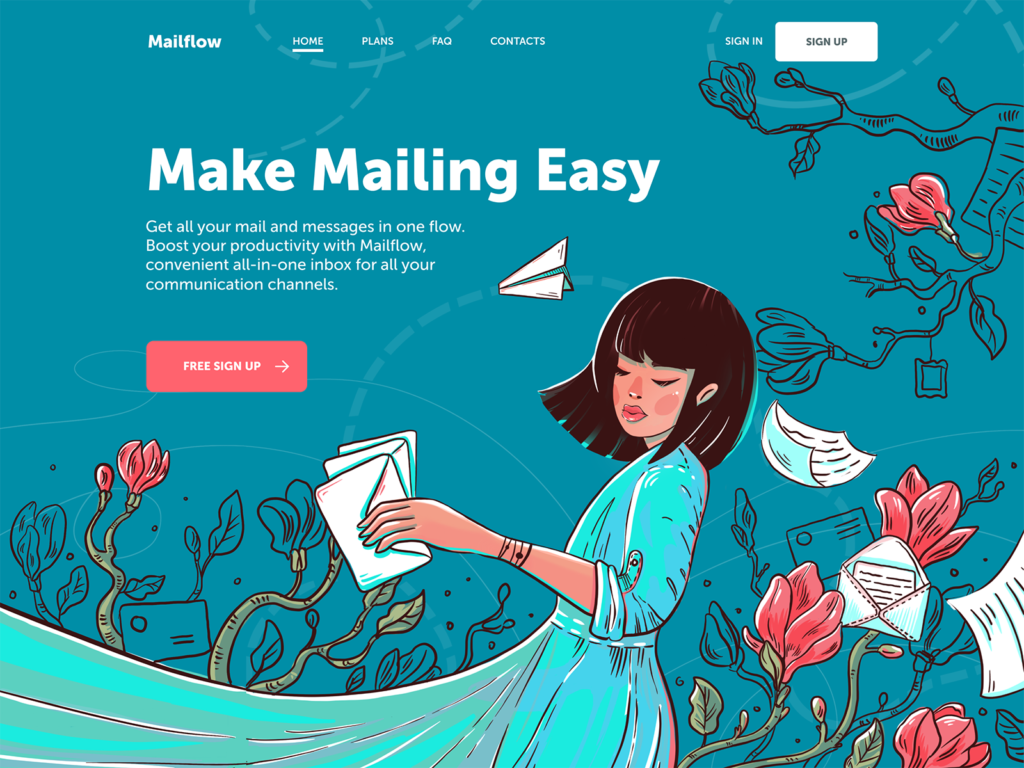
The landing page for the mail management app features a beautiful full-screen illustration with the copy content and a call-to-action button elegantly integrated into it
Video Backgrounds and Diverse Video Content
With nonstop technological advancements in web development, video backgrounds for web pages aren’t seen as a major challenge anymore. As well as integrating diverse video content into web layouts. So, more and more designers now turn to full-screen videos as a way to capture people’s attention, create the needed atmosphere and give an instant view on the product or service that is offered.
Home page design based on a full-screen video about the product and processes for a website of the studio producing custom wedding dresses
Home page design featuring an atmospheric full-screen video for a website of an agricultural holding
Metallurgy plant website applying atmospheric theme video content on the home page
Diverse promo and explainer videos also get a high presence on webpages and mobile screens. In particular, they are helpful for marketing goals and increase brand awareness efficiently. A video works well for attracting customers’ attention and provide them with core information quickly. A video activates several channels of perception — audio, visual, sound — simultaneously and enhances them with the power of storytelling. That makes video content meaningful and memorable, especially if based on high-quality graphic design and animation. People are daily overloaded with tons of information, so most of them aren’t ready to devote much time to learning about products or services. That’s when videos save the game as a dynamic and attractive way of communication.
Minimal Mobile Navigation
In mobile user interfaces, with limited screen space, designers tend to find ways to reduce navigation space and increase space for content. This trend is now the reason for hot debates regarding usability and clarity of interaction design; yet, new ideas arise and take their place.
The bar inventory application focused on interactions with content tabs and minimal navigation
One of the design practices gaining popularity in recent years is experimenting with mobile UI interactions without buttons. This approach saves precious space on the screen for more information, and it is even believed to be the initial step to the virtual interfaces based on gestures only.
The nature encyclopedia app presents interactive infographics for a variety of themes. All interactions with the data are based on gestures, with no buttons in the layout.
Font Experiments and Contrast
No doubt, combining fonts in interfaces is not a trend but a core operation as old and stable as the design itself. However, the recent year was marked with trailblazing experiments in this sphere. With a massive focus on readability seen before, a whole lot of interface designs started looking like twins with the same well-checked font combinations. So now more UI designers are stepping forward to achieve greater originality and fresher looks with fonts. It is especially noticeable in taglines, headlines, brand names, and short phrases, which are usually presented in quite large sizes, so sophisticated or experimental fonts don’t harm their readability.
A product card for the tea ecommerce website features quite an experimental font, making the whole design look original
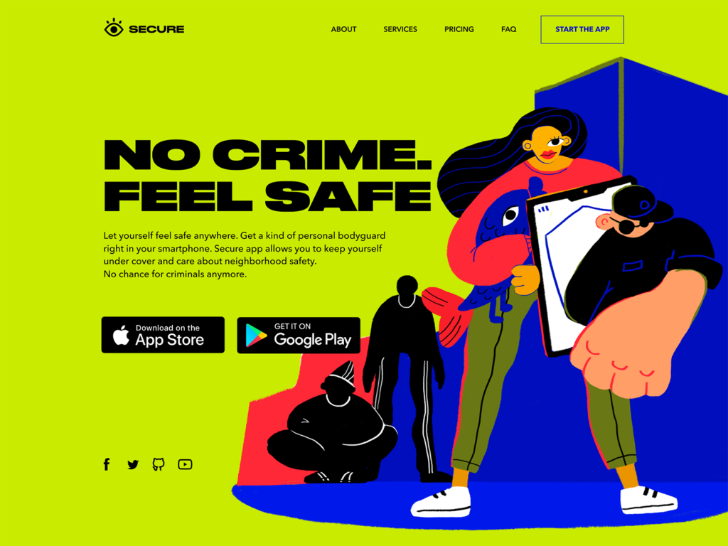
The landing page designed for a security app combines experimental hero illustration with a solid and bold font to create a bright and emotional look
Split Screens
The trend of designing split screens and pages really holds ground for the recent year, getting more and more diverse expressions on websites and apps. This design practice is nothing new – it comes and goes across various design spheres, but now it’s well back and alive. The approach is thought to be effective from a responsive design perspective: it enables experimenting with content variations without losing consistency. In addition, it opens the door to limitless color combinations and experimentation. Split screens are helpful when it’s important to show the duality of options of equal importance.
A landing page for the car security service app with a contrast split screen uniting the parts with a digital artwork visualizing the theme

Split webpage for a food order and delivery service: one part applies the light background, text description and bright CTA button while the other users a tasty-looking meal photo as a background
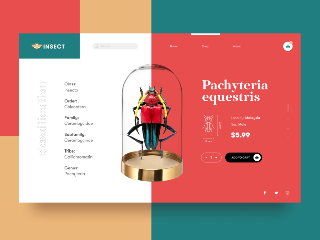
Product page for an online bug store uses a split screen with an informative part to the left and an interactive one to the right, all united with a product image in the center
Asymmetric and Broken Grids
Creative experiments with grids have never stopped in recent years. The custom grid is the way to save the feeling of a harmonic layout and placement of the elements with a higher level of flexibility and originality. In many cases, it’s also the way to rethink the visual hierarchy and draw the visitors’ attention to the needed zones or elements of the layout. Or it helps make consuming much homogeneous content easier. Asymmetry and broken grids are found as one of the ways to reach this goal. However, this sort of creativity requires thorough research and testing, so the effective result often comes through several iterations, tested and analyzed for usability and visual perception.
The gallery app uses the asymmetric grid to present various types of artworks in one beautiful feed
The website for an agricultural holding uses a grid that changes in the process of interaction and makes the interfaces more engaging and visually appealing
Interactions with photo galleries on the MYWONY website features the asymmetric grid to make only one picture in focus but also support the feeling of the big gallery
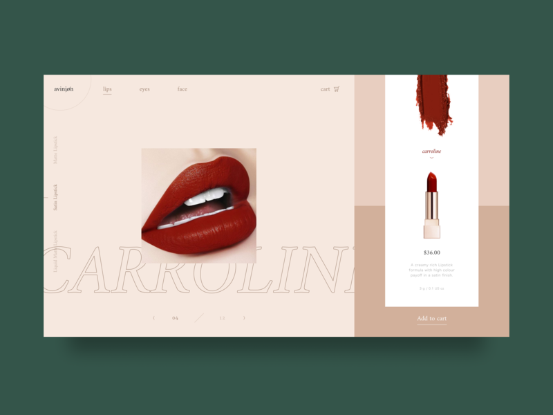
Visuals-Based Ecommerce
Design for the ecommerce interfaces is a special challenge: it should keep a good balance between common well-known patterns easily recognized by buyers and creative solutions that help the platforms stand out from the competition. The trend of this year is prominent, sometimes even overwhelming visuals demonstrating products, and quite small text content blocks contrasting to them.
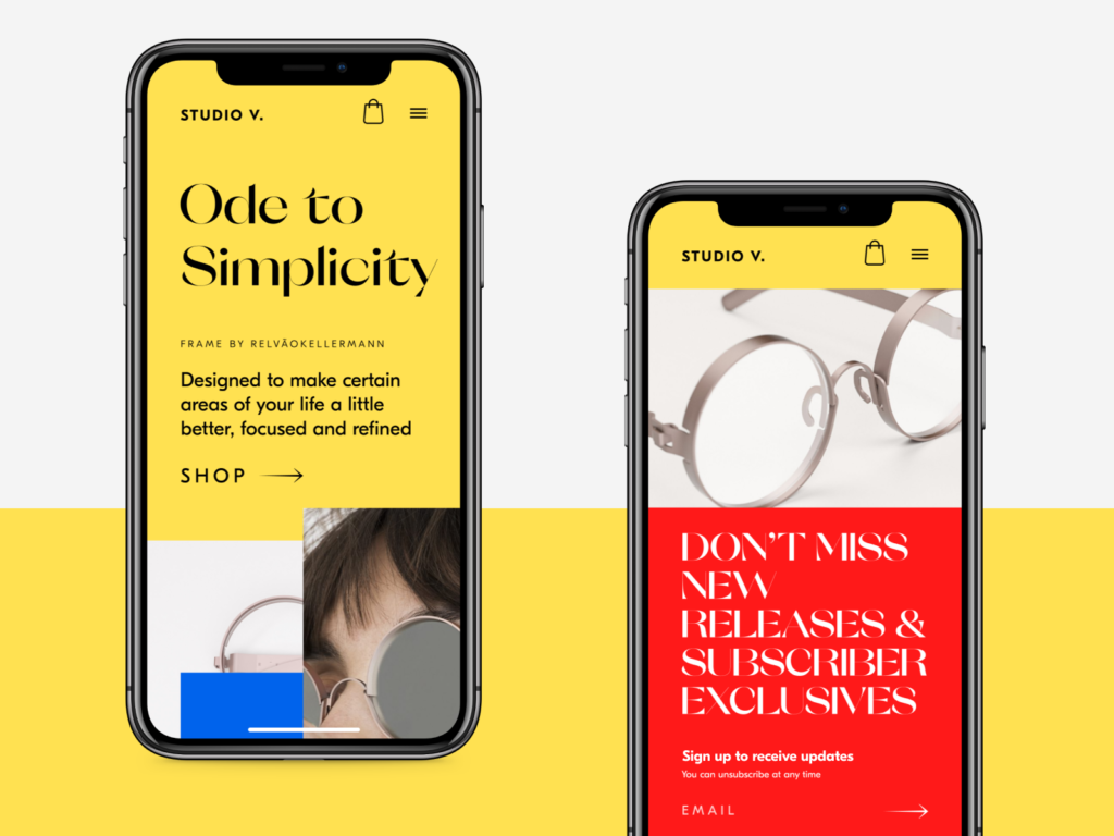
Hero section design for an ecommerce website and its mobile view feature prominent photos in combination with sophisticated typography
The ecommerce platform selling hand-crafted furniture and interior decor features the prominent 3D visualization
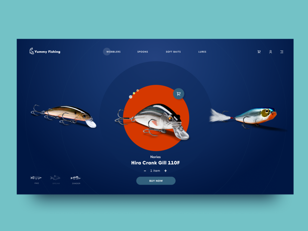
The online store of stuff for fishing is also built around big visuals demonstrating the items
Overlaying Animation
UI designers never stop searching for new ways to make pages and screens engaging. One of the ways to get more and more popular is the animation of several interactive layers that make the scrolling experience original and dynamic, as well as support the integrity of interaction for long webpages or feed screens.
The home page of the innovative energy service quickly grabs attention and conveys its values with a nice animated hero image that makes the scrolling experience feel natural and dynamic.
Experimental Art-Inspired Graphics
As custom illustration has established itself in user experience design and many products and companies now use it, the competition grows day by day. So, illustrators and UI designers are always on the lookout for new solutions and ideas that will take them to the next level of originality. Recently, it evolved into creative experiments grounded in high art. They push the limits of traditional composition and proportions, giving rise to unusual characters, fantastic creatures, and unexpected stories.
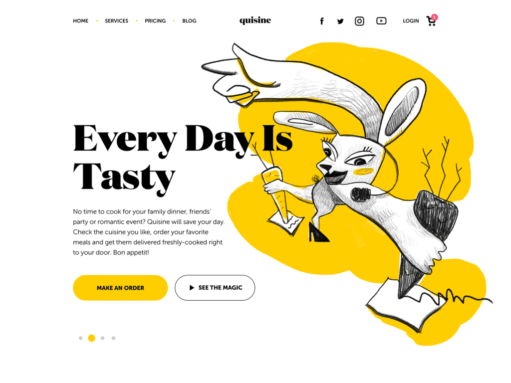
The experimental illustration is used as a hero image on the website for the food delivery service. You may like it or not, but it will definitely catch your attention.
Website design for a small family-run winery features artistic and creatively animated illustrations
Interactive Intro and Onboarding Stuff
Onboarding design is for sure not an invention of today. Still, one of the really hot and rocketing trends of this year is the appearance of diverse introduction projects giving a deeper understanding of the brand, company, or product and supporting their promotion with emotional and catchy storytelling. These can be tutorials, integrated gamification elements and mini-games, cartoons, interactive magazines and much more.
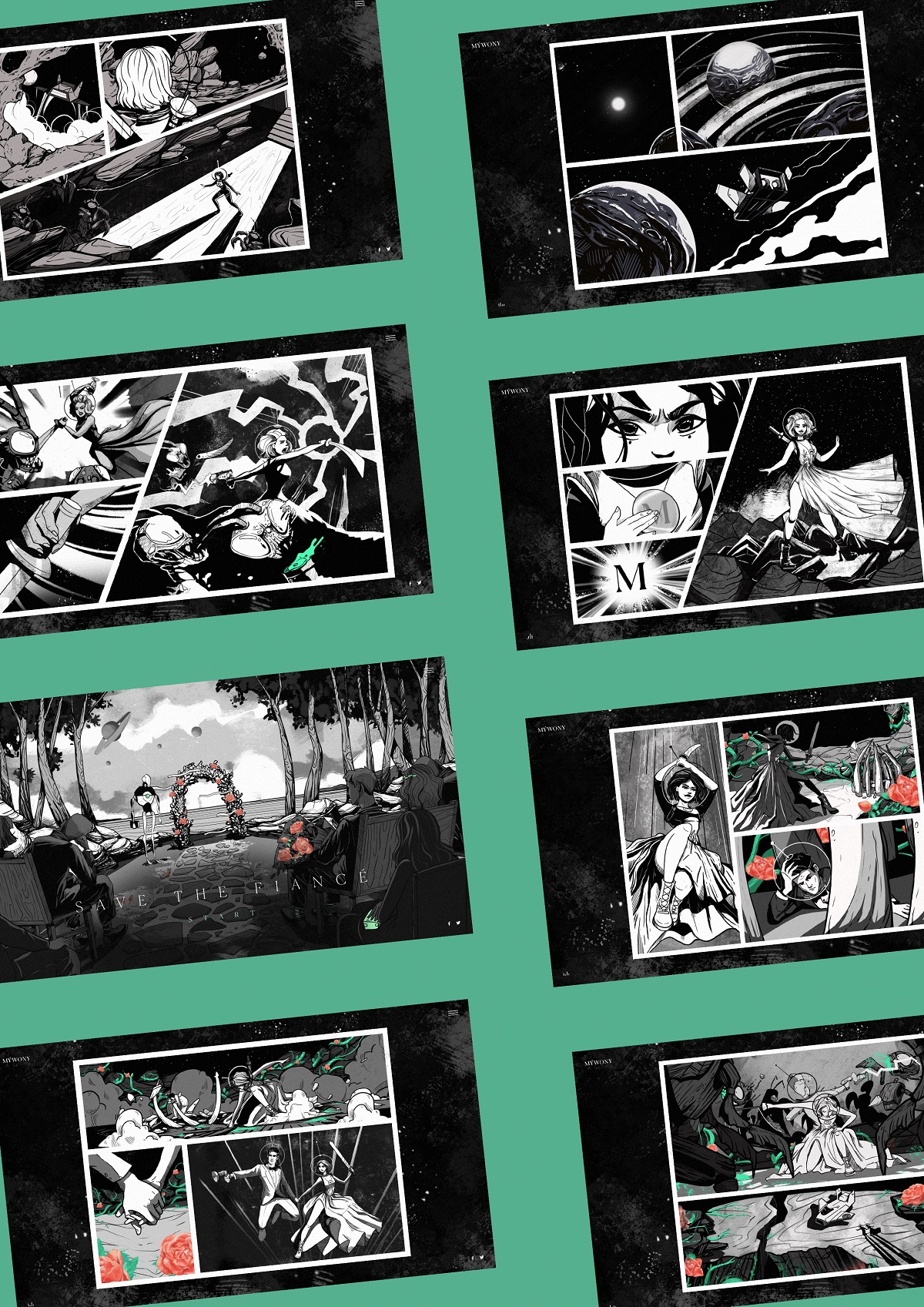
Creative and interactive brand intro for MYWONY, a brand of wedding dresses
Limited and Monochrome Color Palettes
The growing interest in minimalist design for maximum functionality has led to a broad adoption of monochrome UI solutions for web and mobile. The layouts of this kind usually look stylish, harmonic, and non-distractive. However, designers have to invest significant time and effort to avoid making them boring and ensure that all core interaction elements are instantly visible.
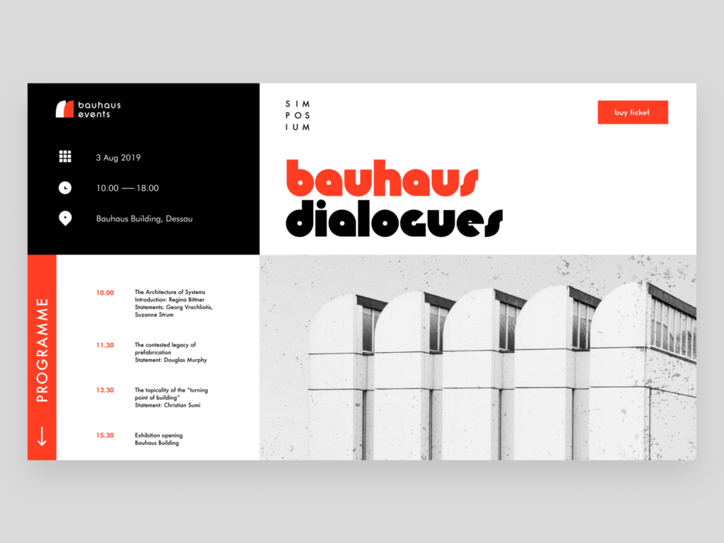
The landing page for an event devoted to the Bauhaus movement features a limited and contrasting color palette that reflects the values and approaches of that artistic school
Design for an online store selling cosmetics and beauty care products features a sophisticated interface in different shades of nude to make an advantageous background for the items
The home page for a web platform on cybersecurity is based on a monochrome layout and catchy, futuristic web animation
User Choice of Color Scheme
Another thing to mention about color is personalization. User interface designers and developers strive to provide more functionality that allows users to customize features according to their personal needs. One of the most popular ways is to give a user the choice of the color scheme they like more for a particular interface. Sure, it takes more time on the design process, but it definitely contributes much to a positive user experience.
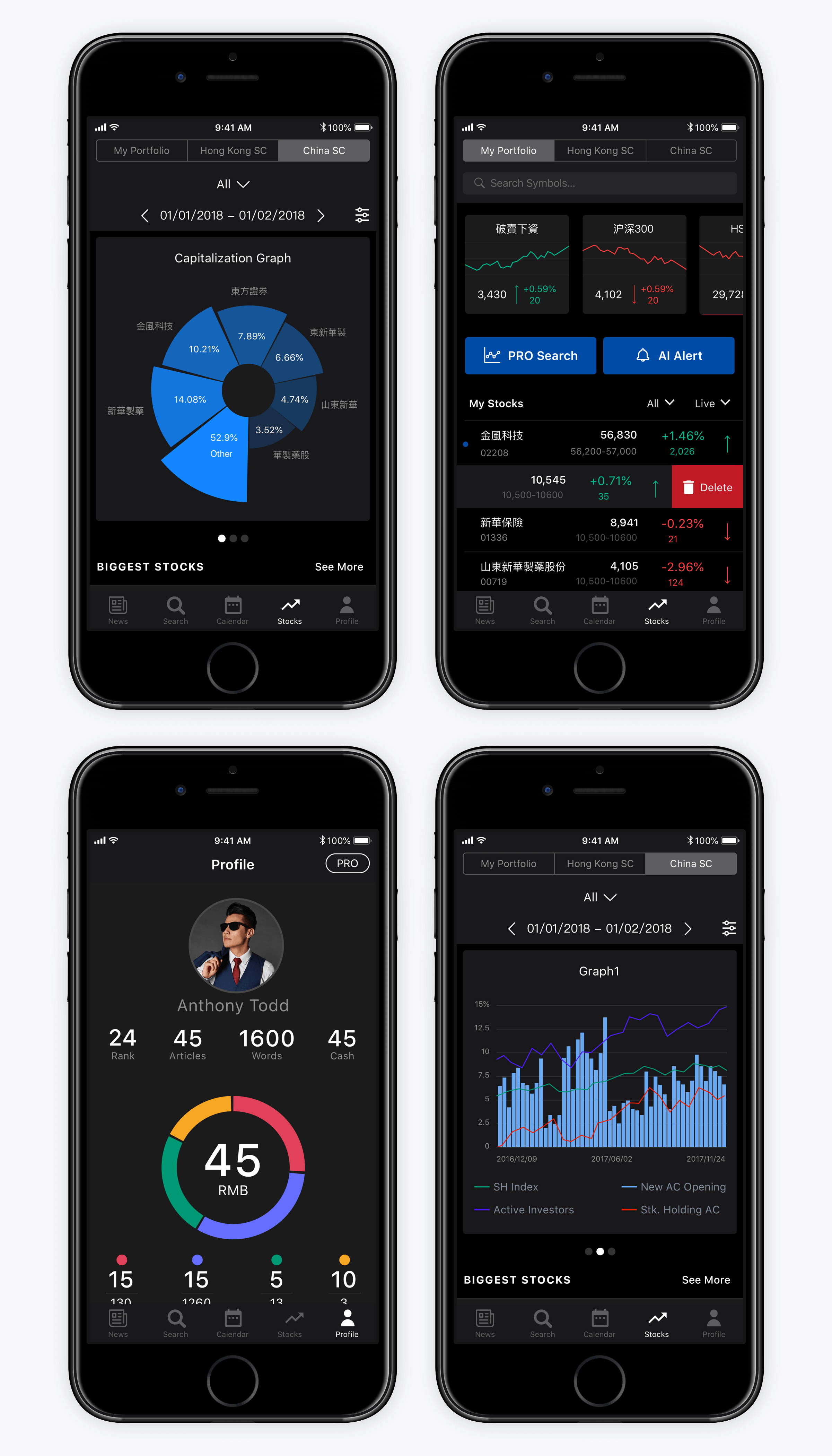
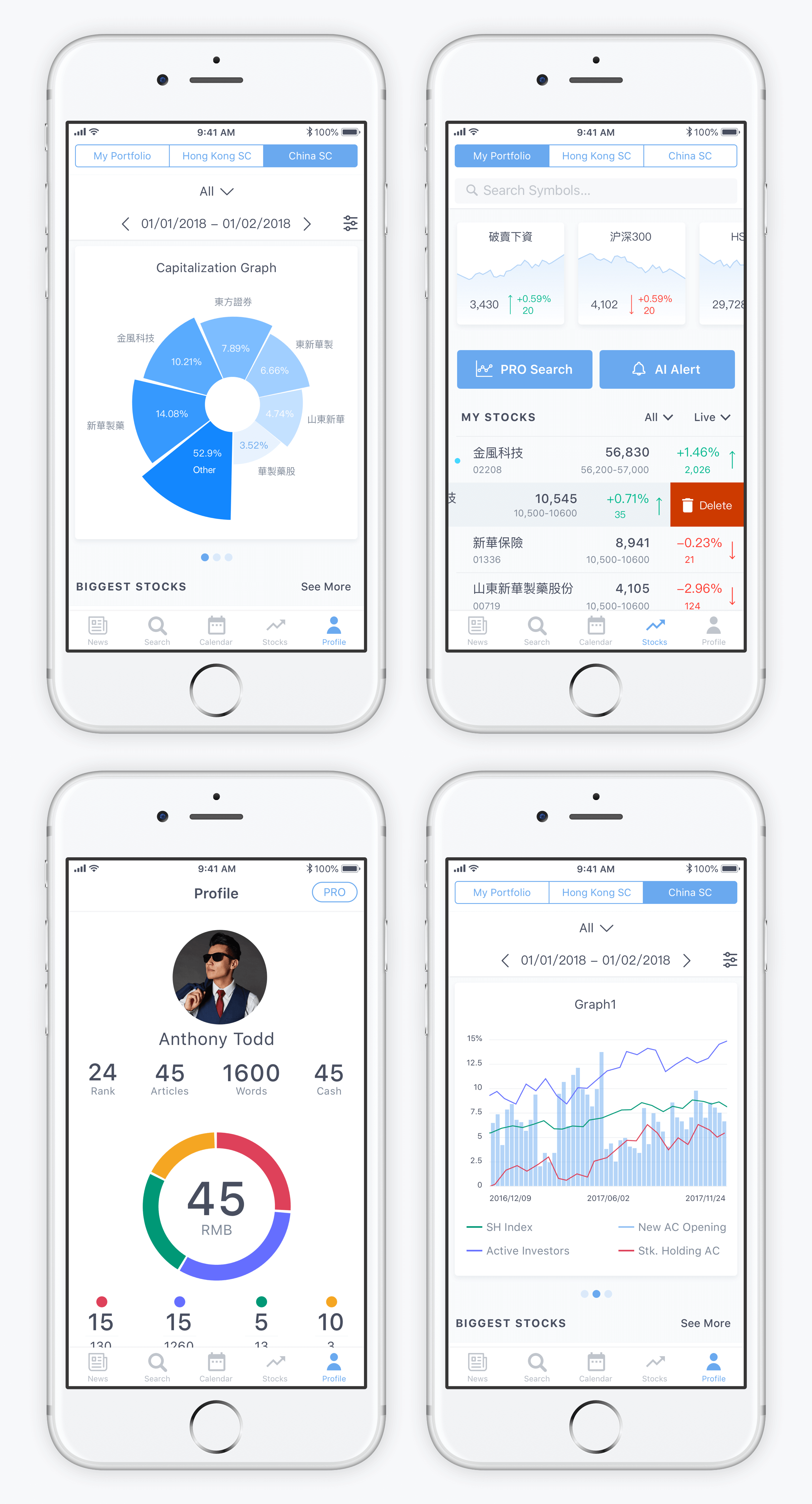
These are screens of a stock analysis app Bitex that offers users the choice between light and dark color schemes
Color Contrast Across Pages or Screens
One more way to apply color contrast for the sake of user experience is by using contrasting colors as backgrounds for different screens within one app or website. This way designers not only add a pinch of diversity into the product but also provide effective visual separation for different kinds of content or various purposes.
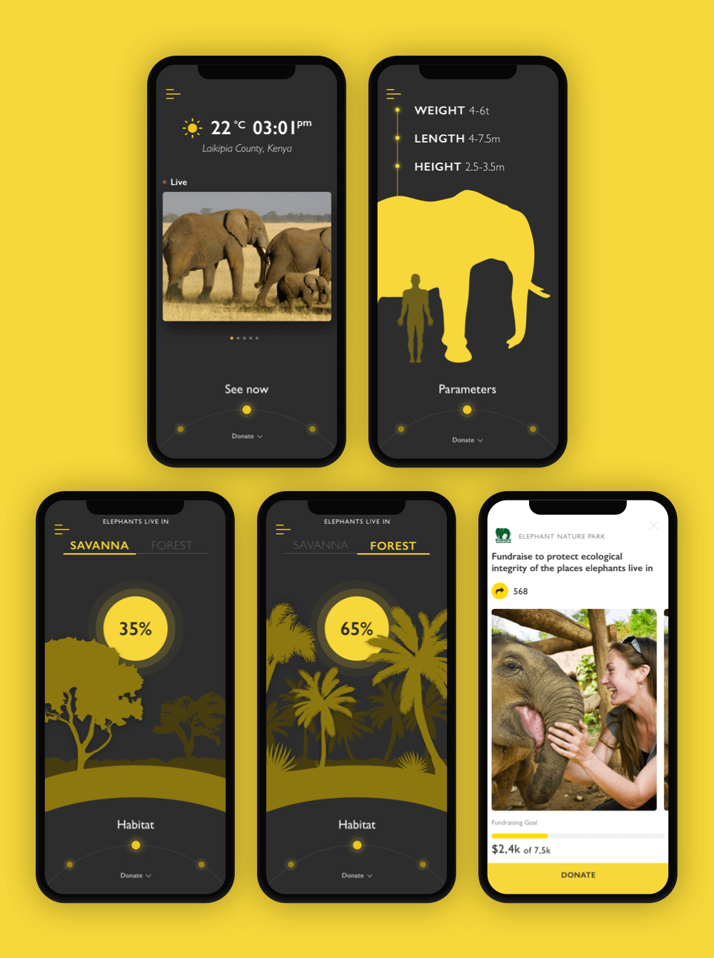
Nature encyclopedia app uses a dark background for encyclopedia screens and a light background for charity screens
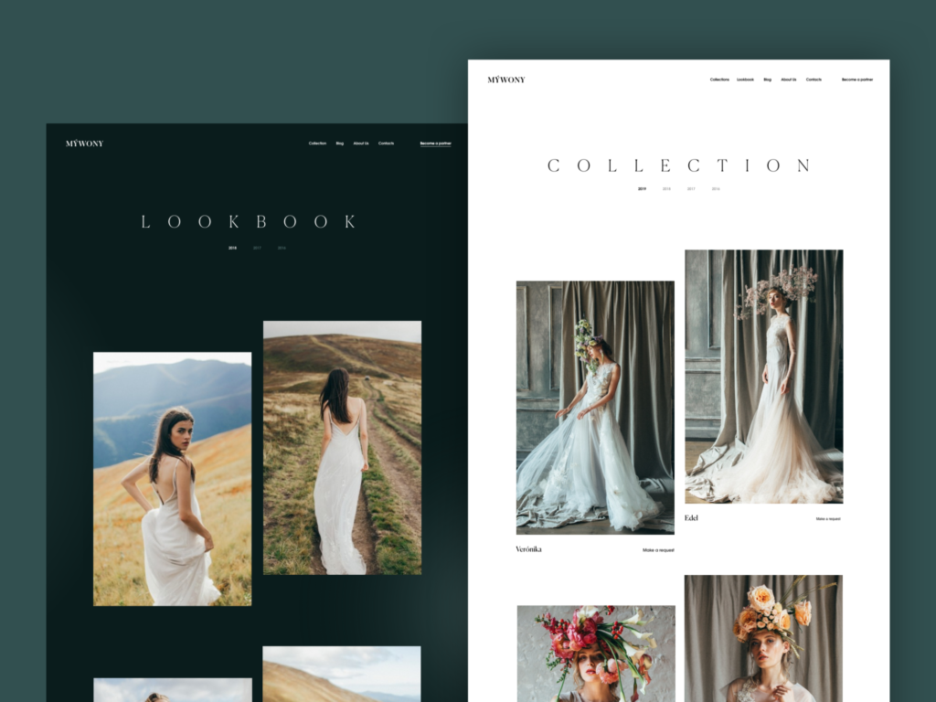
MYWONY website uses a dark background for Lookbook screens and light background for Collection screens
Infographic-Style Numbers
As we mentioned in the article about web scannability, readers subconsciously associate numbers with facts, stats, sizes, and distance — data which is potentially useful. So numbers included in copy catch the reader’s attention while words representing numerals can be missed in the bulk of the copy. What’s more, numbers are more compact than the textual numeral, so it makes the content more concise and time-saving for scanning. One of the trending design features goes even further: it makes the numbers prominent and more noticeable than text as it’s often done in infographics.
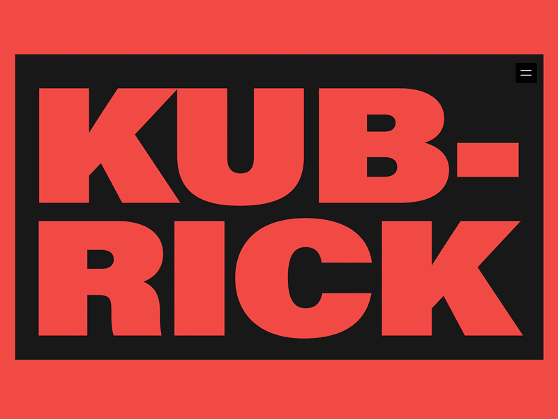
Here’s the design for an award-winning biography website devoted to Stanley Kubrick’s path of glory, life, and creative heritage. Contrast and elaborate typography, as main visual expression tools, are successfully combined with prominent infographic-style numbers that present important dates, milestones, and facts, making the resource informative and easy to digest.
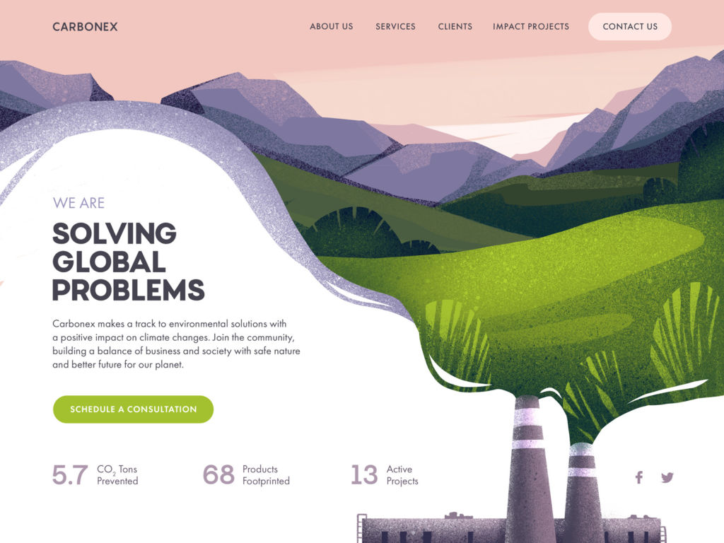
Environment community website sets the visual hierarchy of the home page to make the major information, infographic-style numbers, and CTA instantly visible.
Forms Above the Fold
Although there is much debate about the importance of the above-the-fold, aka pre-scroll, area of the webpage, users still interact with it much more than with everything below. So, some websites and landing pages place interactive forms in this strategic section, often below the website header. This way, the users who are ready to act and complete the conversion without learning more can do it immediately.
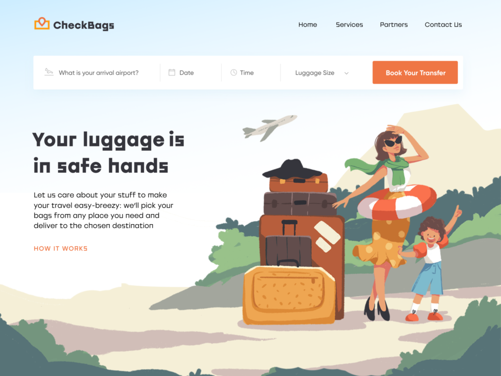
The landing page, designed for a delivery service that takes care of clients’ luggage, delivers it to the destination chosen by the client, features the form right below the header
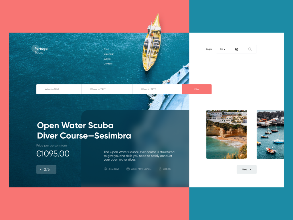
The landing page for the scuba diving courses also features the interactive form of the extended search in the above-the-fold area
In general, it’s easy to see that the global design community continues to build up diversity in interface design. And that is the most user-friendly trend. There are millions of users with different tastes and preferences, and they feel what is convenient and beautiful to them, and now they use apps and websites as part of their daily routine. The more variants we design for them, the wider the range of options users will have to find those that fit their specific wishes. Looking forward to seeing what trends will be found the most popular at the end of the year.
Useful Reading
Here’s the set of articles on more aspects and best practices of user experience design.
How to Make User Interface Readable: Tips and Practices
10 Reasons to Apply Illustrations in User Interfaces
5 Basic Types of Images for Web Design
3C of Interface Design: Color, Contrast, Content
User Experience: How to Improve Web Scannability
Hero Images in Web Design: When, Why and How
Color Scheme for Interface: Light or Dark UI?
Visual Dividers in User Interfaces: Types and Design Tips
Originally written for Tubik Blog
 https://design4users.com/ui-design-trends-web-mobile/
2026-01-18
© by
Marina Yalanska
,
https://design4users.com/ui-design-trends-web-mobile/
2026-01-18
© by
Marina Yalanska
,
- English
- Ukrainian