Profitable Tips for Landing Page Design
Profitable Tips for Landing Page Design The article presents the overview of effective design strategies for landing pages: read how to make the landing profitable and check the examples of modern web UI.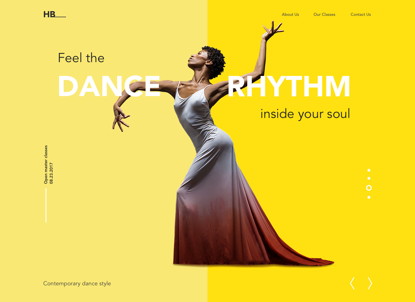
Every traveler knows it’s hard to find a more annoying and upsetting experience than landing in the wrong place. It wastes the precious time and effort on looking for the needed spot right when you are full of nice expectations and ready for the best. No wonder this story isn’t different when users go to a virtual journey around the Internet, especially having particular goals and destinations in mind. So, today let’s discuss how to make their landing soft and effective.
Definition of a landing page
In general terms, the phrase “landing page” was created by analogy with a landing spot in the physical world: on the web, it initially marked any page on which the user “landed” while surfing the Net and started their journey around the website. The phrase is still used in this meaning in terms of web analytics. However, a more specific understanding of this term has become increasingly popular and widely used by not only designers but also marketing specialists. Today, the term is used for a web page designed with a focus on specific, relatively narrow goals and a quick way of accomplishing a particular action.
As for the goals, they can be different. Still, the biggest diversity of landings is found in the e-commerce sphere. This is the field in which they play a great role both for users and stakeholders, presenting the specific commercial offers without distraction in a helpful and attractive way. Creating special pages for every case means giving users directions, which is especially useful for big e-commerce platforms with hundreds or even thousands of items. Directing all the traffic to the home page in the case of such websites can open the big gate to poor user experience, especially when users come from particular marketing campaigns in outer resources. The risk is high that they will get lost immediately in the overwhelming amount of content and links on the home page or their attention will be driven away so the purchase won’t be finalized.
Furthermore, there are also many other cases beyond e-commerce when landing pages present a good point to consider: they can present the mobile applications or educational resources, promote events and meetings, make the announcements, introduce the communities or just share information. Anyway, the design process for any landing page starts from setting the clear and concise aim which should be achieved with its help.
Conversion as a key metric
One of the core metrics for measuring a landing page’s efficiency is conversion. In basic terms, it is the outcome, the achieved goal, which is set for the landing page. Conversion is the transformation of passive users into active, from reading, considering, watching, and comparing to actual buying, downloading, trying, subscribing, etc. Measuring conversions and improving landing pages to get this rate higher is the way to problem-solving design, helping users and supporting business strategies.
As e-commerce presents the highest diversity of landing pages now, the most frequent way of conversion is the actual purchase while the most popular call to action is “Buy”. However, the presence of the Internet in human life is growing constantly and plays a significant part in daily operations on professional and personal levels. On that ground, the variety of conversions also reflects diverse goals – except buying something, users can be called to:
- download the mobile application
- read more about the presented issue
- subscribe to updates
- download a free ebook, templates, graphics, or other deliverables
- start the free or discounted trial of the product
- leave a comment or share the opinion
- share the information with friends and followers in social networks
- browse the educational or informational resource
- fill in the form or survey, etc.
Obviously, conversion, as the finalized action the user is navigated to, is not the only function of a landing page: it is also effective as a general supporter of brand awareness and recognizability, due to the original design or special features, it can even be a part of a viral marketing campaign. Still, the most important outcome of all the effort invested into its creation and maintenance is ultimately measured via conversion rate, with the number of users who actually did the action they were called to.

Design strategies
No doubt, all the design projects are highly individual and require solutions tailored to each case. Nevertheless, on the basis of our diverse creative practice, we have collected a set of general ideas useful for work on efficient landing pages.
Clear goal and structure
The core difference between a website’s home page and a landing page with a specific offer lies in their strategic use. The home page sets the global point of departure, enabling the user to take a variety of routes around the website, while the landing page is focused on one particular aim, which should be effectively presented and easily achievable. Therefore, the first step in designing a conversion page is setting this goal and building the page architecture that guides users to the ways to achieve it.
Targeting
In the article about business-oriented design, we defined targeting as the strategy and techniques of researching the particular target audience to find the best and the shortest ways to attract their attention to the specific product or offer. A landing page is an effective marketing tool when it’s based on the needs, preferences, and expectations of the target audience. Even more, these web pages allow companies to set multiple landing spots for various target users on the basis of:
– geographic targeting
– gender targeting
– psychographic targeting
– demographic targeting
– behavioral targeting.
There are many practical cases when companies changed some parts of the products, their names or even set the new brands to sell successfully in different countries with a diverse cultural background. The same can be done with landing pages: for example, the page offering the same smartphone can look and talk differently to the users from different countries, taking into account their perception of colors, copy, priorities in product features, and trends on the local markets.
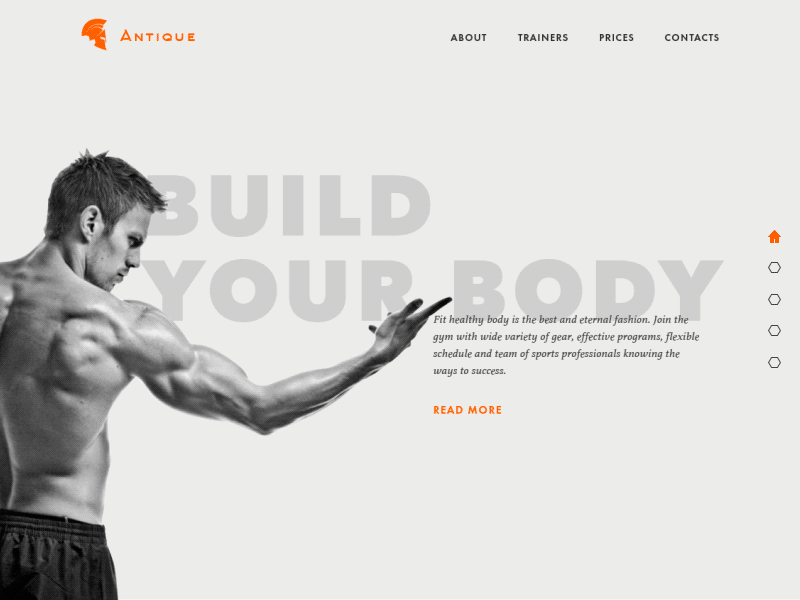
Gym Landing Page
Functional minimalism
Getting back to the metaphor with the physical landing of an aircraft, it’s hard to imagine how it could safely land on the place which is heavily stuffed. For soft landing, a clear spacious spot is a vital condition. For landing page, it works the same way: attempts to overload it with everything bring to a negative result. In most cases, minimalist design based on core functionality and visual elements easily navigating the user to the CTA proves itself a good approach.
Maximum attention ratio
The attention ratio is the level of concentration on a particular task or goal. No need to explain that for a landing page is should be as high as possible. Too many elements of interaction will provoke distraction, lowering the chances of conversion: the more options users have simultaneously, the harder it is to make a choice.
Instantly visible call-to-action elements
CTA or call-to-action element presents the most valuable interaction element of a landing page as it is actually the spot where conversion happens. It should be instantly visible, which can be done via color or shape contrast, and informative, which is usually achieved with proper copy or icon, or both.
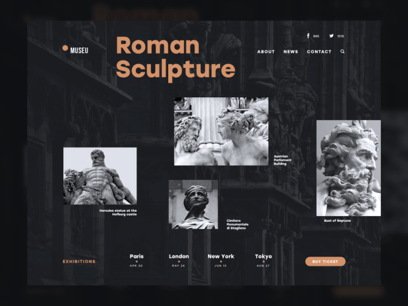
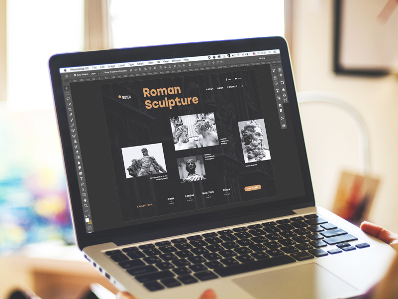
Museu landing page
Harmonic color palette
Colors and shades chosen for a landing page are not objects of the designer’s creative self-expression: they are as much influencing the conversion rate as any other design element and sometimes even more than others. It’s not just aesthetic satisfaction that users can feel from the presentation, but also the hidden message that can be conveyed through traditional associations in color perception. So, colors should present a combination that is pleasant to the user’s eye, emotionally appealing to the target audience, and that establishes an effective visual hierarchy for the layout.
Corresponding typography and good readability
As well as colors, fonts also tell much not only with the copy hidden behind them but also with associations and emotions they bring out. Typographic hierarchy and well-balanced font combinations have a significant impact on page readability, which can directly influence conversion rates. A landing page is not the spot where users are ready to spend much time, so poor readability can drive them away before they make a decision or understand if the offer corresponds to their needs. Being an integral part of the general stylistic concept, appropriate fonts can also contribute much to effective visual performance, catching users’ attention.
Strong and consistent branding
Landing pages are widely used as part of a web marketing strategy, so they should support the general scheme of brand promotion. Coming from outer resources, social networks, and advertisements, users need to feel and see the consistency of the brand image to be ready to trust it. So, identity elements like logo, slogan, mascots, corporate fonts, and colors should be taken into account.
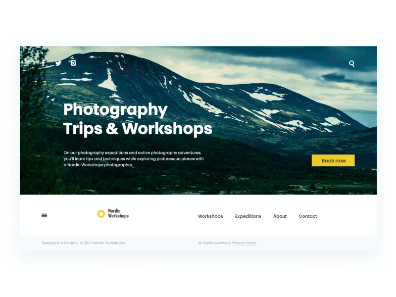
Photography Workshops landing page
Prominent theme image
No secret, most users are visually driven, and they scan a web page in a couple of seconds, perceiving images much faster than text. An appropriate theme image, be it a hero banner, original illustration, high-quality photo presenting a product or service, is a good way to attract users and get them interested as well as inform them about the nature of the promoted offer. Images of this kind save users time, convey a quick, appealing message, and add much to the presentation’s aesthetic.
Engaging and attractive scroll animation
Although there is a big army of those who find animation an unnecessary feature overloading the user interface and making it more complicated, most users expect motion as an integral part of the interaction experience. A scroll animation applied wisely can add life and style to the landing page and become another attractive feature, stimulating positive emotions. Also, motion creates the feeling of a single, seamless interaction across a whole page rather than several separate parts.
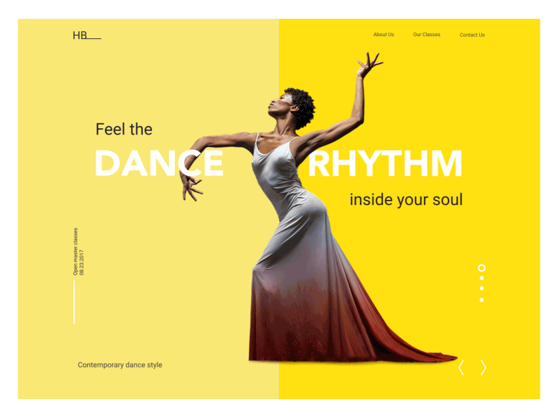
Dance Academy landing page
Visual hierarchy of copy content
Copy content is another aspect that has to be well thought out. A designer’s task here is to think about edible copy presentation framed into a clear visual hierarchy: sizes and placement of copy blocks, instantly scanned headlines and short concise call-to-action elements directly influence the level of conversions. The length of copy on landing pages is a debatable issue: focused goals behind the landing page don’t always mean that it should always contain a minimal number of words. If it presents a famous company product or service or informs about special offers, short and strong copy can be enough to encourage users. However, if a new, unknown product or service is presented, it is often useful to provide users with more information, persuading them to follow the call to action. Anyway, the presentation of the copy has to be designed for good readability and page scannability.
No information overloading
Based on the previous points, the creative team working on a landing page – designers, copywriters, marketing specialists, etc. – should agree upon the priorities and define the core benefits users must see. Trying to overload the page with all the possible data about the offer can leave them feeling overwhelmed, leading them to hesitate or even get annoyed. Core information fields included on the landing page usually cover:
- the general introduction of the presented offer
- concise and informative description of the benefits solving user’s problems
- testimonials and signs of trust
- clear call to action.
If the offer is quite complex and it’s hard to describe all its benefits shortly, the good solution can be found by dividing the page into several theme blocks with separate interactive elements ( buttons, fields, links, etc) enabling users to get further information or help quickly but on the other page.
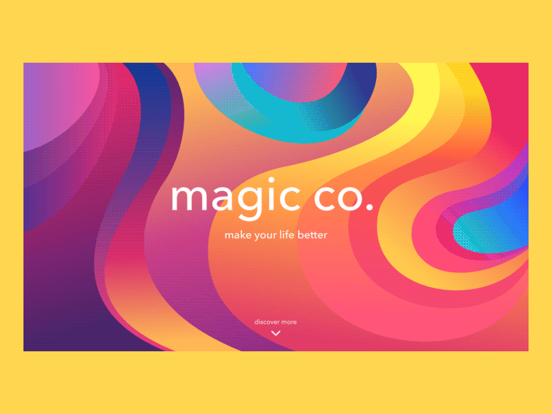
magic.co landing page
Promotional video
In one of our recent posts, we shared insights into the benefits of short promotional videos for product and service presentations. The big advantage of this technique is the high speed of perception, emotional feedback, and big informative potential of the video in comparison with copy. On the other hand, creating the video can be more time-consuming and require a bigger budget, so the efficiency of this element should be analyzed from a business perspective to see if it’s really profitable for every particular case.
High loading speed
None of the mentioned strategies will work properly if the technical side of the interaction is neglected. Whatever stylish, sophisticated, and informative is the landing page, it won’t make users put up with waiting while it’s loading. The matter here is really in short seconds, without any exaggeration. So, optimization of the images, the thoughtful technical realization of motion effects, quickly loading video, and fast transitions, if they are applied – all of these and similar factors can have a crucial impact on conversion rates. Respect the users’ time, otherwise they won’t be quick to trust you.
Obviously, the presented list doesn’t mean that all the mentioned strategies should be applied together on every page. Each project demands an individual approach based on rigorous analysis of the target user expectations, needs, and preferences combined with business goals. When the page is live, A/B testing and analysis of real interactions open new perspectives and prove if the designer’s initial decisions were appropriate for the established aim.
Landing page vs Home page
Should all traffic from external sources be directed to a home page or to landing pages? We have already shared our ideas with the set of strategies for the home page design. The answer considerably depends on the nature and complexity of the website. The issue to consider is the user’s attention and its concentration on specific areas of the website to solve a particular problem or satisfy particular needs.
For simple one-page websites, this question is not relevant: indeed, they represent only a home page that satisfies one or multiple functions, and there is no other place where the traffic could be directed from external sources. The same happens if the website is not complex, the homepage is not overloaded with diverse links and navigation elements, so conversion can be reached right from the home page, while other pages play secondary roles. In this case, directing all the traffic to the most informative part of the site, which also enables a user to accomplish necessary actions and get what they need, is a good idea.
However, for complex websites and platforms, especially if they satisfy multiple needs of a broad target audience, this approach can be the step that kills profitability and reduces conversion rates. The user can get scared, distracted, or even annoyed with the tons of information they have to get through to find what they need, especially if the needs or wishes are focused on a particular narrow goal. Using landing pages in the case when you need to concentrate user’s attention on something important, to make it noticeable and easily available can be an efficient way of solving this problem. A landing page is a tool to emphasize one item, to make it quickly found and reduce delays in cases when target user seeks for specific operations, services or items. This is the issue of especially high importance in the case of e-commerce websites when unwise design solutions bring to poor user experience and financial losses. The choice of a profitable approach in every case should be based on user research and then thorough user testing.
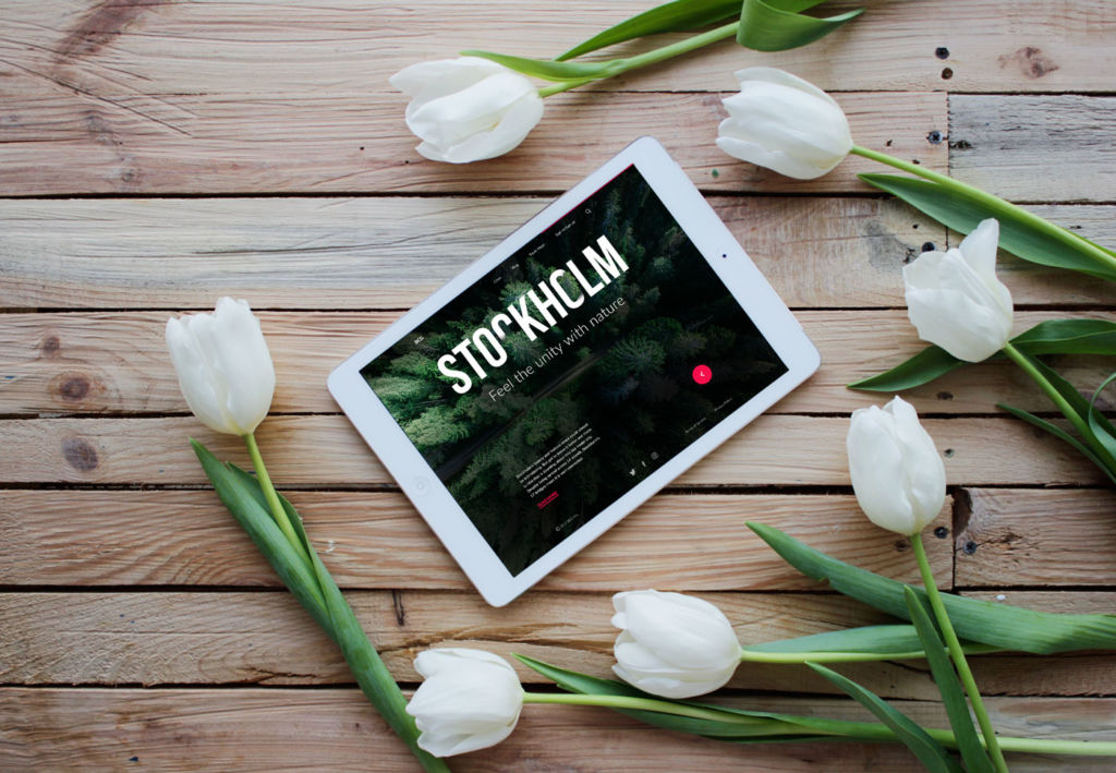
Big City Guide landing page
Recommended materials
Various issues with landing pages have been the subject of professionals’ attention. In terms of design issues, here’s a bunch of articles for those who would like to continue the topic exploration:
Landing Page Optimization: The Definitive Guide to Testing and Tuning for Conversions
Landing Page Conversion Course (9 parts)
Classic landing page mistakes you’re probably still making
Landing Page. Direct Flight to High Conversion
The ultimate guide to designing landing pages that convert
What Happens When You Analyze 100 Landing Page Examples?
10 Key Landing Page Features That Draw in Prospects
7 Landing Page Call-to-Action Formulas for Higher Conversions
Want Conversions? Start with User-Friendly, Useful Landing Pages
Originally written for Tubik Blog
UX Design Articles
Here’s a bunch of articles to dive deeper into the theme of usability and user experience design.
5 Basic Types of Images in Web Design
The Anatomy of a Web Page: Basic Elements
6 Elements of Efficient Company Website Design
UX Practices on Product Page Design
How to Design Effective Search
Web Design: 17 Basic Types of Web Pages
Guide to 6 Effective Types of Web Animation
Directional Cues in User Interfaces
- English
- Ukrainian