Color Scheme for Interface. Light or Dark UI?
Color Scheme for Interface. Light or Dark UI? The article about basic aspects of choosing efficient color scheme and balance of light in dark enhancing usability of user interface.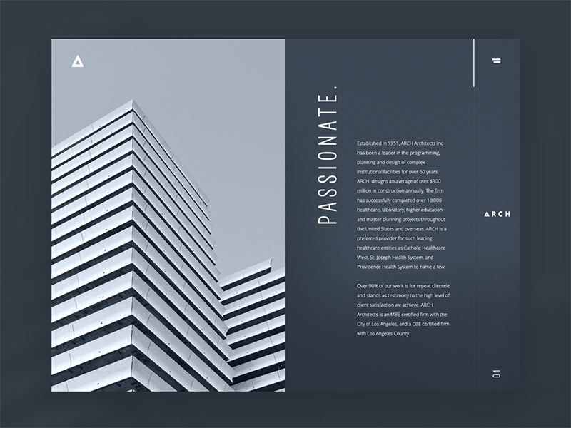
In one of the previous articles, we have already mentioned that the issue of color is one of the major issues in the design of user interfaces. It can significantly affect the usability and attractiveness of a mobile application or website. One of the first questions designers typically face is which general color scheme to choose: dark-on-light or light-on-dark?
Here, we will consider several key points regarding this significant stage of UI design.

Aspects affecting the choice
Lots of discussions are raised here and there about the color scheme, which is more effective in creating good interfaces. Although lots of participants in this big debate try to find a universal solution, here in Tubik, we suppose the cure-all does not exist. Every project in UI/UX design is highly individual and needs a thoughtful approach weighing all pros and cons.
Several vital considerations should be taken into account in the initial stages of selecting the overall color scheme for a website or application.
Clarity
This aspect should include the user’s ability to clearly see and distinguish all necessary details on the screen or web page. The color scheme and combinations should support easy and intuitive navigation and make the most functional elements of the layout stand out effectively. When this aspect is not considered or not tested properly, it can lead to products that make a complete mess on the screen, making it difficult for users to see what they really should. One way to assess it is to use the widely used “blur effect”: look at the screen or page in blurred mode and check whether everything vital is readily and quickly visible.
Readability
The choice of screen background usually influences readability, defined as users’ ability to read text easily. This aspect should be considered among the first, especially if an app or a website is text-driven. Poor readability is the primary reason users miss important information or experience inexplicable tension when using the product, as the text is difficult to read and requires considerable effort. No need to say that lack of readability can be a serious reason why users are not retained, even with attractive products.
Accessibility
In the field of UI/UX design, accessibility is often defined as the product’s ability to reach as many people as possible. That means that the decision “to use or not to use” should be mostly based on users’ needs and wishes but not on their physical abilities. Color scheme issues are among the main factors affecting this aspect. Taking it into account, designers should think over the users of different ages, special needs, and disabilities, which can also determine the choice of color for the background and layout elements.
Responsiveness
Designing app screens or web pages, it is also important to remember that users are going to use the product on different devices. That can have a crucial effect on usability, as often what looks slickly stylish, attractive, and clear on the high-resolution professional monitor can transform into a dirty stain on the small, low-res screen. In every project, designers should take their time on checking their solutions on different devices and in various resolutions: that simple step enables to reveal the problems and fix them on the early stages of design. Color scheme, certainly, influences this issue.
Environment
One more thing to consider while choosing the appropriate color scheme and the type of background is the potential environments in which users are going to use it regularly and frequently. In terms of constant use under natural light, a dark background can literally create the effect of reflection, especially on glossy screens typical for tablets and smartphones. On the contrary, in terms of regular use in a badly-lit environment, a dark background can take the light away from the screen, which has a bad influence on navigation and readability. So, the issue of color combinations, contrast, and shades draw big attention here.

Therefore, as we can see, choosing the appropriate background color for the layout is a vital step affecting such a key characteristic of any product as usability.
Steps to follow in choosing the color scheme
Here is the short checklist of basic things to follow, making solutions on the general color scheme.
Clearly define the aim of the product
It is very important to define the most important useful points of the product, which are going to solve the user’s problems. This data will determine what kind of content drives your product.
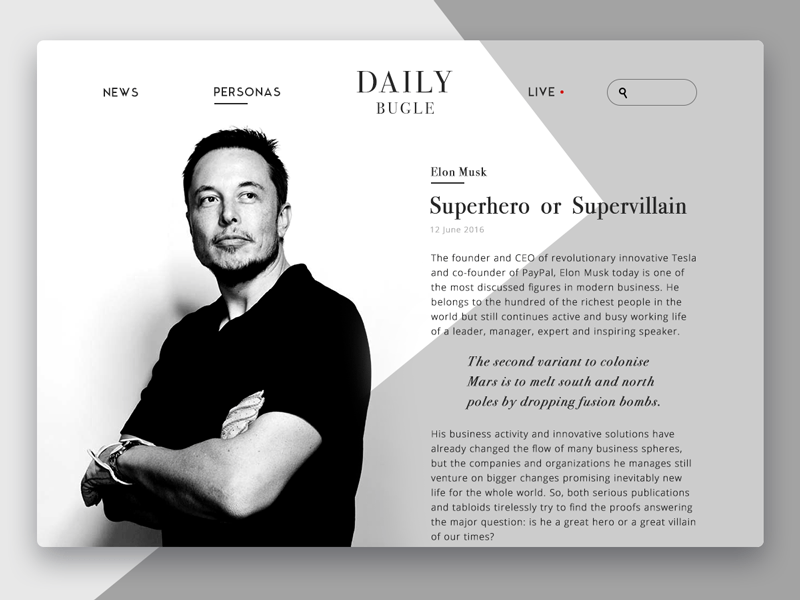
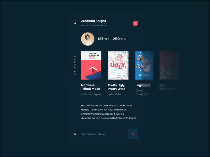
If it is text-driven, such as a blog app or e-reader, perhaps a light background would be a better choice. Light creates the impression of a more airy, spacious screen or page, making it easier to concentrate solely on the text.
Online magazine
Blog App
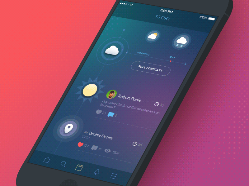
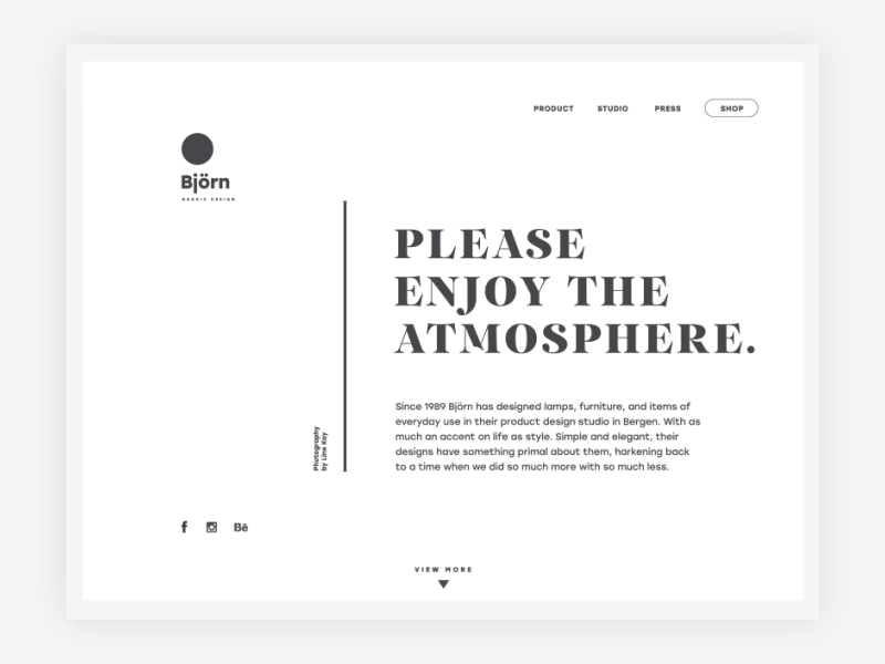
However, if your product is visually driven and moves around images rather than text, a color scheme with dark or bright background for the interface can become an efficient solution as the colors of the images can feel deeper, and the general layout, if accomplished properly, can get stylish and sometimes even luxury look.
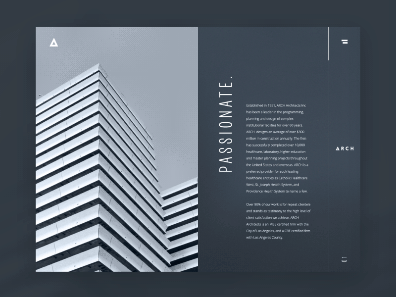
Architecture Company Website

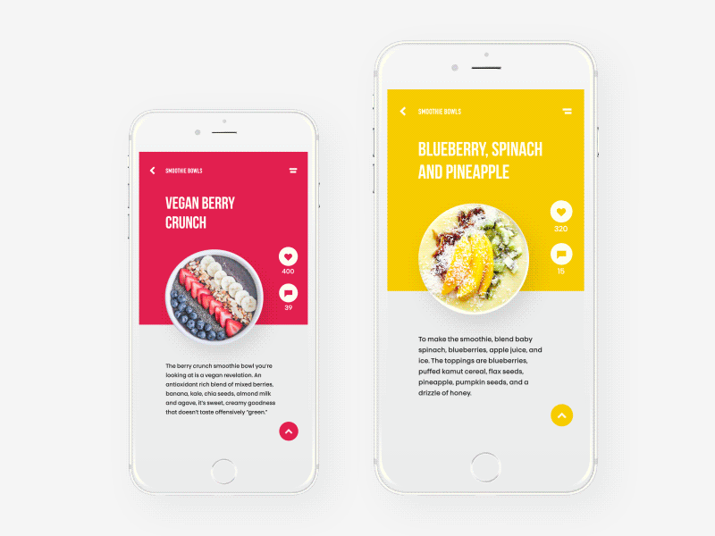
Seafood Recipe Website
Analyze your target audience
As we have mentioned plenty of times in our previous articles, defining and analyzing the target audience is the first thing designer should do to work on effective design solutions. Knowing who is your potential user and what they will want to get from your product is the solid basis for a helpful, usable, and attractive interface. Middle-aged and older people tend to like interfaces with light backgrounds as they find them more intuitive and navigable. Younger people can find well-performed interfaces with a dark background more original and stylish, and it can be the way to involve target users. Teenagers and children can be attracted to thought-out interfaces using bright backgrounds and funny details. Certainly, it deeply depends on the nature of the product functionality and content; however, typical preferences of the target audience can also be a good clue to efficient decisions.
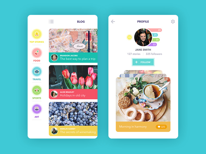
Social Network App
Book swap app
Ecommerce Website
Research the competition
One more thing to remember is that your product is not going to be the only one on the market. It is going to participate in great and dynamic competition the prize in which is popularity and users’ attention. The choice of color scheme can be the way to make a product stand out of the crowd that can be crucial to enable the first wish of interaction from user’s side. Time spent on researching the existing products in the sphere can save much more time and effort in redesigning of ineffective solutions.
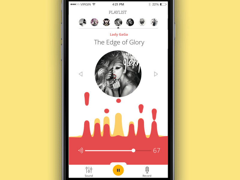
Music Player App
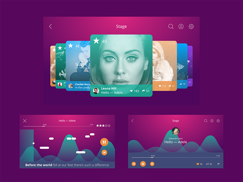
Karaoke App UI
Test as much as possible
All the aspects mentioned above should really persuade in one key thing to do: as the color is perhaps the most important tool affecting the level of usability and attractiveness of the product, every design solution should be tested properly, in different resolutions, on different screens, and under different conditions. Testing proves the strong and weak sides of your choice before the product goes out on the market, gets discussed, and loses the chance of a stunning first impression in case of inefficient design solutions.
Healthy Food App
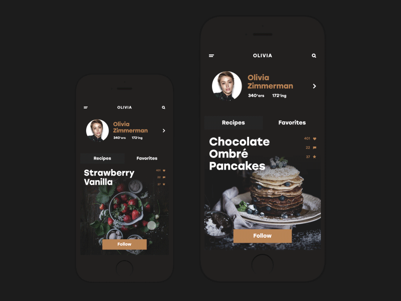
Social app: cooking and recipes
Useful Articles
Here’s a set of articles on more aspects and best practices of user experience design.
Error Screens and Messages: UX Design Practices
Visual Dividers in User Interfaces: Types and Design Tips
Directional Cues in User Interfaces
How to Make User Interface Readable
Basic Types of Buttons in User Interfaces
Negative Space in Design: Practices and Tips
How to Make Web Interface Scannable
UI/UX Design Glossary: Navigation Elements
Originally written for Tubik Blog
 https://design4users.com/color-scheme-for-interface-light-or-dark-ui/
2026-01-12
© by
Marina Yalanska
,
https://design4users.com/color-scheme-for-interface-light-or-dark-ui/
2026-01-12
© by
Marina Yalanska
,
- English
- Ukrainian