8 Typography Tips For Designers: Make Fonts Speak
8 Typography Tips For Designers: Make Fonts Speak The article devoted to the theme of UI typography: read the collection of tips about making typography functional and harmonic in user interfaces for web and mobile.
Typography is a way of communication with users. Visual performance and readability of copy in digital products significantly impact user experience. One of the guru graphic designers, Hoon Kim, once said: “Typographic design is visible as well as audible. If you have a great scenario, it is time to cast good actors.” Typography can become a voice of design. Appropriate typography speaks for itself setting the right mood and transferring a certain message to users. Today’s article presents tips that will assist you in creating effective typography.
Typographic hierarchy makes things work
To create a design pleasant for users’ perception, all its elements should be well organized and clear to navigate. Designers set a proper structure by establishing a visual hierarchy. It organizes all the visual elements so that users could easily perceive content.
Visual hierarchy can be divided into different parts. One of them related only to the copy elements is called the typographic hierarchy. It aims at organizing copy content by dividing it into various types such as headings, subheadings, body copy, captions, and others. The differences between the types of copy are set by regulation of family, sizes, width, and colors of fonts.
Clear typographic hierarchy makes text legible and easy to scan. Moreover, it’s simple to highlight key parts of the text to draw users’ attention and hitch them to the expected actions.
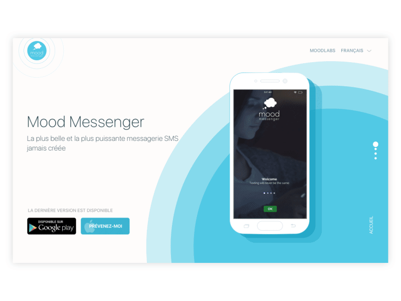
Mood Messenger Landing Page
Consider context and audience
When choosing fonts, an essential consideration is the copy’s context and the potential audience. Each font brings its own mood to a layout. There are friendly, funny, serious, business, and many other fonts that will fit a certain design.
Before you choose a font, you need to learn your client’s goals as well as needs and preferences of a target audience. Visual performance of fonts influences the first impression users to get from the product. If the kind of font doesn’t fit the mood that the product aims at, there can be a misunderstanding with the audience. For example, if a designer chooses a font that looks too fun and silly for a business website, users will hesitate if the company is trustworthy. Or, if a product is meant for youngsters, too formal fonts may seem boring.
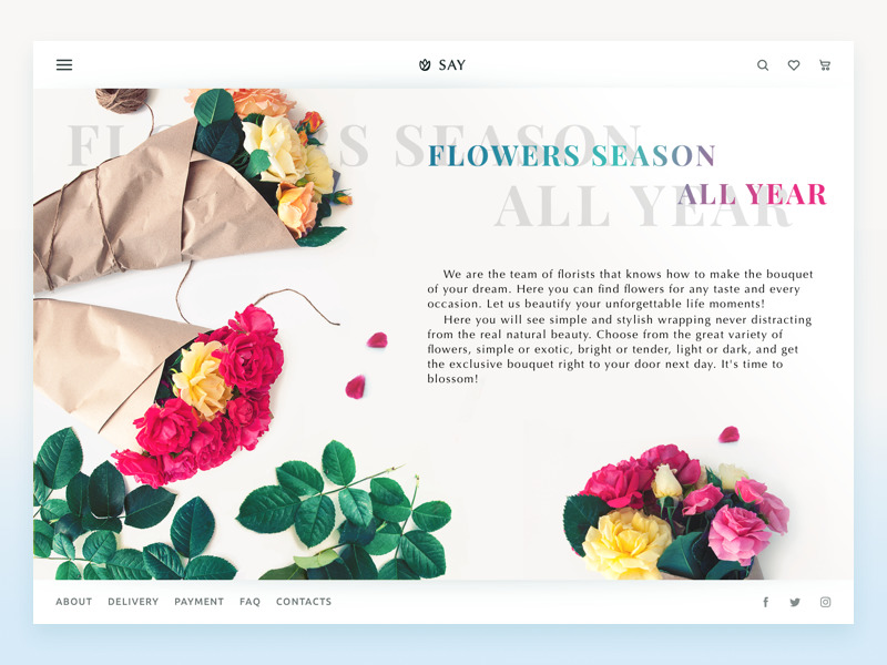
Florist E-Commerce Website
Deep attention to mobile typography
Designers often experiment with typography to make a project more original. However, when it comes to mobile UI design, typographers are literally short of space. Mobile screens are quite small, which poses a new challenge for designers to work within restrictions without losing sense and functionality. Mobile typography requires deep attention to the details, from the appropriate size of fonts to compelling tracking and line length.
Compared to web design, mobile typography is harder to achieve good legibility. The font size shouldn’t be too small, or it will look like an illegible mess on tiny screens. Moreover, if the text is too big, it won’t fit the small screen either. In addition, designers need to care about the level of contrast since a screen with ambient light and high contrast can hurt users’ eyes.
Furthermore, a designer should think of the typography functionality. Smartphone UI includes clickable text parts and designers need to make sure users manage to use them. If these parts are too small, people can’t press it with a finger and it’s rather annoying.
Considering all the tiny details in mobile typography, designers can bring valuable products for users.
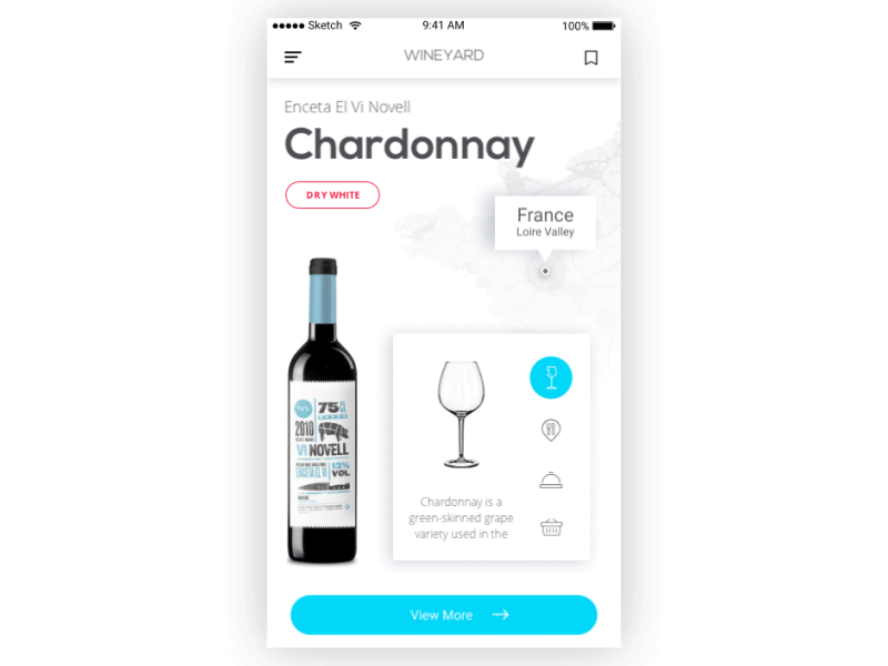
WineYard App
Minimalism can’t hurt
Sometimes, when designers aim to show all the facets of a digital product, they try to use many different styles and fonts in a single design. As a result, they get a design overloaded with unnecessary distracting details and lacking a proper mood.
Experts usually try to keep a number of fonts to two or three for the same layout. It allows making an essential contrast between copy elements along with saving the balance and right message of design. Applying different styles (bold, italic) should also be minimal. They are good for emphasizing really important parts but the overuse of them can make the text look messy.
Also, the copy content shouldn’t overwhelm users with unnecessary information. Of course, it’s a writer’s job to create appropriate text, but designers still need to collaborate with them to make sure the text will fit a design.
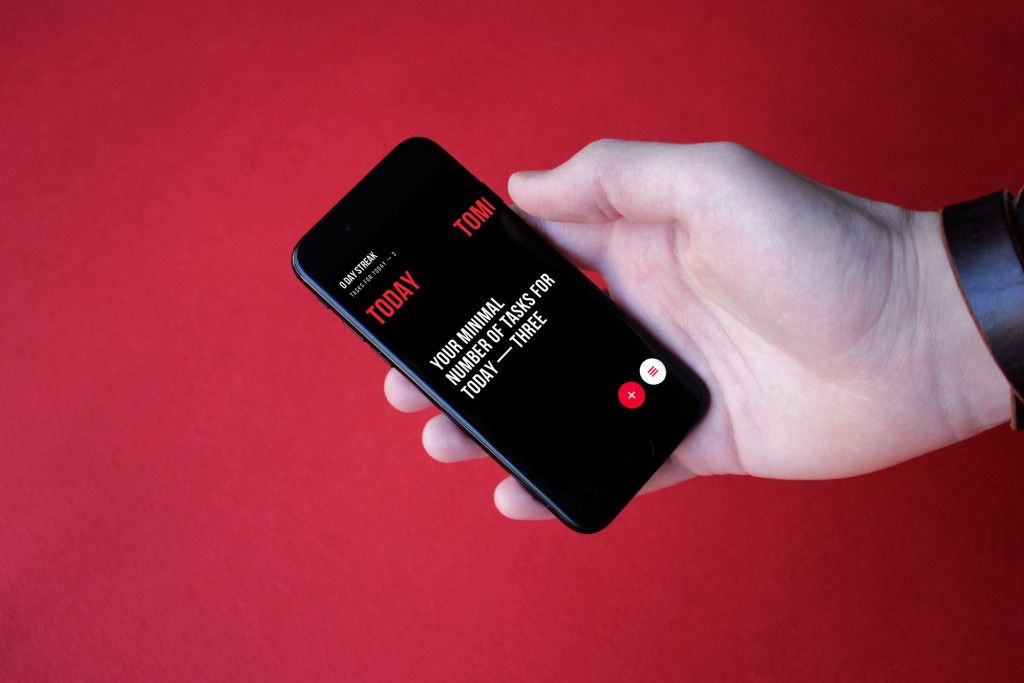
Upper App
Text needs to breathe
Legibility highly depends on the spacing between letters, words, and text lines. Tracking, kerning, and leading are the processes of adjusting the white space between typographic elements. White space is the area between elements in a design composition.
A lack of white space may result in poor legibility of copy because it is difficult to distinguish words when they are placed too tightly together. Appropriate white space provides visual relief for users’ eyes and allows them to move easily from one word to another and from one line to the next. However, try not to overuse it; otherwise, it can ruin text unity.
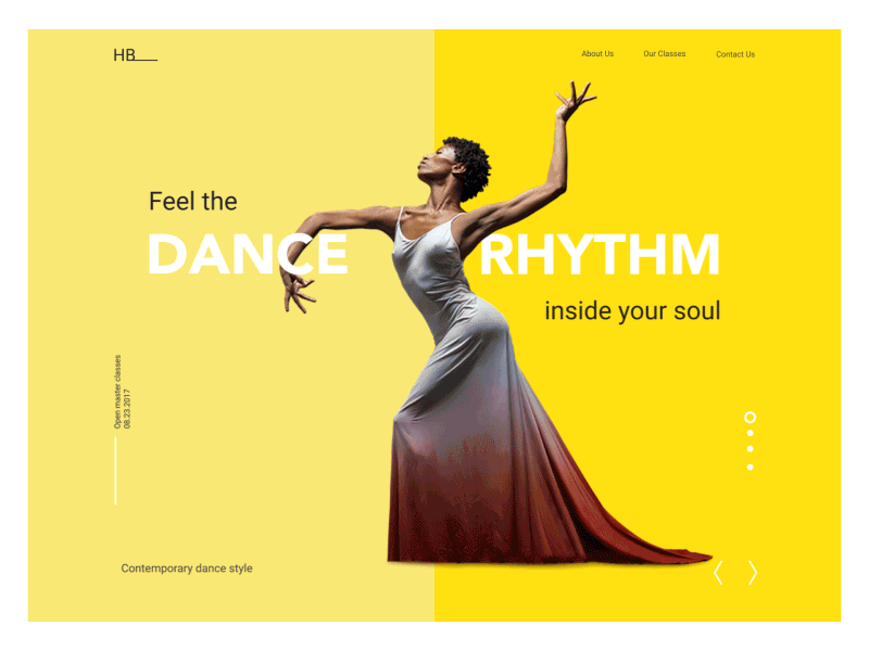
Dance Academy landing page
Build typography like a scientist, revise like an artist
Typography is a complex science consisting of many rules and regulations. Those who cover them can create clean, well-designed typography. However, it’s not enough. Clients always require originality and emotion, but it can’t be achieved solely by following written instructions.
Designers should never bury their artistic souls. Imagination and the sense of beauty bring uniqueness into any project, even the most casual one. Find the balance between the strict rules and unusual choices, and the results may surprise you and your customers.
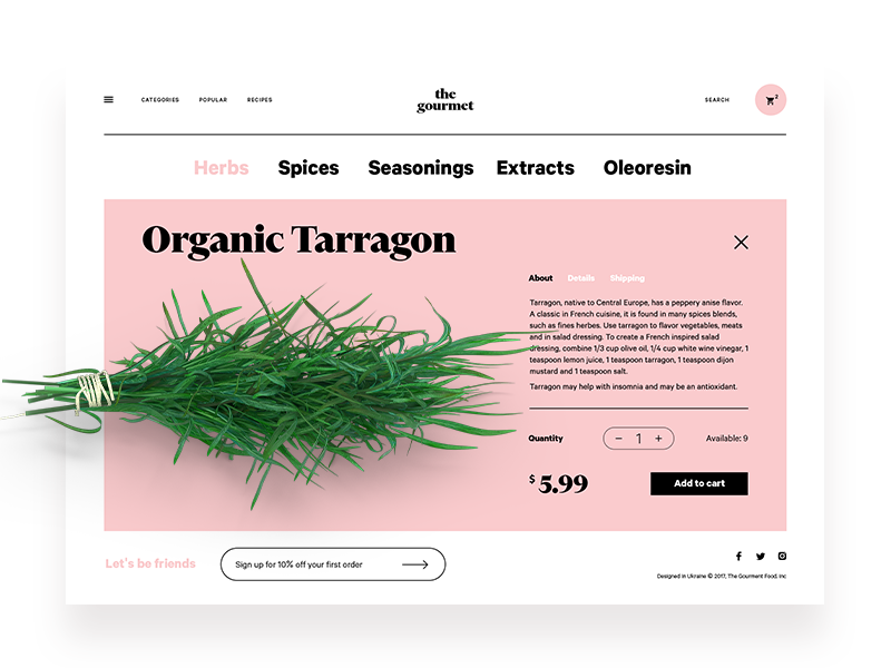
The Gourmet Website
Colorful typography needs thoughtfulness
The topic is actively debated. Some think there is no room for color in typography, and some claim it’s a must-have for good-looking design. There is no point in looking for the right side of the dispute because there is no accounting for taste. Nevertheless, colorful typography does exist, and designers apply it quite often.
Among the advantages of colorful typography, let’s mention the emotional impact it adds to any UI and its ability to highlight points of interest for users. Moreover, each color may transfer a certain message since it influences users’ minds and behavior.
To take all the benefits, colorful typography should be applied thoughtfully and carefully because it’s easy to turn UI into colorful chaos. Here is the useful checklist for this case:
Make it contrast. A major problem with colorful typography is poor legibility. Proper contrast between the fonts and background will help to avoid this. However, ensure the contrast looks pleasant and doesn’t hurt the eyes.
Don’t use too many colors. Again, try not to turn UI into a mess. Too many colors look distractive and amateur.
Color harmony. Remember the basics of art lessons. Use the color wheel and schemes to choose the proper palette.
Be careful with effects. Fluorescent, luminescent, metallic, and glowing colors have their peculiarities and they may not always look good on a digital screen.
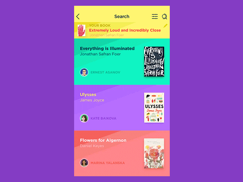
Book Swap App
Learn the basics of typography
It may sound too obvious, but some designers still ignore learning basics of typography science. They rely on modern tools that automatically choose the fonts or just hope the aesthetic features of the chosen fonts will be enough. Such an approach seems like learning to read without knowledge of the alphabet.
Designers who don’t know the concepts and the anatomy of typefaces can’t use the potential of typography at the full strength. Everyone decides for oneself if they need to learn the science in-depth but the basics are a foundation of every craft.
The experts working on the problem of harmonious usage of fonts gladly share their knowledge, which is why there are so many useful books on typography for designers. As the recommended reading we can name
- The Elements of Typographic Style by Robert Bringhurst
- Typographie: A Manual of Design by Emil Ruder
- Just My Type: A Book About Fonts by Simon Garfield.

Recommended reading
Here are some articles providing useful tips and tricks in typography.
How to Make User Interface Readable
The 8 biggest typography mistakes designers make
10 typography tricks every designer should know
Typography in UI: Guide for Beginners
Copy Content in User Interfaces
5 Basic Types of Images in Web Design
The Anatomy of a Web Page: Basic Elements
Originally written for Tubik Blog
- English
- Ukrainian