Visual Hierarchy: How to Organize UI Content
Visual Hierarchy: How to Organize UI Content The article about visual hierarchy for powerful UI content organization: size, contrast, proximity, negative space and other stuff to structure UI elements effectively.
Henry Adams once said, “Chaos was the law of nature and order was the dream of man”. People always favor the order because it makes things more comprehensible. The same works with user interfaces of digital products. When UI elements are organized and structured, people can easily use an app or a website and feel satisfied with a product.
To organize content clearly in the UI for users, designers use a well-known technique called visual hierarchy. Today’s article provides a general overview of this approach and the tools that help organize the content properly.
What’s visual hierarchy?
Visual hierarchy is one of the core techniques that is applied to the design process. It is initially based on Gestalt psychological theory, which examines users’ visual perception of elements in relation to each other and shows how people tend to unify the visual elements into groups.
Visual hierarchy aims to present a product’s content so users can understand the relative importance of each element. It organizes UI components so the brain can distinguish objects based on their physical differences, such as size, color, contrast, and style.
The visual presentation of UI elements greatly influences a product’s user experience. If content components look like a mess, people can’t navigate within a product or interact with it properly. Moreover, unstructured copy content has a low level of legibility, so users can’t scan it quickly, and they need to make a significant effort to distinguish the data they’ve been looking for. Such bad UX can lead to poor user satisfaction which means a product wouldn’t be much sought-after.
Typographic hierarchy
Copy content is a significant part of any UI design. That’s why visual hierarchy often highly depends on typography. Specialists decided to emphasize the importance of copy presentation by creating a separate system of visual hierarchy called the typographic hierarchy.
The system aims to organize copy content in the best way for users’ perception. Designers modify and combine fonts to build the contrast between the most meaningful and prominent copy elements which should be noticed first and ordinary text information. The fonts are modified by regulating sizes, colors, and families as well as their alignment.
Typographic hierarchy includes different elements of copy content, which are headlines, subheaders, body copy, call-to-action elements, captions, and others. To build an effective visual hierarchy, all elements need to be organized into distinct levels. Let’s see what they are.
The primary level. It includes the biggest type, like in headlines. The primary level aims at providing users with the core information as well as drawing people’s attention to a product.
The secondary level. This is the type of copy elements which should be easily scanned. They usually involve subheaders and captions which help users quickly navigate through the content.
The tertiary level. Body text and some additional data build the tertiary level. Designers often apply relatively small type still it should remain readable enough.
As the copy content is usually a major source of information in UI, designers need to present the data gradually. By segmenting copy elements into different levels, designers help users easily move from one piece of copy to another and perceive the information in the correct order.
One more thing to mention is that while creating typography for mobile products, designers are recommended to keep the number of layers within two. The thing is that small mobile screens don’t provide enough space for three levels. That is why the elements of a secondary level such as subheaders step aside to make mobile UI look clean.
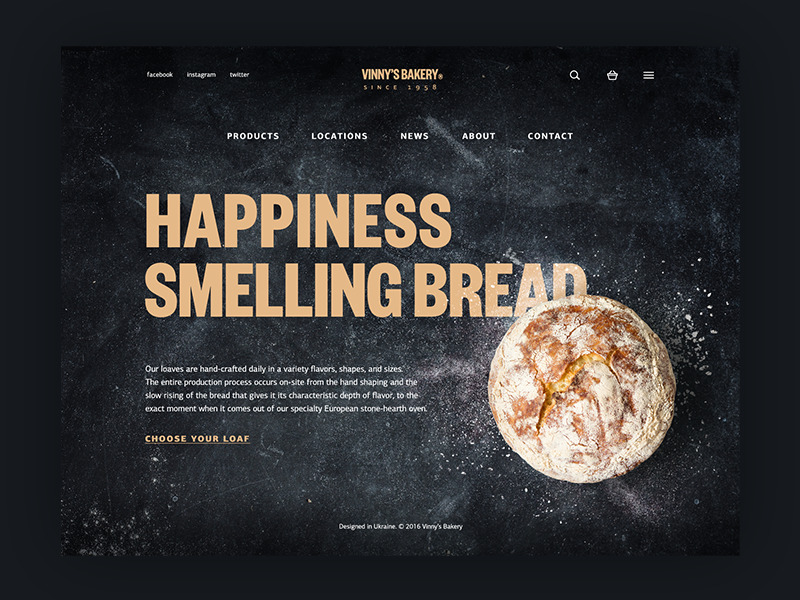
Vinny’s Bakery website
Visual hierarchy tools
When designers have already chosen all the content components, it’s time to create an order. Let’s find out what helps designers create an effective visual hierarchy for UI components.
Size
One of the most powerful tools for visual material transformation is size. It is rooted in humans’ minds that big things are somehow more important than the small ones. That’s why users’ attention first goes to large words or big pictures.
Designers need to distinguish the level of significance for each content element and, based on this data, transform the components into big and small.
Color
In our previous articles, we’ve mentioned that color has a significant impact on users’ perception, which is why it’s an effective tool for creating visual hierarchy.
Colors have their own hierarchy, defined by their influence on users’ minds. There are bold colors such as red, orange, and black, which can easily draw attention. On the other hand, there are weak or soft colors like white and cream that work better as backgrounds.
Using the different colors, designers can support a slight hierarchy of the UI elements. For example, CTA buttons in bold colors will definitely be the first thing that users see if the other UI elements are created in a softer palette.
Contrast
Hierarchy is based on contrast itself. One element contrasts with the other and that’s how users can see the differences between the content elements. Contrast can be created via visual differences including size, color, and style. Still, it’s recommended to keep the contrast in balance so that one object wouldn’t completely obscure the others.
Negative space
There can be many components in a user interface and to make them all noticeable for users’ eyes designers need to give them some private space. Negative space, or white space, is the area between elements in a design composition. Some designers usually don’t think of the white space as a component of design still the experts apply it as a useful tool helping to build an appropriate composition. A right amount of negative space between the elements will help users to notice and perceive each of them to each of them.
Proximity
As we said above, visual hierarchy is built upon Gestalt principles, so designers pay deep attention to the proximity of UI elements. As people tend to unify the visual elements into groups, UI components need to be placed that way so users could categorize them. If some elements are placed in a certain proximity, users automatically perceive them as a group. Designers can use proximity as a tool that helps to divide the content into subcategories.
Repetition
If people notice that some elements look similar, they may automatically group them together. That’s how repetition works. Designers repeat patterns across different objects intentionally so users can unify them. For example, a website with a great amount of body copy at a page can highlight the most important sentences with another color. Seeing the sentences in this color users can follow from one key point to another.
Visual hierarchy is a foundation of effective information architecture. When UI elements are structured and organized, people enjoy using a product and it will be more effective in solving their problems. Moreover, powerful visual hierarchy improves the navigation system since people can better orient within a product. Stay tuned and be ready for the next article about visual hierarchy.
Recommended reading
Copy Content in User Interface: Tips and Practices
Basics of Information Architecture for Designers
Information Architecture: Techniques For Designers
Gestalt Theory for Efficient UX: Principle of Similarity
Gestalt Theory for UX Design: Principle of Proximity
Originally written for Tubik Blog
 https://design4users.com/visual-hierarchy-how-to-organize-ui-content/
2026-01-18
© by
Marina Yalanska
,
https://design4users.com/visual-hierarchy-how-to-organize-ui-content/
2026-01-18
© by
Marina Yalanska
,
- English
- Ukrainian