
How to Create Catchy Flat Illustration: Tips and Tricks
How to Create Catchy Flat Illustration: Tips and Tricks Check helpful tips from the experienced illustrator about creating original flat illustrations and best practices on developing artistic style and manner.
Whatever direction digital artists choose for their professional development, one of the most crucial and difficult challenges is finding their own creative style. Today, we are discussing this theme with Tubik graphic designer and illustrator Yaroslava Yatsuba, experienced in both traditional and digital art. She is keen to share some useful tips and practices to help designers find and maintain their own style in business and to create theme flat illustrations for various purposes. Let’s consider what graphic designers could do to avoid sinking in the variety of styles and catch their own golden fish, fulfilling professional goals.
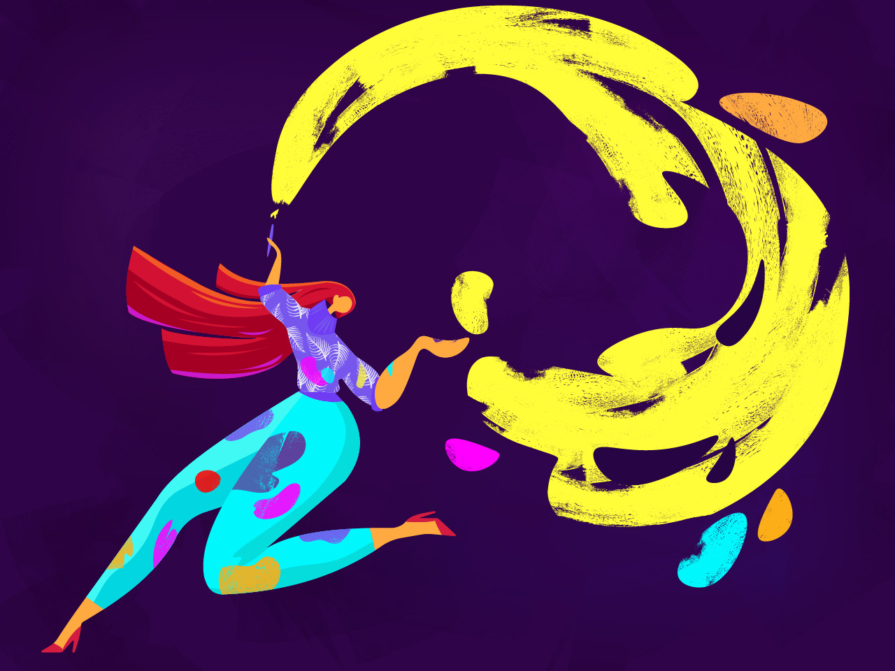
What Is Flat Design?
Let’s start with the terminology. Today, the term «flat design» is applied to graphics for numerous purposes and tasks that have common stylistic features. Flat design is the direction that found its broad and diverse expression in digital art and is famous for the minimalistic and concise use of visual expressive means. Nowadays, the term is widely used as the opposite of «rich design» because of the harmonic simplicity that underlies this design approach. The most prominent feature that has actually inspired the name of this direction is applying flat 2-dimensional visual details as opposed to highly realistic and detailed skeuomorphic images. Flat design has been developing for the last couple of years covering more and more fields of graphic design still finding the broadest and most diverse application in the sphere of digital design for web and mobile interfaces. This design approach is found as the style favorable for enhancing usability and visual harmony of user interfaces.
Obviously, flat design hasn’t appeared out of thin air. Its roots are usually set in the Swiss style, which historians of the design sphere find to be its direct ancestor. Swiss style, also known as International Typographic Style or shorter International Style, is the direction that appeared and got its dose of criticism in the 1920s and later won its bright expression in graphic design in Switzerland of 1940-50s fairly becoming the solid foundation of graphic design of the mid-20th century around the world.
Although this style got a variety of expressions in the sphere of visual design for print, like posters, stamps, postcards, book covers, magazines, etc., it significantly broadened its horizons with the era of digital design, especially in the domain of design for user interfaces. Websites and mobile applications going through the dynamic development of creative search opened the amazing and fruitful perspective for this minimalist and functional approach to design solutions. The style got the name «flat design» (or flat graphic design) which became instantly popular and started a new direction in graphic design daring skeuomorphism and «rich design» and supported with new challenges opened by the field of interaction design. The variety of design directions available and progressing these days engages flat design illustration as a flexible and artistic approach, successfully winning its own place. Read more about flat design, it’s history and benefits in our earlier article.

How to make flat illustrations original and add personal style to them
Today, many designers try their creativity in flat illustration. To avoid getting lost in the great and increasing variety of artworks, it’s vital to work out your own presentation and manner. It gets a bit more difficult in flat which is rather limited in expressive means and volumes than other styles. Yet, difficult doesn’t mean impossible.
Here are the tips for creating flat illustrations from Tubik graphic designer Yaroslava Yatsuba which she got from her everyday practice.
Step away from the simple geometrization of shapes
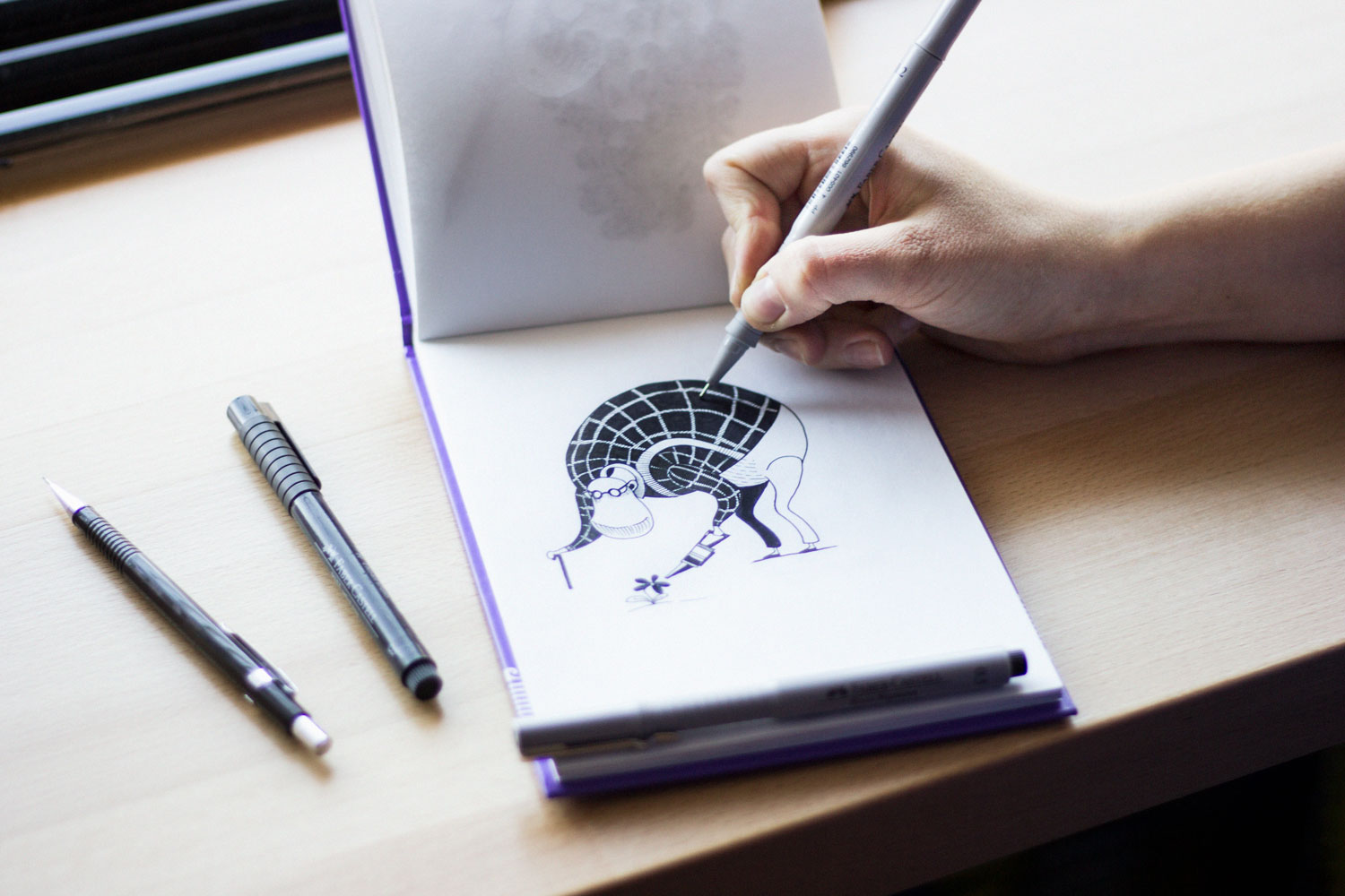
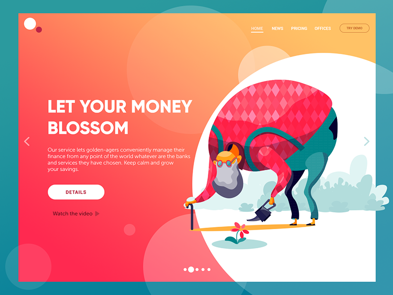
Take your sketchbook and a pencil and rough out quick sketches by hand. The sketch will take up the minimum of time compared to creating a digital picture. Moreover, it will help to quickly find bold lines as well as interesting movements or poses for a character. Having made a sketch, take your time and analyze it, then try experimenting. Try hypertrophied, rounded or, vice versa, sharpened shapes – it might contribute precious details clarifying the nature of the movement or showing the character’s emotional state.
Analyze artworks by other illustrators
Don’t miss a chance to understand what principles and approaches they apply. Consider which elements or color solutions made their artworks attractive to you.
Chose interesting perspective and composition
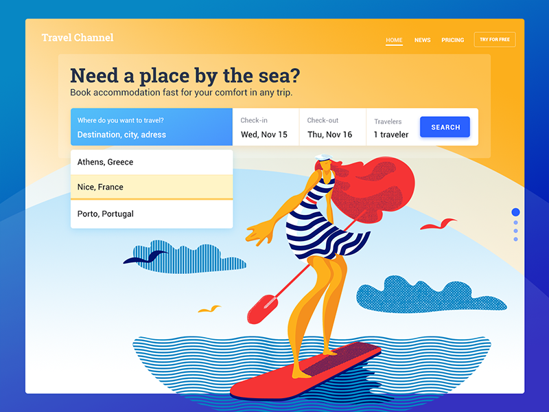
Make sure that the composition is balanced if you need to express the state of calmness – or intentionally tilted if you want to show dynamics or tension. If the composition is multidimensional, the planning should be distinctly shown: make an accent on the plan at which the major characters or elements are placed. You can also add rhythm to the composition with scaling the elements or color and tone accents.
Consider different angles
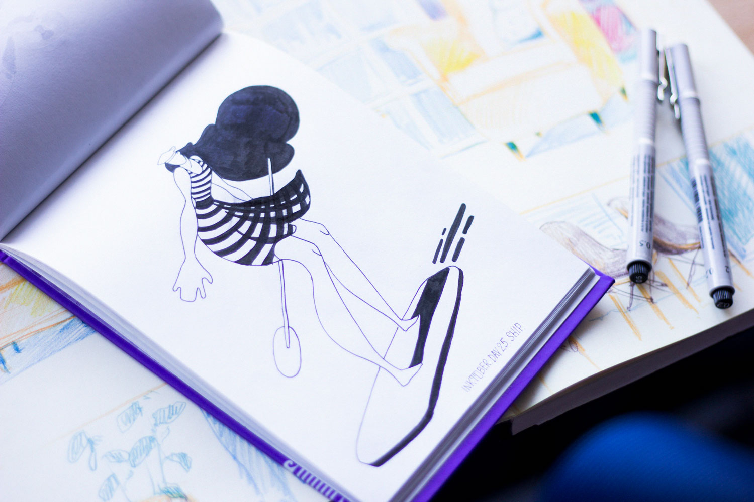
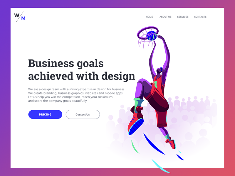
Having decided on the composition, imagine how the scene would look from different angles: in the perspective with the third convergence point, through a fish-eye lens, from a 3-year-old’ viewpoint or in contrary how a super-tall basketball player would see it. This trick will help you to understand which of the angles will be the most beneficial for the goal and message of the illustration.

Apply original metaphors that will help to share the idea behind the illustration
Don’t just catch the first images that come to mind: the risk is high that it will be widespread and won’t look original enough to be really eye-catching.
Use colors to strengthen the idea
The thoughtfully selected color palette will help to strengthen the idea and message, it will set the appropriate mood and put accents on what is major. Keep up the tone contrast of all the composition: to check the correctness of the chosen tones, view the illustration in black-and-white mode – it should stay contrast and well-read.

Try textures
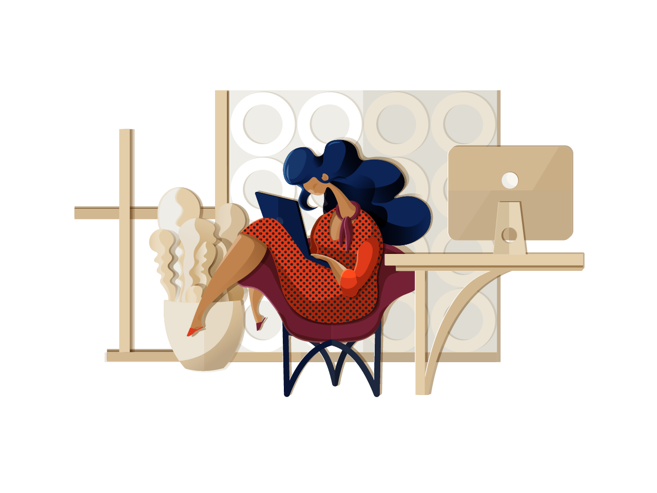
Usage of textures adds vividness to the picture, contributes individuality, and gives the effect of “hand-made”. Also, it will soften the vector images.
Textures may imitate:
- real physical materials and details (such as scratches or scuff marks)
- geometric details (lines, stripes, dots)
- hand-made stuff with not ideally even live lines
In addition, colored photos and full-color patterns may be used to create the effect of appliqué work. All the mentioned variants may be used both separately and in combination, thereby developing a personal artistic style when creating flat design graphics.
6 features of a good flat illustration
Summarizing all the tips, we can define the features of practical flat design illustrations.
- Original stylization
- Thought-out composition
- Non-standard perspective
- Carefully selected color palette
- Applying textures
- Use of metaphors
Try this checklist for your design experiments to create a flat design illustration – maybe, they will lead you to the golden fish of your own recognizable style.
More illustration examples
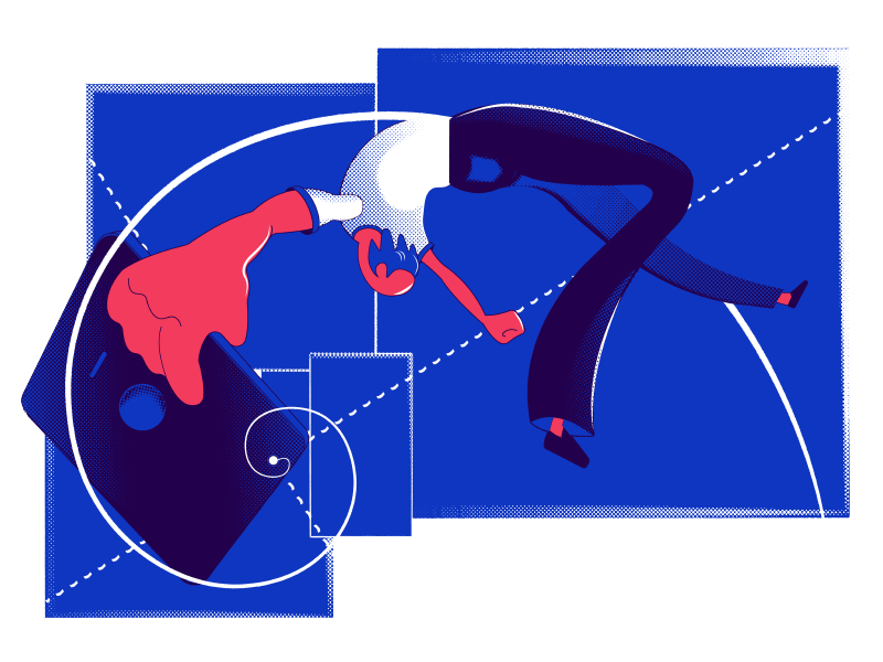
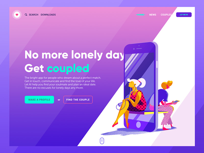
Here are some more illustrations by Yaroslava featuring practical examples of how the tips above may be creatively applied. The designer shows that the limitations of this style are just another reason to trailblaze with flat design colors, perspectives, characters, and metaphors.




Originally published in Tubik Blog
Useful Reading and Inspiration
If you want to see more collections of illustrations or discover how they work in particular design projects, here’s the set of posts for you.
17 Trends in Illustration and Graphic Design to Meet 2020
Motion Design: 20 Inspiring Animated Illustrations
Winter Olympics Illustration. Step-by-Step Process
Moonworkers. Digital Illustrations on Film Production
How to Generate Ideas and Inspiration for Illustration: Artist’s Practical Tips
 https://design4users.com/how-to-create-illustration/
2026-01-18
© by
Marina Yalanska
,
https://design4users.com/how-to-create-illustration/
2026-01-18
© by
Marina Yalanska
,
- English
- Ukrainian