Product Page Design: Best Practices on UX for Ecommerce
Product Page Design: Best Practices on UX for Ecommerce A well-designed product page is vital for ecommerce as most decision-making on purchase happens there. Review popular practices on product page design, with lots of examples.
In e-commerce, the measurement of success is not the number of website visitors or clicks. It’s the number of finalized purchases. From that perspective, a product page is crucial as it is usually the spot where most decision-making on “to buy or not to buy” happens. So, when designing or improving an e-commerce website or application, UX designers have to think it over and test it up to the slightest detail. That’s what today’s article is about: let’s discuss what a product page is and how to design it effectively. Packed with plenty of examples from both known e-commerce websites and creative design concepts for niche or specific business goals.

What Is Product Page
The product page is a page of the e-commerce website that provides a customer with all the needed information about the particular item, allows them to check various options if they exist, and enables a customer to quickly proceed with the purchase process if they decide upon buying the item.
Unlike a real point-of-sale, an e-commerce website doesn’t provide physical contact with an item or assistance from shop staff. Product page becomes the major source of attraction, impression, information, and persuasion. That’s why its design, navigability, and usability play a crucial role in growing sales.
As we mentioned in our guide to the basic web pages, a badly designed product page may waste all the effort (usually massive and complex) taken to bring the buyer to the website and to this particular product. So, besides the attractive product presentation, focus on functionality, clarity, readability, and intuitive navigation.
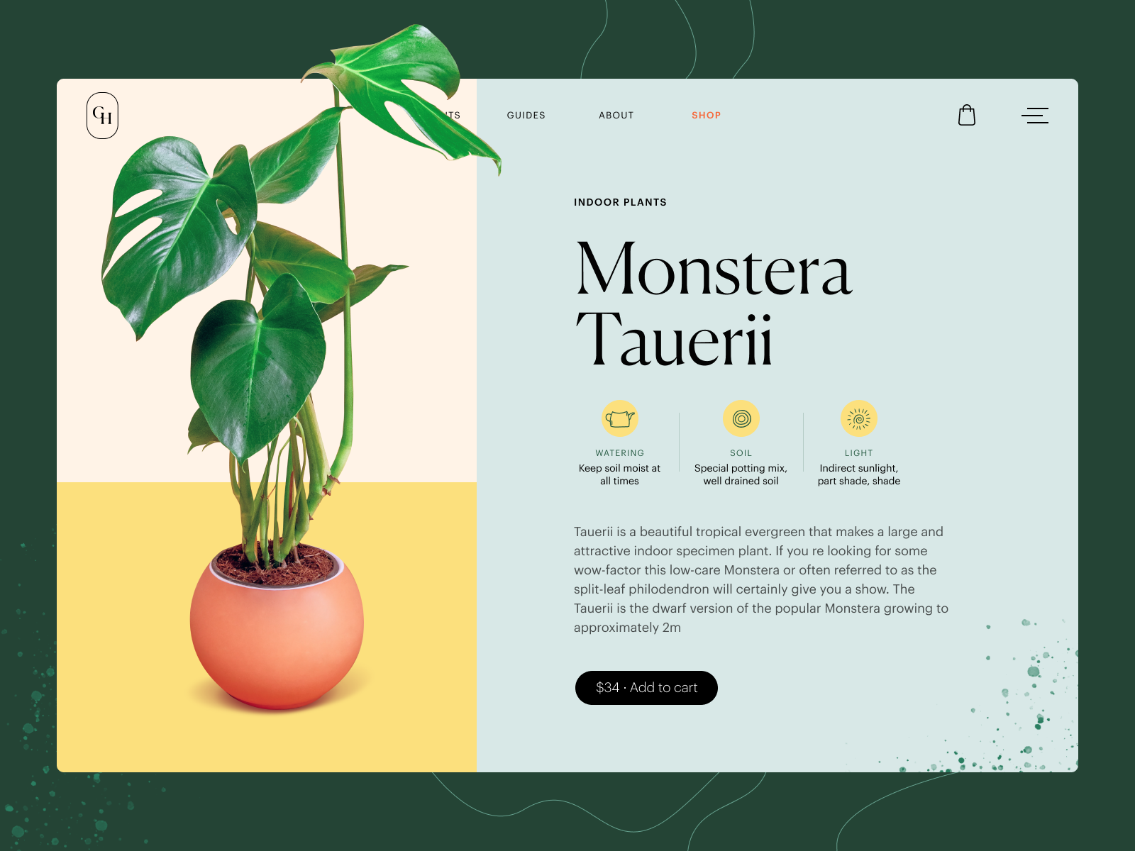
Product page concept for a gardening e-commerce website
Typical Elements of Product Page
Basically, a product page:
- shows the image of the product
- gives all the needed information about the product
- allows users to check different color/model options (if any)
- enables visitors to see the reviews, comments, and ratings from earlier buyers
- allows for adding the product to the cart or wish list
- shows other relevant options.
Additionally, the product page may include such options as a comparison of different items, especially popular on websites selling different devices and appliances.
Product page interactions for Bennett, a tea brand e-commerce
Based on that, here’s a checklist of basic elements of the product page layout:
- name/title of the item
- photo
- price
- item availability
- add to cart/add to bag/add to basket/buy button
- add to favorites/save to wishlist button
- description
- social proof: rating, reviews, the number of previous buyers, the number of people looking at the item now, etc.
- choice of color
- choice of model
- choice of the number of items to buy
- size guide or calculator (for clothes and footwear)
- extended details (materials, technical specifications, dimensions, weight, special features, etc.)
The list above doesn’t mean that all the points are obligatory for any product page. The choice will depend on analyzing multiple factors, understanding the target audience, and careful prioritization to see which points to include and which may be eliminated from the list for this particular type of goods or kind of customer.
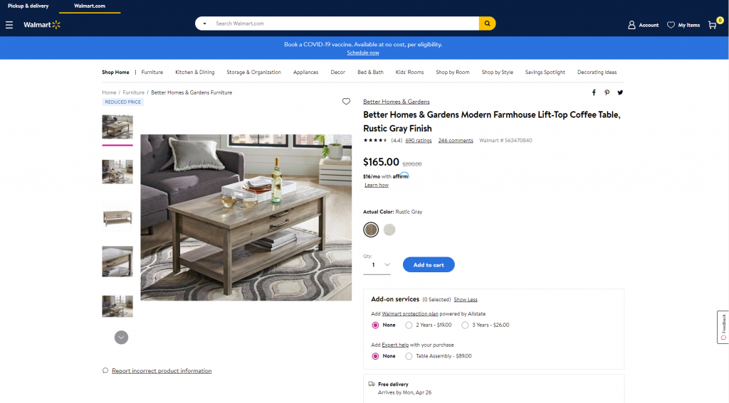
Product page first-screen view on Walmart
Design Practices for Product Pages
Visual Demonstration
Ecommerce platforms are the best place to prove the saying that the picture is worth a thousand words. Not able to contact the item physically, visitors will count on the visuals of the product to make their first impression about the goods. What’s more, images are noticed and decoded faster than words; they will be the first element attracting the visitor’s attention. They present the part of the content which is both informative and emotionally appealing.
That’s why many e-commerce platforms:
- use a set of images to present one item from different points and angles
- apply zoom functionality to enable a visitor to look at some parts of the photo closer, see the textures and small details
- combine the photos of the item with photos of it on a model or in the proper environment to give a better understanding of its looks and sizes
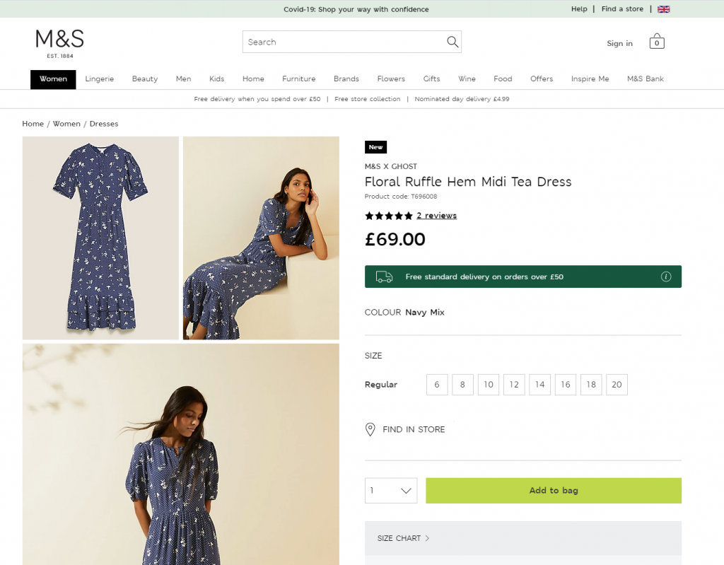
Product page first-screen view on Marks and Spencer: a combination of several photos shows the item separately and on the model
The approaches to photo content can be different and depend on both general brand strategy and particular campaign or collection style. However, what unites them all is:
- originality: special shootings are organized to make custom photos that correspond to the style defined in a brand book or specific campaign guidelines
- high-quality: no doubt, the quality of photos directly influences the impression about the particular item and the brand in general
- optimization for the web: being quality, photos shouldn’t be too big as it can dramatically influence the loading time, which in turn has a great impact on SEO; also, pages loading slowly are the solid reason for high bounce rate – unless the website offers something absolutely unique and super exclusive, people will just go away instead of waiting.
Product page for the niche brand of underwear, using photo demonstration on model
Except for images, other media, more complex or interactive, can also be used. Among them, you can now find:
- product videos, detailed video reviews, and instructions
- 360-degree view of the item
- augmented reality technologies helping people to observe the item in their own environment or try it on virtually
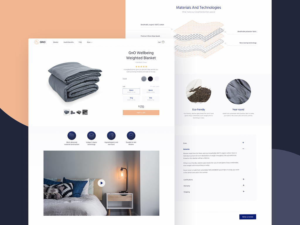
The product page of GNO Blankets website uses video demonstration and graphics with detailed demonstration of product layers.
Obviously, these types of media are often more complicated, time-consuming, and expensive in production than photos. So, the decision on their worthwhileness is usually based on the type and price of the offered item. For example, to sell a 5-dollar T-shirt, photos may be enough, but for buying a massively more expensive fridge, smartphone, computer, or even a car, customers need more convincing in the decision-making way. And in this case, expenses on the more complex but more impressive, persuasive, and informative visuals and media could be a worthy investment.
A creative product page concept for a website selling niche accessories applies special realistic effects to the functionality of a model choice.
The pet shop website uses video demonstrations of the items as a convincing way to see how the product works in the environment and sets the needed emotional connection.
Informative but Simple Description
The saying that people don’t read anymore has nothing in common with the product page: when customers are deciding upon spending their money, they do read what they need to know about the product they are going to buy. Still, it’s not the reason to overload the description, as the attention span is quite limited. The description text should be concise, factual, simple, and talking in the language of the audience. It should answer the basic questions: what the product is, what it looks like, what it does, and how it does it. And better to do it from the first lines, which have the highest chances to be read, instead of filling them with standard marketing hooks shoppers are already sick and tired of.
Another rule of thumb here is connected to the previous point: show, don’t tell. Well, it’s better to say, tell, but also show! Don’t just describe in detail how the bag looks inside – show the photo. Don’t just tell how beautifully this neckerchief matches that jacket – show the photo. Don’t just mention the size of a toy – show the child playing it. Combine the power of words with proper images to make the experience much more effective.
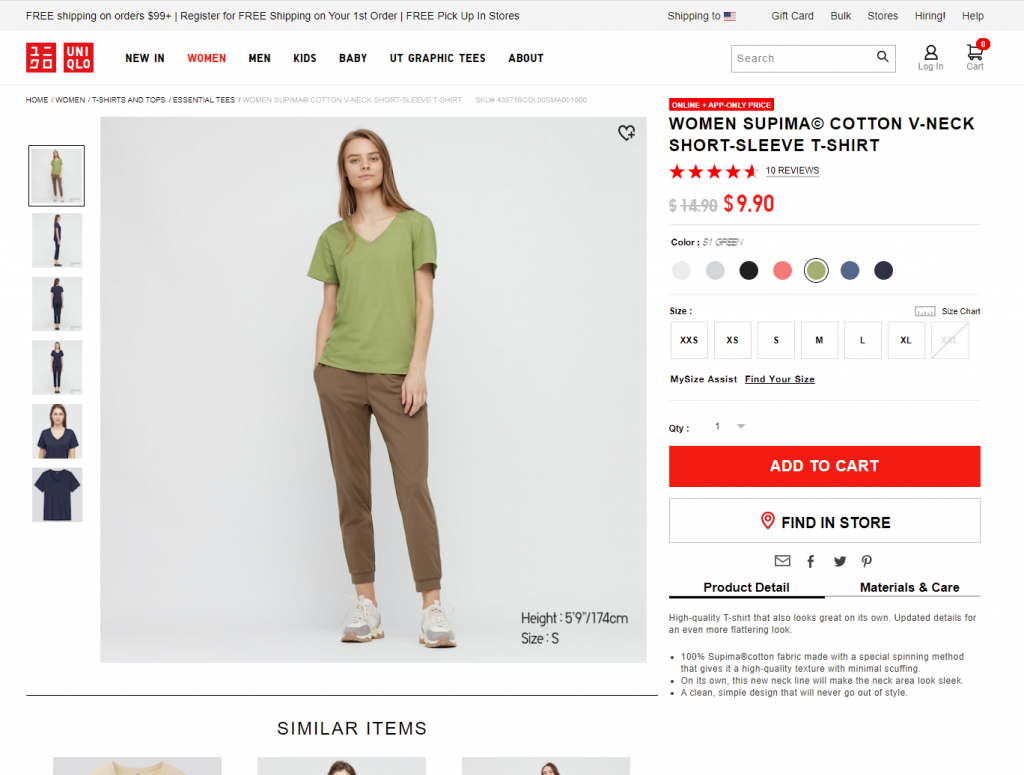
Product page first-screen view on Uniqlo: the page features a concise and informative description of the item and puts the details on materials and care in another tab, both in the pre-scroll area of the page. Another good thing is a clear definition of model size on the photo, allowing the customers to instantly understand the proportions.
The product page for the cosmetics website uncovers the information about the product gradually, with the core data above the fold, supporting the prominent item visualization; the split-screen approach helps to divide visual and text zones to make them easily scanned.
Super Obvious Call to Action
Calls to action (CTA) should be instantly noticeable. In e-commerce interfaces, CTA elements are the core factor of effective interaction with the product; they play a crucial role in usability and navigability and, therefore, in getting profits. When all the path of interaction and transitions is built clearly for users, but the CTA element is not obvious, misplaced, or designed badly, the risk gets higher that users will get confused and need to make an additional effort to achieve their goals – which is annoying. Therefore, the risk of poor conversion rates and bad user experience grows.
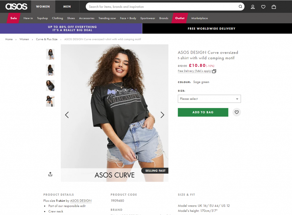
ASOS product page first screen: the CTA button differs from everything else on the page due to color contrast and is instantly noticed in the light, airy layout.
Focus on the Item
No doubt, thinking about the layout and content of the product page, both stakeholders and designers feel the urge to fill it with everything possible, and even more, to make the page super informative. However, be careful as this strategy may do a dirty trick: in that flood of information, the focus gets blurred, and visitors can get too distracted to make a decision. How to find the balance?
On the one hand, it’s recommended not to overload the page with a great deal of information that will overwhelm customers and distract their attention from the major goal – to make the purchase. On the other hand, visitors aren’t ready to jump from one page to another to get different information about the item they are interested in. Therefore, the designer has to take the time for thorough research on the issue, prioritize carefully, and find the balance of data that needs to be provided on the product page.
Is there a golden rule for all e-commerce websites? No way, as different customers and markets have different needs, and the type of the product also influences the choice of core and secondary information to show. The analysis of the target audience and user testing can give clues on what information is required for the specific categories of items or services.
Creative product page design for a niche perfume website focuses on item presentation amplified with an atmospheric video background and special effects.
The more pricey, uncommon, or innovative the product, the more information the customers usually want to get about it. And even for common stuff, there may be tons of questions and hesitations. Sure, all the needed information should be accessible from the product page, and the challenge for UX designers here is to find a way to organize it properly. Technical details, materials, weight and size, size chart or calculator for clothing and footwear, functionality for comparing the item with a similar one, and so on and so forth – any of those details can play the premier violin in a story of a particular item.
Use the principle of the inverted pyramid and uncover information gradually, from the most important and demanded shown first to more and more specific details unveiled further.
Instead of creating intrigue, be open, direct, and clean in content presentation.
Try to put all core information in highly readable form on the above-the-fold part of the page.
And test, test, test again, analyze the time on the page, heatmaps, and clicks, ask and analyze to know what buyers really need and what makes shopping convenient for them.
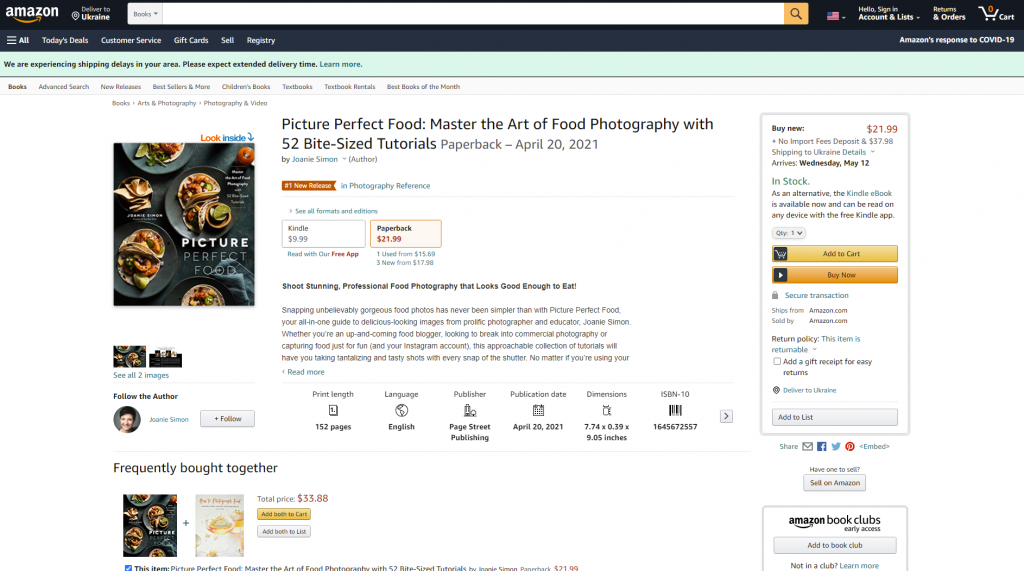
The product page on Amazon is based on the principle of the inverted pyramid: this above-the-fold view shows the core information and functionality buyers want and need to know about this type of product first of all. Engaging social proof is marked by the label of #1 New Release and shows what other products are often bought together with this one.
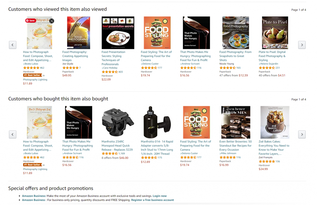
The second screen uncovers more about the actions of other customers interested in this theme: two sections, visually attractive due to the focus on product images, uncover other items customers view or buy.
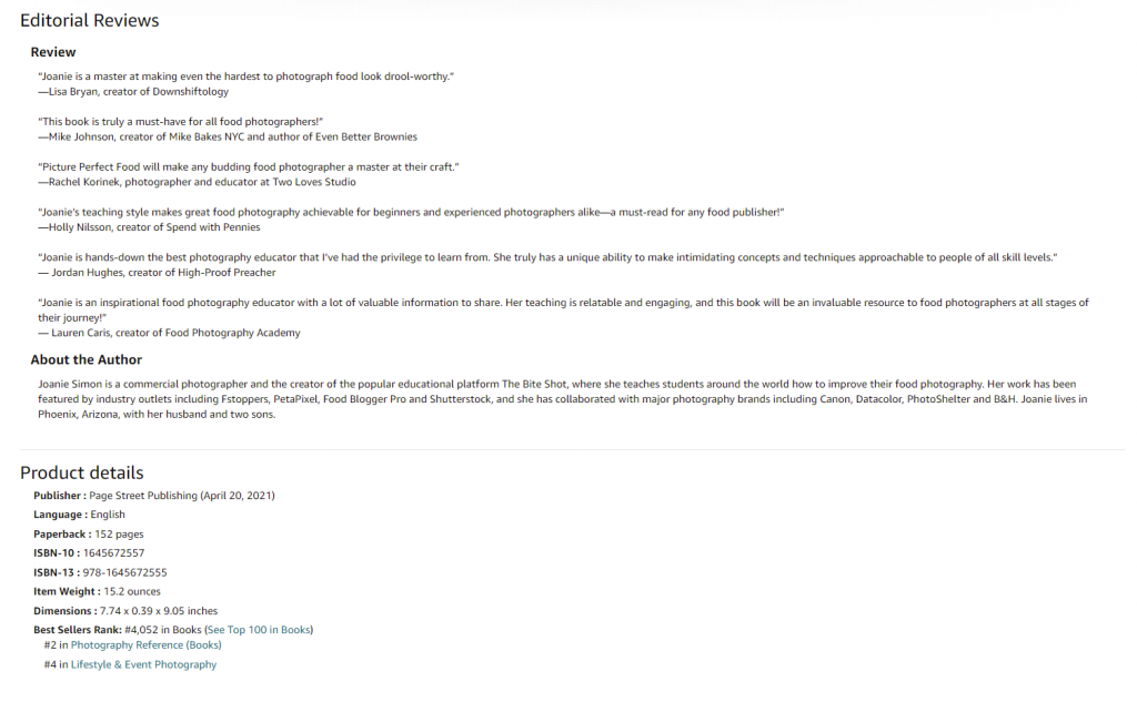
And only after that, when scrolling further, users can find extended information, editorial reviews, etc., based on text without visuals.
Intuitive Navigation
Every button, link, and card design can change the conversion rate significantly. It’s vital always to remember: in the intense competition we observe in e-commerce now, buyers aren’t ready to wait or waste their time on unnecessary operations or efforts to understand where’s what they need. What they do demand from e-commerce is an experience that is faster, easier, and more convenient compared to going to the actual store. If this website doesn’t give it to them, they will look for it somewhere else.
So, adding to obvious CTA, make sure that users can effortlessly do common steps, for example:
- find search field
- use breadcrumbs helping to quickly understand the current position in the website hierarchy and probably take a step or two back instead of just going away
- be totally sure which elements on the page are clickable
- see if the item is already in the cart
- see the number of items in the shopping cart or bag (usually in the website header)
- use the power of visual dividers and common directional cues to perceive the information faster
- find the contact information and navigation links in the website footer
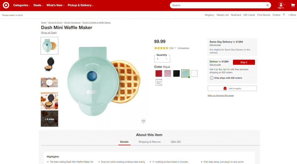
Product page first-screen view on Target: multiple photos of the item, both clean and integrated into the environment, clear and instantly noticeable controls for choice of color, the obvious search field in the header, breadcrumbs creating the secondary navigation level, social proof in the form of ratings and questions, and clear call-to-action element.
Consistency
Consistency means that the product communicates with the user in the same or similar way, whatever point or channel of communication. In terms of user experience, it means that similar elements look and function similarly, this way reducing the cognitive load and making interactions smoother and more intuitive.
In e-commerce interface, it touches both:
Internal consistency is about different parts of your interface or brand that look and behave as one clear system. For example, when you make all the CTA buttons on different pages or screens of your product colored and designed the same way, visitors can learn fast and will be able to quickly distinguish them at any step of their user journey.
External consistency is about parts of your interface that look and behave as typical patterns for most products of this kind. That’s, for example, when you use a shopping cart even on the website selling non-tangible products or underline the text links to give users a hint that they are clickable.
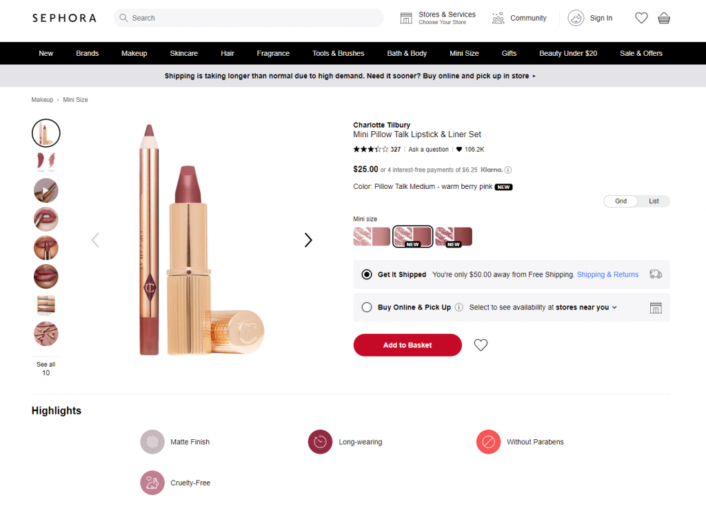
Sephora product page first-screen view: expected navigation in the website header, easily recognizable for e-commerce shoppers, super obvious call-to-action button, arrows used as the clearest directional cues for most users around the web, focus on the item presented in different visuals and highlights important and influencing decision-making for the target audience.
Power of Known Patterns
Adding to the previous point, UX designers would better never underestimate the power of habit. In UI for e-commerce, especially in the red-ocean spheres, the primary goal is not to shock and awe. Basically, UX designers become a friend or at least supportive shop assistant who greets visitor, guides them around the store, takes a right to the items they want, and make the checkout as fast and simple as possible. To make that all possible, designers should base their decisions on how actual customers behave.
There are many articles and videos calling creative people to hear their hearts, trust their guts, and think out of the box. However, design is not just pure creativity striving to show all the power of original solutions. First of all, it’s a way to solve the problem and make users happier. So, it’s vital to look at the interface from the user’s perspective and find a way to make interactions that will provide a smooth and easy way to purchase.
The power of habit plays a big role in the products of this kind. Choosing a layout, menus, or icons that stand too far from the ones users are generally accustomed to often brings confusion and frustration. For a simple example, the usage of any other image instead of a magnifying glass to mark the search field can result in a bad user experience as buyers know that visual symbol and will look for it. If you are ready for such experiments, take time to test them well and ensure that customers are ready for them, too.
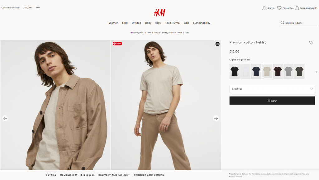
H&M product page design is based on a minimalist approach: the first-screen view is designed around prominent images, model choice options, elegant and readable basics (product title, color name, and price), a heart icon as a well-recognized visual trigger of adding the item to favorites and a noticeable CTA button. Even the size options are hidden in the dropdown menu to put the number of controls to a minimum and focus all the attention on the visuals. Sure, it means additional clicks and scrolling; however, the approach may be reasonable and effective if the customers are used to this flow and appreciate this particular style, consistently reflecting the brand image in general.
In the article on home page design strategies, we mentioned that the website is made not for creative contests or galleries of fame but for real users. The positive impact of habit in terms of user experience can be stronger than the wish for revolution. No doubt, the dose of uniqueness is needed, but not so much to knock down the user. In e-commerce UI design, often aimed at quite a diverse target audience, too much of a revolution might scare and provoke hesitations: do I really need to buy this thing, a user may think, if it’s so hard to get it? Study the interaction patterns and typical products for that particular target audience to make their habits their power. And don’t forget to check that all the icons on the screen don’t have a double meaning; support them with text labels where needed. Strive for the balance between innovation and traditions.
Narrowing the focus, we may also talk about the power of habit for a particular e-commerce website. You could have read numerous reviews of the “poor UX design” of this or that e-commerce giant, breathing fire and brimstone into old-fashioned solutions or complex navigation. However, thinking deeper, it’s easy to understand that they activate the power of habit as a major approach of respect to their buyers, as plenty of their customers have been with them for many years. It’s not because they don’t know how to change; it’s because, at some stages of business development, the cost of change may be too high. It doesn’t mean that the changes are never made; they are just not as revolutionary and made in small steps.
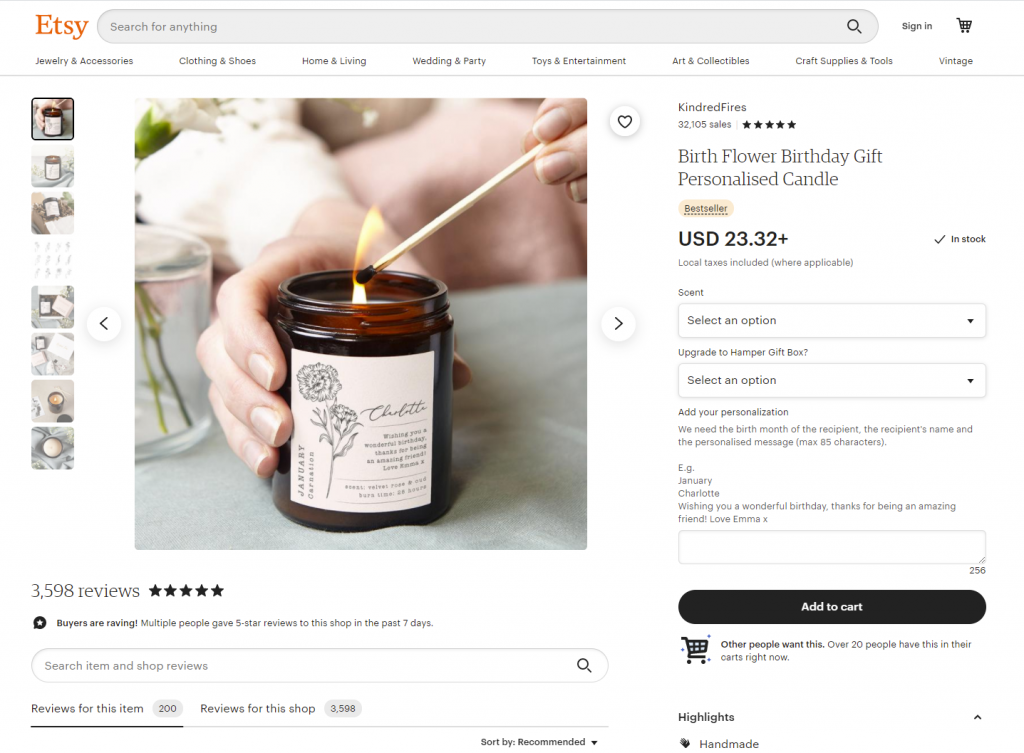
Product page above-the-fold view on Etsy marketplace
Scannability and Skimmability
It’s already well-known that when coming to a website or app, users don’t usually read and observe all the content on the page or screen. Instead, they start with quick scanning to understand if it contains something they need or want. Knowing the eye-tracking models, Gestalt principles, and laws of visual hierarchy, designers and information architects can put the core data and interactive elements into the zones of high and natural visibility. Other factors making product pages scannable are readable typography and enough white space.
There are numerous things that have an impact on decision-making, and harmony is one of them. Eye-tensing color combinations, unreadable or not combining fonts, aggressive background, intrusive pop-ups or animations, annoying sounds, or pages loading for ages – any point of that stuff can spoil the experience quickly, distract users, and move them away, sometimes even without a clear explanation what they didn’t like. Details matter; think over them and organize them well.
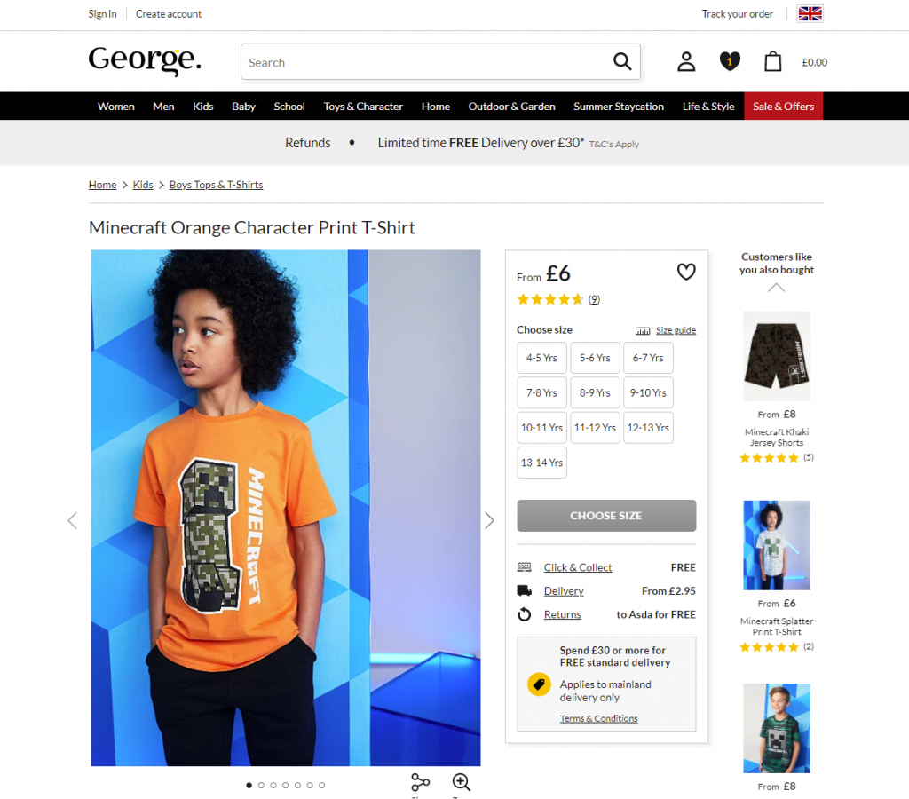
First-screen view of the product page on George: due to the light, airy layout, the page looks clean and simple, but at the same time, it’s highly informative even at the stage of fast scanning.
Dark, elegant, and catchy product page for the neon signs shop, balanced and scannable
Fewer Clicks
If going from page to page or jumping from screen to screen is not a part of the journey into the sales funnel, save every user’s click possible. Too many operations are tiring and annoying, which is a kind of negative emotion. And emotions have a huge impact on user experience and make retaining users much harder. Minimize the number of clicks on the way of choosing and buying whenever it’s possible – this way, you respect the user’s time better than the politest words of thanks. For example, avoid dropdowns for a small number of choices in basic options such as color or model choice.
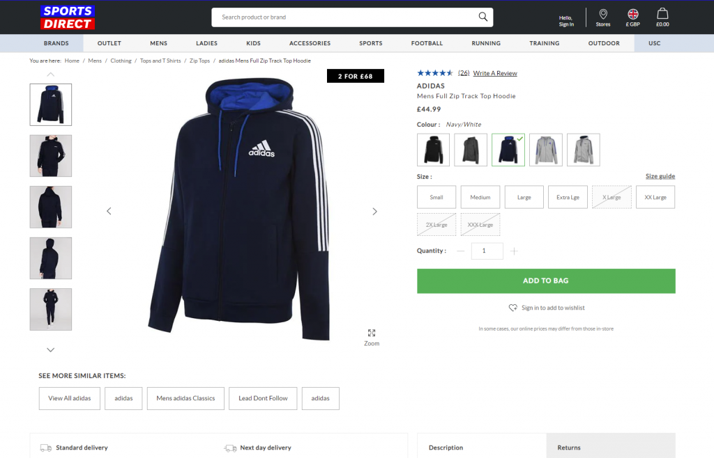
Product page first-screen view on Sportsdirect website: no information is hidden in dropdown menus, so it’s super easy to scan the availability of models and sizes, the CTA is seen immediately, the number of items is changed easily by typing or manipulating plus/minus controls, arrows show how to see more images, and breadcrumbs help to jump back to choosing other items easily.
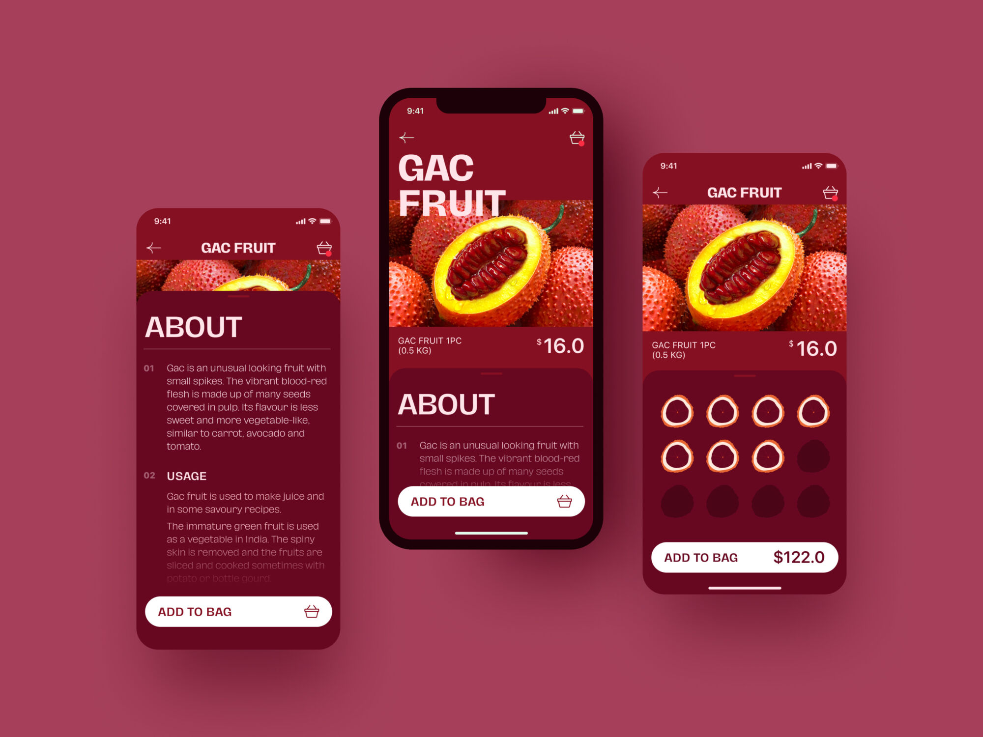
Exotic Fruit e-commerce app uses a tab for adding the needed number of products with a simple tap.
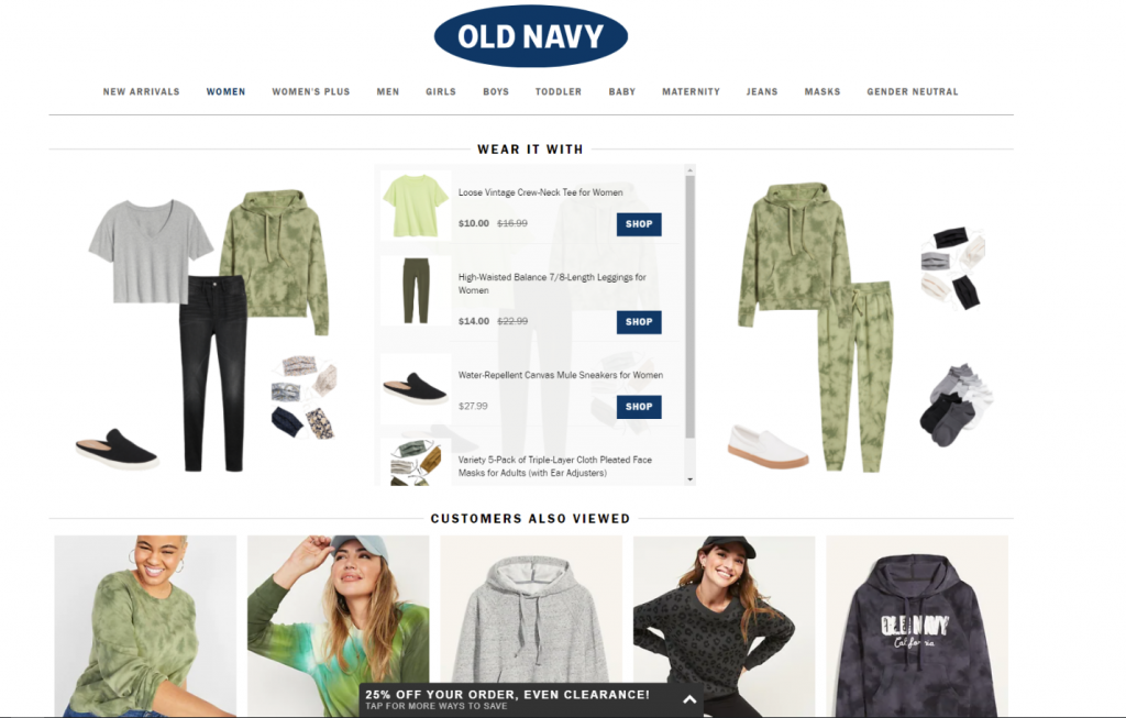
The OldNavy product page integrates the section of offered combinations with other items from the website, and it is not just an image to get buyers inspired: on hover, the shopper gets the list of links to items with basic information, which enables them to easily get engaged in further shopping and makes the relevant product accessible quickly.
Social Proof
Social proof is a big factor of impact on the decision-making process in both the physical and digital worlds. It is a psychological and social phenomenon of people copying the actions of others to undertake behavior in a certain situation. This term was introduced by Robert Cialdini in his 1984 book Influence; the concept is also called informational social influence.
In e-commerce, the experience of the previous buyers influences the behavior of the next ones greatly; that’s why ratings, comments, and reviews are needed, especially on mass-market platforms. They help customers feel united with a group of similar buyers, which is easy to feel in the actual store among other shoppers but even more needed in the online shopping experience when you are shopping alone in front of a computer or mobile screen. What’s more, reviews can answer the questions the customer has and, this way, support the positive decision about buying – or prevent from buying the wrong item and having a negative experience.
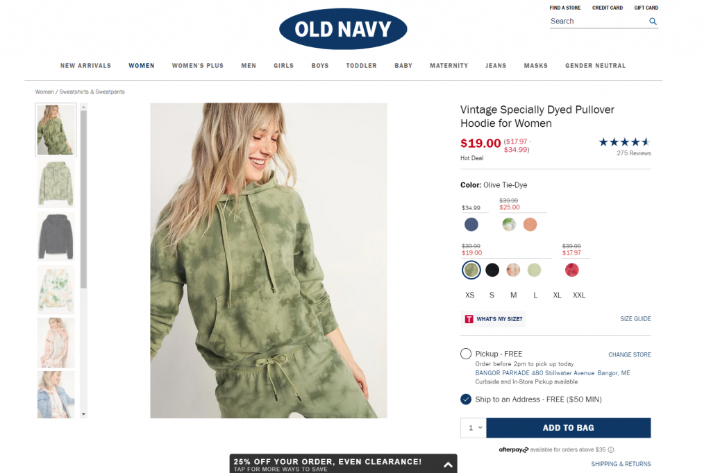
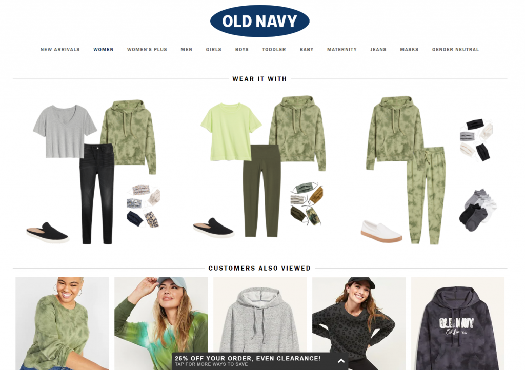
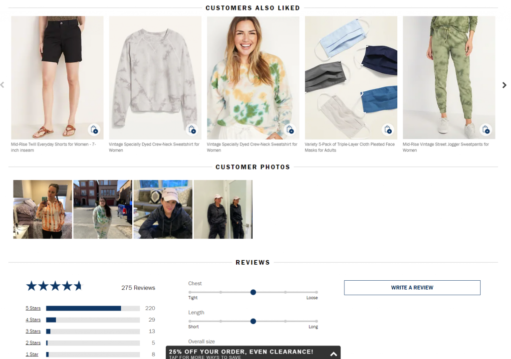
Here’s the product page on OldNavy: the first screen view, among all other details, includes the social proof showing the rating of the item with the number of people that marked it. Scrolling down, buyers are getting even more engaged: except for relevant products to combine this item with for the perfect outfit, the page uncovers the relevant items other customers looked at and liked, and further customers’ photos and details on reviews.
Interactivity
With more and more buyers online, brands and retailers can analyze more data about their behavior, needs, and wishes and integrate new approaches on that basis. Interactivity that imitates seeing the item from different angles and manipulating it, trying on the clothing or footwear, testing the make-up options on your face, virtually placing the piece of furniture or decor into your room – all that and diversity of other innovations are becoming more and more accessible and affordable due to the creativity, customer experience care, and new technologies. And sure, they help customers to make a decision.
Another vital aspect of interactivity in e-commerce now is personalization and customization, when people can customize their purchase instead of just choosing it from the catalog. Choosing a custom combination of flowers for a bouquet, customizing the burger or pizza with favorite ingredients, collecting a personal outfit or family look instead of just buying ready-made ones – able to add their own personality to the offer, many shoppers feel ready to buy.
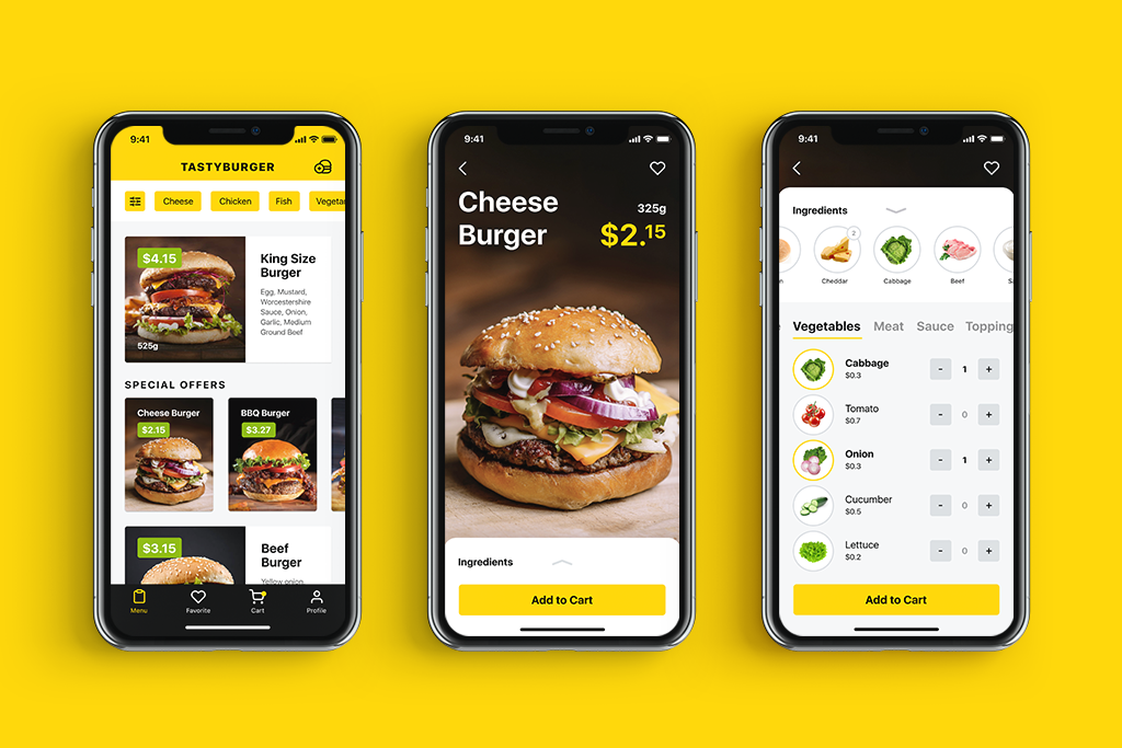
Tasty Burger app allowing for creating custom burgers to buy
Mobile Adaptation
Needless to say, there are many daily things people do with their smartphones nowadays, and shopping is becoming one of the top options. Besides, mobile adaptation is among the core web vitals of search engine optimization. If you want an e-commerce website to be googled successfully and let the visitors have a seamless shopping experience from any device, make the product page mobile-friendly and reconsider the layout to make the interface convenient and navigable for mobile devices. Some e-commerce platforms go even further and also invest in creating their native applications for iOS and Android, but for many small businesses, it may appear not affordable or even not reasonable. Anyway, the product page, as well as the rest of the website pages, should be responsive and mobile-friendly, no matter if the native app exists or not.
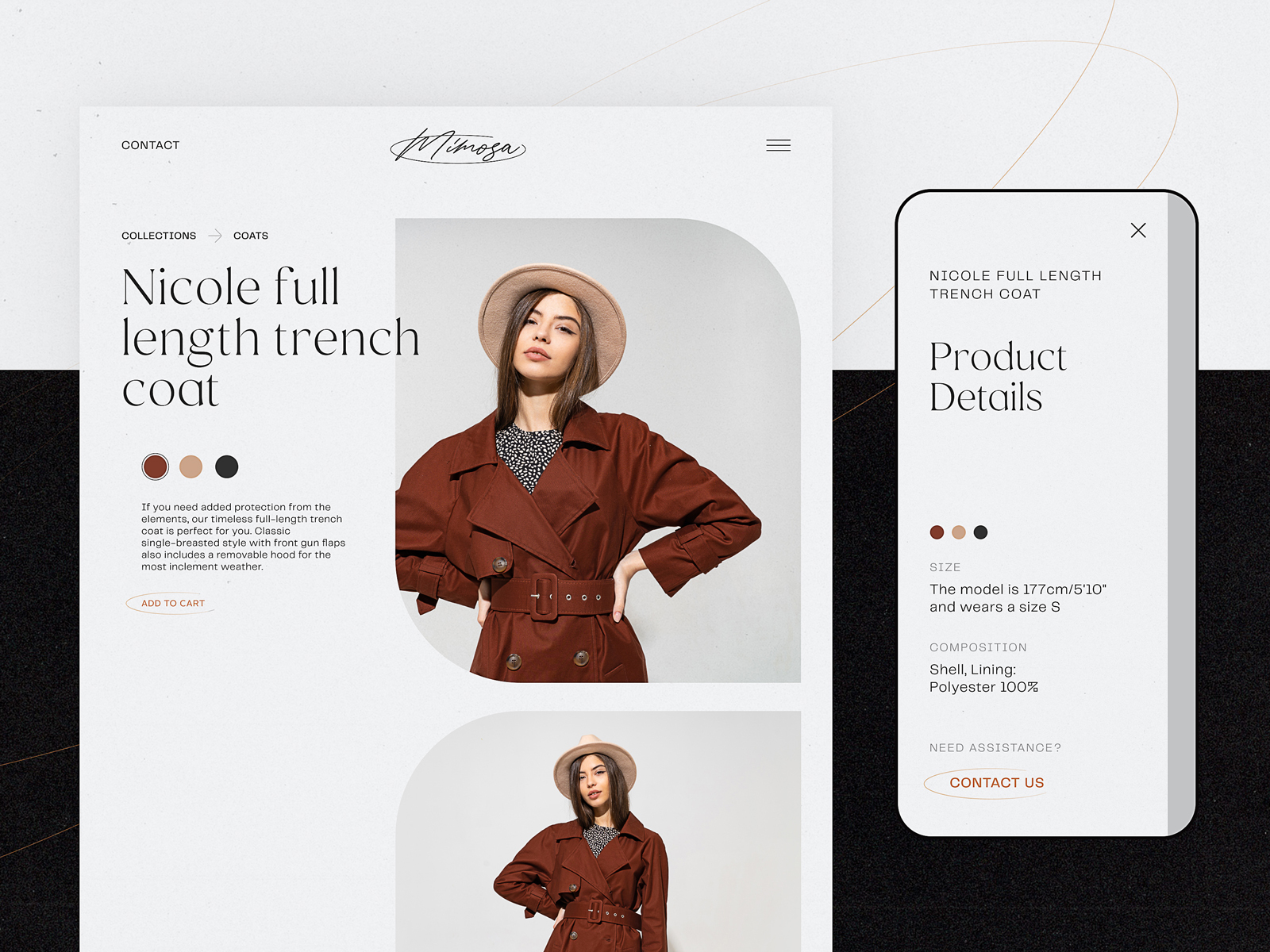
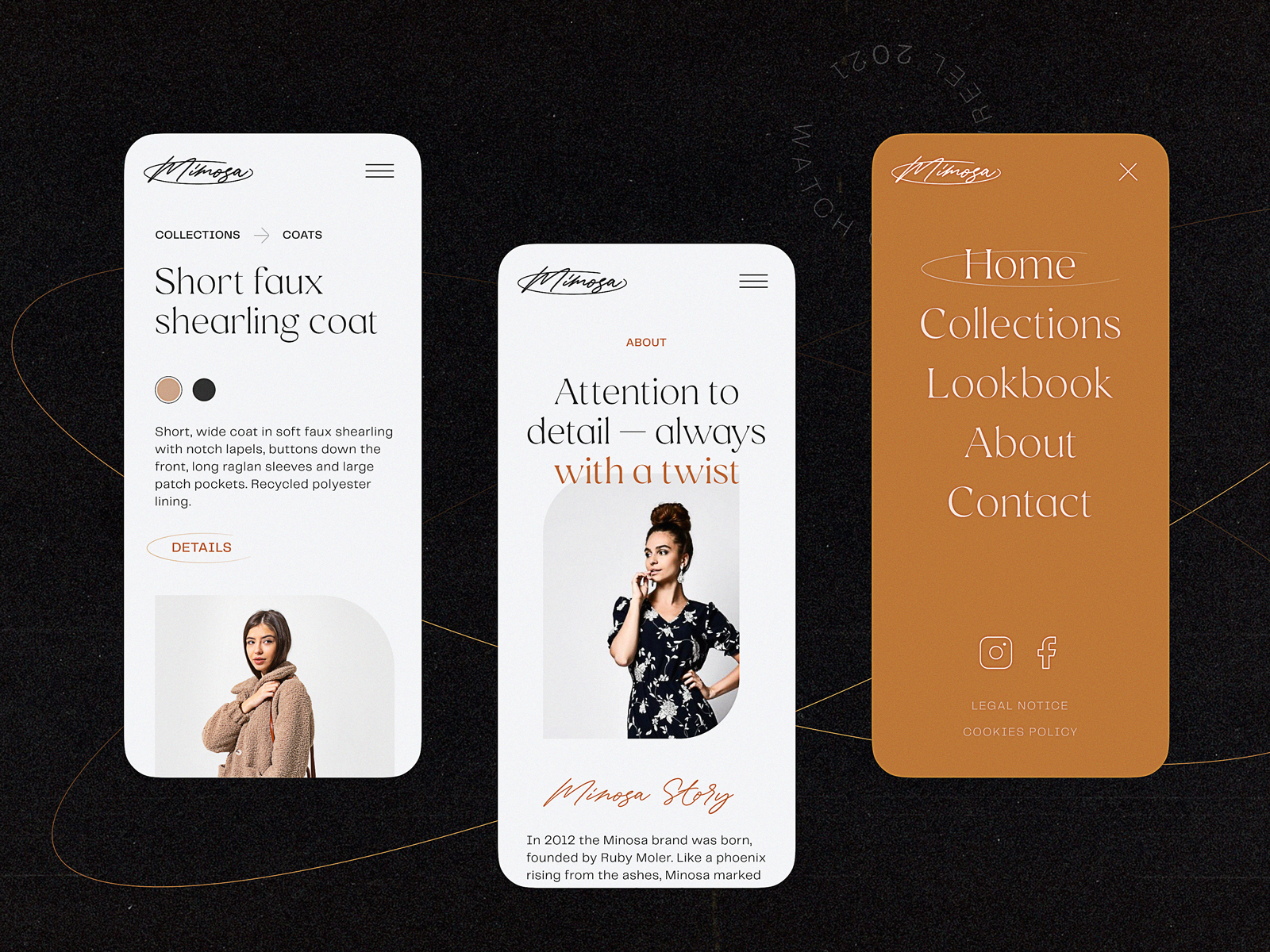
Minimalistic product page for a fashion brand e-commerce focused on photos, easy choice of color, and responsive to be used on any device
404 Error
With product pages intensively used and often updated, there are different cases of running into an error. People can accidentally mistype a letter in the URL, or the page they saved before may not already exist as the product is already out of stock. Make sure not to let customers come across an empty error page and go away. Connect them to other pages, offer relevant options or categories, and do everything to take advantage of the error page involving a customer to check something else.
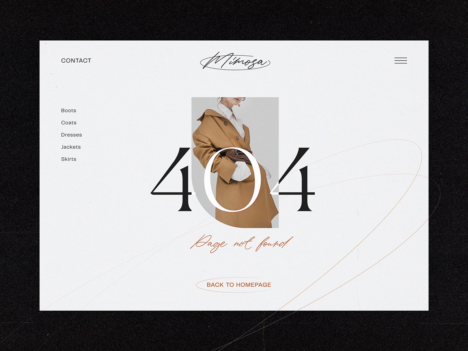
404 error page for a fashion e-commerce website
Bottom Line
Sure, the decision on the design practices to choose for a particular e-commerce project is a matter of thorough thinking, and the solutions on what to use and what to leave will be based on many subjective factors, from the type of product and market segment to the company budget, employers’ skills, individual tastes and specific needs of the target audience. The approach to mass-market e-commerce differs from the approach to a narrow niche. The approach to various generations of customers will be different.
Yet, all the practices mentioned above won’t work properly if the major condition of the commercial world is not followed, which is: the product should be good above everything else. All the other steps, investments, and practices make sense if the website sells quality goods and makes a website or app its channel of sales, not the place of lies and tricks. Anyway, if the products you offer are good and the customer is already on the website, let the product page show the item in its best light and help the shopper to feel it like home, convenient, clear, and friendly.
Useful Articles
Here’s a bunch of articles to dive deeper into the themes of e-commerce, web usability, and user experience design.
UX Design for E-Commerce: Principles and Strategies
11 Profitable Strategies for E-Commerce UI Design
The Role of Branding in UI Design
Business-Oriented Design. Know Your Target
Product Page Design Inspiration: 17 Ecommerce Web Designs
Design for Business: User-Friendly Way to Profits
Two Types of User Motivation: Design to Satisfy
5 Basic Types of Images for Web Content
Web Design: 16 Basic Types of Web Pages
Error Screens and Messages: UX Design Practices
Originally written for Tubik Blog, graphic and video content by tubik
- English
- Ukrainian


