How to Make User Interface Readable: Tips and Practices
How to Make User Interface Readable: Tips and Practices Learn what factors influence readability and legibility in web and mobile user interfaces and check how to improve them for better user experience.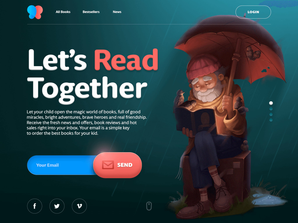
Whatever interesting your story is, the reader will never know it if it isn’t packed in a clear and readable layout. This article is devoted right to this aspect of user experience design: let’s check what readability and legibility are, why it’s important to care about them, what factors influence them in user interfaces, and how to improve them for usability and desirability of web or mobile user interface.
Why would you want to read about all that stuff? The reason is simple but big: app users or website visitors won’t read the content if it doesn’t look clear and digestible to them.
Readability and Legibility of Digital Content
Let’s start with the basics and define the phenomena of legibility and readability. Although designers often use the terms as synonyms, in fact, they are about different sides of content perception by the user.
Legibility of content is focused on how people see it and distinguish elements one from another. So, from this perspective, you deal with how people see the content on the page or screen, distinguish its elements and recognize them (for example, characters, words, sentences, numbers, etc). Based on that, we can say that legibility is more about the visual presentation of content that makes it edible and lets users quickly understand what is what on the page or screen.
As for readability definition, it’s easily found right in the name of the phenomenon: readability is the ease of written content perception. In its classic understanding, readability is the next level going deeper into the comprehension of the text content. It deals with the simplicity of words and sentences, clarity of thoughts, ease of consuming information, and the understandable structure of the text blocks.
Anyway, these days UX designers often give readability a broader understanding that combines both visual performance and clarity of the text itself: the term is often used to define how easily people distinguish different elements of text while legibility is focused on distinguishing particular characters and symbols in the particular words for specific typefaces. Whatever meaning you use for the terms, they are always united with one thing: how users see, scan, and read your content.

Factors Influencing Readability and Legibility
There is a number of factors that have an impact on making content legible and readable. Let’s review the ones that are directly connected to the design process.
Background
As well as it happens with printed books and newspapers, in digital interfaces the background color has a great effect on the ability to read and distinguish both interactive elements and content. For example, similarly to physical objects perceived on different backgrounds, black copy shown on white or light background seems to be larger than the white copy on a dark background. The wrong color scheme may result in poor readability which in its turn leads to poor user experience: users aren’t able to scan the data, even more – even if the data is relevant but not readable, users feel the inexplicable tense struggling with the text or even miss some critical information.
Any color scheme may be readable enough if the designer studies the peculiarities of copy perception on different backgrounds and works carefully on the font choice. The nature of the content presented in the interface also plays its part: text-based interfaces aimed at reading as the core activity tend to use more color schemes based on light backgrounds while the image-based interfaces often apply dark backgrounds to amplify pictures performance and give them deeper look.
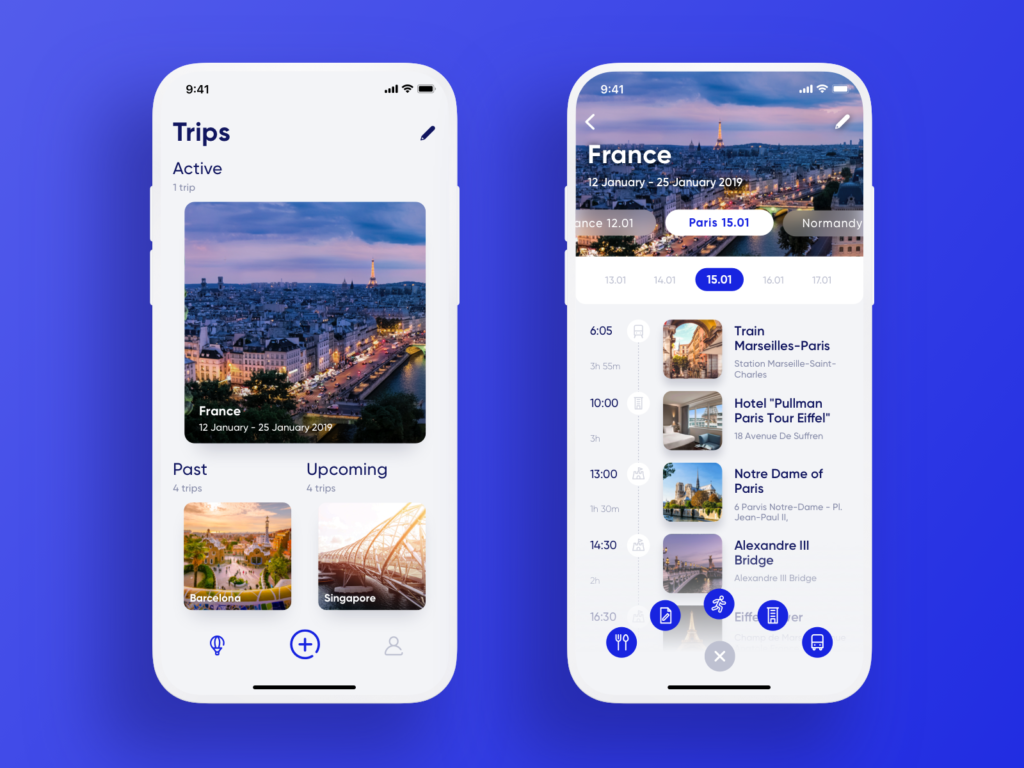
Travel Planner app uses a light background to make copy content readable even on the go
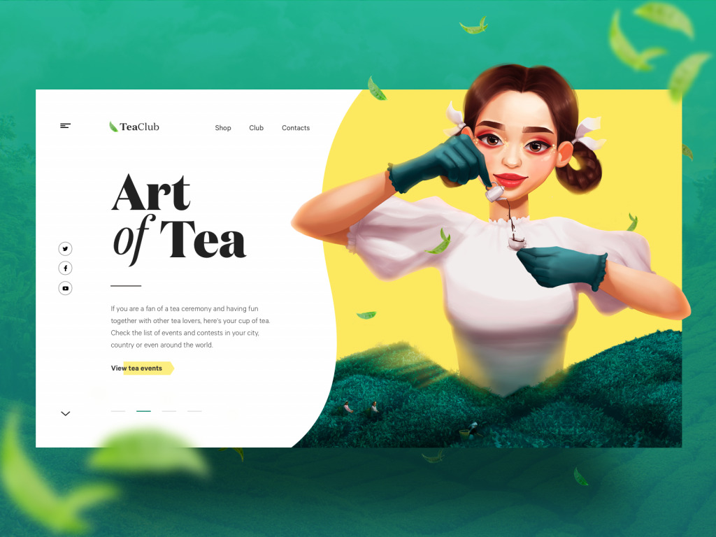
The webpage for the Tea Club website splits the screen with color and features copy content on the light background.

The page for a bookshop website is based on a dark background so the choice of fonts, their size, and contrast are different to ensure readability
Typography
In basic terms, typography is the skin of the text content. The choice of fonts directly influences how quickly and easily users will perceive and decode the copy. Font size, width, color, and text structure – each particular point matters. What’s more, as well as images, fonts are able to add mood to the written message with their visual style. Typography in design is the art of balancing aesthetic text with the ability to read it quickly – and this game is not as easy as you may think.
In the aspect of making content clear, there are several impactful points such as:
- white space (negative space): the area between elements in a design composition
- alignment: placing and justifying text
- tracking: adjustment of space for a group of type characters which form a word and text block
- kerning: adjusting the space between two type characters
- leading: the spacing between the baselines of text
- line length: the number of characters used for one line in a block of text.
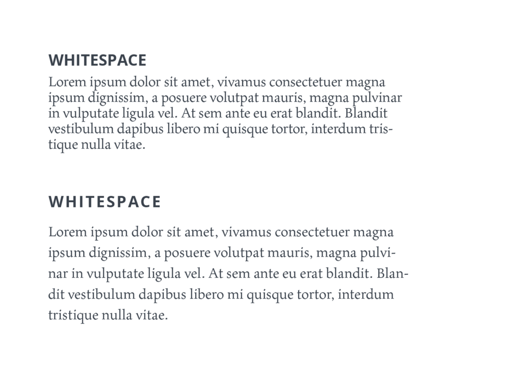
Working on the mentioned characteristics, designers tune the performance of text to make it not only eye-pleasing but also read easily. Not enough space between the words, too little distance between the lines or letters, too small font size or color that doesn’t create contrast with the background – all that stuff makes the text hard to read and creates tense for the user’s eye, although readers often can’t even explain what’s wrong. The balanced length of the line makes text bulks more readable and digestible for users. That is why designers pay much attention to typography issues in the creative process.
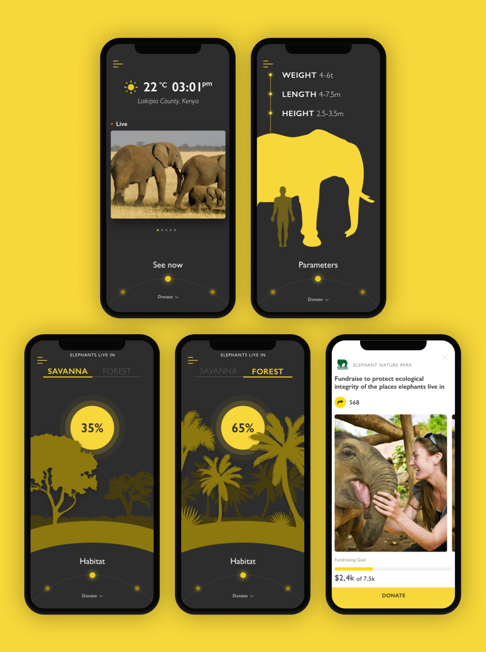
In the Nature Encyclopedia App the designer chooses readable sans-serif font to make the text easy to read; what’s more, for the charity pages, that feature more text, the background is changed to light. This contrast both enhances readability and marks the different nature and goals of the screens.
Visual Hierarchy
Visual hierarchy is an approach to content organization that makes the levels of content priority clear. It is based on Gestalt theory that deals with the psychology of visual perception of elements and shows how people tend to unify the visual elements. It organizes UI components so that the brain could distinguish the objects on the basis of their physical differences, such as size, color, contrast, style, etc.
It’s not a secret that coming to webpage users don’t start reading all the content as it is, they start with scanning it. For example, when we see the article in the blog, we’ll get the headline first, then subheadings, and only then copy blocks. Does it mean that the information in the copy blocks has a low level of importance? No, not at all, but this way users will be able to scan the headline and subheadings to understand if the article is useful and interesting for them instead of trying to read all the text. And if the headline and subheadings are done properly and inform the user about the structure and contents of the article, this will be the factor convincing to read more. On the other hand, if users see the huge and long sheet of text, they will be literally scared as they won’t understand how long it takes to read the article and if it is worth investing their time and effort.
So, with text content, it’s vital to present information gradually. For a copy, we are talking about the typographic hierarchy which includes different elements such as headlines, subheaders, body copy, call-to-action elements, captions, and so on. To build an effective visual hierarchy, all the elements need to be segmented into different levels.
The primary level. It includes the biggest type like in headlines. It aims at providing core information or drawing attention to the key benefit.
The secondary level. This is the type of elements that supports scannability, such as subheaders or captions which help users quickly navigate through the content.
The tertiary level. This one is for body text and additional data. It features a relatively small type still it should stay readable.
Negative space
Negative space (or white space as it’s also called) is the area of the layout that is left empty. It may be not only around the objects you place in the layout but also between and inside them. Negative space is a kind of breathing room for all the objects on the page or screen. It was already mentioned above as one of the factors of effective typography, but it also important in general user interface layout to set the connection between the text and non-text elements. For example, the amount of negative space will help you to see if the text and photo are connected to one message like in the case of image caption.
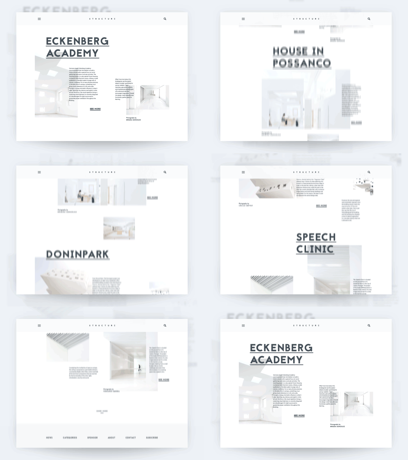
The architecture blog uses negative space as one of the core solutions enhancing the perception of content in the web interface.
Writing
As we recently told in our article devoted to UX writing, the text content in an interface is based on 4 basic features:
- clear (users understand what you talk about, the core message isn’t blurred or complicated)
- concise (the piece of text is meaningful, laconic, and concentrated on the goal, no empty talk is included)
- useful (the copy gives users necessary information or helps with interactions)
- consistent (the copy within the interface of one digital product keeps the same style, tone, voice, and terminology).
The good thing you can do with the written content for users of the app, website visitors, and blog readers is creating an atmosphere of human-like communication. Make your interface, landing page, or email talk like a helpful and friendly human with a clear style and voice of communication, without trying to awe and shock the interlocutor.
Tips on Better Readability and Legibility
1. Be short and consistent in the interface copy
Decide upon the main terms and names of operations and use them throughout the messages and notifications. For instance, if you’ve selected the word “delete” to mark the specific action, use it every time when this action is meant to be done, and don’t replace it with “remove” for some screens if the action is the same. Ask users to “Pay” instead of “Make a payment” – that’s easier to scan, faster to read, and you can make one word look bigger than a phrase for the button microcopy. Synonyms and elaborate phrases are good for making language bright and vivid in articles or books, but they may ruin user experience making users find the connections between synonymic terms instead of just using the product for solving their problems.
2. Apply content personalization
One of the ways to personalize the user interface and make it closer to users’ preferences is by letting users change the color of the background and set a bigger or smaller size of letters. Such functionality has a great impact on making content even more readable as nobody knows better than users what is more convenient for them.
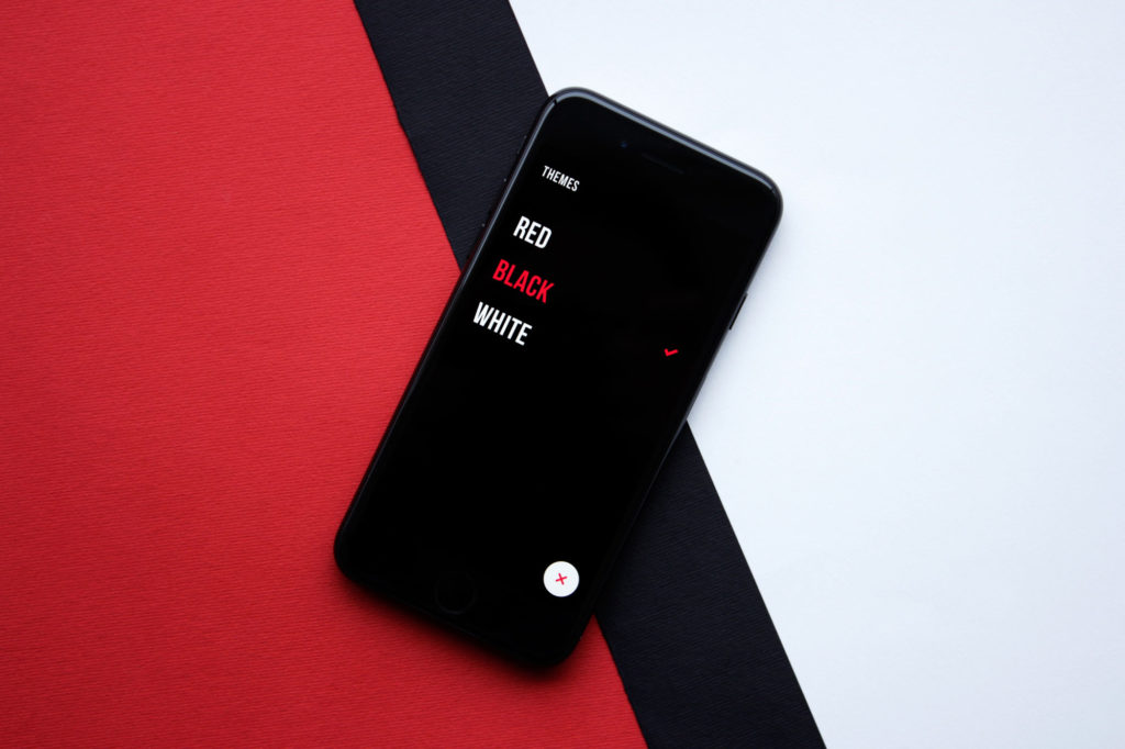
Upper App allows users to choose the theme color that is the most convenient for them
3. Consider split screen for different types of content
Split screens got especially popular for interfaces based on the dark or bright background scheme. It features one more approach to proper readability: applying boxes or spaces with the light background for core data blocks, designers make the content more readable and add elegant contrast to the screen or page.
![]()
4. Put one idea into one block of text
Working on the content in the aspect of scannability, try not to make the text fragments too long. Short paragraphs look more digestible and can be easier skipped in case the information is not valuable for the reader. So, follow the rule when you present one idea in one paragraph and start another one for a new thought.
5. Use numbers
Nielsen Norman Blog shared an interesting research finding: based on eye-tracking studies while users scan web pages, numerals often stop the wandering eye and attract fixations, even when they’re embedded within a mass of words that users otherwise ignore. People subconsciously associate numbers with facts, stats, sizes, and distance – something potentially useful for them. So, using numbers instead of text numerals, you influence the legibility and scannability of the text.
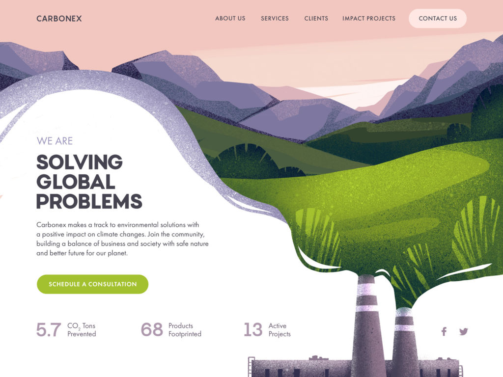
Website design for the environment protection community uses numbers as a part of the design layout and this way attracts attention to important data.
6. Don’t forget about the lists
One more good trick to make the text more legible and easily scanned is applying lists with numbers or bullets. They help to organize information clearly. Also, they catch the user’s eye so the information won’t get lost in the general body of the text.
7. Visually mark the key information in the text
Bold, italics, and color highlighting words or phrases in the text are old school but they still work successfully. This way you may attract attention to the specific data included in the paragraph. What’s more, the clickable parts of the text (links to other pages) must be visually marked. We are used to seeing them underlined, still highlighting them additionally with color or bolder font is even more effective.
8. Check the contrast
Contrast has a direct influence on the ability to distinguish text elements and read them quickly. Too little contrast makes the text elements coalesce into illegible spots, too much contrast causes eye tension and makes reading physically hard. So, firstly, remember about color theory that will help you to choose the palette with good contrast, and secondly, test the interface on different screens to make sure the contrast works properly in different conditions.
9. Play with fonts using common sense
Choosing the fonts, designers often want to apply something original and elaborate. Make no mistake: readability shouldn’t suffer for the sake of beauty. Still, it doesn’t mean that you should pass up the beautiful and catchy fonts: the typographic hierarchy helps to make good use of them. Sans-serif fonts are usually more legible while serif fonts look more elegant. Using a sophisticated or experimental font for a short tagline featured in big letters won’t harm the ability to read it quickly due to the considerable size of copy content. But if you choose it for long fragments of copy, the impact on readability may lead to poor user experience. Also, mind the color scheme: for example, dark background absorbs some part of the light from the other elements so there should be enough empty space between the elements, differently than it would work on a light background.
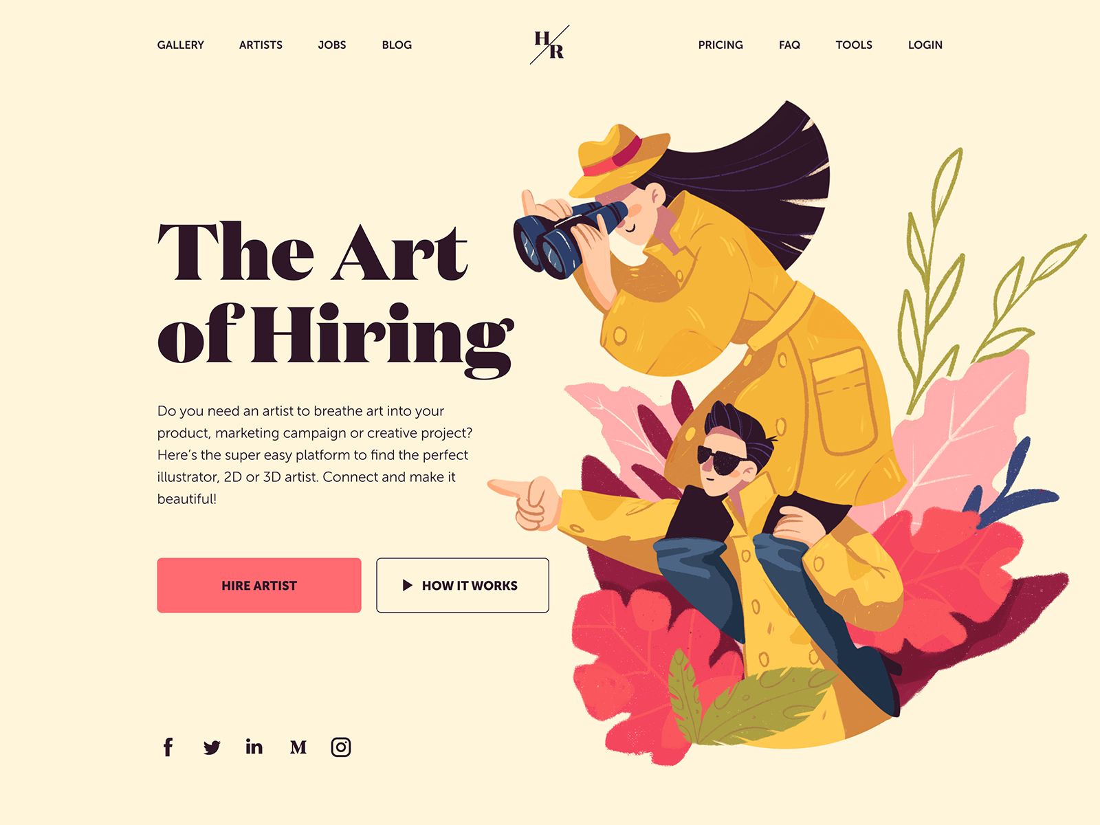
And this landing page features the choice of a serif font Domaine for the tagline. It visually reflects the style of the hero illustration. Yet, for the description copy block, the designer chooses a sans-serif font that is highly readable.
10. Give the text enough air
As we mentioned in the article about negative space in user interfaces, if there’s not enough space between the elements, they become hard to read and demand additional effort. It may be a strong reason for eye and brain tense although many users won’t be able to formulate the problem. A proper amount of negative space, especially micro space, solves this problem and makes the process more natural. So, negative space directly influences the efficiency of typography on the page or screen. In music, pauses play the same role as sounds. In reading it works the same way: empty spaces placed correctly make the text easier to read.
11. Divide the blocks of content
One of the natural ways to divide the blocks of content is using subheadings or traditional dividers using horizontal or vertical lines. This way you let readers or users easily separate different elements and understand their interconnection in one layout. The negative space mentioned before also effectively works as a divider. Another way is by using images. It may appear not logical at first glance, but images do help to make the content readable and legible. For example, used in articles, they work as elegant and informative dividers that both illustrate the text content and separate different parts of it. With an image, you give users a brief rest from reading and even a long article may look not that overwhelming as it would without pictures. Illustrations, photos, and 3D graphics catch users’ eyes much quicker and are faster decoded than text. So, the images can work as directional cues and navigate users to the messages or calls to action presented in text form. Also, it’s advisable to make text harmonically work together with key images on the page or screen: this way they amplify the effect of each other.
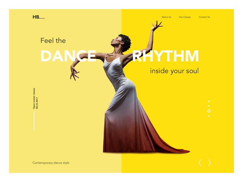
The landing page for the Dance Academy divides the copy content into scannable blocks supported with images
12. Use the power of title case
Although there are hot discussions about using sentence case instead of title case to make the text feel more informal, for English speakers, it’s still a natural feature of the language that marks the levels of text hierarchy. So, consider the following tips about capitalization:
- Use Title Style Caps to mark field labels, actions, menu items, and page titles
- Choose Sentence style caps for longer copy such as page or field descriptions and tooltips
- Apply ALL-CAPS moderately, only to super important items (short taglines, brand name, core navigation points in website header, short call-to-action text, and abbreviations like OK).
Whatever choice you make, what’s really important: be consistent. If you decided to use the title case for all the buttons, follow that rule through all the screens.
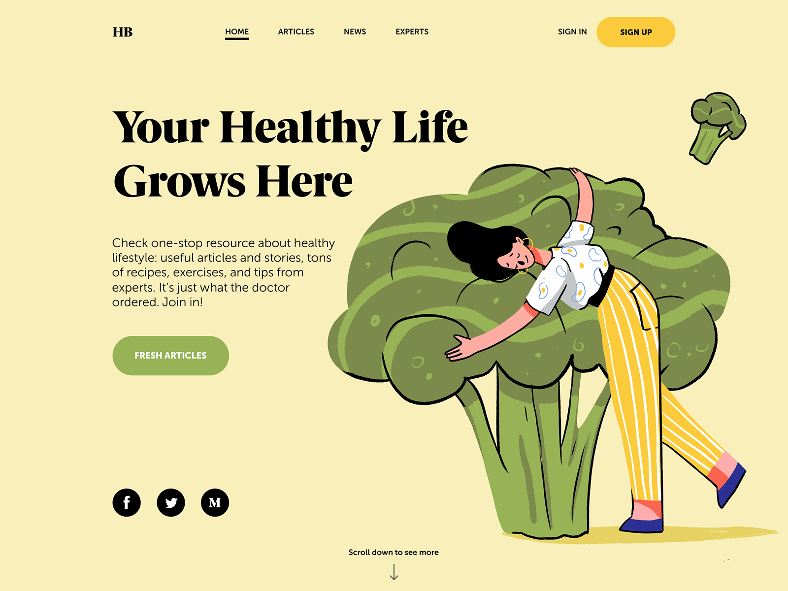
The landing page for the Health Blog uses all-caps for button microcopy and header elements, title case in the tagline, and sentence case in the description.
Sure, all the mentioned points can be discussed further and deeper and unveil more ways to enhance the clarity of the content on the page or screen. Still, hopefully, today’s article will become a helpful checklist that will help UX designers to make the interfaces not only beautiful but also easily readable.
Useful Design Articles
UX Writing: Handy Tips on Text Improving User Experience
3C of Interface Design: Color, Contrast, Content
Negative Space in Design: Practices and Tips
User Experience: How to Improve Web Scannability
Hero Images in Web Design: When, Why and How
Color Scheme for Interface: Light or Dark UI?
Originally written for Tubik Blog, graphic content by tubik
- English
- Ukrainian


