Guide Into Types of UI Copy for Mobile and Web Interfaces
Guide Into Types of UI Copy for Mobile and Web Interfaces The article presents a classification of different types of copy content applied in web and mobile user interfaces and provides tips on UI copywriting.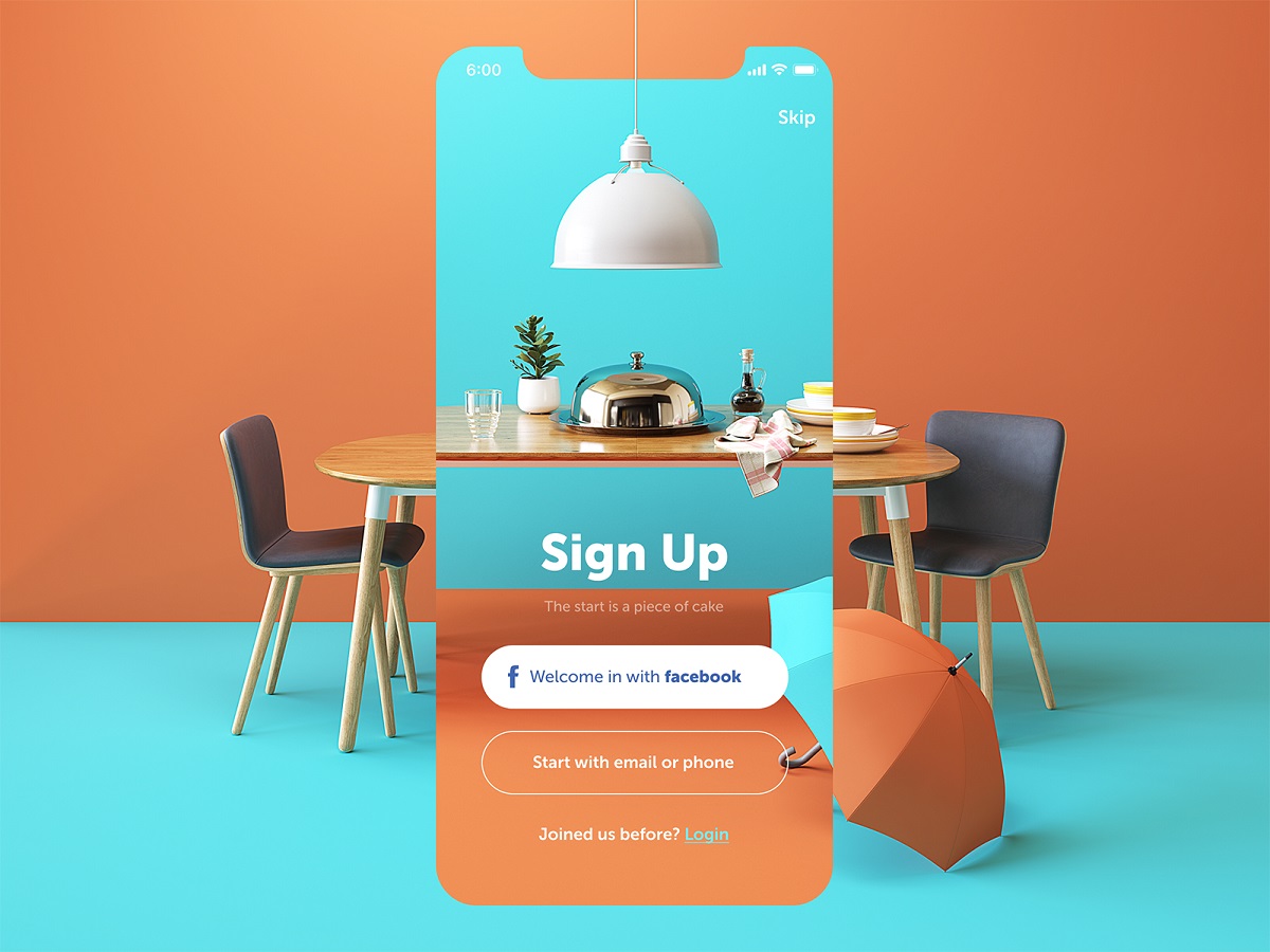
Quality copy is a key part of a successful user interface performance. Text and visual components mutually support each other creating the sufficient design and user experience of a product. Some may associate UI copywriting only with the long block of text such as in blogs or informative pages, but it’s just a tip of an iceberg. A new article provides a guide to different types of copy applied in user interfaces and shows UI copywriting examples.
Restaurant App
What’s UI copywriting?
In our previous articles, we’ve already touched upon the topic of copy in UI. To remind, copywriting for web interfaces and mobile apps involves the creation of text content, both small and big. Each word applied in a user interface is an inseparable part of a layout and plays its role in the user experience of a product.
Effective copy content improves the usability of the apps and websites as well as encourages people to interact with the interface. To create an appropriate UI copy, designers need to master additional skills and knowledge since the field is quite complicated. Also, it may be good to engage a professional copywriter or technical writer in the creative process to make it faster and more productive. Today we want to give an insight into the different types of copy as well as provide some tips based on UI copywriting best practices.
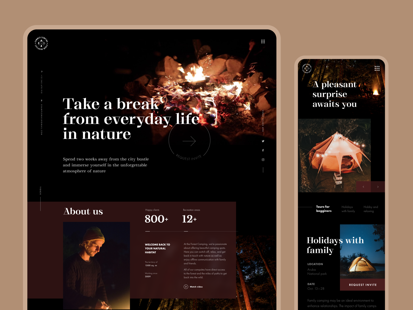
Forest Camping Website
Information copy
Headlines
A headline is a large, bold word or phrase that users usually notice first in any interface. Headlines deliver and emphasize the key informative message of a page. Headlines should be catchy and short so that they could quickly draw users’ attention. The results of the research published by Buffer, the popular social media sharing platform, showed that the perfect length of the headline is 6 words.
Moreover, headlines need to be meaningful to inform users of the web page or screen’s theme. To provide a better understanding, it’s helpful to support a headline with additional visual elements, such as photos.
Agriculture Holding website
Subheaders
Subheaders are brief and concise phrases that help users quickly scan text so that they could understand if they are interested in it. The headlines can give only a summary of the theme or message of the whole page while subheaders mark out the core points in separate sections of text.
To create proficient visual hierarchy, designers usually chose smaller fonts for subheaders than for headlines. Still, they need to be bigger than the rest of the copy for fast scanning. Also, it is recommended to make subheaders fonts bold so that they would look prominent among the other text.
Cryptocurrency Report landing page
Body copy
Body copy is usually a part of text that provides description or further information, placed in a compact block under a subheader or headline. Traditionally, body copy applies thinner and smaller fonts, sometimes presented in italic for even more prominent visual contrast.
There is no unified opinion about the best length of body copy. Some content creators claim that long copy is more informative and serious-looking, while others declare that only short copy is effective since users never want to read too much. However, to achieve efficiency in the text, it’s good to vary the length according to the target audience. The thing is that users are incredibly different; they have diverse preferences, goals, and wishes when searching for web resources or mobile apps. Long and short copy can bring pros and cons, and each of them can be appropriate depending on the target users of a product and its conversion goals.
UI copywriting for mobile apps and landing pages often requires applying short copy: their users usually want to see concise and highly informative copy content. Moreover, mobile interfaces have a limited amount of space, so too much copy won’t look nice and will demand additional effort for reading. Long copy is sufficient for web products providing users with complex information on specific topics as well as the presentation of new products that need additional informative support.
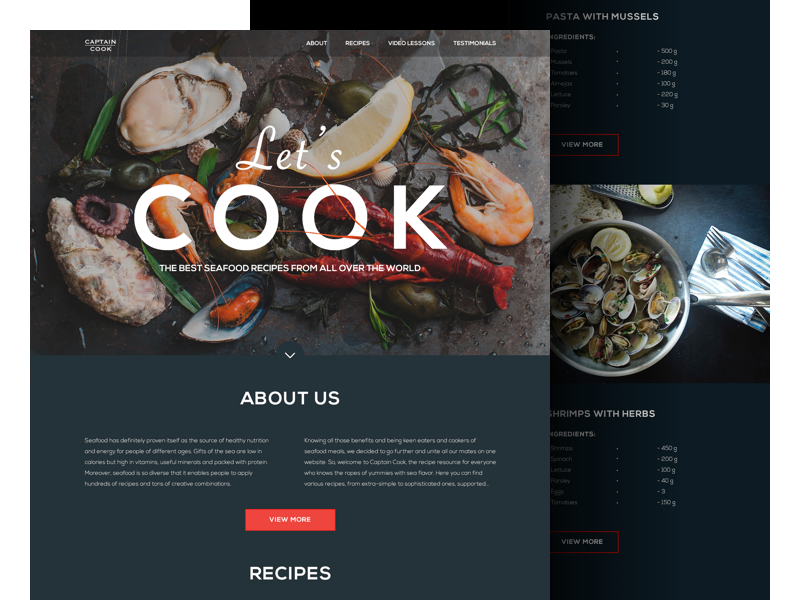
Seafood Recipes landing page
Interaction copy
Captions
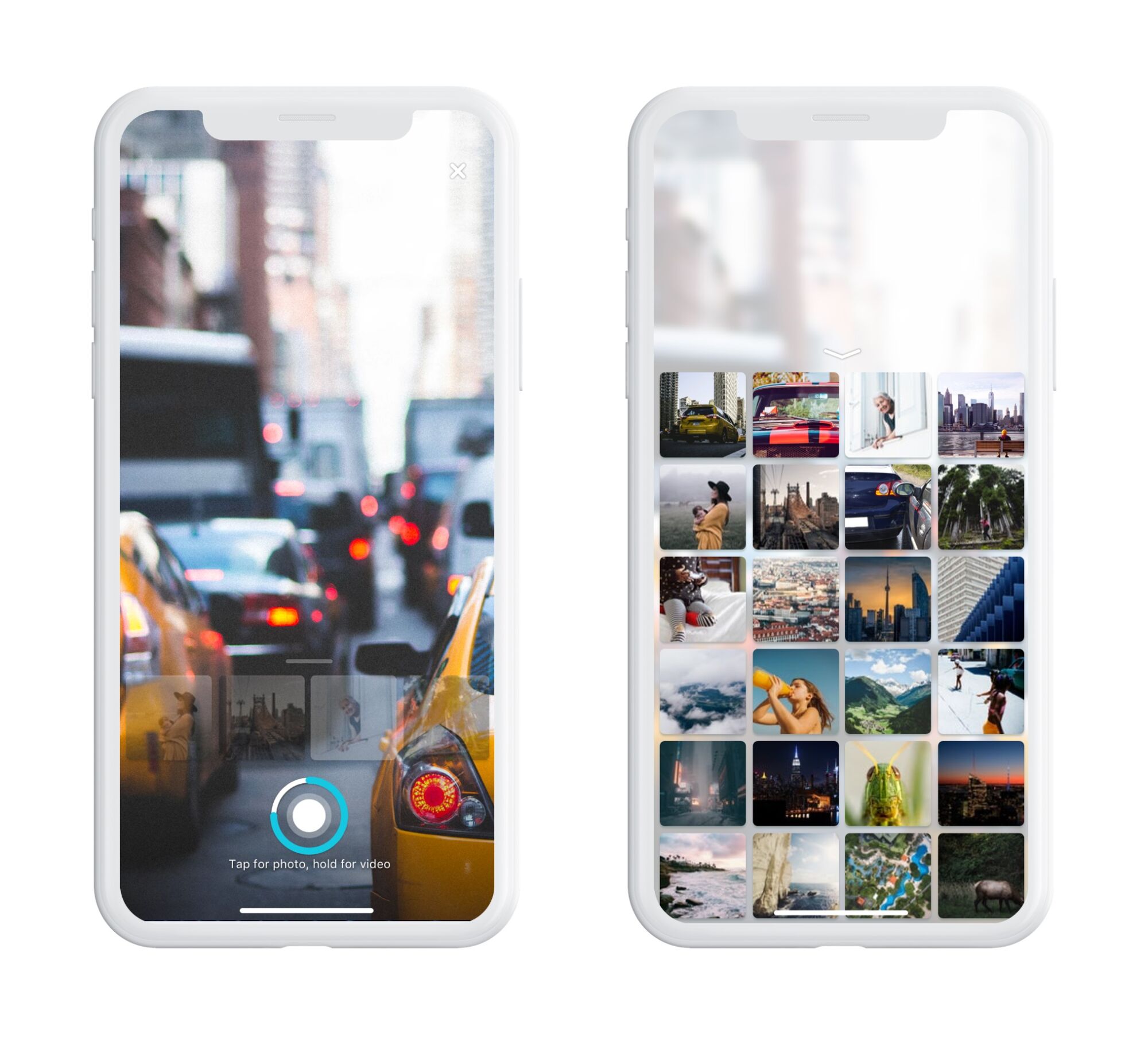
Caption is the short text under a picture describing its content. In web interfaces, fonts are usually small and often italic, and in mobile interfaces, the sizes of fonts depend on the size of a picture.
A powerful caption needs to contain accurate data helping users to understand what they see. It’s important for captions to provide new information so it shouldn’t describe obvious statements which users already see in the photo. Choose the tone of the caption according to the specifics of the target audience and the whole content on the page. If you apply pictures from a side author, you should include credits and citations otherwise you break copyright law.
Fashion portfolio website
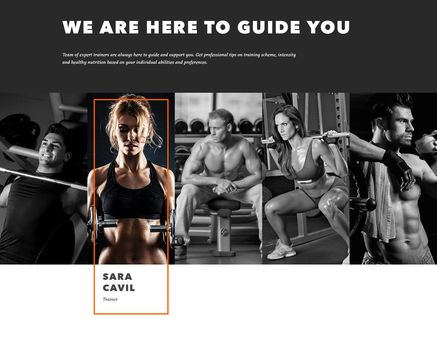
Gym landing page
CTAs
CTA button copy is a call to action that tells users what they will do when they click the button. CTA microcopy has to catch users’ attention quickly and lead them right to the action.
To make a sufficient call-to-action, you need to keep the number of words at the minimum, usually not more than 1-2 words. A few appropriately chosen words work much faster than a long descriptive phrase. In addition, applying imperative case in CTA microcopy, you give strong and direct instructions on what users can do next.
Moreover, a CTA should stand out among the other components on a layout, which is why high contrast is a must. Prominent colors and size can make call-to-actions easily noticeable and increase readability.
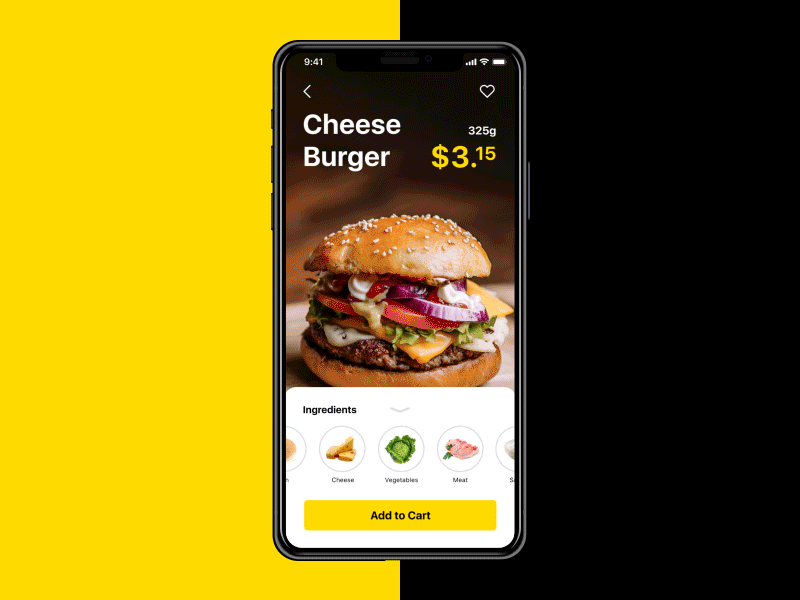
Tasty Burger app
Notifications
Notifications are applied to both web and mobile user interfaces. They are usually short messages that aim to inform people about upcoming upgrades or other product activities, as well as to provide reminders to keep users engaged.
Notifications need to be created that way so they could enhance the user experience and wouldn’t annoy users. That’s why notification messages need to contain only valuable information. Moreover, it is recommended to keep the messages short and clear. The research shows that the notifications with less than 25 characters perform much better than long text. Creating a notification it’s vital to be authentic to a brand voice. The tone of a message has a significant impact on how people perceive a product and a brand.
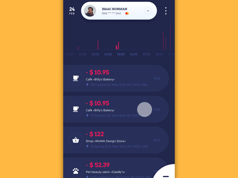
Home budget app
Errors
Errors are an inseparable part of any digital system, including system failures and users’ errors. In case some unexpected conditions happen, it’s vital to provide users with the information helping them to understand how to handle problems.
An error message is a short text tip displayed to a user by a website or application when something goes wrong. An error message should be clear and helpful so that users can define the problem and what to do about it. A message needs to be polite and friendly to make users feel calm about the situation. In addition, a bit of humor can help annoyed users feel more relaxed and enhance a product’s user experience. Still, you need to be careful adding jokes since it can be inappropriate or misunderstood in some situations.
To improve the efficiency of error messages, designers should consider their placement. It is good to place a message near a UI element that it is related to.
User onboarding
User onboarding tutorials are often applied to various digital products. Tutorials appear to users who launch a mobile or web product for the first time, helping them get oriented within unfamiliar features and controls. Also, onboarding is a great opportunity to enhance user motivation and present the product in a way that encourages people to use it more than once.
Onboarding tutorials usually contain short but clear copy describing the benefits of a product helping users to understand if it can be useful for them. The major task of an effective onboarding copy is to engage users and not to make them bored. That’s why tutorials usually apply minimalistic and concise text presenting only key tips that aren’t obvious for users. It’s recommended to use imperative since it helps to reduce the number of unnecessary words.
Bee and Honey App onboarding screens
Menu copy
A menu is a basic navigation component of any user interface, allowing for interactions with a product via graphical control. Menus can vary in different interfaces by placement (side menus, header menus, footer menus, etc.), the performance of appearance and interaction (drop-down menus, drop-up menus, sliding menus, etc.).
Even though there are different types of menus, each of them requires copy elements. Text for a menu usually includes one word for each action. For example, it can be presented as a list of commands consisting of verbs such as “send”, “save” or “download” which mark certain actions available in a product. Also, the menu can introduce the categorized content and sections of the layout. In this case, the copy includes nouns to mark the destination users can follow. The choice of the menu type and the copy for it should be based on the specifics of the target audience preferences and expectations.
Upper App
Tooltips
Tooltips are labels that appear when a user hovers over or taps a UI element. Their task is to identify interactive components in a user interface providing short info about their essence or function.
Tooltips copy is often created in imperative making it look more like a valuable instruction rather than a distracting message. Practice shows that short tooltips work better so it’s recommended to keep the number of characters under 150. If your message can’t be cut down, you can divide it into several labels.
Pazi mobile app design
Product-generated emails
Product-generated emails are notifications that inform users about activity in a product. For example, they remind you to activate an account or show the progress in an app.
Product-generated emails can be divided into several types. First of all, there are activation emails that help to verify the email address provided by the user during sign-up. Such emails usually consist of greetings and an active link leading users to their new account. The next type of email often follows the previous one. Once users create accounts they receive a welcome message. They aim at providing essential information about the terms and conditions of a product as well as general insight into the benefits it provides.
Security and account change notifications are essential for any kind of product. It’s vital for users to know that their personal data is safe. Providing updates about activity in the account such as change of a password or logins from unknown devices assist in protecting users’ accounts.
There are several conditions for creating effective copy for product-generated emails. First of all, they need to have catchy and clear headlines so that users won’t miss messages. Moreover, the email should clearly explain the aim of the message and what users should do about it. Copy should be personalized to make users understand it has value for them. Finally, the tone of a message needs to be based on the results of user research.
Copy plays a significant role in the flow of interactions with UI. That is why it’s important to analyze every single piece of copy and create it in a way corresponding to the general design concept and positive user experience.
Useful Articles
Copy Content in User Interfaces: Tips and Practices
The Anatomy of a Web Page: Basic Elements
How to Make Web Interface Readable
UX Writing: Handy Tips on Text Improving User Experience
Error Screens and Messages: UX Design Practices
How to Improve Web Scannability
3C of UI Design: Color, Contrast, Content
Originally written for Tubik Blog
 https://design4users.com/ui-copy-for-mobile-and-web/
2026-01-21
© by
Marina Yalanska
,
https://design4users.com/ui-copy-for-mobile-and-web/
2026-01-21
© by
Marina Yalanska
,
- English
- Ukrainian