
User Experience: Best Practices on Effective Visual Hierarchy
User Experience: Best Practices on Effective Visual Hierarchy Visual hierarchy is essential for effective design composition. Let’s see tips helping designers to structure and organize UI elements on web and mobile layout.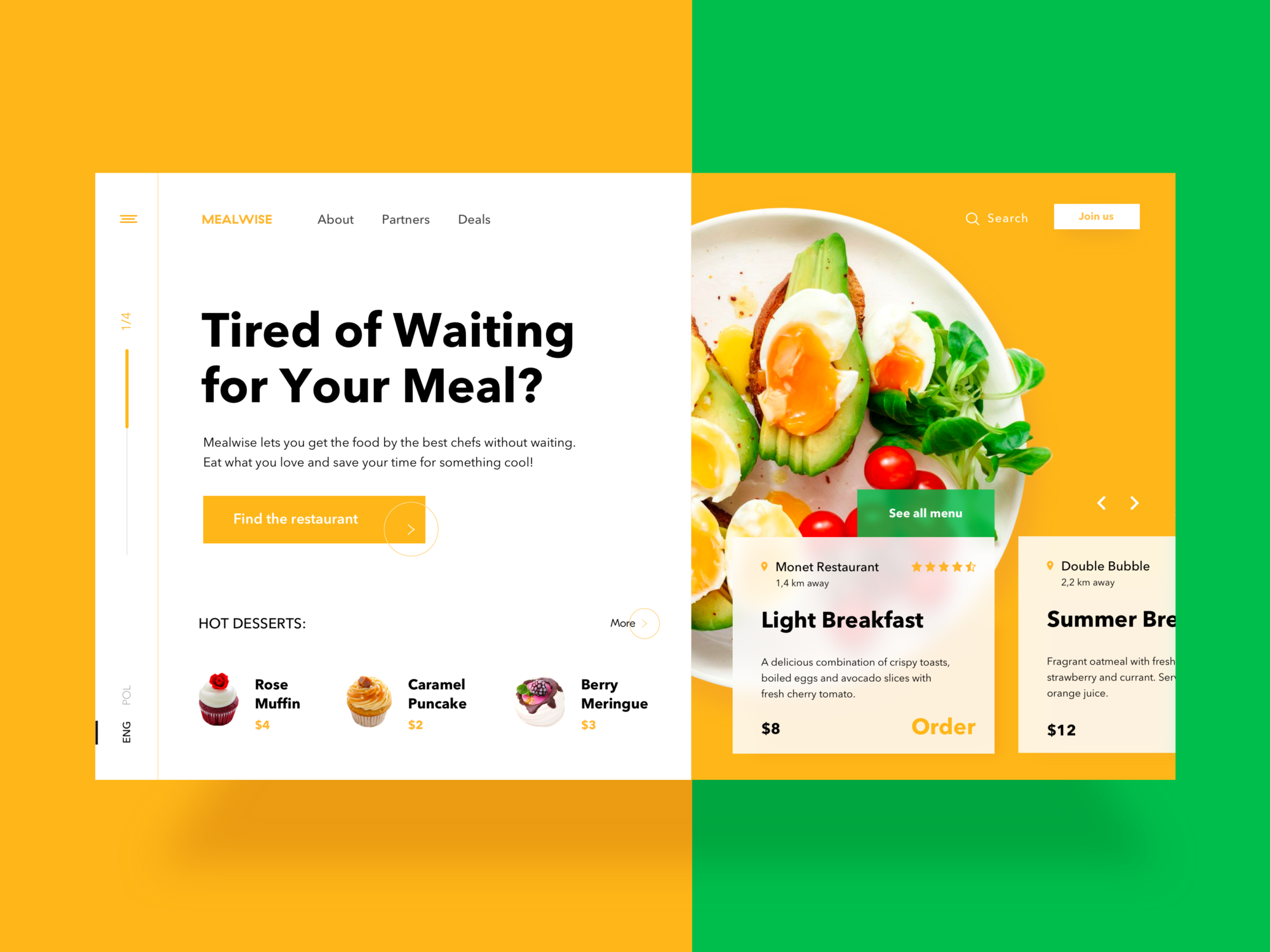
Sufficient visual hierarchy is the foundation of a successful digital product. It helps to organize UI elements in an effective way so that content would be easy to comprehend and pleasant to see. The presentation of visual elements has a great impact on the user experience. If the components are organized wisely, users navigate and interact with a product without efforts and enjoy the process.
So, what makes a powerful visual hierarchy? Of course, different kinds of products require different methods of building it still there are some common solutions helpful for UI content organization. Today’s article provides useful tips on creating a compelling visual hierarchy for web and mobile products.
Keep business goals in mind
There are often business goals standing behind a digital product. To achieve them, the creative team needs to work out which UI elements are more important and prioritize them according to their roles. For example, all the elements on e-commerce websites perform the tasks of various levels. The item images are usually the main eye-catchers since they have to encourage customers to consider it. A heading goes after the image explaining what it is and the next important stage is a CTA button calling people to buy an item. By considering business and marketing goals set for the website or app, the creative team can effectively prioritize visual content and make a product stand out of the crowd.

Design Agency Landing Page
Consider scanning patterns
In our previous articles, we mentioned that before reading a web page, people scan it to get a sense of whether they are interested. Different studies, including those by Nielsen Norman Group, have revealed several popular scanning patterns, among them the “F” and “Z” shapes.
The F-pattern appears mainly on digital pages or screens with a large amount of content, such as blogs and news platforms. Users’ eyes move in an F-shape: first, they scan a horizontal line on the top of the screen, then move down the page a bit and read across the shorter horizontal line, finishing with the vertical line down on the left side of the copy, where people look for keywords in the paragraphs’ initial sentences.
A Z-shaped pattern occurs on web pages that aren’t overly copy-heavy or that don’t require scrolling. The pattern is the following: people first scan across the head of the page starting from the top left corner, searching for core information, and then go down to the opposite corner at a diagonal, finishing with the horizontal line at the bottom of the page from its left to right.
Knowing these patterns, designers organize content, putting all the core UI elements on the most scanned spots to draw users’ attention.
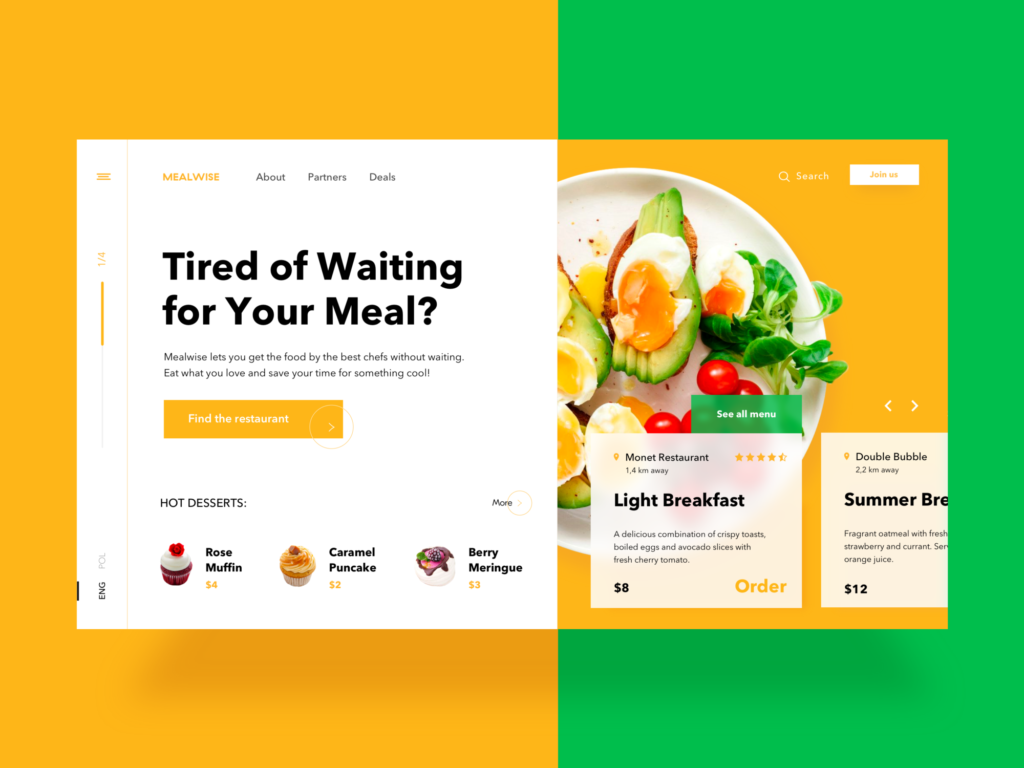
Food Order Website Design
Functionality first
The visual hierarchy may seem to be oriented only to the aesthetic aspects, but it’s not like that. First of all, by structuring and organizing visual elements, designers need to make sure a product is clear to use and the navigation works right. The visual hierarchy, which is built exceptionally on aesthetics, can’t work effectively. User interface with badly structured content leads to bad UX. So, while building visual hierarchy designers need to consider functions of UI elements and a role they play in the navigation process.
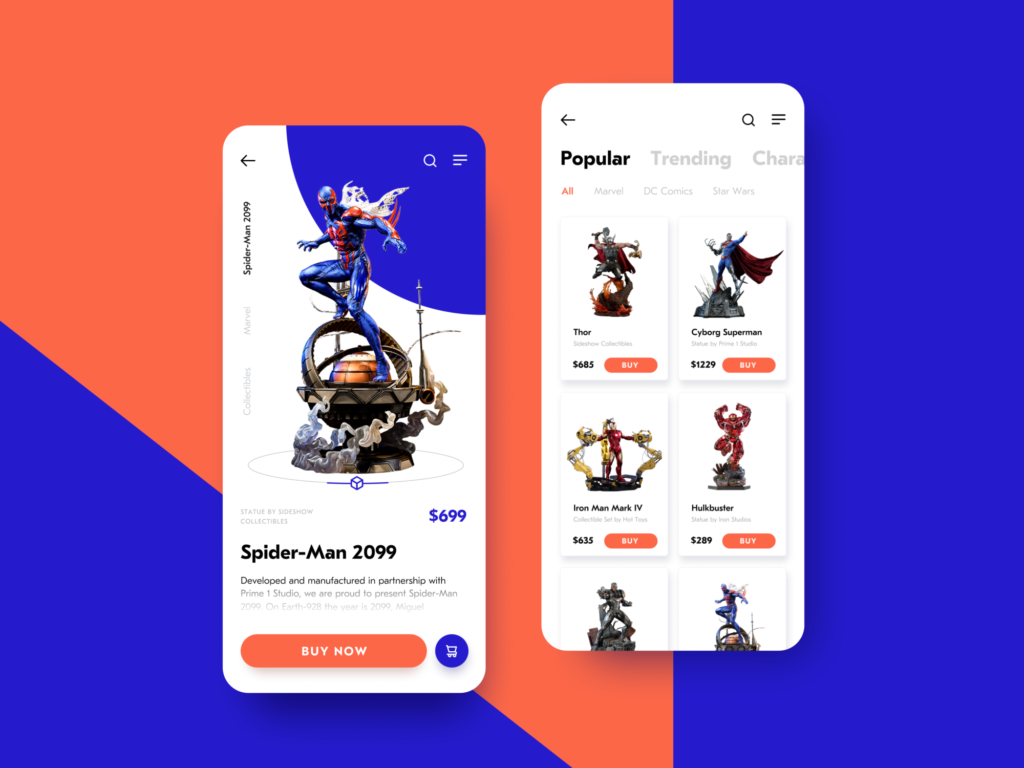
Action Figures Ecommerce App
Remember that white space is a visual element
White space, or negative space, is not just an area between design elements; it is actually a core component of each visual composition. It is a tool that makes all user interface elements visible to users’ eyes. Designers can group or separate UI components to create an effective layout. Moreover, negative space helps to emphasize particular elements that require deep attention from users. White space is an effective instrument for creating a visual hierarchy, so designers need to work on its balanced usage.
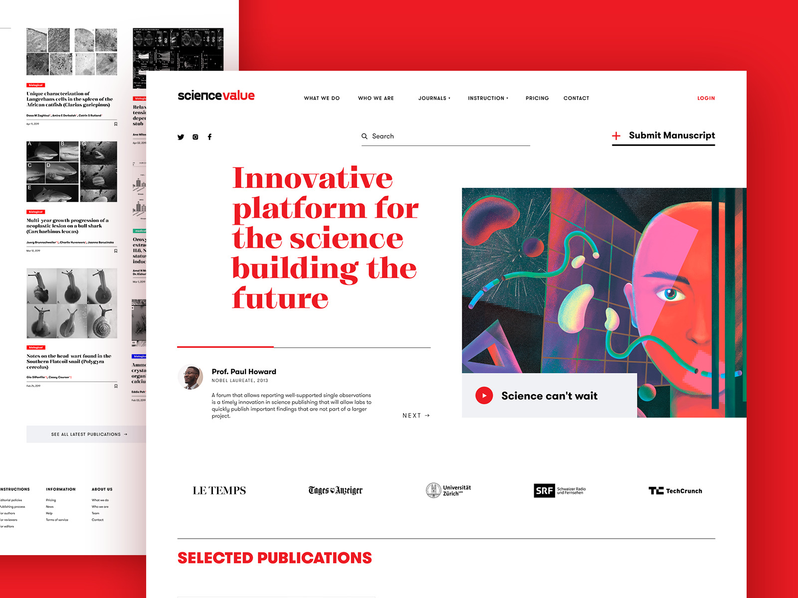
Scientific Web Platform Design
Apply the golden ratio
We devoted one of our latest articles to the golden ratio applied in design. It is a mathematical proportion of the elements of different sizes, which is thought to be the most aesthetically pleasing for human eyes. The proportion equals 1:1.618 and it is often illustrated with seashell-shaped spirals which many of you could have probably seen.
Designers often apply the golden ratio at the stage of wireframing. It helps to plan a structure for the layout placing and sizing user interface elements in the right proportion which will be pleasant for users.
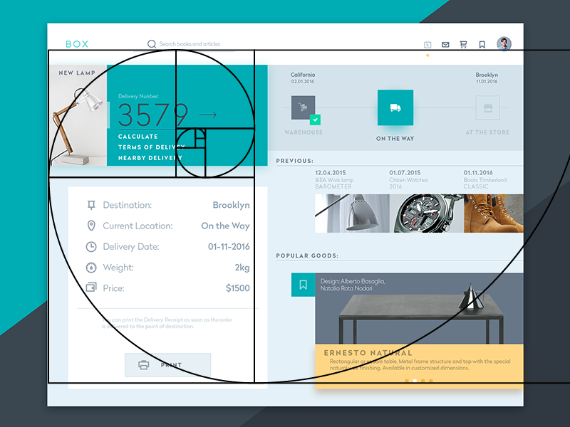
Tracking Widget
Use a grid
A grid is one of the key tools applied at the different stages of the creative process and visual hierarchy is not an exception. A grid helps to structure all the components and put them into the appropriate sizes and proportions. What’s more, designers can effectively work with the negative space since a grid shows if the elements are placed proportionally and even.
Add some colors
Color choice and combinations are essential for visual hierarchy as they help users to distinguish the core elements. The thing is that colors have their own hierarchy, which is defined by the power of influence on users’ minds. There are bold colors, such as red and orange, as well as weak ones, such as white and cream. Bold colors are easy to notice so designers often use them as the means of highlighting or setting contrast.
Moreover, applying one color to the several elements you can show that they are somehow connected. For example, you can choose a particular color for purchase buttons or buttons of adding content so that people could intuitively find them when they need to.

Travel Planner App Design
Pay attention to the fonts
Visual hierarchy includes a core subsection called typographic hierarchy which aims at modifying and combining fonts to build the contrast between the most meaningful and prominent copy elements which should be noticed first and ordinary text information. The fonts can be transformed by regulating sizes, colors, and families as well as their alignment. Different fonts can divide the copy content into different levels so that users could perceive the information gradually. However, designers are recommended to keep the number of fonts within three since too many fonts look messy and make the design inconsistent.
Three levels for web, two for mobile
As we mentioned above, different fonts form typographic levels, which consist of such elements as headlines, subheaders, body copy, call-to-action elements, and captions. There are three typographic levels: primary, secondary, and tertiary. The first one includes the biggest type and aims at drawing people’s attention to the core information on the screen. The next level provides copy elements that are easily scanned and help users navigate through the content. The tertiary level usually applies body text and some additional data which is presented via a relatively small type.
In many cases, web products include all three levels since they are more likely to provide a big amount of content. On the other hand, designers are recommended to keep the number of layers within two while creating typography for mobile. The small screens don’t provide enough space for three levels so the elements of a secondary level such as subheaders have to step aside to make mobile UI look clean.
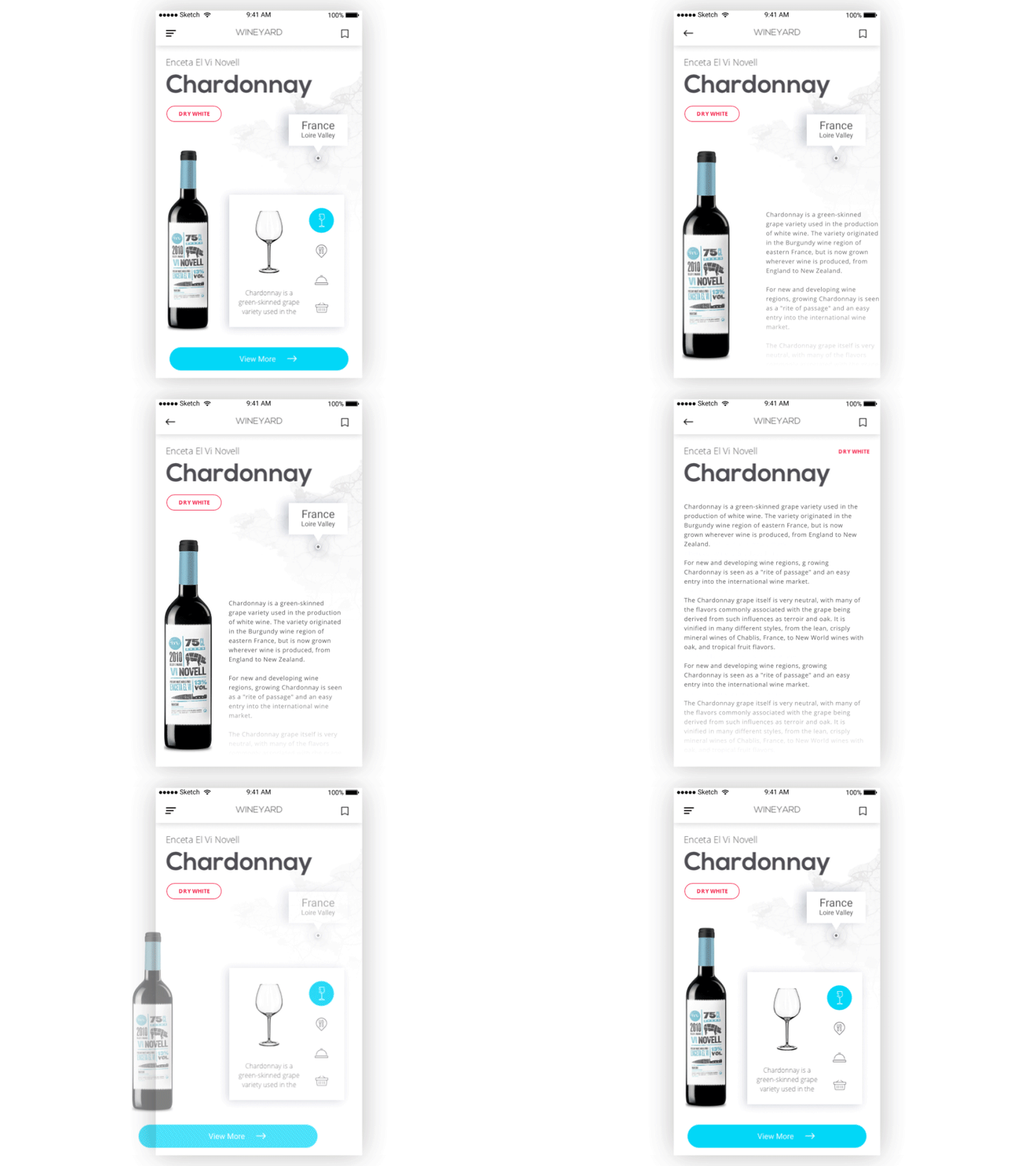
WineYard App
Effective visual hierarchy is not only about aesthetics. It aims to provide problem-solving navigation and interaction systems, as well as a friendly user experience. To create a sufficient visual hierarchy, designers need to organize all UI elements considering the functionality and business goals.
Useful articles
The topic of visual hierarchy is broad and complex, so we gathered some helpful articles that explore various aspects.
Visual Hierarchy: How to Organize UI Content
How Golden Ratio Works in User Interfaces
How to Make Interface Effort-Saving
Copy Content in User Interfaces
Information Architecture. Techniques for Designers
Typography in UI: Guide for Beginners
5 Basic Types of Images in Web Design
The Anatomy of a Web Page: Basic Elements
Originally written for Tubik Blog
 https://design4users.com/best-practices-on-visual-hierarchy/
2026-01-18
© by
Marina Yalanska
,
https://design4users.com/best-practices-on-visual-hierarchy/
2026-01-18
© by
Marina Yalanska
,
- English
- Ukrainian