3C of UI Design: Color, Contrast, Content
3C of UI Design: Color, Contrast, Content The article covers three core aspects of user interface design: color, contrast, content. Check how they influence usability and interactions of web and app UI.
Many factors influence the outcome of a design project. Working on the interface of a website or mobile application, designers have to think about not only the sense of beauty, creativity, and aestheticism but also – and primarily – the ways in which people perceive the structure and content as well as respond to it. Today, we are going to talk about the magical formula of “3C” in interface design, the aspects that play a huge role and have a great impact on making UI helpful and intuitive, while UX positive and problem-solving. So, let us talk about color, contrast, and content.
Color
In visual arts, it seems that color is the soul of everything, breathed in by the artist into a creation. Color is power, actually. It can change the mood of the image in the blink of an eye. It can encourage, warn, appeal, frighten, highlight, persuade, and so on and so forth. It can support the words or vice versa – steal their power. It can share an emotion without saying anything. It can become a great weapon in the hand of a master.
No wonder, in the sphere of UI design color is one of the key steps to efficient result. It is actually a multi-functional and diverse tool able to fulfill several needs simultaneously:
- supporting recognizability and brand awareness;
- supporting readability;
- strengthening call-to-actions;
- satisfying aesthetic needs;
- sharpening navigation;
- enhancing intuitive interaction;
- beautifying visual solutions;
- creating a clear and harmonic style.
As it was mentioned in one of our articles about colors in UI design, trying different combinations and their functionality for user-friendly interfaces, it is important to remember that, in any case, even the most venturesome color matches and blends should feel clean. No dirt on a screen or a page. Clarity enhances the usability rate, supports readability, and allows all colors to perform at their best.
Talking about interfaces, whose aim is to not just transfer a visual message but also enable easy and successful interactions, a good way to check your solutions is a black-and-white look at the accomplished screen. Observing it, you will quickly understand if the elements, which have to be noticeable and functional, work like this or get lost without colors. Don’t neglect this easy way to check the efficiency of your design: it will reveal ineffective combinations and will easily show what the potential problems of your interface are for color-blind users.
It’s also essential to note that color choices and combinations have a significant psychological impact: they can strengthen the website’s message and content, creating the appropriate mood. Psychological aspects, stereotypes, and cultural background make the color itself a strong and effective factor, enabling designers to transfer the ideas, goals, nature, and mood of the digital product.
Creating interfaces is never an act of pure creativity. It is the act of providing users with the product that will heal their pain and make their lives happier. So, from the perspective of color choices and usage in UI, a designer should never forget that the interface should be highly usable and clear. The slightest aspects of color choices should enhance usability, utility, and harmony. Use category color coding, provide color markers, and use color to improve and speed navigation – there are so many aspects that can become much more efficient and user-centered just with the incredible power of color.
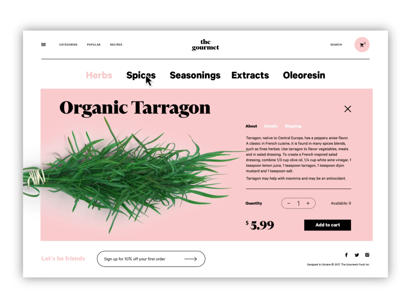
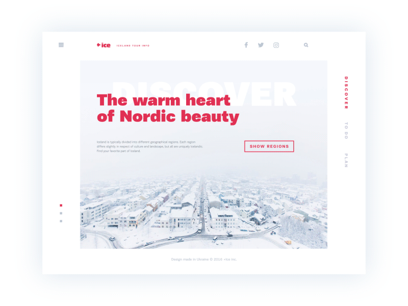
The Gourmet website
Contrast
Contrast is one of the key factors that influence a page’s scannability and visual hierarchy. It enables the designer to present the layout in a way that informs users which points of interaction are vital and which ones are secondary. Contrast is effective at catching the user’s attention and directing it to particular elements, thereby supporting intuitive navigation and the usability of the page or screen.
Contrast can be based on different features of UI elements, including:
- color
- size
- shape
- direction.
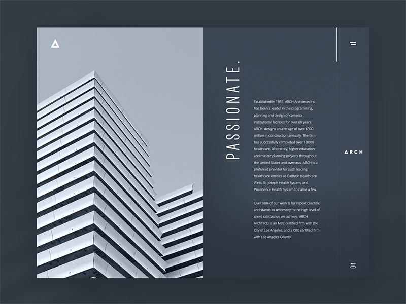
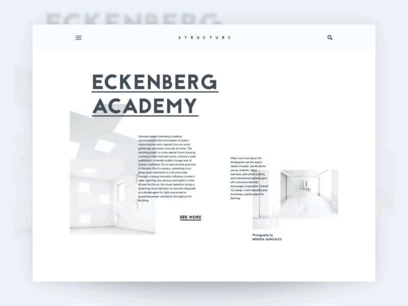
Architecture Firm Website
The first idea that often comes to mind about contrast is something black and white. In the absence of shades and multiple colors, the monochrome image relies on contrast as its main source of expressive potential. And that works the same way in user interfaces. Even more, compared to pieces of art or photography, contrast not only influences aesthetics but also significantly impacts the usability and navigability of the layout. Therefore, the wise usage of contrast is a powerful method of making websites and apps user-friendly and easy to use.
Surely, it doesn’t mean that only black-and-white UI is the most effective. It wouldn’t be wise to get limited so much when users globally present such a diversity of wishes and needs. However, “black-and-white” testing, mentioned earlier, is highly helpful. Designers should keep in mind that colorful interfaces can look different on different screens and resolutions. Moreover, low contrast can make the interface hard to use for people with health issues like color blindness.
One of the first questions designers usually have to answer about color and contrast is which color scheme to choose: dark-on-light or light-on-dark? There are several vital aspects that should be taken into account in this perspective:
Clarity: This aspect should include the ability of the user to clearly see and distinguish all the necessary details on the screen or page. The color scheme and combinations should support easy and intuitive navigation and make the most functional elements of the layout stand out effectively. The case, when this aspect is not considered or not tested properly, can lead to products that make a complete mess on the screen, in which users do not see what they really should. One of the ways to check it is widely used “blur effect” when you look at the screen or page in the blurred mode and check if everything vital is easily and quickly observed.
Readability: the ability of users to read text easily. This aspect is especially vital if an app or a website is text-driven: poor readability level can result in users missing key data or feel inexplicable tense using the product as all the way they have to struggle with the copy which takes considerable effort to be read. Lack of readability can be a serious reason why users are not retained even with attractive products.
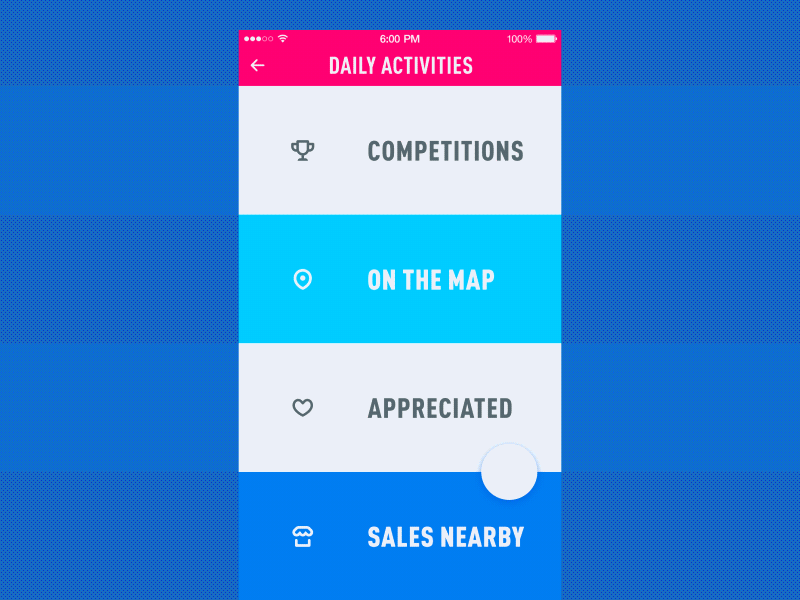
Menu interactions
Accessibility: the ability of the product to reach as many people as possible. That means that the decision “to use or not to use” should be mostly based on users’ needs and wishes but not on their physical abilities. Color scheme issue is among the main factors affecting this aspect. A designer should think over the users of different age, special needs, disabilities which can also determine the choice of color for the background and layout elements.
Responsiveness: the ability of the product to transform layout flexibly according to the devices it is used on. That can make a crucial effect on usability as what looks slickly stylish, attractive and clear on a high-resolution professional monitor, can transform into a dirty stain on the small low-res screen. The color scheme and contrast level, certainly, influence this issue among the first.
Environment: choosing the appropriate color scheme and the type of background for potential environments in which users are going to use it regularly and frequently. In terms of constant use under natural light, a dark background can literally create the effect of reflection, especially on glossy screens typical for tablets and smartphones. On the contrary, in terms of regular use in a badly-lit environment, a dark background can take the light away from the screen which has bad influence on navigation and readability. So, the issue of color combinations, contrast, and shades draw big attention here.
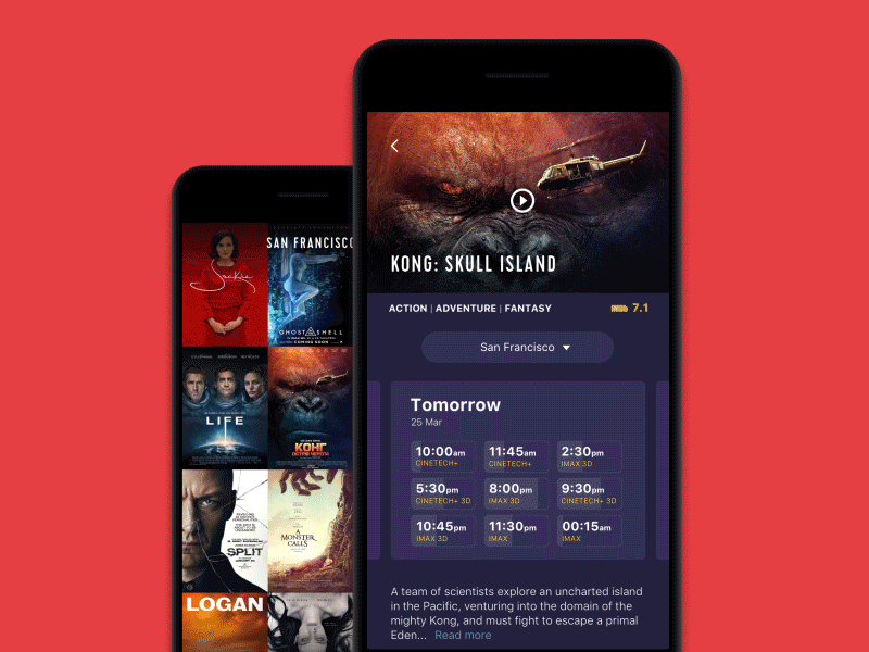
Cinema App
Content
There shouldn’t be a fight over what is more important, design or content, as neither works fully without the other. There is a wide variety of content types that can be organized globally around copy, images, and video. Let’s have a closer look at them.
Images
Images play a big role in usability: since the vast majority of users are visually driven, images serve as hook points for getting basic information about the website or app. Images present the part of the content that is both informative and emotionally appealing. The level of detail and functionality allows classifying the images in user interfaces into types, among which:
– photos: these can be theme photos creating the appropriate mood and setting the message, demonstration photos, photos of the items on e-commerce websites, title photos for blog articles, etc.
Big City landing page
– illustrations: accomplished in different styles and complexity levels, custom illustrations present the popular trend in UI design as they can look both informative and original, enabling the design to stand out from the competition.
– hero banners: applied mostly in web design, they are big images that are usually the first visual element catching the user’s attention in the initial seconds of interaction; they usually give an attractive visual presentation of the main content of the resource.
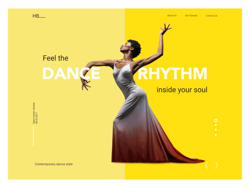
Dance Academy landing page
– icons: These are small but meaningful pictograms that are informative and support data exchange between the informer and the addressee. While copy is conveyed through letters or characters, icons communicate through images that resemble objects in the physical world. Icons play a key role in providing clear and intuitive navigation.
– mascots: images, usually personified, which in most cases represent the brand, product, or service identity and therefore become its symbolic convention via all the applications or websites as well as the branded items and promotional activities. Mascots can both add positive vibes to interactions and increase brand recognizability.
– visual identity elements: these are various visual signs of branding like logos, custom lettering for the brand name, and slogans, etc.
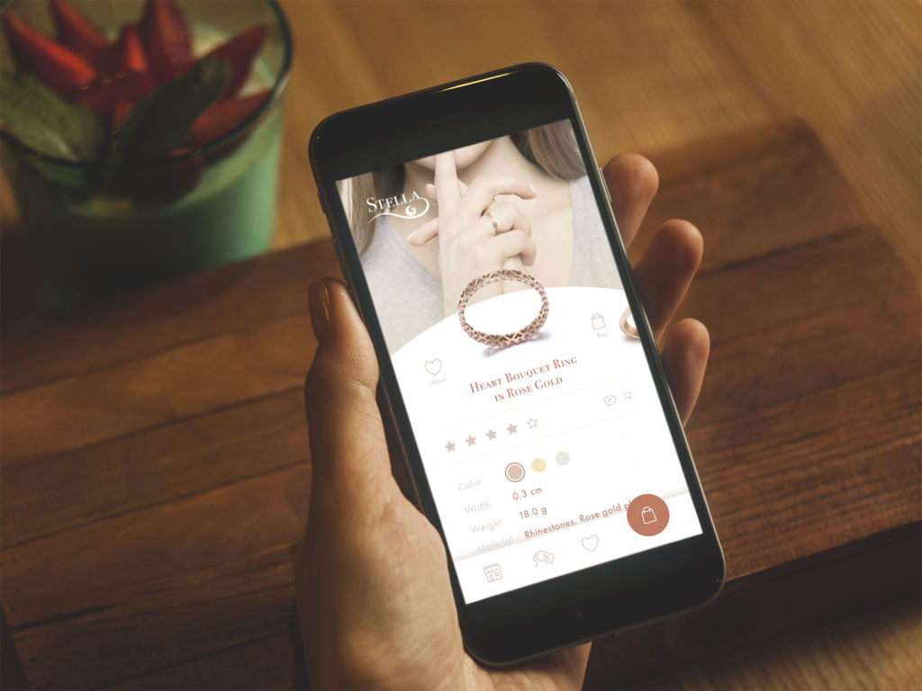
Jewellery ecommerce app
Copy
Words are well known for their incredible functionality. In terms of a user interface, text is one of the key features of successful performance.
Given that a web page has rather limited space, while a mobile application screen has a highly limited amount of space for interaction elements, the copy should adopt an elaborate, professional approach. That is actually amazing when designers are able to do all the work on the interface by themselves, that’s always great to have a unicorn on board. However, they are not obliged to do it. Moreover, in many cases, being great professionals in design, they have difficulty tackling the issue of correct and appropriate copywriting for the screens.
This job, as well as any other, needs special skills and knowledge that designers need to master additionally. It has to be said that a great number of them really go this way, carefully studying the techniques and methods of creating copy that will be informative and engaging for users and at the same time will support all the visual design solutions applied to the screens or pages.
Ice website
Another way to solve this problem is to engage a professional copywriter in the process. Anyway you go, the most important thing in this aspect is to find a way of creating copy for the interface that makes every single letter count. As copy is an integral part of UI design, we believe it should follow the same philosophy as the rest of the layout: everything on the screen or page must be functional and purposeful. Everything should work for the user.
Copy implemented in an application or a website can and should:
- inform
- communicate
- enable interaction
- enhance navigation
- appeal to feelings
- engage emotions
- create tone and voice.
One more thing that designers creating interfaces of any kind should always bear in mind is that copy is one more visual element of design. As well as icons, fields, buttons, illustrations, toggles, and the like, it occupies space on the screen or webpage like any other graphic component and influences the overall stylistic presentation of the app or website. That means that both its informative content and visual presentation significantly affect the efficiency of copy. This is the sort of mutual support of the outer and inner sides.
The success of the efficient copy depends directly on design solutions such as the choice of typefaces and fonts, background, and placement of the copy. All the mentioned aspects greatly affect readability, so when they are used inappropriately, the copy, even if it is highly meaningful, will lose the chance to realize its full potential.
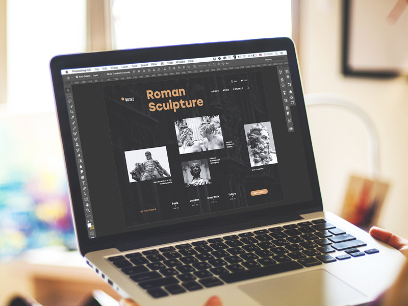
Museu landing page
According to everything mentioned above, there are some stages of the design process when a professional copywriter can become a great help in the process:
- creating copy presenting user personas and use cases: done by a professional writer based on information obtained from user research, these types of texts can be more efficient,concentrated, and concise, which is vital, especially in terms of teamwork;
- creating copy for call-to-action elements;
- creating copy for intro-screens, tutorials, and tooltips;
- creating instructions and notifications for screens and web pages;
- creating the copy for sets of catalog or menu positions;
- creating engaging copy for landing pages;
- creating templates for item descriptions, etc.
Architecture blog
Video
The frequently used types of video content:
- introduction video usually gives the first insights about the company, product, or brand, and shows what benefits the users can get
- product presentation videos give details about the product’s features and advantages, inform about special steps of interactions, and show the problem-solving potential of the product
- landing page videos strengthening the message, driving users to a particular call-to-action offered on the page
- video testimonials showing the reasons and signs of trust and loyalty to the company, brand, or product
- entertaining and educational videos, rising emotional appeal, and often presenting the material for viral marketing.
All the mentioned types can serve efficiently for marketing goals and increase brand awareness. A creative, catchy video is a good way to attract customers’ attention and a proven method for informing them quickly and effectively. A video activates several channels of perception — audio, visual, sound — simultaneously and usually does it to tell a story. All the mentioned combinations of factors tend to make the presentation strong and memorable, especially when supported by high-quality graphic design and animation. People are daily overloaded with tons of information of all kinds, so most of them aren’t ready to devote much time to learning about products or services, especially the new ones. In these conditions, video can become a dynamic, informative, and attractive means of communication. However, it should align with the general stylistic concept and be technically correct so it doesn’t take too long to load.
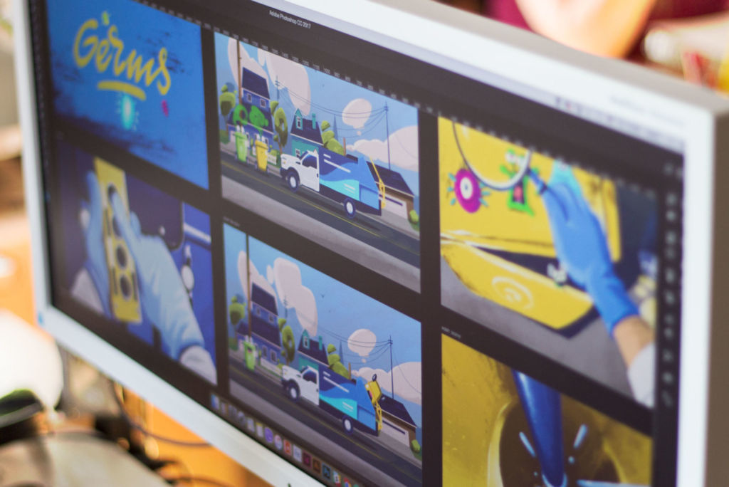
Storyboard for Binned promo video
Having checked three core aspects of user-friendly design, it’s clear that the creative process involves multiple issues designers must consider. There are no universal solutions: for every project, decisions must be made based on user and market research and thorough user testing. To make users feel the magic, designers must find the 3C combination that best addresses the particular users’ problems and business goals.
Useful articles
Color in UI Design. Look on the Bright Side
Color in Design. Influence on User’s Actions
Light and Darkness in UI Design. Matter of Choice
Copywriting in UI. Words that Make Design Go Round
Small Elements, Big Impact: Types and Functions of UI Icons
Visual Hierarchy: Effective UI Content Organization
Tips on Applying Copy Content in User Interfaces
Visual Perception: Icons vs Copy in UI
Originally written for Tubik Blog
 https://design4users.com/3c-of-ui-design-color-contrast-content/
2026-01-18
© by
Marina Yalanska
,
https://design4users.com/3c-of-ui-design-color-contrast-content/
2026-01-18
© by
Marina Yalanska
,
- English
- Ukrainian