How Human Memory Works: Insights for UX Designers
How Human Memory Works: Insights for UX Designers The article giving insights into the ways human memory works and considering the factors of its influence on UX design solutions for websites and mobile apps.
One of the greatest information processors we deal with in our everyday life cannot be seen or touched. It cannot be bought or sold, nor taken from other people; however, it can be developed and strengthened in many ways. It cannot be easily described but is among the most precious features of human life and perhaps determines every step we take and every decision we make. It is a wonder we rarely think about that way. It’s a human memory.
Memory presents a complex natural system for data storage and processing. It keeps great loads of information throughout life and is even able to organize it for the sake of the holder. Moreover, it takes the responsibility of setting priorities and keeping some details which could be remembered just off the top of our heads while erasing others that seem unnecessary or haven’t been used for a long time. Human memory is one of the mechanisms determining a person’s interaction with the outer world.
Obviously, this aspect needs to be studied and considered in the sphere of UX design responsible for interfaces of all kinds. Knowing how memory works, designers can create human-centered interfaces that correspond to the natural abilities of the users, save their effort, and boost usability.
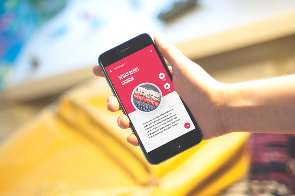
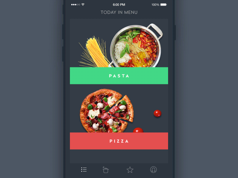
Healthy Food App
Basic points about memory
In general terms, human memory is the natural storage for data right in the human brain. It reacts to the outer stimuli, collects the data, processes it, and organizes it in different ways. Also, it enables a person to access the needed data collected in the memory when it’s needed. However, it doesn’t present the perfect mechanism as it’s influenced by a big number of factors of physical and emotional nature.
Basically, psychologists mention three types of memory:
- sensory memory holds the data for a short moment when we perceive it with our physical senses, like hearing, vision, or touch;
- short-term memory (working memory) allows a person to keep some data remembered for a short period of time without repetition;
- long-term memory presents the storage for large quantities of diverse data, which could be saved for long periods of time, potentially up to the whole lifetime.
The effective methods of getting the information kept in long-term memory are repetition and association. Taking a look at the scheme below, which was provided in the article by Learning Solutions Magazine, we can see the basic flow of data from the first outer stimulus to the long-term memory.
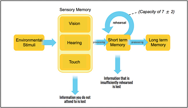
Creating the flow of interactions with a website or a mobile application, UX designers have to take this factor into account. Surely, they aim at long-term memory which will keep the core data about the app and will allow using the interface easily again and again. Knowing the steps of moving the data to this storage enables designers to set the effective strategy of data perception and necessary repetitions. Also, it helps to organize the data on the screen properly and strengthen the information architecture of the product.
Basic laws of memory
Three core aspects of memorizing, which are mentioned by specialists in psychology, are very simple:
1. Concentration. To remember a thing or chunk of data, a person needs to concentrate on it. Otherwise, the chances are high that the data will be discarded on the level of short-term memory.
2. Association. The memory presents a huge network of links connecting different data. If a person builds an association that links the new data or object with something well-known or kept in long-term memory, the chances of memorization increase.
3. Repetition. It is one of the effective ways to activate the data in working memory several times until it moves to long-term memory storage.
The organization of the interface content based on these three points is performed with visual hierarchy and perception, which can mark important layout elements that should be remembered and make the interaction easier.
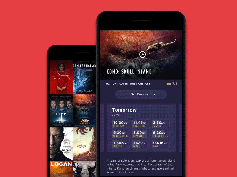
Cinema App
Expert explorations of memory
There are also some laws and rules that were concluded from various research, experiments, and practical testing. Among them, we would mention Miller’s Law and Hick’s Law.
Miller’s Law
The number of objects an average person can hold in working memory is about seven.
This exploration was based on scientific research by George Miller in the 1956 Psychological Review article, “The magical number seven, plus or minus two: Some limits on our capacity for processing information”. In general terms, it states that the short-term memory of an average human is able to keep and process about seven objects or chunks of data, plus/minus two, at once. The formulation given here is generalized as the real flow depends on many factors, including the nature of the information.
Later studies, for example, the review by Richard Shiffrin and Robert Nosofsky called “Seven plus or minus two: A commentary on capacity limitations” provided deeper insights into the work of working memory. In particular, the authors mention that the number of objects which a person can remember at once after they were presented is dependent on the nature of the objects, on average, with seven for digits, six for letters, and about five for words. It gives the brain abilities to quickly process information, recognize its character and connection to the objects already existing in long-term memory and finalize memorizing.
From a design perspective, this information plays a vital role in building up a usable and clear layout. Interfaces, which demand to remember too many options at once, can create tension and irritate users even if they aren’t able to describe the reason for unpleasant emotions.

Magic.co landing page
Hick’s Law
The more elements people get, the harder it is to make a choice.
At first glance, it seems that this law is not about memory; still, the connection exists. Memory is one of the mechanisms that protects people from negative experiences. The more options people get at once, the more distracted they get with numerous associations, which can be called, and that’s impossible to predict how good or bad they can be in this particular case. In addition, giving many options for the choice at once, again, we can overload users’ memory with a bigger number than the working memory can process. In particular, this factor requires special attention on e-commerce platforms, which should strike a delicate balance between providing the user with all the necessary information and overwhelming them with too many options. Finding this harmony is one of the major challenges for UX designers.
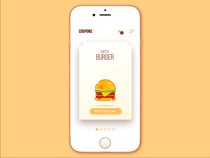
Cafe Coupon App
Tips for memory-friendly UX
On the basis of the factors and explorations given above, let’s consider a set of tips applying this knowledge for the sake of usability.
1. Don’t make users memorize many items at once
Definitely, it doesn’t mean that all the screens or pages should be limited to 5-9 elements. Still, the number of elements that present core interaction points would rather be considered in these terms. Making several objects in the layout prominent and attractive, designers can follow the law of concentration, which will catch the key zones like the menu, call-to-action, an image presenting the product, etc. Visual hierarchy is one of the vital strategies that enables to create an interface containing many elements visually grouped and divided in a way that is digestible for human memory.
It is also effectively applied to the copy content in the interfaces. In the article, devoted to this issue, we mentioned some investigations: according to the research published by one of the popular social media sharing platforms Buffer, the ideal length of the headline is 6 words; Jacob Nielsen provides the study at which shows that headlines of 5-6 words work effectively, not less than extensive headlines presenting a full sentence. One reason is the ability of working memory to process such data chunks faster and more effectively.

Photography workshops
2. Don’t present too many elements for the choice together
It’s important to care about the concentration ratio. If you present several choices, buttons, or options at once, you should be ready that it will take more time and effort for the user’s short-term memory to work them over, and this can distract him or her from making the final decision or interaction. This can be the reason for inefficient landing pages or sales funnels: even if they are stunningly designed, the over-distracted user can go away before the conversion happens. Apply scrolling and transitions based on careful prioritization, dividing the objects on the screen or page into groups of primary, secondary, and tertiary importance – this will help users and make navigation through the interface more natural.
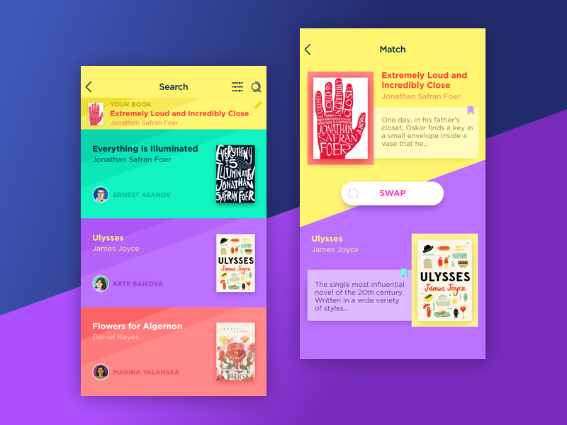
Book Swap App
3. Save memory effort with recognizable patterns and symbols
No secret, people are visually driven creatures, so designers usually master the art of applying images that not only attract attention but also inform users and organize the content. In one of our articles, we gave the details on how users recognize icons and copy. It shows that pictorial elements such as icons and illustrations are perceived faster, while copy can be more informative. This can be useful in interface design to apply diverse models and markers which are widely recognizable not only in this particular interface but generally in a variety of them. Magnifier icons for search, shopping cart for the page collecting orders, plus button for creating a new item, flags marking the buttons changing the language – all of them present the elements existing in human memory for a long time and bringing up correct associations without the need to keep and process new information.
Moreover, going to a broader perspective, most users expect to see the sign of the brand and the links to core sections of the website in the header while the contacts, privacy policy, terms of use, and credits in the footer. Knowing these and other similar patterns of user behavior, designers can save users’ effort making basic operations simple and intuitive. This way it’s easier to focus user’s attention on new data and make its perception quick.

Weather App
4. Apply consistent markers in navigation
Navigation is a crucial factor in usability. Enabling to move through the interfaces, it also presents the data which should be kept by users’ memory; therefore, designers apply a variety of techniques making transitions and interactions consistent and clear. For example, color or shape markers sorting out particular sections, icons defining specific groups of items, fonts used consistently for specific names or types of copy, illustrations, and mascots uniting different screens – these and similar tricks boost memorability of the layout and often support the user in processing new data.
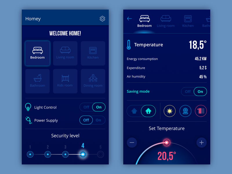
Homey App
5. Don’t hide the core elements of navigation
Discussions about various menus that show or hide content blocks are still popular. It’s vital to remember that the key aim of the interface should be for the user clearly understand what’s going on. So, the decision about hamburger menus, sliders, hidden layers of navigation, and content should be based on the careful analysis of the target audience. In most cases, especially for the complex interfaces used by the diverse target audience, hiding core navigation elements can serve badly: users need to find and memorize the patterns of reaching them. Some users can appreciate the techniques of saving space for other elements, while others will be annoyed with the necessity to remember how to find the necessary section. Again, prioritization plays a great role: hiding secondary elements while leaving primary ones always visible, designers focus users’ attention on what is core to them. User testing helps to evaluate the efficiency of the navigation flow and its impact on the conversion rate.
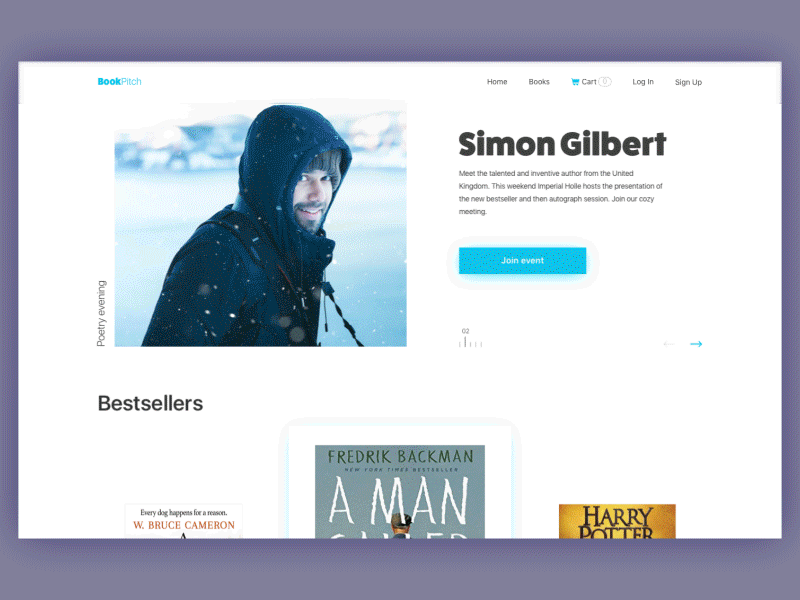
Bookshop Website
6. Stimulate different types of memory
Remember the scheme given above? You could see that the first and the quickest stage of absorbing data is sensory memory. Basically, it is divided into several types of memory which depend on the sensor: it can be visual, audio, kinesthetic, verbal, mechanical, etc. Activating them, not only do designers create more memorable interaction flows, but also support broader circles of users. Research and experiments show that different people have different types of memory as the most effective for them. That’s why, for example, icons given with copy in the names of core categories of the menu can boost usability supporting users via both visual and verbal memory. Sounds accompanying interactions also create memorable flows and operations.
Recipe App
7. Remember about emotions
Make no mistake, emotional feedback from the interaction is a great factor in retaining or losing users. Bad experience stimulates quicker forgetting the details but tends to leave general negative feelings because in this way the brain tries to protect the human. Vice versa, positive emotions, be it fun, aesthetic satisfaction, gratification for the quickly solved problem or accessible communication can bring the person back to feel it again and again.
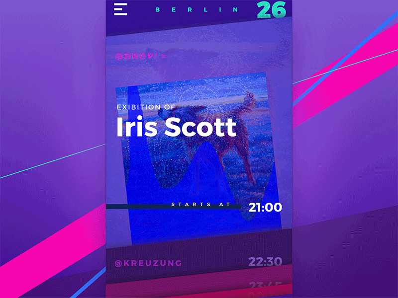
Night in Berlin App
So, the bottom line is simple: creating interfaces for people, designers have to know how people interact with the world and what influences their behavior. Human memory is one of the essential features determining successful and positive user experience on both conscious and unconscious levels, so it needs to be studied, considered, and tested for human-centered UX design.
Recommended reading
Here is a bunch of useful links which could provide further interesting explorations of the topic:
Short-Term Memory and Web Usability
UX and Memory: Present Information at Relevant Points
The Magical Number Seven, Plus or Minus Two: Some Limits on our Capacity for Processing Information
User Memory Design: How To Design For Experiences That Last
Visual Perception. Icons vs Copy in UI
The Properties of Human Memory and Their Importance for Information Visualization
Originally written for Tubik Blog
- English
- Ukrainian