UI Design: How to Choose Between Light and Dark Theme
UI Design: How to Choose Between Light and Dark Theme The article covers pros and cons of various color schemes for web and mobile UI: check how light and dark background influence user experience.
Our everyday life is an endless flow of choices. In both personal and professional life, we have to consider numerous oppositions and challenges, and it’s better when solutions are based on not only suggestions but also facts, experience, and knowledge. Today we are going to discuss one of the frequent choices UI designers have to make project by project: which scheme is better for the interface, light or dark?
Factors Influencing the Choice of Color Scheme
Be sure, there is no one particular choice which would work for all the aims. The solution heavily depends on numerous factors covering not only the user’s side but also business goals, market conditions, and current design trends. Let’s review the essential factors which have to be considered regarding the issue.
Readability and legibility
These terms are both directly connected to the perception of the content presented with text. Readability defines how easily people can read words, phrases, and blocks of copy. Legibility measures how quickly and intuitively users can distinguish the letters in a particular typeface.
These characteristics should be carefully considered, especially for the interfaces filled with a lot of text. Among many other factors, the color scheme chosen for the interface plays a crucial role in the effective process of text perception. For example, as well as with physical objects perceived on different backgrounds, black copy shown on white or light background seems to be larger than the white copy on a dark background. Poor readability results in poor user experience: users aren’t able to scan the data, even more – even if the data is relevant but not readable, users feel the inexplicable tense struggling with the text or may even miss the critical information.
Does it mean that interfaces with a light background are more readable? Not always. One of the famous gurus of user experience design Jacob Nielsen mentioned: «Use colors with high contrast between the text and the background. Optimal legibility requires black text on a white background (so-called positive text). White text on a black background (negative text) is almost as good. Although the contrast ratio is the same as for positive text, the inverted color scheme throws people off a little and slows their reading slightly. Legibility suffers much more in color schemes that make the text any lighter than pure black, especially if the background is made any darker than pure white.» So, any color scheme may be readable enough if the designer studies the peculiarities of copy perception on different backgrounds and works carefully on the font choice.

Museu landing page
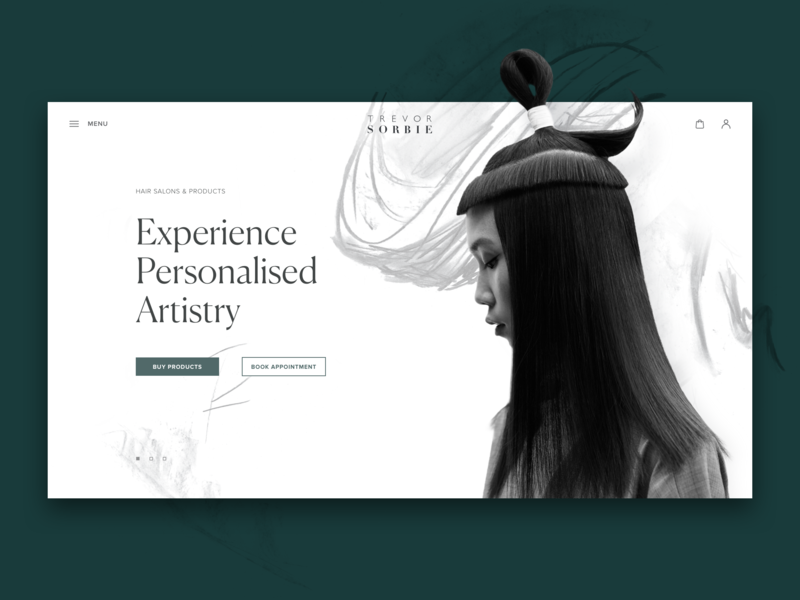
Hair beauty website design
However, some scientific studies dating back to the 1980s show that big blocks of text with a light background appear to be a more effective choice for the majority of users. Studying how advertising carriers worked, D. Bauer and C.R.Cavonius shared their explorations in the paper “Improving the legibility of visual display units through contrast reversal” (1980). In particular, they found that participants were 26% more accurate in reading text when it was featured with dark characters on a light background.
Why may that be so? Jason Harrison from the Sensory Perception and Interaction Research Group (University of British Columbia) explains this phenomenon in the following way. People with astigmatism (which, according to various stats, affects about 50% of the population) find it harder to perceive white text on black than black text on white. Part of this has to do with light levels. With a bright display (white background) the iris closes a bit more, decreasing the effect of the “deformed” lens. With a dark display (black background) the iris opens to receive more light and the deformation of the lens creates a much fuzzier focus at the eye. So, based on this, if the interface presents a lot of copy and suggests a long-reading experience, a light background may feel more user-friendly.

Accessibility
Accessibility is mostly defined as the ability of the web or mobile interface to reach as many people as possible and provide its functionality regardless of any discrimination. So, the decision “to use or not to use” has to be mostly grounded in users’ needs and preferences, not on their physical abilities. The color scheme is mentioned among the top factors affecting this aspect. When selecting the palette and color combinations, a designer needs to take into account users of different ages, special needs, or disabilities, as these factors can also inform the choice of background and layout colors. User research becomes a great help, providing UX designers with data that helps to get closer to the target audience.
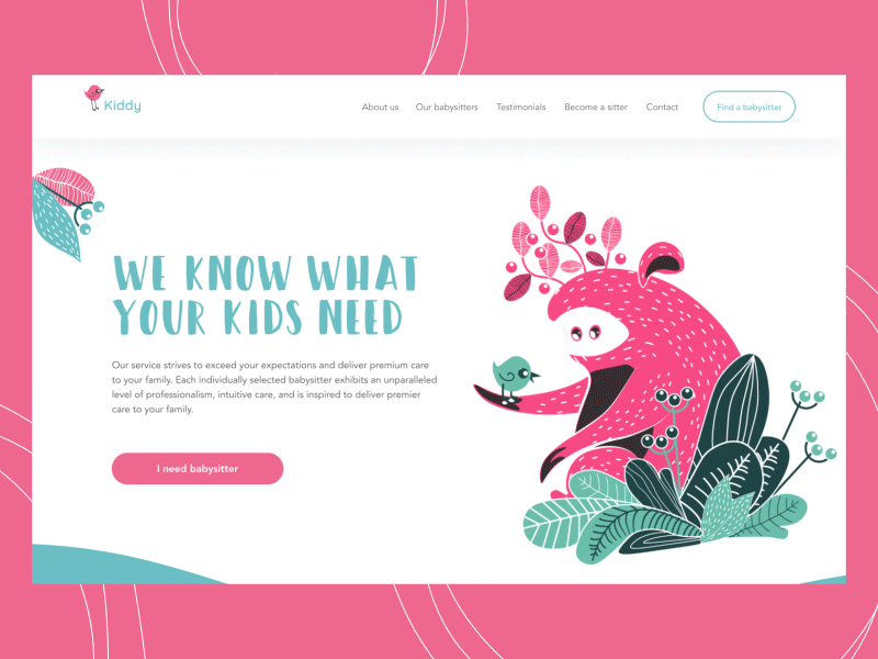
Landing page for a babysitting service uses the light background for all the parts with text content for a high level of readability
Clarity
Clarity defines the ability to see and distinguish all the core details on the screen or page. First of all, it focuses on the simplicity and intuitiveness of navigation: by being able to scan the layout and find zones of information and interaction, users don’t need to put much effort into getting what they need. If this aspect is not tested properly, it may result in a weak visual hierarchy and turn the screen into a complete mess. Contrast plays a big role here, and the color scheme becomes its foundation. To check if the interface is clear and contrast enough, don’t forget about a good old trick of “blur effect” when you look at the screen or page in the blurred mode, and check if everything vital is easily reached and noticeable.

Landing page for the digital agency
Responsiveness
The interface’s responsiveness means users find it usable and functional on whatever device they use. What looks stylish and appealing on a high-resolution professional monitor may turn into a dirty stain on a small, low-resolution screen. Therefore, some color schemes that look nice at the design stage may lose their beauty in a variety of everyday conditions. Because the color scheme directly influences perceptions of color, shape, and copy, it should be tested across diverse devices before making the final decision.
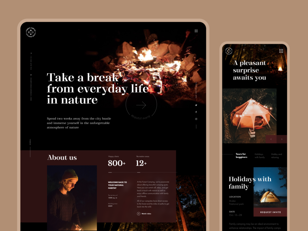
Responsive website design for the forest camping service
Environment
Web and mobile interfaces are used in environments that may be assumed typical if the target audience is carefully researched. For instance, when used continuously under natural light, a dark background can create a reflection effect, especially on glossy screens common on tablets and smartphones. On the contrary, in conditions of a badly-lit environment, a dark background can take the light away from the screen, which has a bad influence on navigation and readability. So, the issue of color combinations, contrast, and shades draws big attention here.
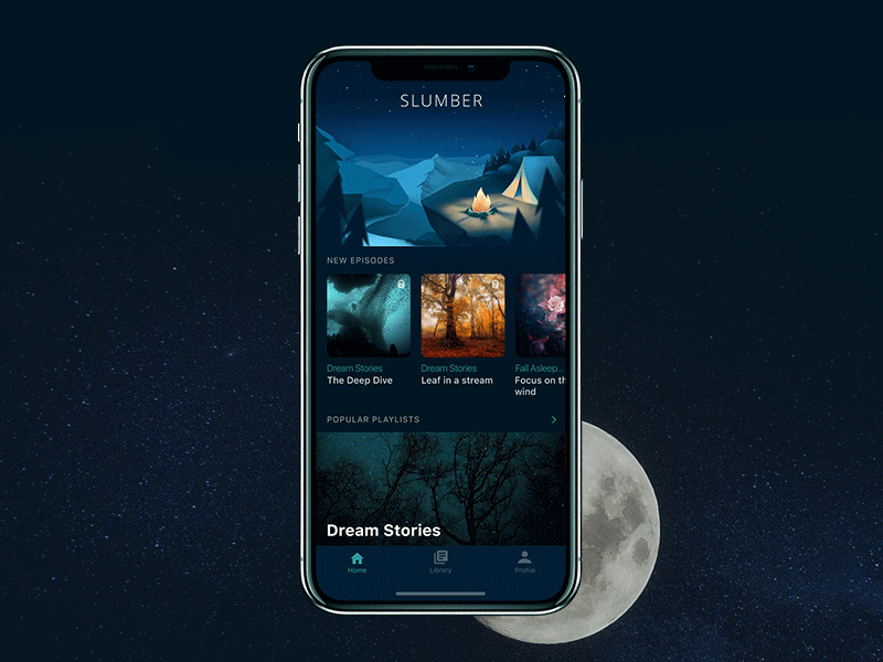
Slumber mobile app
Checklist for color scheme selection
With the factors mentioned above, we offer here a short checklist of basic steps to follow while selecting a general color scheme for web or mobile interface.
1. Define the purpose of the interface. Having determined the core points of the interface utility and problem-solving capacity, you can make the color scheme choice more reasoned. If the UI is text-driven (e.g., a blog, news platform, e-reader), a light background tends to be an effective choice. Light makes the screen airy and spacious and it will be easier to concentrate purely on the copy. On the other hand, if the interface is visually driven and moves around images rather than text, a color scheme with a dark or bright background may be a good solution as the colors of the images feel deeper and the general layout gets a stylish or even luxurious look.
2. Analyze your target audience. Defining and analyzing the target audience are the primary tasks a designer should undertake. Knowing who is your potential user and what they will want to get from the website or app sets the solid basis for a usable, useful and attractive interface. Middle-aged and older people tend to prefer interfaces with the light color scheme as they find them more intuitive and navigable. Younger people often find well-performed interfaces with a dark background more original and stylish so that can be the way to involve target users. Teenagers and children are attracted to interfaces using bright backgrounds and funny details. The choice of color obviously depends on the nature of the interface functionality and content. But the preferences of the target audience are always a good clue to user-centered decisions.

Nature Encyclopedia app based on dark background and contrast yellow and white for images and copy content
3. Research the competition. Another aspect to keep in mind is that your product won’t appear in a one-in-a-blue-ocean situation. Vice versa, it will fight for user’s attention in conditions of great and dynamic competition. The choice of the color scheme also becomes the way to make an app or website outstand and lead to such a precious first wish of interaction from the user’s side. Time spent on the exploration of the existing products in the segment saves time and effort otherwise wasted on the redesign of ineffective solutions.
4. Test, test, test. The points described above are convincing on a key point: since color is a factor directly affecting the interface’s usability and attractiveness, every design solution should be appropriately tested across different resolutions, on various screens, and under diverse conditions. Testing reveals strong and weak sides of the color scheme before the product comes on the market, gets discussed, and loses the chance of a stunning first impression if the design solution is inefficient.
Compromise Solutions
Not wishing to stick to strict color schemes, user interface designers sometimes find compromise solutions, as shown below.
Dark interface, white tabs for copy
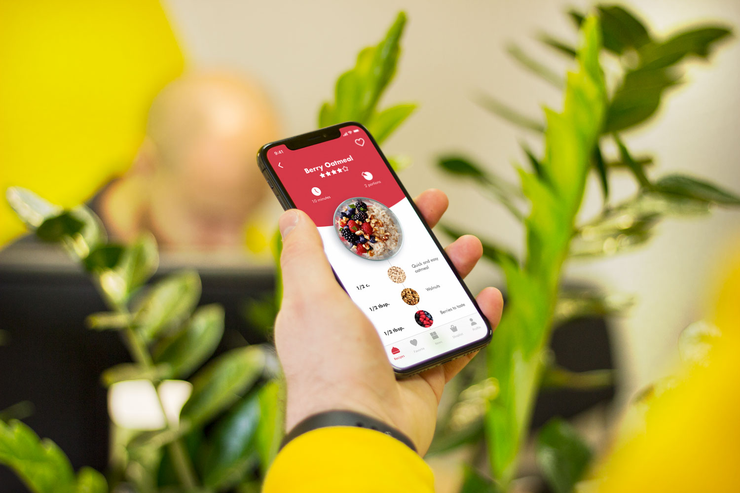
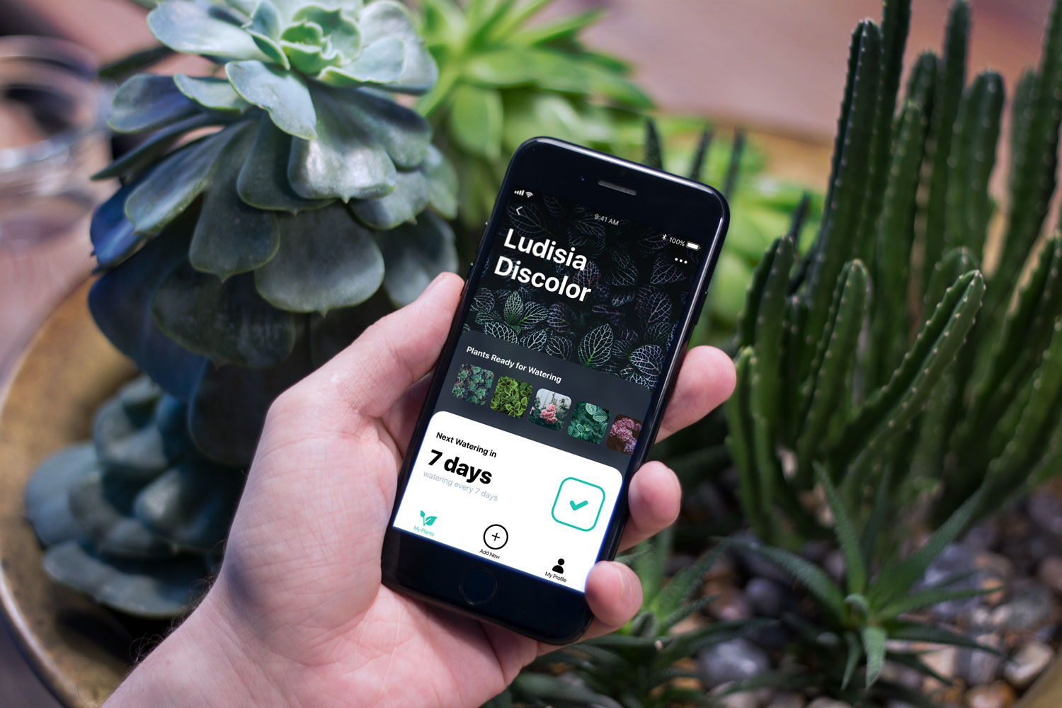
As we mentioned in the review of UX design trends, this trend got especially popular for interfaces based on the dark background scheme. It features one more approach to proper readability, which is often the issue of debates: applying boxes or spaces with a light background for core data blocks, designers solve this problem and add elegant contrast to the screen or page. One of the cases, when it was applied efficiently, is Watering Tracker app designed by the Tubik team.
Giving the choice of color scheme to the user
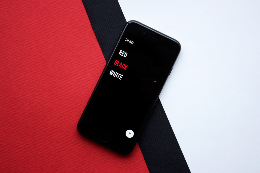
Another approach is to give users a choice of modes. That’s what we did for Upper, a to-do list app that offers users a selection of color schemes. On the one hand, it makes the product really user-friendly and allows users to make a more personalized choice, taking into account not only usability issues but also aesthetic preferences. On the other hand, it takes additional work hours for designers and developers to work out all the schemes.
Useful Reading
Dark Side of UI: When Dark Is Good for Users
The Impact of Web Page Text-Background Color Combinations on Readability, Retention, Aesthetics, and Behavioral Intention
Visual Perception: An Introduction
Art and Visual Perception: A Psychology of the Creative Eye
Colour Choices on Web Pages: Contrast vs Readability
The Dos and Don’ts of Dark Web Design
Why light text on a dark background is a bad idea
When to Use White Text on a Dark Background
Design Glossary: Basic Color Terminology
How Color Influences User Behavior
Originally published in Tubik Blog
 https://design4users.com/ui-design-light-and-dark-theme/
2026-01-18
© by
Marina Yalanska
,
https://design4users.com/ui-design-light-and-dark-theme/
2026-01-18
© by
Marina Yalanska
,
- English
- Ukrainian