
UI Design Tips: How to Choose Colors for Interface
UI Design Tips: How to Choose Colors for Interface The article reveals six tips on choosing colors for mobile and web interfaces. It shows techniques helping UI designers to boost user interest to a product.
User experience design involves many processes that need to be done thoughtfully so that an interface would meet the needs of the target audience. Each step requires deep attention to details, even if it doesn’t seem too complicated.
One of the time-consuming still vital stages in UI creation is color choice. Designers sometimes can spend hours picking up the right color palette. In this article, we’ll provide six useful tips helping designers choose powerful colors for UI and make this process easier and more productive.
Tip 1. Learn 60–30–10 rule
This rule, or technique, came from the interior design, so it is often applied for house decorating. The idea is simple. To bring the balance into the composition, the colors should be combined in the proportion of 60%–30%–10%. The biggest part should go to the dominant hue, the third of the composition takes secondary color and 10% percent goes to the color which helps to make the accents.
Such a proportion is thought to be pleasing to the human eye, as it allows for perceiving all the visual elements gradually. Knowing the appropriate proportion designers can successfully combine the colors without risks of turning UI into a colorful mess.
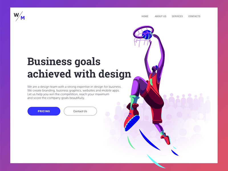
Digital Agency Landing Page
Tip 2. Contrast is a friend
Color contrast is a key part of any visual composition. It brings individuality to each UI element and makes all of them noticeable. User interfaces that use only shades from the same color family are less likely to draw users’ attention. Moreover, copy content in this UI will look illegible which makes the interactions with a product almost impossible.
Designers control the level of contrast depending on the goals it is supposed to accomplish. For example, if you need users to pay special attention to the specific UI elements, it’s a good idea to apply two highly contrasting colors, such as blue and red. High contrast is often used for CTA buttons design.
However, speaking of UI as a whole composition, a high level of color contrast may not always work well. If copy content and the background colors contrast each other too much, it will be difficult to read or scan the text. That’s why designers are recommended to create a mild level of contrast and apply high contrasting colors only for highlighting elements. User testing across various devices can help designers ensure the effectiveness of their solutions.
Urban Sketcher App
Tip 3. Consider the psychology of colors
As we’ve mentioned in our previous articles, psychology is one of the fundamental studies that help in a design workflow. A branch of psychology that examines the influence of colors on human mood and behavior is called color psychology. It states that our mind reacts to colors, even though we usually do not notice it. When our eyes perceive color, the brain sends signals to the endocrine system, which releases hormones that affect mood and emotions.
Each color has its own influence on our minds, and knowledge of possible reactions can help designers convey the right message and prompt users to take the expected action. Here is a short list of color meanings.
Red. It symbolizes both good and bad feelings, including love, confidence, passion, and anger.
Orange. An energetic and warm color bringing the feelings of excitement.
Yellow. This is the color of happiness, sunlight, joy, and warmth.
Green. The color of nature which brings calming and renewing feelings.
Blue. It often represents some corporate images. May be associated with distance and sadness.
Purple. Long associated with royalty and wealth. It’s also a color of mystery and magic.
Black. It associates with a tragedy and death and signifies a mystery. At the same time, it can be traditional and modern.
White. The color means purity and innocence, as well as wholeness and clarity.
In addition, designers need to remember that visual perception is highly individual. Factors such as age and gender have a significant impact on color preferences, so it’s vital to understand the target audience’s specific characteristics. You can find a detailed description of color meanings and preferences in our previous article.
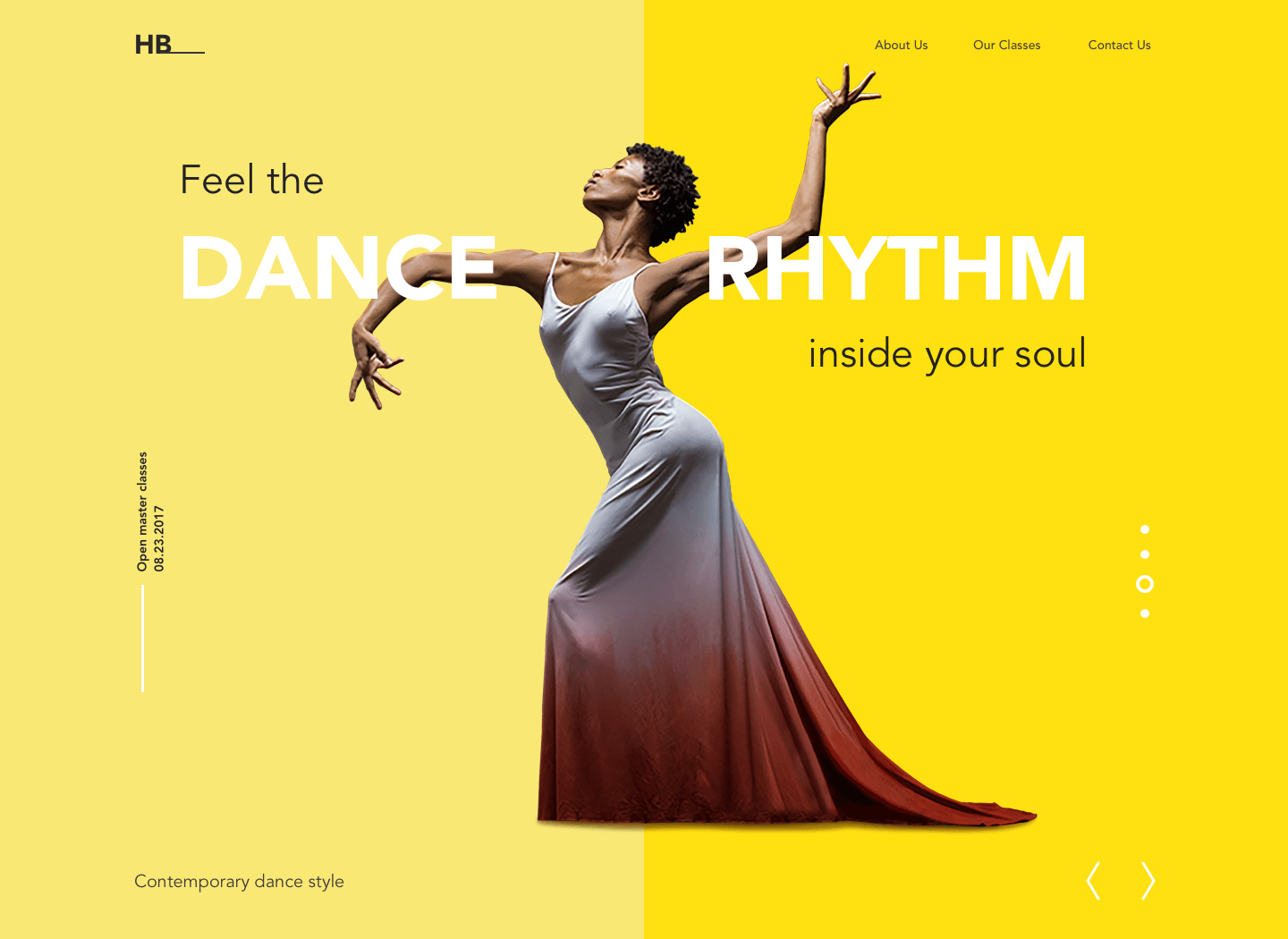
Dance Academy Website
Tip 4. Don’t forget cultural differences
Each culture has its own traditions and beliefs, so before you choose the colors, you need to make sure that they will be interpreted the way you mean. The thing is, sometimes one color can have completely opposite meanings in different countries. For example, in European countries, white signifies purity and is often used at weddings, whereas in many Asian countries, it symbolizes death and sorrow. Incorrect usage may lead to misunderstandings that could be fatal to a product. By acknowledging the specialties of culture’s color perception designers decrease risks of being misconceived.
Tip 5. Strive for color harmony
Harmony is what UI design strives to. To make users feel pleased and comfortable, designers try to bring balance into user interface design. Color harmony is the arrangement of colors in design to achieve the most attractive and effective perception for users. Harmonic colors create a nice first impression for the website or application.
After years of searching, designers distinguished the basic color schemes that work effectively. Let’s see what they are.
Monochromatic. Color harmony is based on a single color with its various tones and shades.
Analogous. The scheme applies colors located right next to each other on the color wheel.
Complementary. It is the mixing of colors placed next to each other on the color wheel, aiming to produce high contrast.
Split-Complementary. This scheme works similarly to the previous one but it employs more colors. For instance, if you choose the blue color, you need to take two others that are adjacent to its opposite color, meaning yellow and red.
Triadic. It is based on three separate colors that are equidistant on the color wheel. Professionals recommend to use one color as a dominant, the others as accents.
Tetradic/Double-Complementary. The tetradic color scheme employs four colors from the wheel which are complementary pairs. If you connect the points on the chosen colors they form the rectangle.

Tip 6. Steal ideas from nature
Mother Nature is the world’s best artist and designer. Color combinations in the natural environment are always close to perfect. People enjoy watching sunsets and dawns, autumn forests, and winter mountains since they are full of natural color combinations.
So, why don’t you try to borrow a few ideas? Go for a walk or search for beautiful nature photos, and you will find the inspiration.
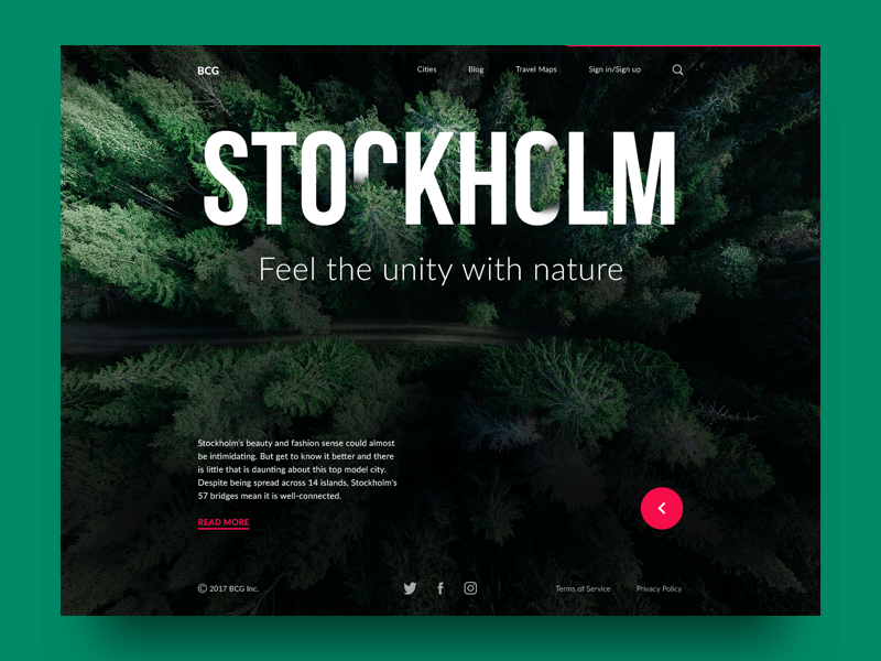
Big City Guide
The success of a digital product depends largely on the colors chosen for its UI. The right colors help users feel comfortable with a product. Designers can put people in the frame of mind that compels them to take action just by applying the appropriate color palette. Make your choices wisely.
Recommended Reading
Color Theory: Brief Guide For Designers
Color in Design: Influence on Users’ Behavior
Color in UI Design. Look on the Bright Side
Dark Side of UI. When Dark Is Good for Users
3C of UI Design: Color, Contrast, Content
Design for Diversity of Cultures: Perception of Colors
Originally written for Tubik Blog
 https://design4users.com/ui-design-tips-how-to-choose-colors-for-interface/
2026-01-18
© by
Marina Yalanska
,
https://design4users.com/ui-design-tips-how-to-choose-colors-for-interface/
2026-01-18
© by
Marina Yalanska
,
- English
- Ukrainian