
UX Design: How to Make the Interface Effort-Saving
UX Design: How to Make the Interface Effort-Saving The article presenting the set of useful tips for web and mobile interfaces saving users' time and effort, boosting usability and improving user experience.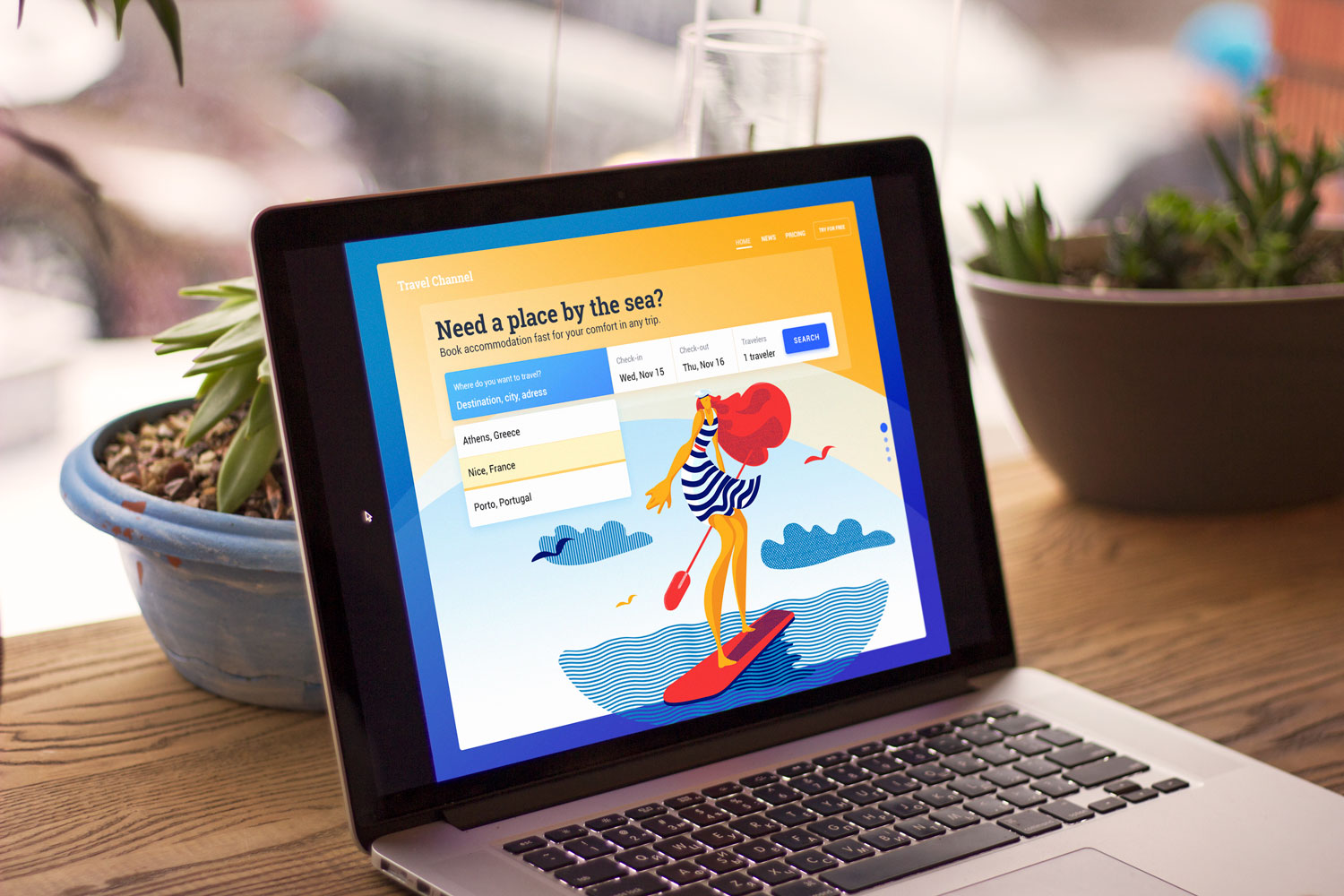
“Simplicity is the ultimate sophistication,” said genius Leonardo da Vinci, and this eternal truth is as fair now as it was several centuries ago. Such an approach in design for web and mobile interfaces results in human-centered products that are pleasant and easy in use. Make no mistake, simple doesn’t mean empty, primitive, or monofunctional. Instead, it means clear, intuitive, and helpful. Really simple products not only solve user’s problems but also do it in an optimal way in the aspects of times and effort.
We aren’t often thinking in terms of love and respect when it comes to digital products. We can describe them in tons of other words featuring appearance (like beautiful, elegant, interesting, etc.) or functionality (like intuitive, easy-to-use, confusing, etc.) or content (like informative, consistent, etc.) but you rarely can hear that someone names a website or app respectful. However, respect for user’s time and energy is one of the vital goals which designers should strive to achieve in the product they work on. This approach is a great factor in usability and desirability. Today we would like to share some advice and techniques which could become supportive of this aim. These tips aren’t reinventing the wheel but present a helpful checklist for the design outcomes. So, let’s check what designers can do to save time and effort for users.
1. Put the core navigation into the header
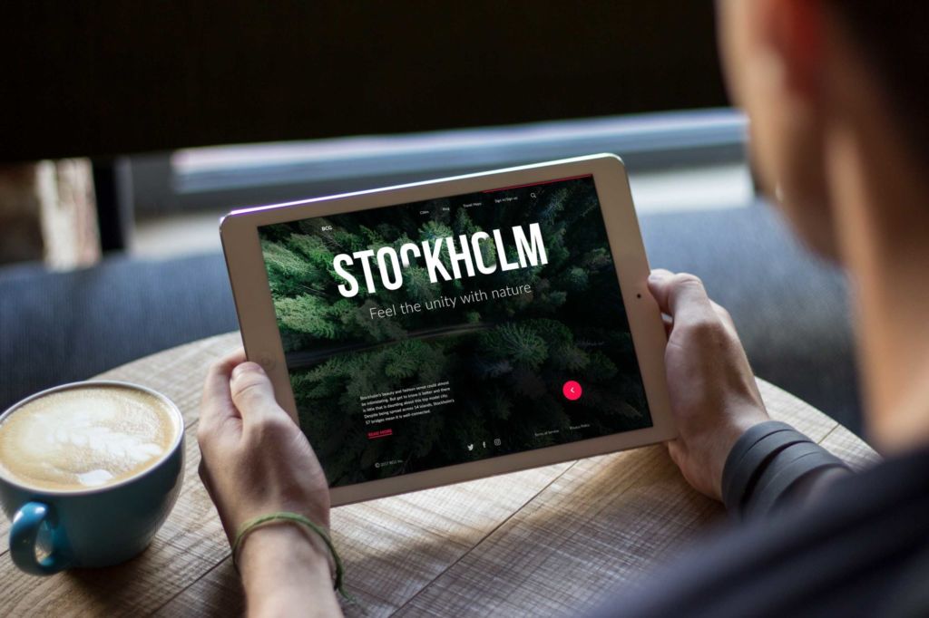
Talking about websites, it is an extremely helpful idea for quick and easy navigation. The only problem is to decide on what core data is, especially for websites with a huge amount of various data, like big e-commerce websites, news platforms, or multi-theme blogs. The header is a strategic part as people see it before scrolling the page in the first seconds of introduction to the website. Being a sign of invitation, the header should provide the key information about the digital product so that users could scan it in split seconds.
In our article telling about web headers design in detail, we provided the typical kinds of content which can be included in headers:
- basic elements of brand identity: logo, brand name lettering, slogan or company statement, corporate mascot, photo presenting the company or its leader, corporate colors, etc.
- copy block setting the theme of the product or service presented
- links to basic categories of website content
- links to the most important social networks
- basic contact information (telephone number, e-mail, etc.)
- switcher of the languages in case of multi-lingual interface
- search field
- subscription field
- links to interaction with the product such as trial version, downloading from the AppStore, etc.
It doesn’t mean that all the mentioned elements should be included in a single web page header; in this case, the risk is high that the header section would be overloaded with information. The more objects attract the user’s attention, the harder it is to concentrate on the vital ones. Here, designers, preferably together with marketing specialists and stakeholders, need to decide on the strategically important options and pick them from the list or add others.
Why is the header so essential? Eye-tracking investigations show that, regardless of the scanning model a particular user follows, the scanning process starts in the top horizontal area of the webpage. Using it to show core information and branding is a strategy that supports both sides: readers can scan the key data quickly, while the website has a chance to retain them if it’s presented properly. That is the basic reason why header design is an essential concern for UI/UX designers and content and promotion specialists alike.
2. Make branding highly visual
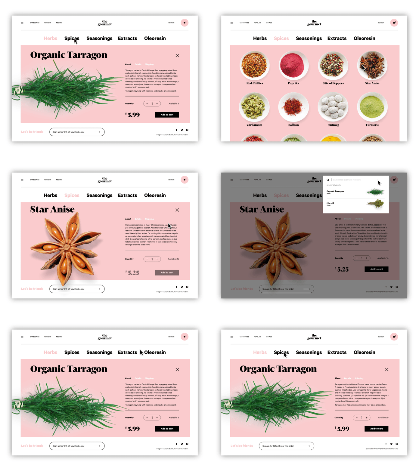
In terms of the discussed topic, a brand means a sort of image created via a set of distinguishing features and promoting awareness and recognizability of the product or service on the market. This image can be created in tons of diverse ways – visual, verbal, touchable, etc. In web and mobile design, branding supposedly means a set of visual elements that define the brand style, which can be applied to interfaces, such as the logo, typography, brand colors, and the like. All of them together are a powerful tool for creating visual recognition of the product and its style. Being based on the analysis of the target audience and marketing/ customer research, branding in this sense plays a vital role in product promotion as visual perception is very fast and easy for most people, much easier than reading the text and much more memorable than listening to speech. Moreover, if the brand is already well-established, its signs observed in the first seconds of seeing a website or app increase the level of trust.
3. Use numbers, not words
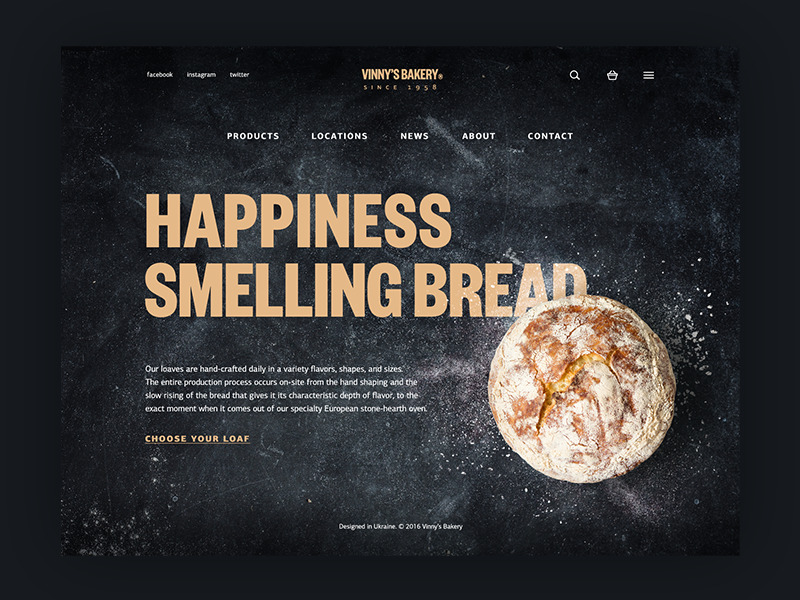
One of the investigations of user behavior provided by Nielsen Norman Blog shared an interesting finding: based on eye-tracking studies while users scan web pages, numerals often stop the wandering eye and attract fixations, even when they’re embedded within a mass of words that users otherwise ignore. People subconsciously associate numbers with facts, stats, sizes, and distance – something potentially useful for them. So they are hooked with the numbers included in copy while words representing numerals can be missed in the bulk of the text. Even more, whatever numbers represent, they are more compact than their textual variant, which allows for making the content more concise and time-saving for skimming the data.
4. Make the call-to-action (CTA) instantly noticeable
A call to action (CTA) is actually a word or phrase stimulating users to interact with a product in a way, and according to the aim it is designed for.CTA elements are the interactive controls that enable users to perform the action they are called to. Common types of such interactive elements in the layout are buttons, tabs, or links. In the interfaces of all kinds, CTA elements are the core factor in effective interaction with the product, playing a crucial role in usability and navigability. When all the path of interaction and transitions is built clearly for users but CTA element is not thought-out, placed or designed well, users can get confused and will need to take additional effort trying to achieve their goals. That sets the high risk for poor conversion rates and general user experience. That’s why this navigation element should draw particularly deep designer’s attention. In any interface, it should be one of the most prominent and quickly noticeable parts to inform users how the product can be helpful or useful for them.
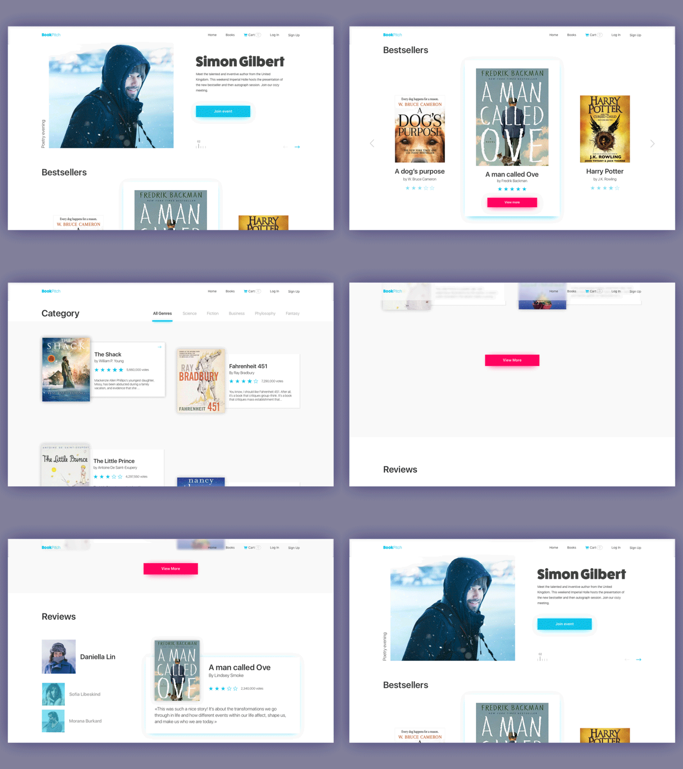
5. Care about general page scannability
As mentioned earlier, users don’t usually read or observe all the content on a page or screen from the start; instead, they start with a quick scan to see if it contains something they need or want. This significant domain of user research is massively supported by Nielsen Norman Group and provides designers and usability specialists with a better understanding of user behavior and interactions. Different experiments collecting data on user eye-tracking have shown that there are several typical models along which visitors usually scan the website.
Among the following common models, you’ll find Z-Pattern, Zig-Zag pattern, and F-Pattern. Let’s check what are the schemes for them.
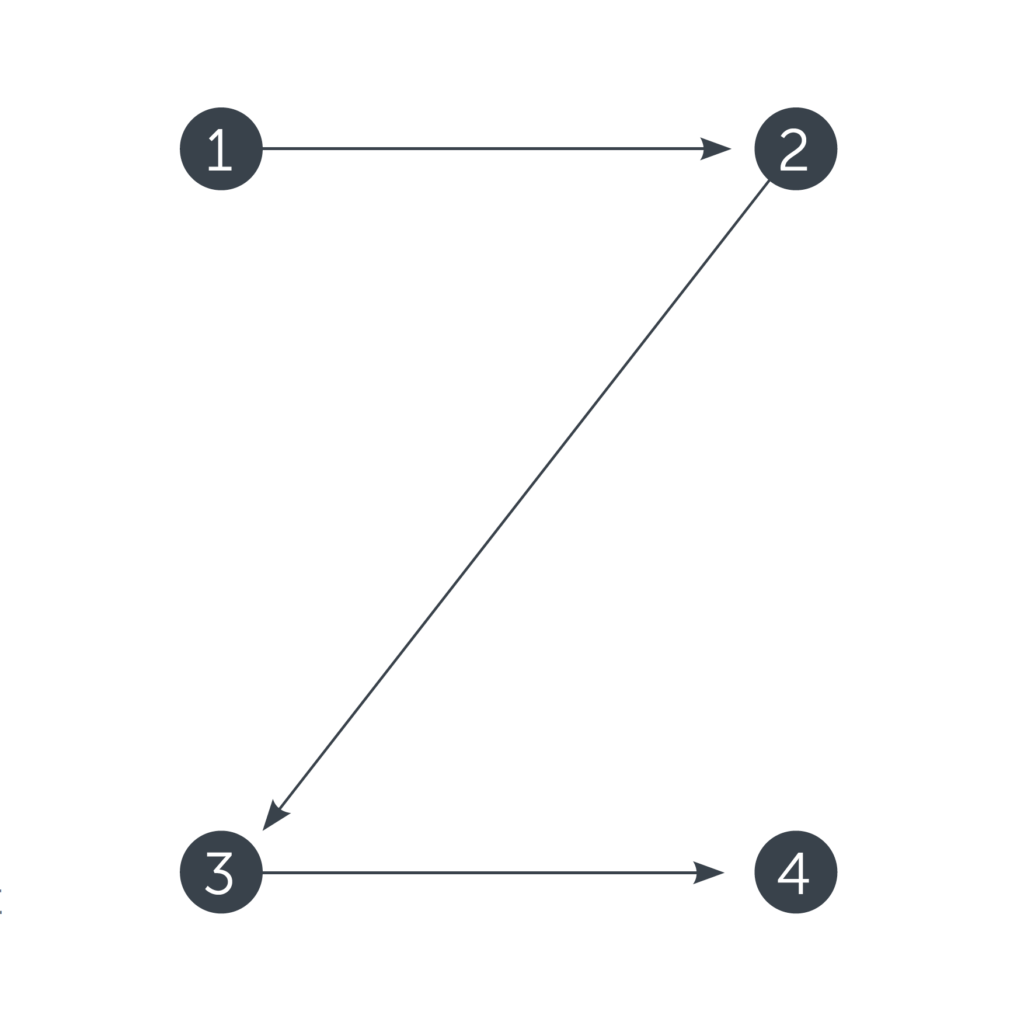
Z-Pattern
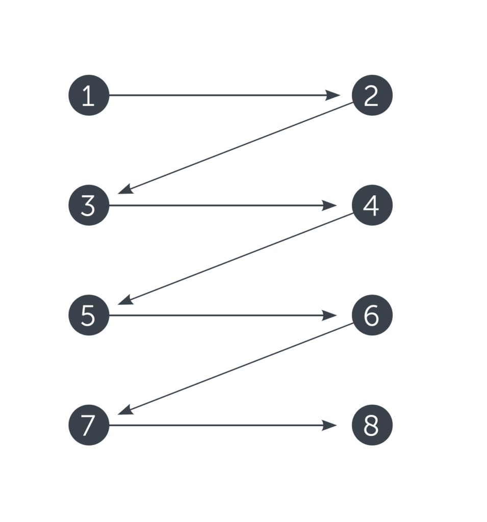
Zig-Zag Pattern
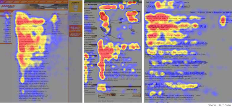
F-Pattern
Knowing these models, designers and information architects can build navigation and important data in the points where they have the highest chances to be seen and get the user interested. The well-thought-out visual hierarchy will make the page easily skimmed, saving users’ time and energy.
6. Check the icons perception
Icons are pictograms or ideograms used in the web or mobile interface to support its usability and provide a successful flow of human-computer interaction. It’s hard to overestimate their role in UI navigation: they make it much quicker as most users perceive images faster than words. The use of recognizable, clear icons has great potential to boost usability. However, even the slightest misperception can become the reason for poor UX, so the solutions for the type of icons should be carefully tested and, if needed, supported with the appropriate copy content.
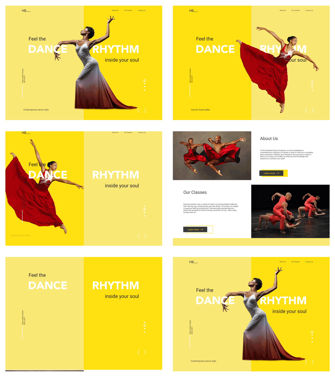
7. Strengthen the message with theme images and hero banners
No secret, in many cases, an image is worth a thousand words. In web and mobile UI, it often works this way: images are highly effective at setting the mood or conveying the message. In addition, images present the part of the content that is both informative and emotionally appealing. Original illustration, prominent hero banners, and engaging photos can satisfy multiple goals:
- catch users’ attention
- transfer the message visually
- support the general stylistic concept
- set the needed theme, mood, or atmosphere
- demonstrate the core benefits or items effectively.
8. Talk to users in their language
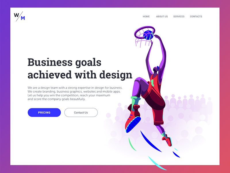
Copy content plays a crucial role in communication with the user. Not only is its effective visual presentation significant for high page performance, but the style, structure, and vocabulary should also correspond to the user’s expectations from a page. Usage of too formal or business-like style in an entertainment app for teenagers, or vice versa, too informal style on the luxury website selling elite real estate – there can be hundreds of cases when the copy doesn’t follow business goals as well as habits and needs of a target audience. That kind of content inconsistency can be confusing and move the users away from the website or app. User research will be effective for this issue to see how users want to communicate, while a professional copywriter will help to strengthen the design with the power of words.
9. Use the power of Gestalt principles
Gestalt is the term meaning «shape, form». It is primarily used in cognitive psychology to explore the laws of meaningful perception of the data people constantly receive from the world, which seems primarily chaotic. It works at different levels of perception, but the visual part seems most interesting to designers creating interfaces. It helps better understand the psychology of app or website users. When designers know the factors influencing visual perception, it makes the process of UX design much more proficient, giving higher rates of successful interactions and lowering the level of misunderstandings users could get in this way.
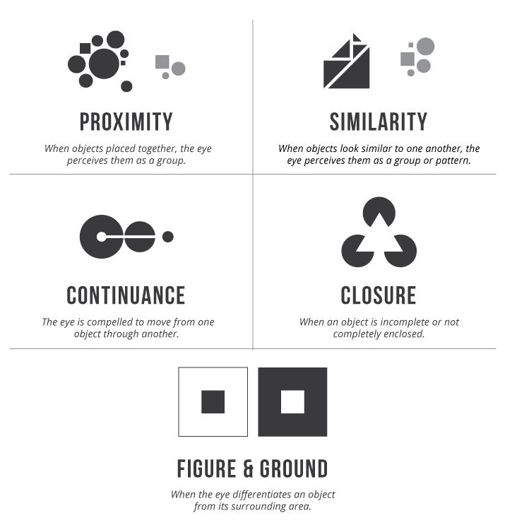
For example, applying the principles of similarity and proximity, designers can group the layout elements according to human cognitive abilities, so that users can perceive them in the most natural and convenient way.
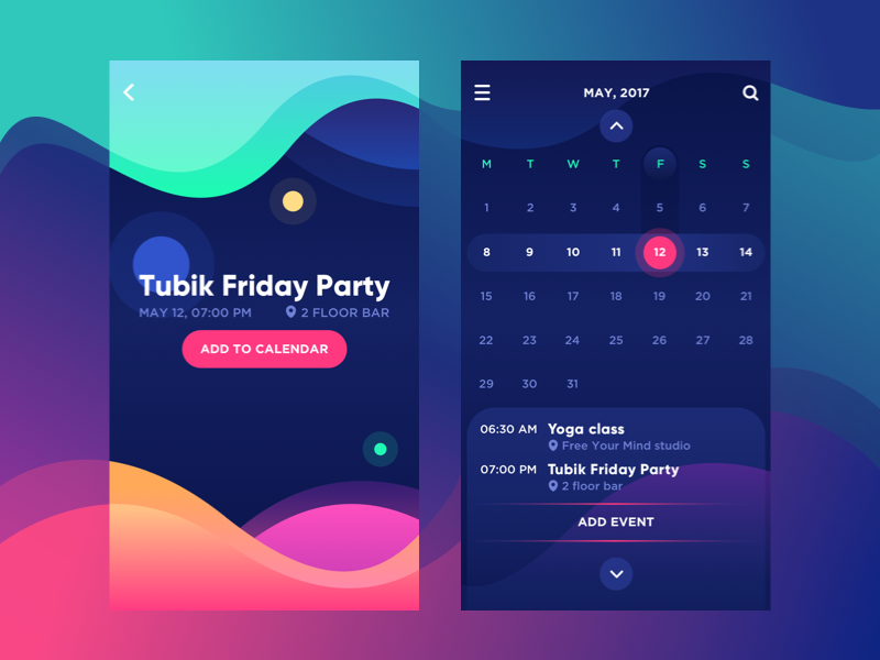
10. Optimize visual content
Whatever is interesting, attractive, and informative about the interface, there is an invisible factor that can erase all the benefits – the loading speed. If the visual content – images, animations, video – applied to an interface is too heavy or doesn’t perform well on different devices, the risks are high of losing users before they understand the strong points of the product. In high-competition environments, with loads of websites and applications, be sure: users aren’t going to wait; they will head for the more convenient, quicker alternative, even if it loses on a few points. Optimization and persistent testing of visual content are real signs of respect for the user, boosting a more time-efficient flow of interaction.
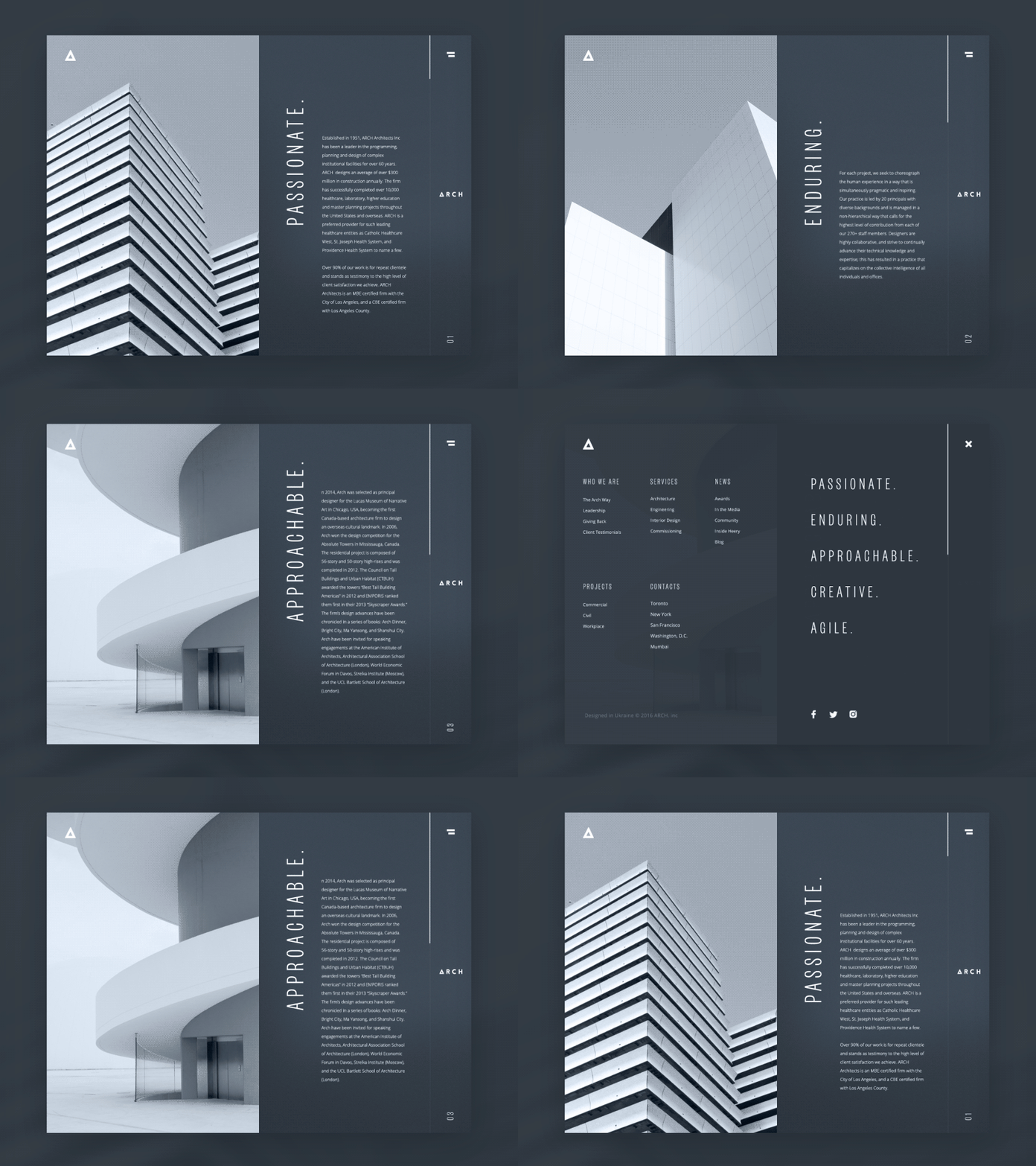
Hopefully, this list will be helpful to those aiming to create a positive user experience. Don’t miss the updates – new practical tips and inspiration are coming very soon.
Useful articles
This set of articles can be useful to dive deeper into the points mentioned above
Best Practices for Website Header Design
The Relations of Branding and UI Design
Visual Hierarchy: How to Organize UI Content
Gestalt Theory for UX Designers: Principle of Similarity
Gestalt Theory for UX Design: Principle of Proximity
Role of Copywriting in UI Design Process
Small Item, Big Impact: Types and Functions of UI Icons
Copy Content in User Interfaces
Originally written for Tubik Blog
 https://design4users.com/ux-design-how-to-make-the-interface-effort-saving/
2026-01-18
© by
Marina Yalanska
,
https://design4users.com/ux-design-how-to-make-the-interface-effort-saving/
2026-01-18
© by
Marina Yalanska
,
- English
- Ukrainian