Case Study: UI/UX Design for Vehicle Safety Mobile Application
Case Study: UI/UX Design for Vehicle Safety Mobile Application The design process for Pazi, the mobile app helping drivers get their vehicles parked safely. Check UI and UX design solutions, app screens, user scenarios, and interactions.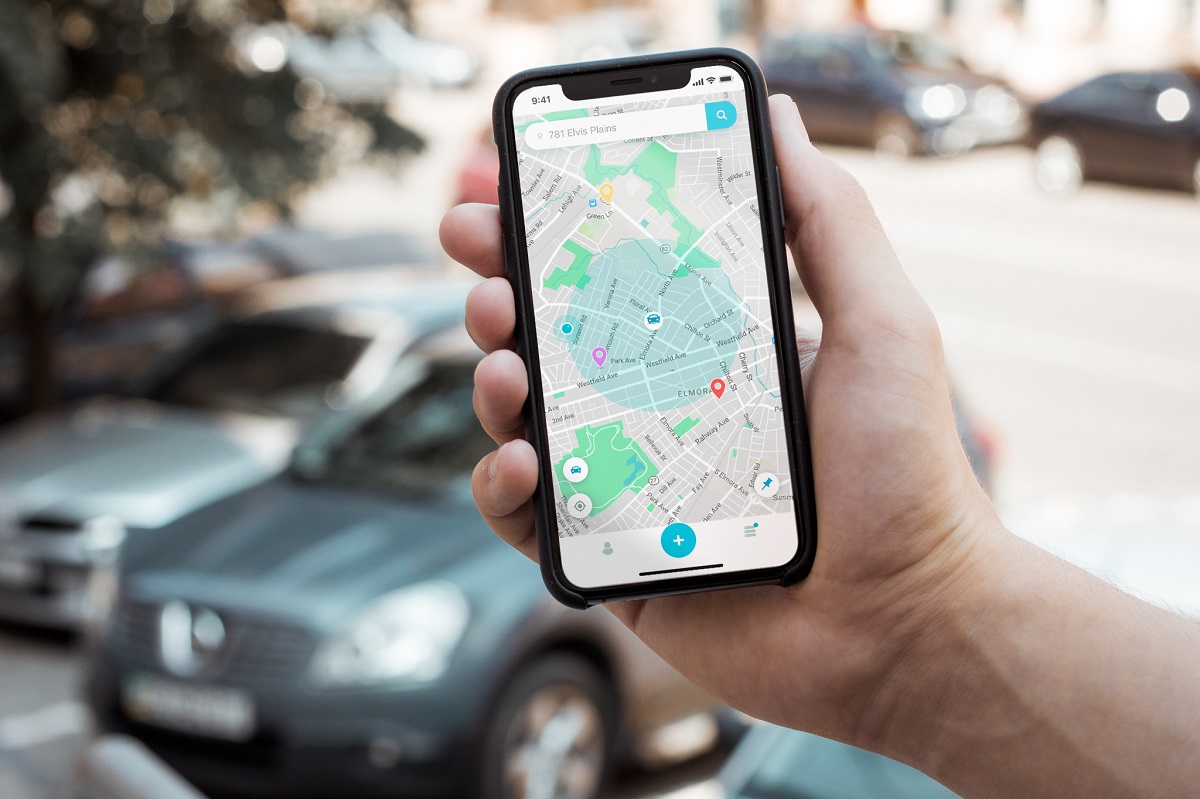
Among various functions provided by the growing pool of mobile applications today, more and more options are appearing to deal with various safety and security issues. Our today’s case study from tubik agency team is here to show you one of them: let us unveil the creative process for the mobile user interface design of Pazi, the app dealing with the problem of car safety. Below we will tell about the idea behind the app, user scenarios, UX wireframing and UI design for the project.
Project
Millions of drivers in the world face the problem of car vandalism, damage to a parked car, or lack of information about safety issues in different locations. The client had an idea to create a community of drivers so that they could easily get and exchange actual information about car accidents in specific areas, find a safe place for parking and get news about their cars left on the parking spaces.
The application had quite a diverse target audience of various ages, gender, physical abilities, and levels of tech literacy. What’s more, in most cases, the users would use it on the go on different devices and in diverse conditions of lighting, noise, and other factors influencing user experience. So, the user interface had to be highly intuitive and employ well-recognized patterns of user behavior.
User Scenarios
The app had three scenarios:
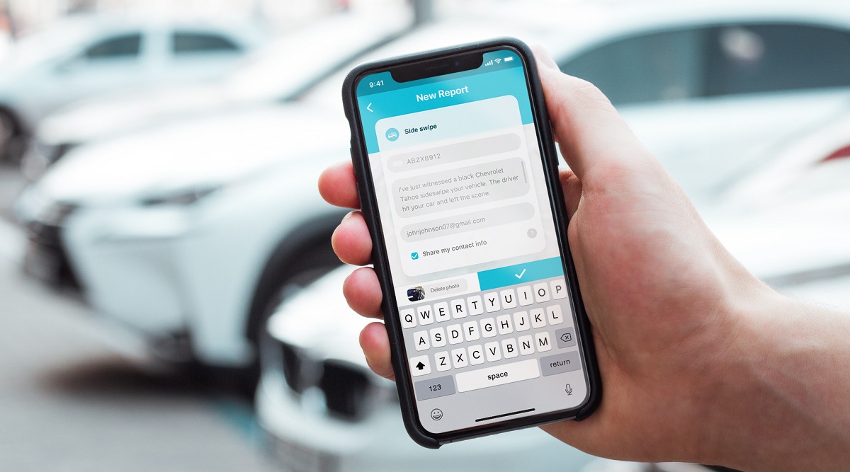
- You are an accident witness, and you report the accident (flat tire, sideswipe, ticket or highlights turned on, etc.), specifying the license plate number. The driver gets a notification about his car, so he can immediately react to it.
- You are a driver. You park a car and receive all notifications about it. Furthermore, you can turn on the parking mode and receive all notifications in the area nearby. When something happens with another car (for instance, dome vandalism) close by yours, you will know about it and can avoid that happening to your vehicle. You go to the other area and look for a place to park. You can see all of the accidents that happened there recently and find the safest parking lot.

- The app also may help police since the search for a witness of the accident would be easier. This way, the drivers using Pazi app would avoid many unpleasant situations, starting with a dead battery due to the lights turned on and ending with vandalism. Drivers come together in a friendly community to reduce vehicle accidents and speed up reactions to them.
UX Design
Let’s have a look at the screens and navigation aimed at covering the goals and scenarios mentioned above.
Main Screen
The map on the main screen allows a user to track all of the close incidents and gets fast access to all of the app features.
Search field: aims at the search for a safe parking place and view of all reports in the needed area.
Tab bar: provides fast access to profile and reports screen.
Add button: lets a user add a new report of an accident
Features: pinning the place allows for tracking the area around a parked car when you are far from it.
Reports Screen
The reports screen has two tabs.
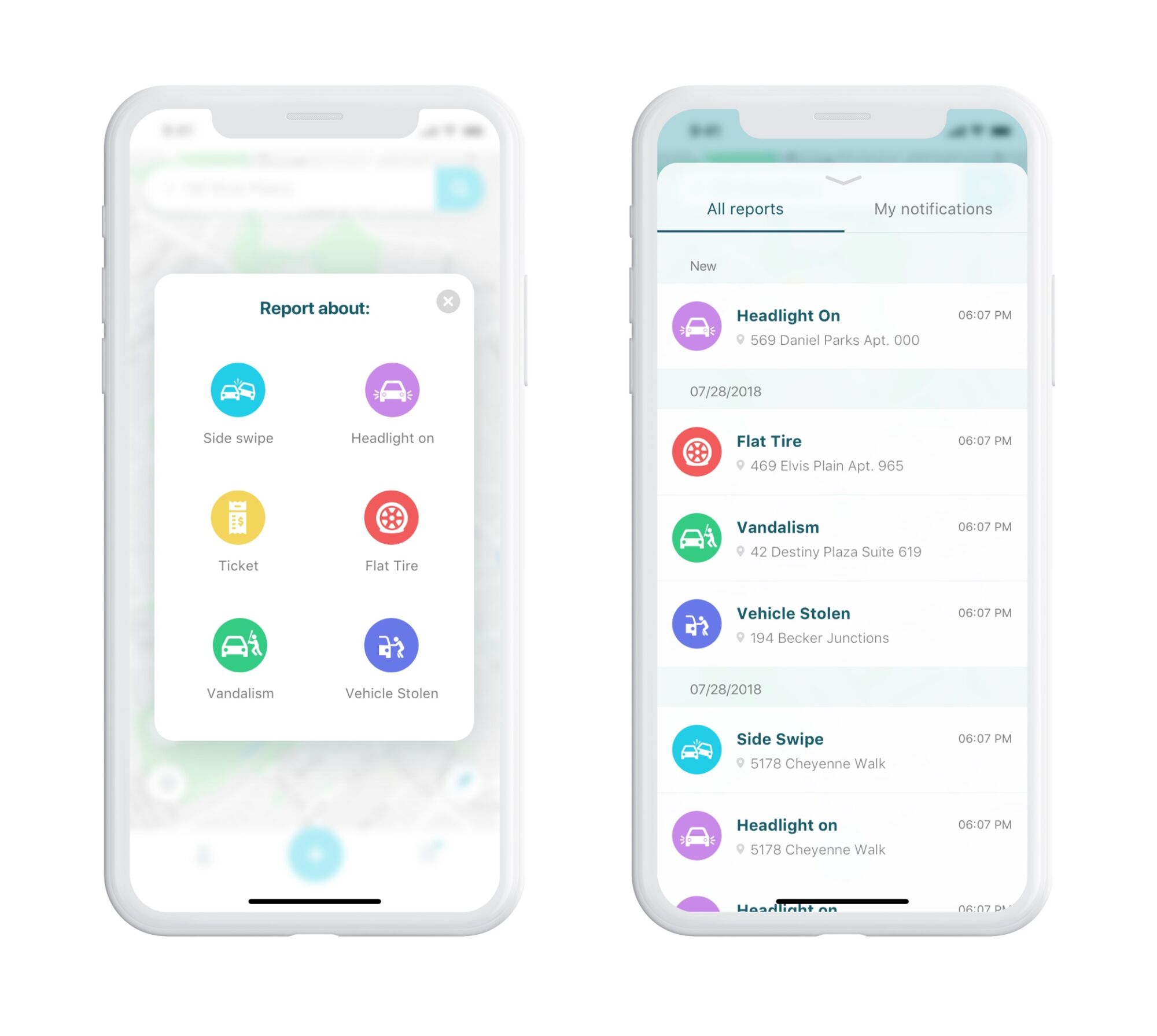
All reports: History of all added reports in the current city
My notifications: Reports indicated with the user’s license plate. The user is immediately notified when the report on his car is done.
User Flow
Traditionally, at the stage of UX wireframing, the designer developed the layout, navigation elements placement, and flow of interactions in clear monochrome screens.
Scenario 1
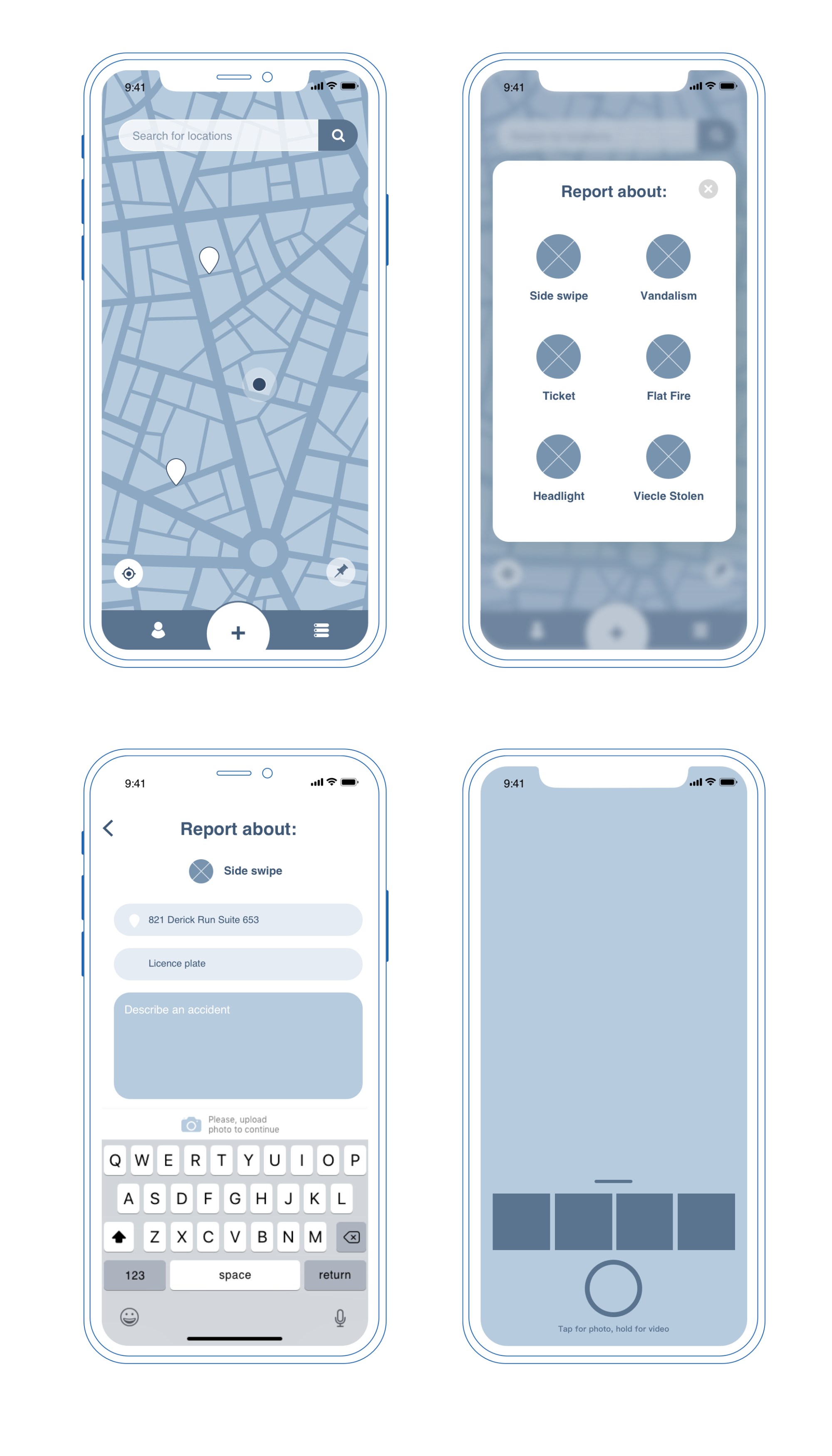
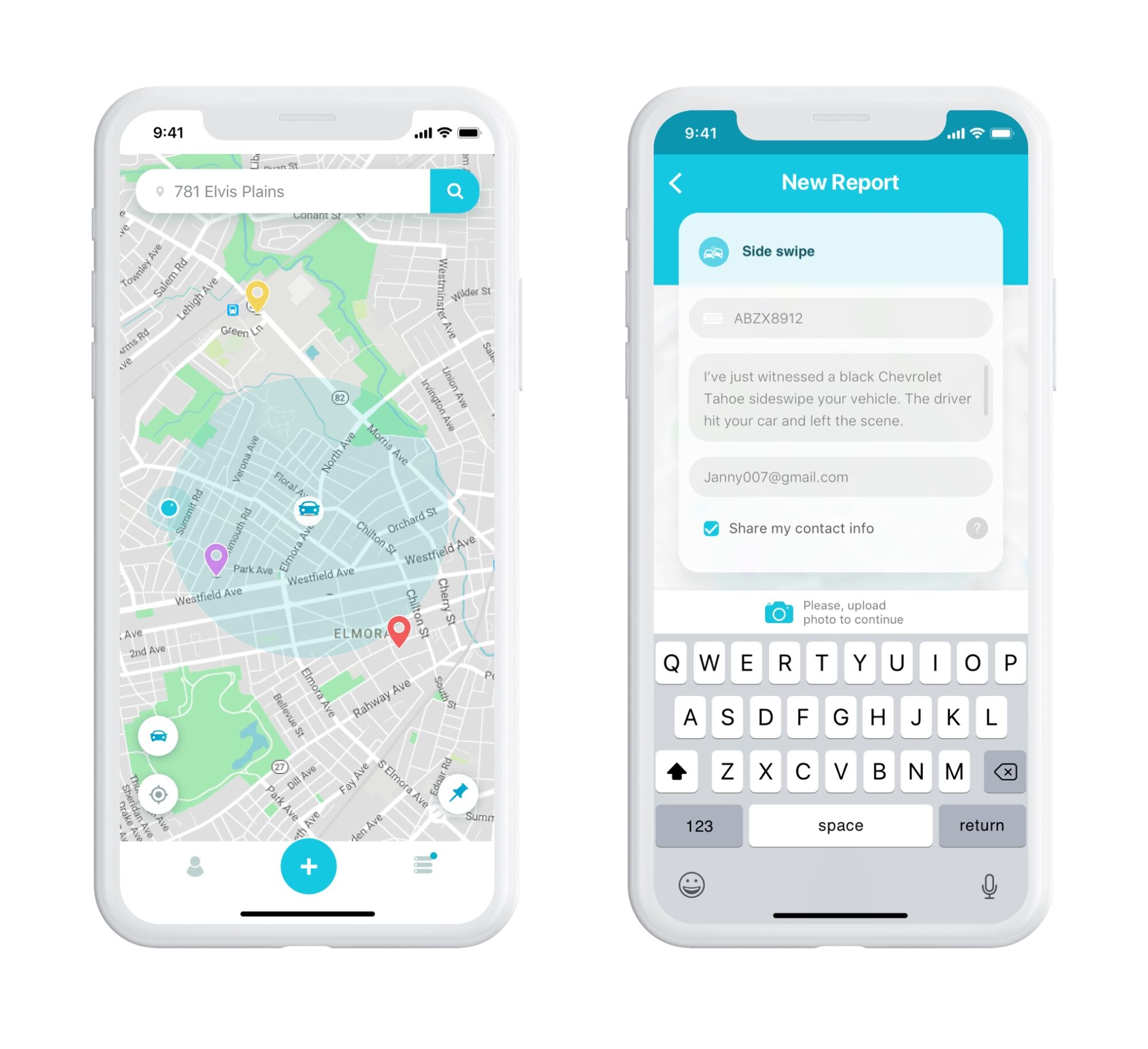
Adding a new report is a primary CTA on the main screen. The user can choose the type of accident to classify their report. Then a new report screen opens, and the user has to indicate the circumstances of the accident. The address is set automatically by the user’s location, but they can change it in case of a report delay.
The license plate field is a piece of the required information; it activates the opportunity to notify the car owner about the accident that happened with their car. The comment field lets users describe the details of an accident, but it is optional: the main goal is to make the report as fast as possible, so giving details is not obligatory.
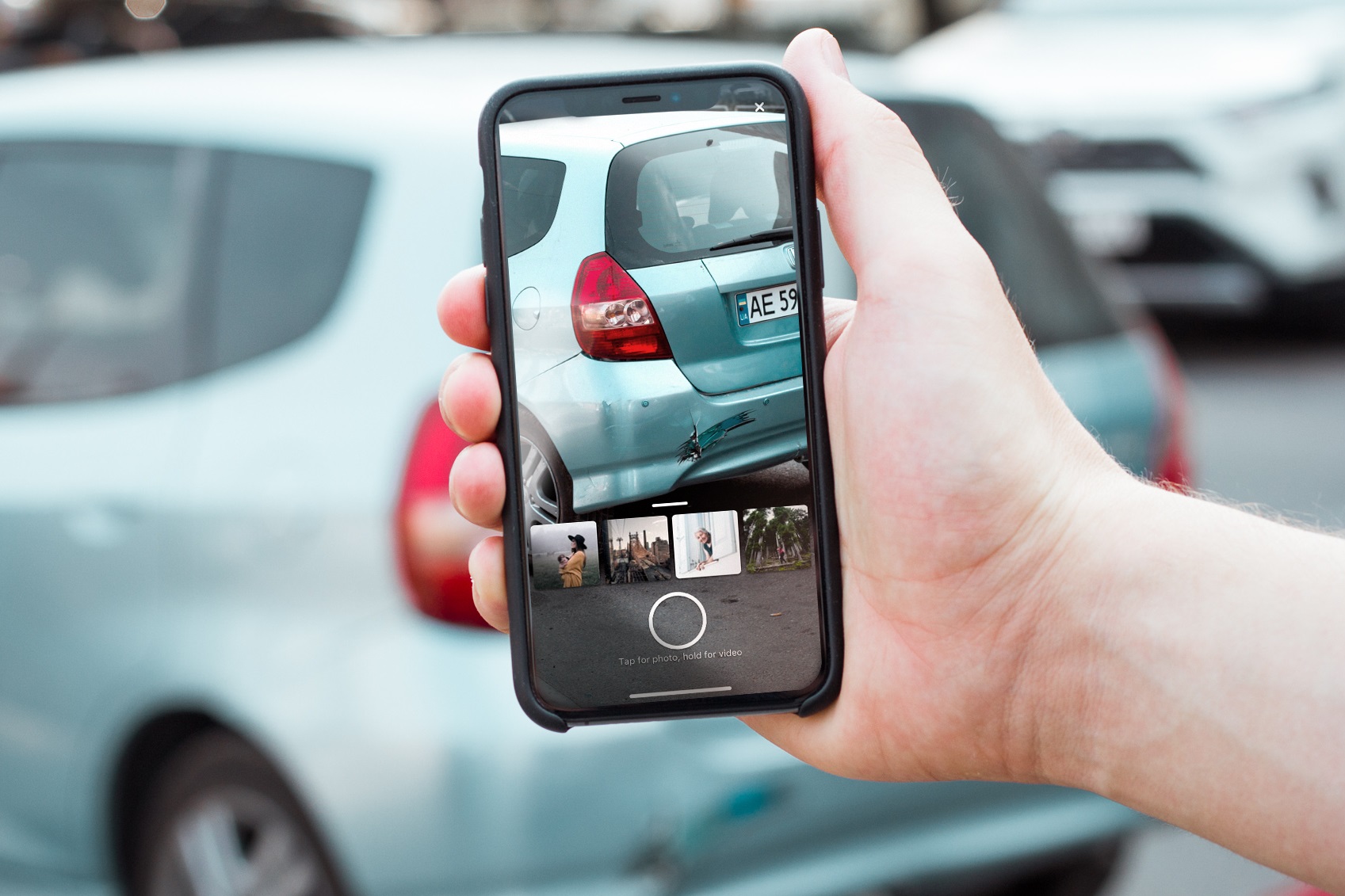
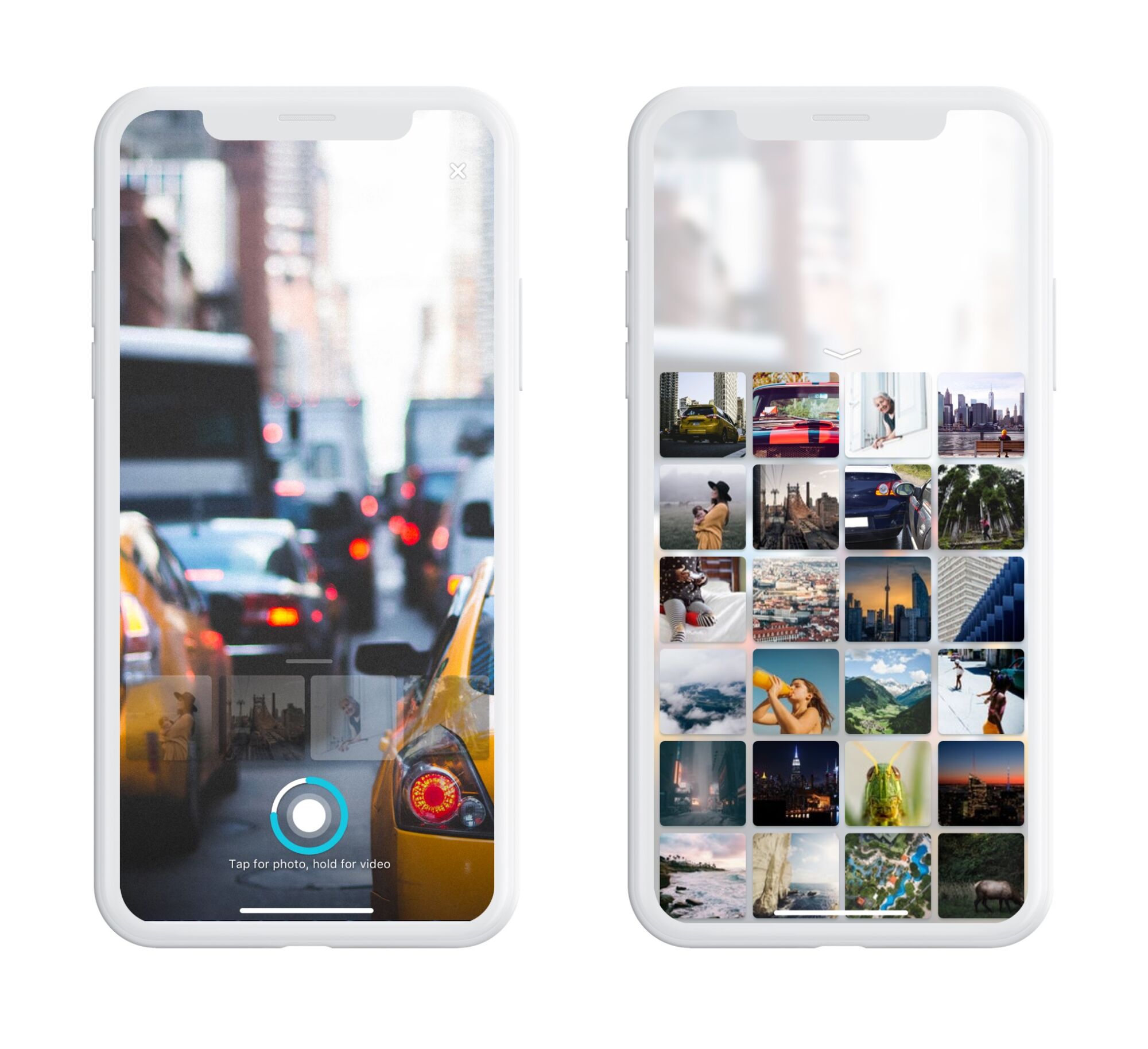
Also, the client asked to make the photo/video attachment as required, so the camera was designed with fast access to the latest photo in the gallery. The recording of the short video is possible by a long tap on the camera button.
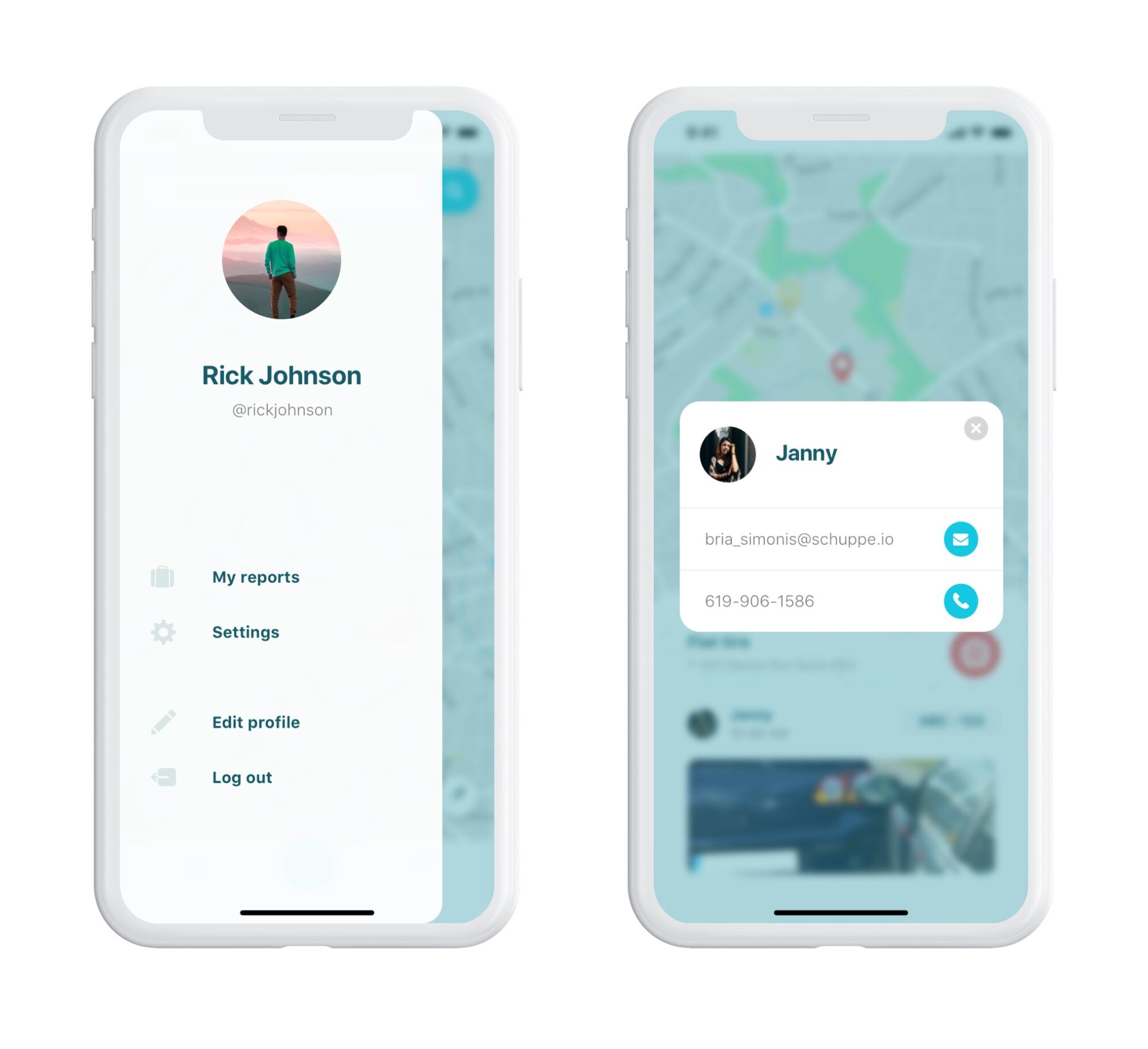
Also, the designer offered the client to add the possibility of contacting the accident witness, but there was a problem with confidentiality and personal data security. So, an optional checkbox was added to the New Report screen: it allows opening the user’s contact info, but only the car owner can do it.
Scenario 2
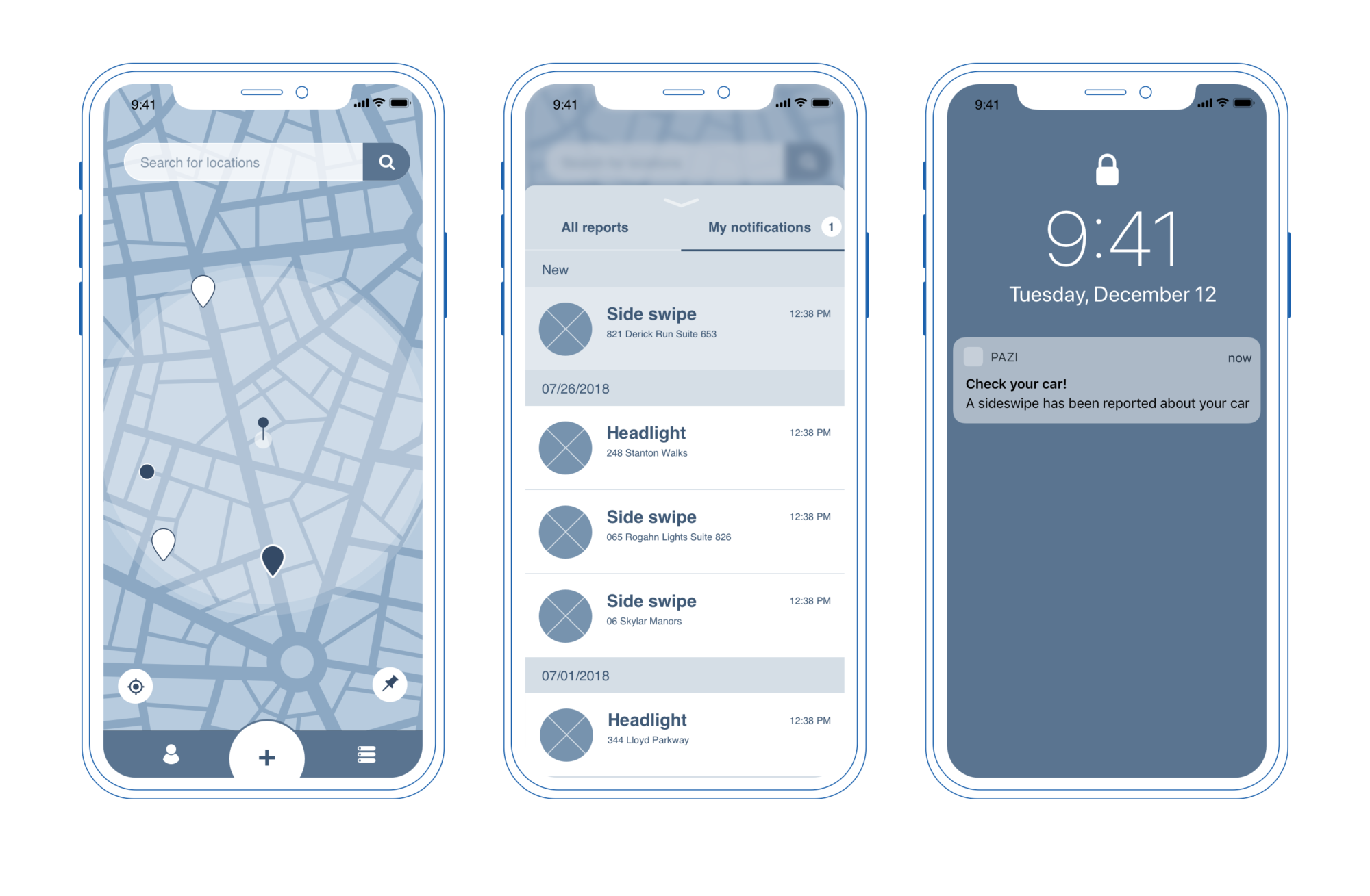
A driver parks his car in any area and turns on the parking mode by pinning the location. The app remembers where the car is left and starts monitoring this area so that the driver could be notified not only with reports with his car plate number but also other accidents reported nearby.
Scenario 3
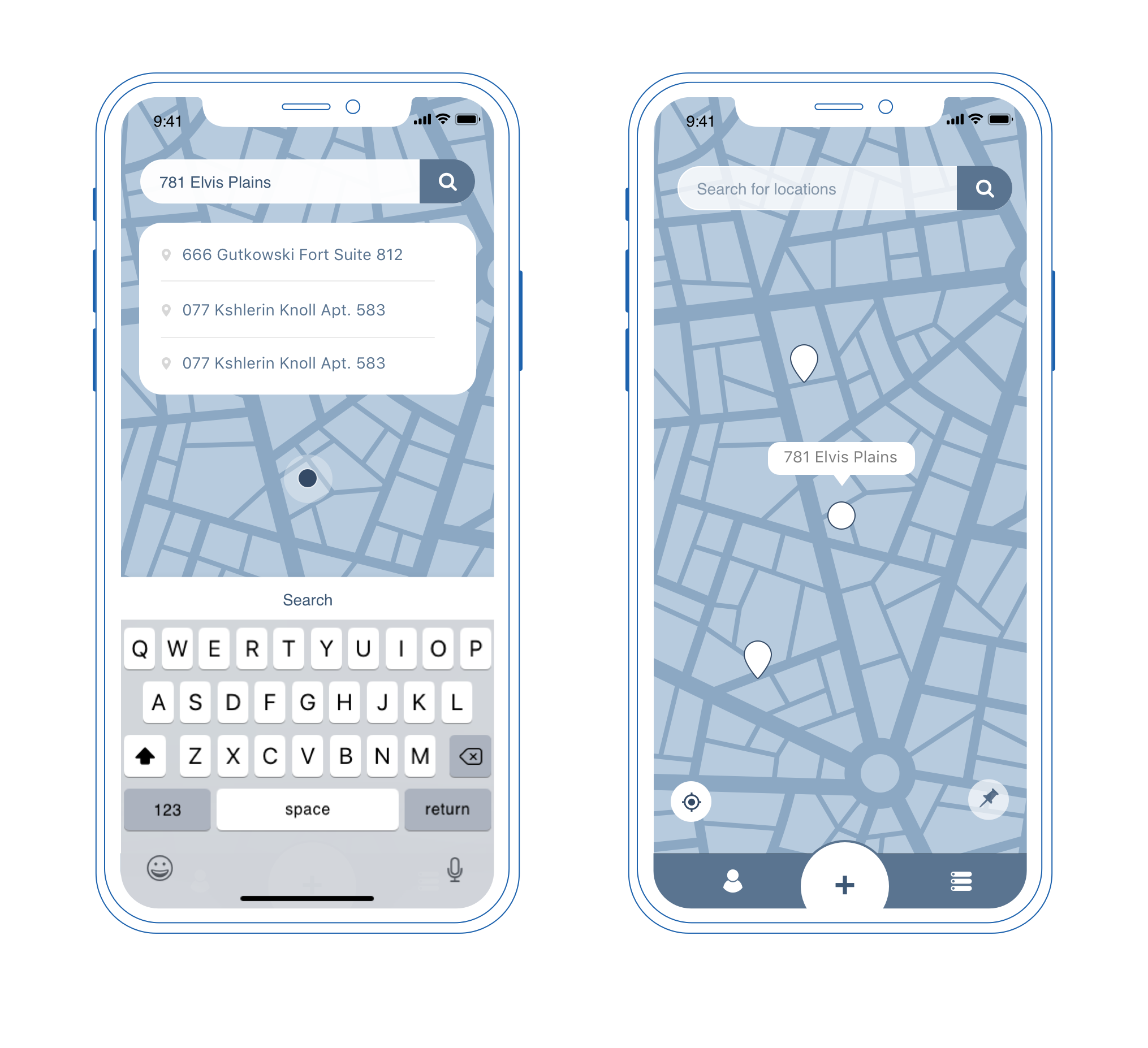
The driver is going to visit a new place and park there. He uses the search to see how many accidents have happened there recently and decide if it is safe to leave the car there, or maybe there is a reason to find another place.
UI Design
Color palette and style
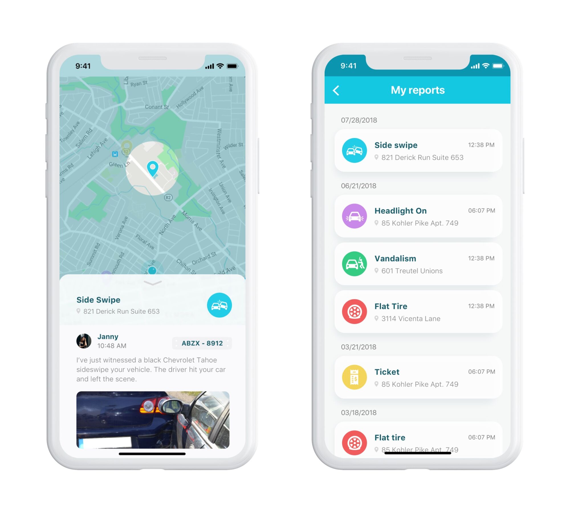
The color scheme is based on a light and airy background that makes the text content highly readable, while the color accents are easily caught in different conditions of the app use. The client requested the turquoise color as primary, so it helped the designer to understand his vision of the visual style. The idea was to make the app friendly and easy, and round the corners of unpleasant situations in an elegant style, not provoking any tension or overdistraction.
Icons for accidents
Continuing the style, there was made a decision to illustrate every incident type by a specific icon and assign a color for fast identification of the reports on the map and other screens. Color marking is a well-checked way to reduce the user’s memory load and make the interaction patterns quicker and simpler. It helps the user to scan and understand the content even before reading about the type of accident.
Camera
Simple and handy camera screens and interactions were also included to provide functionality for the core app needs: fast photo or short video. Minimalistic layout and clear navigation allow a user to take a picture instantly right on the accident spot.
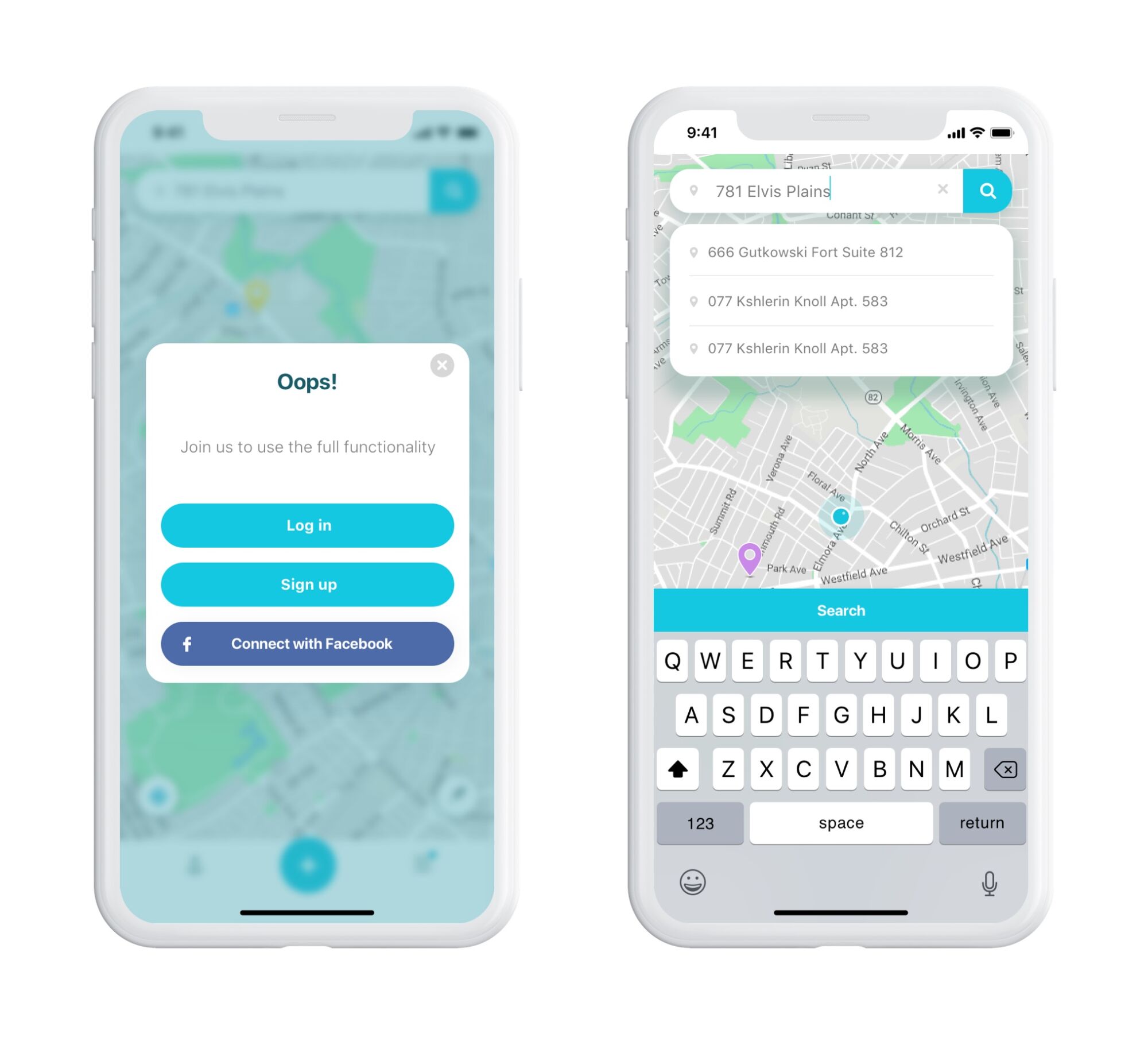
Here are some more of the final app screens: sign-up/log-in popup window, interactions with a map, profile and user contact information, etc.
In general, all the user interface design for the mobile app was built around simplicity, intuitiveness, and readability as core issues of positive user experience.
UX Design Case Studies
Welcome to review other case studies on UX design process and solutions for a variety of digital products:
Designer AI. Dashboard and Graphics for Service for Fashion Designers
Otozen. Mobile App Design for Safe Driving
Crezco. Brand Identity and UI/UX Design for Fintech Service
Bitex. UX Design for Stock Analysis App
Perfect Recipes App. UX Design for Cooking and Shopping
CashMetrics. UX Design for Finance Management Service
Tasty Burger. UI Design for Food Ordering App
Slumber. Mobile UI Design for Healthy Sleeping
Watering Tracker. UI Design for Home Needs
Home Budget App. UI for Finance
Originally written for Tubik Blog, all graphic content by tubik
- English
- Ukrainian


