UX Wireframing: Foundation of Usability
UX Wireframing: Foundation of Usability The article presenting deeper insights into the topic of UX wireframing: definition, benefits, classification, tools and tips on design workflow.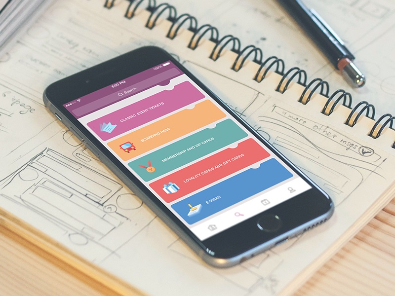
In 4th BC Plato said: “The beginning is the most important part of the work”. Nearly 24 centuries later, his words remain relevant to our realities. Buildings require a stable foundation to stand and provide shelter for as long as any project, necessitating careful planning from the outset to avoid problems later. Wireframing is the early step of UI/UX design process when the structure of the project is being formed. The usability and efficiency of the final product often depend on how well the wireframe is created at the very first steps of the design process. However, today designers still haven’t agreed on a common view of wireframing: some consider it a key part of the design process, while others regard it as a waste of time. But where does the truth hide?
We’ve already touched upon the topic of wireframing in our article about creating mobile applications, and since the topic remains actual and debatable, this time we want to devote the full article to the roots, nature, benefits, and diverse issues of the wireframing process as well as the reasons why it’s advisable for designers to apply it.
What’s a wireframe?
Wireframe is a simplified and schematic visual representation of a layout for website pages or screens of an application interface. Wireframes are similar to architectural blueprints: they are usually black and white illustrations, sometimes with bright marks or spots to outline specific areas or points, that give a clear vision of the project structure and connections between different parts.
Wireframing is effective at the beginning of the design process when the main objective is to create the product’s structure. Designers use wireframes to outline visual and typographic hierarchy on user interfaces, set the interactive zones and elements, plan transitions and interactions, organize the general interface clearly for the target audience. Since a wireframe focuses on structure rather than the visual and emotional perception of details, designers aim to keep it simple. They primarily limit it to monochromatic color schemes, with boxes and lines representing text, images, and all interactive elements on the web page.

Example of a UX wireframe for a HealthCare App
Earlier we presented the typical creative flow for the digital product in Tubik by the example of creating mobile apps and mentioned the set of stages in this process:
- setting the task and initial scope of works
- estimation
- user/market research
- UX wireframing
- prototyping
- UI design
- animation
- software architecture planning
- iOS development
- testing
- release
- updates.
According to this list, it’s easy to see that UX wireframing is not the first stage of digital product creation, but it’s usually the initial phase of actual design when the future website or application gets its first visual presentation, the sketch of its face and figure. The chances are high that the actual participants in creating digital products would agree with the idea offered by UXPin team in their book on wireframing: “Whether you’re building the next hot startup or a solid website or mobile application, wireframes are invaluable in keeping everyone on the same page – not just product managers, designers, and engineers. And they can be changed really quickly to accommodate the collaborative and iterative nature of product design and development, especially in agile startups and enterprises.”
Why do you need wireframing?
Wireframing is a fast and cheap way to plan the structure of the page or screen design. Moreover, it provides numerous advantages not only for designers but also for the entire development team and clients. First of all, a wireframe is the first visual representation of a designer’s abstract idea. This step ensures that developers and clients have a clear understanding of the project’s design. Furthermore, in case the client wants to make some changes, a wireframe is much easier to reshape since it doesn’t take much efforts and time to create one.
Another benefit a team gets from wireframes is that developers can clearly see the placement of elements on the page. Some software for creating wireframes allows you to see all sizes and spacing by clicking a single button, saving time for both the designer and the development team. In addition, wireframing is quite inspiring for designers. It is flexible and provides ample room for experimentation, making the creative process more productive and opening the field to fresh, outstanding solutions.

A brief metaphor for the basic reasons why wireframing is a good idea. When we think about building the house, for example, we usually mean the process of the physical appearance of the construction rather than tons of projects, drawings, and calculations made on paper. And yes, physically it’s possible to build the house without any project, as well as it’s possible to create the interface out of thin air. However, in this case, you shouldn’t be surprised if one day the house will crack and collapse without any visible reasons as well as the app looking amazing and stylish won’t bring you any loyal users. If you want to have a reliable house, a durable mechanism, a powerful application or a highly-functional website, the recipe is the same – take your time for thorough planning and projecting. This will not waste your time; rather, it will save you time and effort you would otherwise spend on redesigning and attempting to determine why your product doesn’t work properly.
Overall, wireframing is an effective tool that can save time and money for both the team and the client. It helps organize development and design processes and reduce the chances of problems on future steps.
Types of wireframes
Some argue that a wireframe is essentially a low-fidelity paper sketch of the page structure, with boxes and lines illustrating visual elements. Nevertheless, modern technologies today enable designers to create wireframes of varying fidelity levels quickly and with minimal effort. Typically, we can define 3 widely used types of wireframes.
Low-fidelity wireframes. They are black and white illustrations focused on a “big picture” of the page. UI elements are shown as boxes and lines without detailed annotations. The wireframes of this kind are quite abstract, but they give a chance to see the basic structure of the user interface.
Medium-fidelity wireframes. This type is created in a monochrome palette, often a gray-scale, which makes it similar to the previous one. The wireframes can be created both manually or via digital tools so that the UI components are more detailed and realistic. Copy elements such as headlines and headers are distinguished, which assists in establishing typographic hierarchy. Placeholders are filled with images and the comments describing their destination.
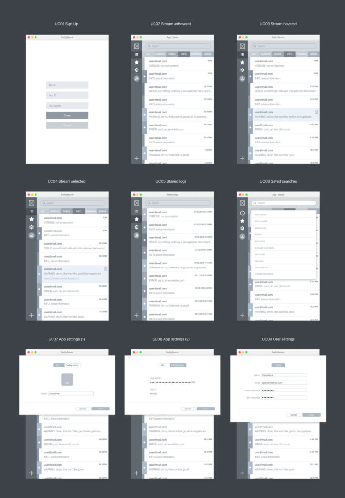
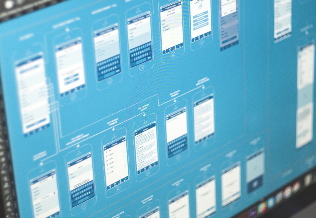
The UX wireframes for SwiftyBeaver project
High-fidelity wireframes. These wireframes are created via digital tools. The core difference from the other types is that high-fidelity wireframes are built in color and present the screens in the view close to the final visual performance. The fonts are styled and visual elements are created with textures and shadows. The designer pays more attention to the sizes and alignment of UI components. It’s actually the static version of the app or website presented page-by-page or screen-by-screen. So, in distinction from the previous stage, they are called UI wireframes.
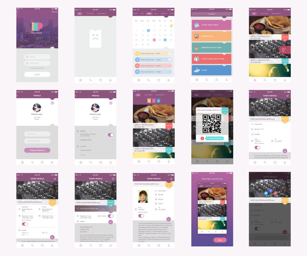
UI Wireframes for PassFold app
Wireframing vs Prototyping
High-fidelity wireframes are often mistaken for prototypes because they are rendered in color and appear realistic, resembling a fully completed project. Nevertheless, these concepts present different stages of the design process, have different aims and focuses. As we’ve already mentioned, wireframes are focused mostly on the structure of the page. On the other hand, prototypes are created to give a more detailed look at the UI elements, their style, and alignment: the most significant difference is that prototypes give the opportunity to test the interactions between the user and the interface, similar to the final product. As we mentioned in UI/UX Glossary, the original concept behind the term ‘prototype’ is the sample model of the product that gives the ability to test it and see if the solutions and decisions made about the product are efficient. However, prototypes should not be seen as the analog of the final product as they aren’t those: their main aim is to enable a designer, a customer, and a user to check the correctness and appropriateness of the design solutions.
Interactions need to be thought out well and similar to the final result, and checked thoroughly before the development team starts their work. Making alterations, adding elements, and changing transitions is much more time-consuming and expensive at the stage of development; that’s why it’s important to check the usability of the UI elements in advance. Prototyping is much more efficient and useful as the step between UX design and UI design. So, here in Tubik, we support the workflow having the sequence «UX – prototype – UI».
The prototypes on UI stage can be created for the presentation of application general looks rather than for testing and improving its functional features. And this is the trap in which it is easy to get confused. Prototyping all the details on the final stage of UI in most cases is not so reasonable as it could seem. It can be too time-consuming and in this perspective, it would be better to spend the same time on coding a demo-version. Moreover, usability should be thoroughly checked first of all at the UX stage, otherwise, it would be much harder to change inefficient solution after having accomplished a lot of work on UI. Certainly, it would be amazing to create prototypes both for UX and UI, but by far not all the designers and customers agree to spend so much time on design tasks and want to test and improve the design much faster and cheaper. Anyway, the solution of applying prototyping at different stages of UI process should be approached individually according to the requirements and goals of every particular case.
Prototypes are created on the basis of the static wireframes, making them clickable and interactive, so the designer can try out if the interface is clear and usable for a real user. This kind of testing is a key step in the design process because it allows identifying possible problems and difficulties with user interactions. There are various prototyping tools providing functionality on checking the usability of the design solutions, and research platforms which make the process even easier.
Efficient wireframing tools
Today, designers are not limited in the aspect of choosing tools for wireframing: there are plenty of them, free and paid, to set up the productive design flow. The number of tools is growing so fast that it’s easy to get lost among them.
Wireframing is an integral part of the design process here at Tubik, so our designers need a flexible and effective tool for creating wireframes that can be effective both for individual and complex team tasks. The long path of probes has led us to Sketch.
Sketch is a professional design software that allows creating the variety of art and design projects. The program is vector-based and gives the opportunity to work with layers and shapes which can be easily manipulated via the tools panel. Sketch is an effective tool for UI/UX designers because it can be applied at different stages of the design workflow starting from wireframing. The features which we see as advantages are quite convincing.
It’s vector-based. This means designers can use vector shapes and scale them without losing quality. Moreover, the artboard is still pixel aware which is a core thing for creating quality web and app design.
Effective guidelines. You can see dimensions of the components and spacing between them only by holding the alt key. This is helpful not only for designers but also for developers. When designer shares the wireframes with the development team, they can define the placement and details of UI components and layout without designer’s explanations.
Grids. Unlike many other tools, Sketch provides the inbuilt grid feature that saves designers’ time since they don’t need to create it beforehand.
Native font rendering. It often happens that fonts in a browser look absolutely different compared to the PSD and it ruins the whole picture. Nevertheless, Sketch uses native font rendering that makes fonts feel more natural and accurate in browsers.
It’s fast. Sketch is a tool oriented on web and app design, so the functionality is more concise compared to other software in the field. This makes it lighter, so it works much faster not overloading the computer which saves time (and nerve!) for designers.
Yet, there is one specific feature about Sketch: it works only on Mac and there are no exceptions. Nevertheless, if you don’t have one, you shouldn’t give up. There is still a classic option – Adobe Photoshop. Yes, it may work a bit slower but it is an efficient tool for creating wireframes, and many designers are sincerely linked to it as a multipurpose tool. Moreover, you should remember that not all the customers are ready to accept the assets in Sketch, so Photoshop will save the game in this case. It proved itself as an efficient tool. Among newer options, the star of Adobe Experience Design (XD) is also rising and winning its positions on the market and in design flows.
And, for the last point here, if you are keen on creating interactive high-fidelity wireframes, you’ll need additional tools to make them clickable prototypes. For this stage, we could single out InVision and UXPin: these tools help to add interactivity to wireframes, creating efficient samples for gathering feedback from the team and clients.
Tips on how to make your wireframing efficient
There are no big secrets about creating a quality wireframe, still some tips on how to make it more productive can be mentioned for the bottom line:
Do thorough research beforehand. Do not start the wireframing process before you outline the goals, USP, target audience, and the problems which should be solved with the product.
Keep them simple. The aim of a wireframe is to create a structure of the page design, details go after.
Use a monochromatic palette for UX wireframes. Our experience proves that the design process is more productive if the designer leaves detalization for the next step.
Write annotation. If the designer plans to present a wireframe to the team, it would be good to include annotations. They help to catch and understand the ideas quicker and deeper.
Gather feedback. Try to solicit the opinions of your team members and, if possible, potential users at this stage. It is an effective way to improve your work and save your time for later stages needing a more sophisticated design.
Use a grid. It helps to place all the components in an efficient way for users’ perception.
Recommended reading
Here is a collection of recommended materials for further reading if you would like to explore the theme further.
The Guide to Wireframing (E-book)
The Wireframe Perfectionist’s Guide
Using Wireframes to Streamline Your Development Process
What is a Wireframe: Designing Your UX Backbone
Jargonbuster: mockups, wireframes, prototypes
What’s the difference between wireframes and prototypes?
10 tips to improve your wireframes in the web design process
9 Free to Use Wireframing Tools
Originally written for Tubik Blog
Useful Articles
Here’s a bunch of articles to dive deeper into the theme of usability and user experience design.
5 Basic Types of Images in Web Design
The Anatomy of a Web Page: Basic Elements
6 Elements of Efficient Company Website Design
UX Practices on Product Page Design
How to Design Effective Search
Web Design: 17 Basic Types of Web Pages
Guide to 6 Effective Types of Web Animation
Directional Cues in User Interfaces
- English
- Ukrainian