


Creative Web Design Concepts of Landing Pages
Creative Web Design Concepts of Landing Pages The set of practical design concepts featuring landing pages for different purposes. Variety of techniques and approaches for user-centered and efficient web design.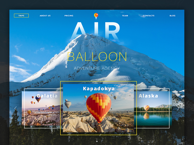
What makes the journey by air good? Easy take-off, smooth flight, breathtaking view from the air. And soft landing with feeling safe and convenient. These final minutes of reaching your destination can become the icing on the cake, enhancing comfort and excitement of the flight, or vice versa, the dark spot crossing out all the amazement and positive moment if the landing is hard and unpleasant, perhaps confusing or painful. Landing really does its job.
In web design, it works similarly. For many users, a well-thought-out landing page will be the good experience of getting to the right destination and starting a journey around the website from the proper point. In our previous article sharing the details of the design for efficient landing pages, we mentioned that process of creating landing pages lies on the crossroads of design, marketing, user research, psychology, and other spheres dealing with people, their behavior, and solving their problems.
Here we have collected 10 different UI design concepts accomplished by studio designers. They represent different landing pages reflecting various business goals, natures of presented offer, and visual styles supporting the purpose.
Landing page for the shop selling organic products
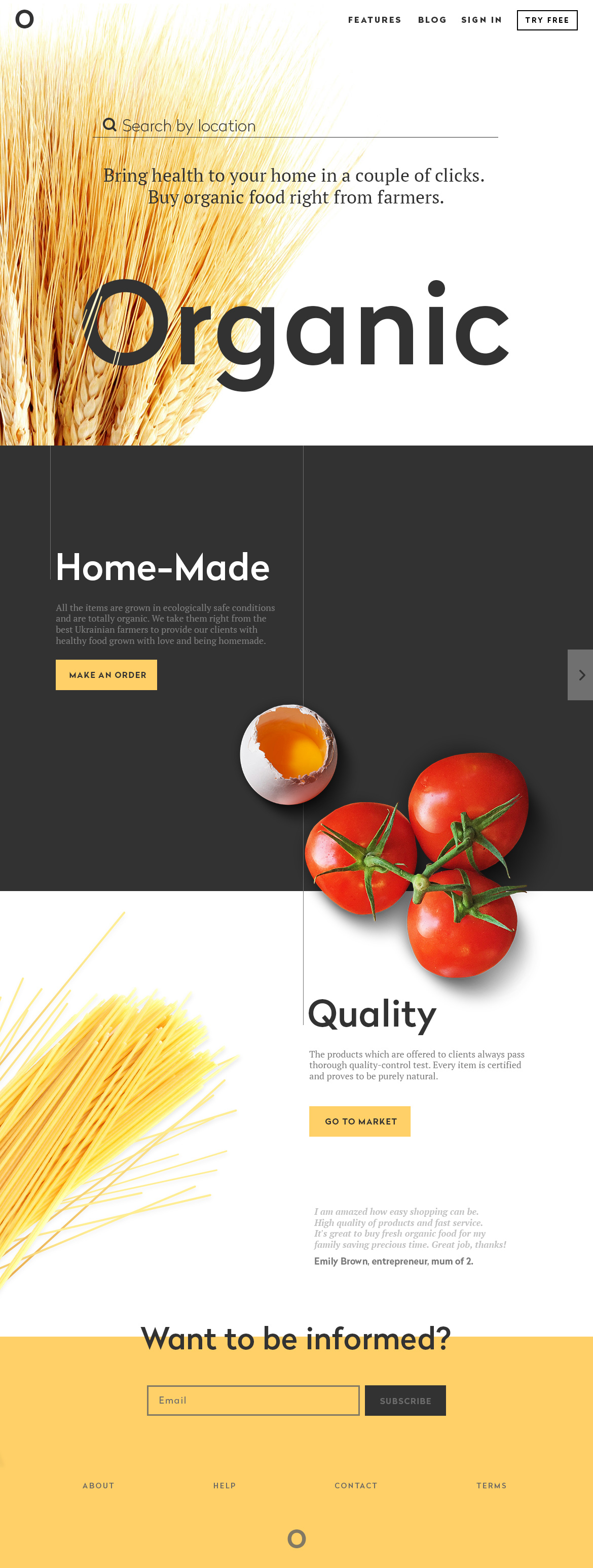
The aim of the presented landing page is to promote a shop of organic food. It is composed of several blocks presenting the name of the shop, products, highlighting some important aspects of service, call to actions, and testimonials. The designer sets the purpose to make it informative but not overloaded, appealing but not aggressive. So, all the visual accents, first of all, key images of food selected carefully to immediately transfer the appropriate message to the user, support the basic theme. To make the experience more attractive and engaging, the process of scrolling the page was livened up with animation, and the visual elements were selected to support the general theme and provide the immediate visual perception of the basic idea.
We can also see that in this case, the designer chooses quite short and condensed copy blocks which provide users with basic data and give the links to learn more following the call-to-action. At the same time keywords describing the most important benefits like ‘organic’, ‘home-made’, ‘quality’ is marked out visually so that they could be noticed at once. This strategy is wise as users do not need to spend much time reading to learn about the service but see the opportunity to learn more any time they need.
Landing page for a website providing services for everyday life
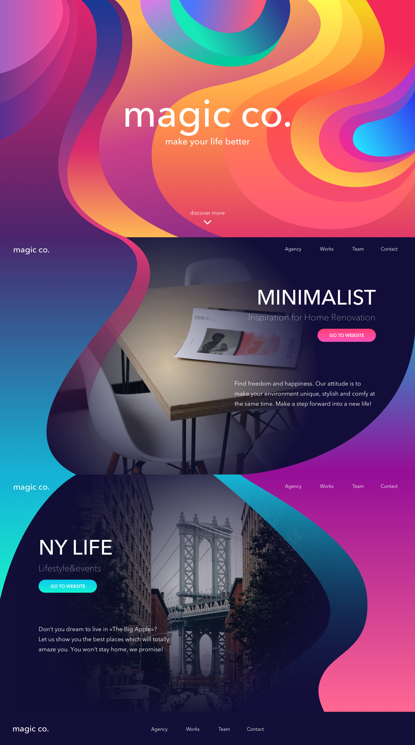
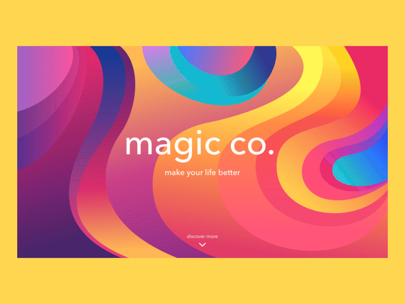
Here is the landing page concept designed for a website of the agency that presents its services. The variety of provided services is echoed by the variety of colors used in the interface. The designer’s aim was to make it lively, vivid, and attractive, creating a catchy first impression and supporting positive user experience with engaging design solutions. Dynamic motion accents add much to the general stylistic solution whereas a good combination of fonts with balanced contrast of layout elements creates the field of good visual perception and enhances readability.
Landing page for museum exhibitions
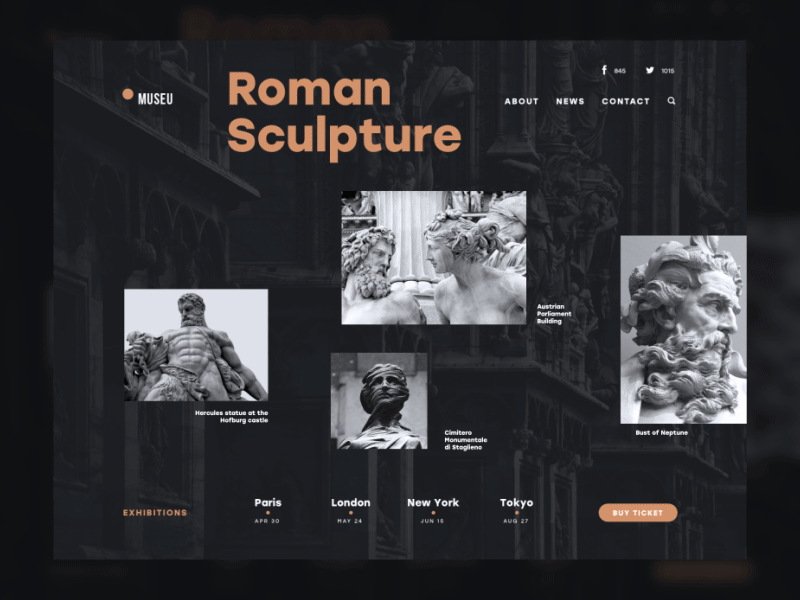
This example presents a landing page promoting art exhibitions. The idea behind it is to make this sort of promotion aesthetic and unobtrusive for the user as well as highly informative. The balance of minimalism and utility appealing is kept by means of style, color, and motion. The minimalist presentation still is highly informative and successfully uses the studies of eye-tracking for applying the most important layout elements in the zones of the highest usability.
As we mentioned in the article devoted to the benefits of dark background in UI, the color of background can be not only the effective field of presentation but also the carrier of its own message. Dark colors are usually associated with elegance and mystery. Moreover, black is often associated with elegance, formality, prestige, and power. That is, perhaps, one of the reasons why many powerful brands build their visual presentation around the black-and-white scheme with dark dominating and light presenting and informing the recipient. Playing out this aspect in interface design can provide additional support to other design solutions and general presentation of the product which we can definitely observe in the presented design concept. The dark background makes the images of the exhibits look more deep and stylish while the readability doesn’t suffer being supported with the right choice of fonts.
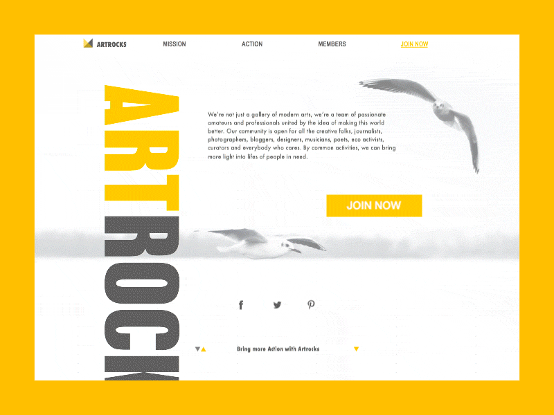
Landing page for a non-profit charity organization
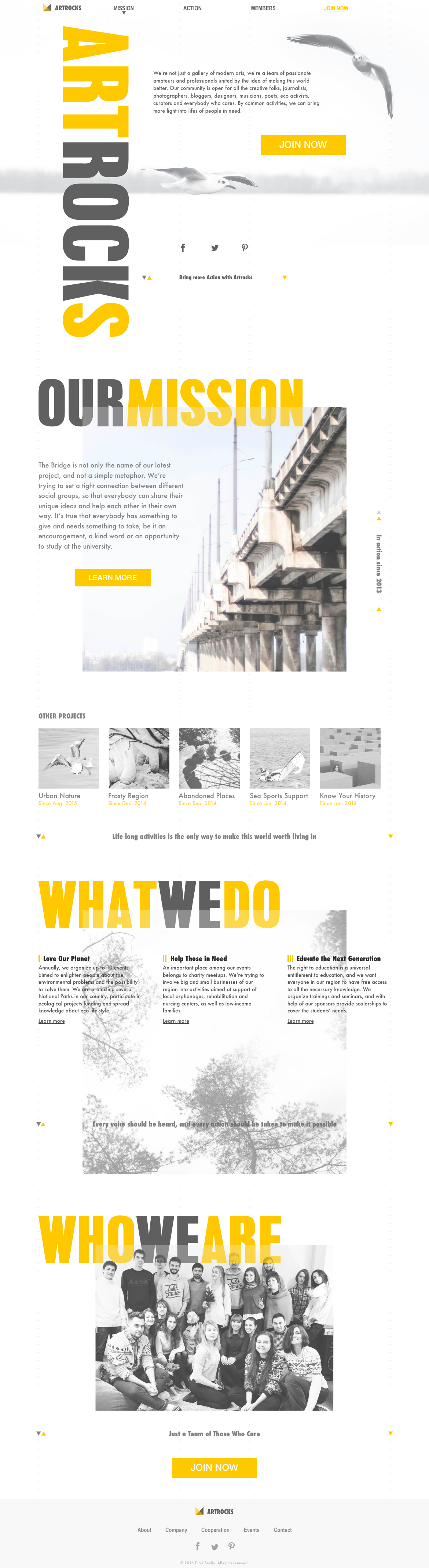
The provided example shows the design concept of a landing page for a non-profit organization accomplished. It uses considerable copy blocks and supporting visual elements to set the understanding of the club activity. The decision on the amount of copy used on the page should be the aspect of thorough research and testing as it directly and highly influences conversions. However, it doesn’t mean that every landing page should contain a minimal number of words. If it presents a famous company product or service or informs about special offers, sometimes short and a concentrated copy is enough to encourage users. However, if a new unknown product or service is presented, it is important to provide users with more information persuading them to follow the call to action. So, in this case, copy becomes a tool of engagement and informing as the service is not concentrated on the product that can become the primary visual accent, but with the activities that should be verbally described.
Arts, Culture & Education Curation
Landing page for a native Mac application
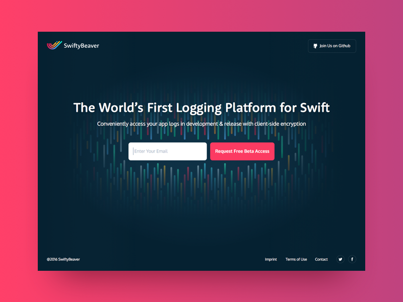
Here is a landing page for SwiftyBeaver native Mac application whose target audience is developers. As we can see it is designed in a minimalistic manner and concentrates users’ attention on short copy about the product’s functionality and CTA enabling to request free beta access. Although the page provides other important links, they are designed in a way not distracting from the main elements providing conversion. The work on the landing page for the product was also an interesting and challenging design task as far as the product doesn’t offer a lot of visual material for user engagement and attraction. Therefore, the main visual design solution was made around the colored accents echoing the design solutions of the application interface layout.
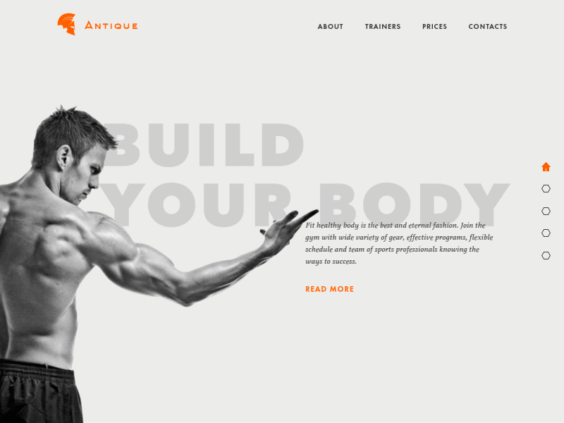
Landing page for a gym
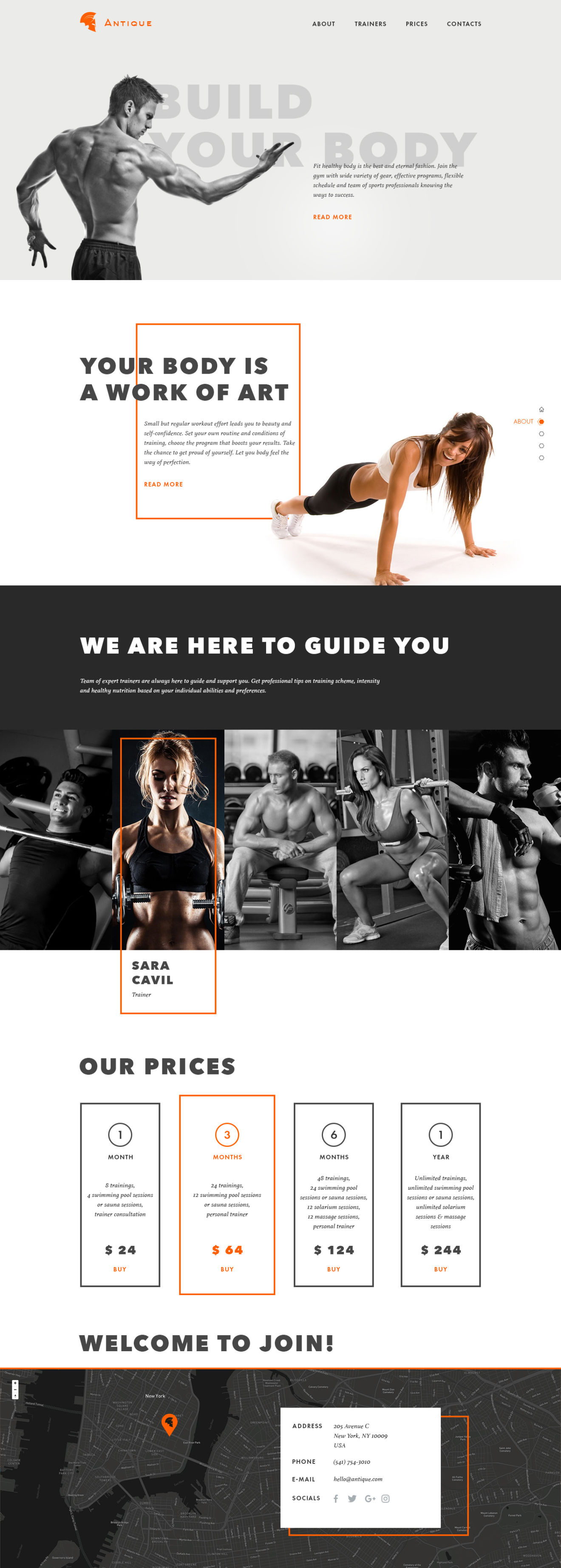
Here is the landing page of a gym presenting all the basic information necessary for user: general description, provided services, trainers, prices, and location. Slight colorful accents and motion effects are used to make the interface more engaging and scrolling more smooth. In this sort of service selection of appropriate motivational images is vital as people associate workouts first of all with attractive and athletic body and positive energy. So, photos applied in design presentation support this particular aim creating a clear and obvious perception of the theme and benefits of the service. Bold and strong font applied for headlines adds to both fast readability of key messages and general visual consistency of all the design.
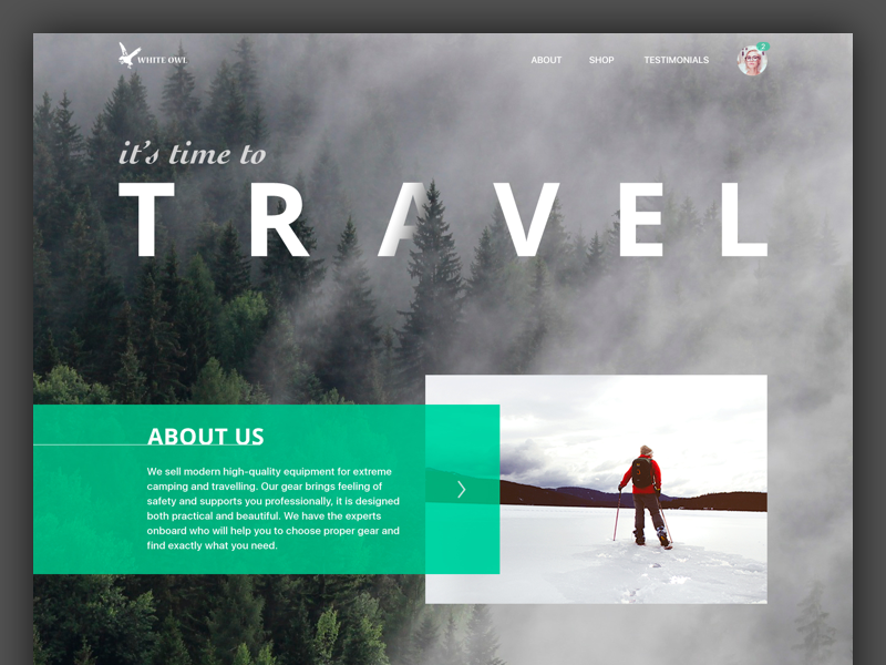
Landing page for the shop selling travel gear
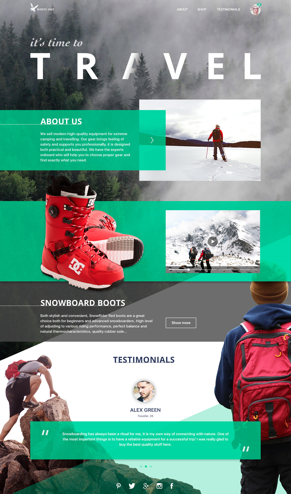
This one features the layout of a landing page for e-commerce. The company presented by it sells gear for extreme sports and active traveling so images were selected to set an immediate understanding of the main theme. The page includes a general description of the shop, presents the ability of transition to the catalog via description of hot offers, and also has testimonials part to provide users’ opinions about the service. A good combination of visual elements on the background as well as dynamic photos support the clear setting of the theme and provide the strong associative link to potential buyers engaging them and informing about the nature of the offer.
Landing page for a service organizing photo tours
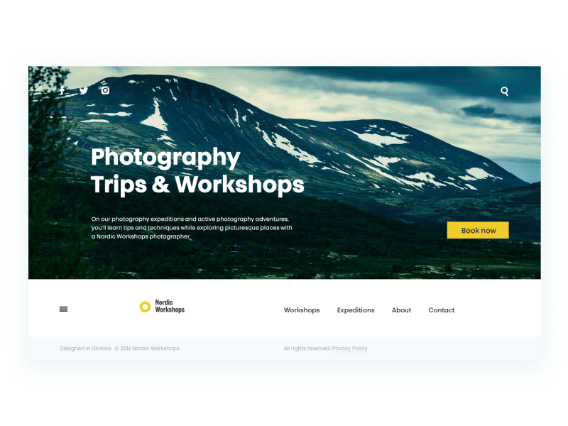
Here is the landing page for a company organizing photo tours and workshops for photographers. Functional and stylish minimalism is the basic approach behind this web interface, visual elements inform users and provide the quick harmonic perception of the nature of the services while the animation is provided to show the transitions between content blocks.
Landing page for a digital non-profit product
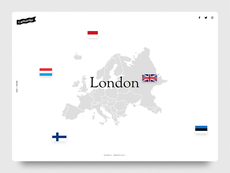
Capitoledge — Free Screensaver
The landing presented here has the aim to inform users about a free education service Capitoledge Screensaver which provides the opportunity to use screensaver for studying capitals. Here you can see the upper part of the landing page which features interesting and engaging animation activated by smooth scrolling. The visual presentation is full of air due to the light background which also provides easy readability and quick perception of the background map image.
Landing page for an adventure agency
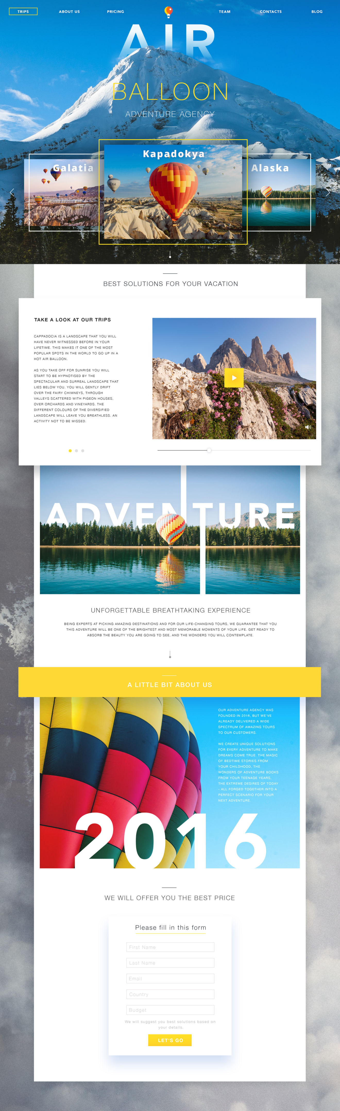
Here is the concept design, presenting a landing page for an adventure agency specializing in air-balloon tours. All the information blocks are supported with bright thematic photos while copy blocks move users through the sales funnel stages. Again, light background feels harmonic and naturally adds air to the general design presentation.
So, practice shows the diversity of techniques and methods to make a landing page informative and attractive. Nevertheless, to retain users, the trendy and pleasantly-looking design should just cover effective functionality and user-friendly solutions that are accomplished according to business goals and user research. Otherwise, beautiful design will work as a hard landing immediately erasing all the positive vibes caught during the flight and that is a fast way to reduce conversion rates which are actually the main purpose of landing pages. Put usability, informative value, and functionality first, think over the logic, transitions, and intuitive navigation — and visual design will become a great support for smooth and effective landing!
Originally collected for Tubik Blog
You may also like the collections of ecommerce app designs, web designs for events, user interfaces for finance management, creative logo designs, UI concepts for education, and other D4U Inspiration posts
- English
- Ukrainian