5 Basic Types of Images in Web Design
5 Basic Types of Images in Web Design Insights into visual web content: check different types of graphics used to make web design beautiful and user-friendly, with a big bunch of UI examples and tips.
“Content isn’t King, it’s the Kingdom,” Lee Odden said. We couldn’t agree more: without content design will be just an elegant wrapping. There shouldn’t be a fight on what is more important, design or content, as none works at full without the other. Today we invite you to review five basic types of visual content that users come across most web pages day by day and consider the benefits of each type. All the types are presented in various web design examples by Tubik designers.
What Is Web Content?
Web content is basically everything that fills the website and is the part of user experience. That’s what people read, hear, see, watch, and manipulate on a website. Based on that, the core types of web content are:
- text (copy)
- images
- video
- animation
- audio (sound)
Today, let’s discuss the images.
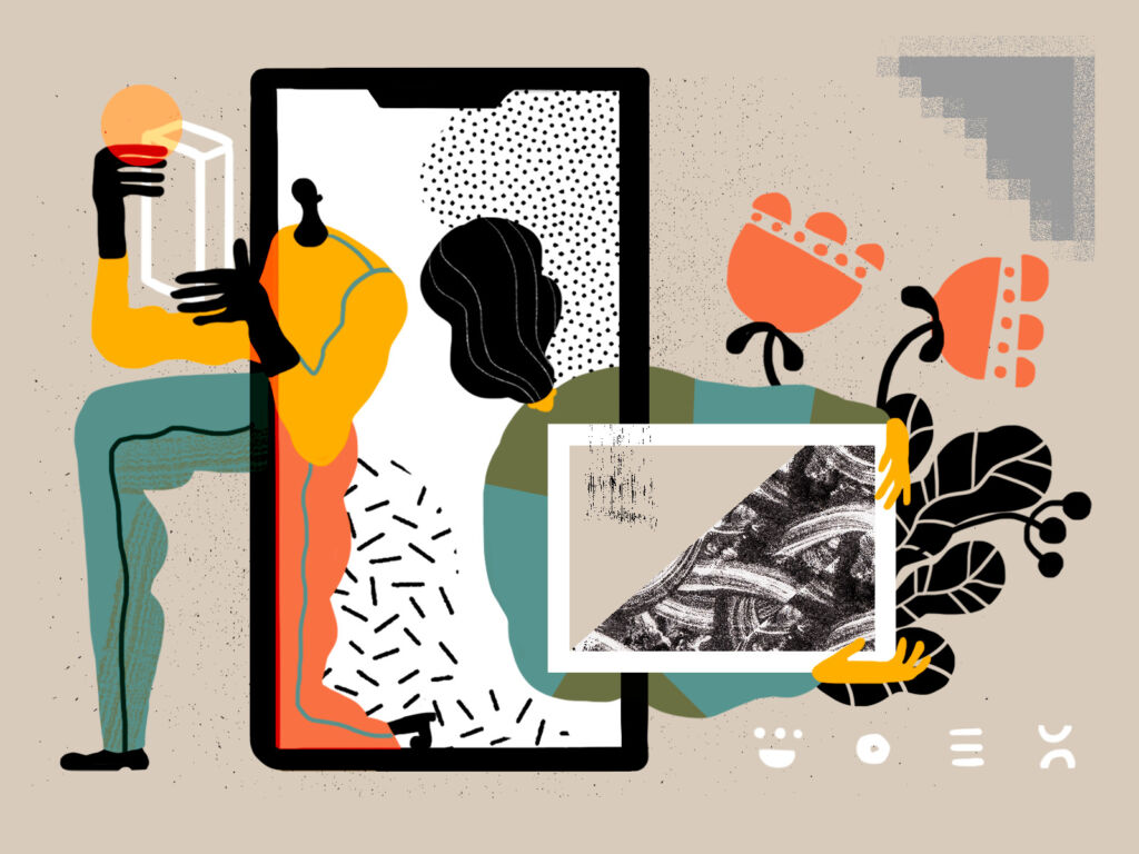
Images aren’t just a factor of beauty: in user experience design, pictures play an important part in building up usability. Most web users are visually driven, they perceive pictures faster than words. So, quite often images are the layout elements that are seen and scanned first. What’s more, they are informative and emotionally appealing, they transfer not only a message but also particular aesthetics. Also, images used on the web pages positively influence website SEO ranking.
Depending on the goals behind the website design, creative and marketing teams choose among different types of images. The following ones are the most typical to see on a webpage.
Logo
A logo is a key element of a brand, its symbolic representation. So, it is an obvious visual element of most websites that present companies, brands, services, communities, and organizations. Even personal blogs and portfolio websites often feature original logos these days.
In terms of web design, consider the following tips on logo usage in UI:
- put a logo in the header – it’s one of the highly scanned zones of a web page
- don’t break a well-checked habit: when users click the logo in the header, it takes them to the starting point of the journey. It may be a home page or up to the start of the page if it’s a single-page website
- think of logo animation on hover: motion will add life and will be the prompt that the element is interactive.
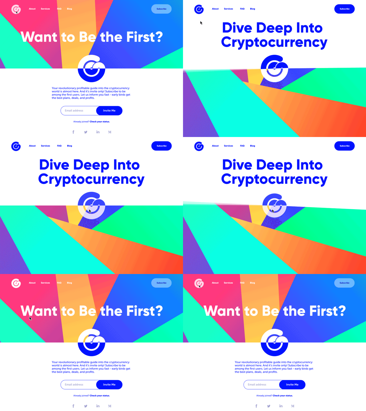
Here’s a landing page for a cryptocurrency service with an interactive logo to add some fun and make the experience lively.
Photos
Photos could, probably, be called the classics of web design imagery. They are used for a wide variety of goals such as:
- theme photos
- demonstration photos
- photos of the items (for example, on e-commerce websites)
- title photos for blog articles
- hero banner photos, etc.
The biggest advantage of photos is their ability to connect what users see on the web page with a real world of physical things and live people. Photos have been a part of human reality for many decades, much before the Internet advent, so this kind of visuals is sort of native, close, and clear for us. What’s more, with all those devices that let any of us capture something in a second, photography is really a part of everyday life for many people – so, being used on a website, it sets strong connections and associations.
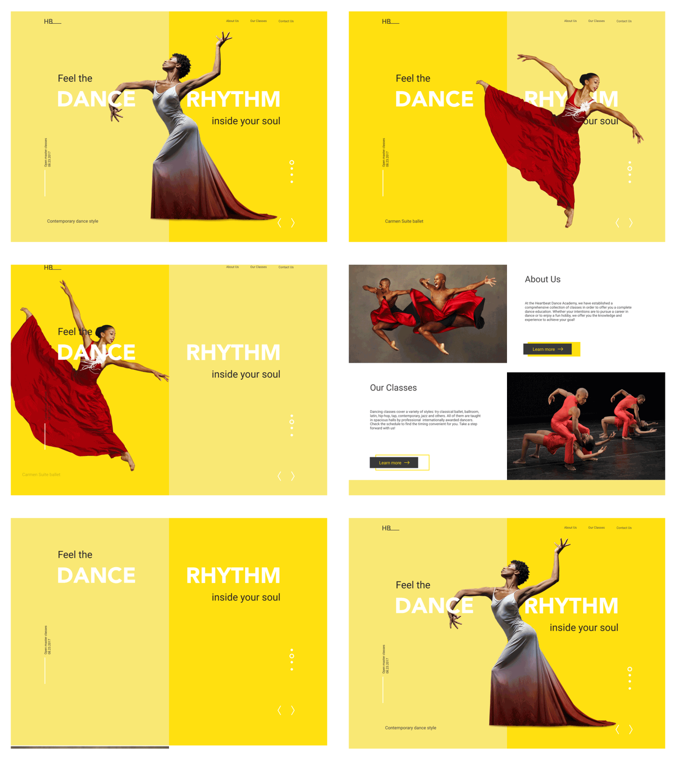
Dance Academy landing page concept uses the prominent photos of dancers to set the theme.
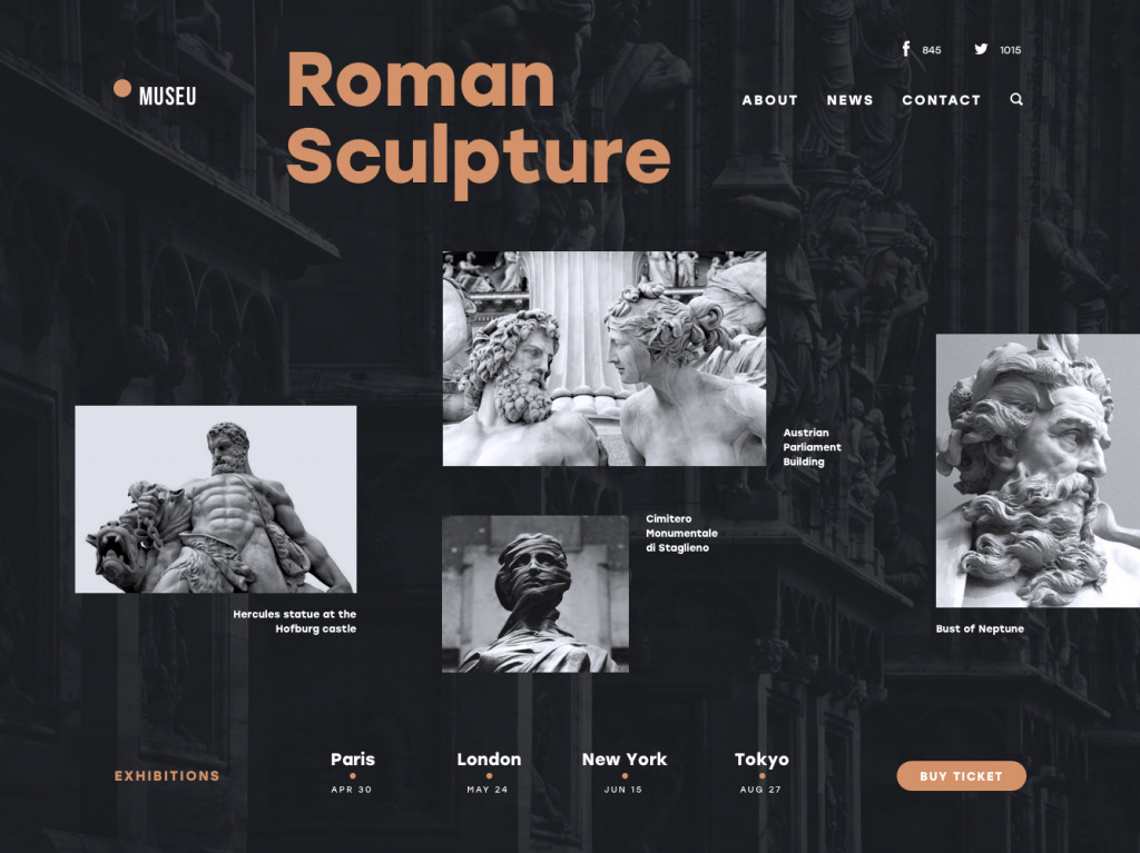
Museu Landing Page attracts attention and sets the needed atmosphere with beautiful photos
This About Us page for the cleaning company website uses photo content as a part of an engaging scrolling experience.
What’s more, photography is also a kind of art. With them, you can set the balance of realism and aesthetics in your web user interface. You can keep the necessary style appealing to your target audience and creating the necessary emotional background. This is one of the reasons for choosing photos to support articles on blogs and media websites.
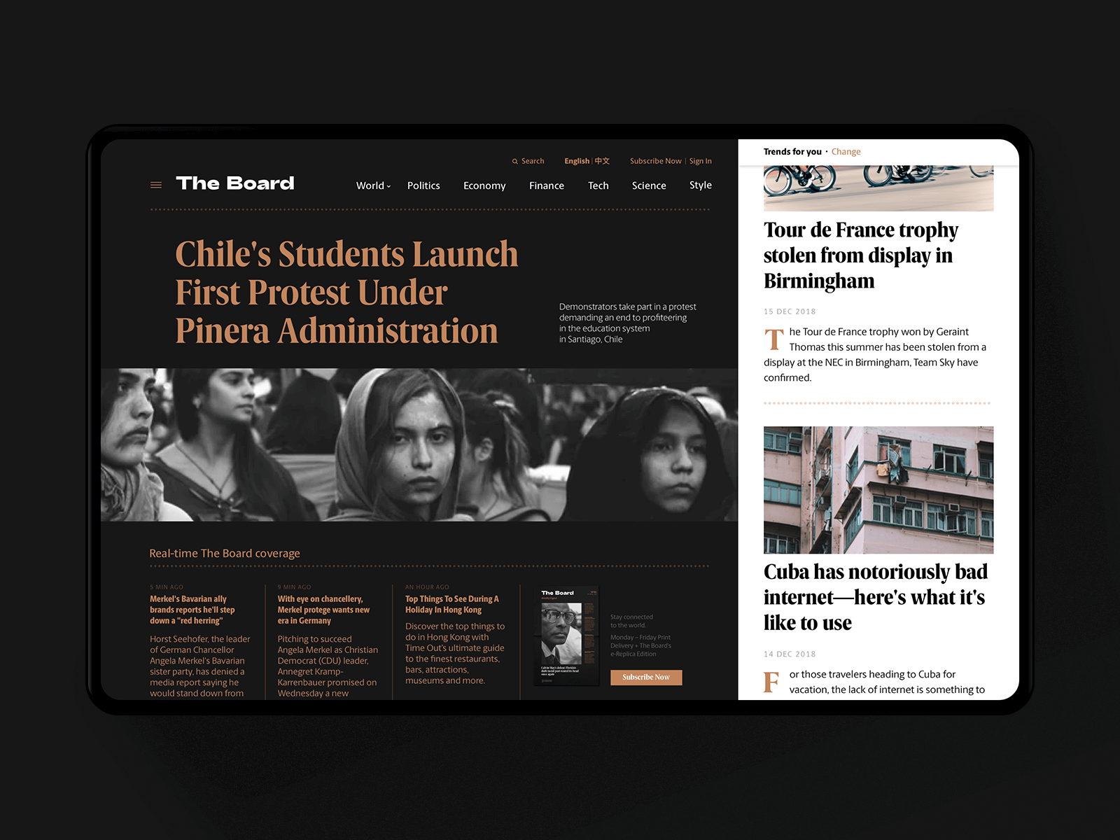
News Media Website
No doubt, photos are the main tool of visual presentation of goods on e-commerce websites where the principle “you get what you see” is a vital part of success.
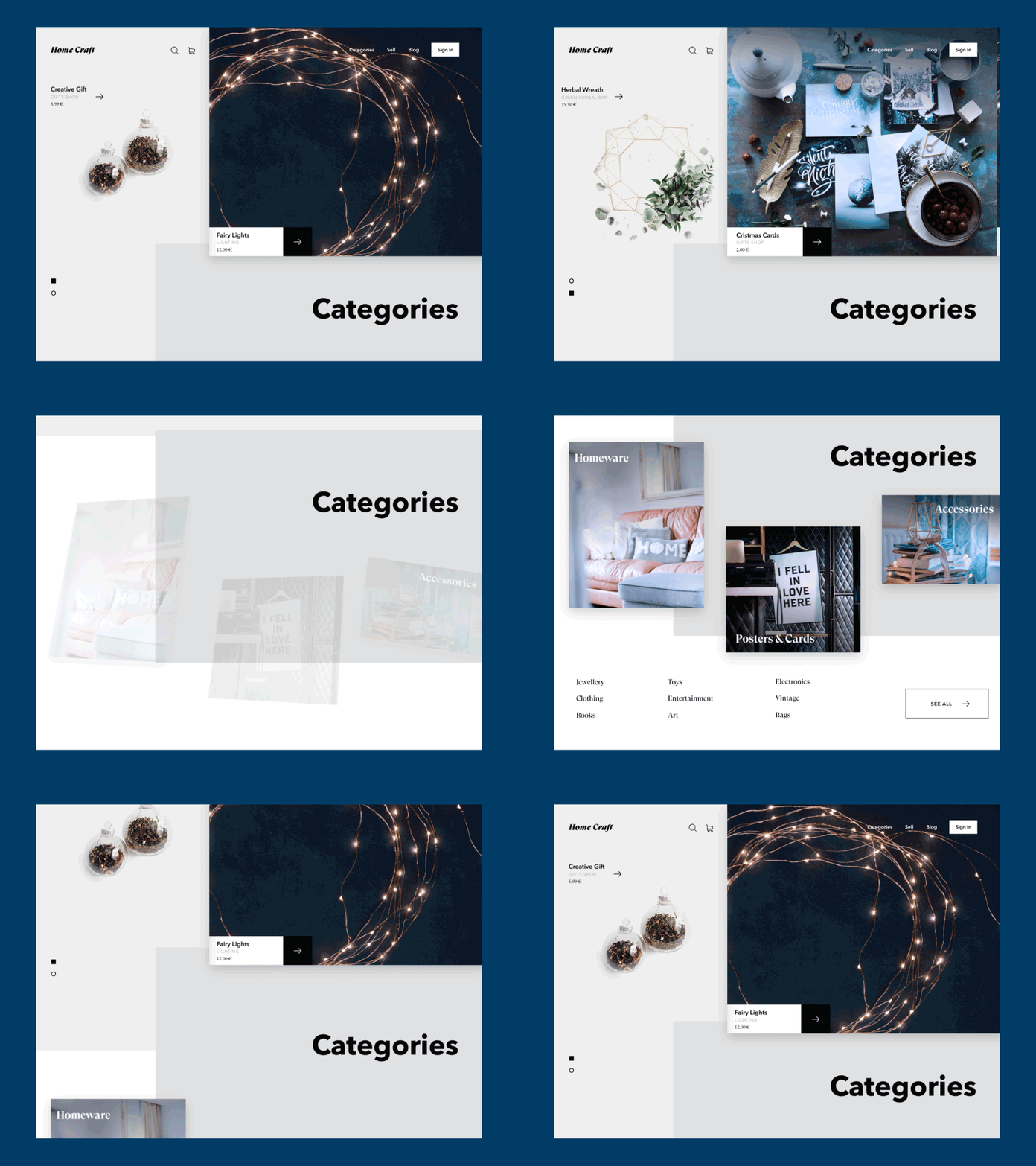
Home Craft Website
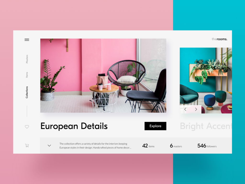
Home Decor Website
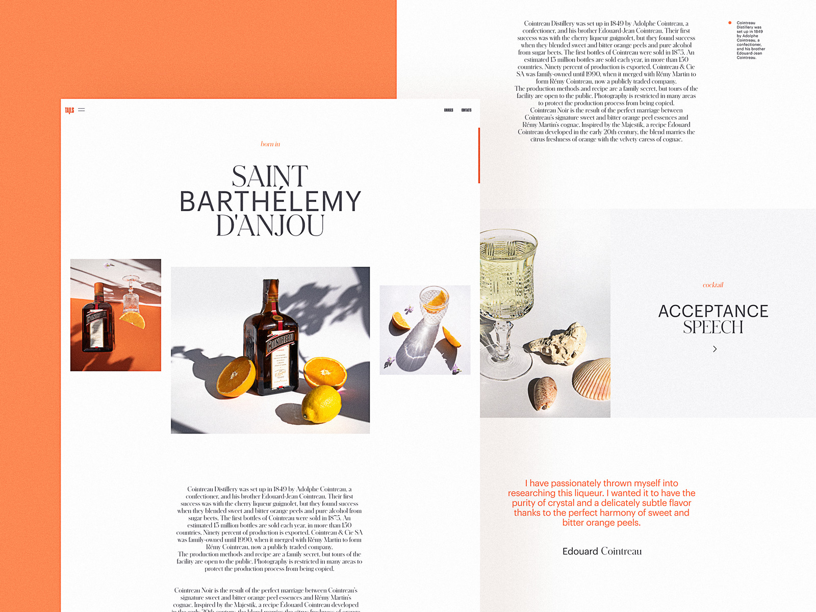
The website for bartending encyclopedia with custom photo content to share the theme and present the drinks.
Where do designers get photos? There are several ways:
- original photos taken and processed for the particular project: this is the most expensive option but the photos will have the highest level of exclusiveness;
- paid stock photos: you buy a photo you need from a photo stock that offers a variety of shots. This may be cheaper than custom photo shooting but you may spend a lot of time searching for the photos corresponding to your tasks;
- free stock photos: you take the photos from the communities or teams that share them for free. It is the cheapest option but you have to be ready that other people may do the same so you’ll have to think well about how to make your design original under these conditions.
So, it’s easy to see that the way you choose depends on a specific project, it’s budget and goals.
Anyway, even if you are the one who runs a blog or charity with no budget on visuals or if you are creating a design concept for your portfolio, free photo stock websites offer a lot of high-quality content now. Among them, the following resources are often used for good photo content:
- Unsplash: it’s a community of photographers from all over the world sharing their photos for free. Photos are featured under thorough curation, so you won’t find trash there
- Pexels: big bank of free stock photos on a variety of topics
- Moose Photos: professional production of stock photos that work together and are very flexible for a broad content strategy
- Pixabay: a huge stock of free images, not only photos but also illustrations and vector graphics.
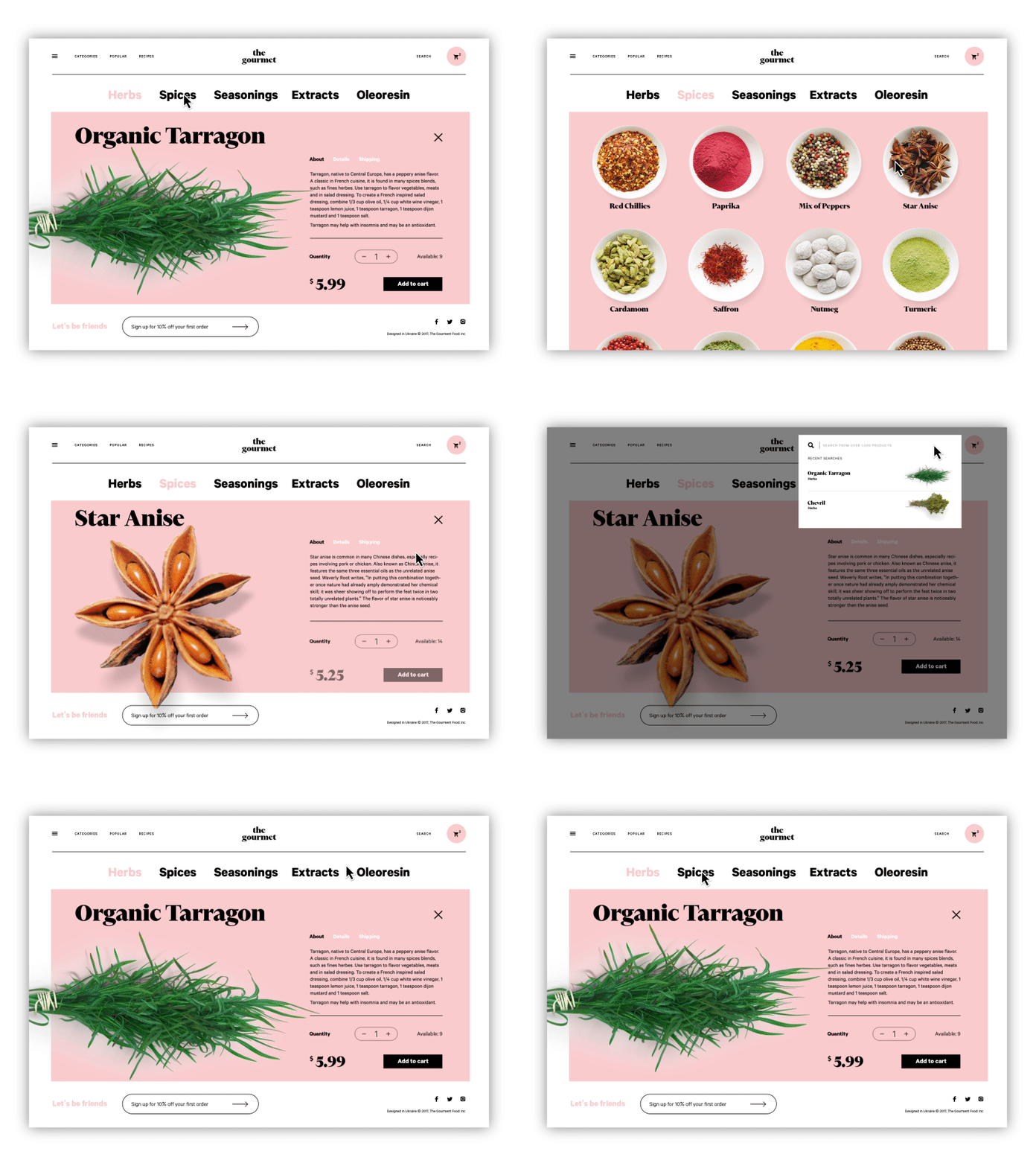
The Gourmet website, an e-commerce store selling herbs, oils, and spices, applies photo content for goods presentation.
Using photos in web design, consider the following tips:
- download high-resolution photos
- optimize them for the web so that too big images didn’t overload the page – loading speed is a crucial factor of positive user experience
- give the images enough air to breathe – keep the balance of negative space
- remember about responsiveness and test how the images look on different screens and devices
- don’t use photos as just a decor – let them speak to users, transfer a message and support all the other layout.
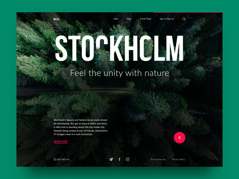
One of the popular design trends of a recent couple of years is using photos as a background image. This approach makes the screens visually and emotionally appealing. Also, it supports the feeling of the integrity of all the layout elements. On the other hand, it demands deep attention to contrast and legibility of all the elements which may be harder to achieve thaт in the case of monochrome background.
Illustrations
Another big web design trend this year is using custom illustrations for a variety of website needs. Made in various styles, custom graphics effectively support the quick perception of the information on the page or screen. They also set the solid foundation of visual originality. It adds aesthetics and beauty to blogs and websites we often read as well as broadens the creative horizons for artists.
That’s the landing page for a conference where illustrators and digital artists share their experience. Custom hero illustration and it’s animation make the web design catchy and original.
You may often see illustrations in
- hero images
- theme images
- characters communicating with users
- blog article images
- rewards and other gamification graphics
- notifications and system messages
- stickers (these are especially popular for messenger apps)
- storytelling
- infographics
- marketing stuff and advertising banners
- visual markers of content categories.
Let’s check some examples.
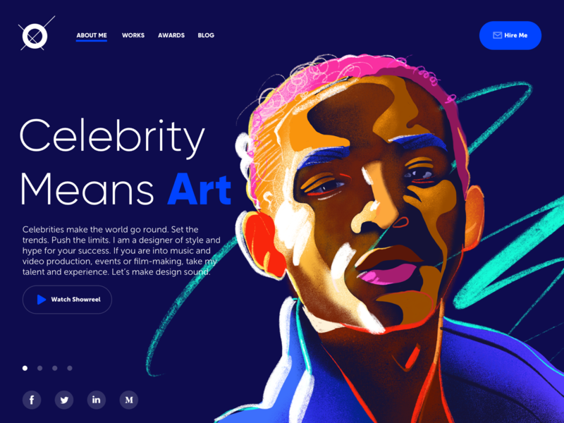
Here’s a concept of a portfolio website for a designer that specializes in projects for celebrities, entertainment, music, and film production. Dark background in combination with the custom hero illustration looks more vivid and sets the association with the atmosphere of a concert stage.
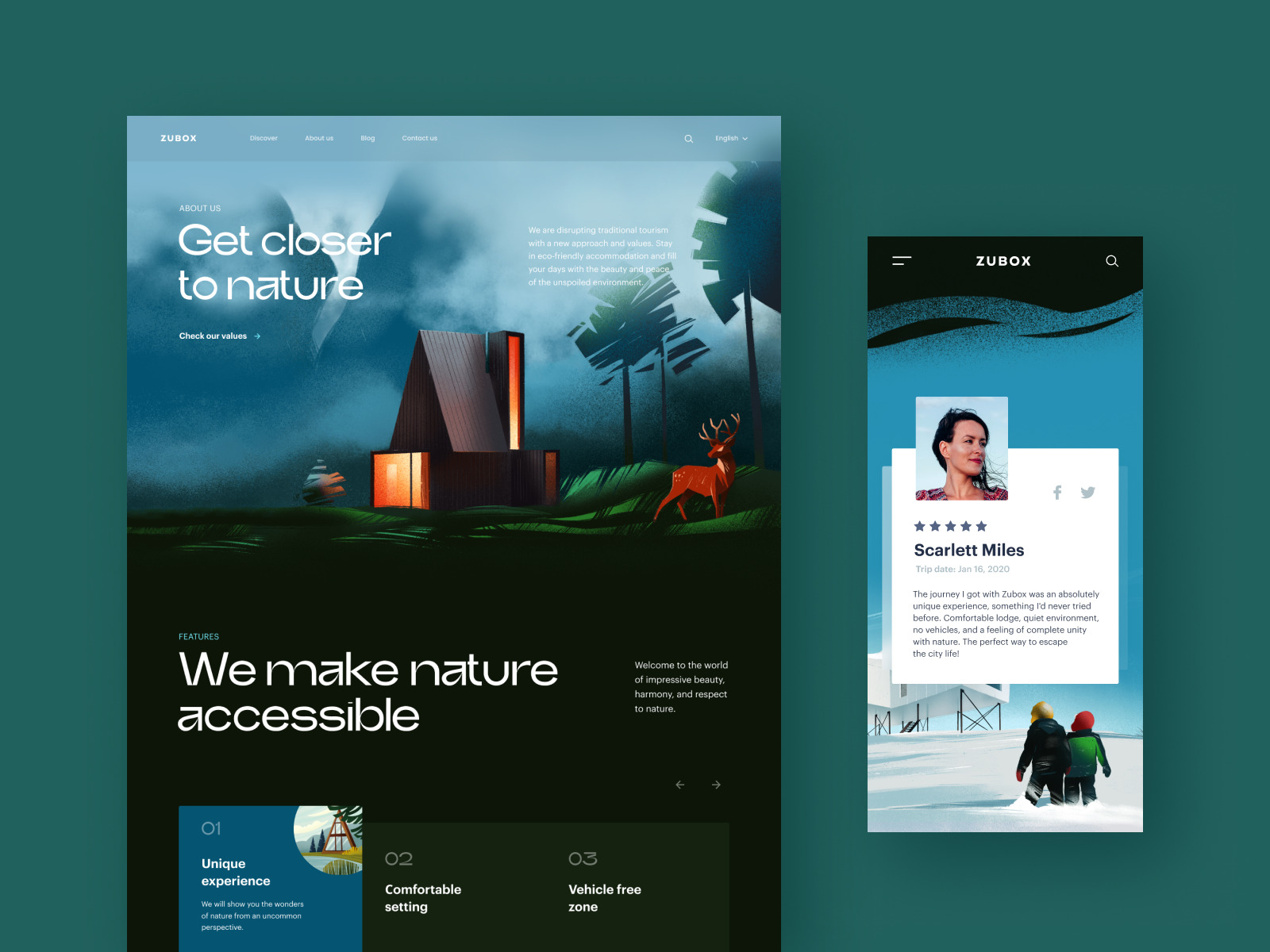
Here’s the example of the website design for an ecotourism company, featuring impressive and atmospheric illustrations setting the theme and strong emotional appeal.
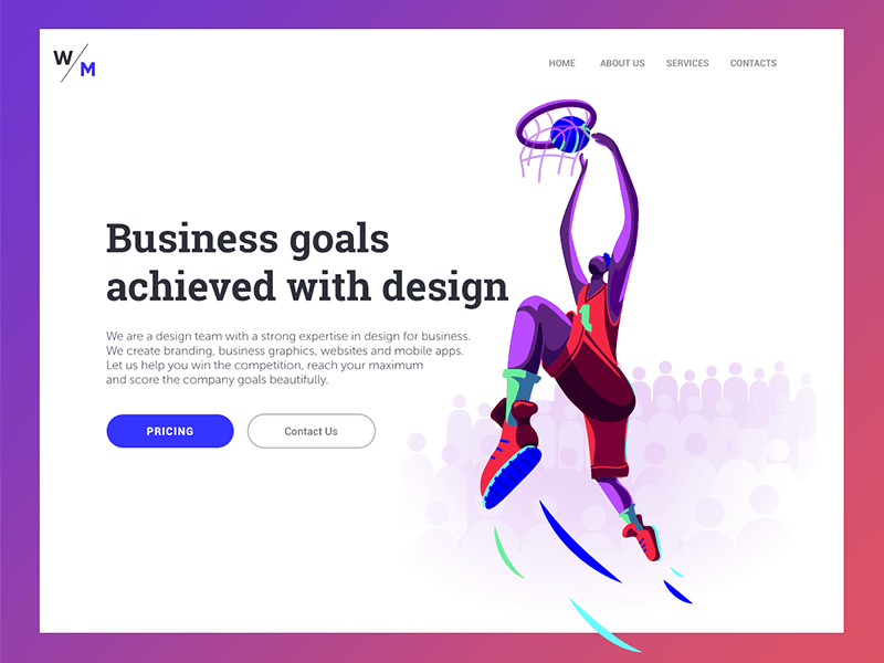
Here’s the landing page of a digital agency that positions itself ready for the highest business challenges and goals. That message is quickly transferred by the strong link between the tagline and the bright hero illustration showing a basketball player.
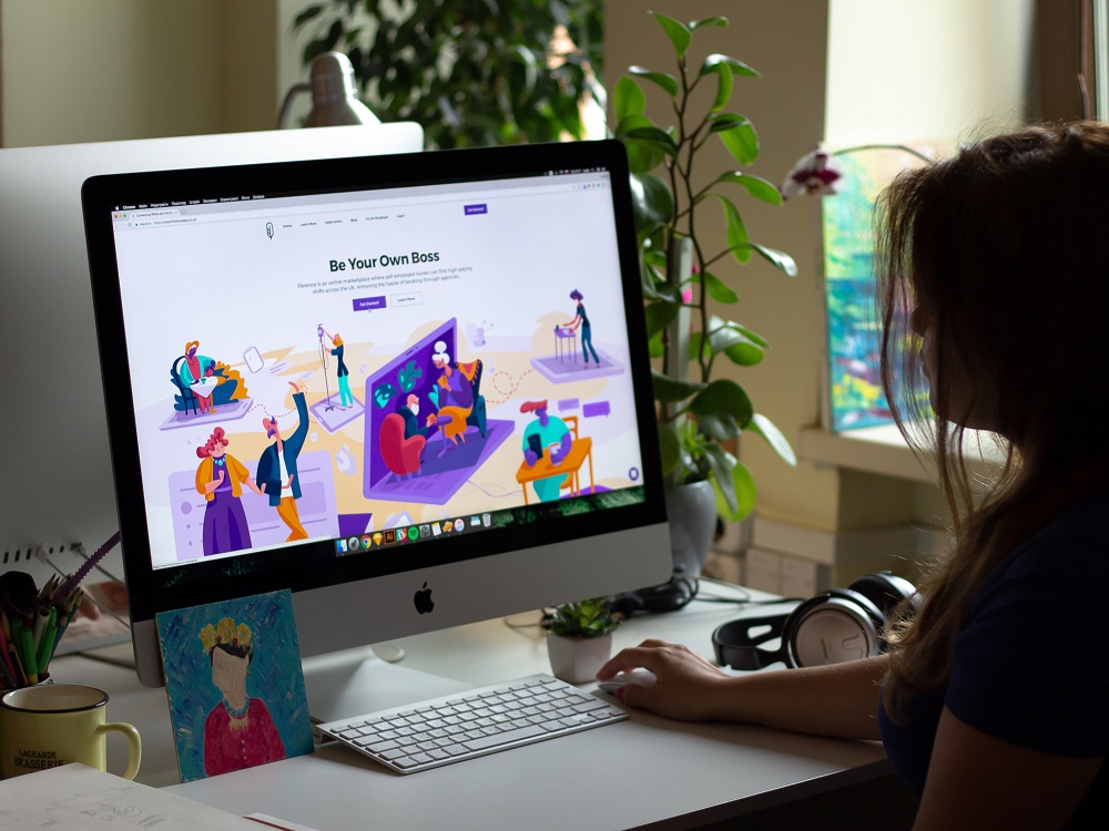
Here’s the set of illustrations designed for Florence, an online marketplace where self-employed nurses can find high-paying shifts across the UK. The original characters quickly catch the user’s attention, show the story, set the atmosphere, send the message and present the benefits in a way that corresponds to the tone and voice of the platform.
This is a landing page for the company that offers a full cycle of services for marketing and promotion. Custom digital illustrations enable storytelling with quick visual prompts about the nature of the offered services, set the mood with a vibrant color palette and support the integrity of all the parts of a page.
Mascots
A mascot is a character, a personified image that becomes a symbolic representation of a brand, company, service, or even a public figure.
In web user interfaces, mascots can serve as an effective element of communication and interaction. Changing its appearance (for example, mood, outfit, activities, etc.), you can quickly deliver a clear message to the user. Mascots can communicate directly with the speech bubbles, provide visual prompts with various facial expressions, reflect the mood of the user with different graphic variations, give helpful instructions in tutorials, and congratulate with the achievements. All the mentioned makes the interaction with the system more human-like enhancing the general user experience.
Funny and super positive mascot animation integrated into the website design for ShipDaddy
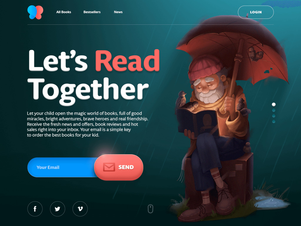
Cute and friendly mascot used as a hero image for an e-commerce website selling books for children.
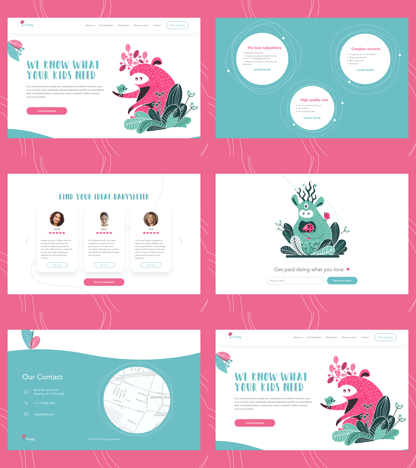
Originally created characters used as mascots for a babysitting service
3D Graphics
One more type of web visuals growing its presence this year is 3D renders. These are computer graphics created by turning 3D wireframe models into 2D images. Many of the images have photorealistic effects which is their big advantage for web design. 3D graphics may serve well in cases when photo content you need is impossible to get or highly expensive.
Web page design with catchy and impressive animated 3D graphics
Keep in mind that this kind of graphics demands specific skills as well as an artistic eye and taste. In addition, it is quite costly and time-consuming. Yet, well-done 3D graphics are highly attractive and convincing so they can have a great impact on web design looks and conversion rates.
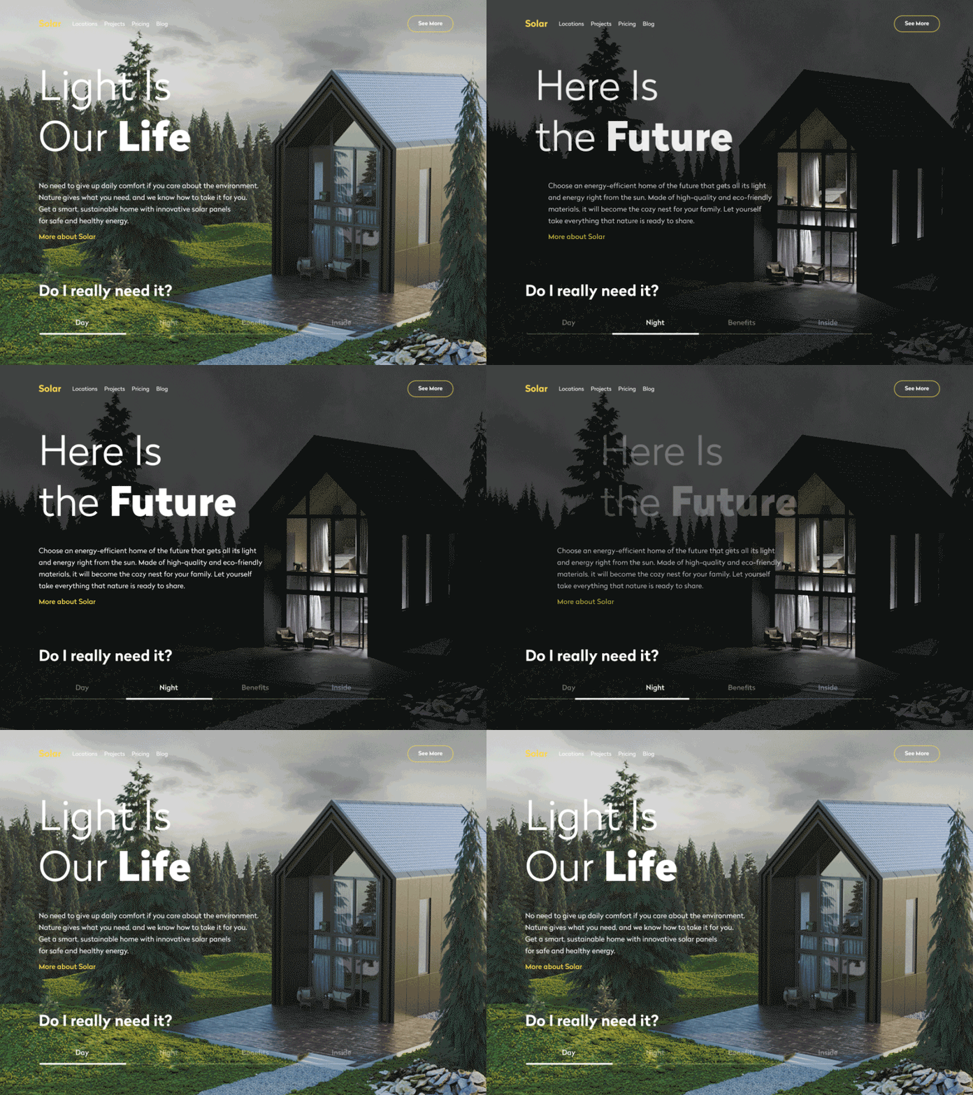
That’s a website of a company that designs and builds sustainable homes using solar power to get all the needed energy. 3D rendered model of a house allows users to see the photorealistic image of the offered service and even manipulate it to see the view in day and night mode.
Here’s a web design concept for the health blog with stylish and trendy 3D animation.
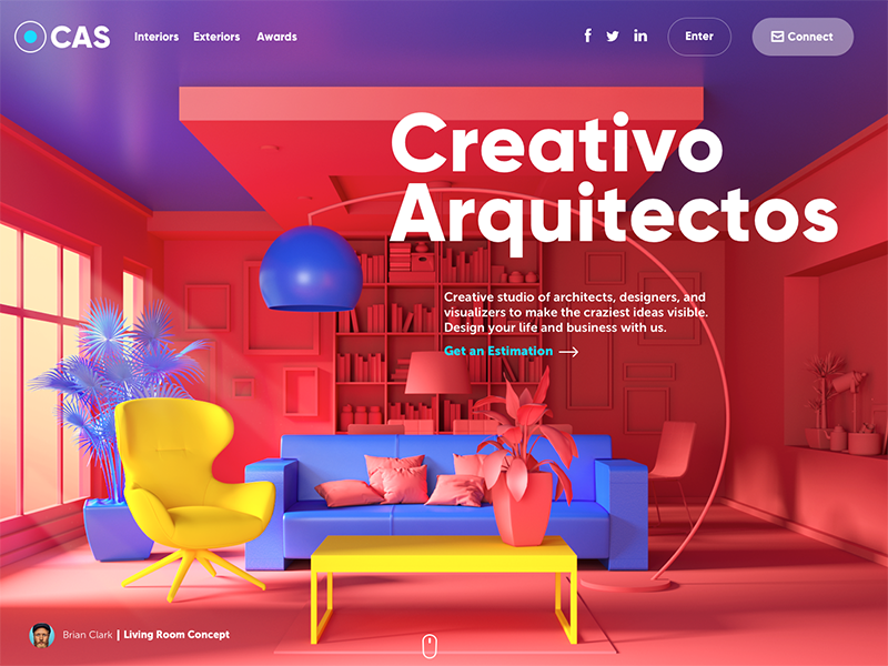
Here’s the website for the design studio specializing in exterior and interior design visualizations. The high-quality 3D graphics rendered for the page take the whole background area: this way the image immediately sets the theme and presents the company services.
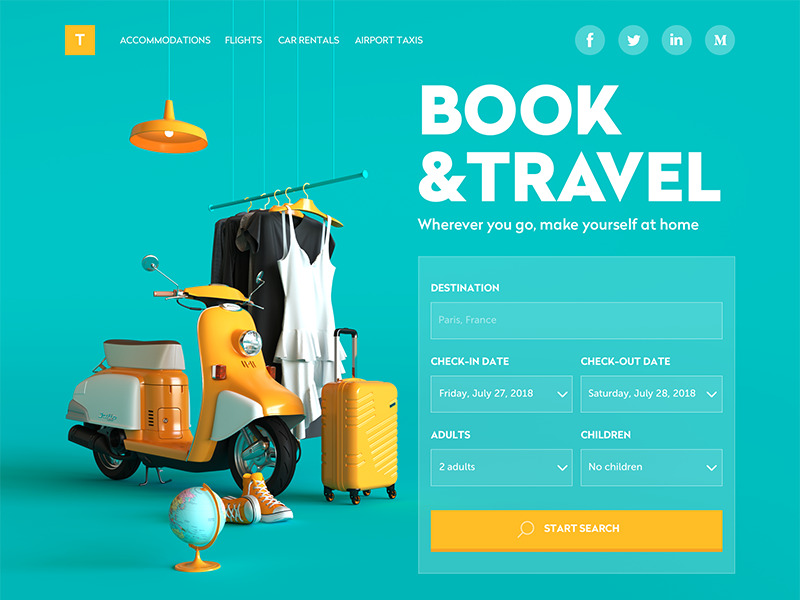
This website of a booking service uses 3D graphics as a big theme image that takes the left part of the page and catches the user’s attention at once. Not only does the artwork set the theme but also makes the interface beautiful.
Why Images Should Be a Part of Your Web Content
Here’s a bunch of convincing facts:
- the research shared by web archive Wayback Machine shows that people perceive images 60,000 times faster than text
- psychologists claim that people need about 1/10 of a second to get a general perception of a visual scene or element (that speed is indeed impossible for textual items)
- important pieces of information are often fixed by the brain as visual images even if they were obtained via text perception
- images are less vulnerable in combination with the background and surrounding elements while the text is highly dependent on the aspect of readability
- images have a tendency to stick better in long-term memory which means that dealing with the interface users will not need to process and remember more data than it’s really necessary, so interactions get faster
- visuals in the interface can make it more universal in cases when an app or a website is used by people from different countries
- pictures push the limits of perception for users who have natural problems with text recognition such as, for instance, the dyslexic or non-reading preschoolers.
Useful Reading
Here are some handy articles to continue plunging into the theme of web design and graphics for user experience.
Web Design: 16 Basic Types of Web Pages
How to Improve Web Scannability
How to Create Original Flat Illustrations
The Role of Branding in UI Design
How To Use the Power of Mascots in UI Design and Branding
Negative Space in Design: Tips and Best Practices
Web Design: The Big Guide into Different Types of Websites
Originally written for Tubik Blog
- English
- Ukrainian


