Photo Content in User Interfaces: When and How It Works
Photo Content in User Interfaces: When and How It Works Let's look at the goals that push UI/UX designers to search for the best photos and review plenty of design examples of how photos work in user interfaces.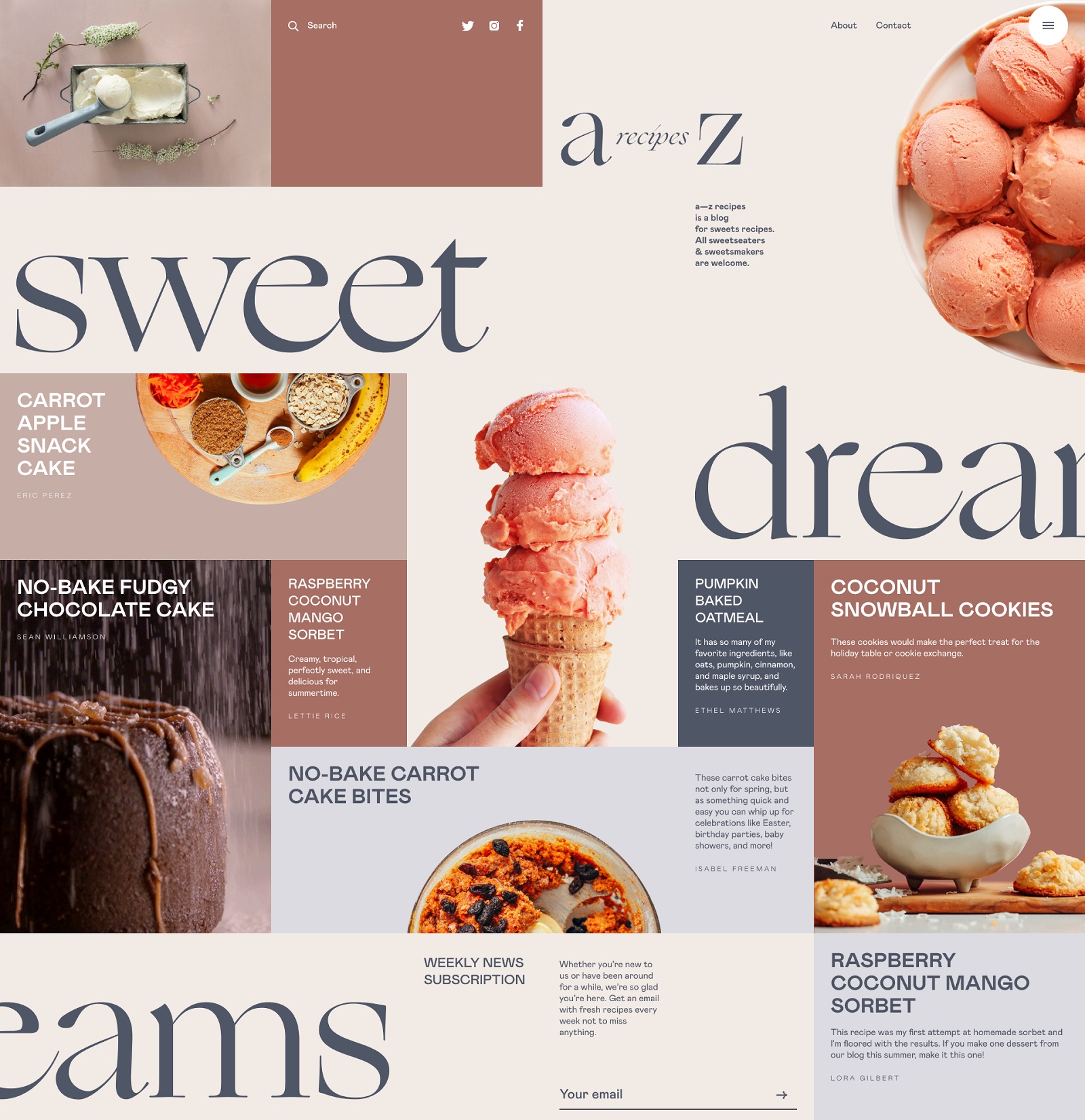
Photos are the classics of web and app design imagery. They catch attention, set the mood, show how things work, and cover many other essential objectives in cases when pictures work better than words or enhance the written message. Today’s article is also devoted to photos used for websites and mobile applications: let’s look at the main goals that push UI/UX designers to search for the best shot and review plenty of UI design examples of how photos work in user interfaces.
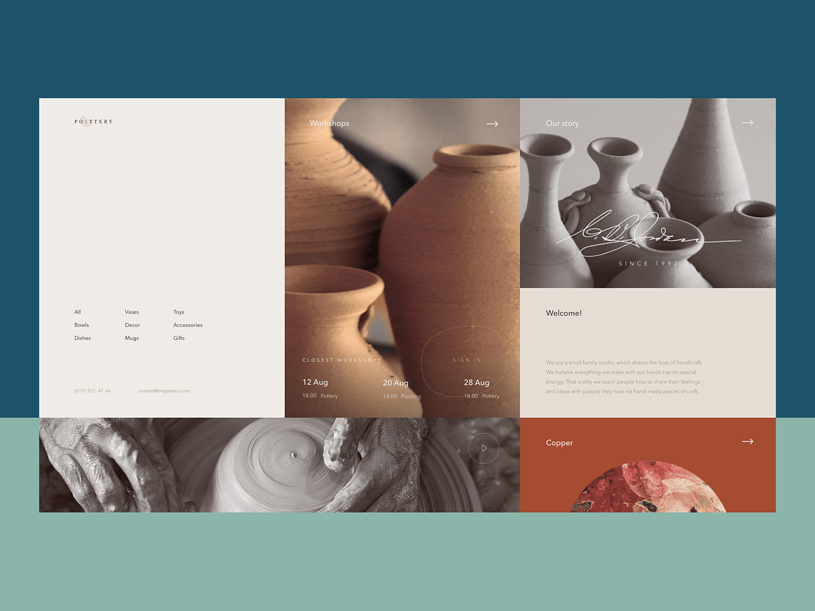
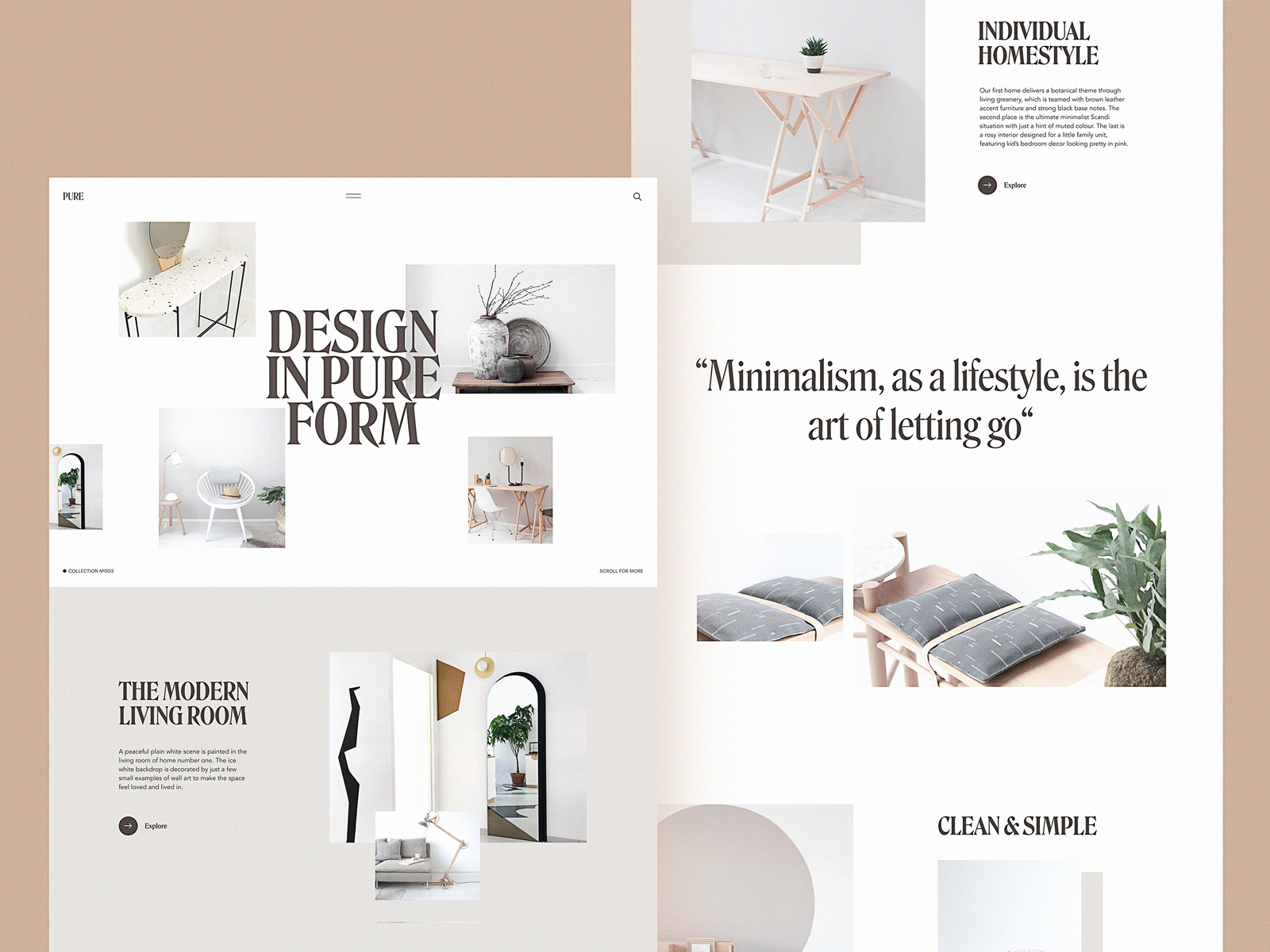
Pottery website design
Product or Service Demonstration
Obviously, photos are the major tool for the visual presentation of goods on e-commerce websites, where the principle “you get what you see” is a vital part of success. As long as you sell something physical, the customer expects to see it by default; that’s really the case when the picture is worth a thousand words. For shopping online, the quality and style of photos are crucial as they often become the main trigger capturing the customer’s eye as well as one of the key elements in the decision-making process under conditions you cannot see and touch the real goods.
Other vital aspects of using photos effectively as a part of e-commerce experience and brand presentation are originality and consistency. To stand out from the crowd of competitors, online stores need their photos to look unique, memorable, and instantly convey the brand image. That’s why regular photo shootings are an integral part of e-commerce reality. Depending on the target audience, different stores choose different approaches to photo presentation: some make it friendly, informal, and as close to real-life as possible, while others present their goods in original surroundings or model-posing; some resources prefer studio shots others take photos in special environments. Whatever the approach, an essential aspect is staying consistent in it to make it recognizable so that website or app visitors can feel it like a pattern and don’t have to handle too much cognitive load. As well, a consistent approach to the cross-platform photo presentation of the brand photo content in different marketing channels, such as social networks, advertising banners, newsletters, etc., sets a strong visual connection and helps shoppers recognize the brand whenever they see it.
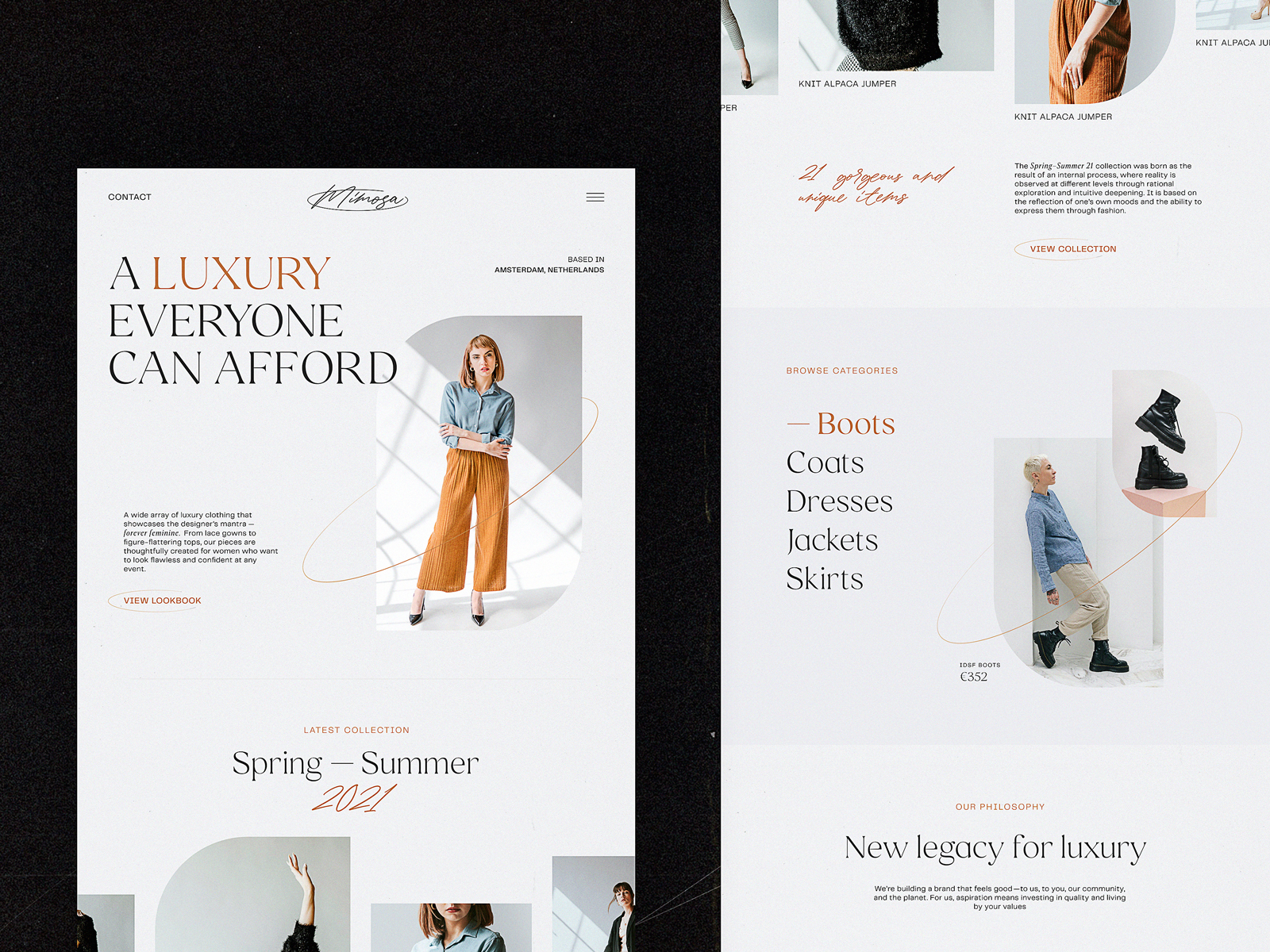
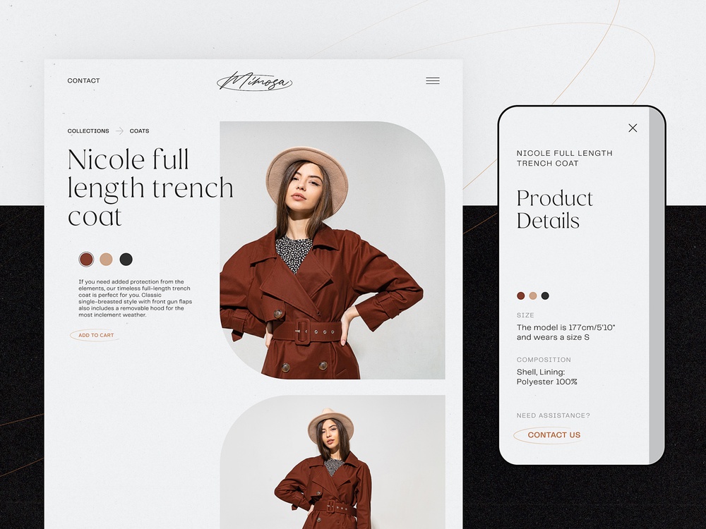
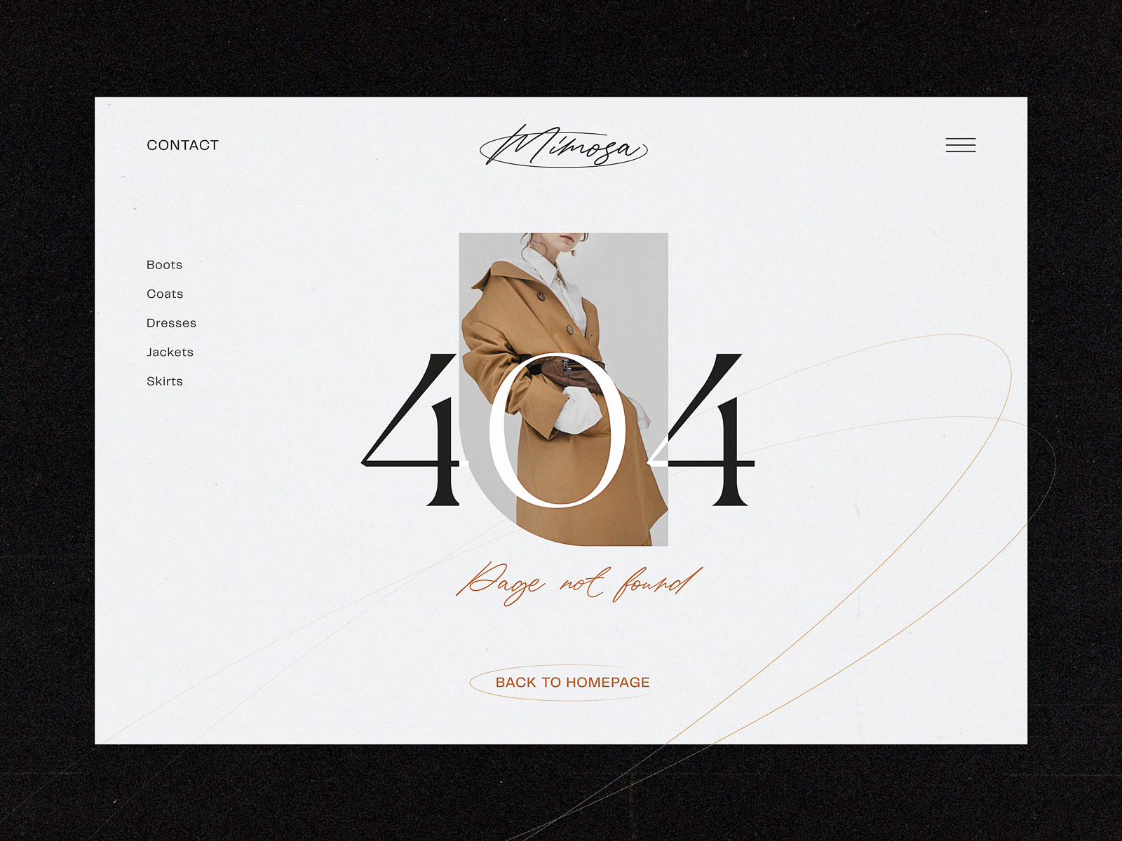
A consistent approach to a visual photo presentation of the items on the e-commerce website for a fashion brand
Anyway, the photos should demonstrate the stuff from different angles and perspectives, especially on product pages. Another thing to keep in mind is that items photographed on models or in the proper environments have more chances to draw customers’ attention and look more convincing. It doesn’t mean that object photography doesn’t work, yet in most cases, seeing an outfit on a model, a toy in the hands of a kid, or a set of dishes on the served table lets the buyer easily imagine what it looks like and see its benefits. So, quite often, e-commerce platforms combine both types of photo presentation: a clean object photo with no distractions as well as its photo on a model or in the surroundings of use.
Certainly, it works the same way to demonstrate the services that can be visualized with photos.
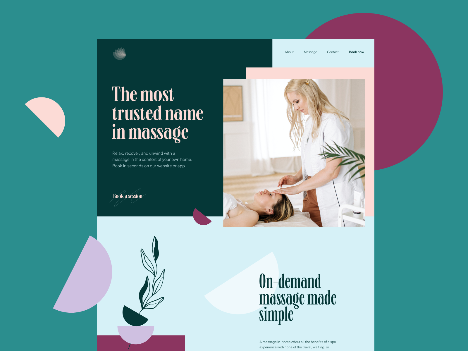

Website for a massage services company
Creative approach to using photo content for not only setting a visual connection to the provided services of a cleaning company but also as a part of scroll animation
One more popular case often demanding thorough attention to photo content is the situation when the person or company has to build an online portfolio website. The visitor’s attention span is very short, so works in the portfolio should be dressed to impress. In this case, photos often become the major visual attractor and help to build a consistent presentation.
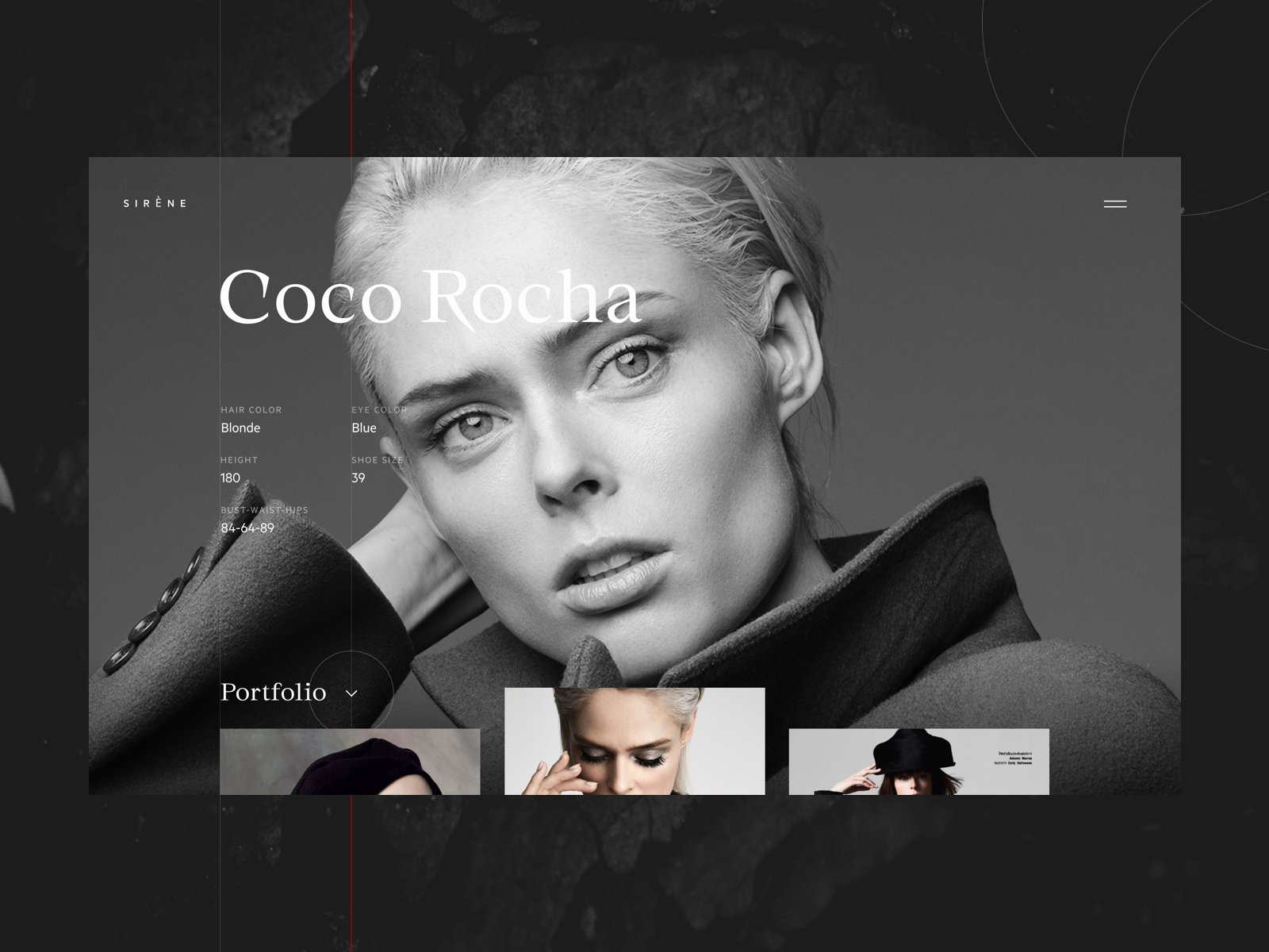
Fashion models portfolio website
MYWONY wedding dresses brand website
Setting Atmosphere
One more point photos are highly effective at is the ability to transfer the visitor to the needed atmosphere instantly. Properly chosen quality photo creates the mood, and this way engages the users to not only see the content but also somehow feel it, connected to their own experience and imagination.
Gin School website design
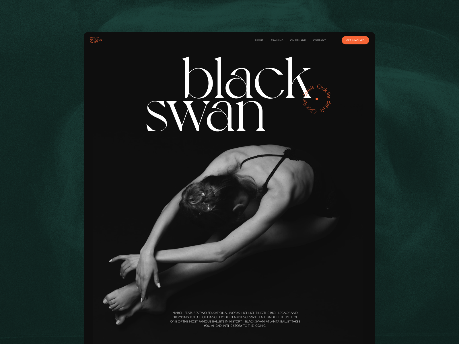
Home page for the ballet company website concept
Due to that, in particular, atmospheric theme photos are quite popular to be used in hero sections of websites and landing pages. This way, designers activate the factor of emotion and delightfulness from the very start of interaction with the interface.
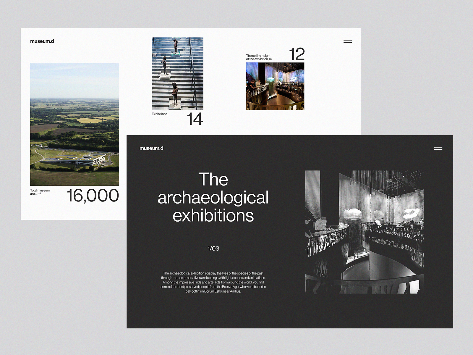
Website design concept inspired by Moesgaard Museum
One more popular UI design trend of the recent couple of years is using photos as background images. Not only does this approach make the screens visually and emotionally appealing, but it also supports the feeling of the integrity of all the layout elements. On the other hand, it demands deep attention to contrast and legibility of all the elements, which may be harder to achieve than in the case of a monochrome background.
Website design concept inspired by Moesgaard Museum: the home page features an atmospheric full-screen background photo.
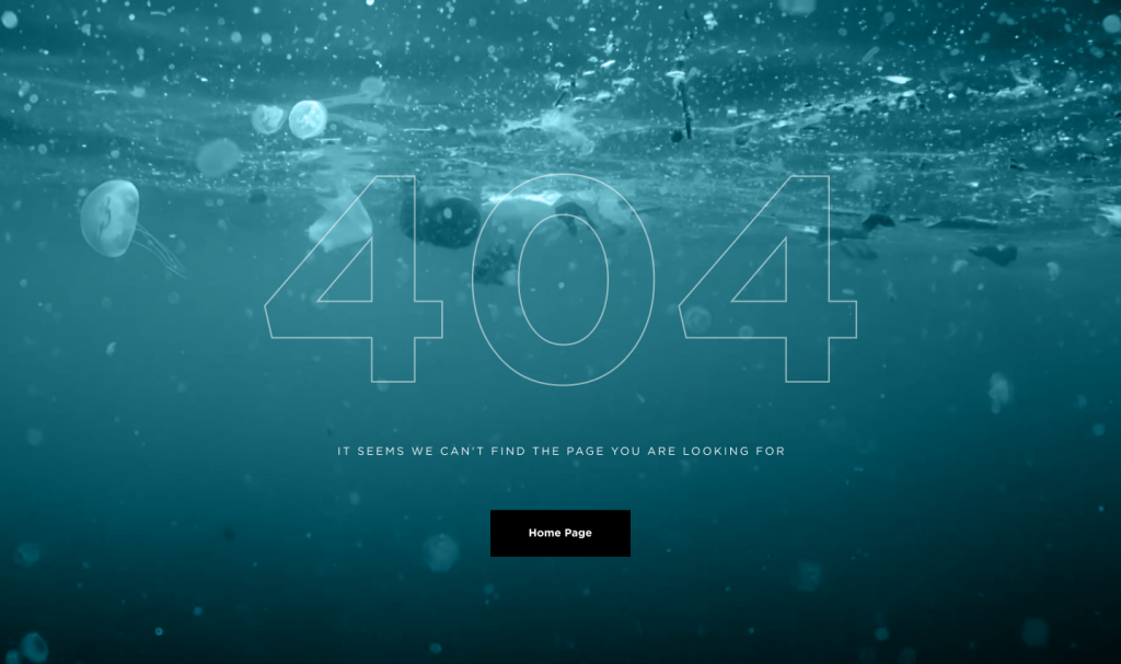
The impressive 404 error page for the website devoted to saving the oceans features an impressive full-screen background photo, instantly communicating the problem to the visitor.
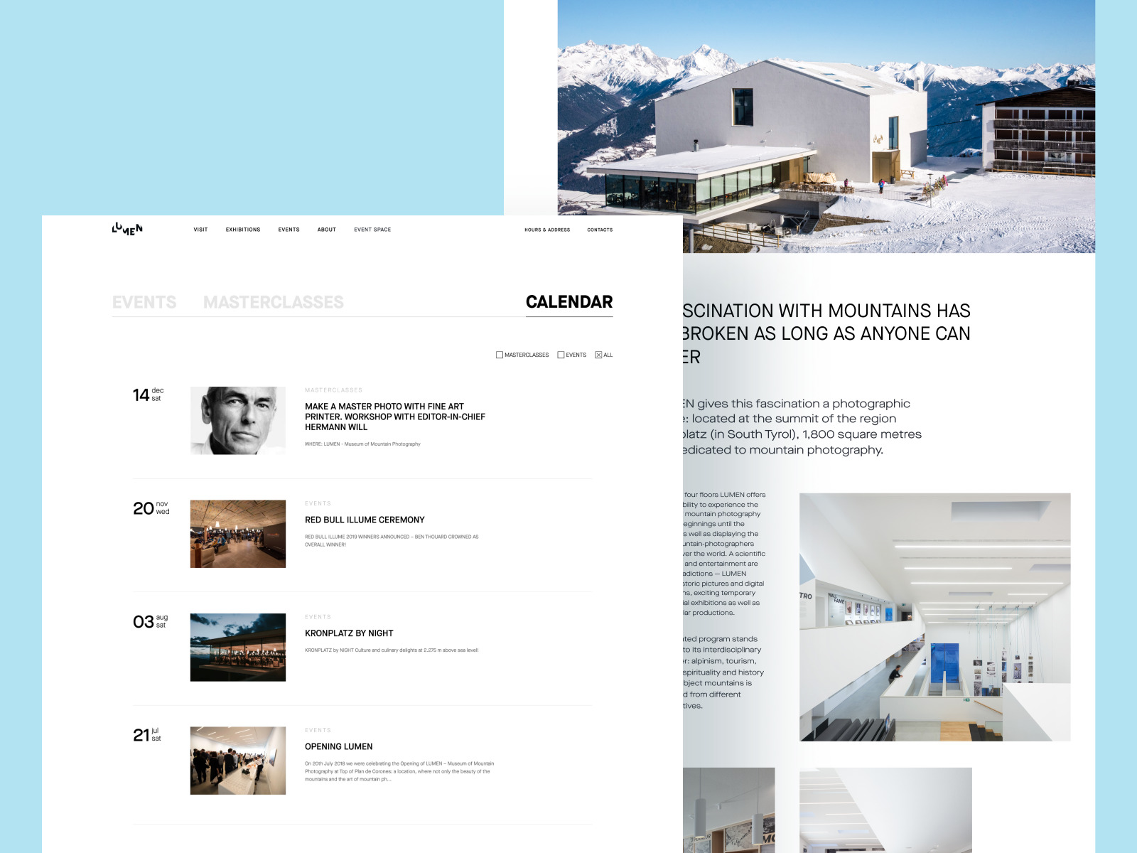
Lumen Museum website pages
Humanized Connection
Consciously or unconsciously, people tend to be curious about other people. What’s even more critical, in many cases, human photos look more convincing and trustworthy to us. No wonder one of the key goals behind the photos on websites or apps is making communication more human-like. Photos of teams working on a product, pictures of people to connect to, from founders and top managers to support personnel, photos of clients providing testimonials or reviews, authors of articles in the blog or media, and many other cases – all of them aim at making the user experience more human and trustworthy.
Nonconventional Show interview podcast website
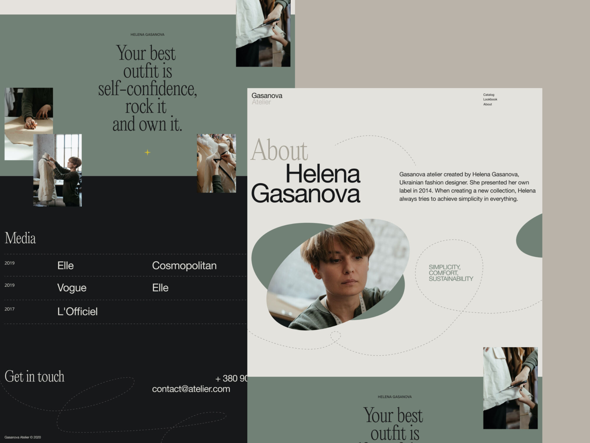
Website of a fashion designer brand
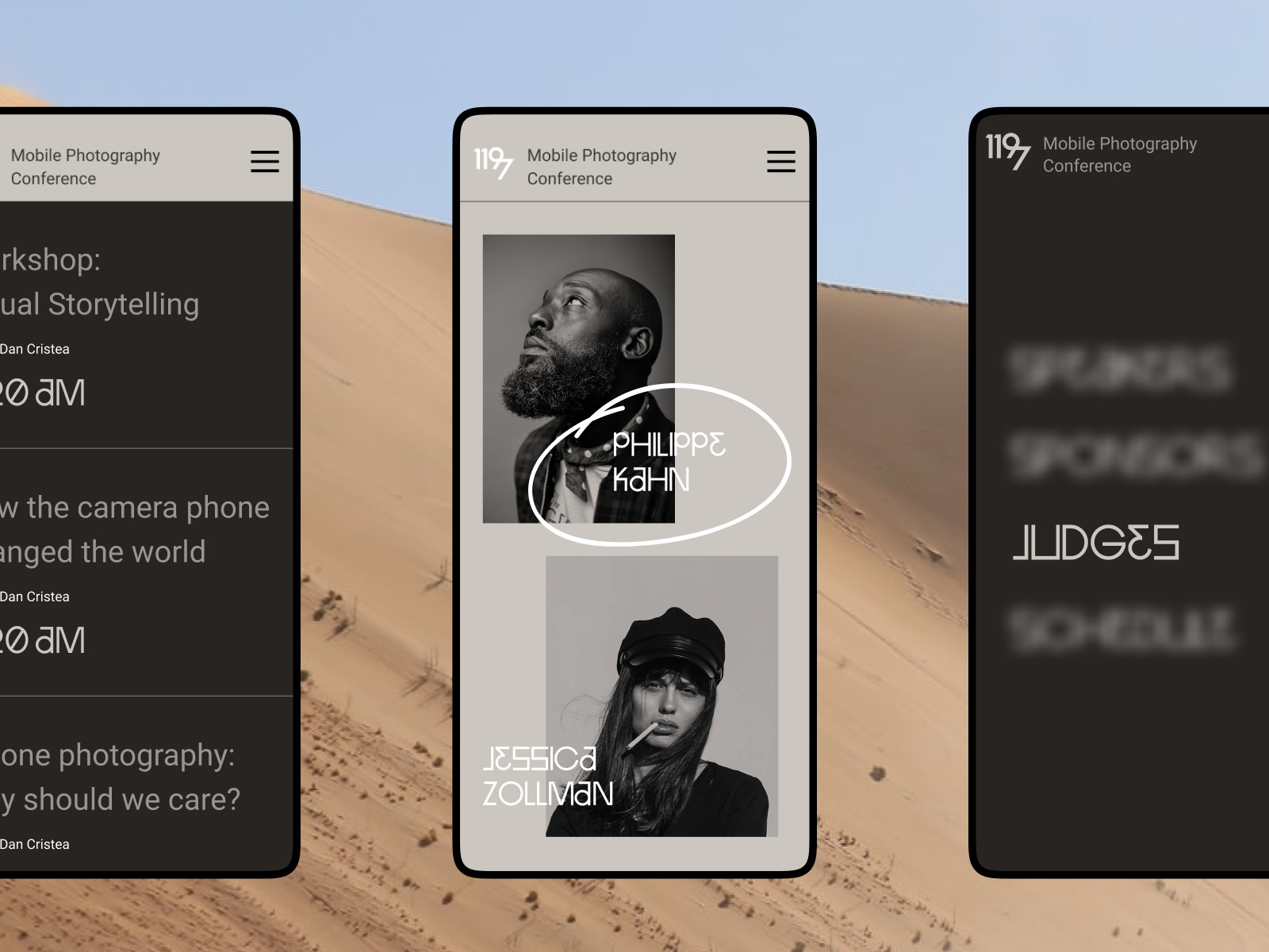
Design concept for a website for a photography contest
Website design for Mayple, a fully-managed marketing services marketplace designed to help businesses work with experts.
Directional Cues
A directional cue is an element of the user interface that gives a visual hint on a certain interaction or content and helps the visitor see it quicker and easier, just like road signs and signposts do in the physical world. Directional cues are an essential factor in enhancing digital product usability, as they:
- enhance the page or screen scannability
- strengthen the visual hierarchy
- improve navigation
- increase conversion rates.
Photos integrated into the interface can also cover that role. They mostly function as pointers (a photo of a human, animal, or object pointing at the needed element and this way attracting users’ eye to it) or gaze direction (a photo of a human, animal, or character whose eyes are directed to the needed element this way stimulating a natural urge of users’ curiosity to check what it is).
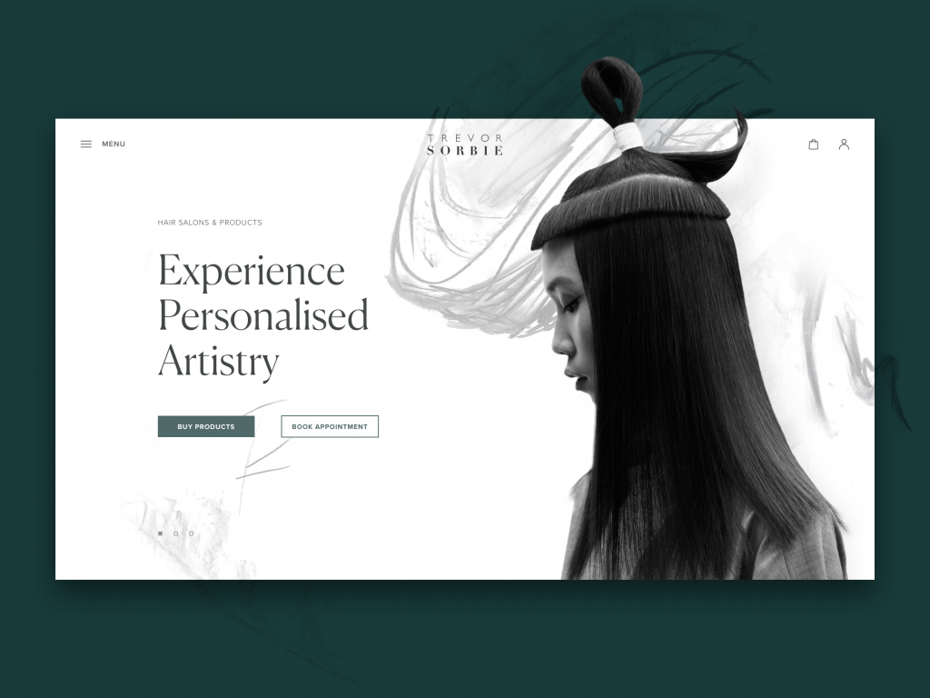
The hair beauty company website uses a hero image on the home page that works as a directional cue: the model’s eyes attract your attention to the zone of CTA elements.
Guides and Manuals
Being highly effective and common in setting a natural visual connection with the physical world, photos often become the primary demonstration tool in diverse manuals and guides. Be it a recipe, a guide on how to use a device, to knit a scarf, to tie a neckerchief in 20 trendy ways, or even how to take a photo – whatever kind of instructions is given to a visitor, supported with good photos it will work much more user-friendly and will be far handier than just a text.

Dessert recipes blog
Illustrative Article Images
One more goal efficiently covered with photos is illustrating articles and online editorials. Photos can add visual support to the topic of the article and strengthen the text.
The rule of thumb here is not to use photos as visual fillers. Both title images and photos included in the article have to work as visual helpers, not distractors, so make them meaningful, informative, or at least adding the necessary mood if the article is a piece of the emotional story. If you are telling a historical or retrospective story, find proper archive photos; if that’s the article about a specific place, don’t use stock photos to show something similar but get the ones from that particular location. Relevance is a key to successful photo usage in this case.
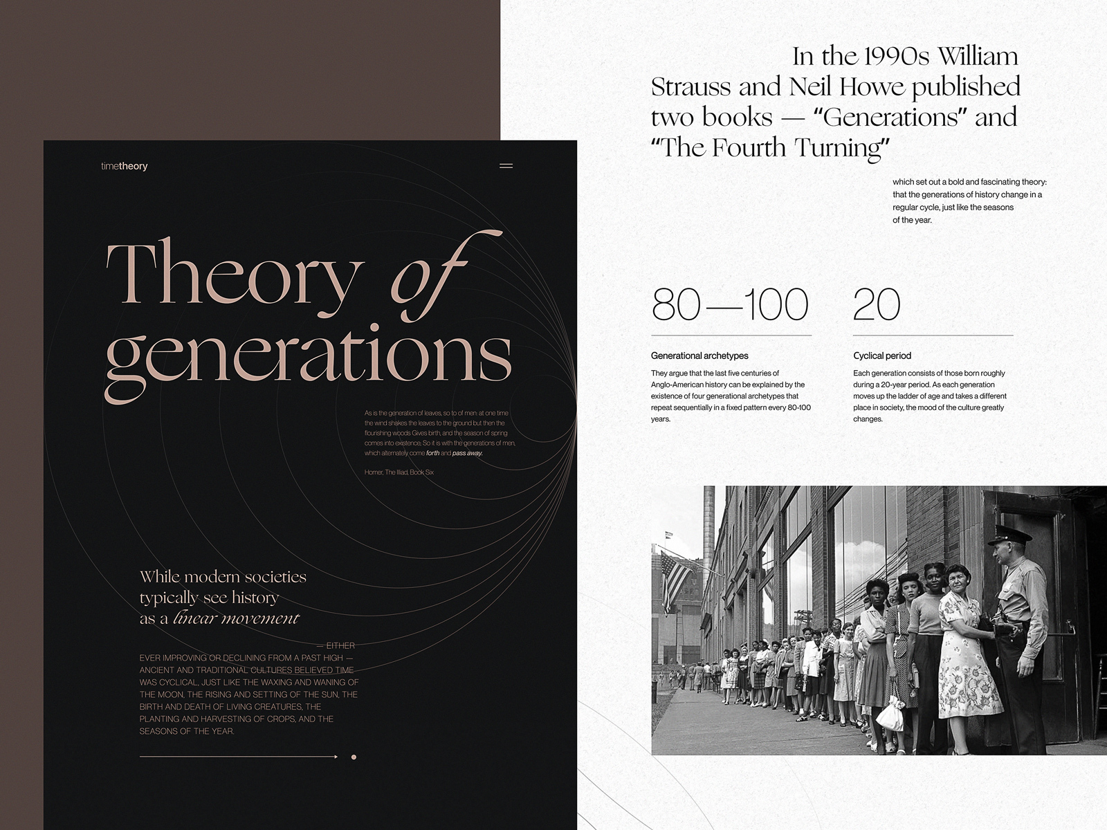
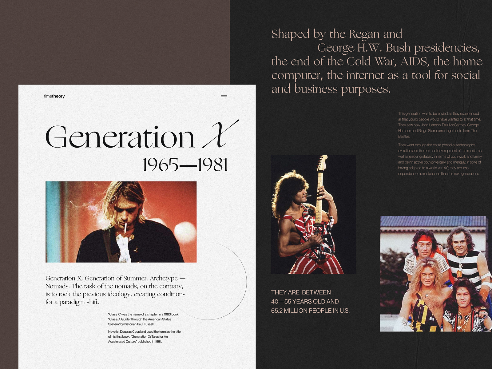
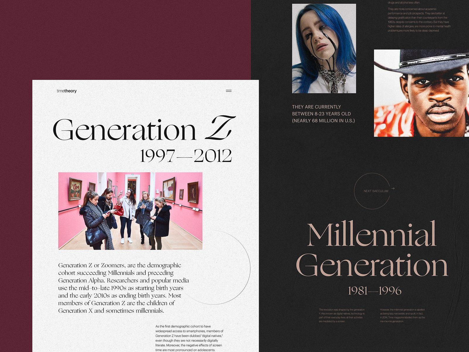
Online editorial about different generations
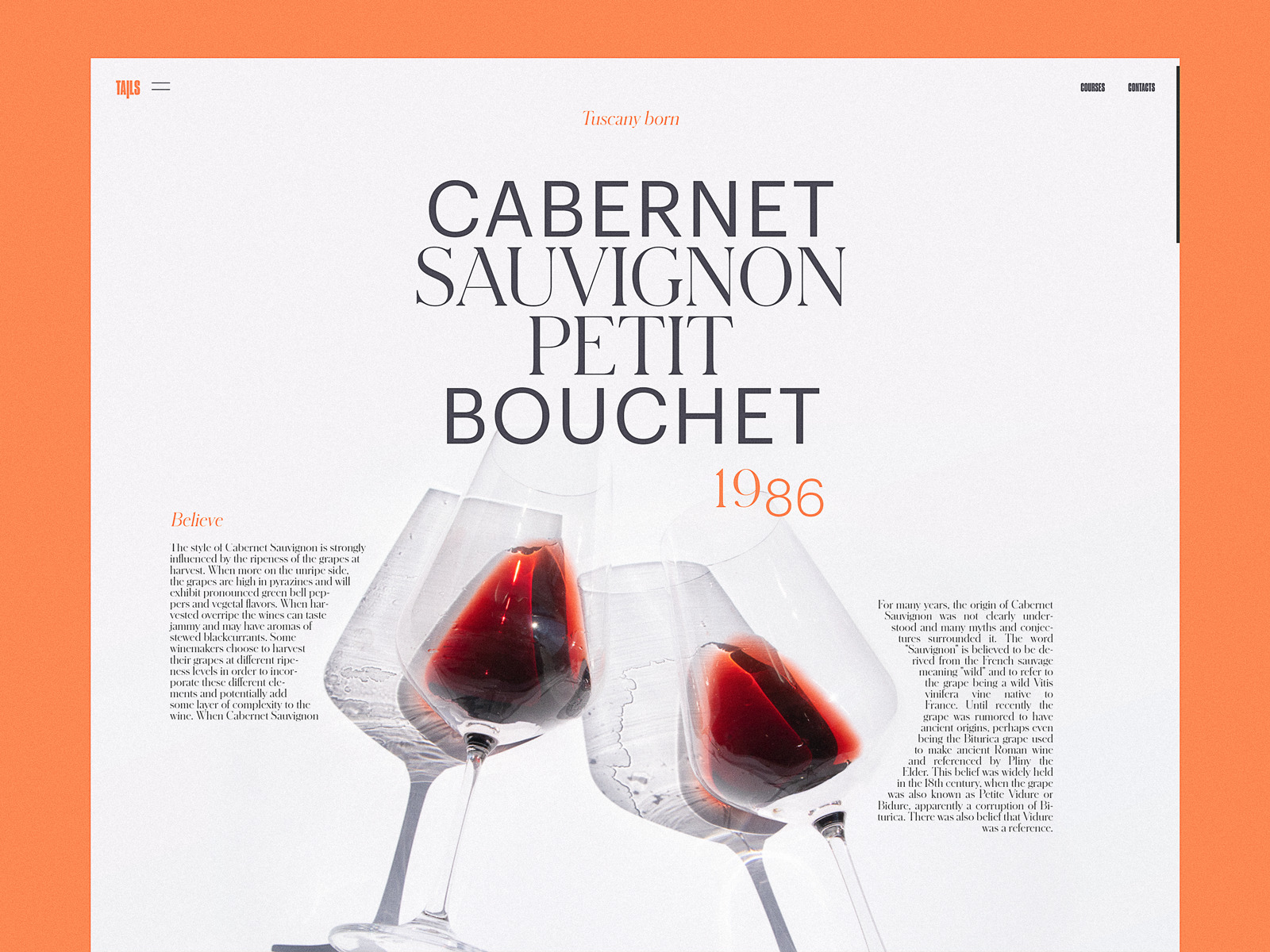
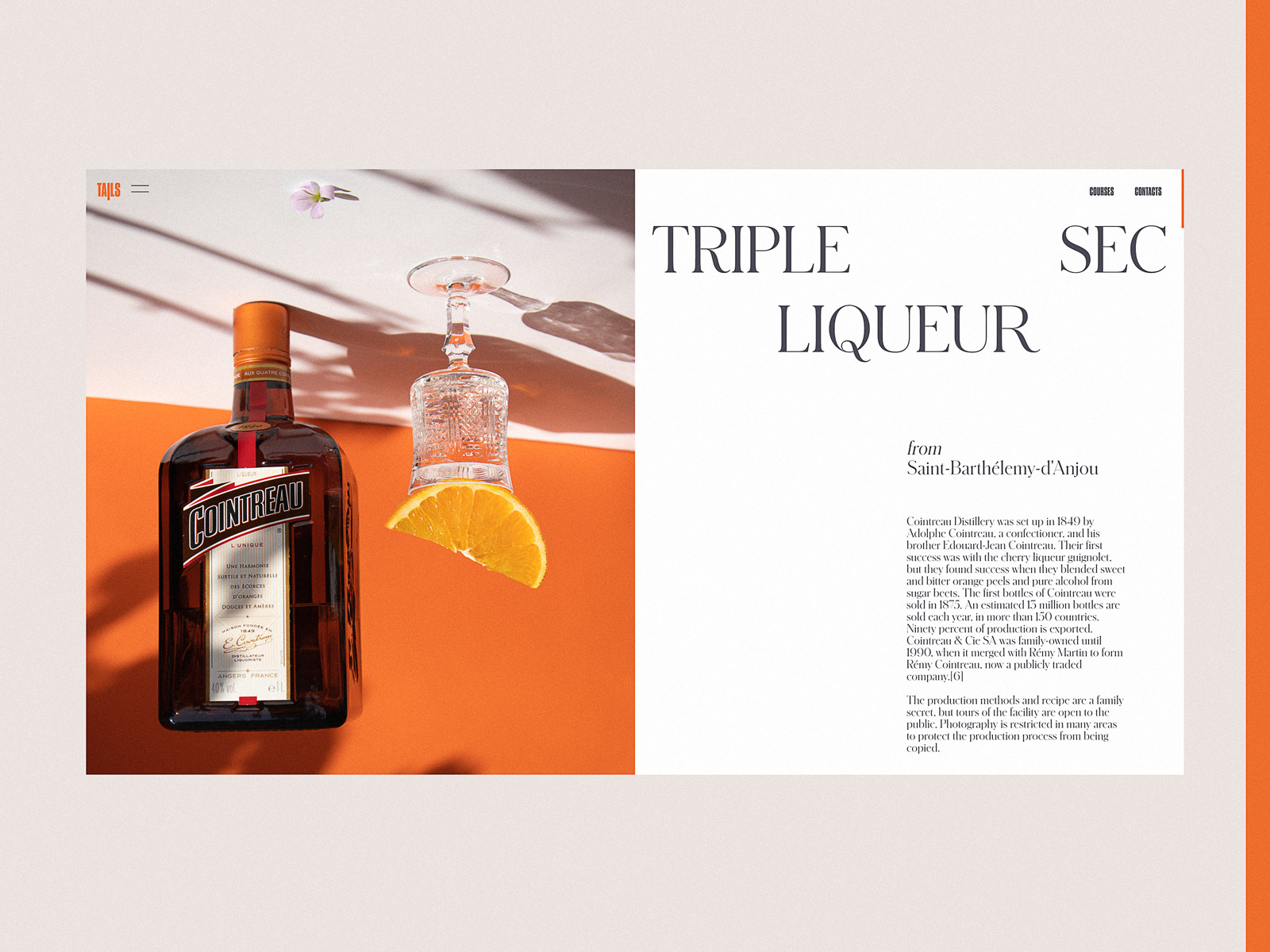
Bartending encyclopedia website
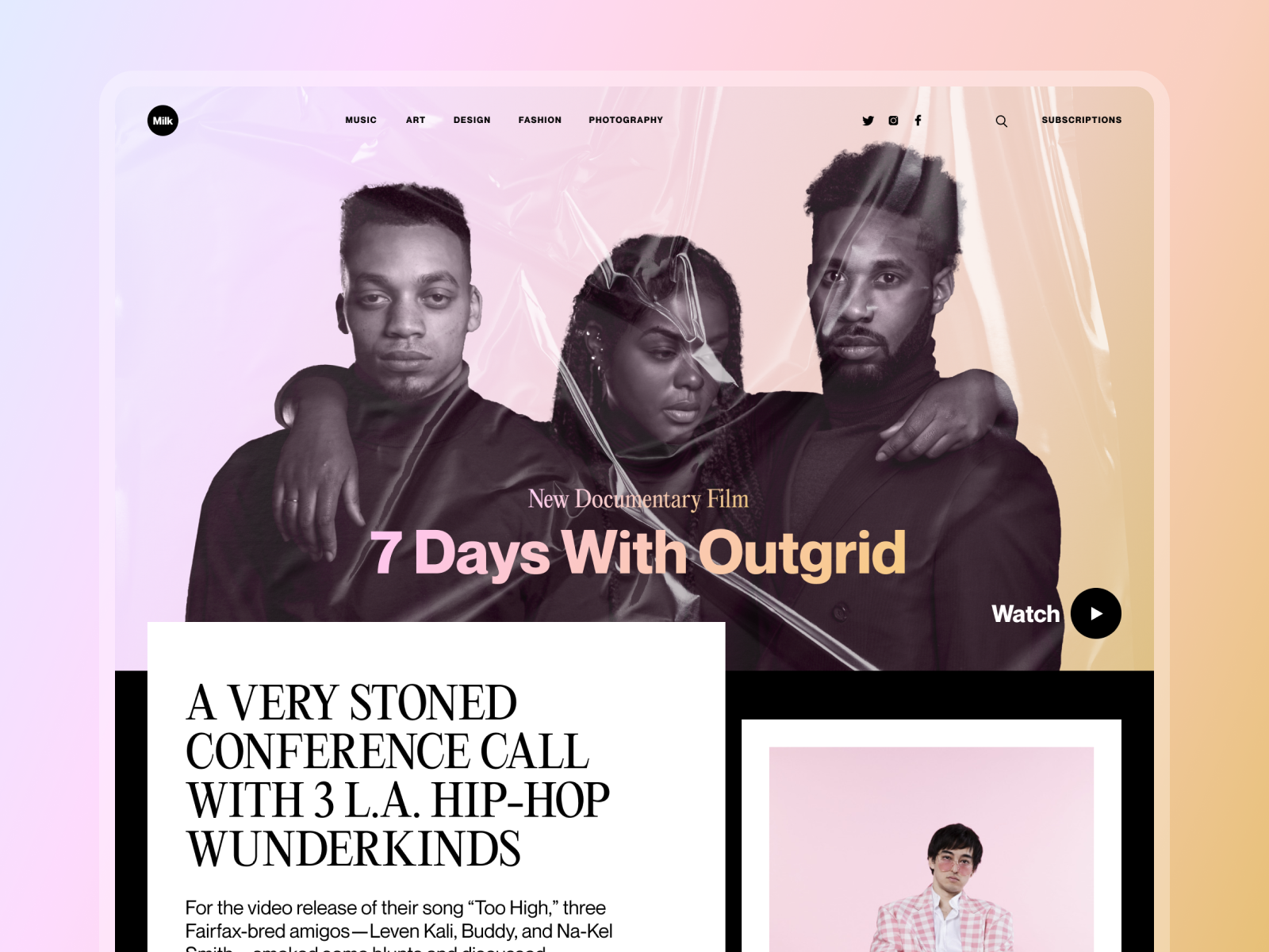
Web design concept for an online magazine
Creating Emotional Appeal
Another big reason to integrate photo content is the emotional appeal added to the user experience. Whatever logical and thought-out we try to make our actions, the emotional background of the situation plays a crucial role in engagement and decision-making. And that is the aspect where images in general and photos, in particular, are super helpful. They set strong associations and build up the necessary atmosphere, often even before a visitor starts reading, as images are perceived faster than words. With the properly chosen photo integrated into the web or mobile layout, designers are able to capture not only the user’s eye but also transfer the needed mood.
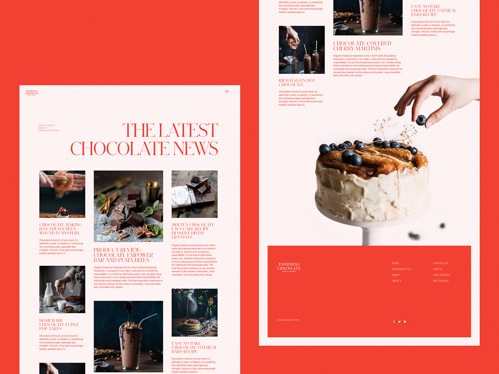
Confectionery website design setting strong emotional appeal
Online editorial about the history and development of skateboarding
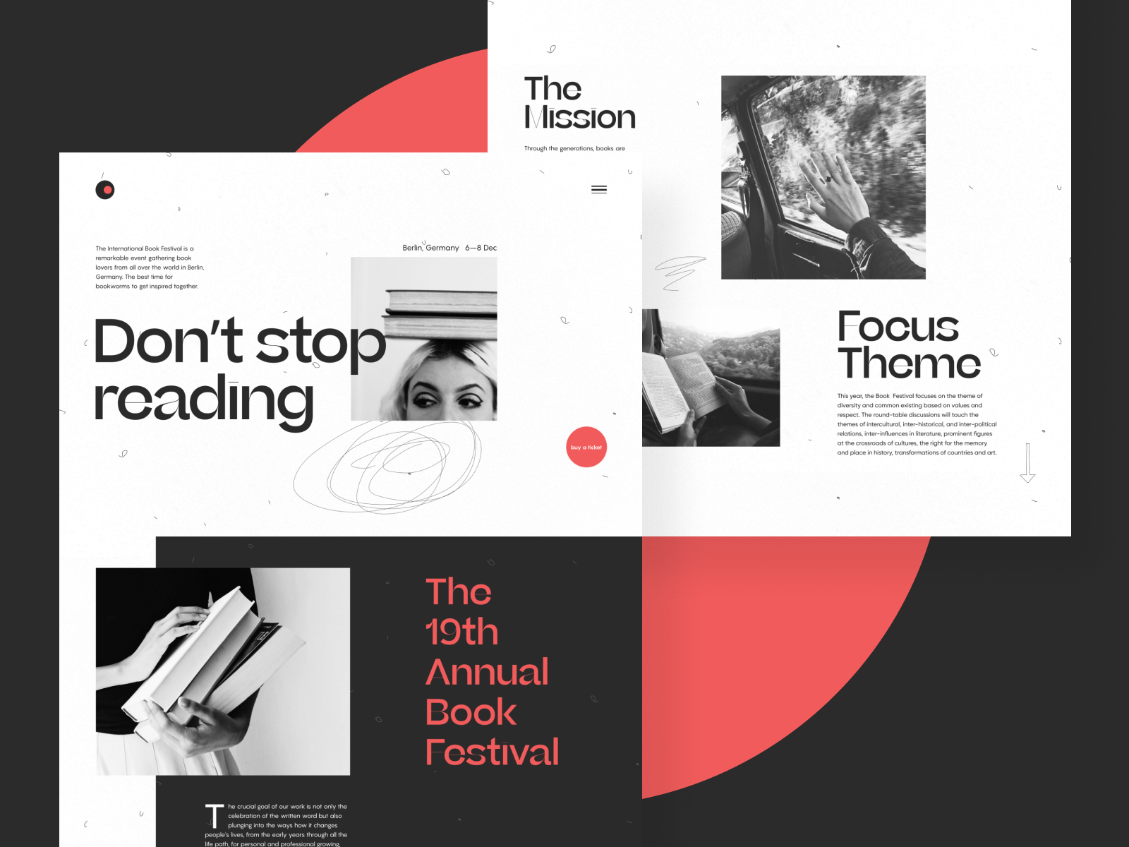
Book festival website
Advantages of Photos in Interface Design
The significant advantage of photos is their ability to connect what users see on the web page with a real world of physical things and live people. Photos have been a part of human reality for many decades, much before the Internet’s advent, so this kind of visuals is fairly native, close, and clear for us. What’s more, with all those devices that let any of us capture something in a second, photography is really a part of everyday life for many people – so, being used on a website, it sets strong connections and associations.
What’s more, photography is also a kind of art. With them, you can set the balance of realism and aesthetics in your web user interface. You can keep the necessary style appealing to your target audience and creating the required emotional background. That is one of the reasons for choosing photos to support articles on blogs and media websites.
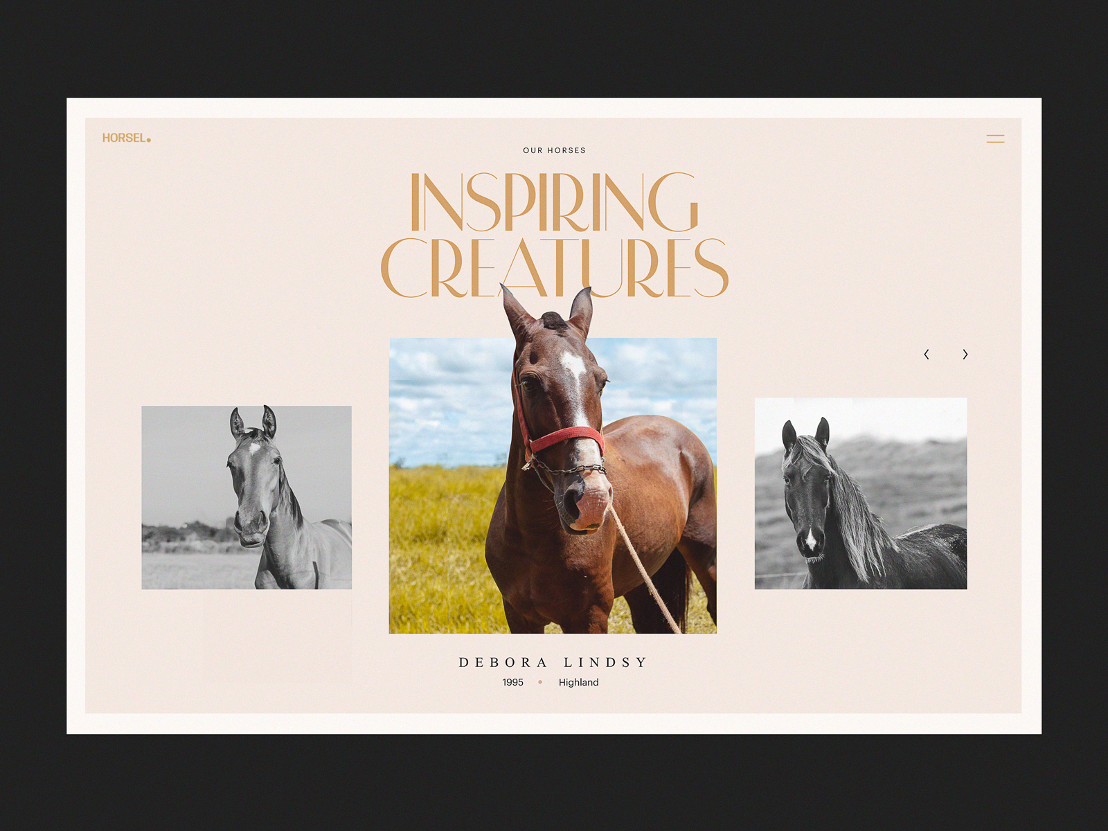
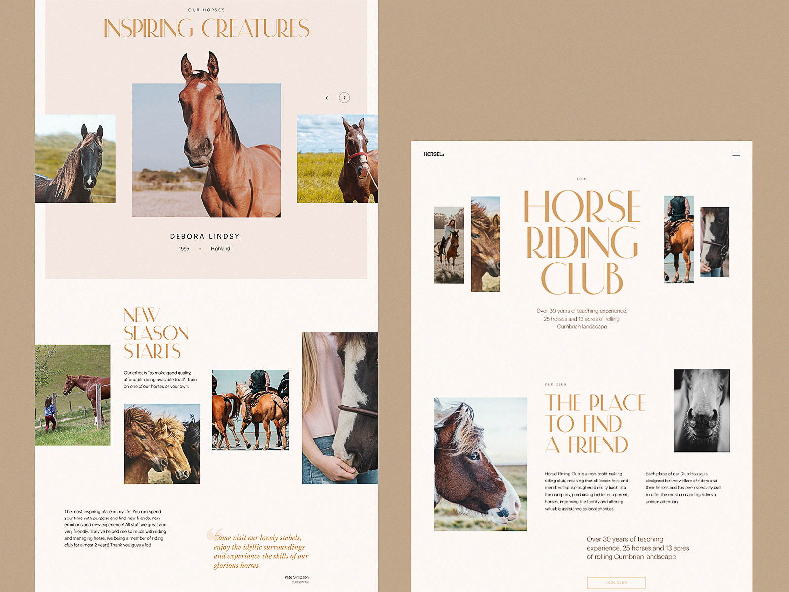
Website design for a horse-riding club
Points to Consider
Using photos in web design, consider the following tips:
- download high-resolution photos
- optimize them for the web/mobile so that too big images don’t overload the page or screen – loading speed is a crucial factor of positive user experience
- give the images enough air to breathe – keep the balance of negative space
- remember about responsiveness and test how the images look on different screens and devices
- don’t use photos as just decor – let them speak to users, transfer a message and support all the other layouts.
Where Designers Get Photos
There are three several ways:
- original photo production for the particular project: this is the most expensive option, but the photos will have the highest level of exclusiveness;
- paid stock photos: you buy a photo you need from a photo stock that offers a variety of shots. This may be cheaper than custom photo shooting, but you may spend a lot of time searching for the photos corresponding to your tasks;
- free stock photos: you take the photos from the communities or teams that share them for free. It is the cheapest option, but you have to be ready that other people may do the same so you’ll have to think well about how to make your design original under these conditions.
So, it’s easy to see that the way you choose depends on a specific project, its budget, and goals.
Anyway, even if you are the one who runs a blog or charity with no budget for visuals, or if you are creating a design concept for your portfolio, free photo stock websites offer a lot of high-quality content now. Additionally, some stock photo banks offer a mixed model, with some content or formats available for free and more on subscription. Some also allow you to order custom photos for your needs or purchase existing photos to ensure they are exclusive to you.
Among them, the following resources are often used for good photo content:
- Unsplash: it’s a community of photographers from all over the world sharing their photos for free. Photos are featured under thorough curation, so you won’t find trash there
- Pexels: a big bank of free stock photos on a variety of topics
- Pixabay: a huge stock of free images, not only photos but also illustrations and vector graphics.
- Shutterstock: a huge bank of stock images on different topics, most content is available with a paid subscription
- Depositphotos: another massive library of stock images, especially for business and marketing goals, mostly available with a paid subscription
Useful Articles
Here’s a bunch of articles to dive deeper into the theme of web and mobile user experience design
User Experience Design: 7 Vital User Abilities
Guide to 6 Effective Types of Web Animation
The Anatomy of a Web Page: Basic Elements
5 Basic Types of Images for Web Content
10 Reasons to Apply Illustrations in UI Design
UX Design: How to Make Web Interface Scannable
Negative Space in Design: Tips and Best Practices
User Onboarding Design: Practices and Tips
Originally written for Tubik Blog
- English
- Ukrainian

