26 Creative Examples of Landing Page Design by Tubik
26 Creative Examples of Landing Page Design by Tubik Check a diverse collection of web design examples: landing pages for a variety of products and brands, with hero images, elegant typography, and clear CTA design.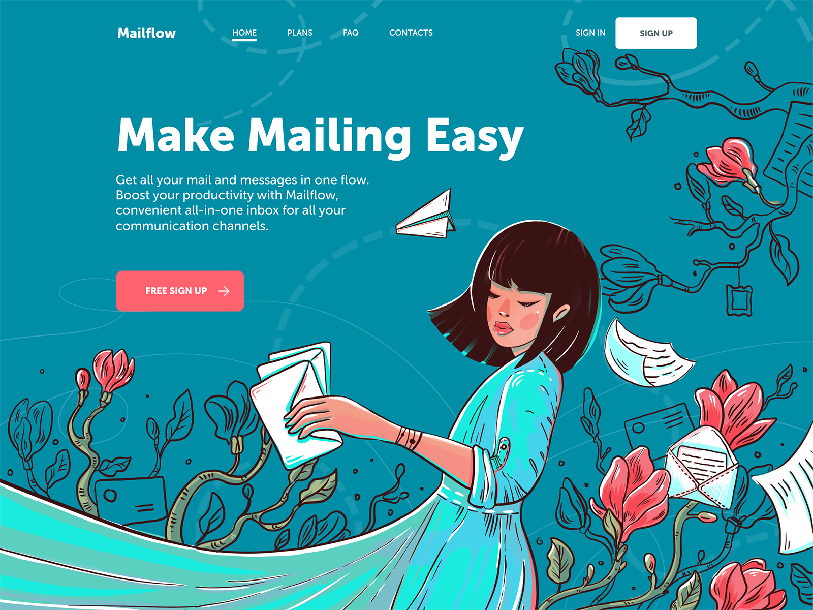
A landing page is a well-checked tool of web marketing: it helps to focus visitors’ attention on the specific offer, benefits, or actions. Today we offer you to take a glance at the collection of web design examples featuring landing pages for a variety of products and offers, created by Tubik Studio designers.
Landing Page Objectives
Why and when landing pages are used most often? As for the goals behind the landing page design, they can be different; yet, the biggest diversity of such web pages is found in the ecommerce sphere. In this field, they support both visitors and stakeholders presenting the particular commercial offers without distraction, in a helpful and attractive way. Creating special pages for every case means giving users directions, which is especially effective for big e-commerce platforms with hundreds or even thousands of items. Directing all the traffic to the home page, in this case, can lead to poor user experience, in particular when visitors come from marketing campaigns in outer resources. The risk is high that they will get lost immediately in the overwhelming amount of content and links on the home page. Or their attention will be driven away so the purchase won’t be finalized. A landing page is a solution to avoid these issues and focus visitors’ attention.
But landing pages are not only about selling and buying: there are also many other cases. They are widely used to present and promote:
- mobile applications
- educational resources
- charity platforms and activities
- communities
- events and meetings
- special announcements and information.
Anyway, the design process for any landing page starts from setting the clear and concise aim which should be achieved with its help. Let’s review the variety of examples for different goals. Most of the design concepts are based on well-checked approaches, so they feature:
- clear visual hierarchy
- catchy hero image
- bold and highly readable typography
- short scannable tagline
- readable and concise description
- instantly visible call-to-action element
- the color palette with emotional appeal corresponding to the message of the page
So, let’s get started!
Landing page for a photo service
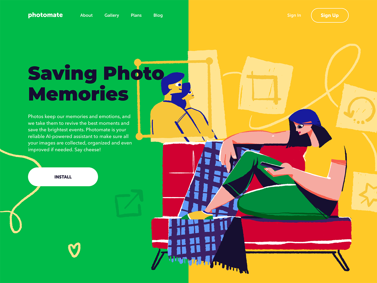
This design has been created for the web promotion of a helpful digital product for those who love photography. The application allows a user to keep their photos in an organized gallery and albums, find the needed photos in short seconds and improve their looks with an AI-based editor. That’s a bright example of using custom hero illustration to support storytelling, add originality and make web marketing effective.
Landing page for a scuba diving course
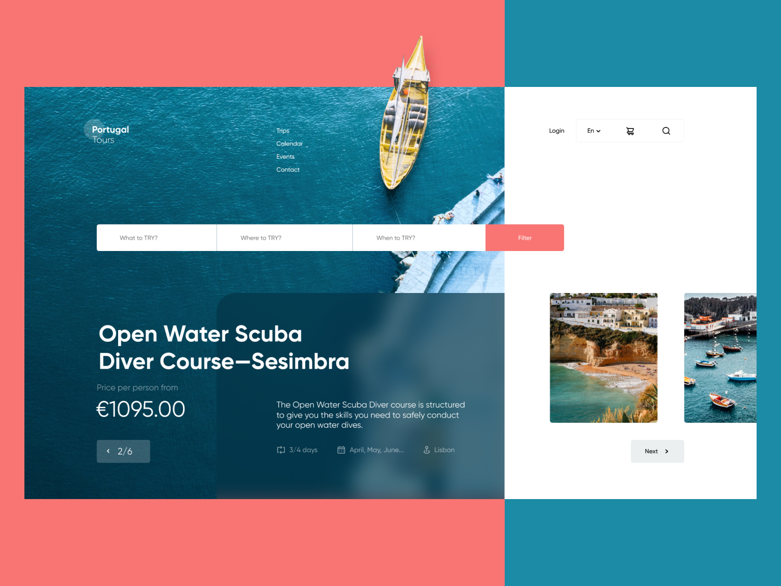
When the season of water sports is at its full, for businesses in this area it’s important to reach the target audience that looks for activities, training, and entertainment through the Web. This landing page design has been designed from the perspective of that theme: it’s created for the company that organizes active lifestyle tours and workshops in Portugal and presents the course on scuba diving. The refreshing and atmospheric photo instantly transfers the mood and reflects the nature of the offer, split screen clearly distinguishes different interactive areas and the thought-out visual hierarchy makes the web page scannable.
Landing page for an innovative car wash service
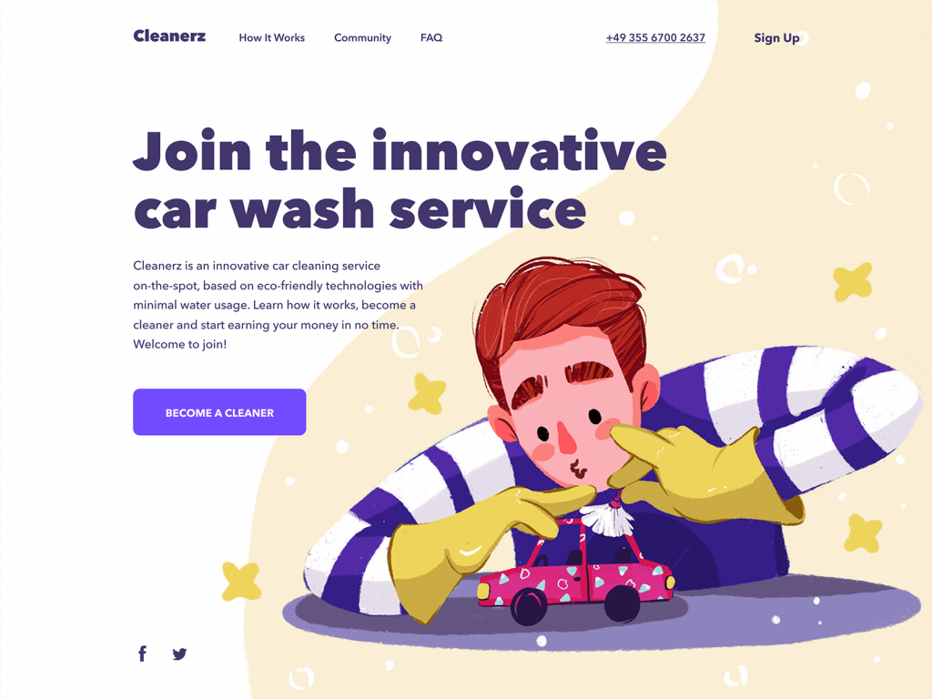
Now more and more digital products are created not to sell, offer, inform or educate, but just to connect people that can solve problems of each other. This design is right about that kind of task: that’s a landing page of the website for a service that provides innovative car cleaning and offers those who want to join and earn money. This particular page is aimed at people who want to be hired as cleaners and join the team of local car wash providers. Cute and catchy hero illustration sets the positive mood and informs about the nature of the service letting all the other content be readable and clear on the airy light background.
Landing page for a mail management service

This page promotes a service for mail management: it unites and organizes all the emails and messages from a variety of channels – inboxes, messengers, social networks. This way, users that deal with lots of communication have the chance of being even more productive. The page composition and layout are built around the hero illustration that sets instant association with both the name of the product and the problem it solves. What’s more, the color accents of the illustration effectively work together with a CTA button, and the dynamic composition of the artwork supports the brand name Mailflow.
Landing page for speech recognition technology
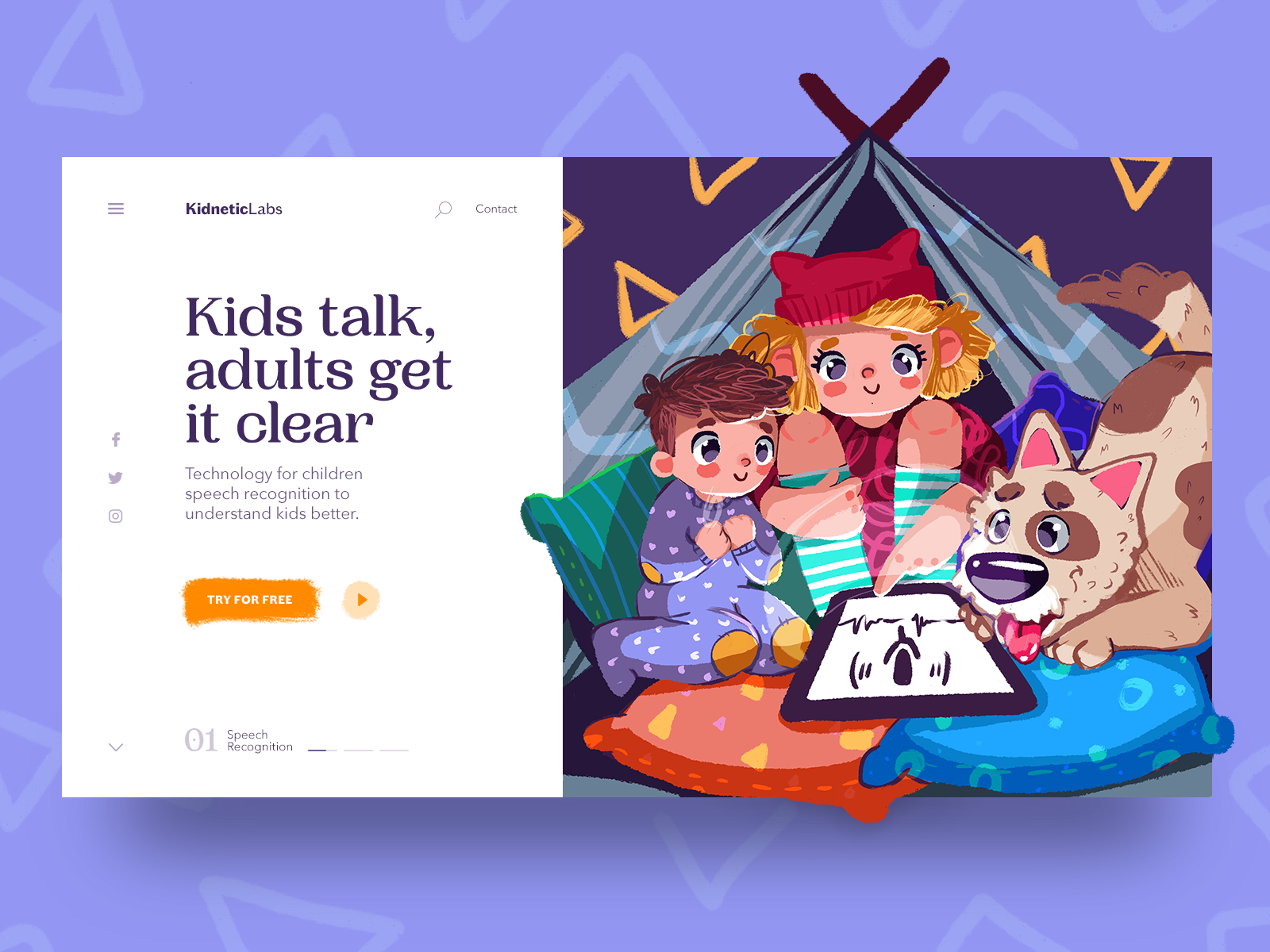
Perhaps, there are no parents in the world who wouldn’t dream to understand each and every sound of kids cooing and babbling. That’s one of the challenges for modern scientific and creative teams, and the presented design is also about that theme. That’s a landing page promoting speech recognition technology in a collection of innovative projects. The pages of this kind are a powerful tool for building a digital product brand so it’s vital to make them catchy and emotionally appealing. Here this effect is reached with a super cute digital illustration that is also informative and instantly gives visitors the idea of the technology benefits. The choice of font for the tagline also supports that mood while the bright color accents make the CTA clear and visible.
Subscription page for a bookstore selling children’s books
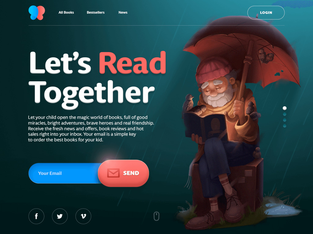
Here’s the webpage for the online bookstore selling children’s books and its conversion goal is to engage users to subscribe to the newsletter. The hero illustration instantly creates the proper atmosphere and together with a simple tagline and description that explains the benefits, it encourages users to join subscribers. The dark background here doesn’t hurt readability in any way due to the thoughtful choice of fonts, but it really helps to make the image look deeper, atmospheric, and eye-catchy.
Landing page for a luggage delivery service
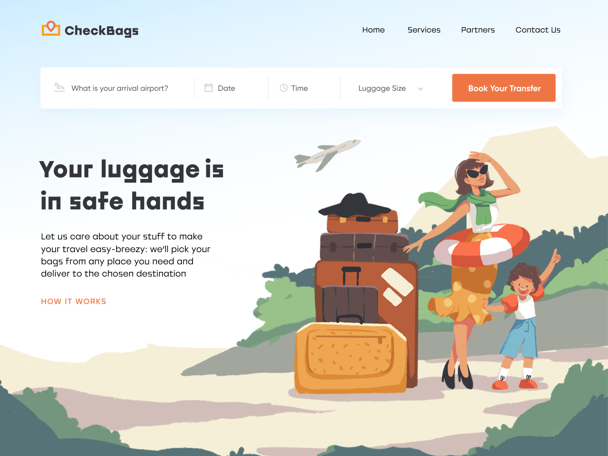
If you are a keen traveler or you have to move in business all the time, high chances are you know all the ins and outs of the luggage challenge. That’s one of the negative points for many people on road – and that’s the point behind the service presented in this design concept. Here’s the landing page designed for a delivery service that takes care of clients’ luggage picking it from the needed location and delivering it to the destination chosen by the client. The bright and catchy hero image and color palette instantly set the positive mood and harmonically combine with the tagline and interactive tab. Color accents effectively unite all the layout composition.
Landing page for car security app
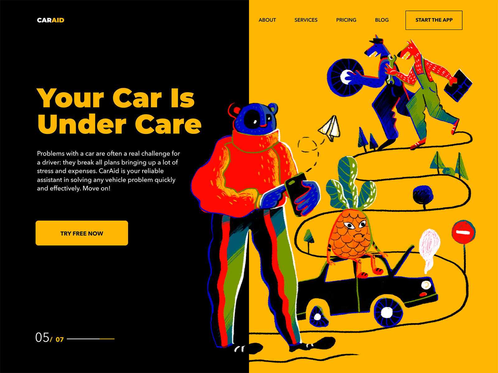
For a mobile app, the goal behind a landing page is app installation and the core task is to concisely cover its benefits and functions. What’s more, you can create multiple landing pages for one app based on various segments of the target audience. It is an effective way to reach users and give them a quick presentation of the app telling and showing more than just screenshots on the AppStore. Here is a quick glance at a landing page of that kind: it presents the CarAid, a mobile application of the service to solve problems with a car and save drivers their time, money, and nerve cells. The page design is built around a prominent and a bit experimental hero illustration setting the original visual style and catching users’ attention.
Landing page for an art exhibition
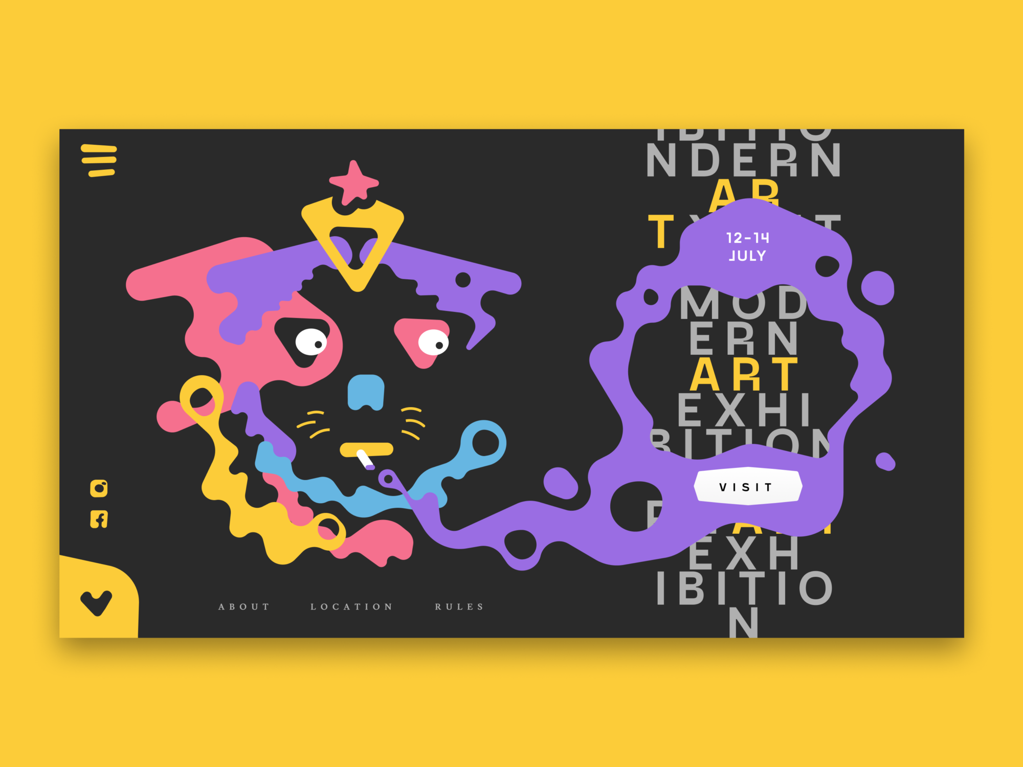
In terms of high competition, one of the factors any event success depends on is its promotion. The landing page is an effective tool to unveil the benefits of the event and simplify the process of booking or buying tickets. As well as get potential visitors stunned with wow-graphics and effects setting the right mood and building up strong emotional appeal. This design features a landing page of that kind: its goal is to promote an art exhibition and let users quickly buy tickets. Prominent illustration, catchy palette and experimental typography will definitely catch the user’s eye.
Landing page for hiring platform
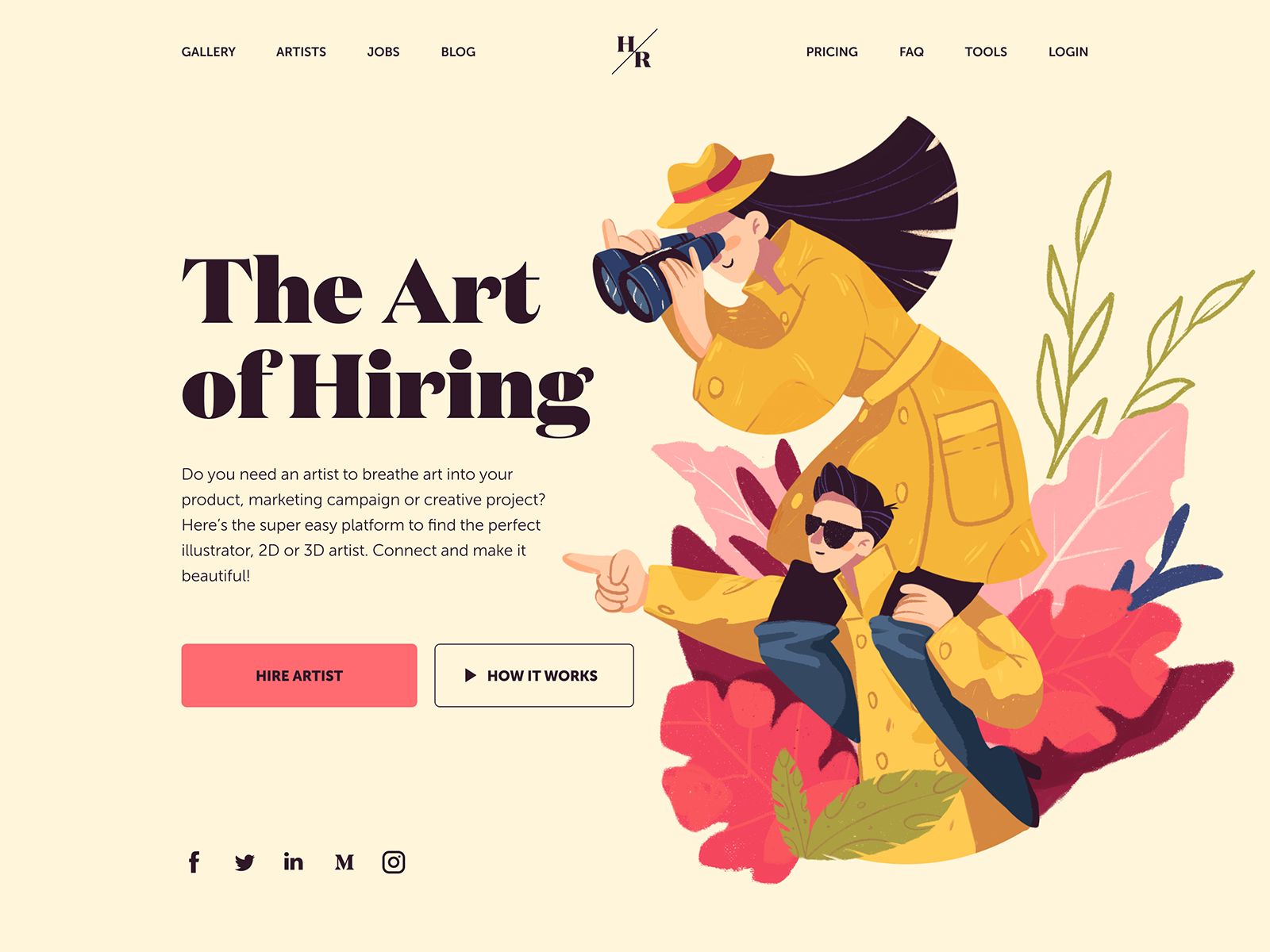
Finding a skillful artist for a design or marketing project sometimes feels like exploring the exotic area. This web design with a prominent hero illustration is right about that: it’s a page created for the web platform that helps artists and their clients easily find each other and together make the world even more beautiful. This page features the choice of a serif font Domaine for the tagline. It visually reflects the style of the illustration and makes them harmonically work together as one composition. Yet, for the description copy block, the designer chooses a sans-serif font that is highly readable, this way reducing the cognitive load for readers and making the copy presenting benefits scannable.
Landing page for an innovative meal delivery service
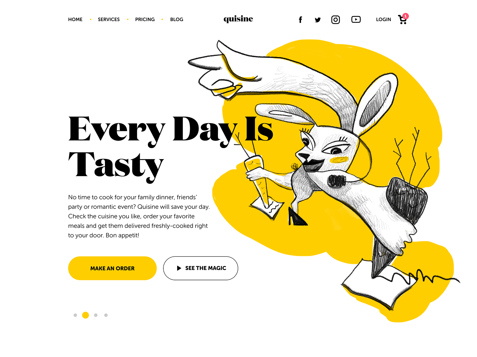
When your day is tasty, everything gets better – that’s what today’s shot is about. Here’s a landing page for Quizine, an innovative service that delivers food of different national cuisines. That’s a project widely integrating brand-style illustrations in UI design. The web design is based on simplicity. It’s full of air and uses a limited color palette to avoid distraction and make the web pages scanned easily due to contrast colors and readable fonts. The original illustrations support a positive user experience with storytelling and give the layout original and trendy looks. Prominent call-to-action elements instantly focus users’ attention on the core interactive zones. Color also helps users understand the hierarchy of CTA buttons: filled “Make an order” button get a higher visual priority than the ghost button used to lead the visitors to an explainer video.
Landing page for a shopping delivery service
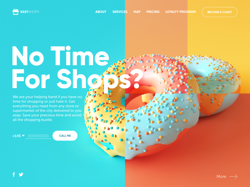
Here’s another landing page for the local delivery service, this time the one that does and delivers shopping for its clients. Catchy 3D graphics set the theme and in combination with an uncommon color palette give the page trendy looks that help the brand stand out in terms of high competition in this business segment. As the website is oriented toward local clients, the CTA is designed for a quick call as a priority action.
Landing page for an interactive mapping app
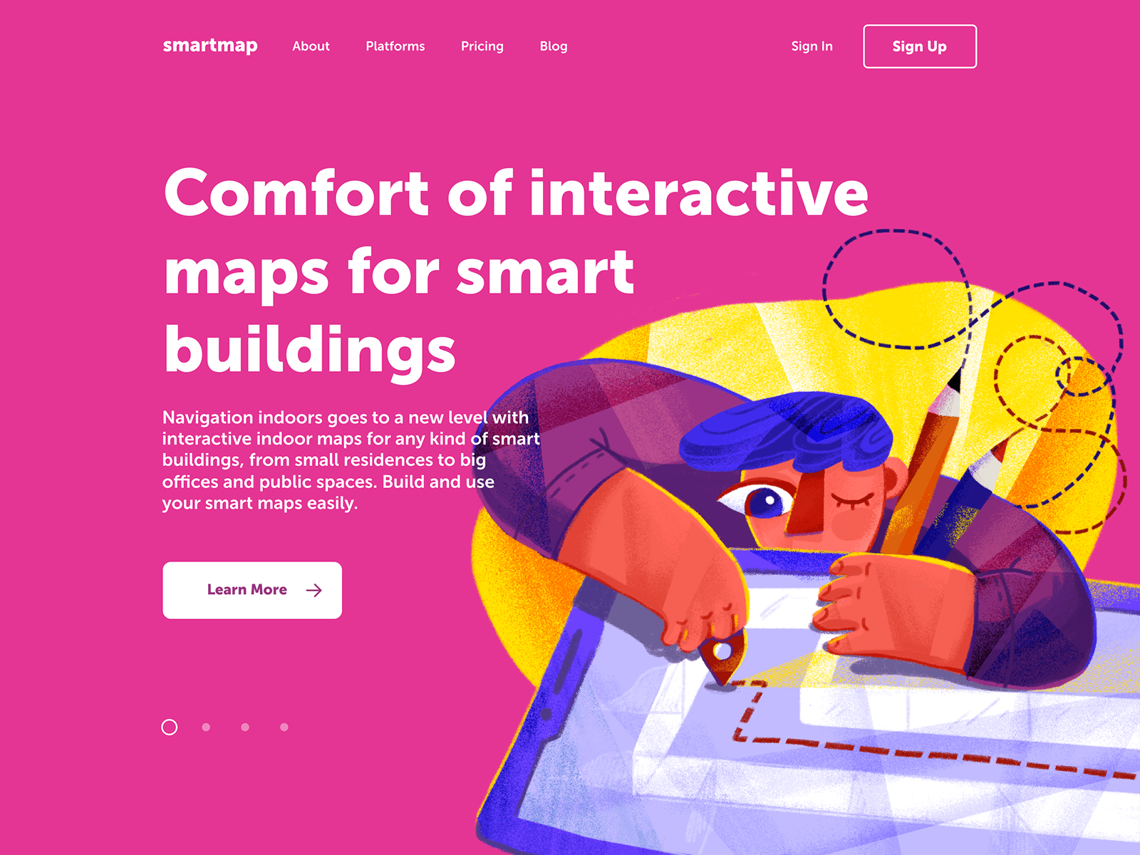
No secret, now websites and smartphones are much more for us than just sources of information and communication. They are used for multiple purposes and often become our digital assistants in daily basic operations. This landing page was designed to promote a digital product of that kind: it allows users to build interactive maps for their smart homes, offices and even public spaces. The catchy and concise layout with an artistic and a bit experimental hero image becomes an integral part of strong product branding.
Landing page for a cryptocurrency guide
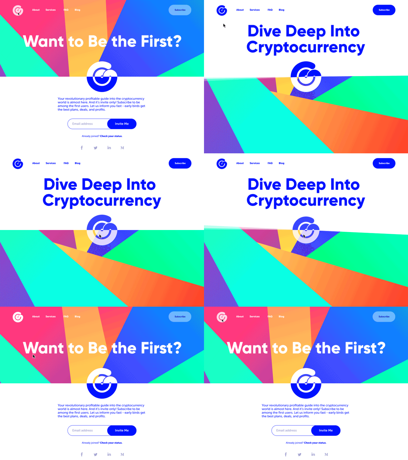
This web interface concept is on the finance theme: it’s a simple and catchy landing page for a cryptocurrency service sharing an invite-only comprehensive guide. The goal of the page is to inform the visitors about the offer and let them join the community by sending the email address. Animated interactions add fun and life; generally, the design strives for a balance of business-like but friendly mood.
Landing pages for a productivity service
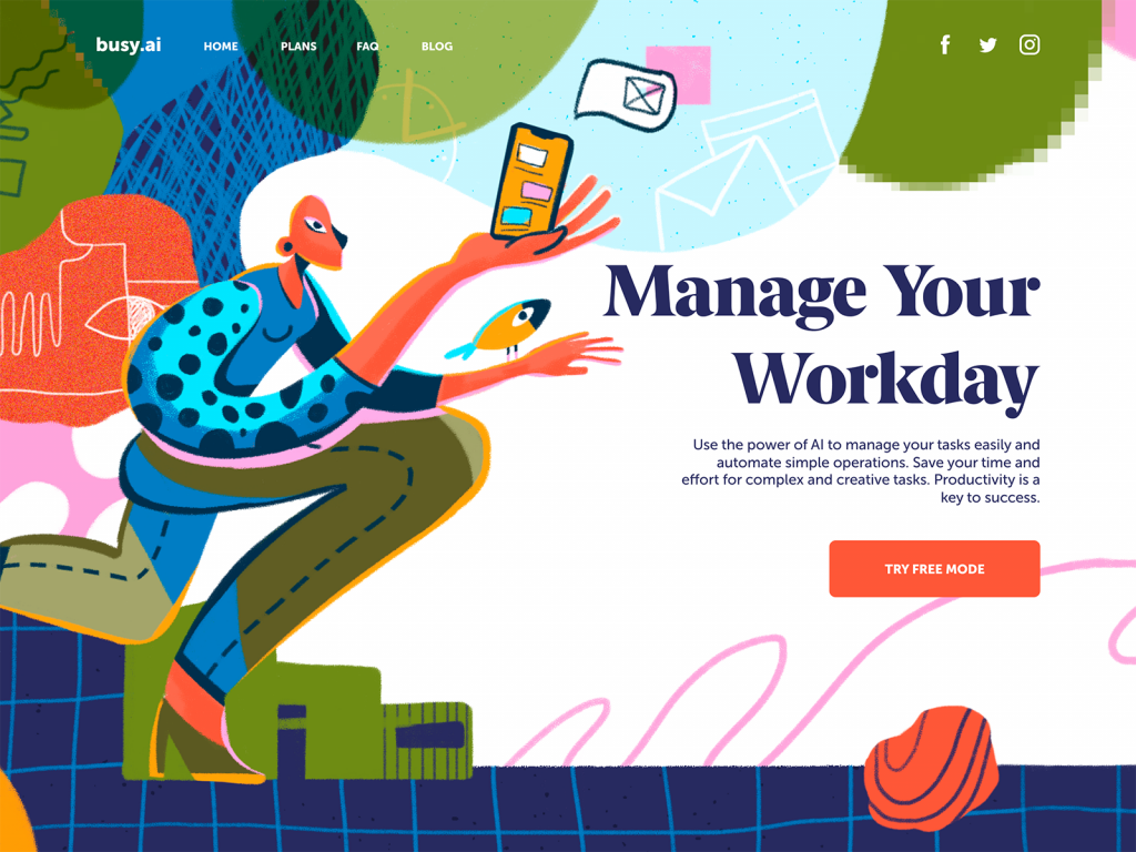
Having our hands full of various tasks, we tend to try tools and methods to boost productivity. This is a landing page for a productivity tool offering AI-based assistance in task management. The prominent hero illustration won’t let the user pass by, tagline and description present the key benefits of the offer and the CTA button engages the user to try the tool for free.
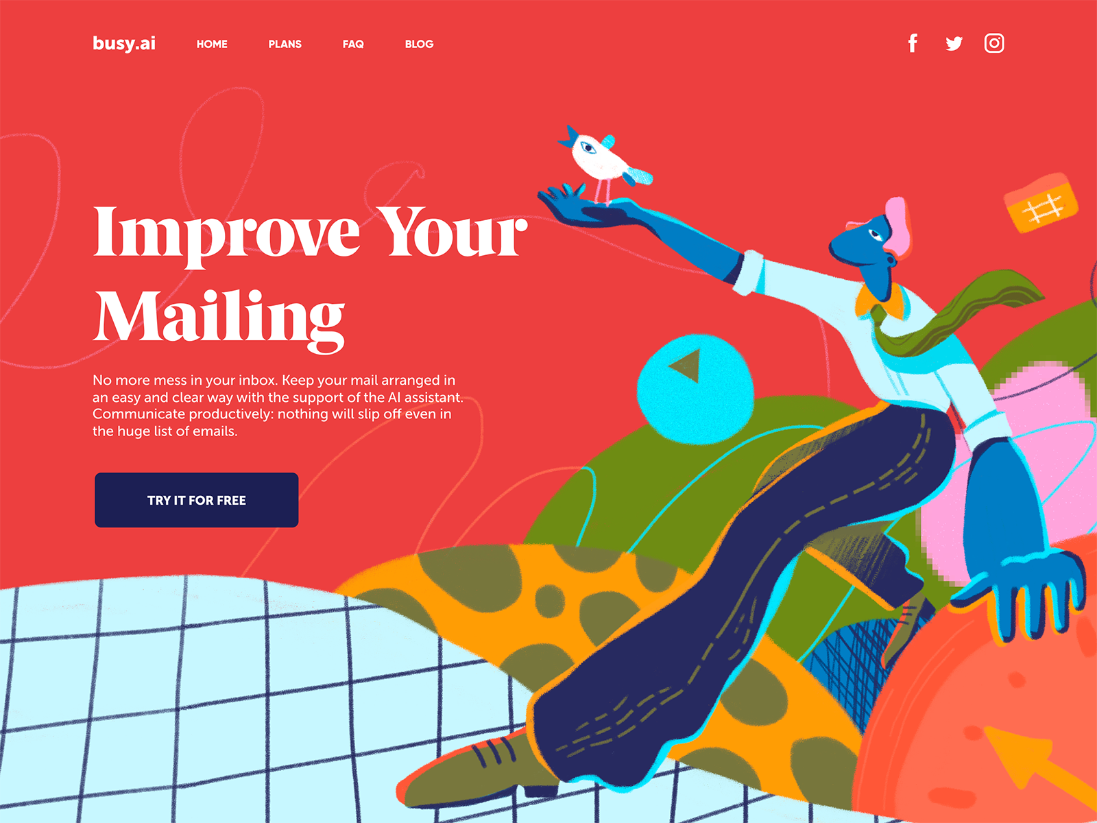
This page for the same service presents another feature of it – inbox management. One of the big challenges is communication in numerous channels, from email inbox to messengers and social networks, so the product offers the united inbox and AI assistance to boost mailing and communication for higher productivity. Following the same visual style, the webpage is built around the original and emotional hero illustration and solid visual hierarchy.
Landing page for a hair accessories store
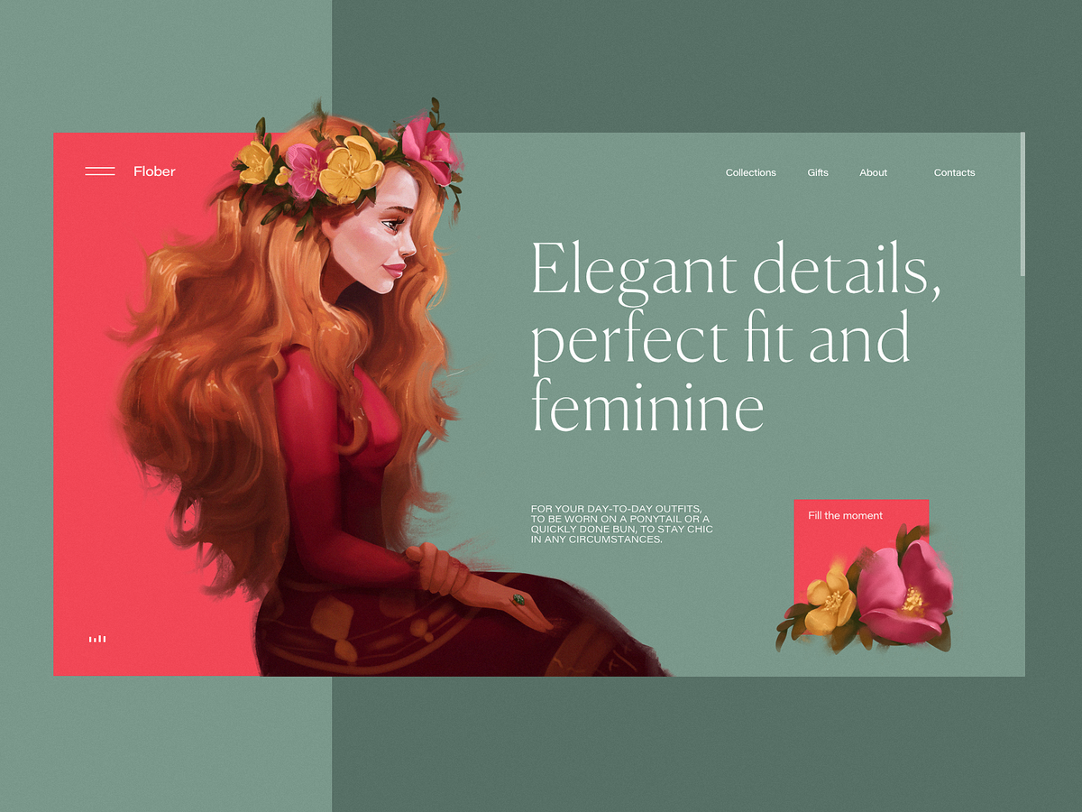
One of the fundamental rules of commerce is to show the offered item at its best. This landing page demonstrates how to do it in the case of an e-commerce website by means of digital art. Here’s the page designed for an online store selling exclusive hair clips and accessories. Prominent and artistic illustration instantly sets the theme, gives aesthetic pleasure, and creates a strong emotional appeal, especially in combination with sophisticated typography chosen for the layout.
Landing page for a security service
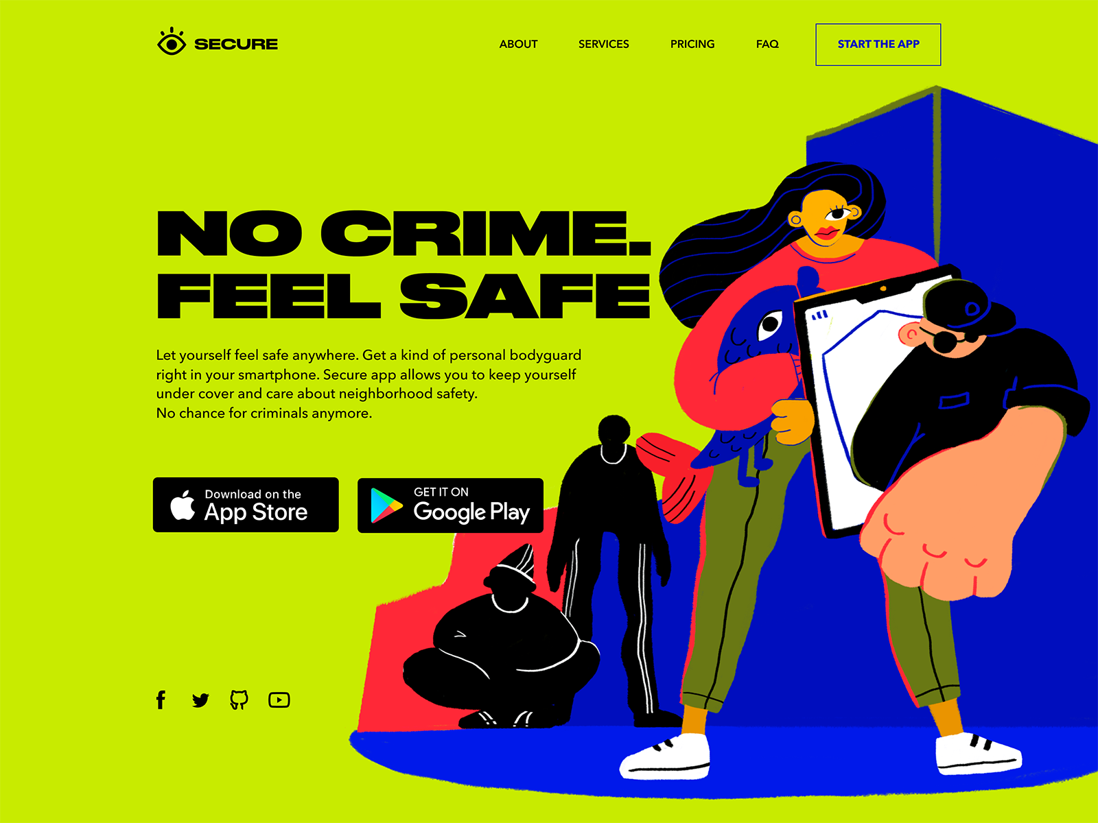
This is another landing page promoting a mobile app, the security application that helps a user quickly contact the police and care about the safety of the neighborhood. It uses the visual contrast of a hero illustration full of irregular curves and thin lines and bold solid Druk font.
Landing page for a fashion event
One more landing page promoting an event: this time it presents a fashion event, gives it a brief introduction, and lets users quickly buy tickets. Prominent illustration, catchy palette, and bold typography don’t leave visitors any chance to pass by and create the artistic trendy look.
Landing page for environment protection community
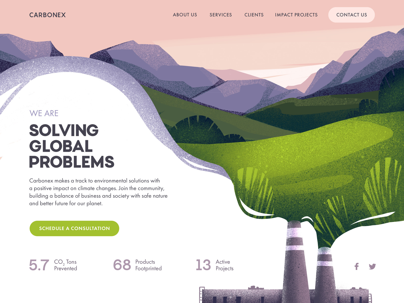
With all the global problems our planet faces today, communities of people concerned with them and seeking solutions are growing to prevent the negative impact. This design is also devoted to that theme: a web page was designed for the website of the eco-aware community consulting businesses and manufacturers as well as launching projects devoted to environmental protection. The composition and color palette of the hero illustration support the emotional appeal and create an instant message about the theme. The visual hierarchy of the webpage sets the basis for scannability to make the major information, infographics, and CTA instantly visible.
Landing page for a Bauhaus event
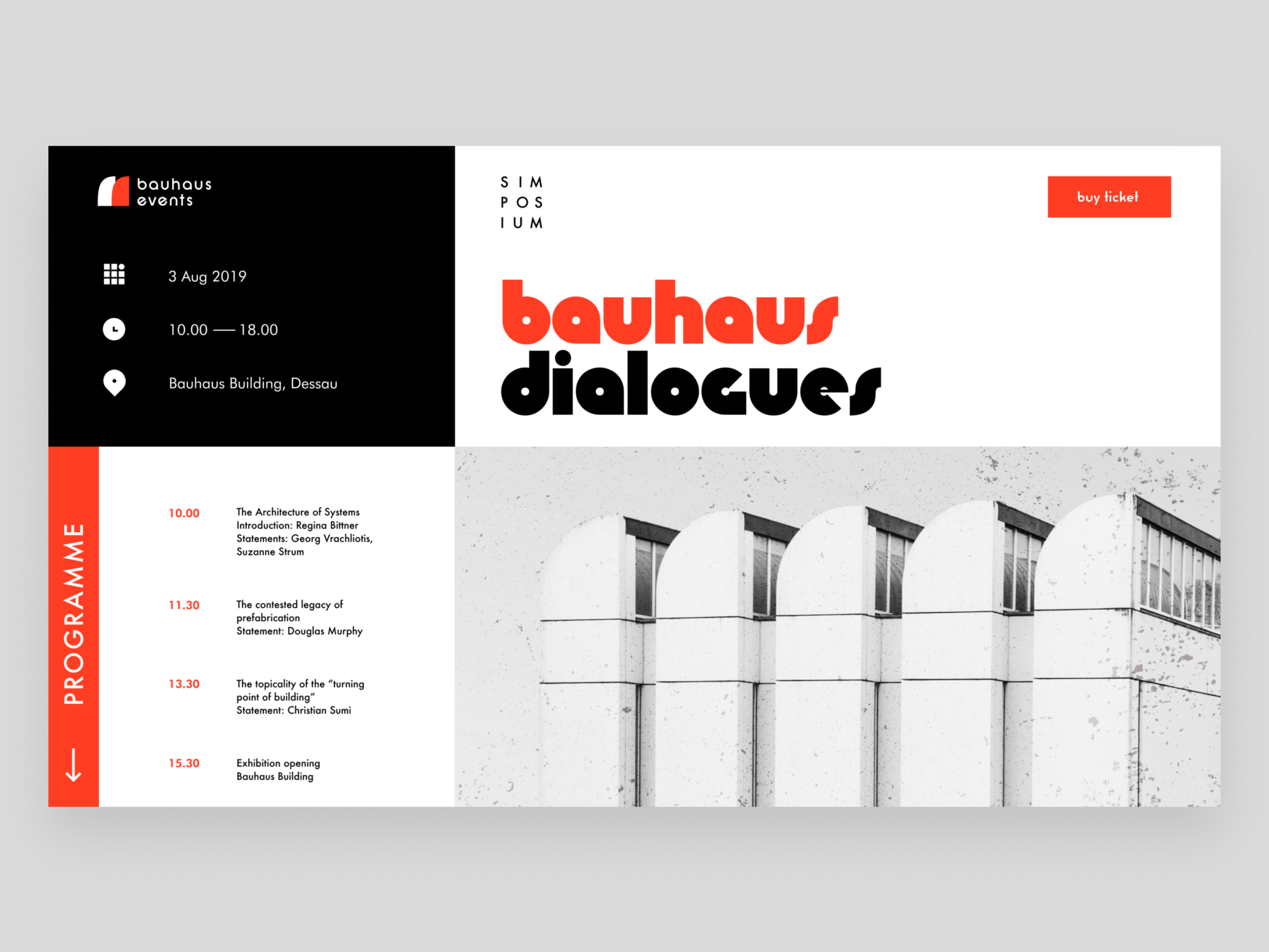
The Bauhaus is often referred to as one of the most impactful modernist art schools of the 20 century. Its approach to teaching and the relationship between art, society, and technology had a great influence both in Europe and in the United States. The Bauhaus aimed to reunite fine art and functional design, creating practical objects with the soul of artworks. The school was operational from 1919 to 1933, so in 2019 the art and design society marked 100 years of Bauhaus with a big number of events, publications, designs, and artworks. This landing page design is also devoted to the theme and aimed at promoting the Bauhaus event. Obviously, the webpage follows the aesthetics of the art school approaches to art and design, first of all with bold color contrast of the limited palette, visual minimalism, and prominent typography.
Landing page for illustration conference
This landing page for the illustration conference builds the composition on the original and eye-pleasing animated hero image that will attract the target audience: designers, artists, and illustrators. The animation also supports the integrity of the transition between the pages. Here the designer chose a light background and pastel color accents that draw visitors’ attention to the needed layout zones and elements, and support the visual consistency of the composition in combination with the digital artwork.
Landing page for a social network management app
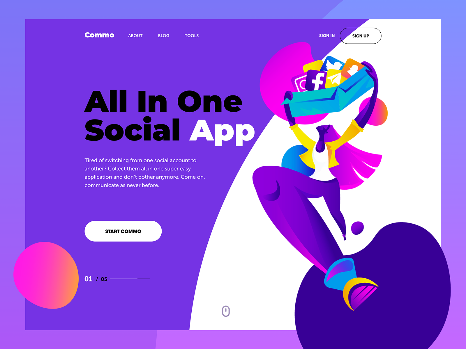
This catchy web page was designed to promote an application that allows users to manage all their social accounts in one place. The illustration has a dynamic composition reflecting the fast-paced nature of communication in social networks. The page uses a split background with a light part for the bright graphics and a dark part for the text content. CTA button works as an element uniting the general composition as a white element on the dark part. The icon of a computer mouse gives the visitor a prompt that the page can be scrolled for further information.
Landing page for a football final match
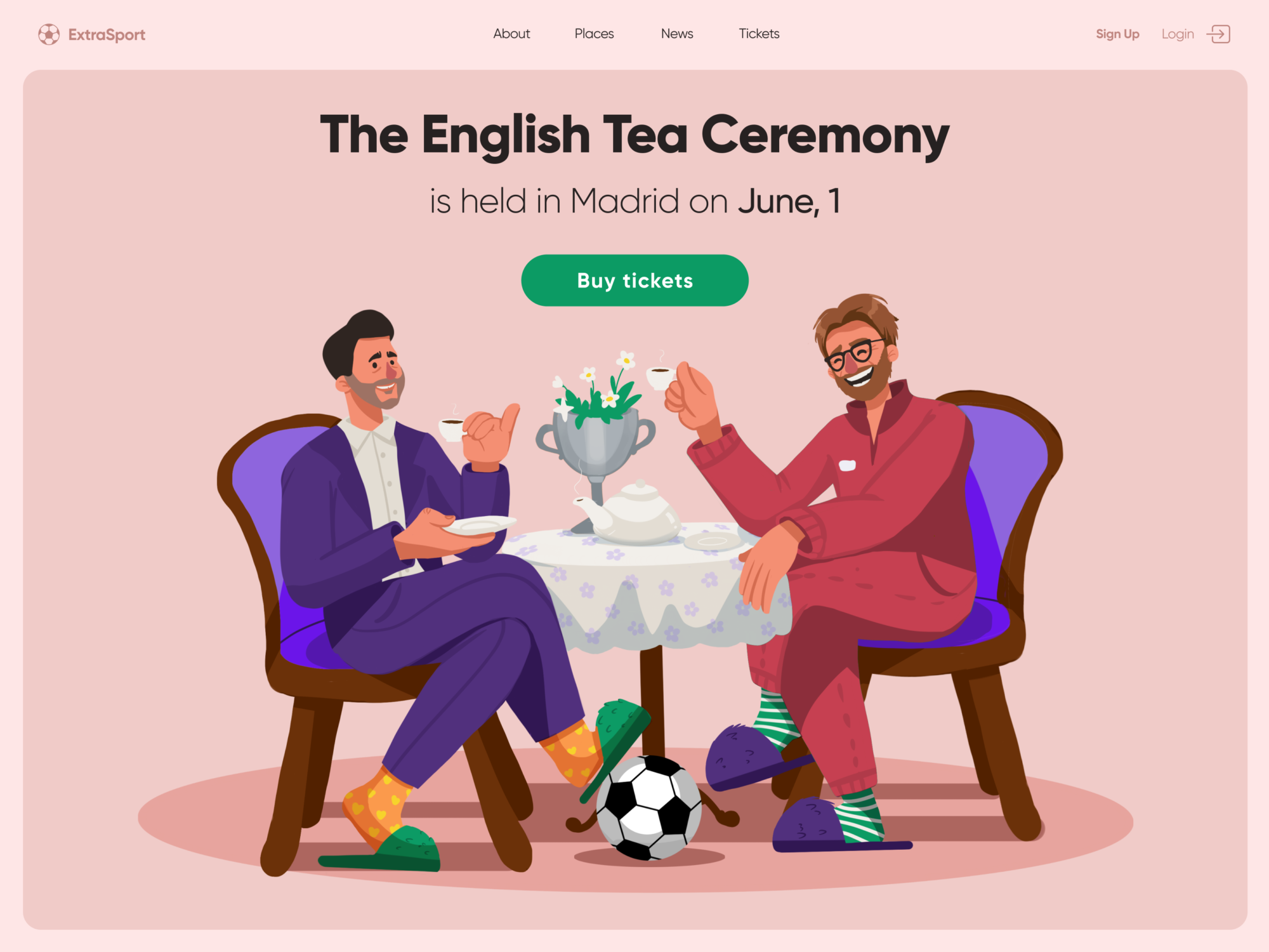
This web design concept was aimed at football fans: on the 1st of June, Madrid hosted a final of the UEFA Champions League – and two English clubs fought for the cup, which doesn’t happen all too often. We couldn’t help adding a pinch of fun and art to this event, and the creative search brought out this landing page on selling the tickets to the match. The hero illustration sends the vibes of the English tea ceremony and the characters are drawn to be well-recognized as trainers of the playing teams.
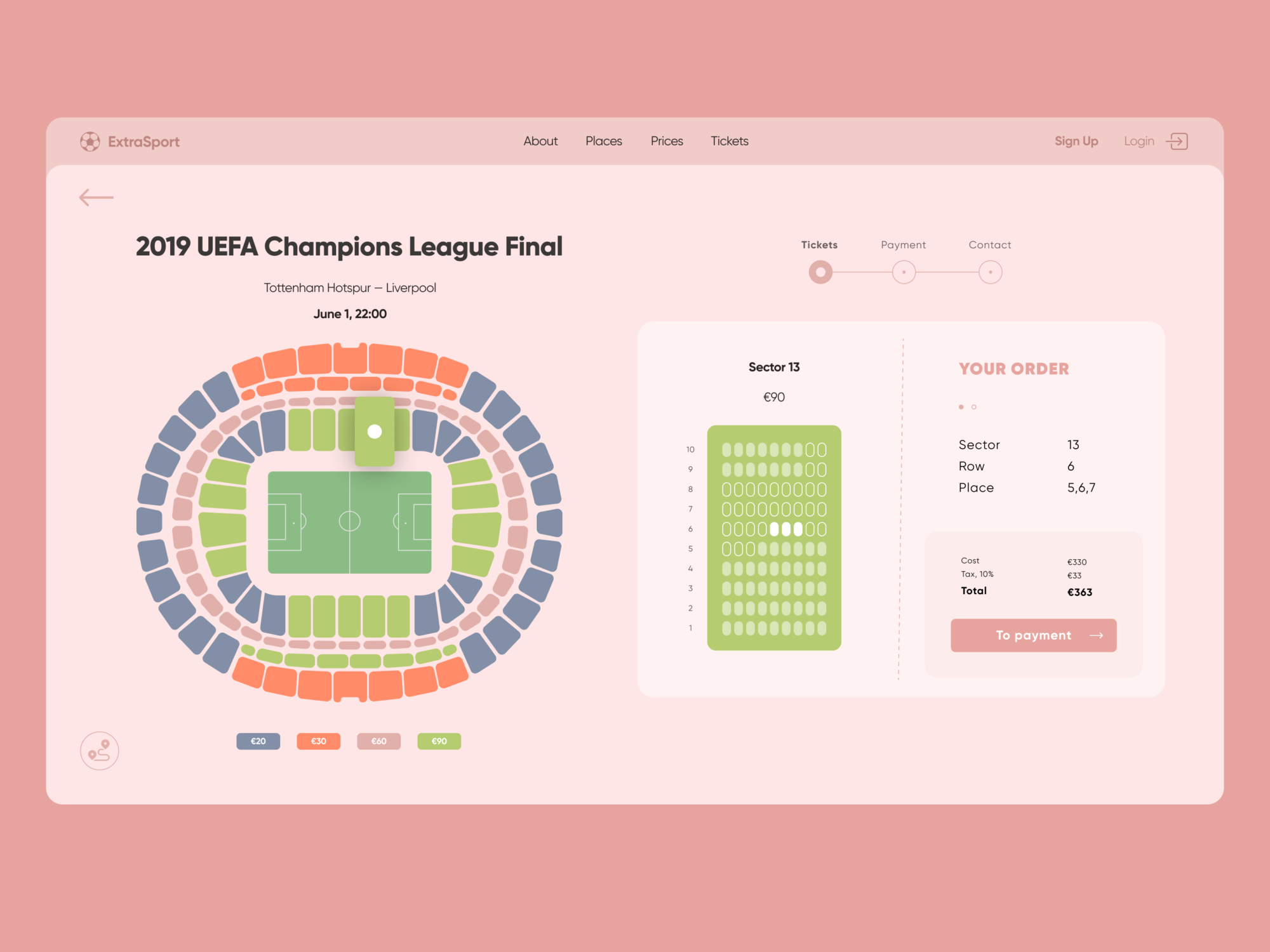
And here is a look at the page section aimed at sales: users can choose a place, get a recap of their order and make a payment right there.
Landing page for a currency converter
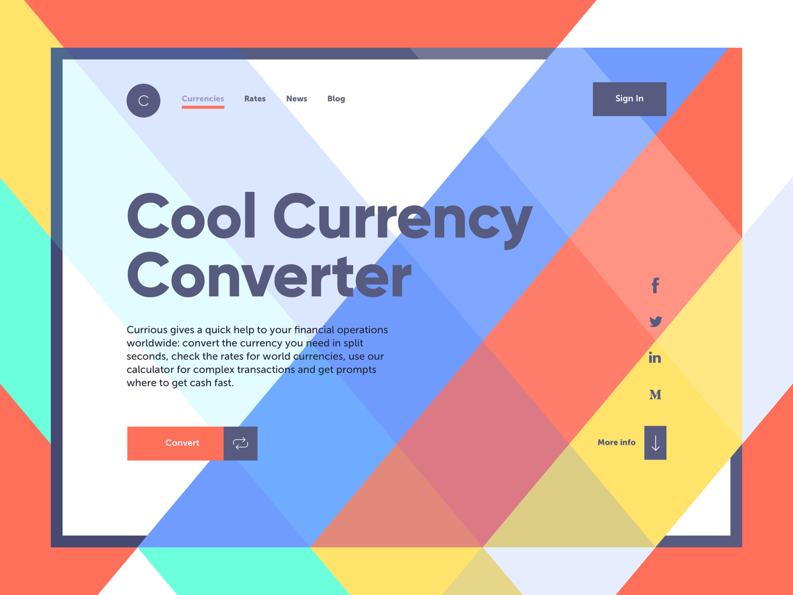
With easier and faster traveling, online financial operations, and global businesses, currency exchange and exploration of currency rates become a part of the routine for many people. Why don’t we add some style to it? Here’s a quick landing page concept for Currious, simple financial service with an online currency converter. Geometric pattern, clear tagline, ability to do the core operation right on the page, and quick connection to social networks of the service.
Landing page for a kindergarten
This landing page of the kindergarten uses a big funny and cute monster mascot designed and animated to entertain users and set the needed emotional background. The layout features playful but highly readable font, organizes the information in a clear list and marks the clickable elements.
Landing page for a babysitting service
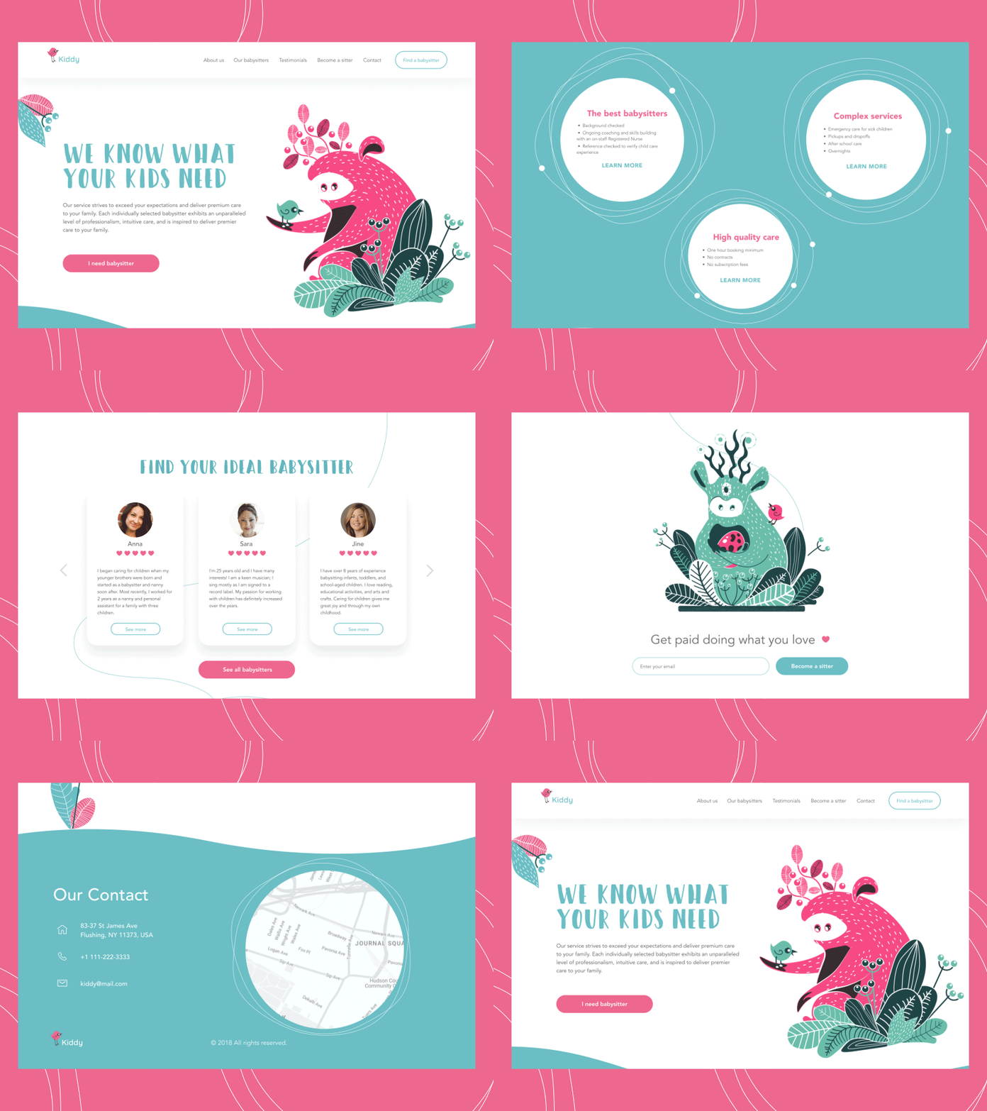
This landing page design is full of cuteness. No wonder: it promotes the service connecting babysitters with their clients. The feeling of cuteness and positivity is supported by several factors, among which animated custom illustrations with funny characters play the key role. They transfer the message and the mood, create the needed atmosphere before the user starts reading about the service, and give the whole page a unique look. Although the color palette is pastel and peaceful, creating enough contrast and making the core details scannable. Smooth scroll animation enhances the feeling of integrity.

The landing page includes all the classic components: it describes the service, gives the direct connection to the top professionals, features testimonials from clients and shows users how to contact the service representatives. What’s important, users aren’t forced to scroll the entire page if they want to apply for a babysitter quickly: they get the needed buttons to do that right from the first pre-scroll screen.
Useful Articles and Design Collections
Check more creative sets of UX design concepts and articles on best design practices.
Negative Space in Design: What It Is and How To Use It
How to Make User Interface Readable: Tips and Practices
10 Reasons to Apply Illustrations in User Interfaces
22 Impressive Web Design Concepts for Various Business Objectives
5 Basic Types of Images for Web Design
The Anatomy of a Web Page: 14 Basic Elements
Photo Content in User Interfaces: 7 Basic Ways to Use
Take My Money: UX Practices on Product Page Design
5 Pillars of Effective Landing Page Design
Design for Sales: 10 Creative UI Designs for Ecommerce
Originally written for Tubik Blog, graphic and video content by tubik
- English
- Ukrainian


