Hero Images in Web Design: When, Why, and How to Use
Hero Images in Web Design: When, Why, and How to Use Read what is hero image, why it's important in web design and how to make it work for your goals. Check the types of images and a big pack of web design examples.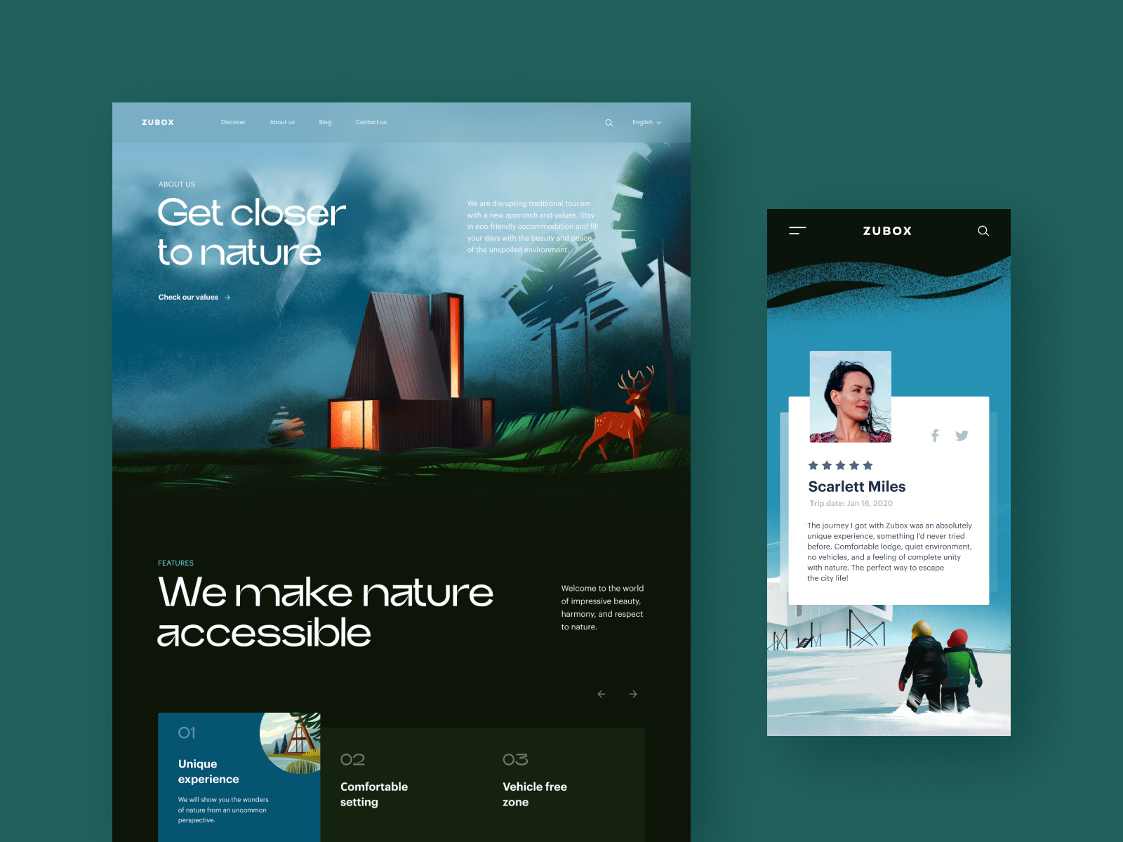
Don’t forget, you are the hero of your own story. (Greg Boyle)
With the growing attention to prominent visual details and diversity of graphics on modern websites, the approach of using a hero image seems to move from trends to well-established strategies. In today’s article, we’re going to discuss what is hero image, why it’s important in web design, and how to make it work for your goals. And sure, we’ll show that all on multiple web design examples by the Tubik Studio team.
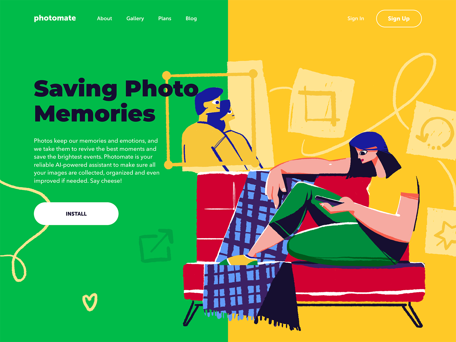
Landing page design for a photo service using a hero illustration
What Is a Hero Image?
In web design, “hero image” is a term that is applied to a big eye-catching image that is usually seen in the above-the-fold zone of the webpage right below the website header. This simple scheme from Balsamiq covers the basic idea.
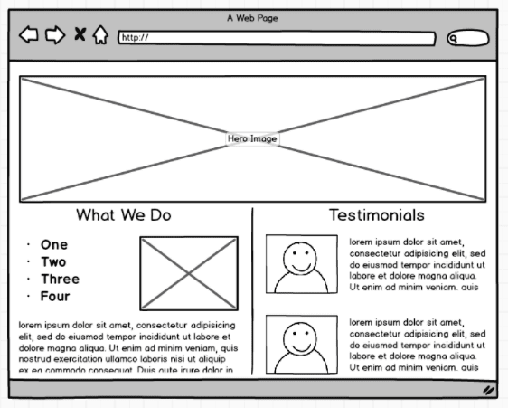
As it’s seen from the wireframe above, a hero image usually takes almost all pre-scroll full-width space on the page. The other layout elements (call-to-action button, text, etc.) are located in the header and on or around the hero image to present a consistent and balanced visual composition.
Make no mistake, the term doesn’t require that all images of this kind should include only a human, animal, mascot, or any other kind of character. Don’t get stereotyped with that “hero” part. It can be also the theme image featuring a landscape, a device, a building – anything, even an abstract model or composition. The main idea is that the image instantly grabs attention and allows for setting a quick visual, emotional, and informative connection with the user.
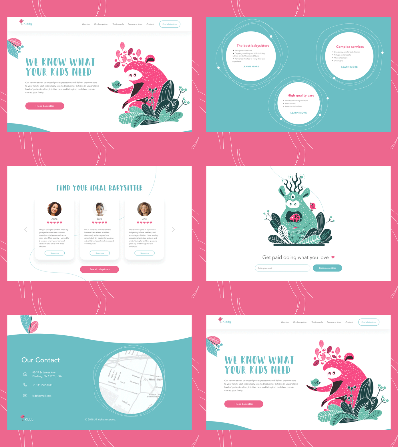
This landing page for a babysitting service applies an animated hero image with funny characters
Why Is Hero Image Important?
Why is it hero? There are several points to answer this question.
- Attention and impression. First, because it activates the power of visual perception from the first seconds. No secret, there is no much time to impress the first-time visitor to the website or to catch attention to new offers. The hero image gives a chance to impress the users as fast as possible.
- Information. Most people perceive and decode images much faster than words. It means that the hero image is not only the element of attraction – it’s also an informative part of the page, providing a quick visual message about the content.
- Navigation. The correct composition of the hero image can strengthen navigation and bring more attention to the call-to-action button.
- Emotional appeal. No secret, the emotional background of user experience plays a big role and makes communication between the website and its visitor more human-like. Hero images are a well-proven way to transfer the needed emotions via images, shapes, and colors, and set the needed atmosphere from the first seconds of interaction.
- Aesthetic satisfaction. The offer and functionality of the website are a priority, sure. Still, people also expect to get their eyes pleased. Aesthetics means much in terms of high competition on the web and rising desirability as a part of a positive user experience. A hero image is one of the ways to activate aesthetics at once.
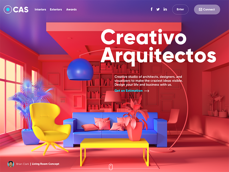
The website of the design studio uses full-screen hero images to both impress the visitors and inform about professional abilities.
What Types of Graphics Are Used for Hero Images?
The type of graphics for the hero image and the message they transfer depend on the goals for this particular webpage and the type of the website in general. It can be news that has to catch users immediately, the image reflecting the nature or the benefits of the offer or information, fresh publication that deserves the most attention, and so on. E-commerce websites often use hero images to present bestselling products, sales and special offers, strategical services, or hot deals.
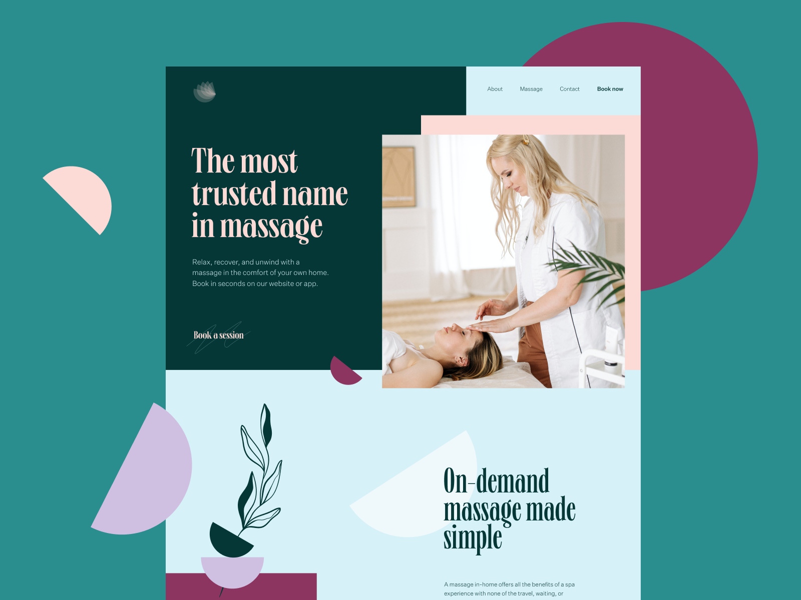
This website presenting and promoting massage services uses the thematic photo as a hero image that quickly informs about the nature of the offer in the above-the-fold area of the home page
As for the type of graphics, the hero image may include the following.
Photos
The essential benefit of photos is that they connect the stuff which users see on the web page with a real world of physical things and live people. Photos have been a part of human reality for many decades, much before the Internet’s advent. That’s why we feel the visuals of this kind like intuitive, close, and clear. What’s more, with all those devices that let any of us capture something in a second, photography is really a part of everyday life. So, used on a website, it sets strong associations and may reflect the needed atmosphere in a style typical for the target audience.
What’s more, photography is also a kind of art. Photos let you set the balance of realism and aesthetics in your web user interface. You can keep the necessary style appealing to your target audience and creating the necessary emotional background. This is one of the reasons for choosing photos to support articles on blogs and media websites.
Furthermore, photos are the main tool of visual presentation of goods on e-commerce websites where the principle “you get what you see” is a vital part of success.
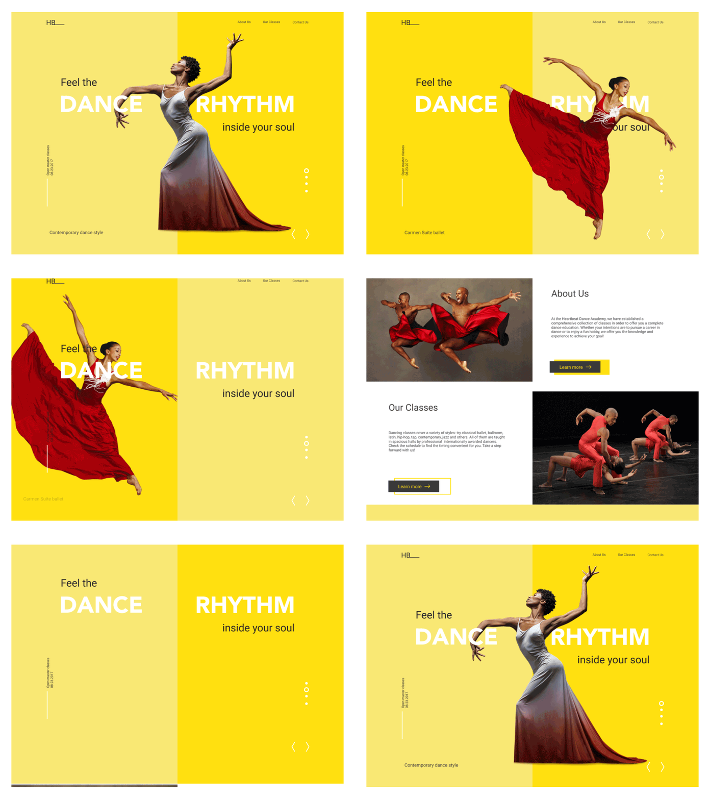
The landing page designed for Dance Academy applies animated hero images on the dynamic slider that instantly connects visitors to the theme of dancing and informs about the closest classes.
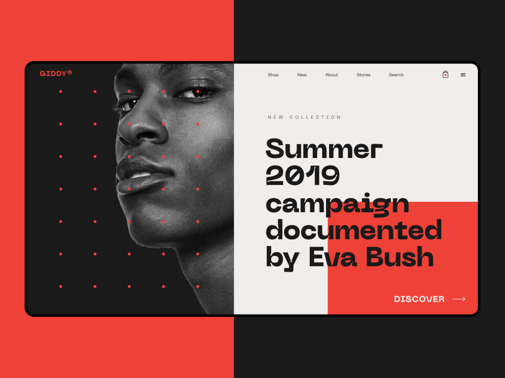
Fashion e-commerce website uses photos as hero images catching attention and setting the proper visual style.
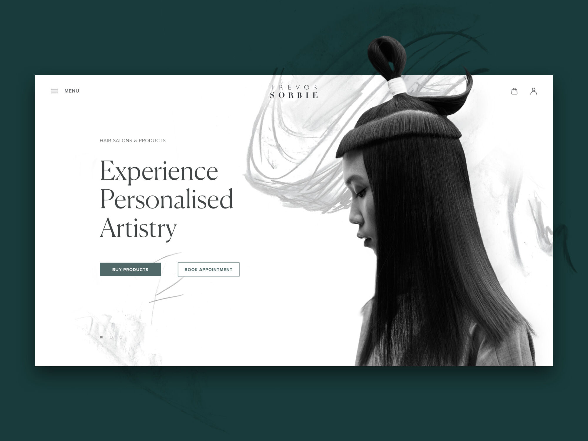
Photo as an impressive hero image as a part of the website redesign for Trevor Sorbie, the British celebrity hairdresser.
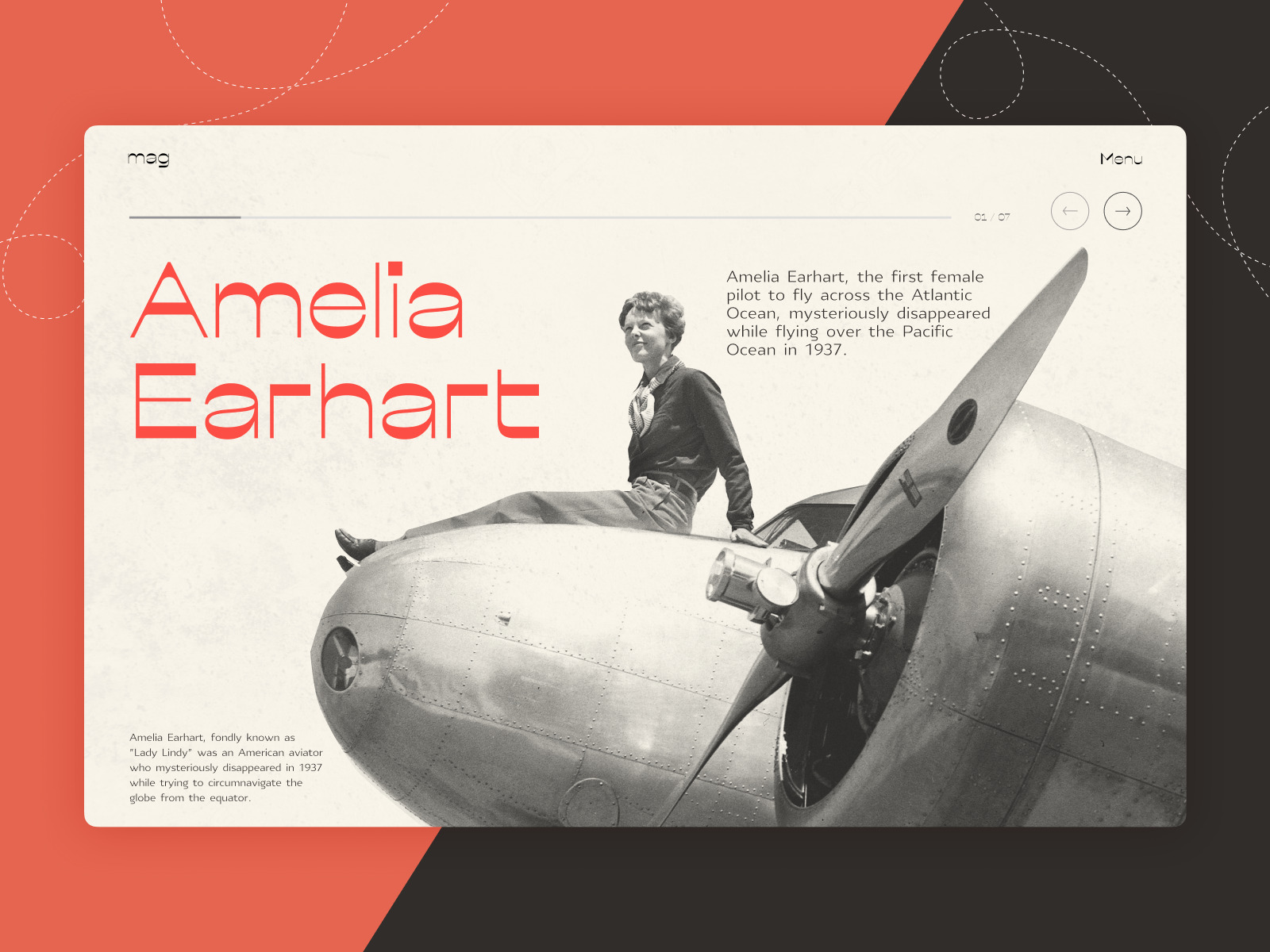
Vintage photographic hero image for the web editorial devoted to powerful women that have changed the world
Illustrations
A big web design trend now is using custom illustrations for a variety of website needs, including hero images. Made in various styles, custom graphics effectively support the quick perception of the information on the page or screen. They also set the solid foundation of visual originality and adds aesthetics and beauty to landing pages, blogs, and websites.
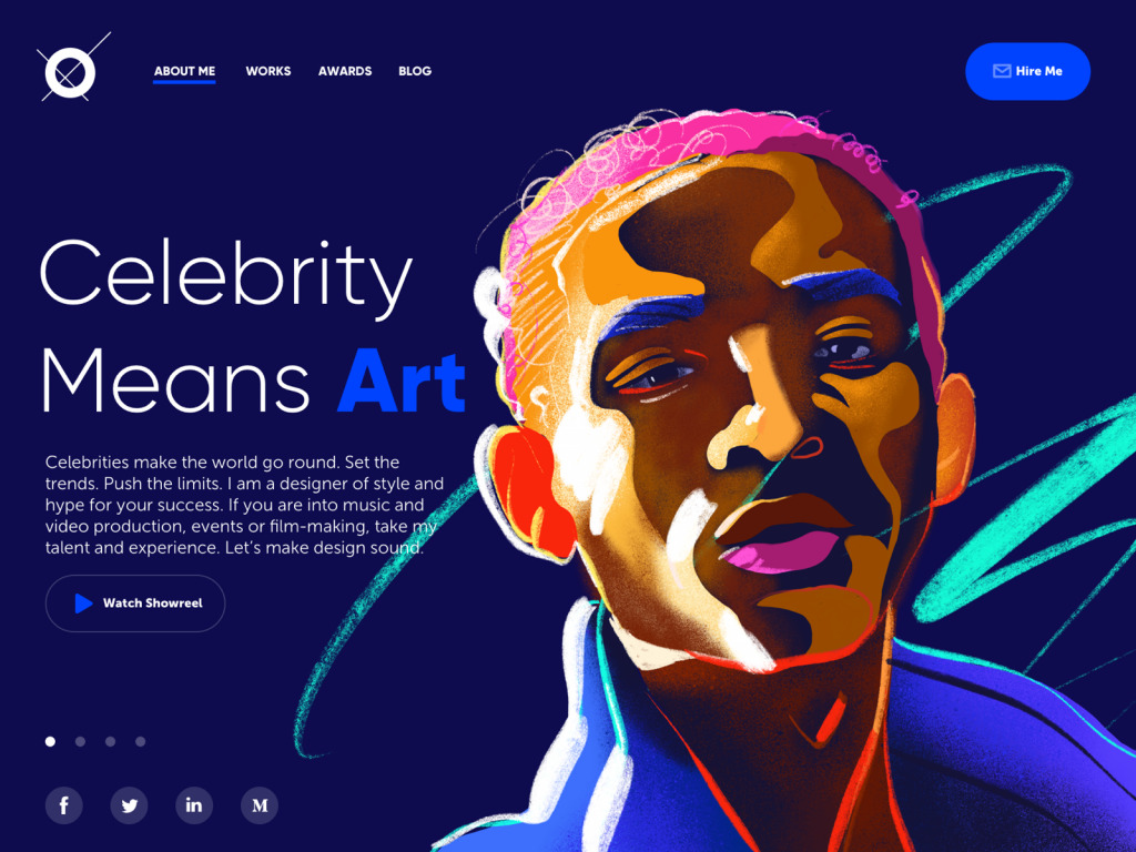
A concept of a portfolio website for a designer that specializes in projects for celebrities, entertainment, music, and film production. Dark background in combination with the custom hero illustration looks more vivid and sets the association with the atmosphere of a concert stage.

Page for the website for ecotourism services using impressive and atmosperic custom illustration as a hero image
3D Graphics
One more type of web visuals growing its presence this year is 3D graphics, visuals created by turning 3D wireframe models into 2D images. Many of them have photorealistic effects which are their big advantage for web design. 3D renders may serve well in cases when photo content you need is impossible to get or highly expensive. Although creating the images of this kind demands specific skills and is quite costly and time-consuming, well-done 3D graphics are highly attractive, trendy and convincing so they can have a great impact on web design looks and conversion rates. That’s why now they are also very popular in hero images.
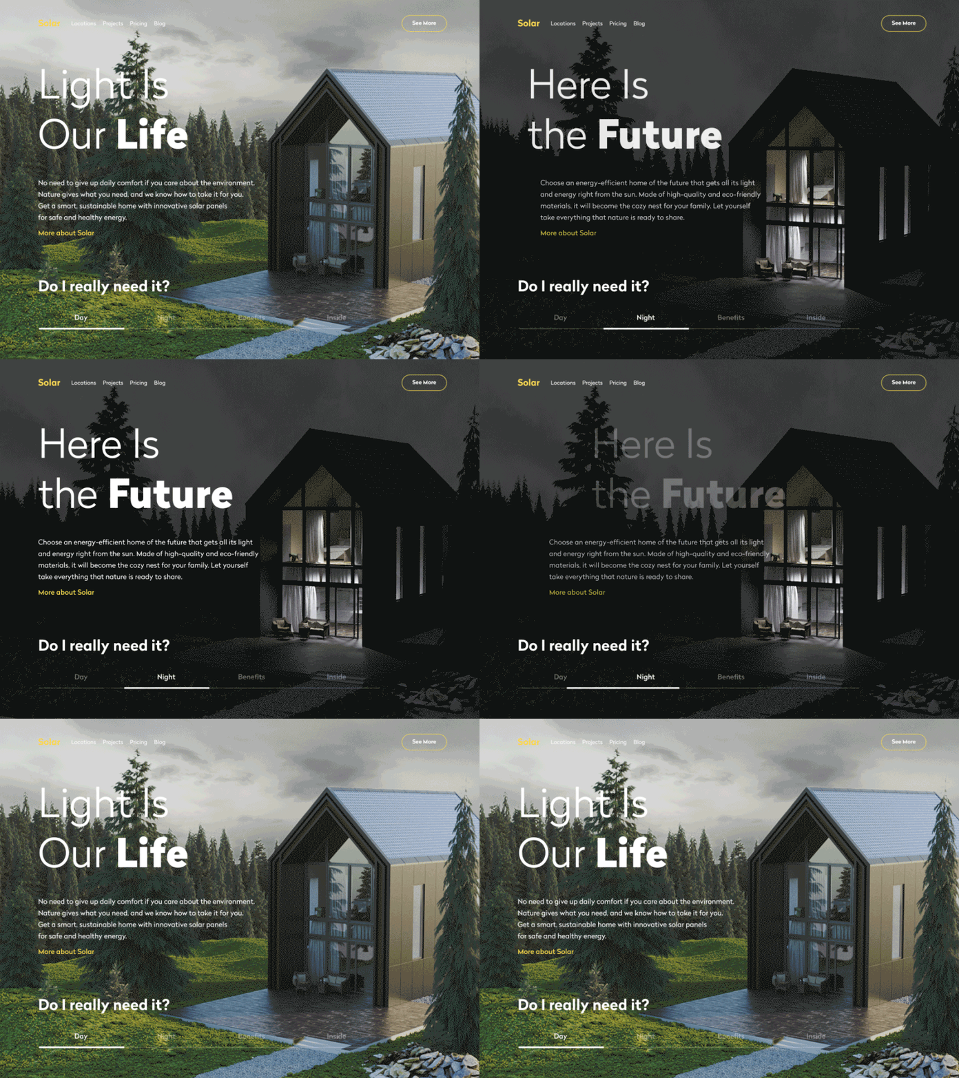
That’s a website of a company that designs and builds sustainable homes using solar power to get all the needed energy. The 3D-rendered model of a house allows users to see the photorealistic image of the offered service and even manipulate it to see the view in day and night mode.
Practices of Using Hero Images in Webpage Design
Now let’s discuss some strategies for hero images that work effectively.
Consider using clear and laconic tagline and make it work together with the image
A tagline is a short and powerful line of text, a kind of slogan that sends a quick and clear message to the reader. It may inform about the core benefits or a problem solved with the product; it may call the reader to action or ask the question that is answered in the rest of the text on the page, etc. If you use a hero image, its harmonic combination with a tagline may be an effective idea: this way the image is supported with the power of words, while the words are made more expressive with the visual.
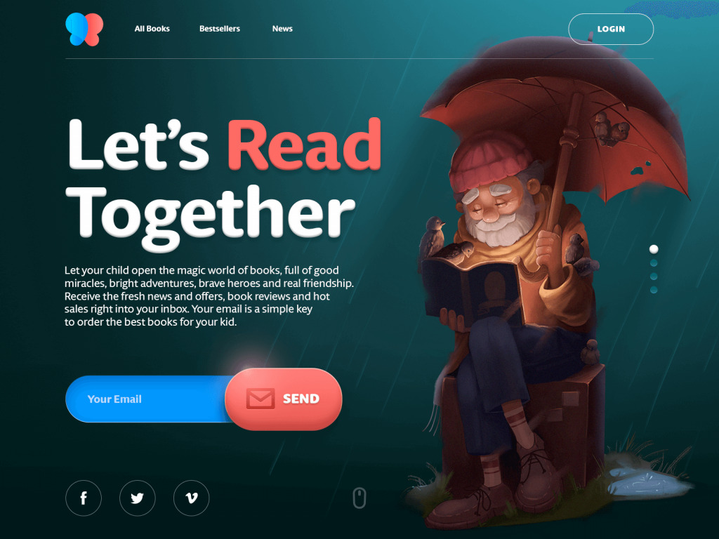
Here’s the webpage for the online bookstore selling children’s books. The hero illustration instantly creates the proper atmosphere and together with a simple tagline encourages users to subscribe.
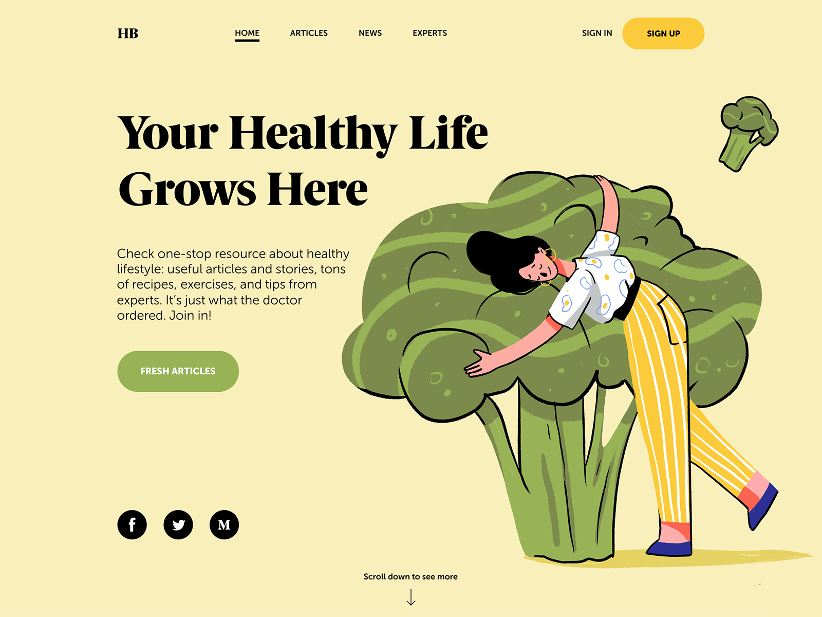
Another example of the web page where hero image and copy content present solid composition, set a positive atmosphere and inform users about the theme of the content the Health Blog provides.
Play with fonts
Typography is not only a way to let users read the information in text. It’s also the part of the design, with its own mood and goals. The hero section of the webpage is a good reason to search for the fonts that will also visually reflect the style and mood of the hero image – or vice versa, will present a total contrast to it, this way attracting attention and rising interest. So, take your time to find the harmonic fonts, that will work together in one composition. However, keep your eye on the issue of readability: too much of the experiment can lead to unreadable copy and poor user experience as a result.
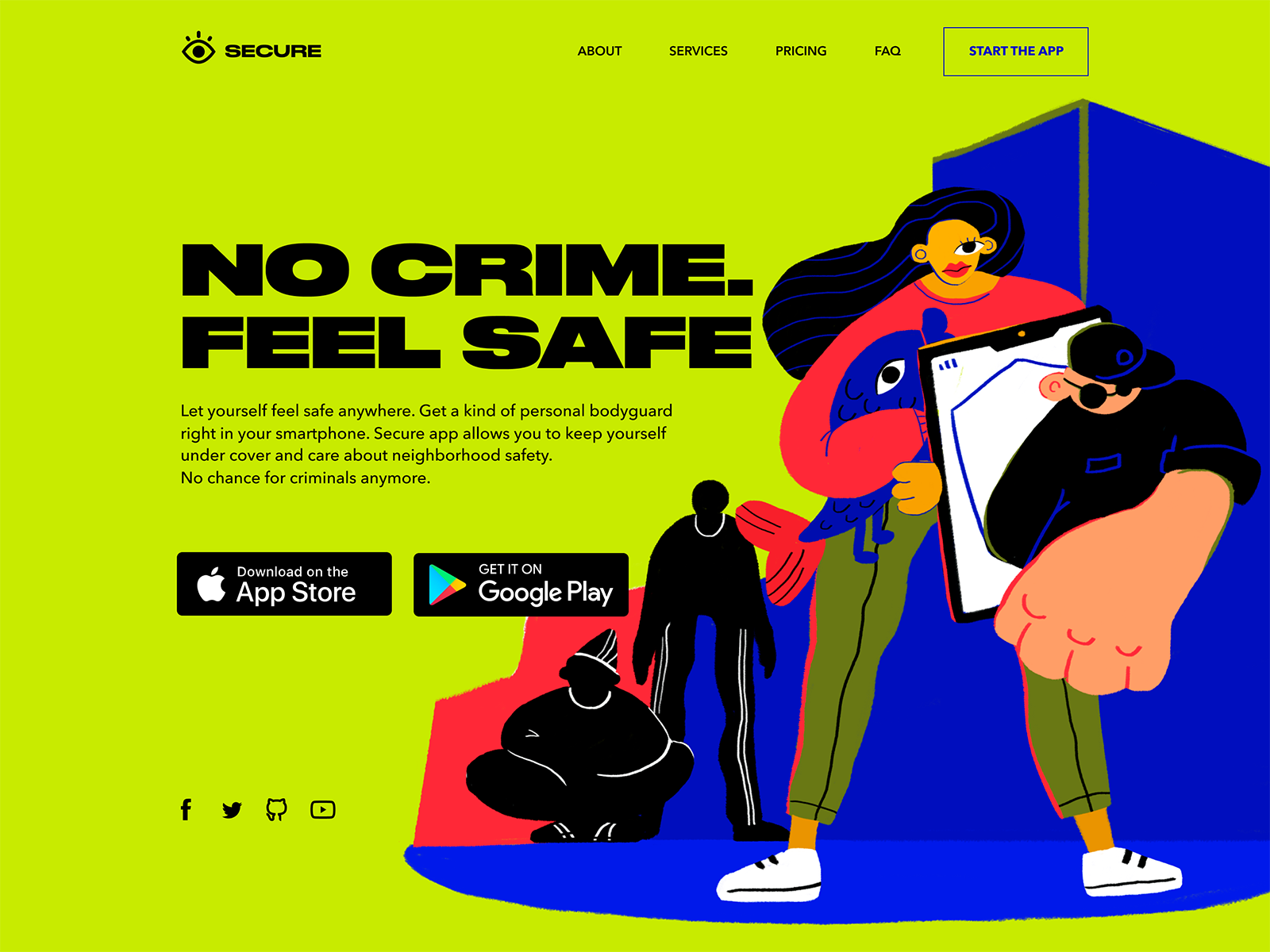
The landing page for the security application uses the visual contrast of a hero illustration full of irregular curves and thin lines and bold solid Druk font.
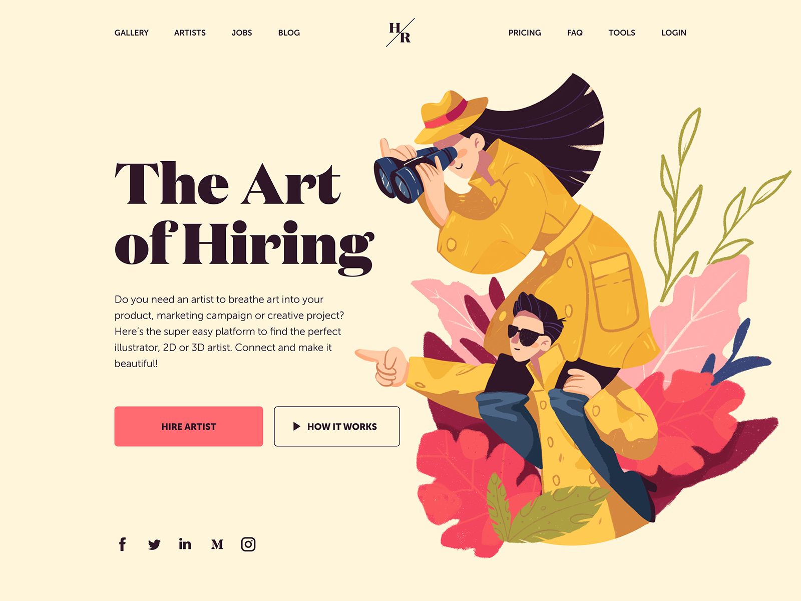
And this landing page with a hero image features the choice of a serif font Domaine for the tagline. It visually reflects the style of the illustration. Yet, for the description copy block, the designer chooses a sans-serif font that is highly readable.
Let navigation elements and hero image work together
Whatever stylish and harmonic is your webpage design, it’s not valuable if it doesn’t convert. One of the core conditions of easy conversion is making a call-to-action element quickly found and clear. So, in pursuit of beauty, don’t forget about the main goal behind the webpage and don’t let the hero image to overcome the CTA. Instead, make them work together and support each other. Let the hero image and navigation work together.
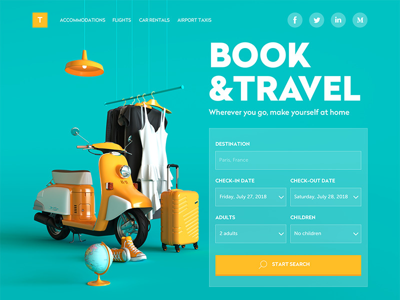
This design of a booking service website uses a prominent hero image in the form of 3D graphics. To make the composition of the layout not only aesthetic but also effective, the designer uses the same shade of yellow color both as a basic color of the hero image and an accent color for interactive elements: logo button and CTA button.
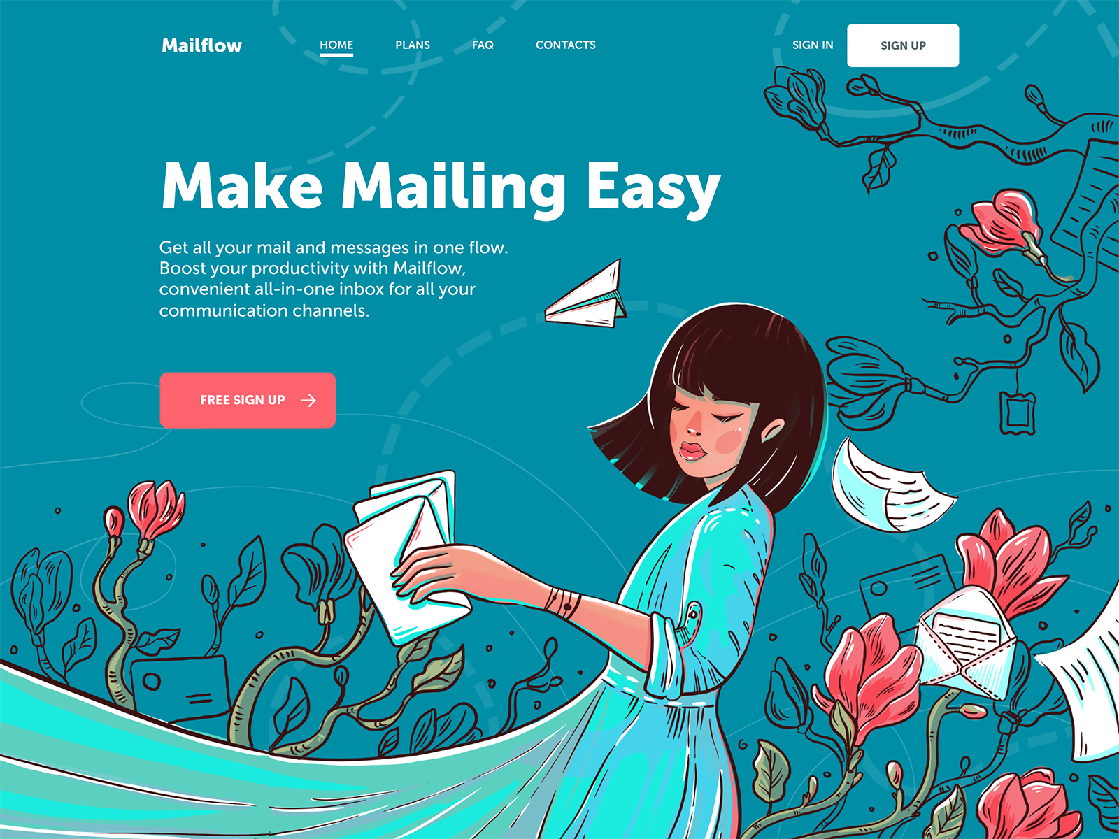
The landing page for the mailing service features another hero image used as a full-screen illustration and combined with navigation elements by color accents.
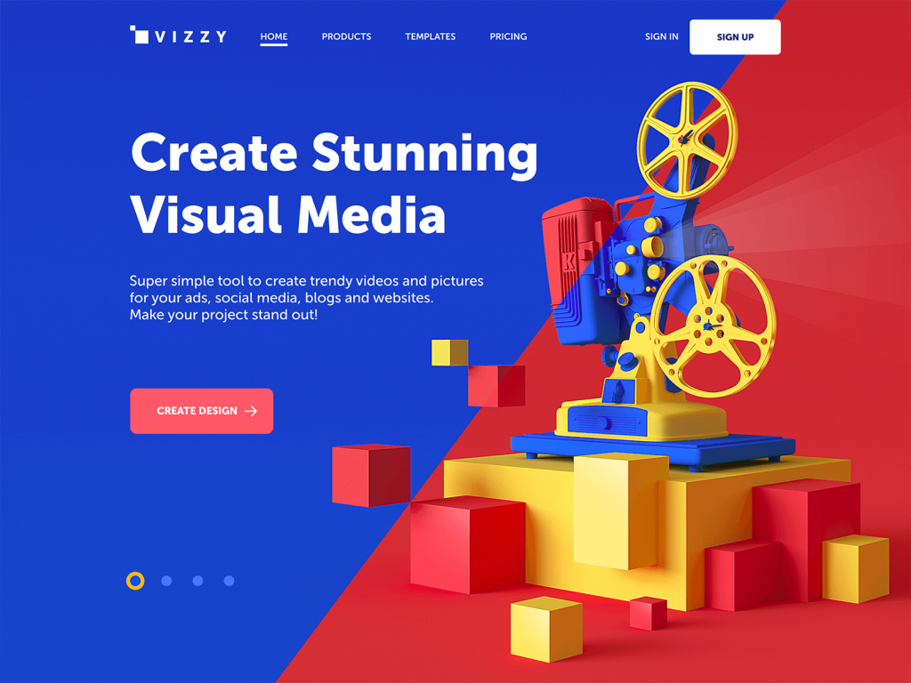
The landing page for the visual media tool uses 3D graphics as a hero image and the split screen making the geometric composition even more expressive. The color accent used for the CTA button makes it instantly visible and visually united with the image.
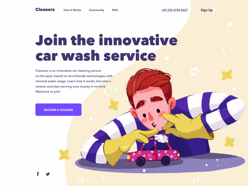
The landing page for the car wash service website also uses the color as the main tool uniting visual details of the hero illustration, the copy content and the CTA button.
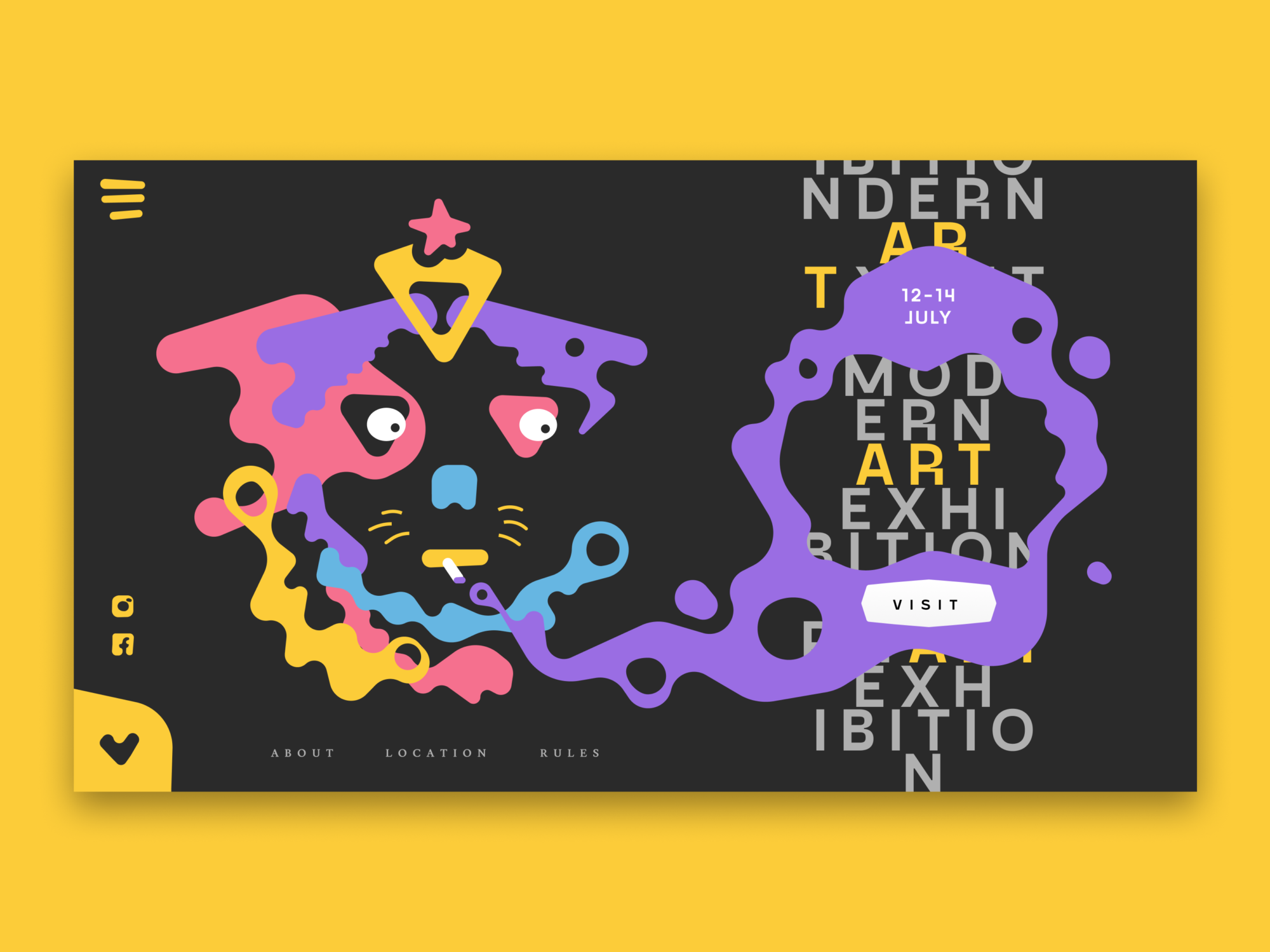
This landing page for the modern art exhibition features the experimental integration of typography into the hero image this way setting the original visual composition.
Add animation
Another way to strengthen a hero image is by adding motion. Animation is an effective approach to add even more emotional and informational power to the visuals, enhance storytelling and set more associations. As well, animation helps to add originality to design.
The website of the innovative energy service quickly grabs attention and informs users about its nature and values with a nice animated hero image.
The landing page for the illustration conference builds the composition on the original and eye-pleasing animated hero image.
The design for the Crypto Blog uses the abstract geometric 3D animation as a hero image and visually unites them with the layout via the color accents and split background.
Evoke emotions
As Aarron Walter said, “When you start your next design project, keep this principle in mind: people will forgive shortcomings, follow your lead, and sing your praises if you reward them with positive emotion.” Sure, it doesn’t break the fact the functionality and simplicity of the product are the foundation of user experience. Yet, except it, users also strive for the lovely facade and positive vibes. As visuals are the great tool of setting the needed mood, one of the primary goals designers set for hero images is evoking the emotional appeal of the design.
The landing page of the kindergarten uses a big funny and cute monster designed and animated as a hero image to entertain users and set the needed emotional background.
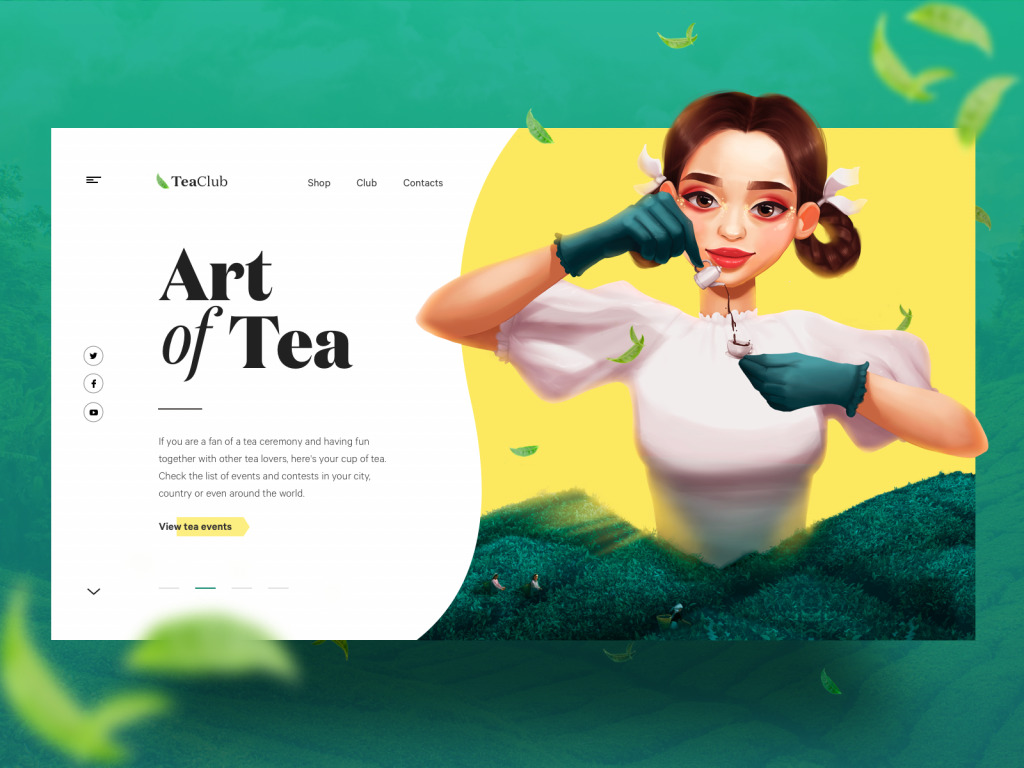
The cartoonish hero illustration for the page of tea events on the Tea Club website quickly sets the visual connection to the theme and transfers the great atmosphere of tea ceremonies.
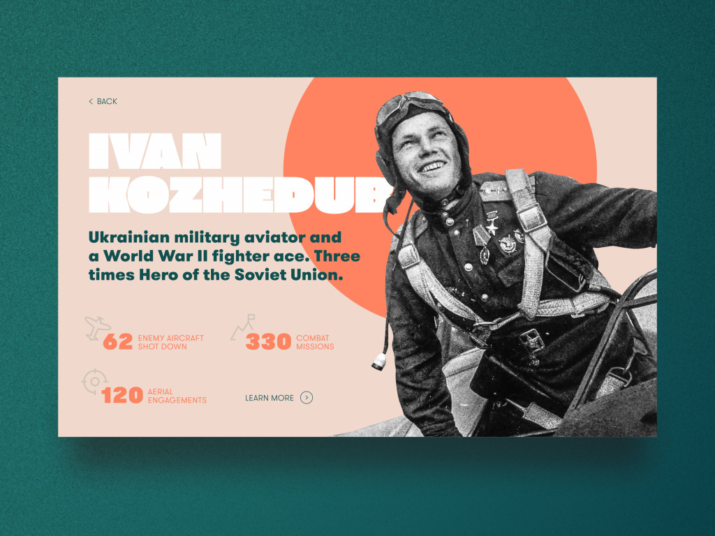
The page designed for the education website devoted to the Second World War also sets the emotional background with a hero image – this time hero in its literal meaning as it’s an archive photo of the personality presented on the page.
Add artistic vibes
With more and more competition on the web, designers are looking for different tricks to win the struggle for users’ attention. One of the popular trends now is the artistic, sometimes experimental digital illustration, often used in hero images. Creative experiments seem to combine traditions and innovations for the new circle of web design evolution.
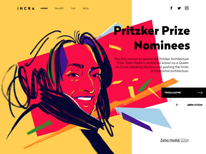
The web page of the gallery of Pritzker Prize winners and nominees in the online architecture magazine features the artistic digital portrait of Zaha Hadid.
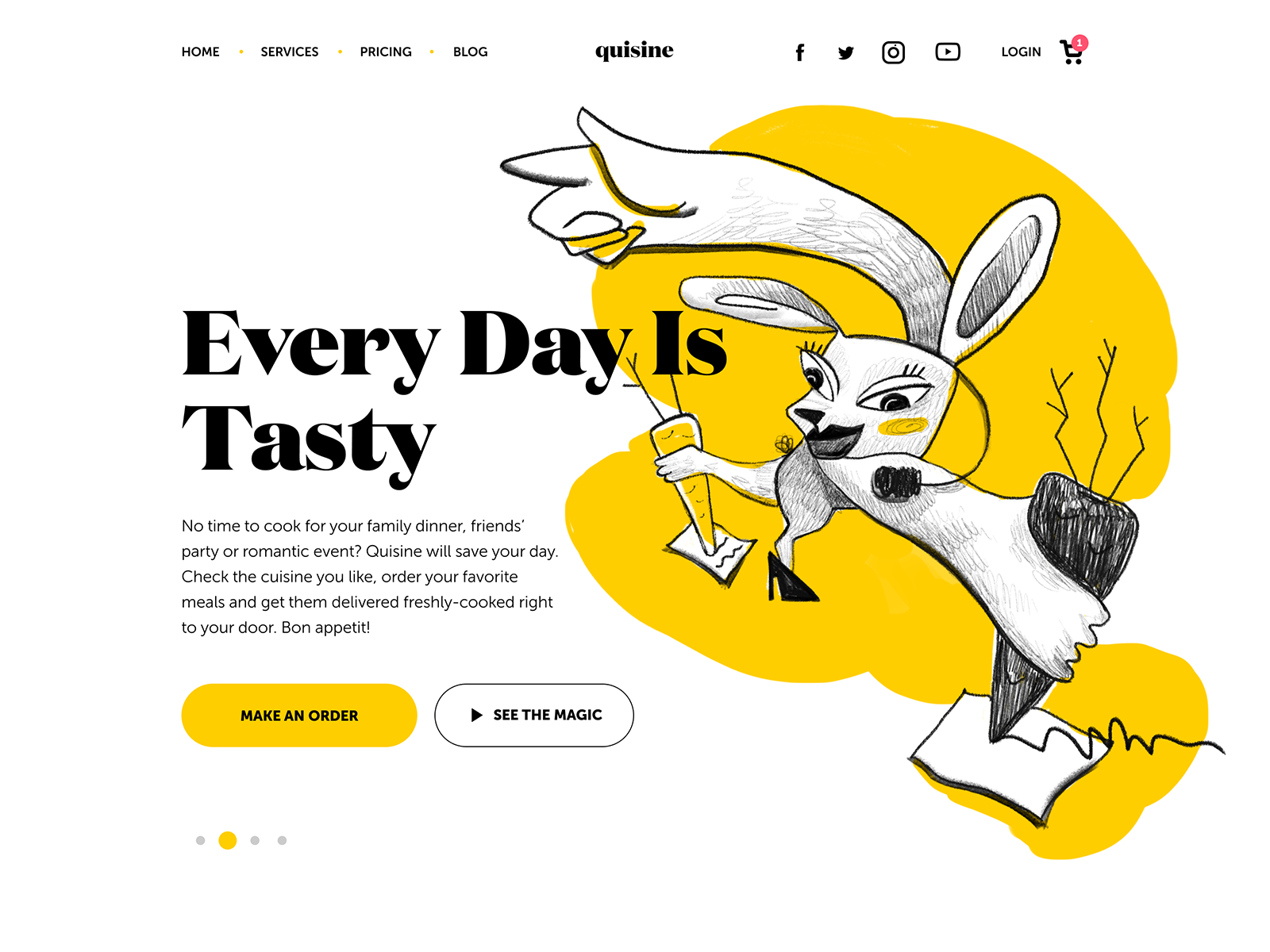
The experimental illustration is used as a hero image on the website for the food delivery service. You may like it or not, but it will definitely catch your attention.
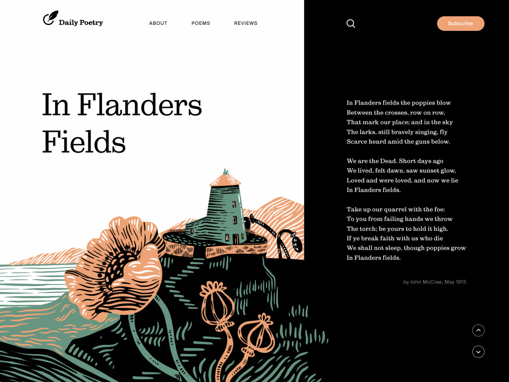
The web page designed for the Daily Poetry website uses hero illustration integrated into the page and this way strengthens the poem with visual images and melancholic palette.
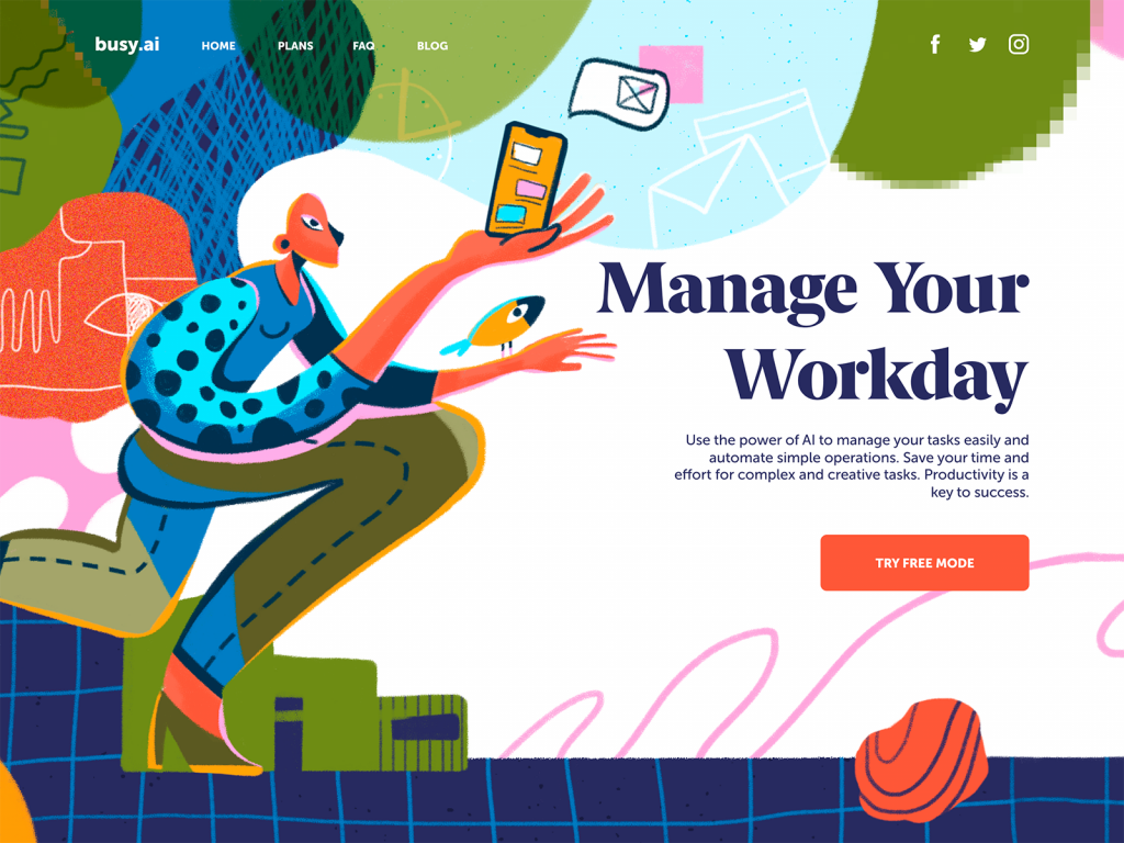
The landing page promoting the productivity service features the hero illustration inspired by the high art.
To sum up, we can see that hero images present a diverse and flexible tool in a web designer’s bag of tricks. It has great potential in amplifying both usability and aesthetics of the web page, this way engaging users to learn more.
Useful Articles
Web Design: 5 Basic Types of Images for Web Content
Functional Art: 10 Big Reasons to Apply Illustrations in UI Design
UX Design: How to Make Web Interface Scannable
Negative Space in Design: Tips and Best Practices
Single-Page Website: Best Design Practices
3C of Interface Design: Color. Contrast. Content
Call for Attention. Powerful CTA Button Design
Originally written for Tubik Blog
- English
- Ukrainian


