Basic Do’s and Don’ts of Effective Website Design
Basic Do’s and Don’ts of Effective Website Design In this article, we share some fundamental do's and don'ts of effective website design and creating web pages that are appealing, actionable, converting, and optimized.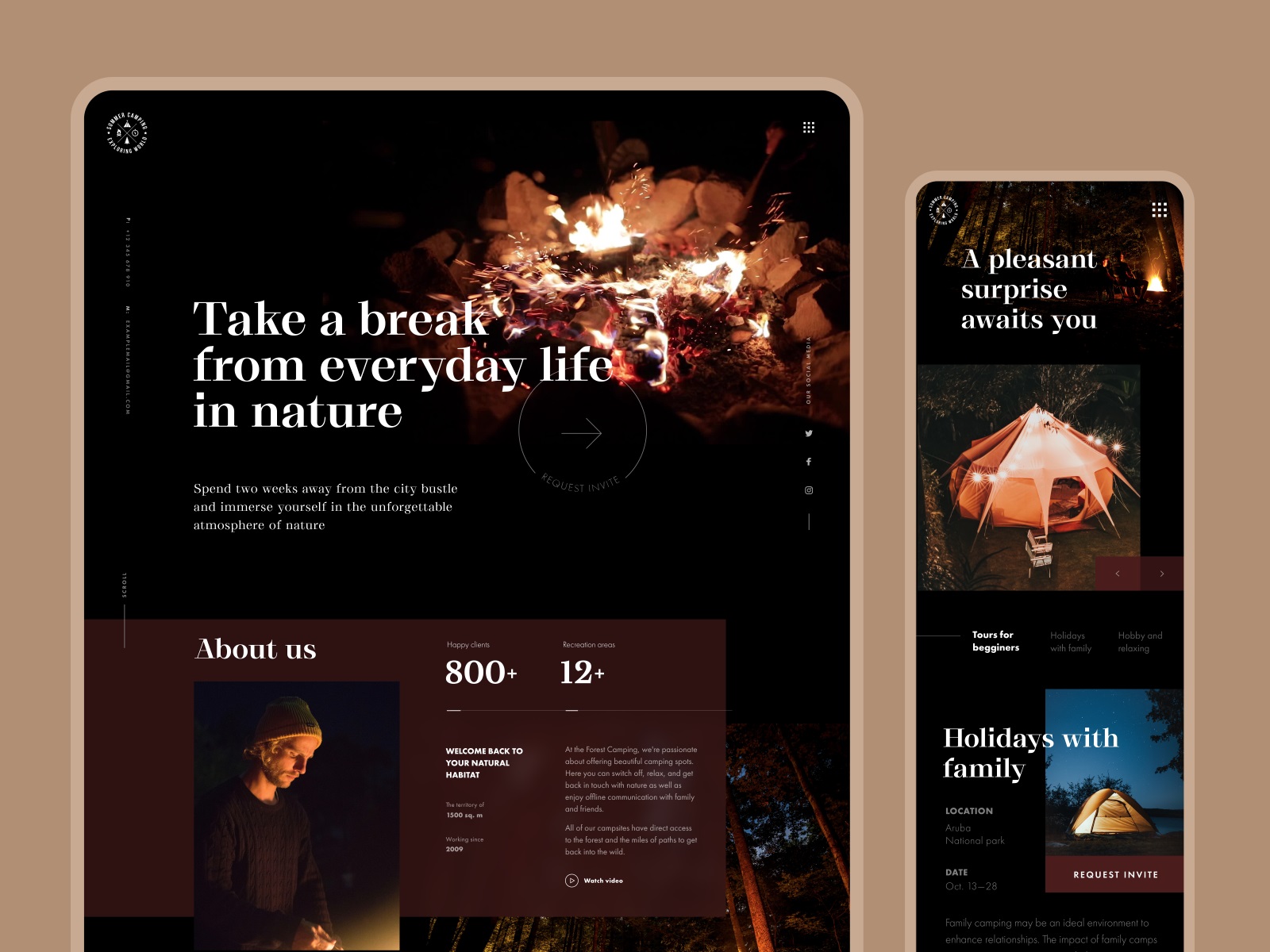
Here’s a cold truth: if you’re not a professional website designer, creating a near-perfect website is quite challenging. Using templates and appealing themes can do the trick, but you’ll also want to understand some basic rules – only then you’ll be able to get the best results. Moreover, there’s so much competition that it sometimes feels like everyone’s website looks better than yours! And there is such a plethora of choices on the web that you have a short time for understanding what practices will help or harm your website.
In this article, we’ll share some fundamental do’s and don’ts of effective website designing that can take you a long way in creating web pages that are appealing, actionable, converting, and optimized. We’ll cover eight elements of web designing and learn and do’s and don’ts of each. So, without further ado, let’s get started.

Design by Tubik
Website Layout
Before you begin designing your website, it’s crucial to figure out the layouts. The layouts are patterns or frameworks that define your website’s structure – providing clear navigation paths within web pages by putting essential elements together.
In this web design style guide, we’ll share with you the do’s and don’ts of the website layout and what you can do to create a clean and memorable design:
Do’s of Website Layout
- Make sure to use UX following the standards users know well
- Focus on user-friendliness
- Use common design elements
Your web design should always focus on enhancing the user experience – and the first step to doing this is ensuring standard, easy-to-use, and familiar UX. Your web page should have common design elements, so they don’t have to think or waste time figuring out the meaning of the components you’ve used.
Don’ts of Website Layout
Avoid using a wholly new or complex layout
Don’t focus too much on creativity
Avoid clutter
Take a look at the Google Meet website page and learn how despite being one of the most influential and innovative brands, Google has focused on simplicity and user-friendliness:
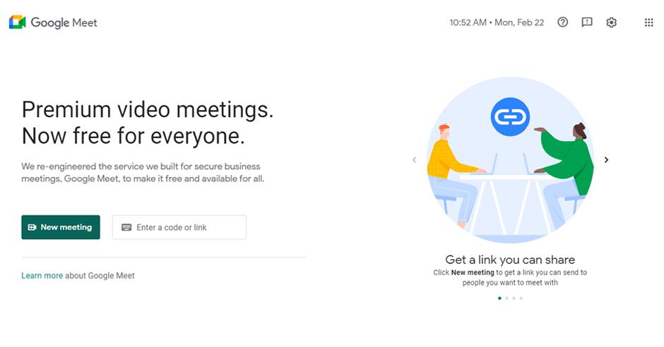
While we appreciate creativity, it’s also important to understand that any new concept should not become a barrier to your user’s experience. That’s the reason most web design experts avoid using a completely new or different layout that’s unfamiliar to their audience.
Typography
While there’s a general misconception that fonts are for tech-savvy web designers or professionals. But that’s not so. When it comes to creating a business website, it’s crucial to consider not only images and colors but also fonts.
Through this web design style guide, you’ll learn the dos and don’ts of typography – which plays a significant role in brand perception. The key to remember is ‘fonts shouldn’t just be an afterthought but at the forefront of the design process.’
Do’s of Typography
- Choose fonts that align with your brand style
- Set headlines large
- Ensure ample space between text elements
Don’ts of Typography
- Do not set continuous text in full capitals
- Don’t use an overused and unattractive typeface
- Don’t use more than three typefaces
Check out Freshworks simple and visually appealing typography consistent with their brand style and tone of voice.
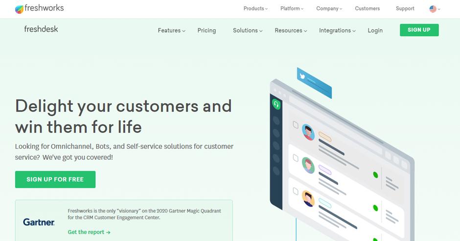
As a website designer, you should know how fonts work to choose the best font for your website design. Different fonts leave various mental images and visual appeal – and hence they have the potential to generate a particular response or atmosphere.
Website Content
Remember that your website’s texts are one of the greatest assets of your site. And to get the most out of your website content, you should be able to approach it from a strategic perspective.
So, focus on refining your texts to send a powerful and clear message that also resonates with your target market.
Do’s of Website Content Writing
- Cut straight to the chase; provide useful, catchy, and informative content
- Always proofread and make sure that your web pages are free of any grammatical errors
- Do use numbers and bullets wherever required
- Adopt a planned, focused, and optimized content strategy
- Be concise but not so vague
Don’ts of Website Content Writing
- Don’t be bland or without a brand voice
- Don’t put too much text
- Don’t plagiarize
- Don’t overdo keywords
Take a look at Trello’s website, and you’ll see how they’ve implemented all these common tips of website content writing.
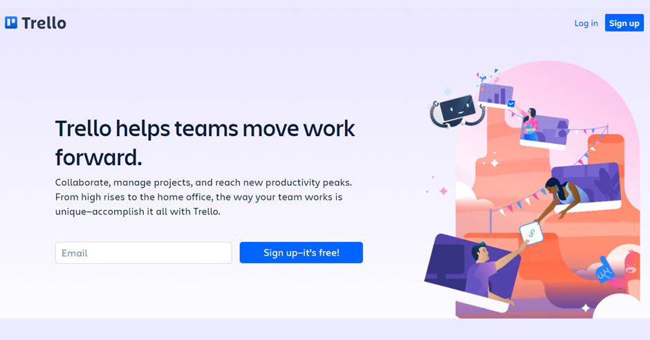
One of the essential things to remember here is ‘refining your texts in a manner they send out a powerful brand message. So, with your writing, try to fuse the right tone of voice. Be concise, use the proper vocabulary, and write in a manner that will inspire your site visitors to browse and stay on your site for some more time.
White Space
White space is just what it sounds like. Though the name sends out a clear message of simplicity, it can still add confusion if you don’t know the principles of using it properly. While space in website design is all about balancing the text-free parts, while too much can make a page appear empty, too little can your content seem cluttered.
Do’s of White Space
- Make sure that one element is distinct from the other
- Use larger gaps to indicate a switch between features of the type of content
- Make sure that all critical components are distinguishable from everything else
- Surround your CTA with a lot of white space
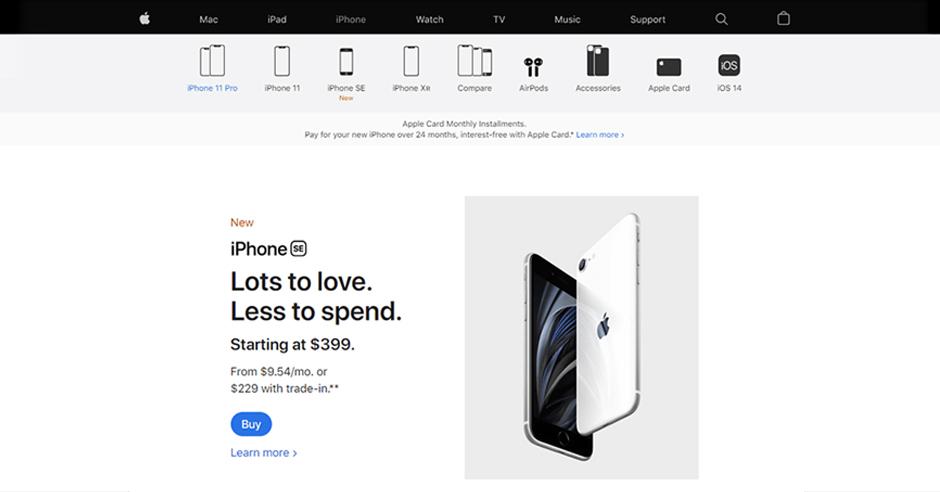
A perfect example of using white space effectively would be the website of Apple. Take a look at how well they’ve maintained the balance.
Don’ts of White Space
- Don’t forget the difference between micro and major white space
- Don’t forget to stay consistent – use the same amount of space between each line of text
- Avoid overlooking white space
For the content to really shine on your webpage, you need to have ample white space around text content. Just think of it as Yin and Yang – you can’t have one without the other.
Navigation
Your website’s navigation is the cornerstone of site usability. In other words, it’s the main interaction button on your site. So, you’ve got to ace this one. Having intuitive and effortless navigation of your site is important for ensuring that your visitors can always find what they’re looking for.
Do’s of Website Navigation
- Use clear labels for navigation
- Always use familiar words in navigation
- Follow the three-click rule: your viewers shouldn’t be more than 3 clicks away from what they’re searching for
- Always use contrasting colors for text and navigation button
- Focus on content and minimize navigation wherever possible
- Tailor navigation to content and screen size
Don’ts of Website Navigation
- Don’t waste your users’ time – design navigation to reduce their spending on finding what they need
- Don’t get fancy in your navigation
- Do not change the navigation of each page
- Don’t hide critical navigation
Occasionally, web designers try to get a bit too creative with designs, navigation, and page layouts. But then, that creativity can harm user-friendliness. So, if you stray too far from standard conventions, users will have difficulty finding the information they’re looking for and may eventually go elsewhere.
Optimizing Images
Well, good quality images are essential for your website. Not only do these images create a more immersive experience, but they also help interactively tell your brand stories. Ensuring that your website images increase user-friendliness and abide by Google’s best practices will not only improve customer experience but also increase the search position ranking.
Do’s for Website Images
- Use stock images or images you have rights/license for
- Use Alt text descriptions on each image uploaded on your website
- Resize pictures to optimize page appearance and speed
- Make sure that all images are the same style and size
- Combine images with relevant text
Design by Tubik
Don’ts of Website Images
- Do not publish photographs of someone without their consent
- Don’t spam your image file names with keywords
- Never use bad quality images for your website
The best practice would be to optimize the images, so they don’t consume too much cloud space and save your users from bad experiences. You can use apps, plugins, and software for optimizing images.
Contrasting Backgrounds
Well, website backgrounds leave a massive impact on the viewers and increase the website’s visual appeal. They allow web designers to unleash creativity and boost websites’ usability in many ways.
In this section, you’ll learn what you should or shouldn’t do while designing websites.
Do’s of Website Background Design
- Blend images into the background
- Use headers for an extra pop
- Use eye-catching elements like a splash of color or illustrations
- Pay attention to contrast; if your text is black, the background has to be light
- Use clever color UI
- Try the gradient if you don’t have proper images
Don’ts of Website Background Design
- Do not use low-quality images for background
- Avoid busy or cluttered images
- Don’t use flash
Take a look at Buffer’s homepage design and see how they’ve used a contrasting background in their hero image:
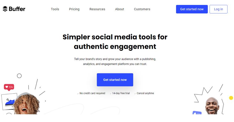
While using an image for your website background, make sure to choose an image that’s more likely to scale nicely – even for the smaller screen. For example, a wide image might not work well on a mobile phone. So, choosing such a picture, you’ll have to check its mobile-friendliness as well.
Speed Optimization
Website speed optimization is very crucial for all websites for SEO and easy loading. So, while designing websites, it is vital to use all elements so that your site loads faster.
Do’s of Website Speed Optimization
- Use Gzip compression to reduce the file size
- Use browser caching to store static files like media files, HTML documents, and JavaScript
- Minify JavaScript and CSS
- Speed up high traffic pages
Don’ts of Website Speed Optimization
- Avoid using pop-ups and external scripts that overload the page
- Do not use bulky flash content
- Avoid complicated or faulty code writing
- Uninstall extra plugins wherever possible
We understand that optimizing website speed is often a trial-and-error process. It takes a lot of practice and consistent effort. But gradually, you’ll see great results that will help you boost customer experience and increase SEO ranking.
Bonus Tip: Focus on Less Clicking and More Scrolling
One of the case studies by Crazy Egg proved that users prefer scrolling over clicking. Instead of hiding content in different pages, sliders, and accordions, try putting them all into one long page that has enough information beautifully scattered with plenty of white space.
Horse-riding club website by Tubik
Conclusion: ‘Simple’ Does the Job
If your website can boast of simplicity, a distinct yet straightforward design, it’s a job well done. Most of us focus so much on making the web design unique that we end up creating complex pages. Lesser the clutter, the better the appeal.
While we’d always encourage you to experiment and see what works best for your users, we’d also leave a friendly reminder that there are no firm rules in designing.
In fact, the best website designs don’t stick to conventional rules at all. What really matters in the user experience? We’ll ask you to have this web design style guide at your disposal – use them as a starting point, but don’t be afraid of trusting your artistic reflexes.
Efficient web design requires a designer to think like an artist, an end user, and a businessman; the result is a high-converting, user-friendly, and good-looking website.
About the Author: The guest article by Vyshnavi Basuthkar is a SaaS Marketing Analyst at piHappiness, a top customer feedback software designed to collect customer feedback.
Useful Articles
5 Basic Types of Images in Web Design
The Anatomy of a Web Page: Basic Elements
Hero Images in Web Design: When, Why, and How to Use
Photo Content in User Interfaces: 7 Basic Goals
10 Reasons to Apply Illustrations in UI Design
UX Design: How to Make Web Interface Scannable
Negative Space in Design: Tips and Best Practices
- English
- Ukrainian