


How to Resize Mockups for Different Screen Sizes in Photoshop
How to Resize Mockups for Different Screen Sizes in Photoshop Tubik Studio UI/UX designer shares his ideas how work with Photoshop can be optimized for projects in case of adaptation. Optimization of software for design.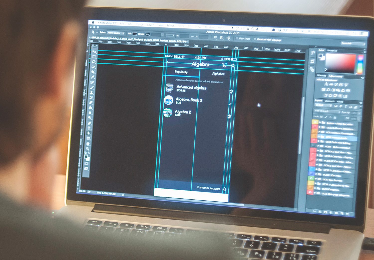
One of the most common problems in the design of applications and its further transition to the developing stage is the requirement of app adaptation to different resolutions. It takes a certain part of the time devoted to designing, and although in big companies the team can include the special person assigned to accomplish this type of staff, in most cases this task rests on the designer’s shoulders.
As our UX/UI designer Konst says, it is impossible to consider yourself a UX specialist until your own work process is as efficient as possible. This particular thought makes him constantly explore and study new ways and tricks of optimizing his work and increasing its quality. While many companies and individual designers are moving to work with more modern and specialized software for UI/UX design such as Sketch, there still are a lot of them who work with Photoshop. Moreover, as we have already mentioned before in our previous post, the more tools you can use, the more flexible you are in solving tasks as different tools and soft are efficient for different problems.
One of the ways of optimization for his own design process which Konst found for himself enables the designer to significantly reduce the time needed for adaptation. Certainly, it is not a silver bullet, but it can be useful for those who have to adapt their designs to many resolutions.
In substance, this method applies drawing in 1x in points with further pixel auto-scaling according to the set density of dpi/ppi.
Besides general benefits, there are also the following positive points if the method:
1) It allows designer to use the indices of the points directly both for margins and types (that is by no means unimportant)
2) It isn’t necessary to scale the design manually in the process of adaptation to a new resolution.
3) It isn’t necessary to scale types visually.
So, let’s get started investigating the process itself.
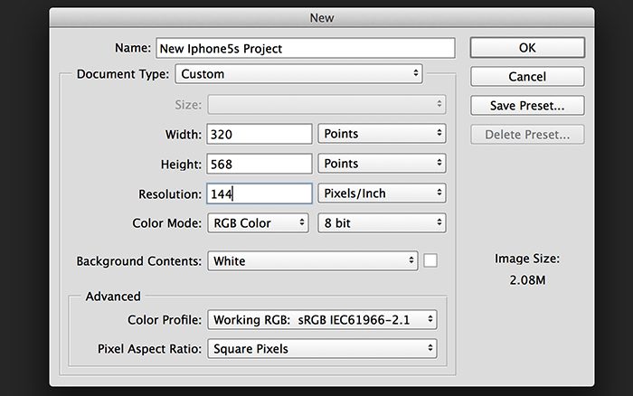
First of all, the most important thing is to customize the file of your project correctly. The most important aspect at this stage is the size of the operating zone of the project and the resolution pixel/inch.
The definition of a point is more or less clear for everybody who worked on design for iOS. However, the meaning of resolution should be discussed in more detail.
Both in web design and design of mobile applications, the resolution of 72 dpi is the equivalent of 1x resolution. It became custom on the basis that this is a standard resolution for the creation of a new file and in this resolution, 1 pixel equals 1 point. Explaining the method, the designer didn’t stop on the position of standard resolution in detail providing the link to the detailed Guide on DPI.
In the given case, the project we are creating is the one for iPhone 6 with the screen resolution of 750*1334 pixels, 2x Retina screen, in other words, 375*667 points. While the resolution in pixels can differ, a point is a constant measure and its actual presentation directly depends on the resolution parameter. In our case, we set 144 dpi that is equal to 2x modificator in the design of the application for iOS. So, now our 1 point is not 1 pixel but 4 pixels. It happens because the point contains more pixels with increasing resolution and now it takes the space of 2 x 2 pixels.
Then we can start drawing. It’s important to consider here the following nuances:
- Set the Rules of the document in Points (Right click – -> points);
- Avoid divisional measures of the objects in points;
- Avoid divisional measures of the objects placement;
- Avoid multiplying the measures from the guideline by any modificator; they should be used directly, i.e. navigation bar is drawn with the height of 44 points, not 88 as we would do in pixels;
- Instead of the pixel grid, it’s better to use the grid of 1 point. It makes drawing more convenient.
When the project for iPhone 6 is accomplished, it’s time to adapt it for iPhone 6+ or convert the project according to the given settings.
It is known that the design for iPhone 6+ needs to be accomplished in 3x, which equals the resolution of 216 pixels per inch. Before, you would have to adjust all the design manually to iPhone 6+ requirements, while with this method it is not required.
To make the explanation more applicable, the current instruction will be devoted to re-sizing mock-ups from 5s directly into 6+.
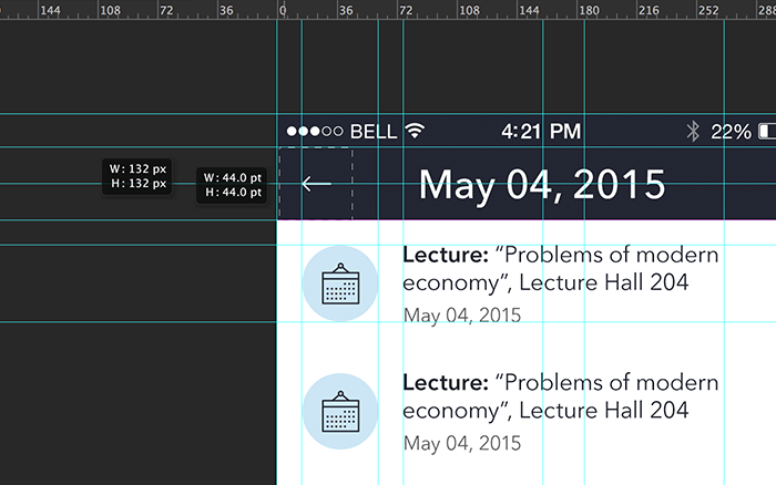
1. First of all, we want to check that our mock-up uses correct settings. The size of the canvas is set in Points. Resolution 144.
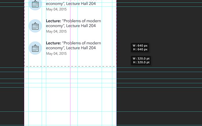
The correctness of the settings can be checked in the mock-up itself, if you set on the rulers first points and then pixels, checking the size of the same elements with marque tool. If everything is done right, then the pixel measure should be twice as big as the point measure.
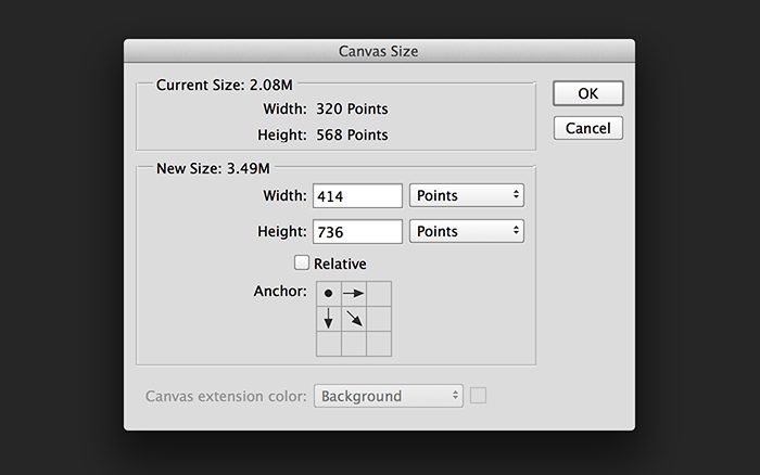
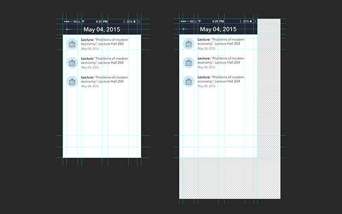
2. Now we start adaptation from 5s into 6+. First, we want to increase the size of the canvas so that it corresponded to the parameters of the new device. To do it, open “Image/Canvas Size…”. In the current case, we need to enlarge the canvas from 320×568 tо 414х736. Pay attention to the anchor point as the sized will get enlarged relatively to this point. Here the designer chooses the top left corner as to it he has already anchored the elements to its edge and such up-sizing will allow additional work on the positioning of these elements.
3. This is how the project will look like after up-sizing. Left – before, right – after. As you can see, the canvas actually got bigger.
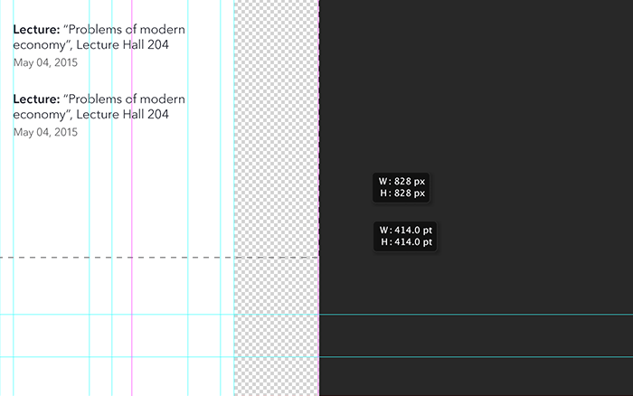
4. Having checked the pixels/points, it’s possible to see that there are some minor mismatches. 414 points are the right measure but the width of the mock-ups resolution for 6+ is 1242, not 828. The point is that we have set the resolution of 144, i.e. 2x.
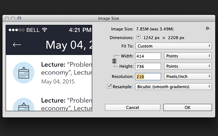
5. To correct the above mentioned, we move to “Image/Image Size…”. There we are able to see the sizes of our canvas in points and its current resolution in pixels. First, we choose “Fit To: custom”. This parameter allows using further settings correctly.
As the size of the canvas in points is correct, we have to adjust its pixel measure. For this aim, we change the resolution from 144 to 216 that is going to correspond to the resolution 3x. After inputting the measure of 216, the number of pixels should change at “2208 x 1242” which we need.
6. After this we press OK. Now by the example of any element with the fixed measure in points, we can check if the resolution in pixels changed properly.
It’s done now! You need only to move the elements of the design and fix them to actual edges, but in general, the main objects are already in their places. Therefore, you needn’t worry about the sizes of the icons and buttons if you followed the guidelines.
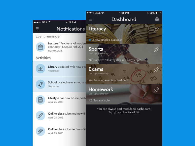
The screens for the project for Unique Publishing, in which Konst applied his method
Optimization is a great step to the efficiency of the workflow as it can save time and make it free for more creative tasks. Here in Tubik Studio we always share our ideas on how to optimize the process saving time and effort but not losing in quality as it is strategically important in work on complex design tasks.
Originally written for Tubik Blog
 https://design4users.com/how-to-effectively-resize-mockups-for-different-screen-sizes-in-photoshop/
2020-08-17
© by
Marina Yalanska
,
https://design4users.com/how-to-effectively-resize-mockups-for-different-screen-sizes-in-photoshop/
2020-08-17
© by
Marina Yalanska
,
- English
- Ukrainian