


UI/UX Glossary. Web Design Terminology
UI/UX Glossary. Web Design Terminology New set of UI/UX design glossary on basic webdesign terms. Explanation and examples of webdesign, responsive design, home and landing page, footer and header.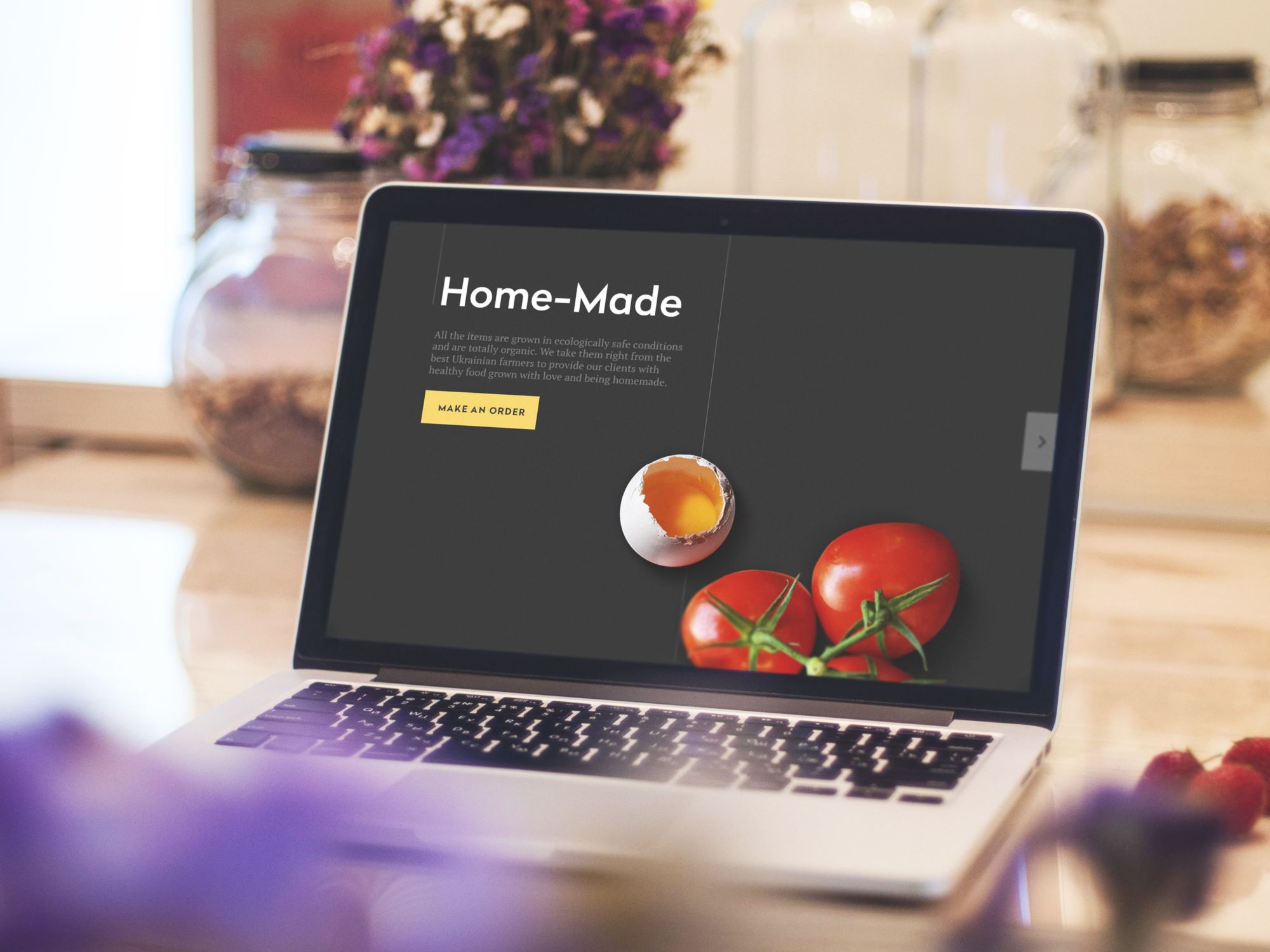
Perhaps you remember our previous issue of UI/UX Glossary dedicated to general terms of creating design with a high level of usability. We were discussing the difference between UI and UX, which are often confused, explained the process and aims of wireframing and prototyping, presented our explanations of icons and microinteractions.
Today continuing the stream we are going to provide some new entries to our glossary, this time concentrated more on web design elements and techniques.
Web Design
Web Design is a term defining design field featuring all the activities connected with the creation and maintenance of websites and pages both as pieces of practical interaction and the product with certain aesthetic qualities. The web design process includes the full cycle of production path from the initial idea sketched roughly in pencil to elaborate visual performance, information architecture, and updating design in the process of actual website use.
Web design as a term can also name the result of the mentioned activity direction, which means that this word is used to describe the structure, functionality, style, and appearance features of a website or a webpage interface. In addition, web design also can include content generation and management.
So, it’s easy to see that the term itself is very broad and comprehensive. Due to this fact, web design as a domain of human activity lies at the crossroads of many sciences and practices. Among them we should mention:
- drawing and composition
- painting and color theory
- logic and schematism
- analysis and statistics
- visual arts
- programming
- user research
- psychology
- copywriting
- branding and marketing, etc.
Covering diverse aspects of a website’s functionality and appearance, some designers work in teams every member of which specializes in a particular sphere while the others can work out different of the mentioned aspects individually. Anyway, in the vast majority of cases, web design is the sphere of digital products which have to be functional and user-centered. As famous American designer Charles Eames said “Design is a plan for arranging elements in such a way as best to accomplish a particular purpose” and his words totally reflect the idea of modern web design.
The authors of the book “Research-Based Web Design & Usability Guidelines” mention: “To ensure the best possible outcome, designers should consider a full range of user-interface issues, and work to create a Web site that enables the best possible human performance.” Working over a website, designers have to concentrate on such aspects as:
– usability (the website is convenient, clear, logical, and easy to use)
– utility (the website provides useful content and solves users’ problems)
– accessibility (the website is convenient for different categories of users)
– desirability (the website is attractive and problem-solving, it retains users and creates a positive experience which they are ready to repeat).
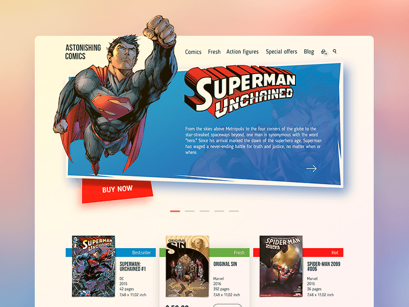
Here are some examples of web design concepts created by Tubik designers.
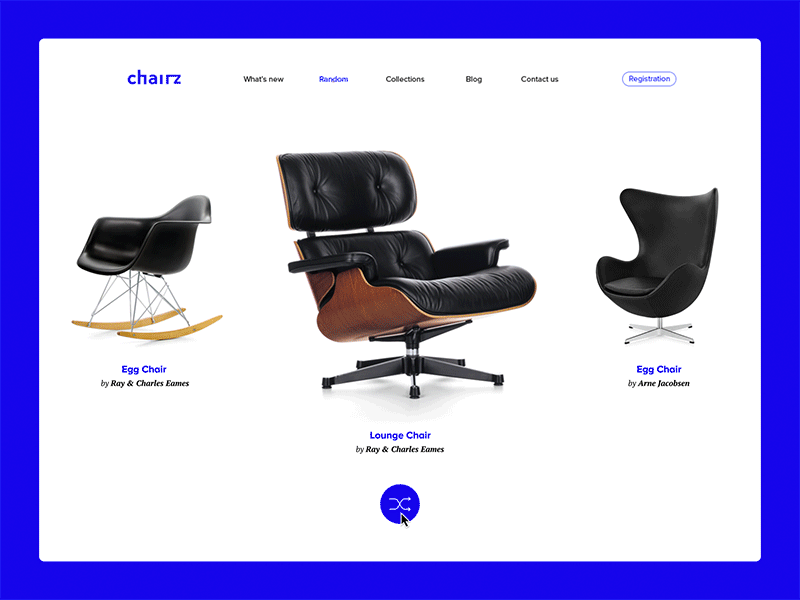
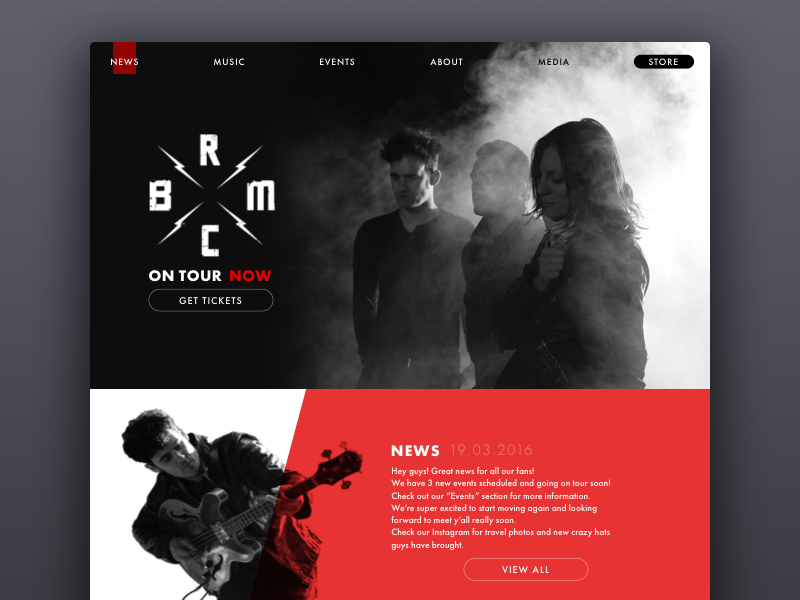
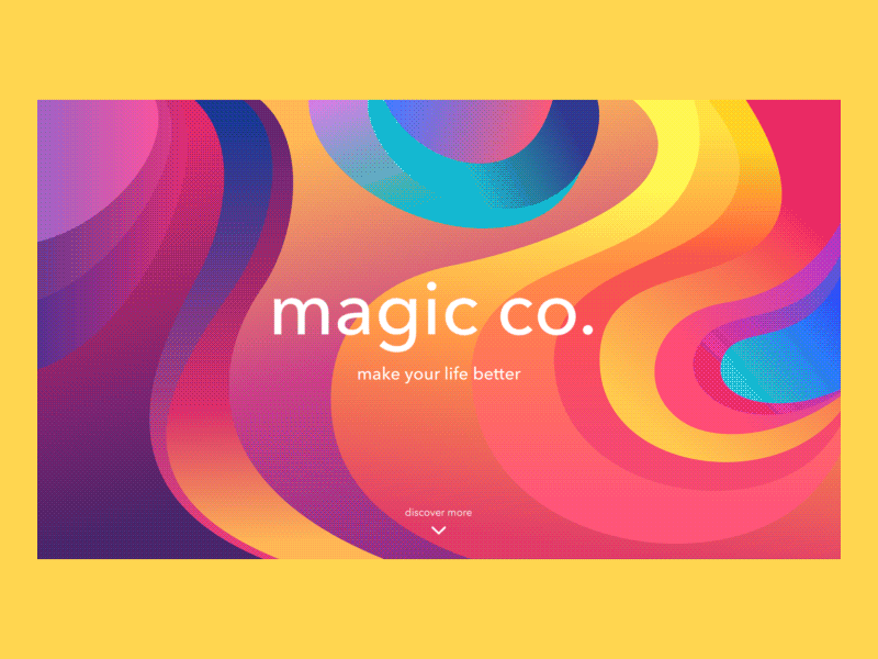
Home Page
The home page is the most popular name for the main page of the website. It is called home as it usually provides a starting point with many further directions for the user, containing direct links to the most important areas of interaction with a website. In other words, it can be also named the initial page or index page. The home page is mostly the start of users’ journey if they are directed to the site by search engines.
In addition to essential links to different website parts, the home page often contains a search field, basic onboarding functionality for personalized sites, different areas of navigations showing users diverse categories of data. It might also contain engaging welcome messages and copy blocks featuring a slogan and/or explaining the benefits of the website or objects it presents.
More than a decade ago famous expert in usability Jakob Nielsen wrote Top 10 Guidelines for Homepage Usability in which he said: “Homepages are the most valuable real estate in the world. Each year, companies and individuals funnel millions of dollars through a space that’s not even a square foot in size. For good reason. A homepage’s impact on a company’s bottom line is far greater than simple measures of e-commerce revenues: The homepage is your company’s face to the world. Increasingly, potential customers will look at your company’s online presence before doing business with you — regardless of whether they plan to close the actual sale online.” A long time has passed since then but a clear and user-friendly home page is still an issue of vital importance for an efficient website.
Home page is actually the basis of good navigation which is usually the core of a positive user experience. A messy interface and badly designed layout can become the reason for user confusion and annoyance.
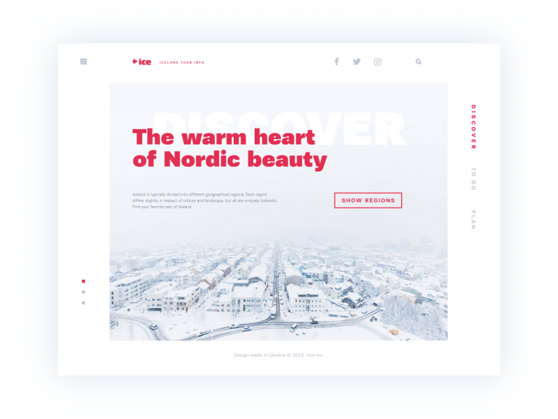
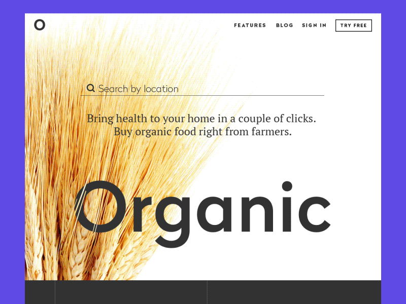
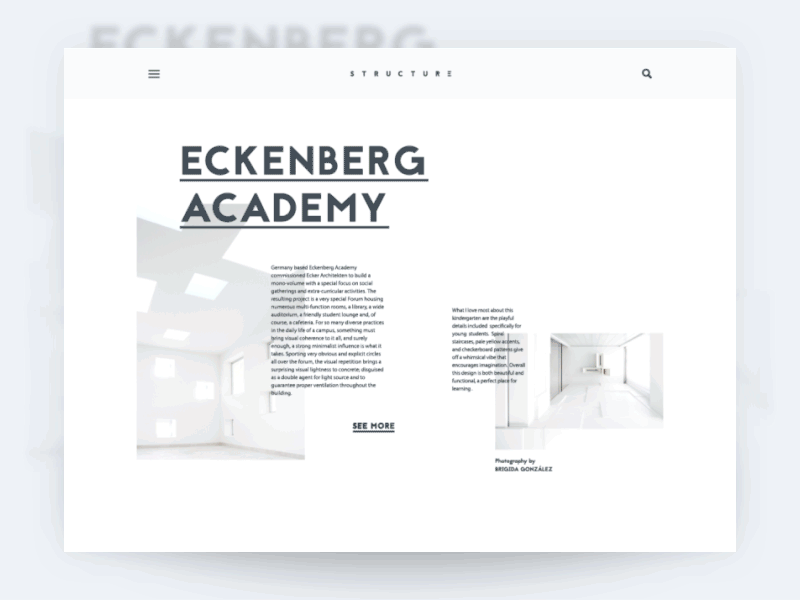
Here are some examples of home pages created by Tubik designers.
Landing Page
Recently we published an article devoted to the functionality and efficiency of landing pages. Let’s remember key points here.
Landing page in its basic wide meaning is the term used for analytics to describe any page where the user started his or her journey around your site, in other words, where a user lands on the website. However, today the other, more specific meaning is used much more often to define a landing page. Behind this term, people understand the special web page created for the presentation of the specific product, service, features, or options so that the visitor could get necessary information quickly and easily not being distracted. That is why the analysts say a landing page is in most cases of marketing and the presentation of a particular product or service is much more efficient than the home page. Home page can have too many options and getting through all of them to find the particular product the user can get distracted from making the decision, lose interest or even get annoyed.
Why is the landing page needed? As we mentioned in the case study about designing a landing page, it is easy to answer this question with a little metaphor. Imagine, you are going to visit, let’s say, New York, to walk around Manhattan. That is the dream of your life. Finally, you find the service which offers to take you to New York City fast and cheap. Great, isn’t it? You pack your bag, you charge your camera, you get up full of admiration as the dream of your life is going to get real. And then you are taken by those amazing people who offered you the realization of your dream to the entrance point of New York City. They leave you there to find Manhattan or any other place you want by yourself. How do you like it now? Who knows, perhaps you will be not so happy after an exhausting journey around the huge city looking for the place you want. Wouldn’t it feel great to be taken right to the destination, fresh and ready to admire and absorb positive emotions? Wouldn’t you as a customer be happier to reach your goal faster and easier? Sure, yes.
That is actually what a landing page does. When a person obtains the information from the outer source about the specific product, feature, information, or service and clicks through the link to its provider, sure, he or she doesn’t dream to spend a lot of time looking for desired product or page among all the links and information provided on your homepage. The user wants to «land» directly at that very place which will make it possible for him or her to get what they want as fast as possible and getting enough (but not too much) information to support their decision-making process. So, creating a well-thought-out landing page is really vital to strengthen marketing strategy and increase conversion rates.
In general, typical landing pages often have:
1) General idea of the presented object (product, service, activity, etc.) with the call-to-action element. Users need to be provided with a basic description of the benefits, preferably not too detailed but concise and useful. The aim of this element is to inform the user and provide a clear and noticeable opportunity to actively use this information via a call-to-action element which can be presented with a button, link, contact form, subscription field, etc.
2) Testimonials and signs of trust. People usually tend to trust more to what is already used or tried by other people and recommended as worth attention. Therefore, testimonials from clients, considerable numbers of followers in social networks, awards, and certificates can have a great impact on the conversion rate.
3) Description of the main features. This block of information can be used as additional information supporting a description of basic functionality. It supplies a visitor with more details about the product or service, its abilities and technical characteristics, its influence on life and productivity, and the like. It certainly makes the landing page longer and requires more attention from users so applying this block should be always thoroughly analyzed.
Here are some examples of landing pages created by Tubik designers.
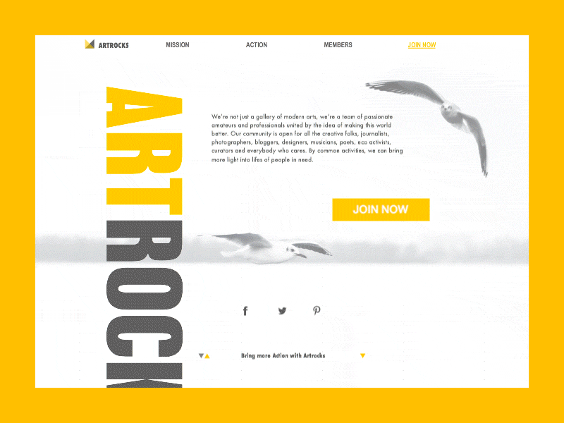
Arts, Culture & Education Curation | Landing
Read more and review the examples on this topic in our previous article
Responsive Design
The necessity of responsive design is based on the audience you want to cover for your website. Would you like your users to use your site from any device and feel it positive, useful, and convenient anyway? Sure, every customer would be aware of the growing popularity of mobile devices. And in this case, we should say confidently: you obviously need responsive web design for the website.
The idea behind responsive web design (RWD) is that the content and layout of a website should efficiently adapt according to the sizes and technical abilities of a device it is opened at. For most users, these changes are so subtle that it is easy to say “ Hey, guys, this is the same site on my smartphone which I looked through yesterday at my desktop. Nothing special has changed here!” And somehow these words can be the great praise of designer’s work. That will mean that the designer managed to keep all the meaningful elements and general layout of the desktop version efficiently and at the same time avoid making the page or layout elements too small, hardly seen, or impossible to distinguish even on the much smaller screen of a mobile device. That is RWD in action.
Nowadays making the site non-mobile-friendly means losing the part of the audience that likes surfing and using the internet sources “on the go”. It’s vital to consider that this part of the audience is mainly the most active part, non-afraid of technologies, fast in browsing necessary information and options, easy-going in making internet purchases, and try new products. That’s why neglecting the idea of RWD can bring real loss to the product which otherwise could be highly efficient and bring high conversion rates.
In the book “Responsive Web Design” experienced designer Ethan Marcotte says: “…web design is about asking the right questions. And really, that’s what responsive web design is: a possible solution, a way to more fully design for the web’s inherent flexibility. In the first chapter, I said that the ingredients for a responsive design were a fluid grid, flexible images, and media queries. But really, they’re just the vocabulary we’ll use to articulate answers to the problems our users face, a framework for ordering content in an ever-increasing number of devices and browsers. If we’re willing to research the needs of our users and apply those ingredients carefully, then responsive web design is a powerful approach indeed.”
Creating responsive web-design for a web-product means making it pleasant-looking, clear, and functional in different sizing with optimal navigation that provides a high level of usability. This technique relieves an owner from the necessity to develop several versions of the site as it provides one site with fast adaptation to different technical conditions, so RWD is also generally cheaper than creating several versions of the site. Responsive web design makes the site flexible, easy to manage, and nice to use. Moreover, you don’t need to publish your content several times for different versions and it saves your time or human resources. If these are the features you want your product to obtain, then consider responsive web design for your product from the earliest stages of its design and development. In addition, you will get higher positions in the Google search engine as it supports the idea of RWD, so that is an important part of the general search optimization of your product. Therefore, it’s up to you whether to apply RWD for your web-product or not, but consider all benefits before making your decision.
Read about this topic in our previous article
Header
In terms of web layout elements, the header is the upper (top) part of the web page. It is a significant and strategic part of the page as it is what people see before scrolling the page in the first seconds of introduction to your website. Therefore, the header should be informative and provide the most important information about the digital product so that users could scan it in split seconds. Header is also the area providing a broad field for creative design solutions which should be catchy, concise, and useful. Headers are often referred to as “Site Menus” and positioned as a key element of navigation in website layout.
Headers can include:
- basic elements of brand identity: logo, brand name lettering, slogan or company statement, corporate mascot, photo presenting the company or its leader, corporate colors, etc.
- copy block setting the theme of the product or service presented
- links to basic categories of website content
- links to the most important social networks
- basic contact information (telephone number, e-mail, etc.)
- switcher of the languages in case of multi-lingual interface
- search field
- subscription field
- links to interaction with the product such as trial version, downloading from the AppStore, etc.
Certainly, the list above doesn’t mean that all the mentioned elements should be included in one webpage header – in this case, the header section would be overloaded with information. On the basis of design tasks, designers, sometimes together with marketing specialists, decide on the strategically important options and pick them up from the list or add the others.
The choice of typefaces for headers and the background color should get under highly rigorous research and testing as the aspect of readability in the header plays a vital role. The user has to be able to scan and perceive this basic information as fast as possible without any sort of additional effort. Otherwise, you risk providing a non-user-friendly interface.
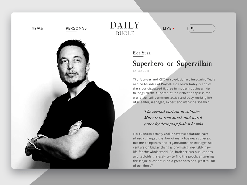
The design concept for a news website presented above features the header including the title of the website as a central element of the composition, two active links to basic categories of publications, a link to live mode, and a search field marked with a magnifier icon.
One more thing to remember is that there are different ways for a header to transform in the process of scrolling the page down. Some websites use a fixed header, which always stays visible and active at any point of interaction with the website; others hide the header in the process of scrolling. There are also websites that do not fully hide the header but shrink it in size in the process of scrolling, which means that they hide secondary information and leave only the most important elements of the layout active and available during all the process of interaction.
Another design solution that is quite popular in the perspective of header functionality is hiding basic links of data categories behind the hamburger button. It is called so as its form consisting of three horizontal lines looks like a typical bread-meat-bread hamburger.
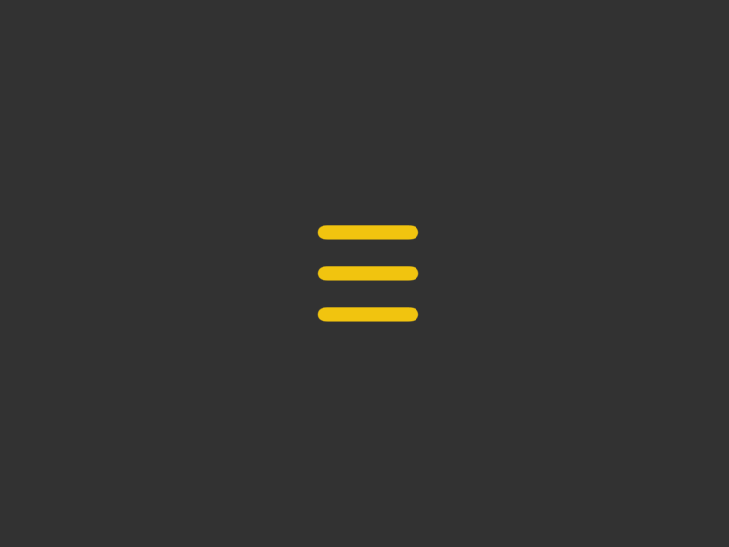
This button is usually placed in the header and nowadays it is a typical element of interaction. Most users who visit and use websites on the regular basis know that this button hides the core categories of data so this trick does not need additional explanations and prompts. Hamburger menus free the space making the interface more minimalistic and full of air as well as allow massive saving place for other important layout elements. This design technique also provides additional benefits for responsive and adaptive design hiding navigation elements and making the interface look harmonic on different devices.
Although hamburger menus still belong to highly debatable issues of modern web and app design, they are still widely used as header elements. The arguments against the hamburger menu are based upon the fact that this design element can be confusing for people who do not use websites regularly and can get misled by the sign which features a high level of abstraction. So the decision about applying hamburger button should be made after user research and definition of target audience’s abilities and needs.
The presented design concept of a website has a fixed header that doesn’t hide while the page is scrolled. However, it follows minimalistic principles featuring brand name lettering as a center of the composition, magnifier icon marking search functionality, and hamburger button hiding links to navigation areas.
In one of the articles devoted to practices of header design, its author Bogdan Sandu mentions an important point that should be kept in mind:
People judge the quality of a website in just a few seconds and the second impression is something absent on the Internet. In conclusion, a website must be eye-catching else, it would be nothing more than a big failure.
Header can become a great help in presenting the essential data to the user quickly and providing a positive user experience via clear navigation. However, that doesn’t mean that every website needs a header. There are many creative solutions providing designs applying typical header functionality in other zones of the layout. Every case of website design needs analysis and research of the target audience for the product or service.
Footer
According to everything mentioned above, it’s easy to understand that the footer is the lower (bottom) part of the webpage. Footer usually becomes a marker of the end of a webpage. Also, being one more zone of global website navigation, in most cases, the footer provides an additional field for useful links and data.
Footer can include:
- name and logo of the company or product
- links to user support sections, for example, FAQ page, About page, Privacy Policy, Terms and Conditions etc.
- credits to website creators
- contact info and forms
- links to company or product accounts in social networks
- testimonials and badges
- certification signs
- subscription field, etc.
As well as the header, the footer is not the element found in 100% of websites. For instance, with some design tasks when designers apply infinite scrolling techniques, the traditional footer is not an effective navigation zone. However, in the case of infinite scrolling, the idea of a fixed footer can be also applicable and support navigation not losing this area. It should be said that for most users footer is a common place of looking for contact information, credits, and sitemaps, so playing on this habit can be beneficial and a fixed footer can become a good way in the case when the page has a long scrolling area. The decision on using a footer is always based on the idea of effective usability. Anyway, if the footer is applied it should get in harmonic combination with all the other design solutions of the website layout and support general stylistic concept.
In the review of effective footer designs, Nathan Leigh Davis and the Creative Bloq team emphasize: “Designing a great footer is not about finding the best way to layout a lot of unrelated content, but the ability to prioritize and disregard unnecessary or superfluous information.” First of all, the footer should provide information support and in this way strengthen the chances of positive user experience.”
The new set of our design glossary is ready for those who need it and we are going to continue this practice before long. Don’t miss the new sets in which we are going to tell more about the types and functions of buttons, menus, and other interactive elements of user interfaces. New definitions are coming soon!
Useful Design Articles
UX Writing: Handy Tips on Text Improving User Experience
How to Design Effective Search
Web Design: 16 Basic Types of Web Pages
3C of Interface Design: Color, Contrast, Content
Negative Space in Design: Practices and Tips
User Experience: How to Improve Web Scannability
Hero Images in Web Design: When, Why and How
Color Scheme for Interface: Light or Dark UI?
Originally written for Tubik Blog
 https://design4users.com/uiux-glossary-web-design-issues/
2021-03-24
© by
Marina Yalanska
,
https://design4users.com/uiux-glossary-web-design-issues/
2021-03-24
© by
Marina Yalanska
,
- English
- Ukrainian