Tasty UI Concepts for Eating and Cooking
Tasty UI Concepts for Eating and Cooking Set of diverse interface design concepts on the theme of food, cooking and eating. UI designs for mobile applications, websites and landing pages.
Many decades ago famous writer George Bernard Shaw, known for his sharp tongue and sparkling sense of humor, said: “There is no love sincerer than the love of food.” With the course of time nothing actually has changed: food is still among the most important, discussed, and loved aspects of everyday life. The sphere of design features it in diverse faces and directions combining traditional visualization with new techniques and approaches.
UI design is no exception. The basic idea behind UI/UX design is to create interfaces that solve problems and satisfy users’ wishes. As eating is one of basic human needs, no wonder we can find numerous applications and websites devoted to this theme. We also take active part bringing new ideas and polishing existing solutions in design projects and concepts for websites and mobile apps. As well as with real meals presentation, visual design for digital products of this sort is a real food for thought.
Like with a nicely performed meal, well-done attractive UI is able to increase the level of users’ expectations and catch their attention and senses immediately. However, even the most creative delivery of a meal is not able to save the situation if the food itself is low-quality and vapid. The same happens with UI. If the designer doesn’t think much about the product itself, its logic, convenience, effective layout, being focused only on beautiful presentation, the risk of creating dead product is incredibly high.
In our previous article devoted to role of icons in UI we mentioned: the best chefs always say that everything put on the plate should be edible. According to the latest trends, we support the same idea when it comes to icons as well as the other elements of layout: everything that is put on the screen should be functional. Therefore, any icon used in the interface should have its meaning and function. Without it, an icon is just a kind of empty stub, making the layout of the screen or web page dirty with unnecessary elements. This philosophy works well with other interface elements like copy, illustrations, photos, animation, color combinations, typography choices, etc.
Here we have collected 10 different UI design concepts accomplished by studio designers. They represent different aspects reflecting the topic of food: some of them are devoted to the cooking theme, some present the direction of eating out, the others are connected to selling food. The nature of functionality platforms is also different: the concepts feature interfaces of mobile applications, websites, and landing pages. If you are interested to see more details, just follow the links. Let’s review them all. Bon appetite!
Restaurant Menu
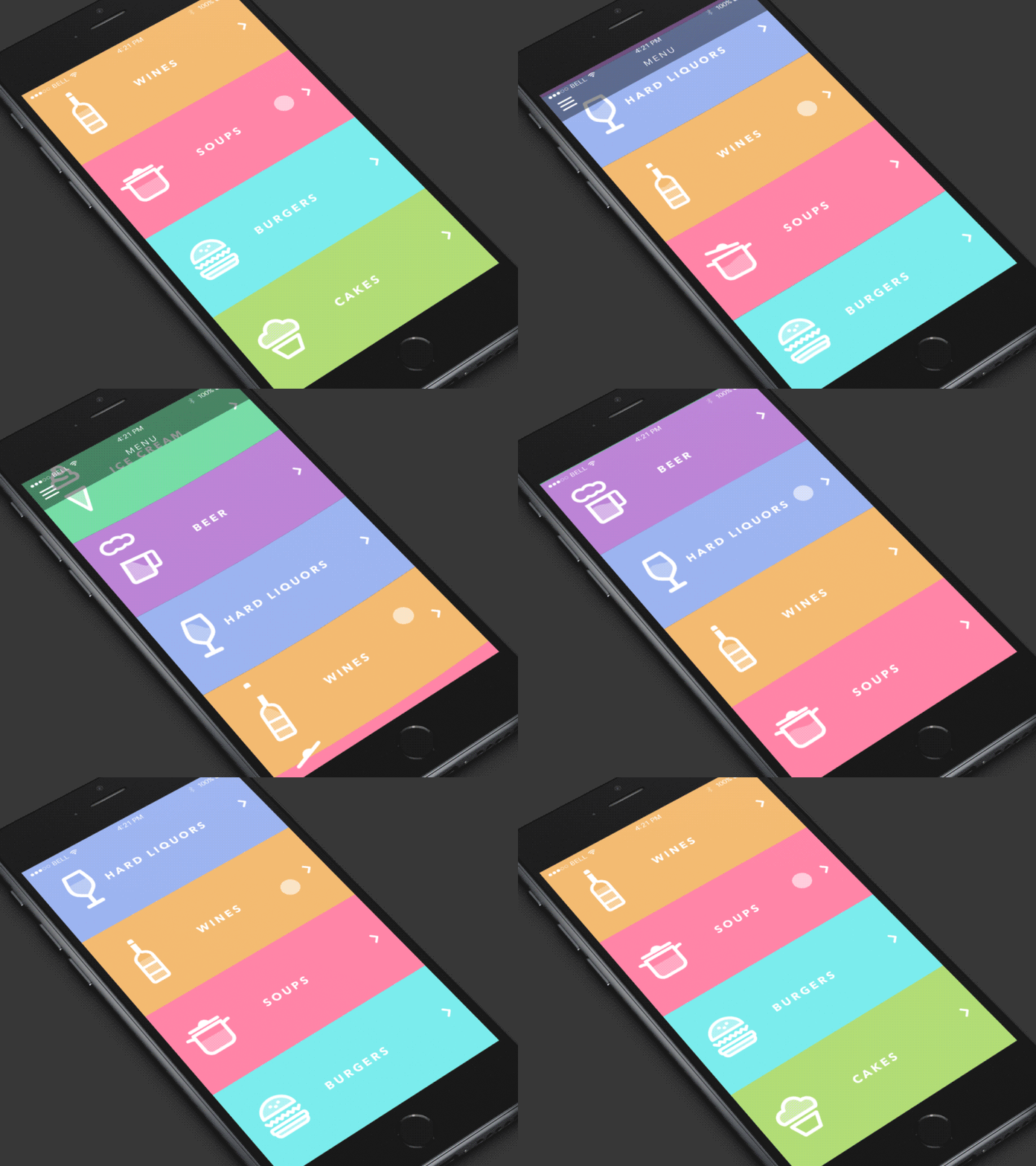
The first of the presented concepts is a mobile application for restaurant visitors. It features animated interaction with the screen, presenting a basic view of the restaurant menu. The categories’ names are presented via an effective combination of highly readable copy and clear, meaningful icons for quick visual perception. Simple design with animated accents that imitate interaction with physical objects is a good way to create a positive user experience.
Resto App
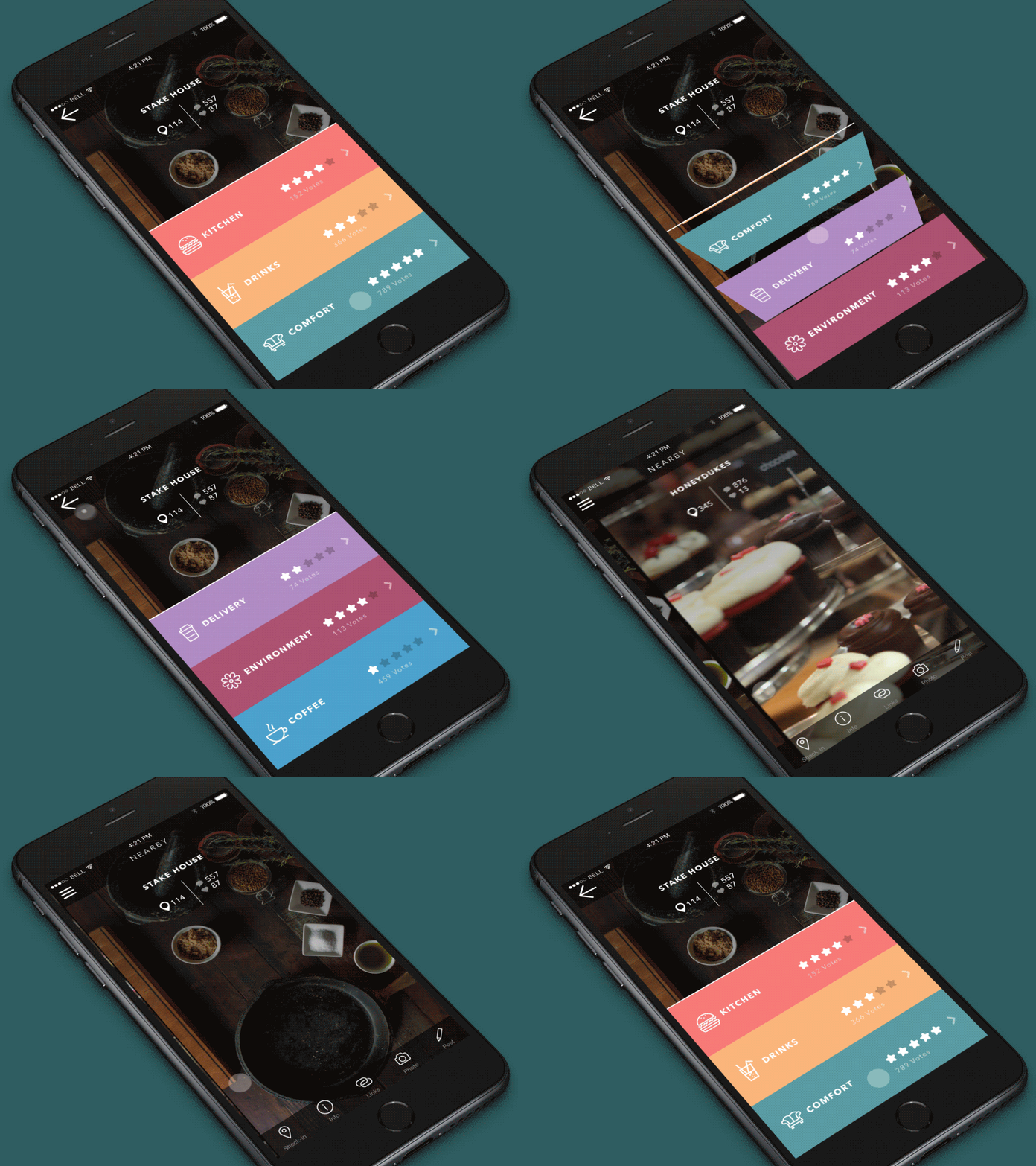
Another interaction for the same app shows one more block of its functionality. It’s a simple restaurant app for checking in and receiving feedback from clients and visitors of different restaurants. The main idea was to provide a simple, easy-to-use interface based on animation and color accents. The restaurant profile shows how many visitors were there and how many of them liked it. The whole app enables users to vote for several different features of each restaurant, such as “cuisine”, “drinks”, “comfort”, “service”, etc. Visual support with high-quality photo content featuring food and drinks enhances the theme’s stylish look and feel.
Cooking Website
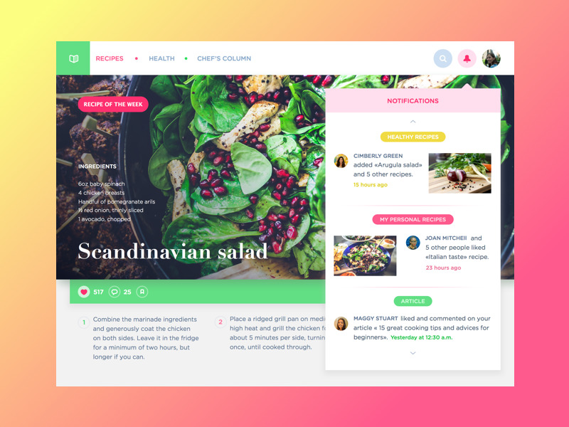
Here is the concept of a cooking website where users can find interesting recipes, add their own, and read useful articles devoted to the food topic. The interface is an iPad version of the layout. The designer chooses a light background, adding air to the screens and providing an environment for efficient readability for different blocks of copy. Color markers are used to define the categories of content.
Bar App Interactions
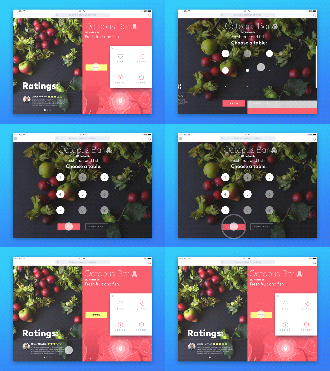
This one is an iPad application for booking tables in restaurants. To show its functionality and strengthen it with gorgeous food images, the designer chose an experimental bar profile page. It’s a venue where users can order fruit and seafood, and the profile page contains everything to go with booking a table, sharing, and saving this venue. The animation shows the interactions of the user flow, showing what happens once the “Book” button is tapped.
Bakery Website
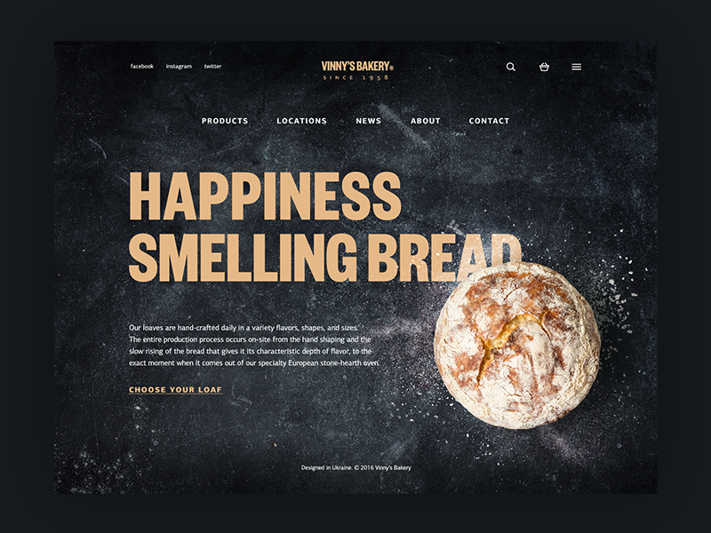
This one a the design concept of a website for a small bakery selling homemade bread. Here you can see the home page presenting the service, providing the links giving more information about the company and the items it offers, as well as links to social accounts. The designer was keen to activate different techniques of visual perception via headline, images, background, and copy block so that users could get the basic information immediately and get the warm feeling of freshly baked bread. He followed the philosophy of minimalism, which is user-friendly, attractive and informative. Based on the design solutions, it is easy to assume that this is the service positioning itself as a producer of upmarket products which are exclusively hand-made and presumably because of that reason cost more than average bread in the supermarket. Harmony is the style provided by the webpage: dark background, branding element as a central element of a header, strong and clear headline establishing positive emotional message, visual elements enabling immediate perception of the theme and setting strong visual association with tasty pastry, short text block describing basic benefits of the product and clear visible call to action.
Organic Food Landing Page
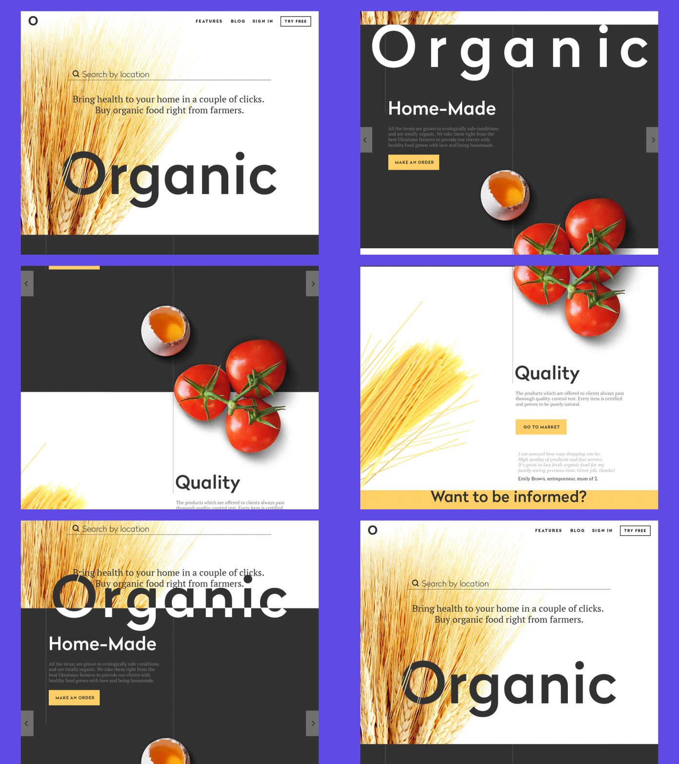
The landing page above aims to promote an organic food shop. It comprises several blocks presenting the shop’s name, products, highlighting some critical aspects of service, call to action, and testimonials. The designer sets the purpose to make it informative but not overloaded, appealing but not aggressive. To make the experience more attractive and engaging, the process of scrolling the page was livened up with web animation, and the visual elements were selected to support the general theme and provide the immediate visual perception of the basic idea.
Buon App
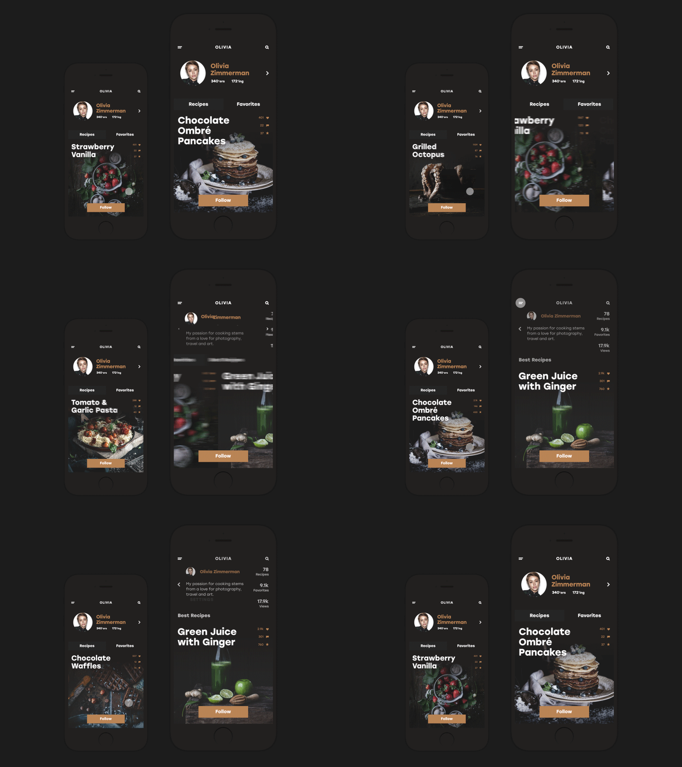
Here is the interface of a social network for those who like cooking and want to communicate and get updated about this topic quickly and easily. The app enables the use of all the social functions: sharing recipes, making discussions, chatting, following, uploading images, collecting favorites, and so on. Nice and smooth animations support the general stylistic concept and show interactions within the app functionality. The designer followed the idea of keeping the interface’s balance of usability and attractive looks.
Cafe Coupon App
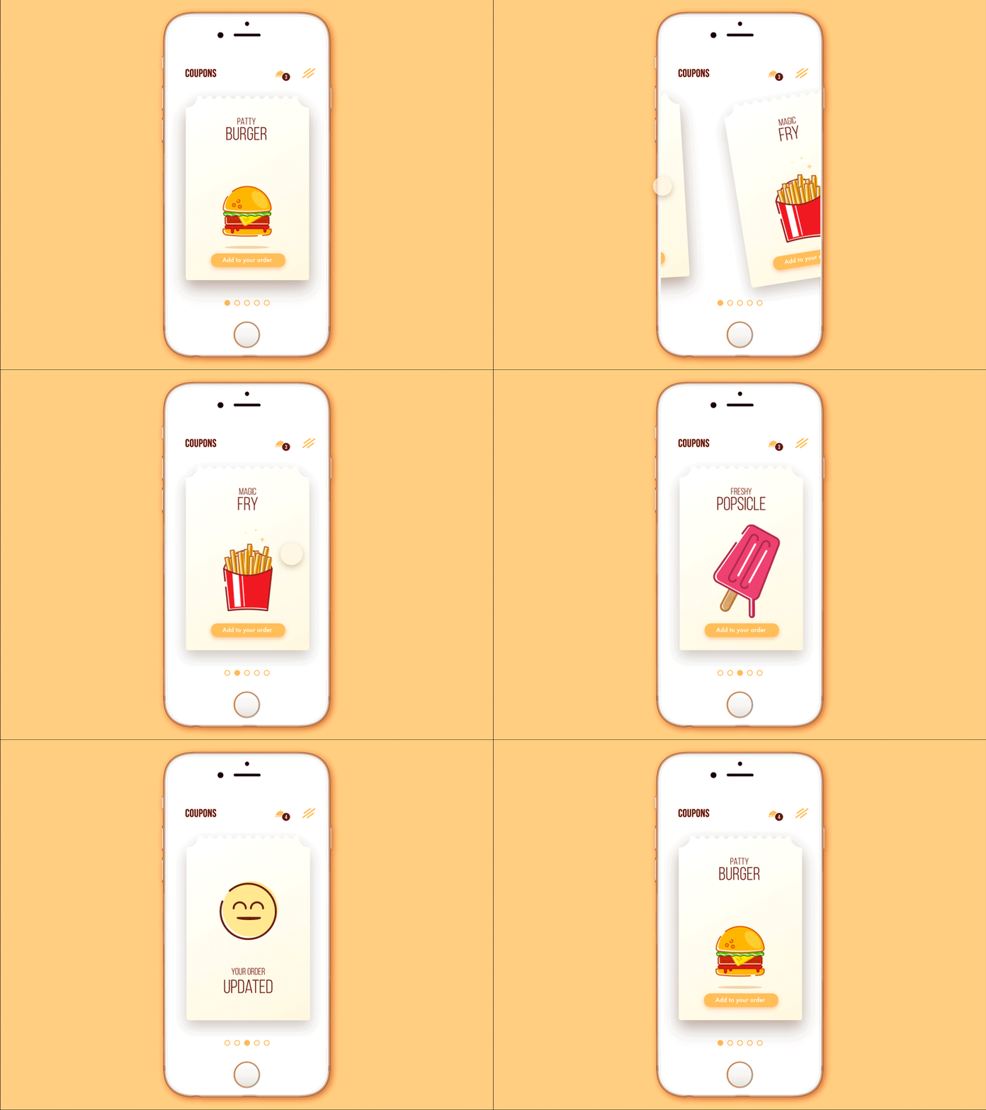
No doubt, good food is a great way to feel the world more positively, and that is the key message behind the presented animated interface design. This is the concept of a mobile application for a chain of cafes that provides the functionality of saving coupons and discounts and then using them to buy tasty stuff. Interface animation is added to make the screen and interactions more lively and engaging, and enable easy micro-interactions. Icons and illustrations look bright and add positive vibes; even small layout elements like the icon for notifications reflect the basic theme and support the consistency of the general stylistic concept.
Healthy Food App
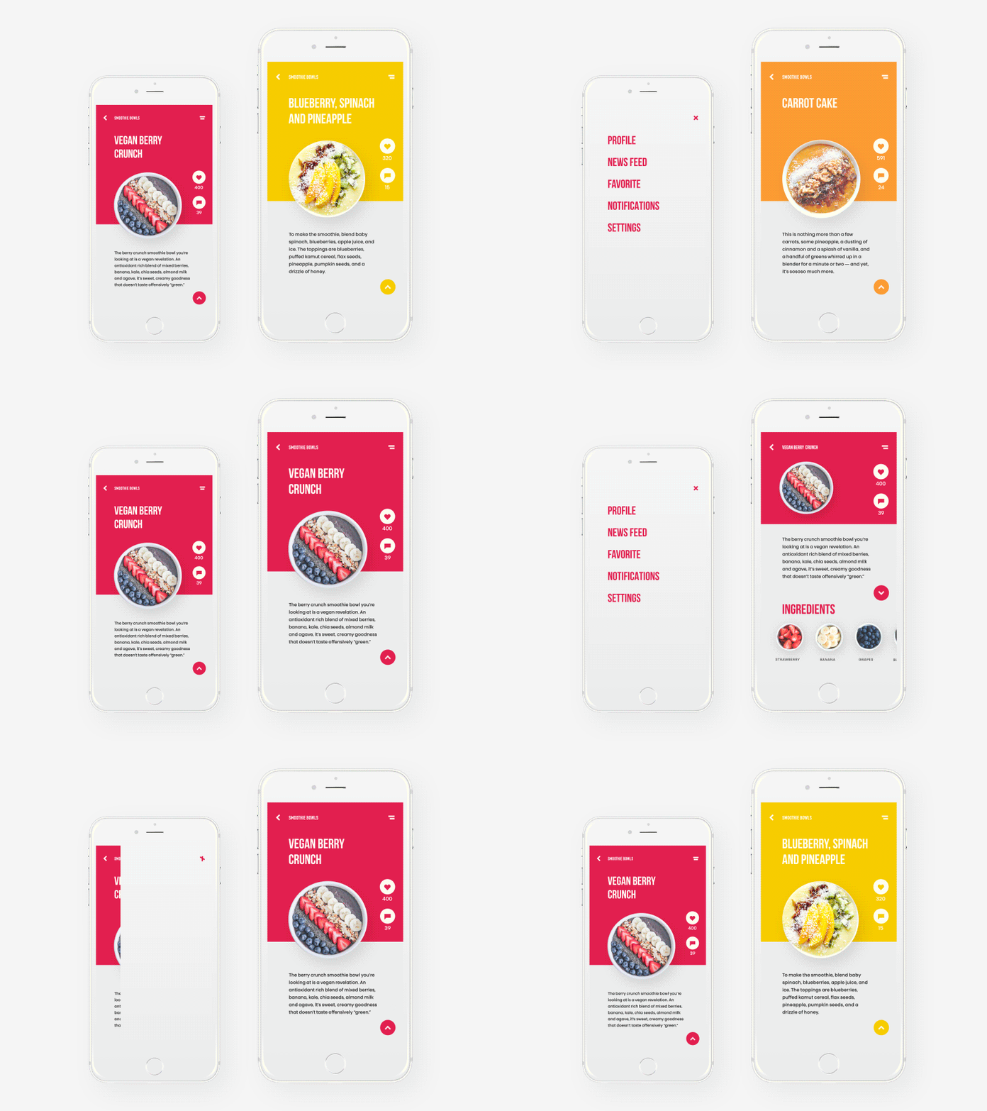
Here you can see the screens of the mobile app organized around the idea of a healthy lifestyle and providing recipes and tips on healthy food. Engaging graphic elements and correspondent color solutions are used to set the theme as well as enable fast visual perception of information which is supported with unobtrusive motion design accents. Animation is also used to show various interactions with a product. Together, all those features support a user-friendly, attractive, and informative interface design.
Recipes and Cooking App
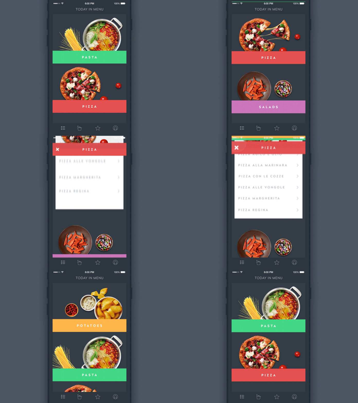
This is a design concept for the recipe application. With it, users can add recipes to their collections or find them online, categorize and organize their recipe books and categories, and form menus and shopping plans. Here you can see some interactions enhanced with motion design. They show the process when the user selects an item from the category list, then from the list of recipes in that category.
Seafood Recipes Landing Page
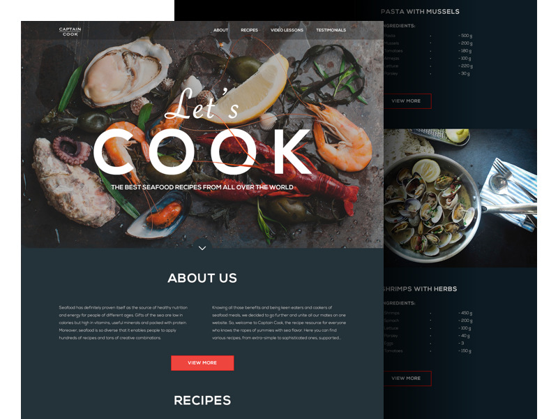
This sample presents a landing page for a website collecting recipes for meals with seafood from all over the world. Again, the webpage looks catchy due to high-quality graphic elements, strengthened by a dark background to make the meal images look even more delicious and also create a stylish feel for the general visual presentation of the layout. The landing quickly provides a general understanding of the website’s purpose and content and features different sections that could interest users.
So, practice shows the diversity of techniques and methods for building an app or website that is tasty and attractive. Nevertheless, to retain users, a trendy and pleasant-looking design should just cover effective functionality and user-friendly solutions. Otherwise, a beautiful design will work like a cover without a sweet inside, and that is the fastest way to lose the users. Put usability and functionality first, think over the logic, transitions, and intuitive navigation – and visual design will become the great icing on the cake!
Useful Articles
Here’s a set of articles covering additional aspects and best practices in user experience design.
Error Screens and Messages: UX Design Practices
Visual Dividers in User Interfaces: Types and Design Tips
Directional Cues in User Interfaces
How to Make User Interface Readable
Basic Types of Buttons in User Interfaces
Negative Space in Design: Practices and Tips
How to Make Web Interface Scannable
UI/UX Design Glossary: Navigation Elements
Web Design: 17 Basic Types of Web Pages
The Anatomy of a Web Page: Basic Elements
Originally written for Tubik Blog
- English
- Ukrainian

