


Handy Guide To Designing a Visually Appealing Online Boutique
Handy Guide To Designing a Visually Appealing Online Boutique If you strive to have ecommerce success, start it from effective design. To help you, here's the checklist on designing a sleek online boutique.
Nothing can send your online boutique to a demise like an unattractive layout. Think of it this way: would you like to shop in an unattractive and dated brick-and-mortar store? Of course not.
Just as a front window display entices customers to enter a physical store and check out the merchandise, the way that your online boutique’s landing and product pages look will either encourage people to make a purchase or go to your competitors.
To be more precise, it takes only about 50 milliseconds for users to form an opinion about your site that determines whether they like it or not, whether they will stay or leave. And if they leave, they’ll probably never come back – more than 85% of online consumers said they’re less likely to return to a website after a bad experience.
In ecommerce, visual appearance is everything. When shopping online, people can’t touch or feel the products, which means they will judge your boutique’s quality by what they see. In fact, studies have found that more than 45% of consumers base their decisions on the credibility of websites on their aesthetics and visual appeal. That includes website layout, color and color schemes, typography, and font size.
So, if you’re looking to have a successful online boutique, get rid of the ‘if you build it, they will come’ mindset and start thinking about how you can make it more visually appealing. To help you out, we’ve put together this 7-item checklist that will help you create a sleek online boutique in no time.
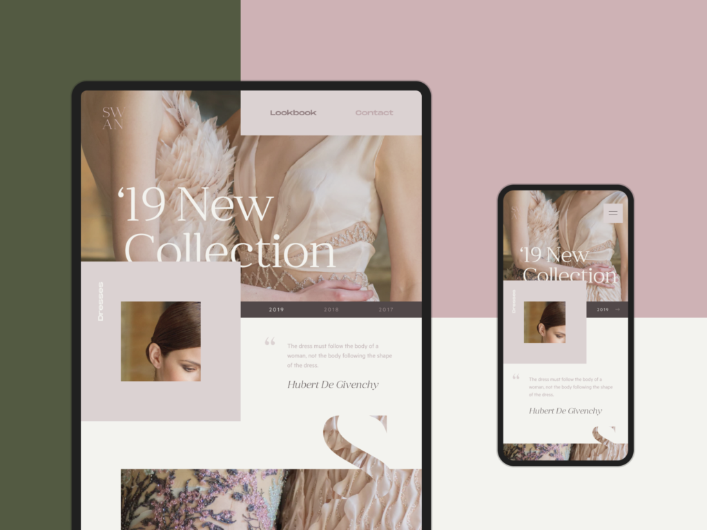
Designed by Tubik
Decide Which Platform You’re Going to Use
Where do you want to start an online boutique? Do you want to take advantage of Etsy’s organic traffic? Or maybe you’d prefer to have more control over your site, layout, and the overall shopping experience? There are upsides and downsides to both options and, ultimately, it will come down to what type of products you’re selling, as well as how much control you want in customizing your online store.
Platforms like BigCommerce offer a wide range of built-in tools and features to support your online boutique’s growth. They also provide powerful reporting to help you keep track of your store’s improvements and success. Moreover, if your budget allows it, you might hire a professional BigCommerce design company to make your e-boutique look as sleek as possible.
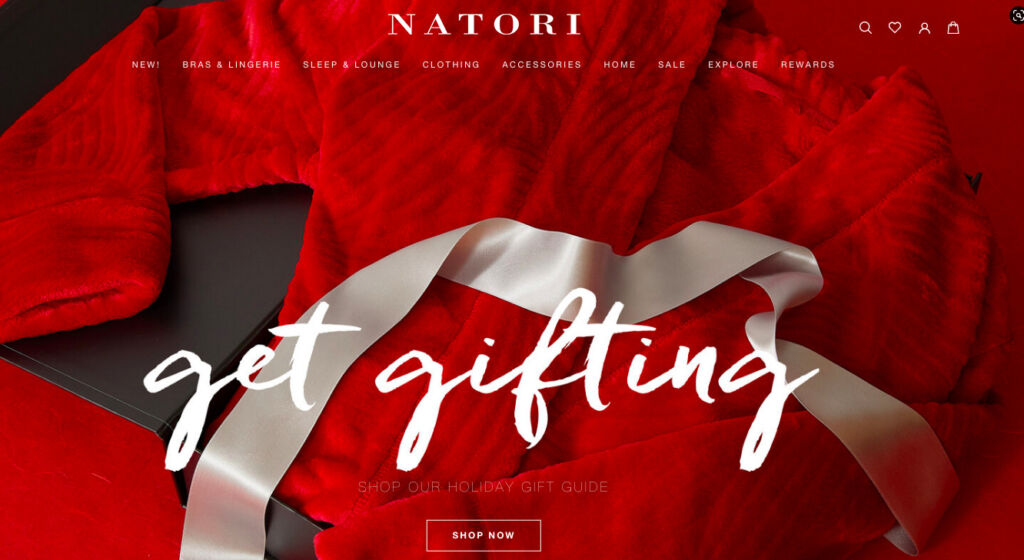
Natori
Think Clean and Organized
One study found that nearly 95% of the website first impressions are design-related. The study participants noted that they often found websites to be too complex and lacking navigation aids. They also commented on an ineffective search feature, excessive pop-ups, improper use of color, too much text, small print, and a corporate look and feel.
Just as people like shopping in clean and organized physical stores, they also like websites that are sleek and free from clutter. A messy design can easily dissuade customers from spending time in your online boutique or interacting with your site, which means they won’t be buying anything either.
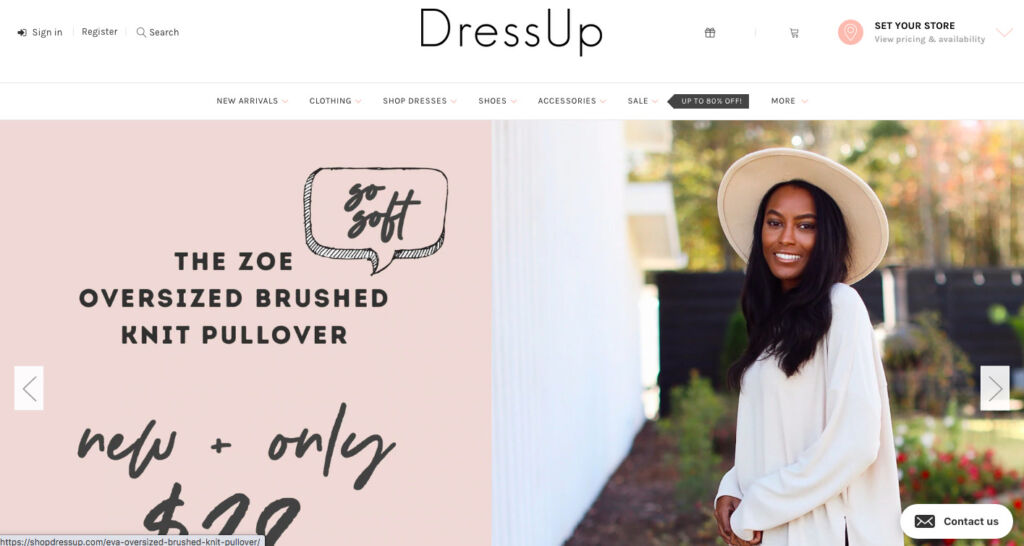
DressUp
Even though it doesn’t hurt to include additional info on your brand’s story, an option to sign up for an email newsletter, or a blog, you need to ensure that these don’t distract customers from making a purchase. For instance, a form at the bottom of your homepage that visitors can fill out to subscribe to your email list is ok, but a pop-up might have the opposite effect of what you want. It could distract people from making a purchase and annoy them and make them less likely to want to give you their email.
In addition, make sure your navigation plan is cohesive and straightforward. As with any site, you should focus on ease of navigation, accessibility, legibility, and above all, optimization of the user’s experience. Once users land on your homepage, they should be able to find what they’re looking for quickly and easily, and make their way to your target zones, be it a contact form or checkout.
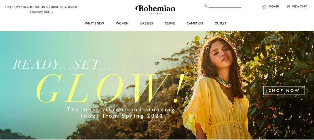
Bohemian Traders
Keep navigation choices to under 6 of your most important pages and use subpages to order a website with more than 5 pages. Create a hierarchy of what information is most important on the page, and don’t be afraid of white space and varied sizing to create contrast. If you have a lot of different categories and pages on your website, you can use a drop-down menu to organize them more easily without causing a sensory overload.
Use Colors to Your Advantage
Color can be a very powerful tool, and if you understand the psychology behind it, you can use it to your advantage.
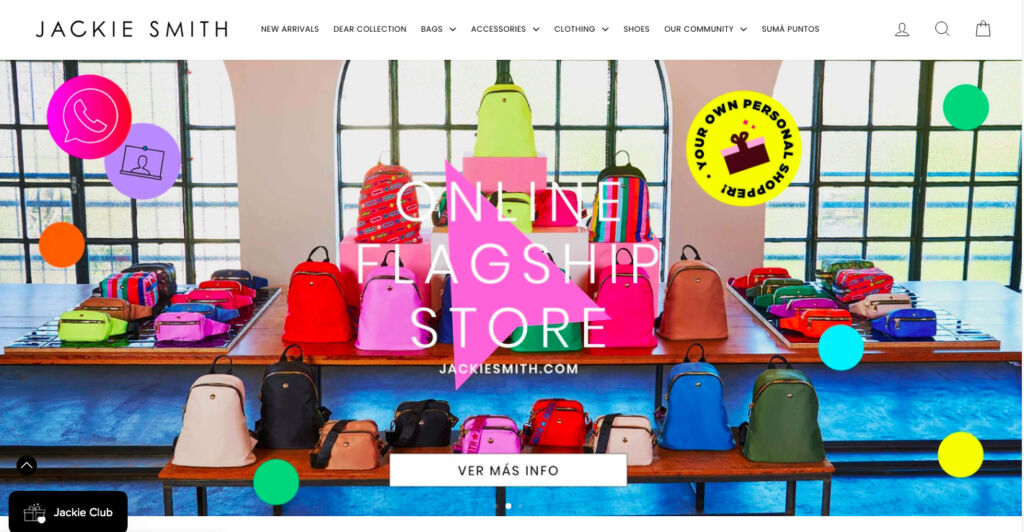
Jackie Smith
Different colors inspire different feelings and actions from people, so if you want your ecommerce website to convert, you need to leverage them. For instance, according to color psychology, red inspires feelings of passion and excitement, which are driving factors behind spending, and studies show that making a CTA button red can increase conversions by more than 35%. On the other hand, blue has been shown to increase feelings of trust, which is why it appears in more than half of all logos (just think about Facebook, Twitter, American Express, and IBM).
The point is, color is one of the most powerful tools in your web design toolbox, and if you know how to use it, it can have a significant impact on your online boutique’s design.
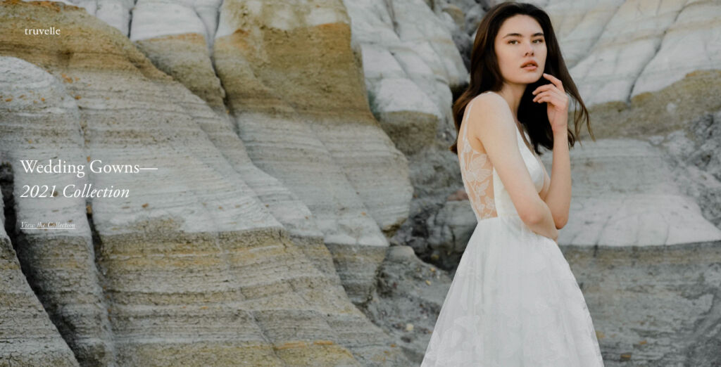
Truvelle
Pay Attention to Images
In the ecommerce world, to sell your products, you must stimulate your customers’ visual appetite. 75% of online shoppers rely on product images when deciding on a potential purchase. A study by Forbes found that 50% of online shoppers consider large, high-quality product images to be more important than product descriptions or even reviews.
The images you use in your online boutique should be so attractive that customers will be immediately tempted to grab your products and walk around wearing them. High-resolution images are a must. Any pixelation or blurriness can make people think that your products are cheap and turn them away instantly. Consider creating a photo gallery for each product to allow visitors to see the product from multiple angles.
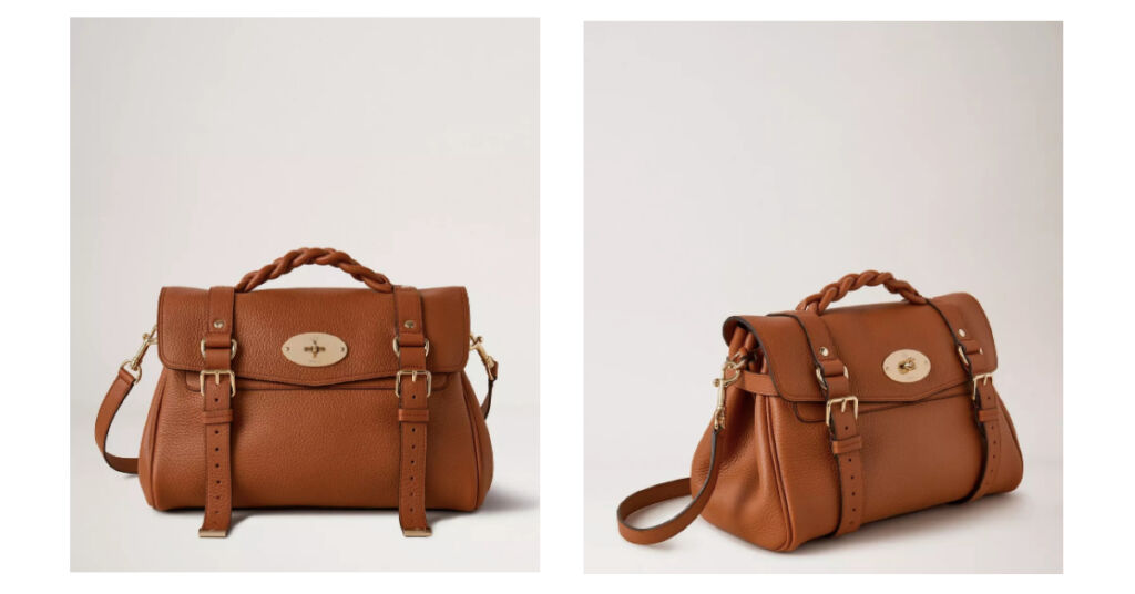
Mulberry
Another popular feature is zoom, which allows them to see the fine details. That is as close as you can get to allowing online shoppers to physically touch a product and examine it more thoroughly.
Whenever possible, use images of people using your products. Clothing looks a lot more attractive when it’s worn by a real-life model rather than on a mannequin or being laid flat.
When curating your images, make sure they represent your online boutique’s style.
Think about who your ideal customer is, what they like, and what they hate. What fabrics, colors, articles of clothing, or kinds of jewelry appeal to them? Answering all these questions will help you create aesthetic cohesion. Your goal is for all of your items to look unified on a screen together and tell a story.
However, you should also make sure that your images are realistic. The average rate at which consumers return products they bought online is about 30%, and more than 20% of those returns occur because the product looks different in person.
Keep Text Minimal
You can spend weeks working on long, detailed descriptions for your products, but we’ve got news for you— nobody is going to read it.
Studies have shown that most website visitors only read about 20% of the text on any page. The average Internet user has a short attention span, so large chunks of text can be quite off-putting. Instead of reading the text word for word, people tend to scan it, looking for crucial information.

Thing Industries
So, if you want to get your point across, you must make your content scannable. Try to keep all the text on your site as short as possible. Break up the content—whether that’s blog posts, an “about us” page, or product descriptions—into an easy-to-scan format. Organize information into short paragraphs, use bullet points, bolding, and even infographics to make it easier to read.
The easier to scan your content, the more likely website visitors will absorb your key messaging—and the more likely they will be to make a purchase.
Develop Your Unique Brand
Whether your online store specializes in toddler clothes or vintage pieces, it should embody a defined style. Create harmony between your boutique’s web design and that style to strengthen your branding and make your target customers feel at home when visiting your boutique.
Is your brand girly and fun, with bright colors and fonts? Or, maybe you’re going for minimalism and clean, sleek lines? Your brand is a combination of your chosen name, product selection, the ideal customer you’re targeting, as well as the overall look and feel of your site and social media platforms.
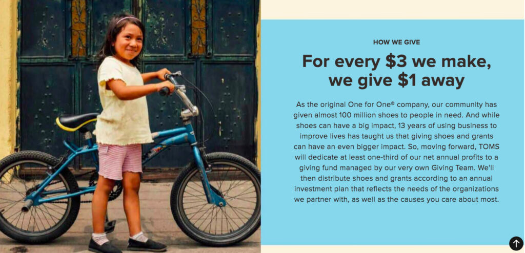
Toms
Ensure that your logo is visible on every page of your website and keep fonts and color schemes consistent and on-brand. You don’t want your visitors to feel like they’ve landed on an entirely new website every time they click onto a page. Maintaining the same design scheme and navigation menu across all pages displays a consistent and trustworthy image.
Don’t Forget About Mobile
If you’re still hesitant about the importance of mobile for ecommerce, here are a few stats to take into consideration:
- More than 55% of internet users say they won’t recommend a business with a poorly designed website on mobile.
- About 85% of adults think that a company’s site should be as good or even better when viewed on mobile.
- Nearly 80% of Internet users in the US have used a mobile device to shop online.
- 35% of US consumers use only their mobile devices to buy online.
- Experts estimate that US mobile commerce sales will reach over $420 billion by 2021.
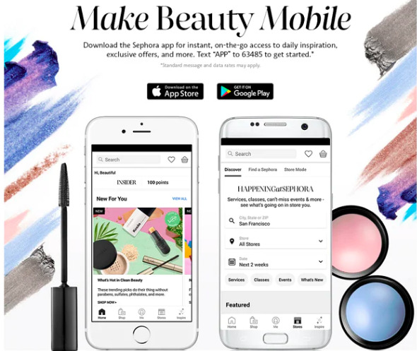
Sephora
In today’s digitalized world, you can’t ignore the fact that many people will visit your online store via their mobile devices. So, in order to make sure that it looks great on different screen sizes, you’ll need to optimize the mobile view.
Mobile shopping differs from shopping on a regular PC. Mobile users prefer longer scrolling, so your site’s mobile version has to be designed vertically. Texts and images should be big enough and spaced out, so they don’t look cluttered. You should also organize your options and product collections simply and intuitively, allowing customers to find what they’re looking for quickly and easily.
Final Thoughts
Web design is critical when creating an online boutique. The main goal of good ecommerce web design is to convince visitors to make a purchase by using the right images, colors, graphics, words, and fonts. Your online boutique’s design should attract customers, provide outstanding UX, and present your store in the best light possible.
Designing an online boutique can be tricky, but now you have these 7 tips to help you create a store that not only looks gorgeous but also converts. It may seem like a lot, but with the right plan in place, you can have the online storefront of your dreams in no time.
About Author: this is the guest post by Hazel Pan, a copywriter whose expertise includes Funnel Copywriting & Inbound Marketing.
- English
- Ukrainian