


ABC of Product Design
ABC of Product Design Entertaining but meaningful ABC checklist of features significant for successful product design in the field of web and app UI/UX and branding from Tubik
Hopefully, you remember a funny but meaningful piece of grammar practice called Basic Grammar for Designers. This time, we decided to go further and make the exercise even simpler, so here in Tubik, we prepared ABC of product design – the set of features and characteristics we think are important for the design of an efficient product which is a good combination of meaning, functionality, and good looks. So, let’s get started!
A for attractive
Although the content and functions are the most important factors in making a product problem-solving, still the old classic trend hasn’t changed: people still believe that a good dress is a card of invitation, and a good mind is a letter of recommendation. An attractive look is traditionally highly important to make your user think about trying your product, especially in conditions of modern intense competition.
B for bright
Brightness is actually the characteristic that goes far beyond the colors. It’s about a successful combination of pleasant-looking appearance and smart design solutions, which together create a positive user experience and happy, satisfied user.
C for clear, creative, comprehensive
C is a very diverse letter to start the significant features of product design. And all of them are vital. Clear product design will make it unobtrusive and effortless to use. The creative component will root its originality and will make it not only stand out from the crowd but also solve old problems with new solutions, which will possibly persuade users to choose your app or site. Comprehensive products will provide different features and, therefore, will give users more opportunities in one spot.
D for delicious, desired
Two D features are totally connected with the emotional component of the product. It’s not a secret that the word ‘delicious’ is now used far beyond the topic of food. The product is delicious if it brings the user the kind of appetite, making him devote his or her most important resource – time – and feel the wish to get back to it again. The product is desired when it brings a positive experience, and we are deeply sure that it is directly connected with carefully thought-out usability and utility.
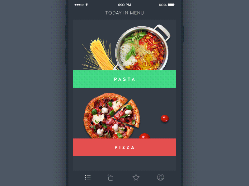
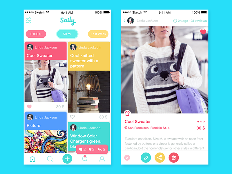
Animation for Recipes and Cooking
E for easy to use, efficient, engaging
There is no need to say how important it is now to make the product easy to use, as now, in terms of a great variety of the web and app market, the vast majority of people prefer those products that make their life easier and solve their problems faster. Efficiency, therefore, is also a vital feature, as speed and easiness is nothing if it doesn’t provide result. If the product is engaging, if it always shows a bit of improvement according to the needs of the target audience and modern design trends, it can become the factor of not only attracting but also retaining users for a long time.
F for flexible, fast
Such characteristic as ‘fast’ does not require long explanations as in our fast and dynamic world people, especially busy ones, are in favor of those things and products that correspond to that fast pace of life. The ability of the product to be flexible that is adaptive to different devices and resolutions, different environments, and various new trends, restarts its lifecycle again and again, making it a sort of perpetuum mobile.
G for global, gorgeous, graceful
The first G-trait – global – is concentrated both on the product essence and its appearance; the idea behind it is to make the product as universal for different cultures as possible if your ambition is to get a wide user community around the world. Making the product gorgeous and graceful, i.e., feel sophisticated and thoroughly thought-over as well as good-looking, can be important in creating a positive user experience.
H for harmonious
Harmony is the basis of everything, say great masters, and we tend to support them. Being understood as the orderly and pleasant organization of all the elements, harmony in design should consider plenty of factors based both on theory as well as practical research and testing. And it is a great thing to invest your time and effort in as it then provides a high level of performance.
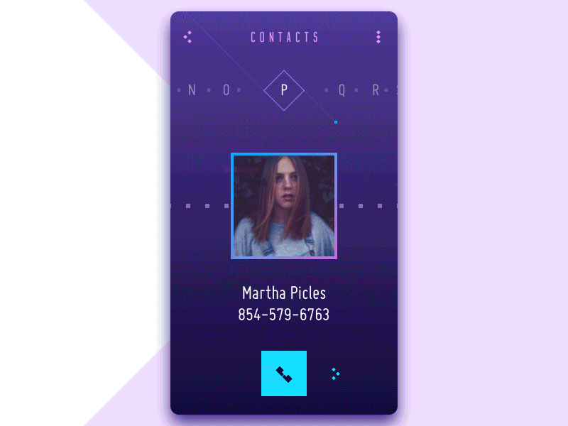
Birds of Paradise Encyclopedia
I for intuitive
If the product is intuitive, it makes the basis for the traits mentioned before, as it will make the product clear, effortless, and easy-to-use, which are among the major features of a high usability level.
J for joyful
Different elements of joy seem to be obvious for the kinds of entertaining products, such as games or quizzes. However, the element of joy can be hidden much deeper, even in very serious and business-like products, for example, congratulating the person on their achievements or providing simple game features in basic operations. Joy can become the sub-conscious characteristic, still effectively making the product desirable.
K for kaleidoscopic
This trait is somehow a synonym for “bright,” as it means your product is full of variety and is never boring.
L for lively, logical
Lively product is full of life, and that means it is close to users, their needs and pains, their wishes, and their lifestyle. Outlining the particular target audience at the very first stages of the design process and analyzing their needs, as well as looking for interesting and sometimes funny solutions, will breathe life into the product. Logic of design is one more vital feature as design should ease and please, be helpful and useful, and never confusing or obtrusive.
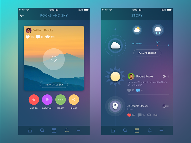
Capitoledge — Free Screensaver
M for meaningful, multifunctional
Any product having only appearance without any feeling of sense and meaning is foredoomed. Even being exclusively attractive, it will not be able to retain the users as it will not satisfy any needs except probably aesthetic ones. So, the meaning that stands behind the product should be decided upon and defined before it is designed and kept in the designer’s mind throughout the design process. The multi-functional nature of the product is going to be a synonym for its ability to satisfy multiple needs of the users, making the level of happiness even higher.
N for natural
The natural feel of the interaction is highly significant for positive user experience and retaining loyal users, sometimes even preferring a natural and organic feel to the feeling of innovations.
O for original
Originality is the trait that can make your product not only attractive, especially in the stage of its launch on the market, but also it can become a feature that makes your product viral, as we have previously mentioned in our article on UX/UI to make your product viral. For those who like standing out of the crowd, it can be a crucial factor in making a choice in favor of your product.
P for pleasant, personalized
The first P-feature mentioned is closely linked to positive user experience. Being pleasant doesn’t deal only with appearance; it takes into account all the features that create the user’s pleasure. So, it works in tight connection with previously mentioned features because the pleasant feel of the product is the result of making it intuitive, lively, and attractive.
It’s also really important to think about making the product personalized. The functions, which provide the user with the feeling of personalization, for instance, enabling them to add or customize the features of the design (avatars, changing styles, type or font, customizing part of functional) or provide strong communication with the user, have more chances of being successful and popular. One of the functions can be neatly organized prompts or tutorials in the web or app product. Another form is correct input text. For example, some investigations and reports on conversion analysis show that input prompts using the first-person pronoun (I) are, in a lot of cases, more efficient than those that contain the second-person pronoun (you). Supposedly, it happens due to a more natural feeling of personalization.
Q for quality
This feature, obviously, doesn’t need extended explanations and comments. According to our studio philosophy of work, this is the primary feature of any product behind any design task. High quality is the foundation for usability, utility, and desirability, three basics able not only to attract but also retain users.
R for readable
The basic and literal meaning of this trait is easily explained. Lack of attention to the correct use of types, fonts, text colors, and placement can have a huge level of influence on usability rates as well as pleasant-looking appearance. Moreover, this is the problem that sometimes cannot be revealed and formulated verbally by users, so it transforms into the horribly blurred characteristic, a sort of “I don’t know what is wrong with, but something definitely is.” Even the best animation, thought-out transitions, and flows can move your product to nowhere if the copy is too small or illegible.
Explaining the feature of readability in wider and somehow metaphoric meaning, we can say that the product is readable when the user easily understands its functions and “read” its abilities and possibilities step by step without difficulties. So, in this meaning, it is a synonym for intuitive.
S for stylish, simple
The first feature mentioned for the letter S deals with the visual characteristics of the product, meaning its correspondence to a certain style. Among all the numerous definitions of style, we suppose the following one is the most exact for our topic: style is a comfortable and elegant mode of existence (American Heritage® Dictionary of the English Language, Fifth Edition. Copyright © 2011). By giving your product the style, you make it catchy and support the feeling of harmony mentioned in the previous part of our design alphabet.
The characteristic of being simple, as well as intuitiveness and ease of use, is one more synonym showing that the aim of the most modern product is to help people deal with various issues of everyday life. So, looking for new ways and decisions, it’s important to remember that they should provide simple solutions for the user’s problem, which means hard and sophisticated work for the designer, as it’s well-known that making things simple is the hardest work.
T for trendy
Trendy here shouldn’t make you consider only the looks of the product. As it happened with other features, its real sense lies much deeper. We see the definition of “trendy” as being able to follow the most modern trends efficiently, combining them with the best classic solutions approved by UI/UX analysis through the times.
U for understandable, user-centered, useful, unique
We can see that U-letter is highly diverse in our ABC. And it’s natural, actually, as the most important word of product design – “User” – starts with this letter. So, all the U-features are concentrated basically on the user. To be successful, a product has to be understandable ( feels as synonym to readable in its wide and metaphoric meaning above) so that the user isn’t confused with illogical operations or transitions, the absence of the essential elements of layout, or unsuitable color and font choice.
The product has to be user-centered, which means that all the solutions, schemes, ideas, and versions should be totally concentrated on deciding the target users’ problem, and this should be the main concern of the designer from the very start of the process.
The product should be useful, especially if its aim is not to entertain the user but also to educate, help, provide means of communication, ease any process or keep tracking and control, etc. If the product is useful, it will retain and grow the target audience steadily.
And finally, the product should be unique. As we have mentioned in the article about UX design to make your product viral, the flavor of uniqueness can be applied not necessarily to the whole product – it can be a small feature of UX or an interesting solution for UI and branding, which will make your product stand out of the crowd and survive in the competition.
V for viable
At the time of the MVP trend, the concept of making the product viable is one more concern for designers, as it can be deeply analyzed in the first stages of design via extended user research and market research. Thinking about the core target audience and solving their problem instead of trying to please all and everyone, the designer is able to build a strong community of loyal users whose further analysis will show the way of adding new features and extending functionality.
W for well-done
As well as quality, this feature doesn’t need much comment. When designers do their best to analyze and find the best solutions and devote part of their soul to the products they create, the users of the product will definitely catch and feel it.
X for xenial
Xenial is actually a characteristic that means being friendly and open. For many products, this is the way to support a strong contract with the user. When your product makes a person feel at home, that is the way to success. The only thing to consider here is that home is where your heart is, so it can be anything that makes you interested and comfortable. Vise versa, any kind of tension means that sooner or later, the user will try to find something more comfortable and user-friendly.
Y for yummy
Yummy actually is the total synonym for “delicious” as analyzed above. Once again, this characteristic reminds us how important it is to find the functions satisfying the user’s appetite by means of well-thought-out UX and beautiful, efficient UI.
Z for zestful
In one of its definitions, zestful means full of interest or excitement. It is no secret that people are highly curious and inquisitive creatures, so the small element of mystery and intrigue will inevitably add user interest to it as well as small amount of spices makes the meal much more desired.
Well, here is the completed set of our ABC features, and as you can see, there are lots of them hiding behind all the letters of the alphabet.
It has to be said that we do not try to discover new horizons or reinvent the wheel with this post. It’s just a bit of a review of what important features can be considered when working on product design, a sort of funny checklist. Moreover, we do not mean that the product should contain all these features as well as the word could not contain all the letters of the alphabet. Nevertheless, their efficient combination can make a great sound for your product. Combining them along with the aim and target audience of a project can be helpful in creating a well-done product.
And now it’s time for a bit of entertainment and exercise: let’s apply this ABC to famous and popular products.
Apple: Attractive+Pleasant+Personalized+Logical+Efficient
Google: Global(doubled!)+Original(doubled!)+Logical+Engaging
Facebook: Flexible+Attractive+Comprehensive+Engaging+Bright+Original(doubled!)+Kaleidoscopic
Quora: Quality+User-centered+Original+Readable+Attractive
Microsoft: Multifunctional+Intuitive+Clear+Readable+Original (doubled again!)+Stylish+Flexible+Trendy
Instagram: Intuitive+Natural+Stylish+Attractive (doubled!)+Global+Readable+Meaningful
and finally, we cannot avoid our own studio name
Tubik: Trendy+User-centered+Bright+Intuitive+Kaleidoscopic
Continue our exercise with your own ideas and designs, and let the inspiration be with you!
![]()
Useful Design Articles
UX Writing: Handy Tips on Text Improving User Experience
3C of Interface Design: Color, Contrast, Content
Negative Space in Design: Practices and Tips
User Experience: How to Improve Web Scannability
Hero Images in Web Design: When, Why and How
Color Scheme for Interface: Light or Dark UI?
Originally written for Tubik Blog, graphic content by tubik
- English
- Ukrainian