Ecommerce Web Design Inspiration: 17 Product Page Designs
Ecommerce Web Design Inspiration: 17 Product Page Designs Product page design examples by tubik: different design approaches, interactive pages, creative graphics, smooth motion, and skillful use of photo and video content.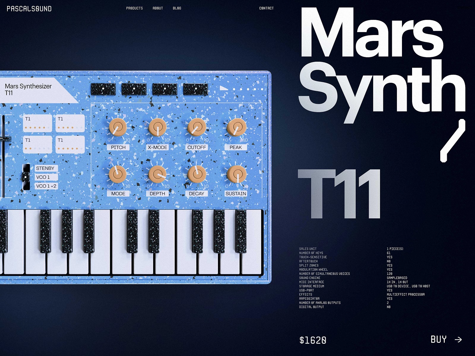
Welcome to review another massive bunch of practical UX design examples, this time covering user experience for ecommerce. In this collection, we’ve gathered web design examples from the tubik agency devoted to product page design. Below, you will find different styles and design approaches, interactive pages and creative graphics, smooth motion, and skillful use of photo and video content to engage and impress buyers. Enjoy and get inspired!
Product Page Design Basics
Let’s start with a quick intro to what a product page is and how it works.
The product page is a page of an e-commerce website that provides a customer with all the needed information about the particular item, allows them to check various options if they exist, and enables a customer to quickly proceed with the purchase process if they decide upon buying the item. A product page frequently becomes the primary source of attraction, impression, information, and persuasion for a buyer, so its design, navigability, and usability play a crucial role in growing sales.
As we mentioned in our guide to the basic web pages, a badly designed product page may waste all the effort (usually massive and complex) taken to bring the buyer to the website and this particular product. So, besides the attractive product presentation, focus on functionality, clarity, readability, and intuitive navigation.
Basically, a product page:
- shows the image of the product
- gives all the needed information about the product
- allows users to check different color/model options (if any)
- enables visitors to see the reviews, comments, and ratings from earlier buyers
- allows for adding the product to the cart or wish list
- shows other relevant options.
Additionally, the product page may include such options as comparing different items, especially popular on websites selling different devices and appliances.
Learn more in our extensive guide on product page design, and welcome to enjoy the web design examples below.
Neon Signs Website
Here’s the product page of the e-commerce website selling a variety of neon signs to help businesses and interesting spots stand out from the crowd. The dark background and smooth animation make the abstract graphics and bold product name look even more atmospheric, while a clear layout and intuitive navigation help users quickly find what they want.
Cosmetics Brand Website
This product page is a part of the web design for e-commerce selling a variety of cosmetics and skincare products. The natural color palette, beautiful theme photo and video content, and sophisticated typography supported with elegant shapes and lines all set the needed atmosphere and inform the visitor about the benefits offered by the brand. Interaction with a catalog of goods is built on a horizontal scroll, and product pages use the split-screen layout, clearly separating a product image from the information zone.
3D Minecraft Models Resource Website
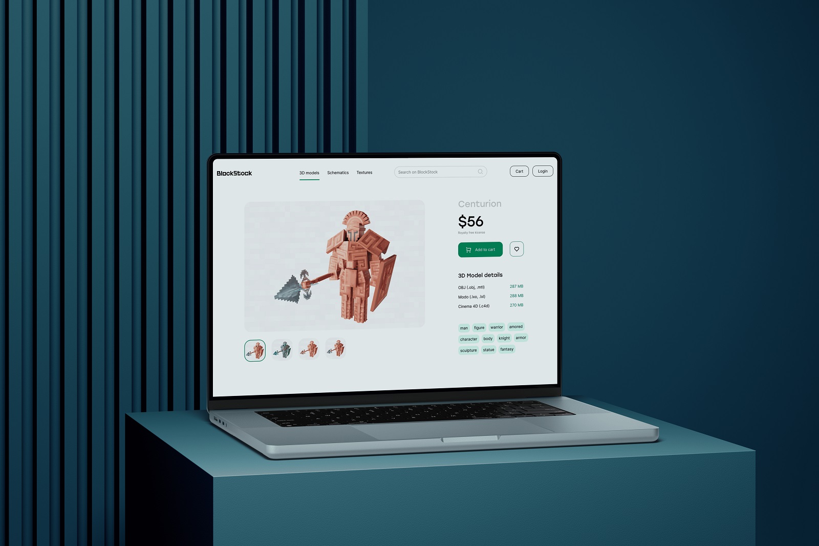
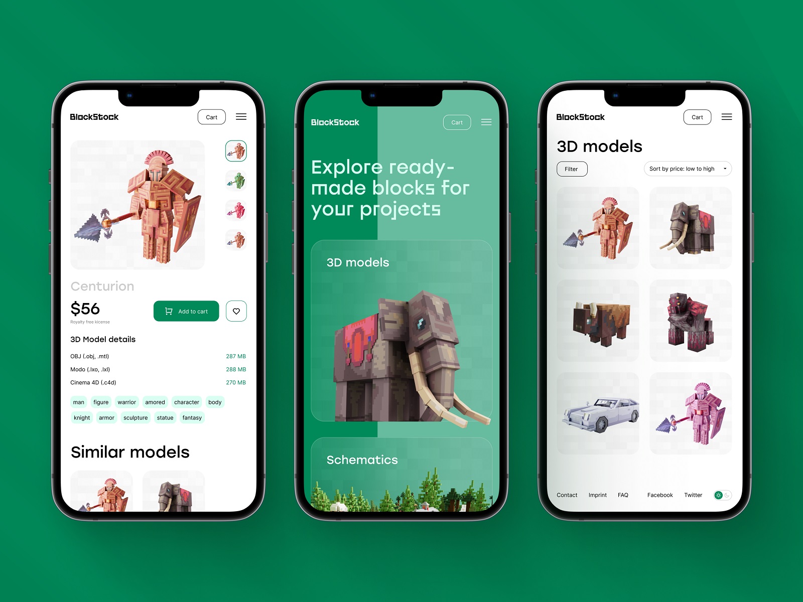
Here’s a glance at the minimalist and airy product page for BlockStock, the resource of high-quality, low-cost Minecraft models and assets. The page is neat and well-arranged in the best traditions, with a prominent product image catching attention at once, the ability to check the model options, noticeable price information and CTA-button, details on file formats, and tags to continue the search if this item is not what the buyer wants.
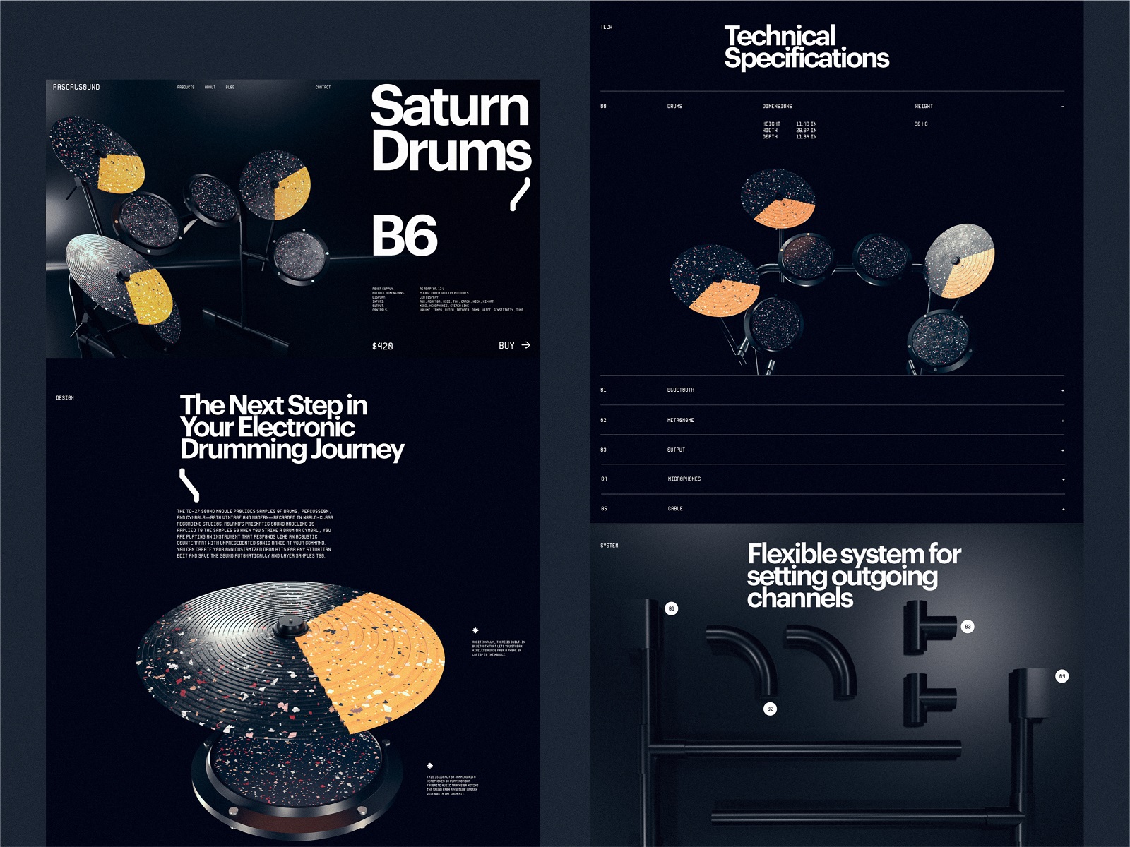
Musical Instruments Website
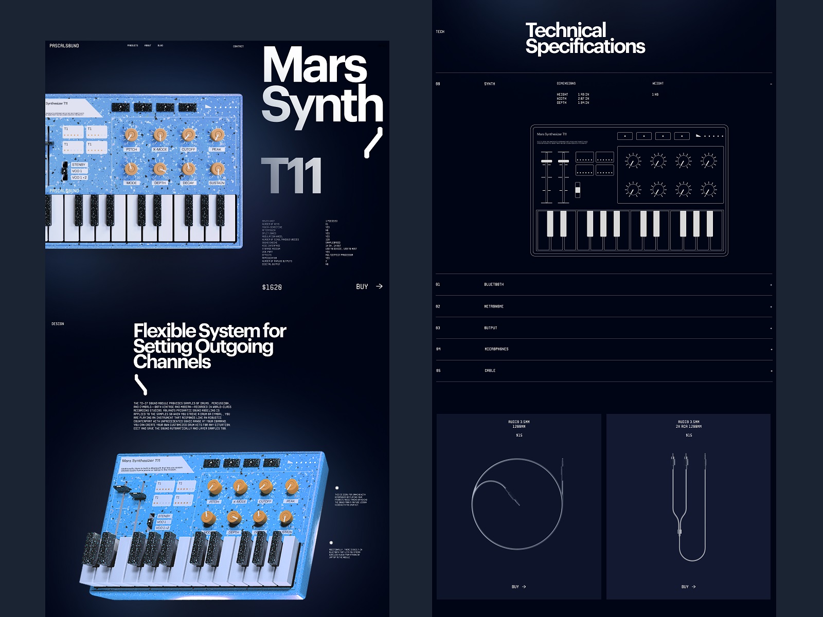
Here’s a glance at the website of the company producing different musical instruments. The brutal and stylish product page features impressive and elegant 3D graphics for product images, while bold typography, deep dark background, and well-balanced layout make it informative, atmospheric, and attractive.

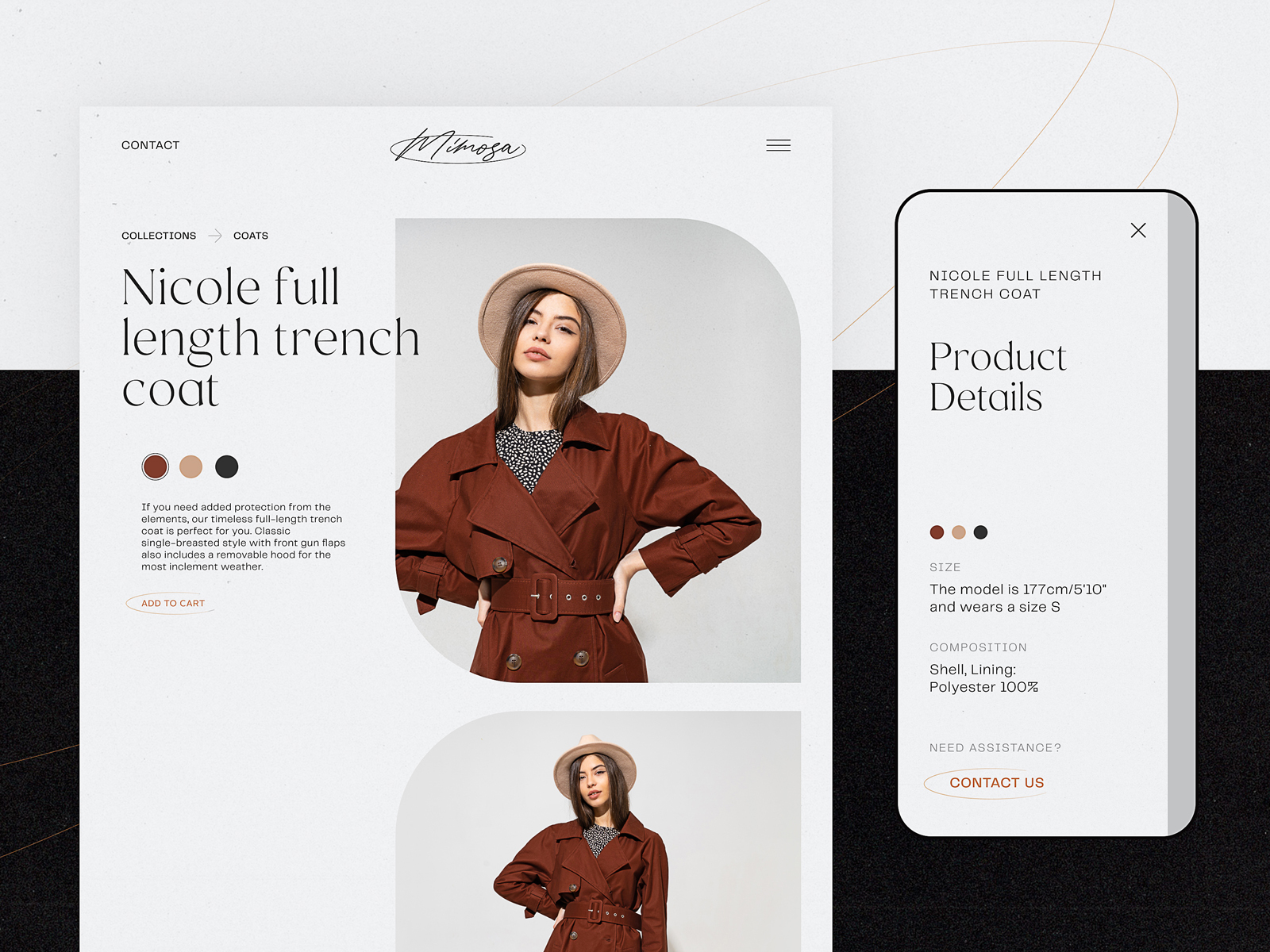
Fashion Clothing Brand
This light and neat e-commerce website supports online sales for a fashion brand, going beyond individual pieces of clothing and striving to allow clients to buy a united outfit. The design approach is based on a minimalist and airy layout with nothing distracting visitors from the beautiful and consistent photo content presenting the items and sharing the general style of the brand.
Pet Shop Website
The cute and engaging product page designed for the pet shop website uses video demonstrations of the items as a convincing way to see how the product works in the environment and sets the needed emotional connection.
Tea Brand Website
Here’s a closer look at the interaction with product pages on the tea store website for the Bennett Tea brand. The layout is built on bright and bold color combinations for the backgrounds, effectively highlighting various products in different packaging colors. Split screen, sophisticated geometry, smooth animation, and original typography – that’s what the designer chose for this case of web layout. The text information is organized in boxes, forming a sort of asymmetric grid.
To keep up with the external consistency and recognizable mental patterns of commerce website users, the website uses a stylish and minimalist sticky header, with the brand element in the center, links to core navigation in the left part, and a shopping bag button in the right corner. The latter uses the visual marker accented by color to let visitors quickly see if they already have something in their shopping bag.
Underwear Brand Website
This e-commerce website helps the beautiful underwear brand to set its image and grow its sales. The general design approach is based on the elegance of contrasting fonts and the passion of red to set the mood and help the photos demonstrating items look even more attractive. Visual dividers, directional cues, and noticeable CTA elements help shoppers navigate the purchase process easily.
Yacht Hiring Website
This website was designed for the service allowing users to find and hire yachts. Atmospheric videos and the color palette help visitors immediately dive into the theme of sailing. Interactive yacht visualizations on the product page assist in making the process of yacht choice straightforward and fun, while sophisticated typography, functional color accents, smooth motion, and intuitive navigation make the page attractive and easy to use.
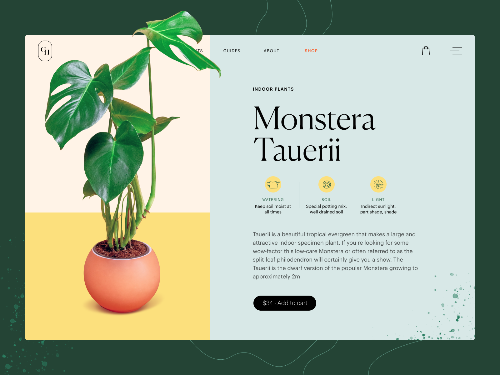
Gardening Shop Website
This product page is a part of the website design concept for the company producing a variety of plants and flowers in its own greenhouses and gardening sites and selling them online. The multicolored background in a natural pastel palette sets the mood and separates the visual product demonstration zone from the item description zone. Minor catchy graphics help to visualize the main characteristics. The price is put on the buy button.
Glasses Shop Website
The moment you put on your glasses makes them integral to your individual style. This design concept presents the website on the ins and outs of selling glasses elegantly. That’s another example of the e-commerce website integrating catchy and quality photo and video content to set the communication with the visitor from the first seconds of interaction. The product page lets website visitors look at the item from different perspectives and provides extended information organized in skimmable and clear text blocks. The price is put on the buy button, saving space on the screen.
Fashion Accessories Website
Here’s the product page design concept for the ecommerce website selling trendy accessories with a pinch of traditional art. The choice of fonts is determined by the fashion theme. Although it’s pretty original, the most informative copy blocks are given in quite a considerable size, so it doesn’t hurt readability. Impressive photo and video content support the atmospheric presentation of the offered goods. The design mainly uses a dark background for imagery-heavy pages, making them even more profound and stunning. The pages can be scanned in short seconds, and the pricing is highly noticeable. Moreover, the choice of model and pattern on the product page also feels impressive with the realistic and interactive animation of the neckerchiefs.
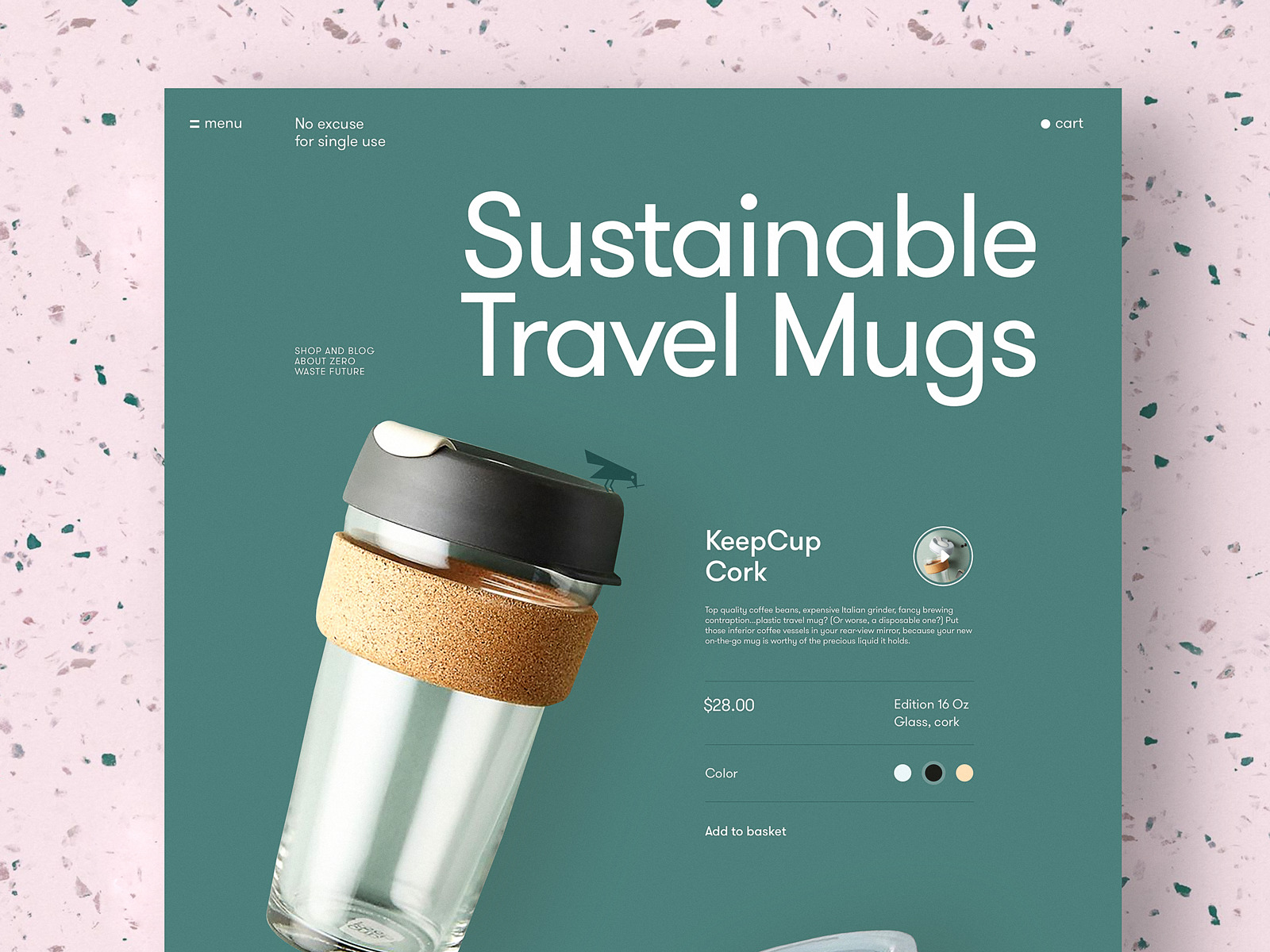
Zero Waste Products Website
Here’s an e-commerce part of the website devoted to the zero-waste lifestyle, where people can buy eco-friendly and reusable stuff. The elegant product pages are built on minimalist principles, with a lot of white space, a prominent product image, simple and super-readable typography, and clearly organized information about the product. Also, the element of interactivity while choosing the color for the items adds fun and makes the user experience engaging and dynamic.
Heavy Blankets Brand Website
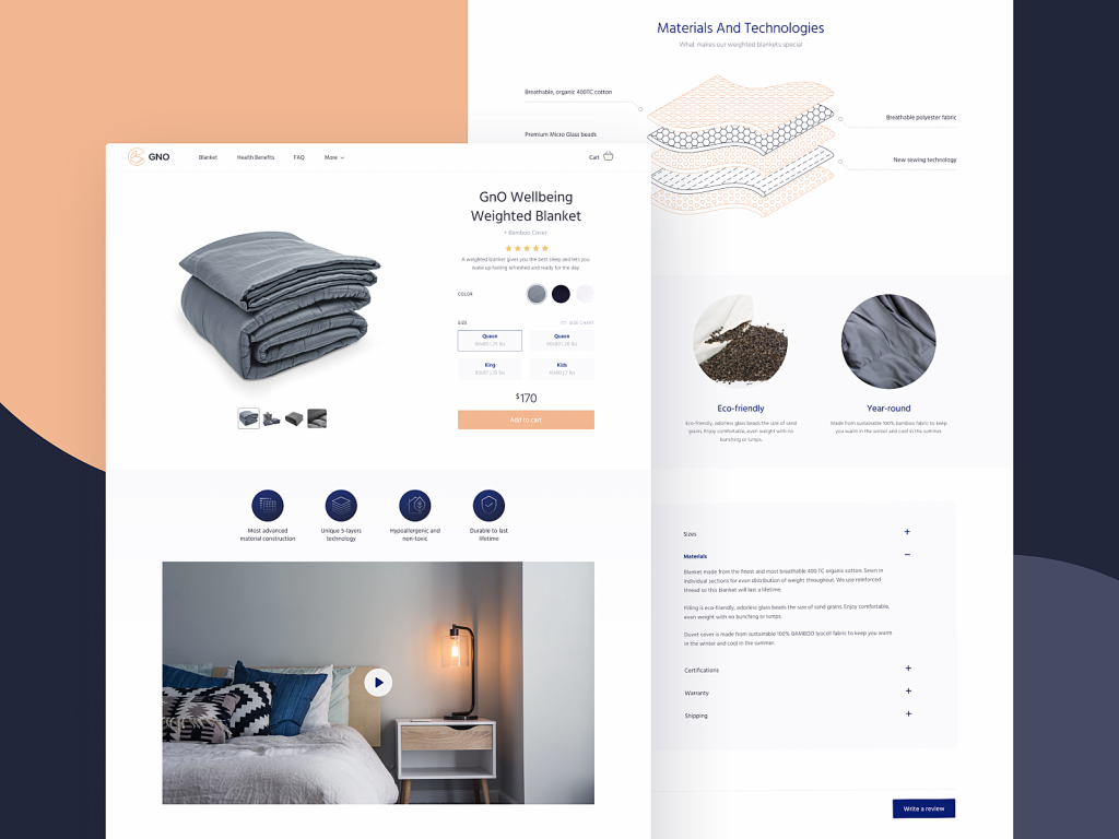
The product page for GNO Blankets website gives all the details about the product, includes the video presentation and custom graphics with detailed demonstration of product layers, and allows for choosing the needed blanket and adding it to the cart. The light background, balanced and thoughtful use of negative space, instantly noticeable CTA button, and highly readable font create the solid visual hierarchy of the page and make it easy to scan and interact with.
Niche Perfumery Website
Here’s the product page concept for the ecommerce website of a company selling exclusive niche perfumes. Dark full-screen video background, smooth motion, and sophisticated font choice instantly set the style and mood.
Interior Decor Product Page Concept
Here’s a glance at the e-commerce web design concept for selling various interior décor and accessories. Functional minimalism, limited and well-balanced color palette, and prominent images to present the products make the customer experience engaging and focused on the offer. Different options show how the design approach works for different items.
Insect Shop Product Page Concept
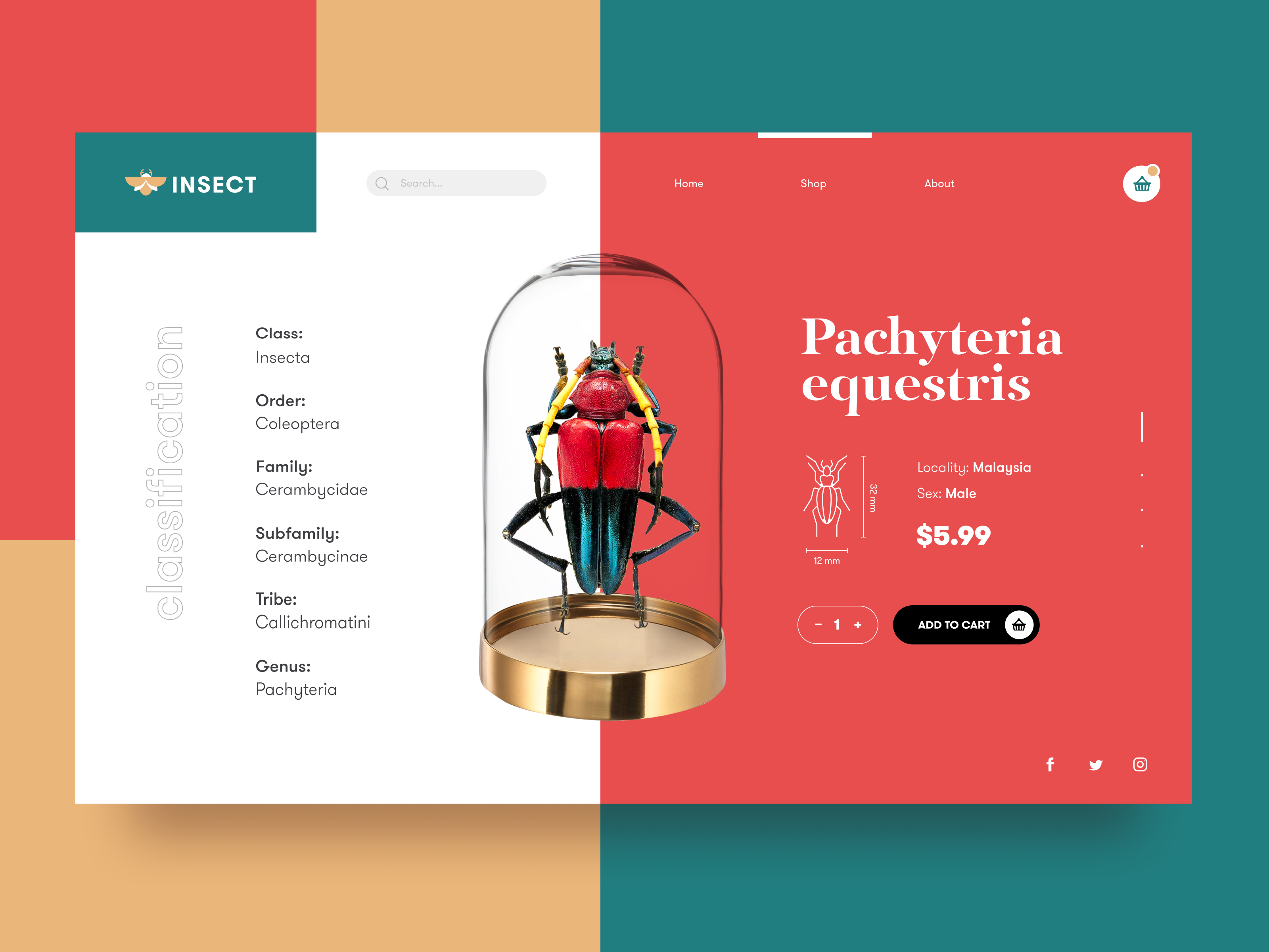
This is an e-commerce website design concept for an online shop selling a variety of insects. The example shows a product card in which the 3D-rendered model of the item gives an instant understanding of the offer and becomes the visual center of the composition. A lot of information about the item is organized to the left and right side of the product image, and infographics help quickly imagine the actual size of a bug. A cool interactive effect is applied to the process of adding the item to the cart when the chosen bug appears to be closed in the glass jar.
New web and mobile design collections and design case studies by our team are coming soon – don’t miss the updates!
And if you’re interested in learning more about the practical side of design, welcome to check the video sharing some insights our digital agency gained from recent collaborations with clients.
Tubik Design Collections and Articles
If you want to check more creative sets and useful articles on UX design for web and mobile, here are some of them.
8 Web Design Projects To Inform and Impress Users
Web Design: 11 Diverse Functional and Awe-Inspiring Website Designs
Dainty UI Design Projects Inspired by Food and Drinks
10 Elegant and Handy User Interface Design Projects
App Design Ideas: 7 Nifty Mobile Application Design Projects
Information Beautified: Media and Editorial Website Designs
UX Design for Traveling: Impressive Web Design Concepts
23 Impressive Web Design Concepts for Various Business Objectives
UX Design: Types of Interactive Content Amplifying Engagement
Motion in UX Design: 6 Effective Types of Web Animation
5 Pillars of Effective Landing Page Design
The Anatomy of a Web Page: Basic Elements
Originally written for Tubik Blog, graphic and video content by tubik
- English
- Ukrainian


