


Meaningful Error: 404 Page Design. Inspiration for Page Not Found
Meaningful Error: 404 Page Design. Inspiration for Page Not Found The article offers tips and web design inspiration for 404 page design: design practices and creative examples for Page Not Found errors.
Life often proves that making mistakes is just a part of progress. Errors present an inevitable part of human life, and the field of interaction with digital products is not an exception. It’s impossible to predict all the mistakes which can arise between humans and technology, yet testing and analysis can allow designers to find ways how to make errors helpful or at least solved easily. Today’s post is devoted to perhaps the most frequent error on the Web, known as Page 404 or Page Not Found: let’s look closer at the definition of this phenomenon, its probable structure and design, as well as a bunch of creative 404 page examples from the global design community.

What Is 404 Page?
Technically, 404 or Page Not Found is the error message in HTTP (Hypertext Transfer Protocol) response code which is sent in case a user got successfully connected with the server, still for some reason couldn’t get the content that was requested. When it happens, for example, in situations if users try to follow the link which has been deleted, dead, or broken, the website server forms and sends a 404 web page informing the user that the content cannot be found.
Certainly, the page can have a very simple and basic appearance with just a line of copy saying that “nothing can be found here.” However, the vast majority of websites prefer to apply the customized 404 web page. And that really could be described as a user-friendly policy, also successfully supporting website or brand promotion. A correctly designed, stylish, and creative 404 page, which is shown to everyone who makes a mistake in the link, is able to not only inform users but also navigate them, entertain, or just give a moment of aesthetic pleasure.
What Does Page 404 Include?
Among widely used layout elements on page 404, we could mention:
- error message
- brand signs (logo, brand name, brand mascot, etc.)
- navigation elements (links, buttons, menus, search fields)
- decorative elements (illustrations, photos, animation)
In many cases, the design concept chosen for this sort of web page corresponds to the general stylistic performance of the website to keep the feeling of integrity and consistency. It means that designers apply the same or very close color palette, style of layout elements and graphic design, typography, and grid. Still, some designers choose the opposite way of presentation and make page 404 look totally different from all the rest of the website, in this way, perhaps, supporting the idea that this sort of error is an accident and shouldn’t be associated with the rest of the website content.
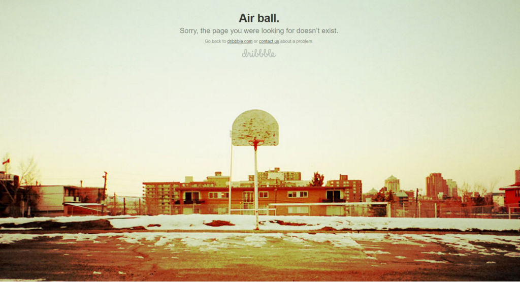
404 page at Dribbble applying the error message, two options of key links (home page or contact form), branding sign (brand name lettering), and theme image as a background
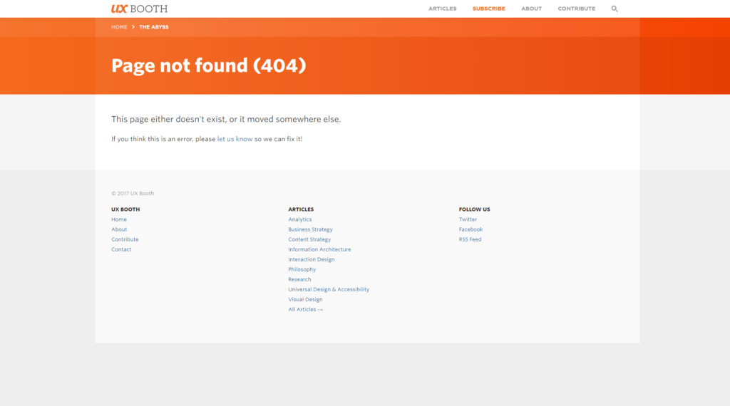
404 page for UXBooth applying the error message, the ability to contact directly to support, and the menu of content categories.
Two different approaches to showing the number 404 could also be mentioned here. Some pages apply it as the central element of the composition, based on the fact that all active internet users know what this number means on the Web: quickly scanning prominent and legible numbers, the user will be informed of the issue in split seconds. However, there are also designers who do not make the number 404 quickly noticeable in the general visual hierarchy of the page: it often happens when this page is used as the field for additional navigation and content presentation.
As for the navigation elements, the examples shown below will let you see that most of them apply the error message to the user and the link or button to the home page. Nevertheless, this basic set can be effectively extended with the following:
- a set of links or a menu providing the user with a variety of routes instead of only the home page, right from this point
- fixed header enabling a user to get to the key areas of the website instantly
- a search field, via which the user can request the needed content without getting back to the home page
- a collection of recommended posts, which could possibly draw the user’s interest
- the advertising element or link.
Creative 404 page design for the ShipDaddy website, featuring mascot animation and allowing visitors to quickly get back to the home page.
Definitely, it doesn’t mention that all of these elements should be included on one page altogether: the choice and composition should be based on thorough user research. Setting the priorities, the designer can make a decision on what should be included in the layout: if users should be navigated only to the home page, then all the other options will work as a distraction. Vice versa, if users, let’s say, look for a particular product or item, they probably wouldn’t be happy to get back to the home page, and only there get access to the search. The solution should depend on the target audience, its needs, and wishes, and the problems, solved via the platform they are at.
The error message is usually another object for consideration: the text should be too long, the style and manner of communication (formal or informal) should correspond to the general tone and voice of the website, and the fonts should look harmonic in the layout and legible. The error message needs to let the users feel that they are respected and get them informed clearly on what happened.
One more highly debatable element of page 404 design is custom graphics. In reviews of design trends, we mentioned the growing trend of applying custom illustrations in mobile and web interfaces. Page Not Found design is one of the most convenient places to respond to this creative trend: original illustrations or unique graphics can both support stylistic performance and communication with users. No secret, people are visual creatures, and a picture is worth a thousand words: it can not only inform but also add vibes of fun, entertainment, formality, etc. This approach can transform the simple web page into a source of aesthetic satisfaction, which is, by the way, an important foundation of positive user experience.
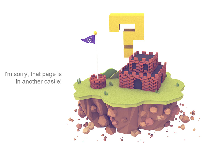
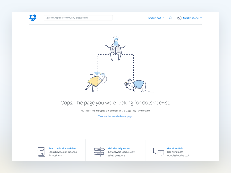
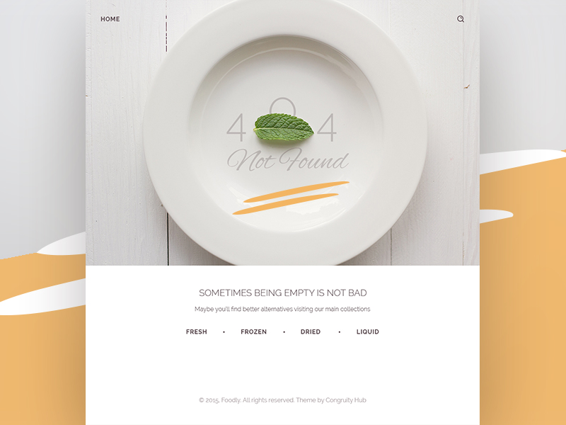
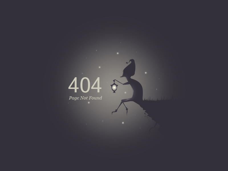
Collection of creative pages 404
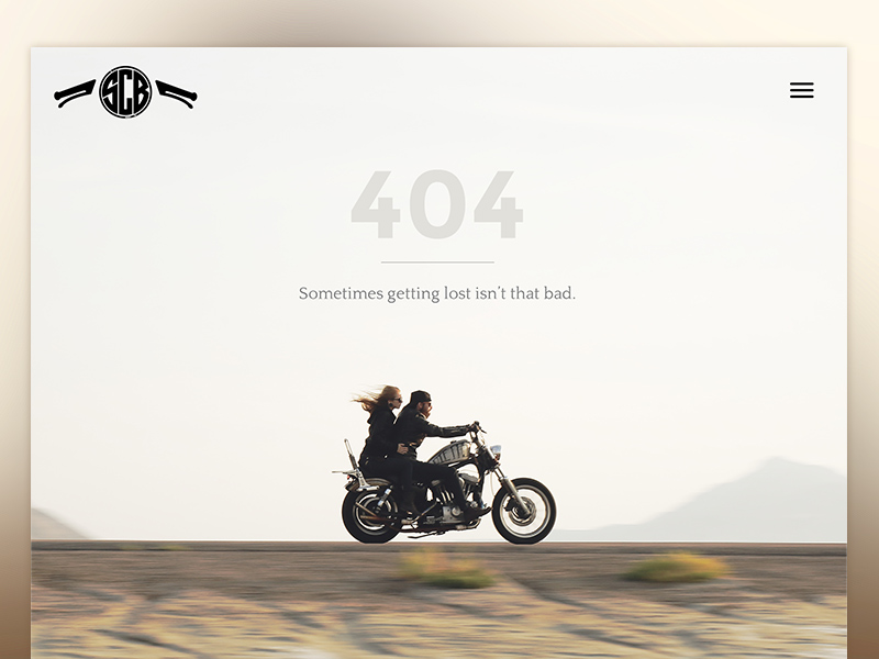
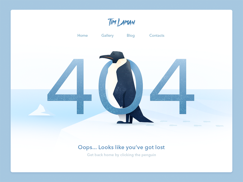
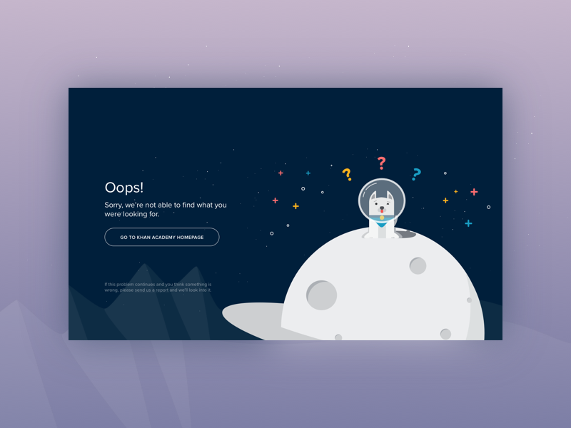
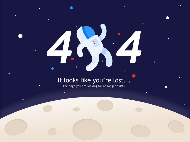
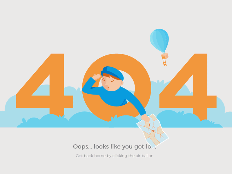
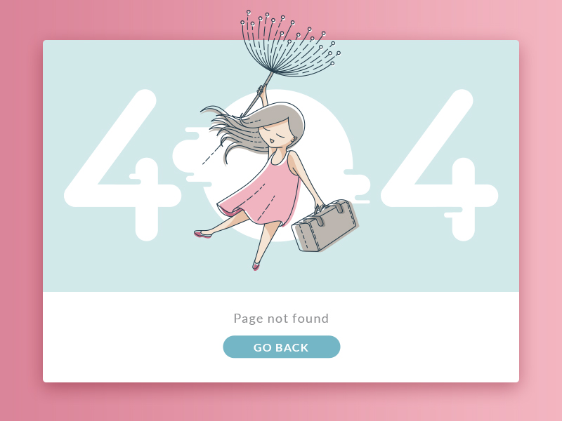
Now let’s go from theory to practice: here, we have selected a diverse set of creative 404 pages, differently applying the UX design practices and custom graphics mentioned above.
By UENO
So, we could definitely say that in the design of a 404 page, diversity is key: following the simple basic understanding of what information the user needs to get from this point of the surfing, designers can find hundreds of creative ways to deliver it elegantly and helpfully.
New design inspiration articles and collections are coming soon, stay tuned!
Useful Articles
Copy Content in User Interfaces: Tips and Practices
How to Improve Web Scannability
3C of UI Design: Color, Contrast, Content
How to Choose Between Light or Dark UI
- English
- Ukrainian