Web Design: 18 Basic Types of Web Pages
Web Design: 18 Basic Types of Web Pages Let's review basic types of web pages you can find on diverse websites around the Web. Packed with web design examples and tips.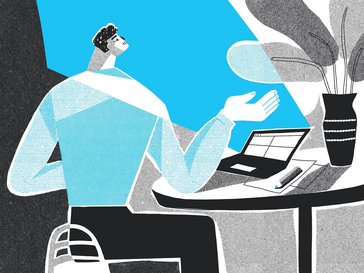
For most people today, it’s hard to imagine life without the Web. Various websites help us with everyday tasks like cooking or shopping, support our education with tons of data, keep us quickly informed with plenty of news, and help us manage, calculate, work, and communicate. According to Netcraft, in the August 2024 survey, they received responses from 1,107,785,375 sites across 270,065,795 domains. So, the diversity of websites requires increasingly varied design approaches and solutions. Yet, regardless of the type of website, some basic pages are common across most website structures. In this article, we offer you a review of 18 basic types of web pages you can come across on the Web.
Illustration by Yaroslava Yatsuba
Home Page
Home page is one of the most strategic pages of any website. It is called home because it is typically the starting point where the user gets a core introduction to the website and chooses the direction of their further journey through it. Home pages usually contain links to the most important interaction zones. In other words, it can also be named the initial page or index page. The home page is the starting point for users who are directed to the website by search engines, so in most cases, it is the page visited by the largest number of website users.
Home page often contains a search field, basic onboarding functionality for personalized sites, and different navigation areas showing users diverse categories of data. It might also include engaging welcome messages and copy blocks featuring slogans and/or explaining the website or brand’s benefits. In web marketing, it is recommended that the home page align with a company or product’s branding to create a strong visual association.
The look and structure of the home page may also differ for websites that allow users to sign up and create accounts. In this case, the home page often looks different for logged-in users and for those who aren’t. For example, on social networking websites, the home page may look like a feed of all updates, while logged-out users may see a page that presents the website’s benefits and a registration form. On ecommerce websites, the home page often showcases hot deals and provides quick access to different product categories.
Depending on business goals and target audience, home page design solutions may vary significantly. Some are based on informativeness. In contrast, the others aim to “shock and awe” a visitor with the wow effect of media content or animation, catching attention, creating the necessary mood, and engaging them to see more.
Home page for the Sunday website designed by Standard Projects
Home page for the website concept by Emote
Home page for music platform website by Outcrowd
Read about best design practices for home pages
Feed Web Page
Feed (or news feed) page is found on websites that often update content. In other words, it’s a content stream users can scroll through and check what’s been updated on the website. On the feed page, the content is presented in blocks or elements that are similar and repetitive. For instance, an editorial feed will present a list of news or articles, whereas on a social networking site, the feed will often show updates from followed users or pages. Also, the presentation of the feed can range from text-only and super minimalist to one using big, complex blocks of content that include both text and media like photos, illustrations, or even video previews.
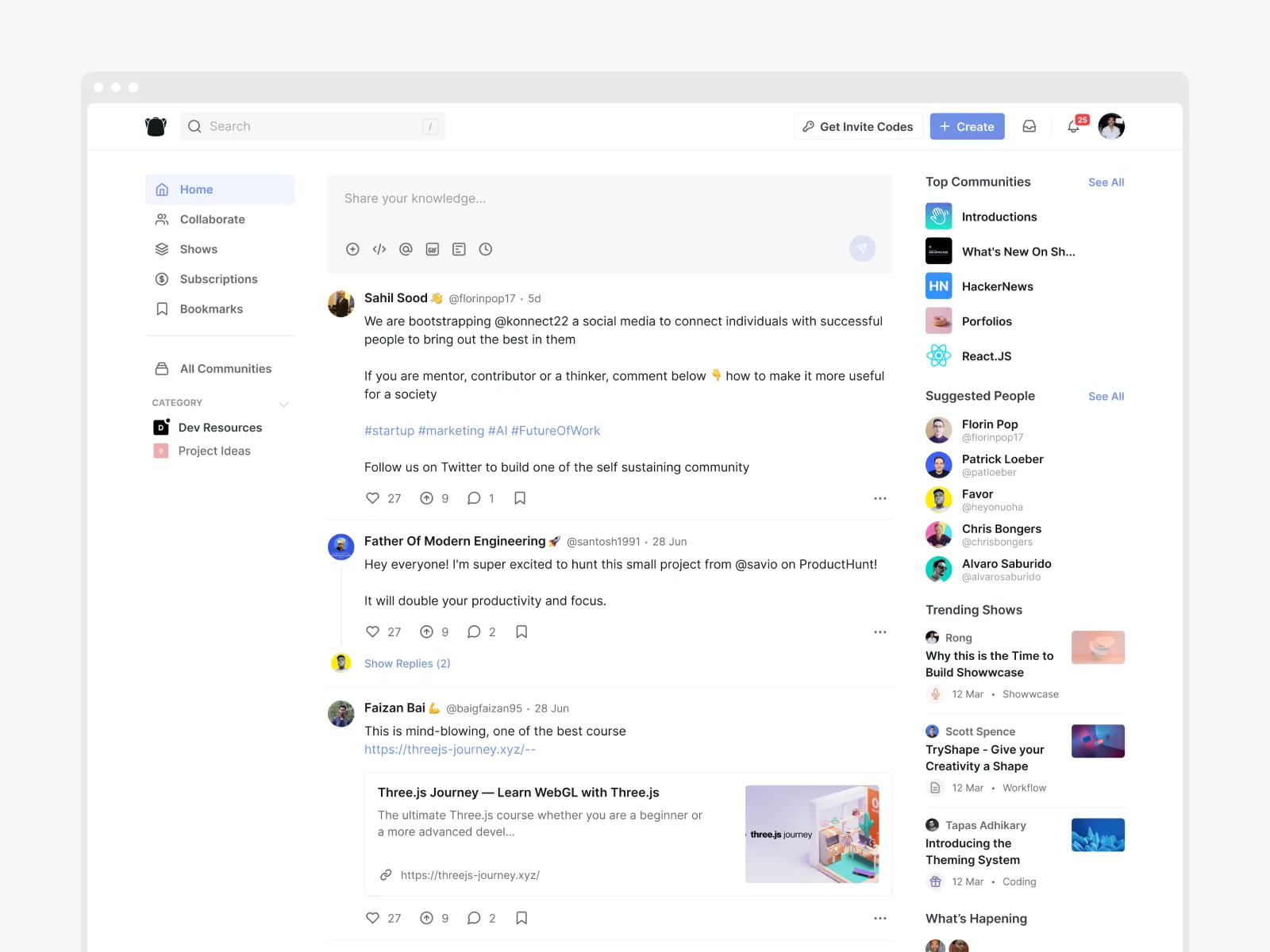
Social feed page example by Never Before Seen
Menu Web Page
This page is usually about navigation goals. In addition to a typical menu control, the menu page presents a list of content categories and interaction zones. It is not always needed: websites with a simple structure often use only menu controls integrated into the layout, which don’t require transitions to a separate page. However, the separate menu page allows designers to focus the user’s attention on the options without distractions. Moreover, in many cases, a separate menu page supports the minimalistic approach for other pages.
Full-screen menu page design for a media platform website by Lumen Studio.
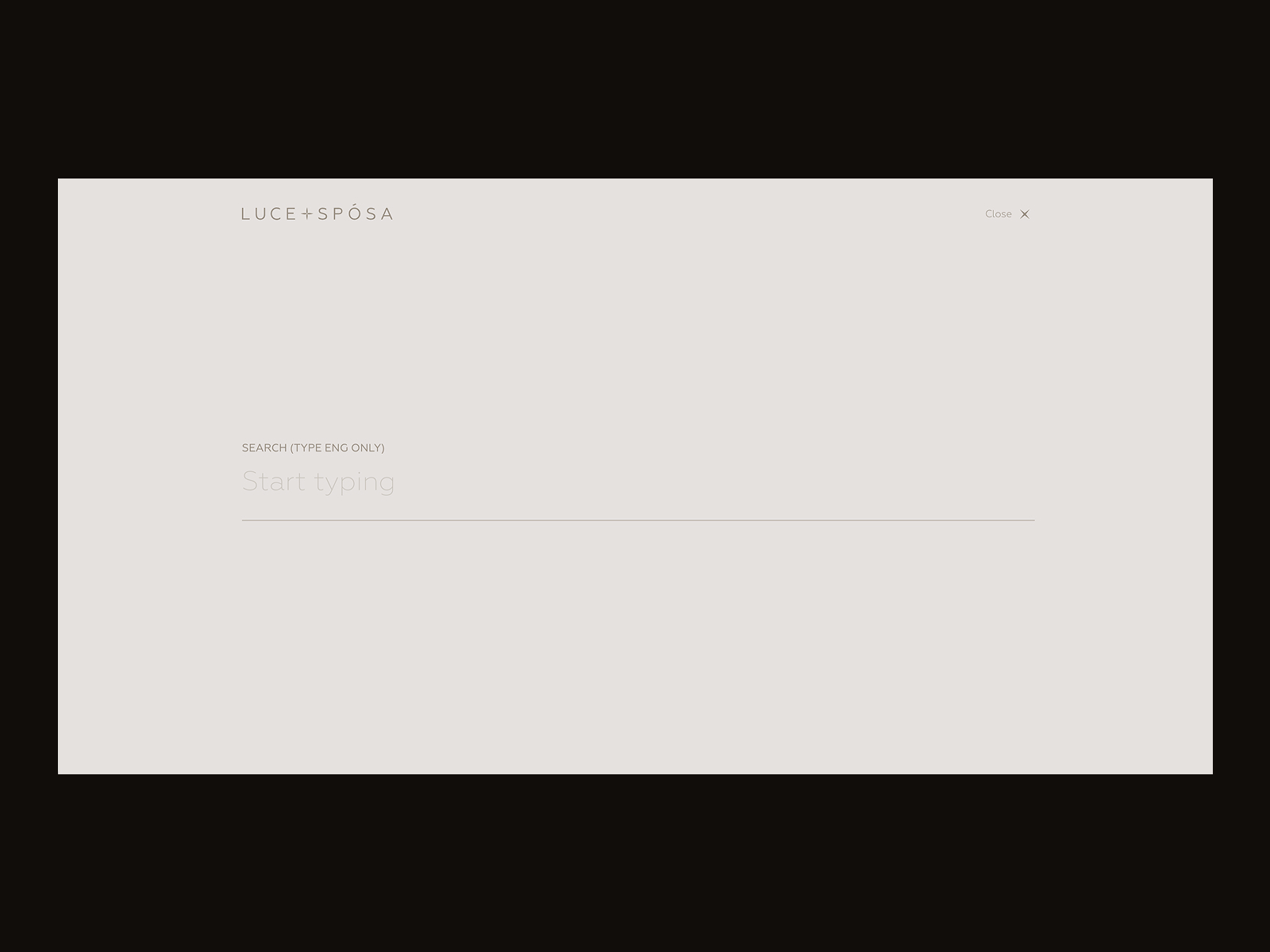
Search Web Page
This page presents a feed of internal search results after the user typed in the request in the search field. The page’s look may be very different, from a simple text list to large blocks with images; the solution for content presentation on this page depends on what is most important to the target audience. The core requirement for the search page — except the well-adjusted results, of course — is high scannability of the layout and instantly readable headings or titles, as that is the page where users usually quickly skim what they see to find the needed option. Also, the essential thing to remember is to keep the search query visible on the results page, so users don’t need to keep it in mind and check whether it was typed correctly if the results aren’t very good.
Here’s what the search results page looks like here, on Design4Users website: when the search query is typed, the website user first sees the list of cards representing corresponding articles, and then the additional layers of seach is offered in the interactive section, which opens the set of content categories that may also be interesting for this reader.
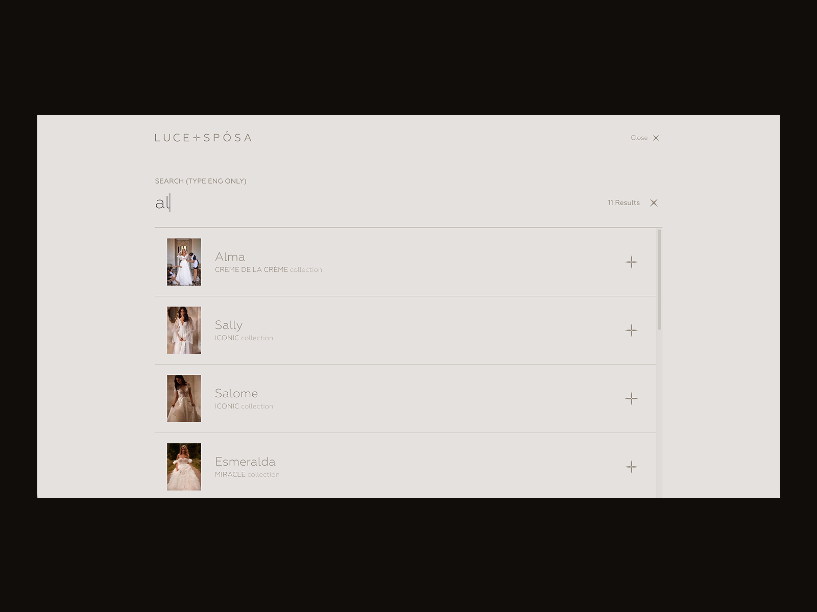
Search page for the Luce+Sposa website by ZentixSoft
About Web Page
This is a web page that allows visitors to get quickly informed about the company, product, or person behind the website. It is an important part of strong branding and the shortcut for telling the audience about the benefits they can find on this website or achieve with its help, so when visitors want a concise introduction to the brand, they look for this page. The link to the About page is often found in the website header, footer, or both.
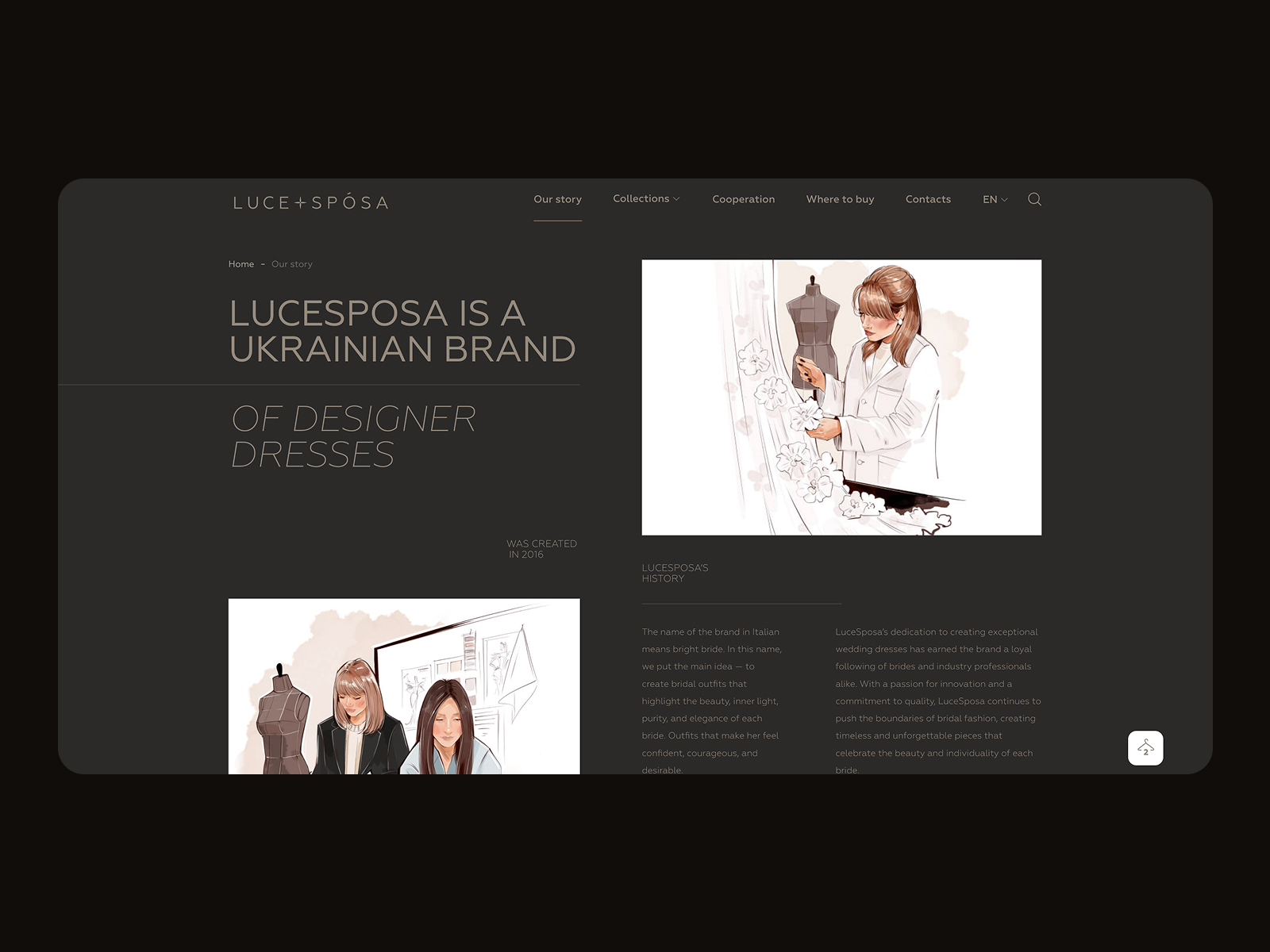
About page for the Luce+Sposa website by ZentixSoft
Registration Web Page
The registration page can be found on websites where users sign up and create personalized accounts. On this page, it is important to focus on a simple, functional way to sign up with few steps and fields to fill in. If possible, offer users multiple registration options, including lazy registration via social networks. Also, consider onboarding for first-time visitors to make interactions and registration easy from the start.
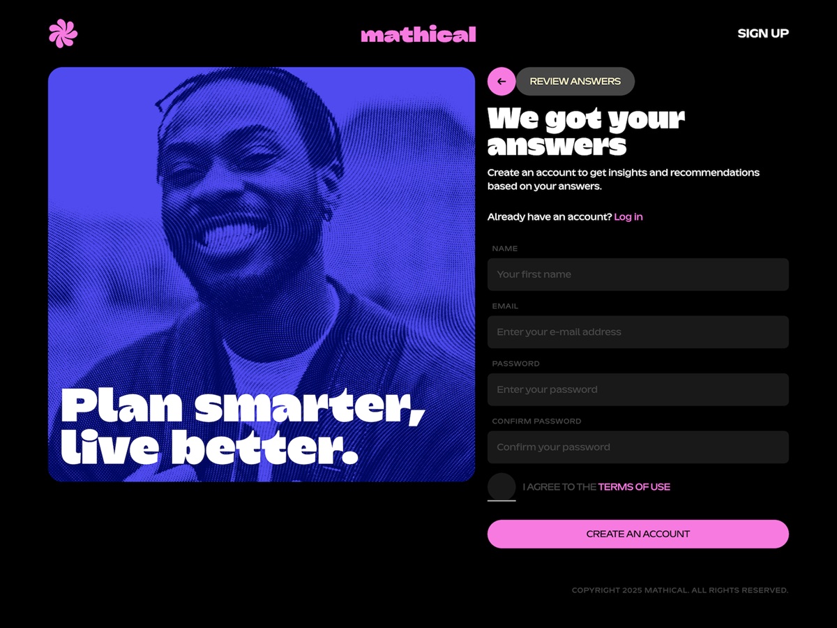
Stylish page of the registration form after the anonymous onboarding questionnaire for the Mathical website by SpartanBeats
404 Web Page
The 404 pages can be found on any website. Technically, 404 or Not Found is the HTTP (Hypertext Transfer Protocol) response code: it is sent when a user successfully connects to the server but, for some reason, couldn’t get the requested content. It can happen, for example, when users tap the link to a page that has been deleted, is dead, or if the link itself is broken; in this situation, the website server forms and sends the 404 webpage to inform the user that the content cannot be found.
The most basic solution for a page of this kind is a simple layout with just a line of copy saying that “nothing can be found here”. Nevertheless, these days the vast majority of websites apply the customized 404 webpages that can serve much more strategic goals or at least add some fun to that annoying case. What’s more, a creative approach to this error page can also effectively support website or brand promotion. A well-crafted and stylish 404 webpage not only informs visitors but also navigates them to other pages, entertains, or just gives a moment of aesthetic pleasure.
Funny 404 page design concepts by Synchronized
Blog Web Page
In our article on different types of websites, we’ve answered a common question: whether a blog is a website itself or a part of a website. Put briefly, it can be both. The term “blog” is used in two different ways today.
Basically, a blog is a type of website devoted to providing information or discussion on particular topics. It is a kind of journal or diary people keep online, sometimes just sharing their thoughts or expertise and also inviting readers to discuss the problem in comments. With a variety of blogs today, you may find the personal and professional ones, some of them will be devoted to daily life while the others will cover narrow themes or areas. Bloggers share posts that become the basic content around which the website is built. In this case, a blog is a type of website.
Nevertheless, in the last decade or two, the situation has evolved. In most spheres, the competition is incredibly high on the Web. To stay above the ocean and rank highly in search engines, websites need not only to meet technical and design requirements but also to constantly update their content. This is when blogs have come into play. Now, you can find blogs incorporated into e-commerce and corporate websites, educational platforms, and portfolios. And this is the case when a blog is not a type of website, it is a part of the website, presenting interesting news and articles around the website’s theme.
In the latter case, the website needs a blog page that will show the feed of articles. The way they present their content may differ, from a simple chronological list to sections and featured articles, depending on how often they add new posts and on the preferences for what to show visitors.
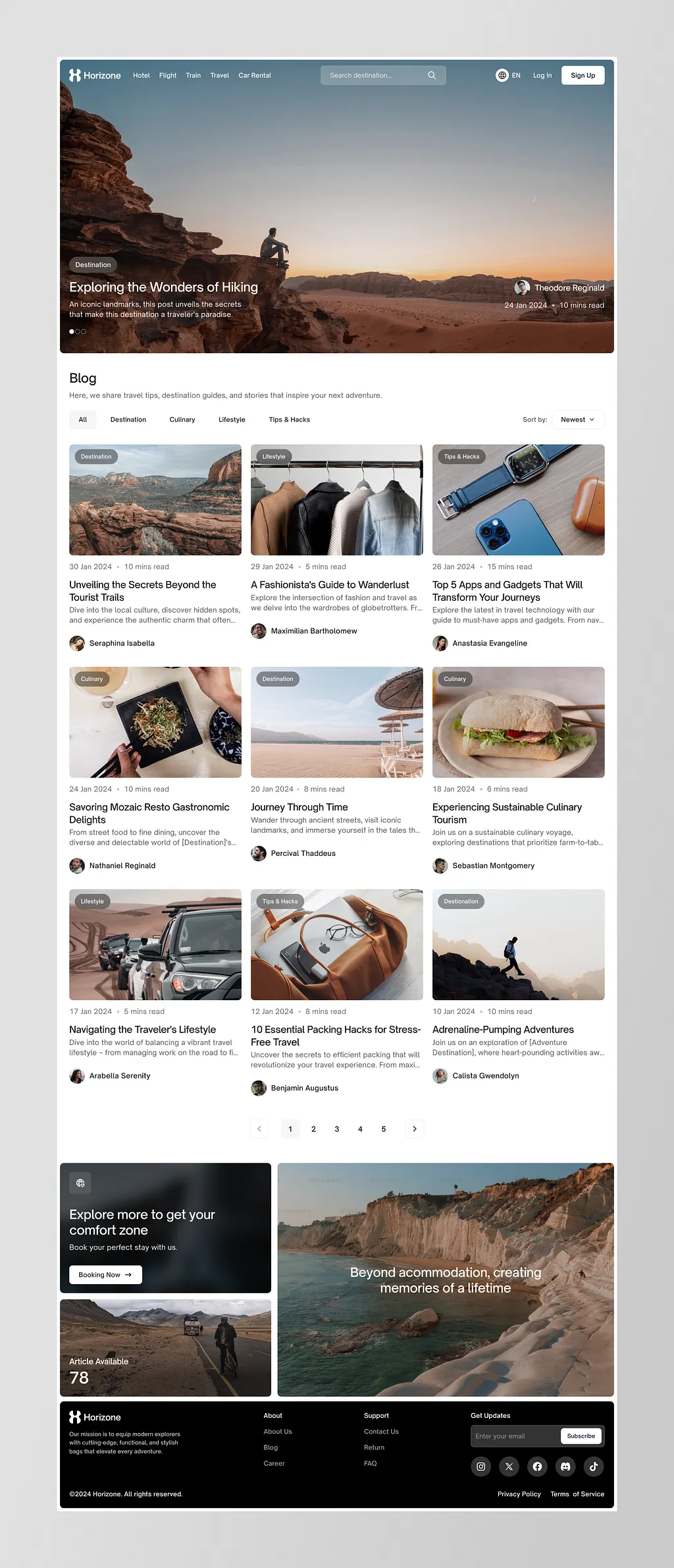
Blog page design by Kretya Studio
Article Web Page
This web page shows visitors a full article in a blog, news platform, educational website, or any text-based website. The article page presents a particular article, news, or report. It’s crucial to design it according to typical eye-tracking patterns so that a large amount of text can be easily skimmed. Also, a solid, well-thought-out visual hierarchy helps visitors quickly prioritize the content: for example, the headline should be the most prominent text element on the page, and the H1 and H2 headings should be easily distinguished. Quite often, at the end of the article page, you can find the blocks of related content helping to engage a reader into further interaction with the website. Another essential aspect to consider is enough white space that divides text blocks making them more scannable and digestible. And consider using images that will not only illustrate the article but also will make the page look more eye-pleasing, add emotional appeal as well as make text look easier to perceive.
Article page for the Sunday website designed by Standard Projects
Portfolio Web Page
As it’s clear from the name, this type of page is typical for websites whose goal is professional presentation, most often for people or teams that create visual content such as photography, designs, art, videos, or physical goods, for example, hand-made stuff, clothing, exclusive decor, etc. You can find such pages on professional platforms where users can create their own portfolios. Or it can be a special page on the personal website. The goal of this page is to showcase the projects to customers at their best, so it is recommended to work on high-quality images of the goods or designs, and to present them in the original way, with a pinch of wow-effect for website visitors.
Portfolio page design for IDST by HelloWorld Studio
Services Web Page
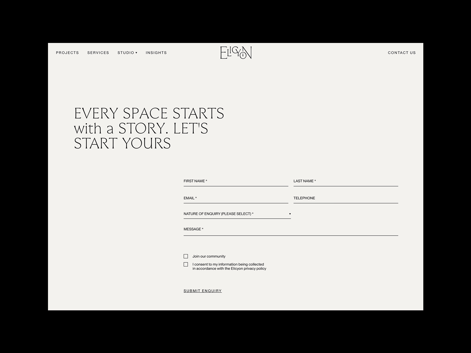
This page has a goal quite similar to the previous one: it presents professionals to potential clients. However, instead of showing the projects and goods as on the portfolio page, this page gives an introduction to the services the company or individual offers. Again, this is not the page where visitors are going to spend much time reading long blocks of text, so make the presentation highly readable and easily scanned, with bullet lists and clear, concise descriptions that use little jargon. Images can also be really helpful here, as they are perceived faster than text and have great power to set the desired mood and emotionally amplify the brand message. As not all the services can be shown with quality photos, custom illustrations and icons can be used instead.
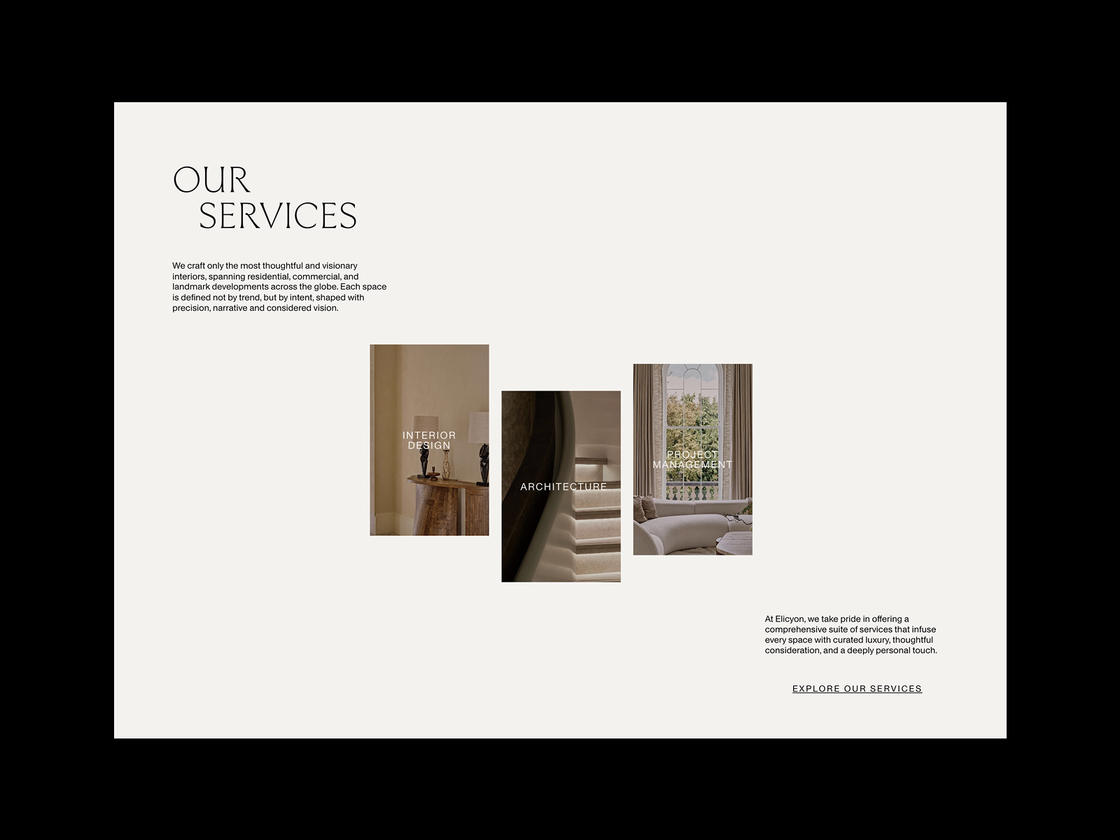
Minimalist services page for the Elicyon website by HNDRX
Services page design for IDST by HelloWorld Studio
Product Web Page
The product page is one of the most vital pages on e-commerce websites. This page gives all the needed information about the product, allows users to check the photos and different color/model options, see the reviews and ratings from earlier buyers, and add the product to the cart or wish list. A poorly designed product page may waste all the effort put into bringing the buyer to the website and to this particular product. So, focus on functionality, clarity, and readability, and make CTA buttons instantly noticeable.
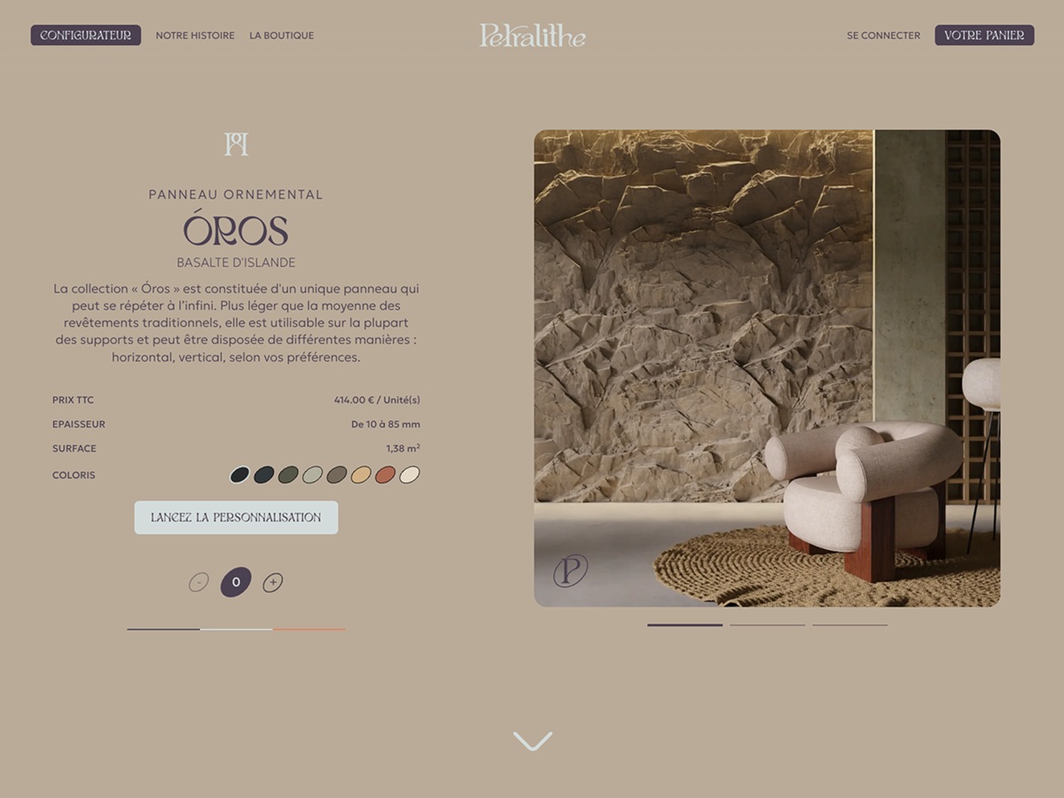
Product page design for Pethralite website by Zieben
Product page for Matthew Fisher website design by CUSP
Product page design for the Sunday website by Standard Projects
Read about the best design practices for product pages
Cart Web Page
Obviously, this page is also another part of an e-commerce platform. In the real shopping process, users add items to the cart, and on this page, they should easily find a way to complete the purchase. The cart page shows a list of items, usually with a picture and basic information to refresh the details and prevent the buyer from having to go back to the item page.
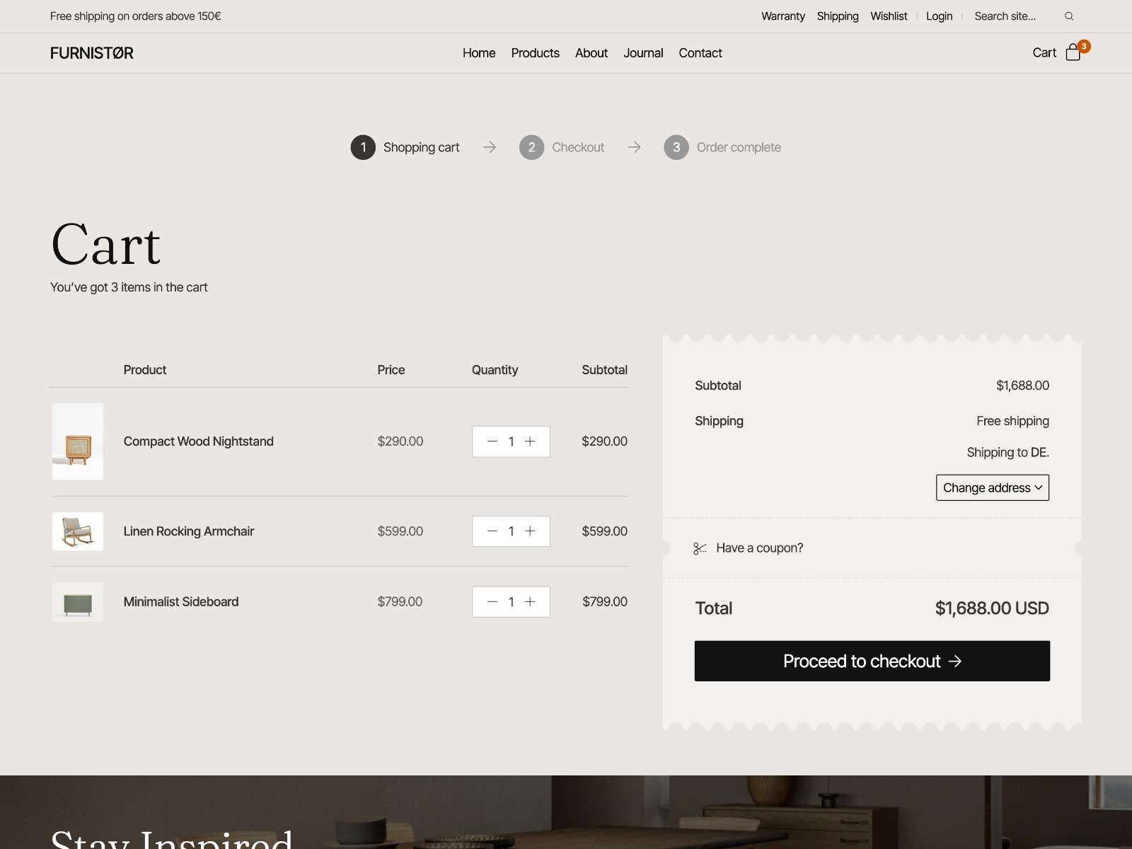
Shopping cart web page for the Furnistor website by Laborator
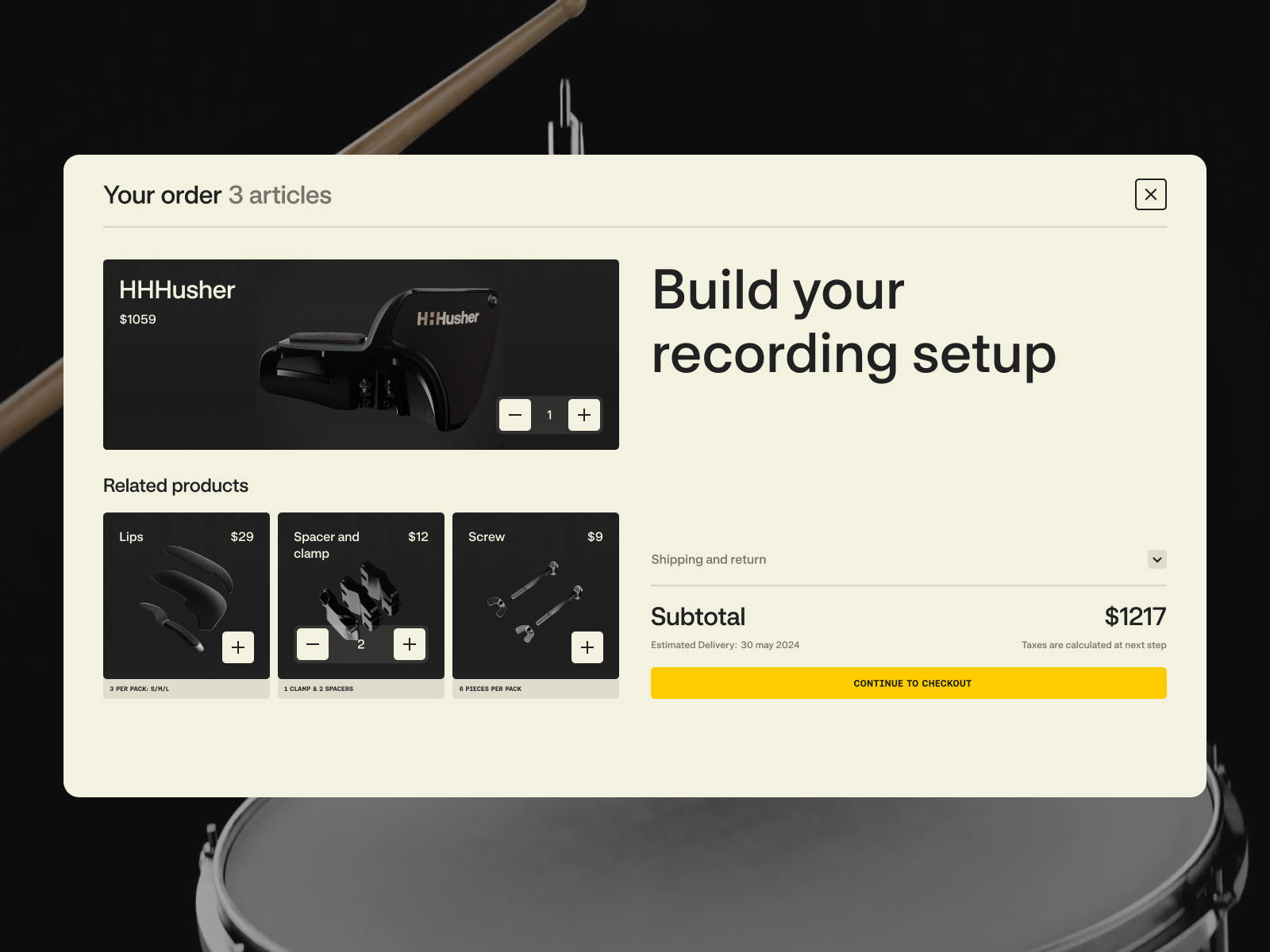
Shopping cart web page for the HHHusher website by RefDigital
Pricing Web Page
The pricing page shows the prices for services provided by a particular company and often displays different pricing plans for different user categories, depending on the functionality and features of the digital product or service they want to purchase or use. This page is a critical tool for converting visitors into customers, as it usually provides necessary details about various plans and lets users easily compare options to choose the best fit for their needs. Pricing pages are often found on the websites of B2B companies and SaaS products.
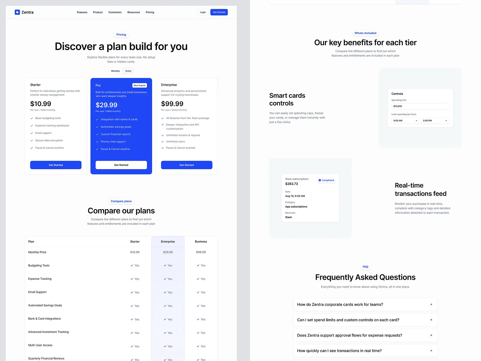
Pricing web page design concept by Keitoto
Statistics Web Page
Many websites with personalized user accounts offer different stats to keep users informed and engaged. The statistics page visualizes various data, usually in charts, numbers, and tables, to make it easier to scan and analyze. Sure, it is a good idea to integrate well-known user patterns, as this reduces cognitive load and makes the stats more user-friendly. One classic example of this pattern is using red for negative changes and green for positive changes in the user’s stats.
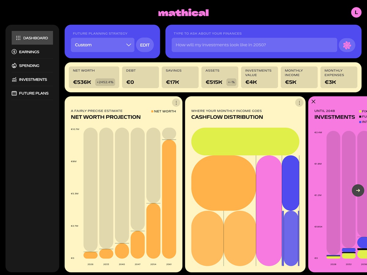
Stylish page of the registration form after the anonymous onboarding questionnaire for the Mathical website by SpartanBeats
Team Web Page
Team page is a popular type of web page for company websites as well as editorial and media web resources. It is the well-checked way to not only make communication more personalized and informative but also add emotional appeal and a human touch to the communication with readers or clients, and let people know more about the professionals who create the resource or provide the services. Many teams approach this page creatively and find ways to add a pinch of fun to it, such as engaging web animation or creating custom artistic portraits for featured team members.
However, creating a specific web page for that goal is not always necessary. There are also many cases when this information is effectively integrated into the website as a section of a home page or About Us page.
Team page interactions design for the Aitkin Turnbull website by Harrison Carloss
Contacts Web Page
The Contacts page is usually quite simple but highly important. It shows how the user can contact the support team, the people responsible for different issues, or the person behind the personal website. Don’t strive to overdesign this page; it should load quickly, be informative, and be functional. In many cases, a contact form is also added to the page so visitors can send the message right from there.
Minimalist and functional contact page for the Elicyon website by HNDRX
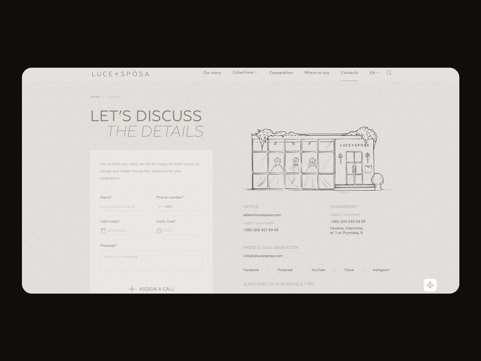
Contact page for the Luce+Sposa website by ZentixSoft
Landing Page
This is a special kind of web page that can be used either on a website or independently. The main goal of the landing page is to present clear, focused content on a specific goal or query, so visitors can land right where they need to be.
In general terms, the phrase “landing page” was created by analogy with a landing spot in the physical world: on the web, it initially marked any page on which the user “landed” while surfing the Web and started their journey around the website. The phrase is still used in this sense in web analytics. However, a more specific understanding of this term has become increasingly popular and is widely used not only by designers but also by marketing specialists. Today, the term describes a web page designed to focus on specific, relatively narrow goals and to provide a quick way to accomplish a particular action.
Creating special pages means providing users with clear directions, which is especially useful for large e-commerce platforms with hundreds or thousands of items. Directing all traffic to the home page, in this case, can lead to a poor user experience, especially when users come from specific marketing campaigns or external sources. The risk is high that they will get lost immediately in the overwhelming amount of content and links on the home page or that their attention will be drawn away, so the purchase won’t be finalized.
Furthermore, there are many other cases beyond e-commerce when landing pages are a good fit: they can present mobile applications or educational resources, promote events and meetings, make announcements, introduce communities, or simply share information. The design process for any landing page starts with setting a clear, concise objective to be achieved through it.
Landing page design by Outcrowd
Read an article devoted to the best practices of landing page design
Indeed, this list of web pages isn’t complete yet, and we will continue introducing various web pages, interface elements, and interaction practices in our following articles. However, hopefully, this list will be helpful not only for designers beginning their web design journey but also for clients who will be better armed to answer the question, “What pages would you like to have on your website?” Stay tuned!
Recommended reading about design
Here’s a bunch of articles for those who would like to continue the topic exploration:
The Anatomy of a Web Page: Basic Elements
6 Elements of Efficient Company Website Design
The Big Guide to Different Types of Websites
UX Practices on Product Page Design
How to Make a Web Interface Scannable
5 Basic Types of Images for Web Content
Guide to 6 Effective Types of Web Animation
How to Make User Interface Readable
- English
- Ukrainian