


Stylish Design Concepts for Diverse Websites
Stylish Design Concepts for Diverse Websites The collection of creative UI design concepts, this time showing the variety of user interfaces for web sites and pages for different purposes and target audience.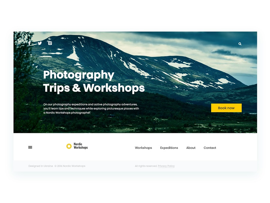
Nowadays, the World Wide Web could definitely be named the web of life. It connects people from all around the world whatever their aims and wishes are about. Personal and professional communication, ordering and delivery of goods and services, education and mentoring, searching for new information, advertising, watching films, tracking everyday stuff and accounting finances, and so on, and so forth—seems, there’s no sphere to which the Internet wouldn’t add its own two cents. No doubt, there are both advantages and disadvantages brought by technology and new ways of broader and faster communication of all kinds. Still, today we are going to focus more on the variety of perspectives for the positive influence of the web on people’s lives of global society.
In the design glossary issue devoted to key terms of web design we mentioned that as a domain of human activity it lies on the crossroads of many sciences and practices. Among them the following should be mentioned:
- drawing and composition
- painting and coloristics
- logic and schematism
- analysis and statistics
- visual arts
- programming
- user research
- psychology
- copywriting
- branding and marketing etc.
Covering diverse aspects of a website functionality and appearance, some designers work in teams every member of which specializes in a particular sphere while the others can work out different of the mentioned aspects individually. Anyway, in vast majority of cases web design is the sphere of digital products which have to be functional and user-centered. As famous American designer Charles Eames said “Design is a plan for arranging elements in such a way as best to accomplish a particular purpose” and his words totally reflect the idea of modern web design.
Working over a website, designers have to concentrate on such aspects as:
— usability (the website is convenient, clear, logical and easy to use)
— utility (the website provides useful content and solves users’ problems)
— accessibility (the website is convenient for different categories of users)
— desirability (the website is attractive and problem-solving, it retains users and creates a positive experience which they are ready to repeat).
Here in Tubik Studio we have felt all the power of the web, both from the perspective of professional growth and positive user experience. If you take a virtual trip around the blog, you’ll see the case studies and articles devoted to the theme of creating websites solving users’ problems, providing a natural and effective flow of human-computer interaction, and positive experience. Being a team knowing the inside-out of web design and development, today we are going to continue the topic with the collection of practical design concepts presenting design solutions for the variety of websites with different objectives, target audience and visual style. Here you’ll find the concepts for particular web pages, animated web interactions, ideas for landing and home page design, and the like.
Website on travel destinations in Iceland
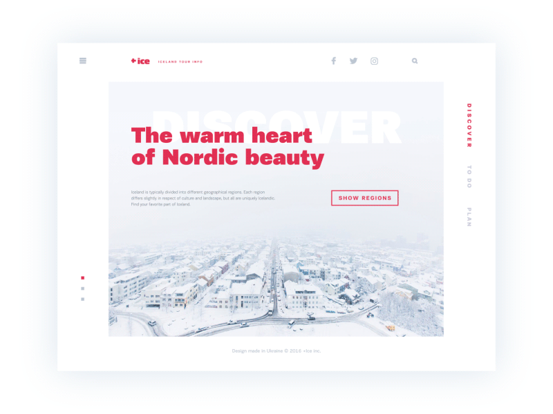
The presented concept features the set of interactions with a website devoted to the theme of traveling around Iceland. Working over the color palette, the designer chose the light background featuring the theme of Iceland and a contrast bold headline. Images are used in the scheme one-per-page so that they could support the theme but not overloading the page or distracting the user. Thorough attention was paid to typography and composition as key sides of user-friendly minimalism enhancing usability, inevitability, and visual harmony transferring the spirit of the presented place. Navigation features the right side menu with titles placed vertically still easily readable due to the choice of font, the rest of the navigation links are hidden in the extended menu behind the hamburger button. Animation shows transitions between pages to give the feeling of general design consistency.
Design concept for online magazine
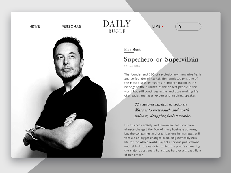
The design concept of an online magazine features the page of a particular article presenting a famous person so an image showing the personality becomes the center of composition still doesn’t take too much attention from the text as the bearer of information. All the design is concentrated on user-friendly solutions around readability and stylish non-distracting looks as well. So, the concept is based around a clear visual hierarchy applied in the general layout of elements and also copy blocks. As for navigation, the page features the header including the title of the website as a central element of the top part composition, two active links to basic categories of publications, link to live mode, and search field marked with a magnifier icon.
Web design for an architecture blog
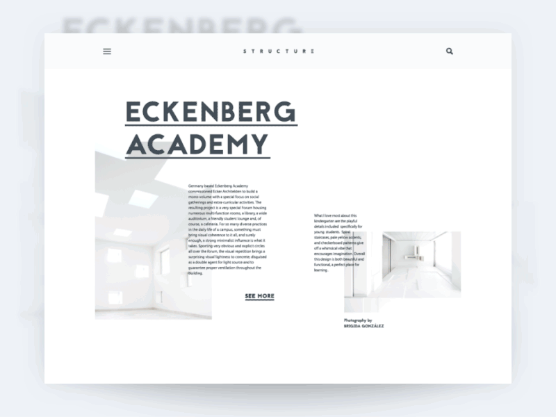
Another concept full of light and air for readable text and stylish visuals. Animated interactions demonstrate the consistency of the flow while scrolling the page with the smooth move of visuals elements, headlines and copy blocks, imitating movement of physical objects while pulling. The presented design of a website has a fixed header that doesn’t hide while the page is scrolled. However, it follows minimalist principles featuring brand name lettering as a center of the composition, magnifier icon marking search functionality and hamburger button hiding links to navigation areas.
Corporate website for an architectural company
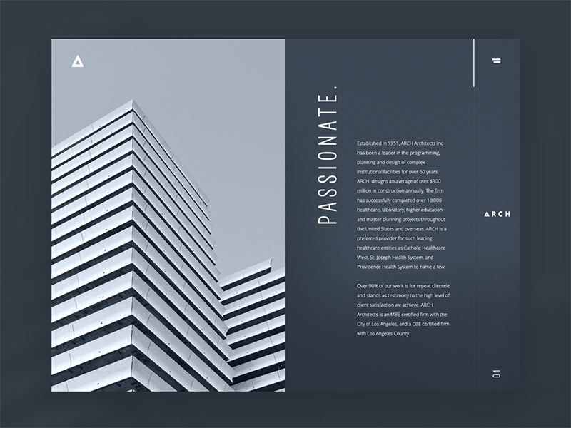
This concept is also devoted to the theme of architecture, still, it has different objectives and core target audience: it is the corporate website for a company presenting the variety and potential of its services. The general performance of the webpages is following a minimalist and functional approach. The layout is accomplished on the basis of priorities in presenting this particular business field. Taking into account that the nature of the company activity is deeply visual especially in terms of presentation to new clients, the designer selected the background and fonts that have to leave the immediate impression of style and sophistication. The key words brought out in capital letters become an integral part of the stylistic concept being also informative and quickly setting the company ideas and approach to work. The visual effects are supported by smooth animation.
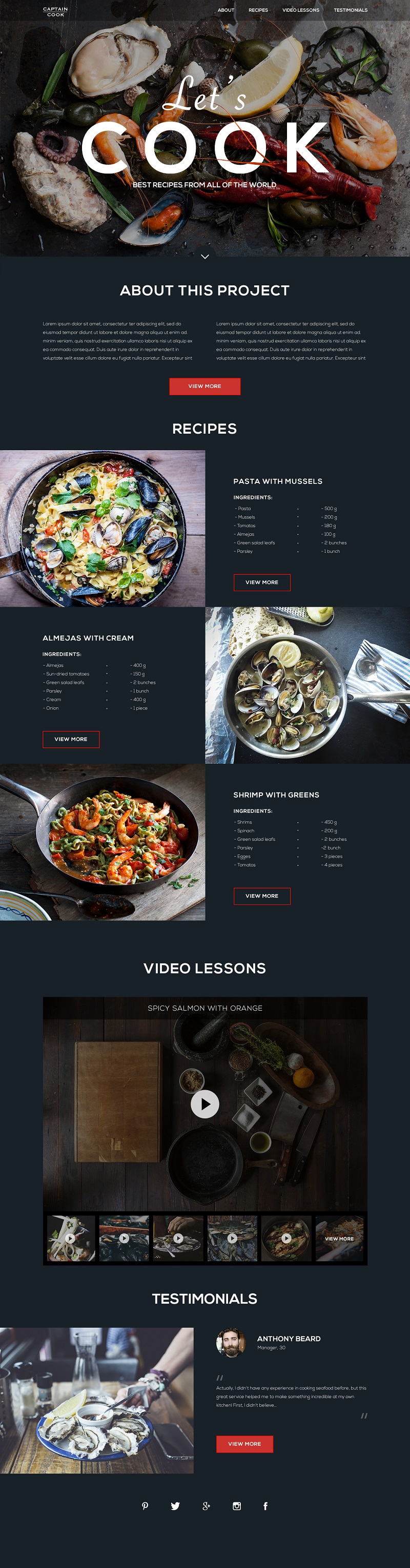
Landing page for the website of seafood recipes
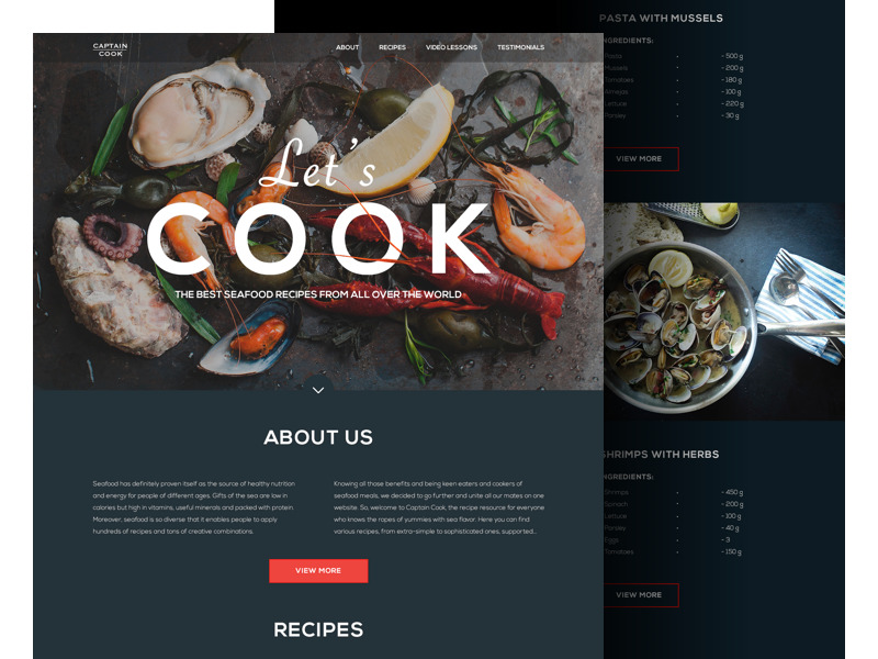
This example presents a landing page for a website collecting recipes of meals with seafood from all over the world. As well as in the previous case, a dark background is chosen to make the images of meals look even more delicious and also create a stylish appearance for general visual presentation of the layout. The landing quickly provides a general understanding of the website’s purpose and content featuring different sections that could be interesting for users.
Website on Swedish ski resorts
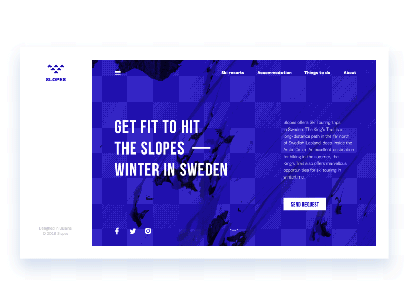
Obviously, traveling is a great way to get inspired and we really believe it’s true. This concept adds one more example of this theme. Here is the set of animated interactions for a website Slopes presenting Swedish ski resorts and enabling users to get the full scope of information about them. Home page features the video background immediately setting the theme, and color palette based on strong contrast and concise color combinations also visually supports the idea of active winter holidays. The basic points are shown in the header for quick availability while all the other variety of content categories is hidden behind the hamburger button to support the minimalist design approach.
Web design for an online magazine about traveling
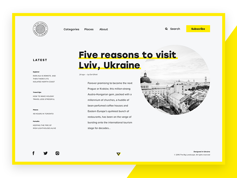
Here’s the design concept for a website that presents the online magazine “The Big Landscape”. Its target audience is primarily people keen on traveling and learning more about the world. The interface is minimalist following the principles of clear visual hierarchy, good readability, intuitive navigation, and aesthetic pleasure from visual perception.
Website for a design studio
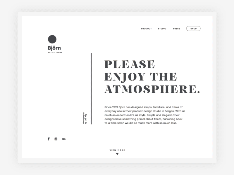
It is a promotional webpage of the particular product by design studio. Its purpose is to present the design object via descriptions and visual details providing users with the link to this item in online shop. Thus, this page, which is actually part of a sales funnel for the e-commerce website, is in charge of attracting users and informing them about the product. Minimalist design full of air makes visual accents noticeable and engaging while the general layout presents the actual direction of company services. Broader aim was to transfer the atmosphere and spirit of the brand by means of design solutions.
Web platform for an encyclopedia
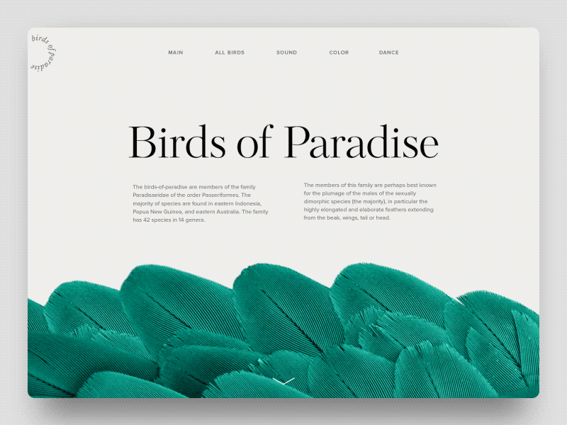
This case realized the idea of the web encyclopedia devoted to the theme of birds-of-paradise. The designer concentrated on the main aspects of usability and utility of such a resource for readers and at the same time set the goal to make it attractive and giving a clear message of the site features with the general stylistic concept. Animated transitions make scrolling interactions engaging and add style to general performance.
Web design for photography workshops service
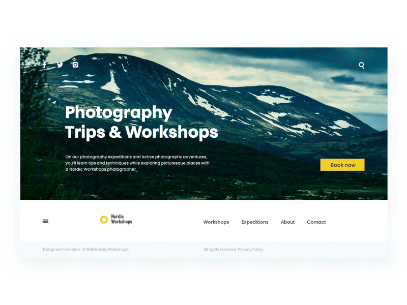
Here is the landing page for a company organizing photo tours and workshops for photographers. Functional and stylish minimalism is the basic approach behind this web interface, visual elements inform users and provide the quick harmonic perception of the nature of the services while the animation is provided to show the transitions between content blocks.
Landing page for coffee delivery service
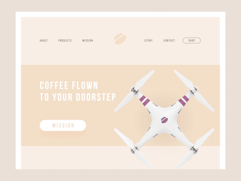
It’s not a secret that drinking coffee is the daily habit, sometimes even obsession, for many people, and different services speeding up the process of getting a cup “on the go” are getting more and more popular. This example shows you a design concept of a landing page that presents an experimental service “Coffee Wings” providing coffee delivery by drones. Landing was created in the manner combining traditional visual elements setting positive associations with coffee and images of innovative technologies involved in this user-friendly service. Copy blocks are not overloaded so that visitors could get the idea and benefits of the service quickly and clearly and obtain more information, if they want, following the calls to action.
Design concepts for 404 page
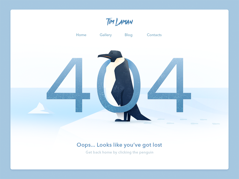
There are tons of design solutions for 404 webpage, which is strategically important for any website, and still, this design object is always actual. This sample shows web design accomplished with some artistic approach featuring the original illustration of the penguin directing everyone back from the Pole where nothing can be found.
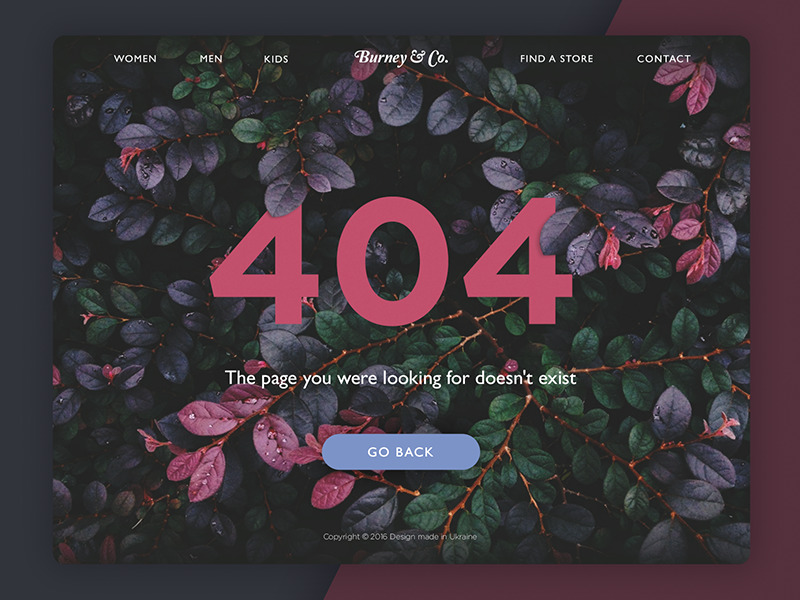
Another concept shows the different stylistic approach and features a page 404 for e-commerce website. It is based on the harmonic interconnection of the background and actual layout elements such as header, CTA button, and copy.
Today’s list is over but studio practice is full of many other interesting examples of design concepts for different purposes and needs of modern users. Don’t miss new presentations.
Originally written for Tubik Blog
You may also like the collections of ecommerce app designs, web designs for events, user interfaces for finance management, creative logo designs, UI concepts for education, and other D4U Inspiration posts
- English
- Ukrainian