How To Make Text Improve User Experience: Insights Into UX Writing
How To Make Text Improve User Experience: Insights Into UX Writing The article provides the brief definition of UX writing, the features of effective interface copy and useful tips on its improvement for the positive user experience.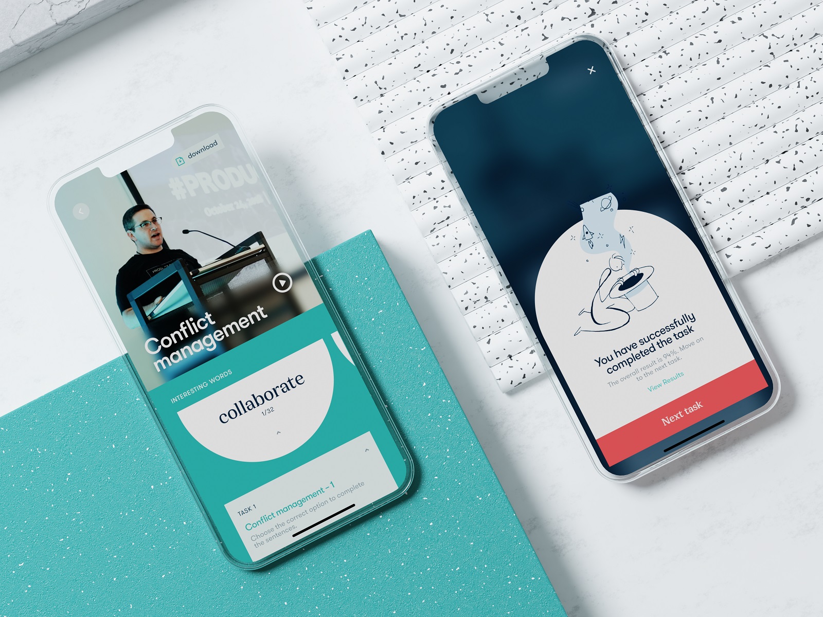
“One day I will find the right words, and they will be simple,” Jack Kerouac once said without any idea that his words will perfectly reflect the essence of UX writing. We mostly think about design as something visually appealing and easy to use, with visual images coming to mind first. However, the type of content with which users deal most often and diversely is text. Our today’s article is right about it: let’s review the essence of UX writing, the features of effective interface copy, and well-checked practices for its improvement.
What Is UX Writing?
UX writing is a professional activity of writing texts for user interfaces, both web and mobile. It includes creating texts from small labels of buttons and icons to taglines, error messages, notifications, navigation prompts and instructions, guidelines, and so on.
What is crucial to keep in mind is that
- text is a part of design
- text is a part of user experience.

Education app screens featuring how text helps the digital product communicate with users
The term UX Writing is often replaced with Copywriting. Do they mean the same?
Basically, no, they define different types of activities. Copywriters’ main goal is creating texts that sell something, be it products, services, tools, intellectual and creative stuff, etc. UX writers’ task is to create texts that support and enhance users’ communication with interfaces, let them clearly understand what’s going on, and lighten the negative experience in case of errors or problems of interaction.
Nevertheless, coming from the advertising sphere, the term “copy” as a synonym of “text” quickly got a toehold in UI/UX design as well. Based on that, people creating texts for interfaces were also called copywriters, much before the term “UX writer” came into play. What’s more, in many companies, people writing marketing texts and interface texts are pretty much the same people. So, don’t be confused too much: although the terms define different tasks, they are still often used as synonyms, and text pieces in UI are usually called copy.
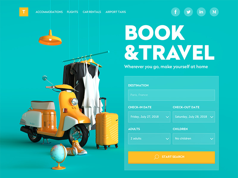
Booking Website home page
Is Text Needed for All Types of Interactions?
We have already touched on this issue in our article devoted to relations between icons and copy in user interfaces. Indeed, visuals are transmitted to the brain much faster than text, and important pieces of information are often fixed by the brain as images even if they were obtained via text perception. In user interfaces, where basic interactions should take seconds, this aspect is crucial, and it can be seen as the real reason to turn hell out of everything into the graphics. On the other hand, there is the aspect of meaning: users can perceive images super fast, but if the message they transfer is not clear and can have double-reading, this speed will not bring a positive user experience.
There are loads of widely recognized graphics and associations, such as a telephone receiver for a phone call, an envelope for mail, a magnifier for a search, and so on. Certainly, using them, you create a much faster perception of the UI functionality than using copy instead of an image. Nevertheless, in cases when the image of an icon is not so obvious, its usage should be thoughtfully contemplated. There are cases when text transfers the idea or data more clearly, so it is an effective solution to use the double scheme when the icon is supported by the text.
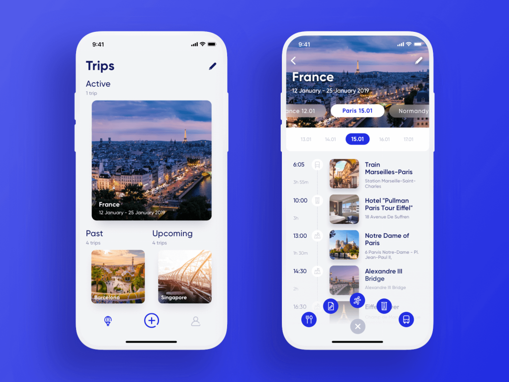
Travel Planner App doesn’t use text labels for icons in the tab bar
OtoZen application for save driving supports the icons in the tab bar with clarifying text labels
4 Basic Features of Effective UX Text
The copy content in any interface is based on 4 foundation stones: it has to be
- clear (users understand what you talk about, the core message isn’t blurred or complicated)
- concise (the piece of text is meaningful, laconic, and concentrated on the goal, no empty talk is included)
- useful (the copy gives users necessary information or helps with interactions)
- consistent (the copy within the interface of one digital product keeps the same style, tone, voice, and terminology)
Now, let’s review some practices helping to create texts that support the positive user experience.
Perfect Bouquet App
Useful Tips on UX Writing
1. Integrate real copy in UI as early as possible
Working on early versions of a user interface, UX designers tend to use the so-called Lorem Ipsum. It’s a kind of popular placeholder text that looks like Latin but really doesn’t mean anything. It’s aimed at creating a natural-looking piece of text in the layout of a webpage, mobile screen, magazine or newspaper page, etc.
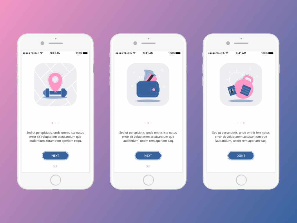
Onboarding screens for the Manuva app at the UI design stage, using Lorem Ipsum for placeholder copy blocks
When you are deep in the design process, it is really tempting to just copy-paste the nonsense text into the places planned for copy blocks. Why is it a not-so-good idea?
Firstly, the text is a part of the design. Various letter combinations look different. Words have different volumes and structures. It’s especially true for a tagline that presents one of the most important elements of webpage visual hierarchy and is scanned in the first seconds of interaction. So, what pleases your eye in Lorem Ipsum may not work with real text that will be used on the page or screen.
Secondly, by using the realistic text, you make a prototype feel genuine and natural. Let’s say, if you design a website selling cooking equipment, you won’t use photos or illustrations of agriculture machines for placeholders, even at the earliest stages of the design process, will you? Why? Because it won’t connect the design concept with the goals set for this product. The same happens with the text part of the layout. The copy you use should create a united image and experience with all the other elements of the layout. What’s more, you can spend hours working out the great looks for notification pop-ups, system messages, and webpage text blocks – and all that effort will be wasted when you realize that the real copy to be used in this UI is different in its length, structure and perhaps even message.
Onboarding screens for Bees and Honey app concept
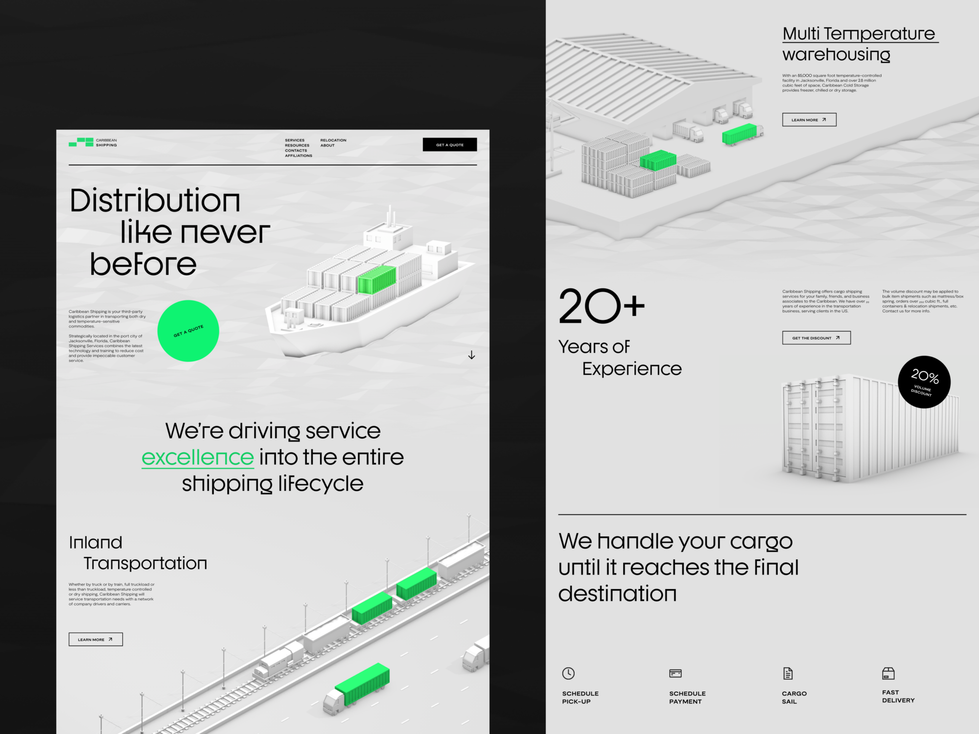
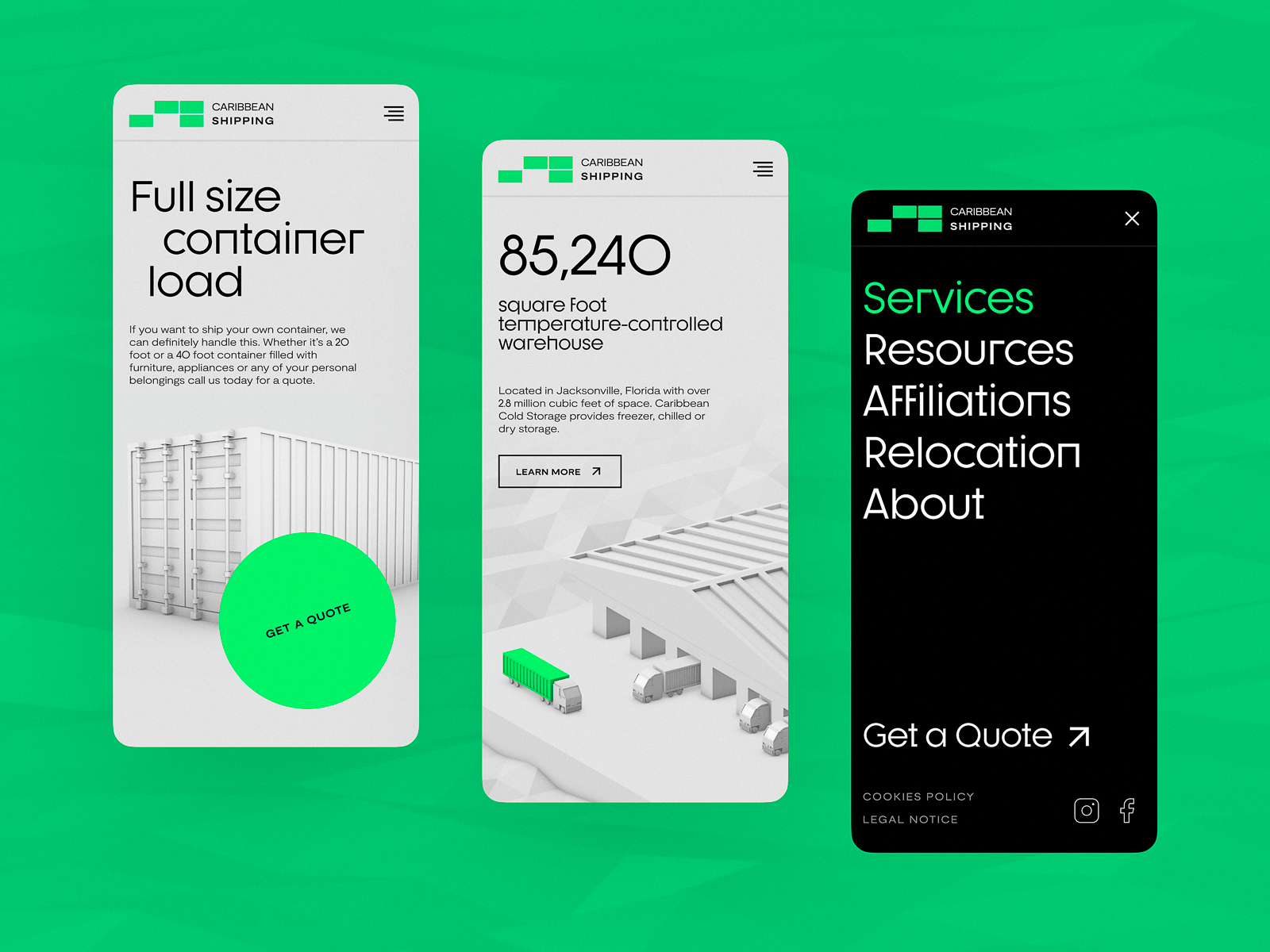
2. Build a solid text hierarchy allowing users to scan the page content
In our article devoted to web scannability, we have already mentioned the well-checked fact: users don’t start an interaction by reading every text element on the page or screen. They scan it in search of the hooks that can catch their attention: if they are convincing enough, the user makes a decision to give the resource a second look, attentive and diving into detail. Although pictures of any kind are much more catchy and faster perceived, in many cases, text becomes the element that plays a crucial part in decision-making. One of the reasons is that from one generation to another, we are traditionally accustomed to seeing a text as a main source of information.
Grounded on that, keep in mind that the main message presented in text form would better be quickly found in the first seconds of interaction. All the text elements should be organized according to the typographic hierarchy so that by scanning the page or screen, the user could quickly understand which part carries the core message and which is less important. Also, it’s advisable to make text harmonically work together with key images on the page or screen (illustration, photo, 3D rendered image, etc.)
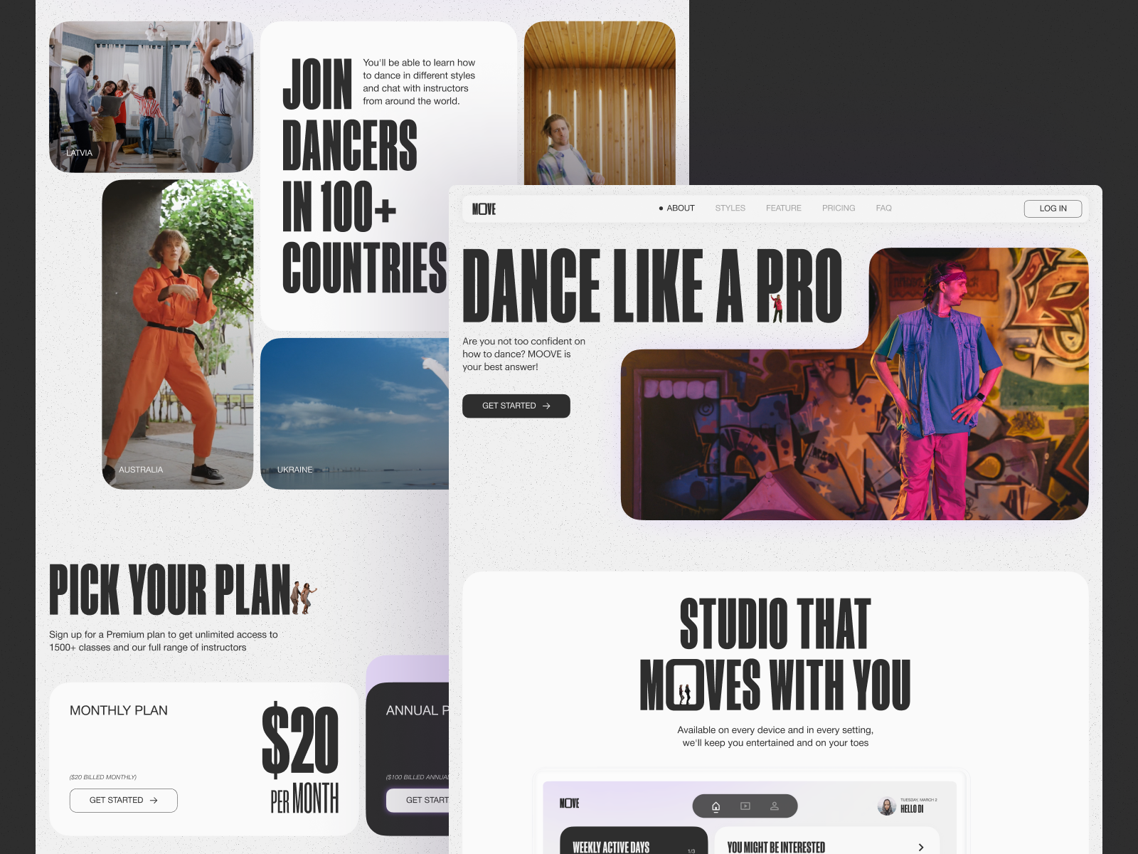
Dance Classes platform website
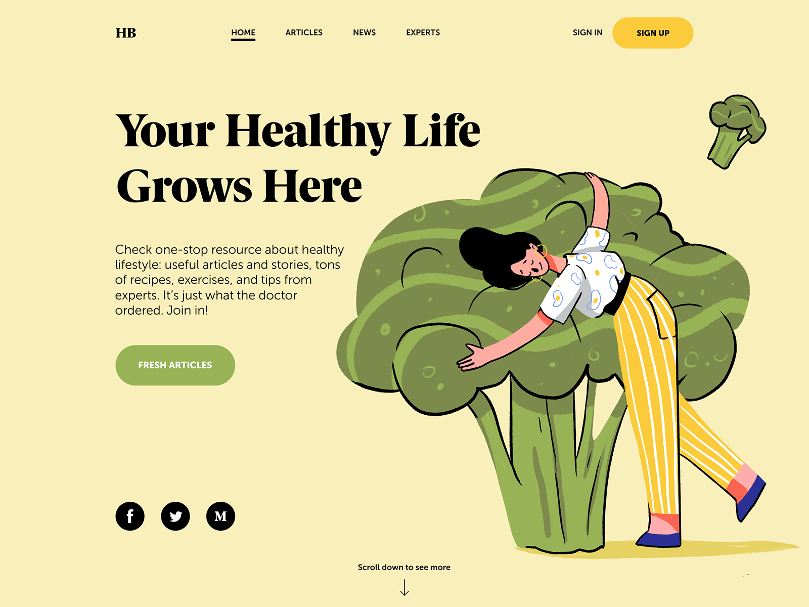
Health Blog home page where all the copy elements are connected to the hero image
3. Catch attention with numbers and marked elements
One of the investigations of user behavior provided by Nielsen Norman Blog shared an interesting finding: based on eye-tracking studies, while users scan web pages, numerals often stop the wandering eye and attract fixations, even when they’re embedded within a mass of words that users otherwise ignore. People subconsciously associate numbers with facts, stats, sizes, and distance – something potentially useful for them. So they are hooked with the numbers included in the copy while words representing numerals can be missed in the bulk of the text. In addition, whatever numbers represent, they are more compact than their textual variant, which enables designers to make the content concise and time-saving for skimming the data.
Everything mentioned above can be a reason to break some rules and habits. Traditionally, we are recommended to spell the numbers at the beginning of the sentences, spell the numbers from zero to ten, etc., and you may follow all that successfully in articles and other types of copy content presented with a big amount of text. However, for the texts accompanying the interactions, you should be as focused as possible, and it’s a good idea to catch users’ attention with numbers.
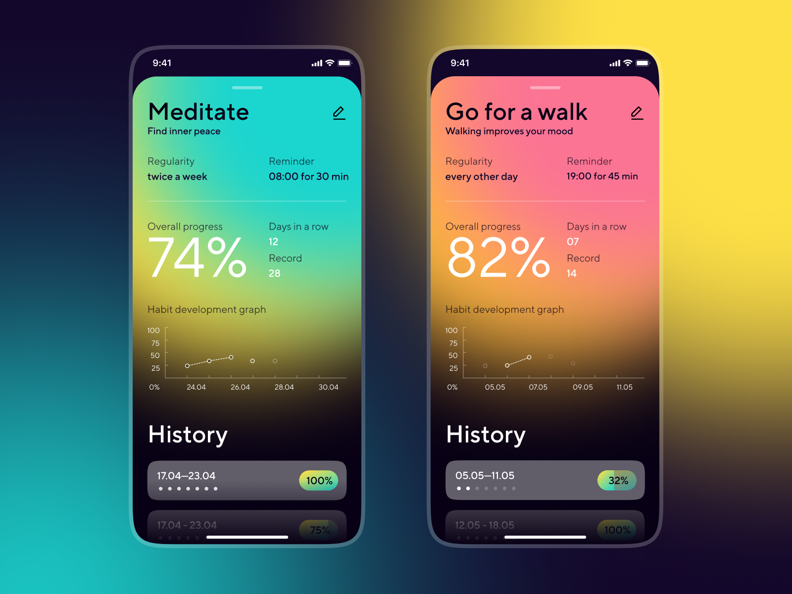
Habit Builder mobile application
Also, don’t forget about the ways of marking out the specific information that came from book and magazine design: bold and italic fonts, word sizes, negative space, different colors, or highlighting – all that stuff worked many years ago and still works successfully today. Just don’t overact, don’t overwhelm users with too many elements trying to catch their attention. As Aarron Walter said, “If everything yells for your viewer’s attention, nothing is heard.”
Construction company website with a typography-based design that marks the keywords with different color.
4. Be focused and grammar-flexible
No doubt, clarity and grammar correctness build the foundation of a good experience when it comes to text. However, it may work differently if you write a microcopy for a button or the message is limited to a rather small number of characters on a pop-up screen. So, here you have to decide on being grammar-flexible, which means avoiding complicated constructions and reducing the elements that do not play a vital role.
For example, Material Design guide on writing advises avoiding unnecessary punctuation such as periods in copy for labels, hover text, bulleted lists, dialog body text, or colons after labels.


As well, for UX copy, they recommend using present tenses but in their simple forms.

Also, keep in mind that choosing Active Voice instead of Passive whenever it’s possible is a good idea. In most cases, it looks more natural and clear; in addition, it may be more user-friendly for users who are not advanced in English.
Just always remember that the main goal of the text in mobile or web interface is to inform. Daily overwhelmed with tons of information; users want to get it quickly and effortlessly – so give it to them. It’s not about breaking all the rules and communicating with unnatural phrases. It’s about the best expression of text minimalism, cutting off the stuff that’s not essential. It’s about using simple and direct language clear to various users.
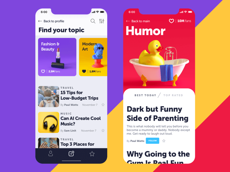
Blog App
Nielsen Norman Group even posted the article sharing the list of cringe-worthy words and phrases that you would better avoid in UI texts, among which:
- very (and other intensifiers):
- utilize
- enable
- we understand (in today’s fast-paced world…) and other blah-blah stuff
- end-user
That’s especially true for mobile interfaces, which are strictly limited in space that can be used for copy content, and with them, you have to take into account that users often deal with apps on the go. The issue of being clear and readable directly influences user experience and conversion level. So, a question like “Save changes?” looks more effective here than “Would you like to save the changes?” or “Do you want to save the changes?” or “Please confirm that you would like to save the changes” and so on.
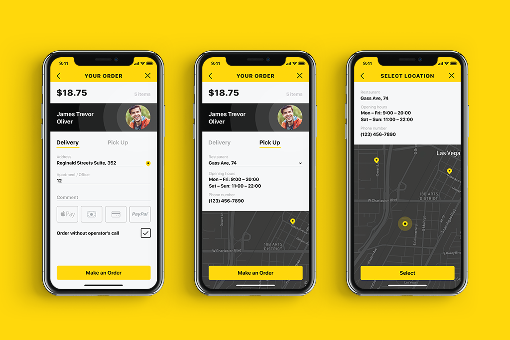
Delivery screens for Tasty Burger App
5. Do A/B testing for the copy of interactive elements
Buttons copy is one of the crucial parts of user experience: if you are not into UX design and writing, you could be surprised how much time and effort should be devoted to these small but impactful elements of the layout. What is written on the button should direct users to the action and let them understand what happens next. So, as well as you test design solutions such as color, placement, or the size of the button, you are recommended to make the text of the button label another object of A/B testing. Especially, if you are not a part of the core target audience: for instance, you create the product for elderly people with a low level of tech literacy while you yourself are a young advanced user of various software and gadgets. Testing will give you an understanding of how real users perceive the label and what kind of text is more convincing for them.
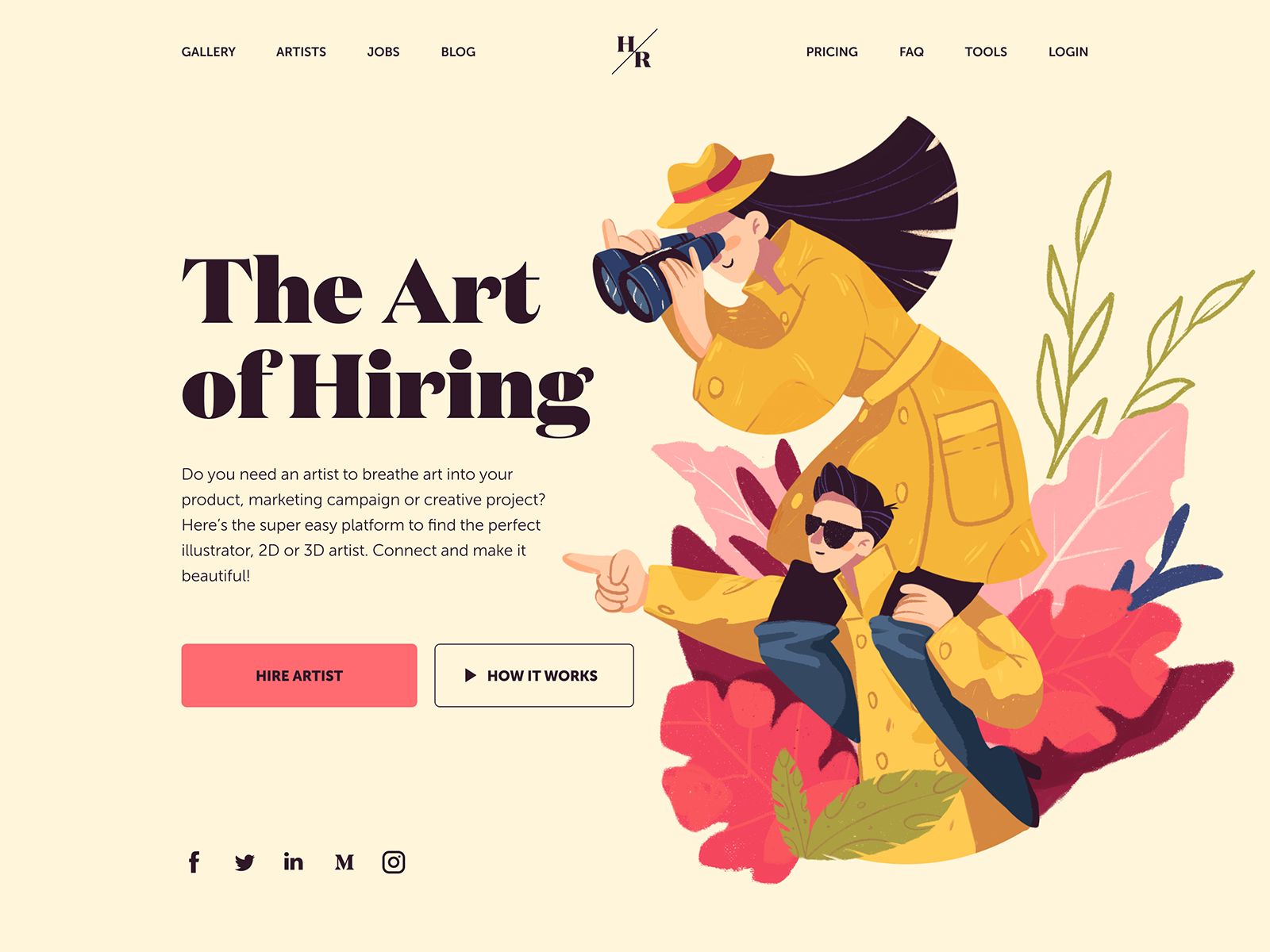
Home page for the web platform to find and hire artists
Buttons often offer the choices to a user: we can accept, delay or cancel something, Writing text for such elements, remember the idea shared in one of the recent explorations by Nielsen Norman Group: “The copy that you use in choices on your interface asks people to agree with a statement. That statement is often about themselves or the actions that they wish to take. It’s important from a user-experience standpoint and from a business perspective to write interface copy that supports rather than undermines the decision-making process. Trust, expectations, and positive self-image all shape the associations that users will have with a product. An honest, direct presentation of choices creates trust and positive emotion.”
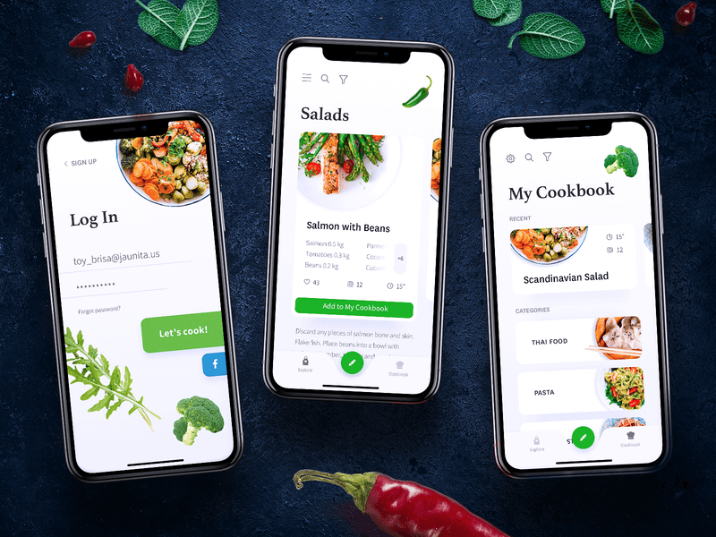
Mobile screens for a cookbook app
6. Build natural and consistent dialogue
The best thing you can do for your user with the written content is to create a feeling of communication with a human. A human that has a clear style and voice of communication is helpful and doesn’t try to reinvent the wheel at every step just to emmarvel you. Decide upon the main terminology and names of operations – and use them throughout the messages and notifications: for example, use the word “delete” every time when this action is meant to be done, and don’t replace it with “remove” for some screens if the action is the same. Synonyms are good for making language bright and vivid in articles or books, but they may ruin user experience making users find the connections between synonymic terms instead of just using the product to solve their problems.
Here’s another example from the Material Design guide on writing.

7. Make your text feel like the users’ friend
Supporting the previous idea, keep the style of the dialogue that corresponds to the target audience’s expectations. Being clear and friendly is more important here than being linguistically elaborate – the only exception is when target users do expect this kind of language. User research is your homework in this case: it allows both designers and writers to clarify a proper style choice for not only visual but also copy solutions.
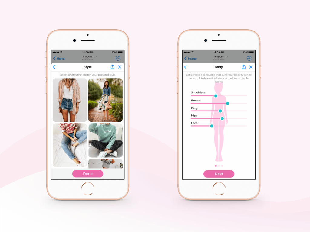
Profile creation screens for Inspora, the virtual stylist
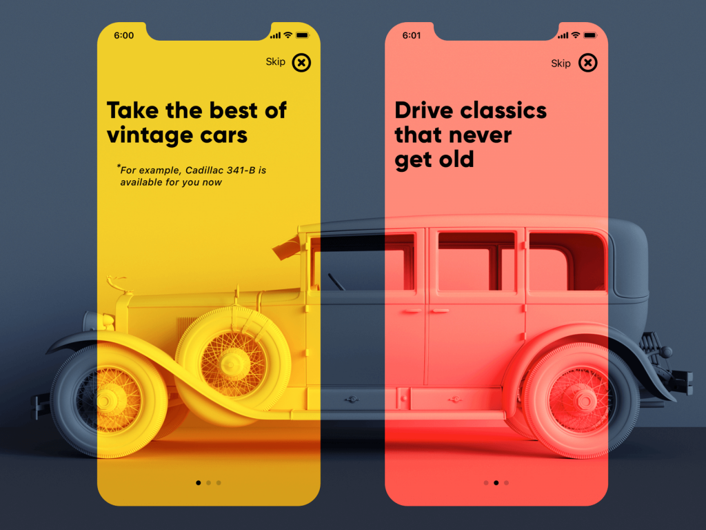
Onboarding screens of an app for hiring vintage cars
8. Avoid slang
By slang, we mean here any kind of specific and technical terms that can confuse users. For example, when you inform a user that the video is buffering, are you sure he or she knows what that means? If yes, that’s a good choice of text. If not, look for a simpler word. Don’t use “enable” instead of “turn on,” which is much clearer for most people. Here’s an example from Alfresco Writing Guide.

9. Don’t forget about capitalization
Basically, capitalization is writing or printing in capital letters or with an initial capital. There are three levels of capitalization:
- all-caps (all the letters are capital)
- title case (the first letter of each word is capitalized, excluding prepositions up to 4 letters and articles)
- sentence case (you only capitalize the first letter of the first word and proper nouns, as you would in a sentence).
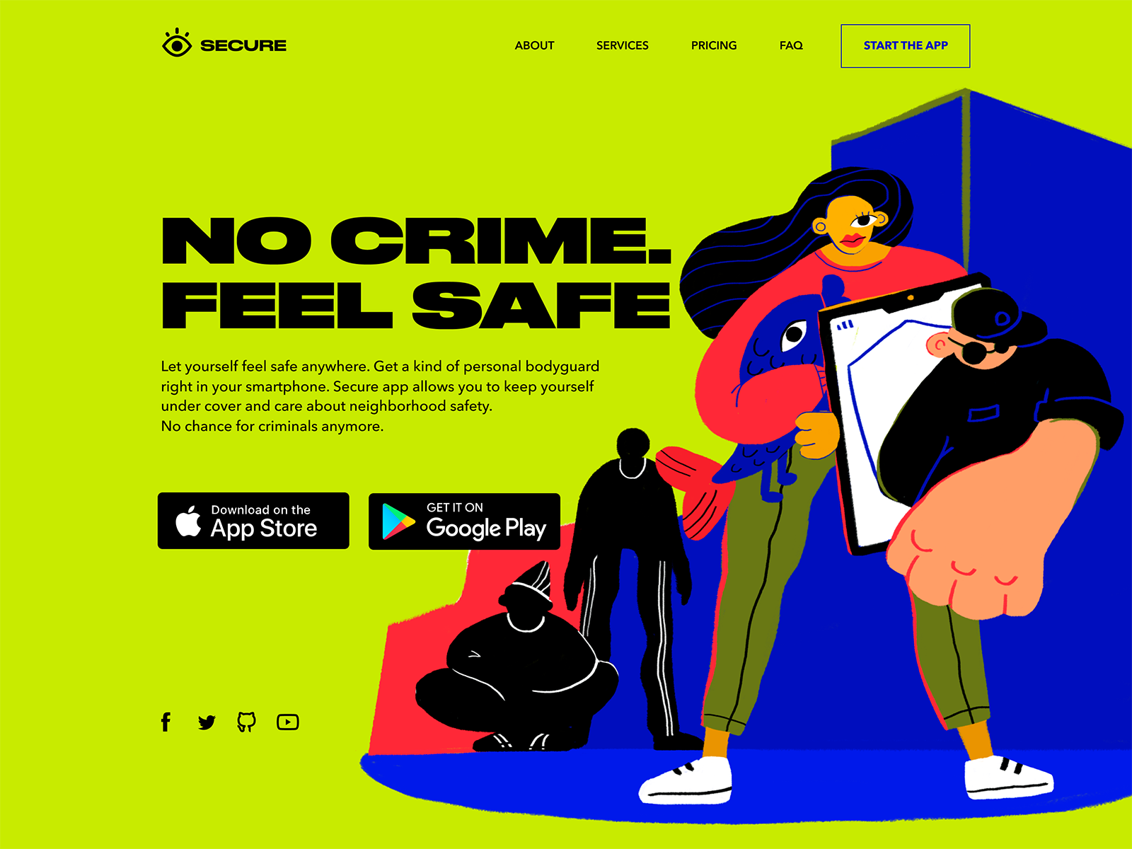
Landing page design for security service
Now, there are hot discussions about using sentence case instead of title case as it feels more friendly and informal. However, for English speakers, it’s still a natural feature of the language that, apart from feeling the text as less or more formal, marks the levels of text hierarchy. So, the decision is up to you, of course, but consider the following tips about capitalization:
- Use Title Style Caps to mark field labels, actions, menu items, and page titles
- Choose Sentence style caps for longer copy such as page or field descriptions and tooltips
- Apply ALL-CAPS moderately, only to super important items (short taglines, brand name, core navigation points in website header, short call-to-action text, and abbreviations like OK), and avoid it in all the rest of the cases.
Whatever choice you make, what’s really important: be consistent. Make a decision once – and follow it through the whole interface. If you decide to use a title case for all the buttons, check that you keep that rule all the time. Inconsistency distracts and even annoys users.
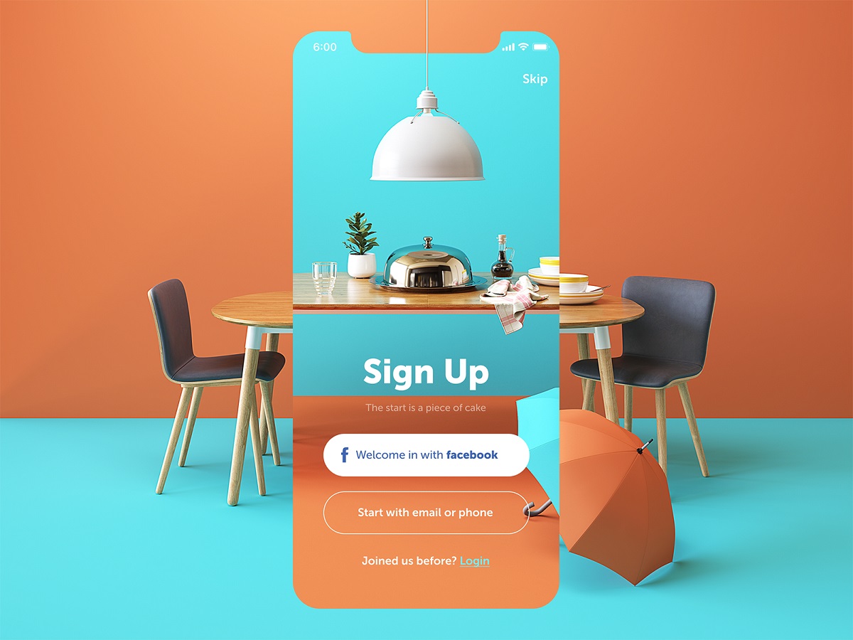
Sign-up screen for a restaurant app
10. Start from the most important information
This advice seems to be super simple, so that’s surprising what a big number of people dealing with copy don’t follow it. In the case of short text, instruction, or message, focus only on valuable information, and don’t distract users with too much lead-in and warm-up text. Sure, it doesn’t mean that you have to come up with only dry, unemotional information-only texts, yet try to minimize the supportive part and maximize the active one. For longer texts, such as articles, guides, product descriptions, and the like, consider using the principle from journalism called the Inverted Pyramid Principle. It’s when you go from what’s needed to know to what’s nice to know, from the core message to the details which may be not that vital.
The home page for the Gin Scholl website uncovers the information gradually, from the core message to the details.
All the mentioned tips are not the cure-all: the decisions upon them have to be based on studies and analysis for each particular case. There are numerous factors that influence the creation of copy for interfaces, from purely design ones to a general brand strategy that defines the style of communication with users. Anyway, we hope that the list collected above will help you to come up with creative lines supporting a positive user experience. Sure, there are more points, cases, and examples to discuss and consider in the domain of UX writing, so we will continue the theme in our upcoming posts. Don’t miss it!
Useful Reading
Guide into Types of Copy for Mobile and Web Interfaces
3C of UI Design: Color, Contrast, Content
Inverted Pyramid: Writing for Comprehension
Interface Copy Impacts Decision Making
Tips on Applying Copy Content in User Interfaces
User Experience: How to Make Web Interface Scannable
Originally written for Tubik Blog, graphic and video content by tubik
- English
- Ukrainian


