UX Design for B2B: Handy Practices for Web and Mobile
UX Design for B2B: Handy Practices for Web and Mobile The article devoted to the theme of web and mobile UX design for business: check what's B2B and how to design for its aims.
User experience design for business is getting more and more expressions today. A great diversity of companies make an important decision to come into play and fight for online presence. Various services are now available and executed online. In these conditions, designers working on the projects at this perspective, have to keep in mind the variety of business relations to offer the solutions corresponding to the specific client’s goals. Continuing the theme of creating web and mobile products, today we suggest discussing the issues of design for the sphere of B2B services.

What Is B2B?
B2B is the term used in business, marketing, and economy to mark the relations of the sides in the business process like «business-to-business». B2B means that one company provides products or services aimed at other companies’ business activities. The target audience of the offer is not individual customers but businesses. The nature of relations has a direct impact on business process, strategy, promotion, and therefore any design stages involved in this scope. Not going far, if we are talking about outsourced design and development services, they are a direct example of B2B.
To get this example deeper, let’s imagine the company which sells physical goods to end consumers, let’s say, casual clothes. They need a website that will provide quite broad functionality for a big amount of users. The stakeholders monitor the market for web services and find out that hiring an outsource company for design and development is cheaper and more convenient for them than creating an in-company department for this purpose. This is the start of B2B relations as a digital agency provides its services for another business — a clothes shop – so that it could start e-commerce activity.
People involved in the design process for products and services have to consider the types of relations chosen for the particular project. Actually, the type of business scheme initially defines the target audience and nature of interactions which are key factors for efficient and user-friendly design solutions. Designing for business should supposedly involve methods of visual and content presentation that are different from the one presented directly to end-users. It’s easy to see by examples of numerous landing pages: the ones aimed at companies use content, language, visual and graphic elements, placement of data blocks different from those which are targeted at individual buyers or users.
Neglecting the aspect of business relations increases the risk of creating the design which will not provide a high conversion rate even being sophisticated, stylish, and attractive visually. The psychological background behind design solutions has to support particular business schemes or strategies. Here in Tubik, we have had a broad experience of design for all the mentioned schemes so below you will find some ideas we would like to share on the basis of that practice.

Aspects to Consider in Design for B2B
Designing for B2B, it’s important to remember that:
- design solutions should consistently strengthen branding and company policy. The quality of design says much to the potential clients which the interface has to attract. A good dress is a card of invitation, a good mind is a letter of recommendation – it worked years ago and it still works now. Quality of design created for a website of B2B service is actually an integral part of their image and therefore profits. Remember, that B2B differs from B2C: the stakes, as well as the expenses, are higher, the number of leads can be limited with the specific nature of services, the decisions about the deal may take weeks and even months before they are agreed upon. The website or app design must present the company or service as highly-professional from the first seconds of the interaction and visual perception. It should build a reliable bridge between the sides looking for collaboration. That’s why business people in this sphere are recommended to involve professional designers in the process while designers have to do their best to understand the business goals and research target audience.
- people become more and more open and sociable, not only in personal but also in professional aspects, and social networks present the great ground for that aim. Implementation of design elements in social network marketing of B2B company, using the same style, voice, corporate colors, and graphics, specially designed branded items and the like is one more way to strengthen brand awareness by means of design. The design has to be consistent whenever the B2B company is presented: headers and banners, logos, style of photos in social network account and on the website need to feature the same stylistic approach. In this way, design makes branding more recognizable, comprehensive and solid.
- consistent and a thought-out content strategy combining visual and textual material with the careful selection of visuals and the copy is able to fulfill all the stages of sales funnel and bring better conversion of the website, landing page or application of B2B company;
- concise and minimalistic solutions in design and copywriting work efficiently in most cases because they save time and effort of busy stakeholders and entrepreneurs. The effective variant of scenario can take place when they are given concise core information at the first stage of interaction but always have the chance to read more if they are interested (as well as avoid reading huge copy blocks if they don’t want). Certainly, this solution should be based on thorough user research, but it has a high potential to make user experience positive;
- business is done differently in different countries. It should be always considered together with the nature of business relations as the factor making a considerable impact on the level of trust and wish to collaborate. Selection of graphic content and layout of the elements on the screen or page should go under analysis in this perspective as some graphic elements, photos, gestures, word combinations, color choices which are efficient and clear for one region or culture can be totally unacceptable or even offensive for the others. Creation of several landing pages targeted locally can be an effective solution;
- the aim of a website or other piece of design presenting B2B company is not to grow a huge flow of traffic but to engage and direct leads which belong to the target audience and are potentially open to take part in business collaboration or partnership good for both sides. It’s important to keep in mind that retaining customers, in this case, plays not less role than involving them in the game.

Design Strategies for B2B
The strategies mentioned below may work not only for B2B but for any kind of interfaces aimed at business. Still, in B2B their role in getting profit may be more significant.
Get CTA elements seen instantly
Call-to-action buttons should be perfectly visible. Doesn’t it work that way for any kind of website, not only B2B? Yes, you are right. But in B2B the price of a click is much higher while visitors are often horribly busy and don’t tend to spend much time looking for a button on the page. Apply color, shape or orientation contrast, test the most effective placement and think over the copy on it – all that stuff may have a crucial effect on conversion rates.
Make value proposition noticeable
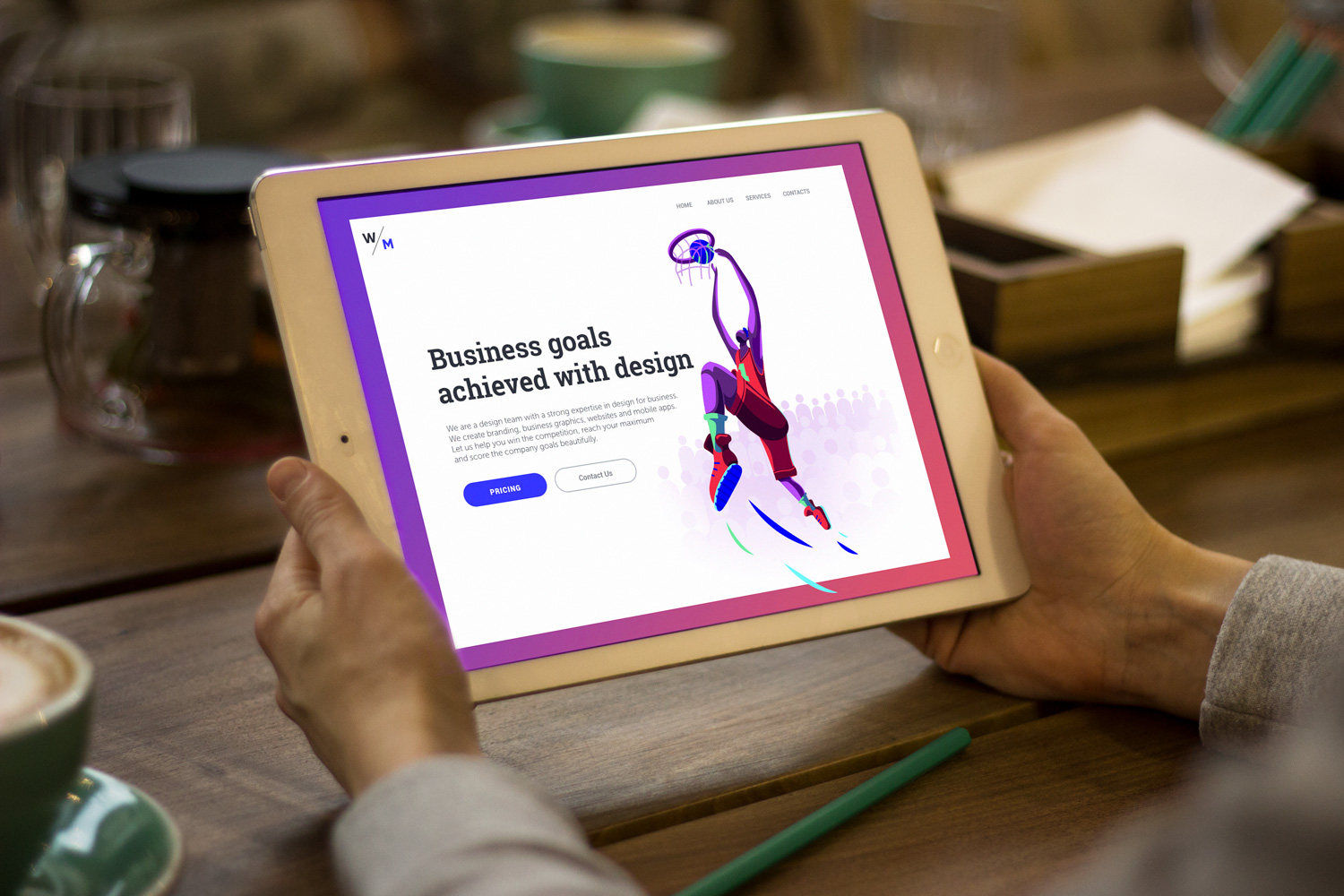
Getting to the website, the visitors should immediately understand why it is beneficial to them. Don’t make them search for the reason to cooperate with this B2B service – they won’t do it. Use the catchy slogan or tagline which will express the value proposition briefly and clearly, and take care of its visual performance. Typographic hierarchy will help the user’s eye to catch it first, appropriate fonts will add the mood and style to the message.
Don’t overwhelm users with information: prioritize content
There is a big temptation for a business to show all its strong sides at maximum. However, it may lead to the website with a huge amount of data which might get the visitor confused, annoyed or frightened. It is especially hard in the cases when the visual hierarchy isn’t thought-out and tested properly: the pages risk transforming into a mess which cannot be scanned quickly. So, prioritization is both designer’s and user’s friend here: apply design techniques and layout which will strengthen the visual performance of the core information.
Make copy blocks digestible
The debates around the theme of copy blocks are still hot and actual: which copy is better, long or short? Actually, both may be effective. As we mentioned in the article devoted to landing pages, a decision on the amount of copy has to be based on thorough research and testing as it directly and highly influences conversions. For example, if it presents a famous company product or service or informs about special offers, sometimes short and concise copy is enough to encourage users to buy or know more. However, if a new unknown product or service is presented, it may be important to provide users with more information persuading them to follow the call to action. Whatever is the decision, the copy content should be given in scannable blocks which aren’t too big so that the user didn’t think reading will take too much time. Scanning the blocks allows for faster understanding if the copy brings useful information.
Keep core data available from the pre-scroll area
Users usually decide on staying on the website or leaving it very quickly. It is really a matter of minutes or even seconds. That is why all the key information would better be seen in the pre-scroll area, including the value proposition and ability to contact the duty holders.
Activate the power of color psychology
Colors present great support in sending the right message. Being attentive to the target audience’s preferences, designers can select the colors not only on the basis of their nice looks but also color psychology which explains associations people have with colors.
Apply catchy visuals sending a message
A picture is worth a thousand words – and that’s not just because it’s more appealing or beautiful but also because in the vast majority of cases, it is perceived faster than words. Moreover, the attractive visual content, be it a photo, illustration or poster may become another source of informing the user about the value proposition provided by the company.
Consider promo video content
Promo videos present the popular trend in business schemes now as they enable to inform users about the value propositions and benefits in the fast and original way. However, it may influence the loading speed of the page so this decision needs to be well-weighed.
Apply landing pages for special offers
Landing pages allow for focusing user’s attention on the specific information instead of making them search for it around the website. It is especially important is the sales funnel starts out of the website.
Don’t forget about the testimonials and signs of trust
Word-of-mouth is the best advertising, especially in the B2B sphere. Making a decision on collaboration, people tend to consider references, testimonials and other signs of trust from the previous clients as positive factors. So, make sure they are available and easily found.
Let users contact duty holders from any point of their journey
Contacts can be presented in various formats. They can reveal the data such as phone number and location, emails, links to messengers, contact forms and an instant chat window. Making the phone numbers clickable is supportive as many users now browse from their smartphones and may want to call right from there. The address can be also clickable opening the screenshot or map showing how to find the location. The solutions have to be based on thoughtful user research setting target audience’s expectations, level of tech literacy and the most convenient ways of contact for them.

Hopefully, the mentioned strategies will help not only designers but also entrepreneurs who want to know more about design issues influencing profitability. Soon, we will share more posts devoted to other numerous aspects of design for business.
What to Read
UX Design for E-Commerce: Principles and Strategies
Relations of Branding and UI Design
Design for Business Goals. Explore the Target
Design for Business. User-Friendly Way to Profits
Two Types of User Motivation: Design to Satisfy Users
Sell Like Hotcakes: UI Designs for E-Commerce
Feel at Home. Tips for Effective Home Page Design
Profitable Design Strategies for Landing Pages
11 Rewarding Strategies for Ecommerce UI Design
Originally written for Tubik Blog
- English
- Ukrainian


