UI Design Trends for Web and Mobile We Start 2021 With
UI Design Trends for Web and Mobile We Start 2021 With Let's look at trends in UI/UX design for websites and mobile applications in the beginning of 2021. Packed with diverse UI design examples.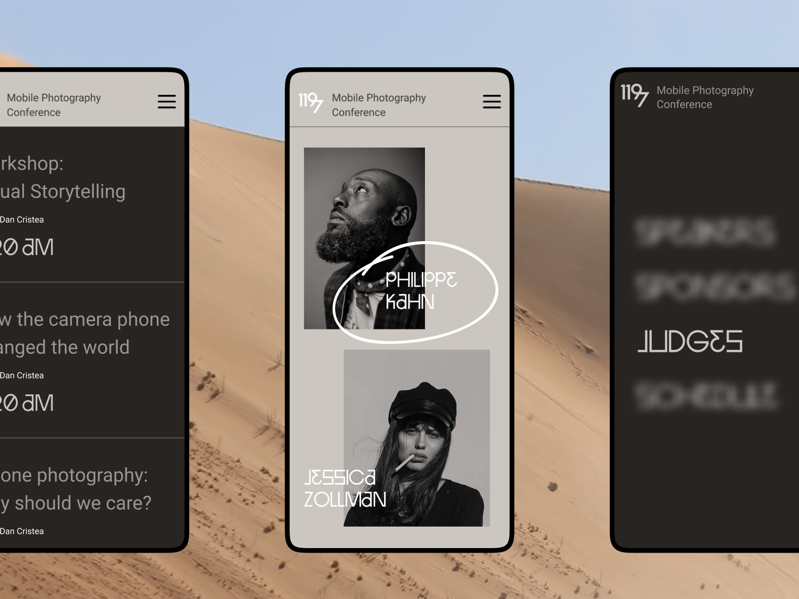
Another year of design and creativity started, so traditionally, let review what’s got trendy for the last year and is going to be popular in UI/UX design for websites and applications in 2021 we’ve just started. Our review is traditionally packed with tons of UI design examples by the Tubik Studio team. Join in!
Video Hero Sections
In recent years, video content integration into web pages of all kinds moved to a new level. One reason is that it is getting more and more technically friendly for websites implemented on different platforms. What’s more, in the online world overwhelming users with tons of messages and a great deal of various information, videos become an effective touchpoint catching the users’ eye, quickly setting the needed atmosphere or demonstrating the product in no time. This year hero sections of the web pages look like the most popular place for the atmospheric video to impress website visitors from first sight.
Video hero section for the ecommerce confectionery website
Full-screen video background for the hero section of the horse riding club website
Video-based hero section for the website of e-commerce fashion accessories store
Website design for a digital transformation service
Atmospheric hero section for the website of Lumen Museum
Ultra Minimalist Navigation
Minimalism as a UI design trend has been getting stronger and stronger positions in recent years, coming out in a great bunch of elegant and stylish interfaces for web and mobile. Yet, now it is getting even sharper, with many design solutions based around an ultra-minimalist design approach to navigation with a super focus on content. Whatever debatable it is, implemented thoughtfully it has high chances not to hurt usability, especially if the target audience is a younger generation that’s well used to interacting with various interfaces and devices. Anyway, as anything minimalistic, this approach needs to be double-checked and tested well to be sure that everything hidden can be easily found by users.
Minimalistic and interactive home page for the furniture website
Quote app interactions
Interactive Details
Interactivity is now seen as a must in user interfaces, playing a big part in engaging users, adding emotional appeal, and giving the feeling of solid product integrity at every step of the interaction. Now UI designers are getting even more diverse and creative in that perspective.
Interactive home page for Illuminating Radioactivity website. It opens the field full of bright tags featuring popular characteristics of radioactivity and hiding the name of the project. Moving the mouse cursor, users remove the tags, as well as the website is going to erase the common stereotypes about the theme of radioactivity.
Smooth motion makes the interaction with the page of a fashion brand website even more dynamic, especially due to little details like the engaging motion of the thread uniting all the sections of the page in the process of scrolling.
Interactive web page for the web editorial about generations
Permanent exhibition page for Lumen Museum website, digitally echoing the real interactivity in the physical museum exhibition
An interactive page for the Credentially website lets users filter different benefits and functions of the service
Impressive Product Pages
Due to the reality of the pandemic times and adaptation to the new way of life, the year 2020 showed a rocketing growth of e-commerce and everything design-like connected to it, which is obviously going to continue this year. Naturally, both business owners and interface designers strive to provide not only a smooth and clear flow of sales funnel, item choice, and check-out process, but also make a bright impression and stand out in the conditions of the competition getting tighter and tighter. Along with the hero sections and home pages, product pages have become one of the major spots of design experiments and creative ideas in the aspect.
Impressive choice interactions for the product page for the website selling fashion accessories
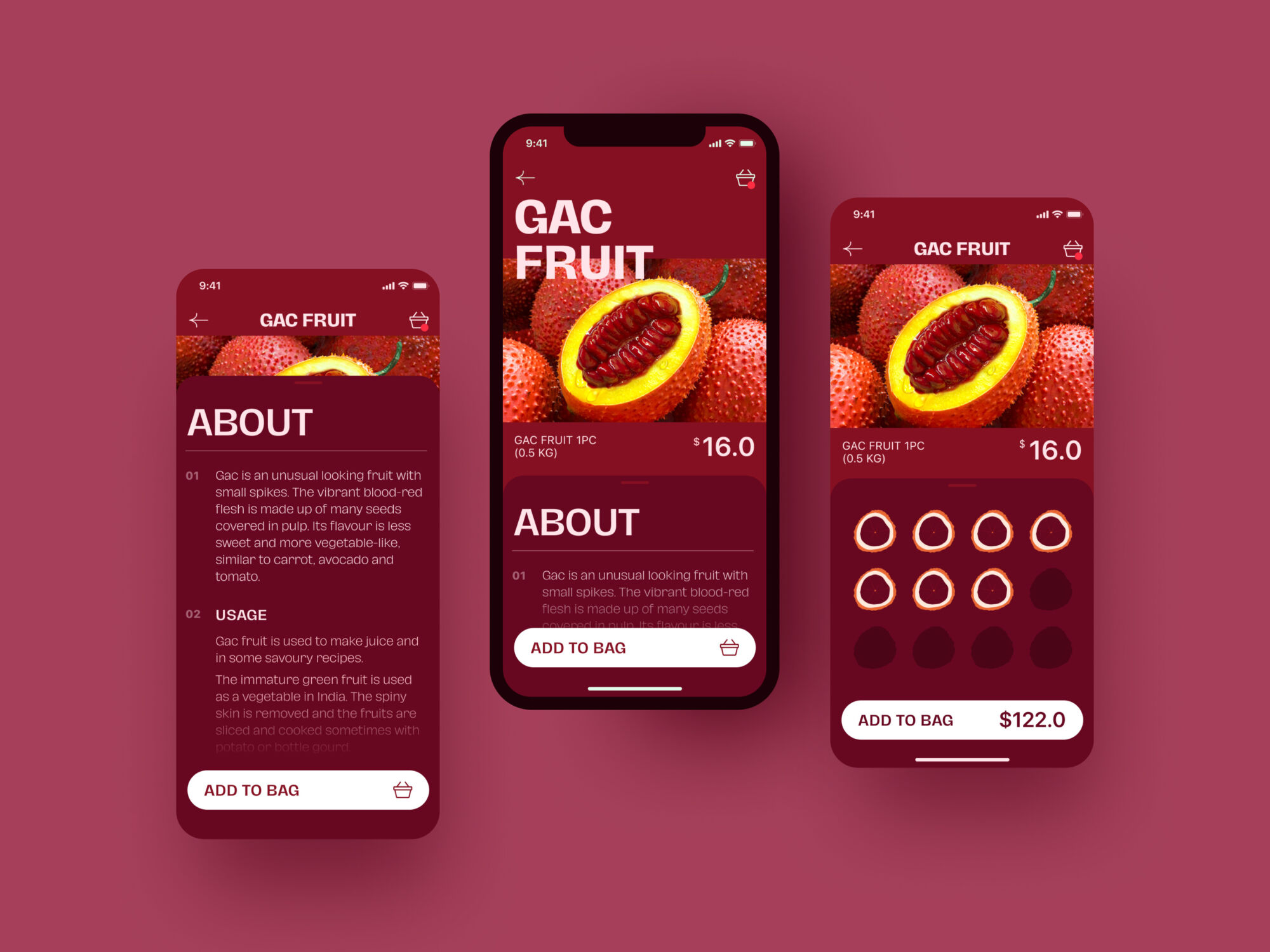
Interactive home screen for the Exotic Fruit application where all the bright fruit images are interactive, so tapping a fruit the user moves to its product page. The product screen features the interactive panel allowing for easy choice of the number of items.
Combination of Visuals
Today, there is no more need to convince anyone in the advantages of images integrated into UX design. Another domain of creative experiments is trying combinations of different types of visuals in one interface. That’s where photos and illustrations work harmonically together, 3D and 2D art can support each other, and that benefit can get enhanced even more with motion design.
Event agency website combining 3D animation and line illustrations
Home page for ShipDaddy website combining animated 2D illustration of a brand mascot and real-life photos
Mayple website harmonically combining photo content and line illustrations
Stop Plastic website based on the limited color palette and impressive visuals on the crossroads of illustration and photography
Creative Data Visualization
Dealing with websites and apps, users often face the need to absorb and process differents data, stats, numbers, and the like. One of the tasks for user interface designers is visualizing that data both clearly and attractively so that it could positively influence usability, utility, and accessibility of the application, dashboard, or website. It seems that in 2021, we are going to observe a new wave of creative solutions for that aspect.
Credentially website design with a thoughtful approach to visualizing partnerships and numbers
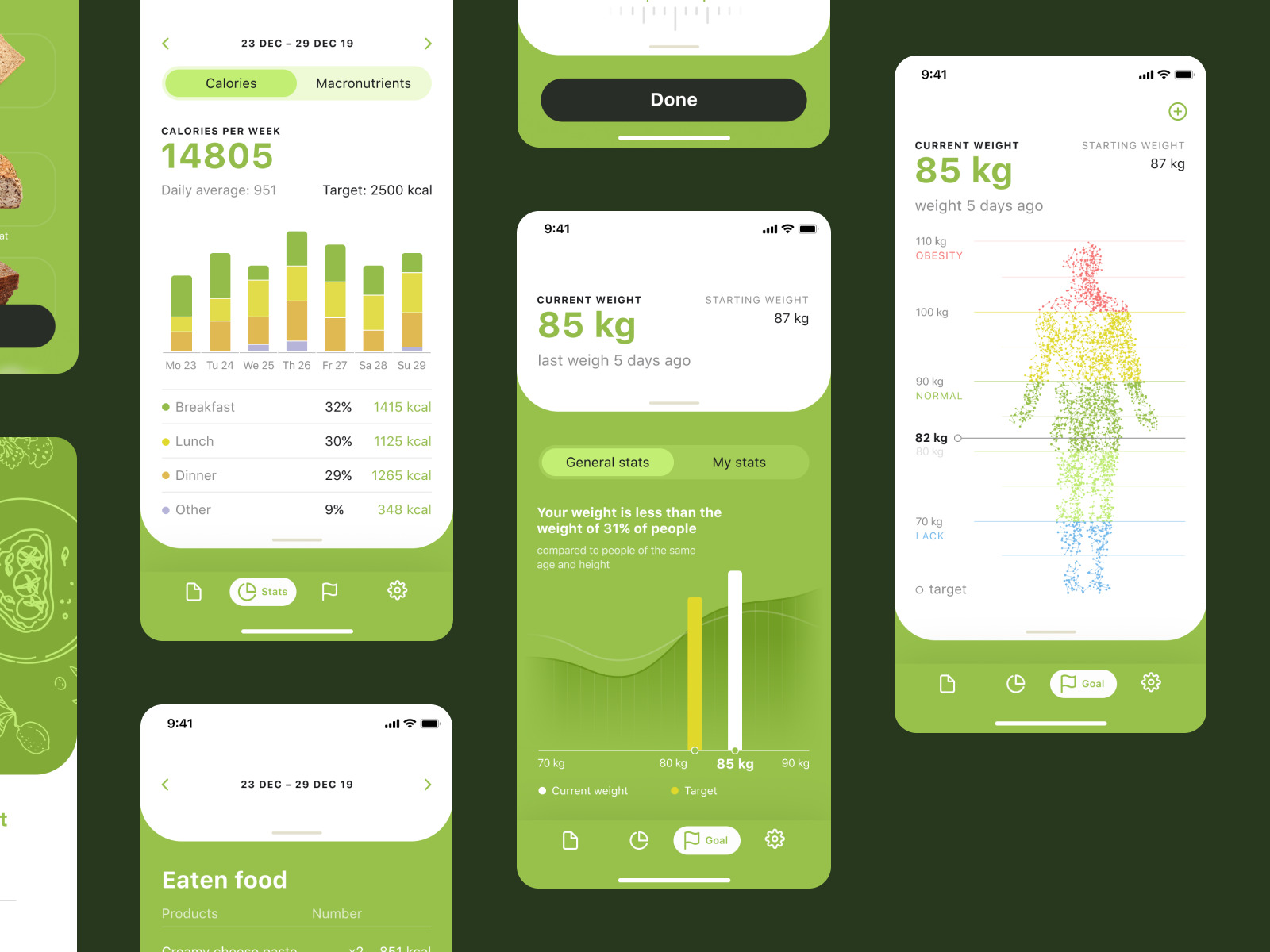
User’s stats screens for the Calorie Tracker app
Stats visualization for Fitness App
Data visualization for a task tracker app
Finance Tracker app interactions
Consistency of Product and Promo Design
Considering the fact that today people are overloaded with information more than ever before, they tend to choose products that are easy to understand and interact with, and that’s where consistency of design solutions comes into play. What’s more, consistency builds a reliable foundation for the feeling of harmony in both how the product looks and how it works. This year we will witness even stronger trend of a consistent and comprehensive approach to the connection of digital product interface design and all kinds of design for its branding and promotion.
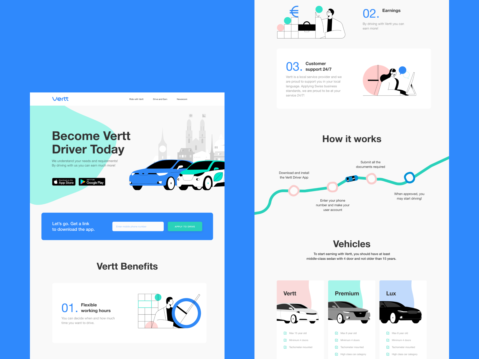
The consistent web, mobile and branding design for Vertt car-sharing service
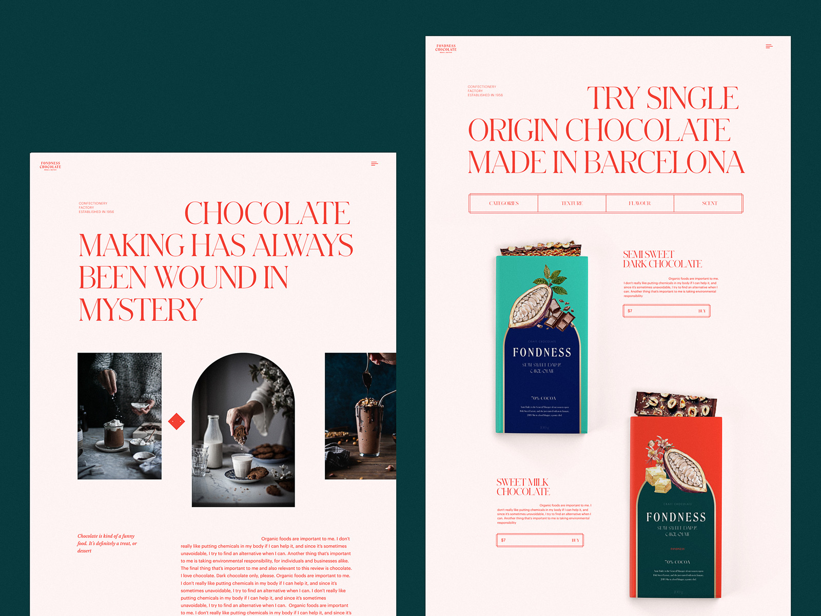
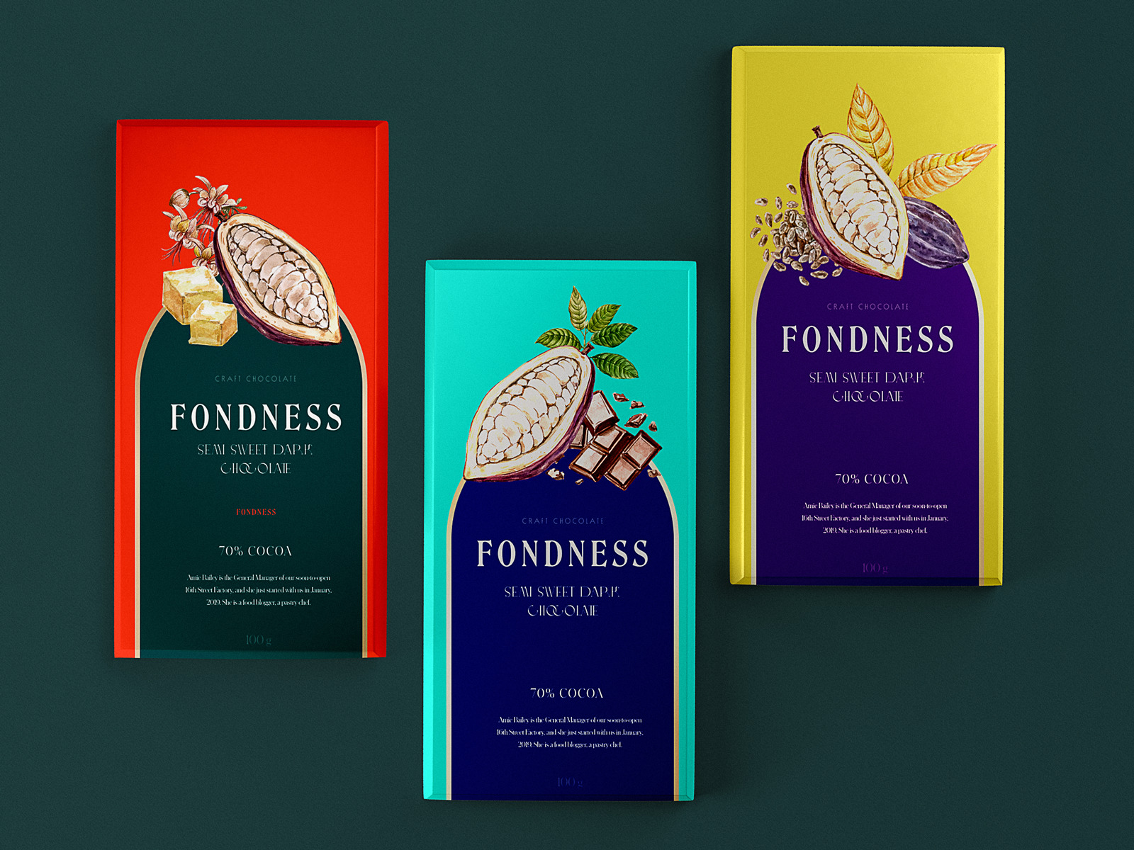
A consistent approach to brand packaging and web design solutions for a confectionery
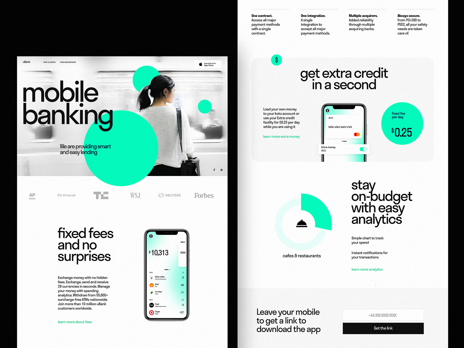
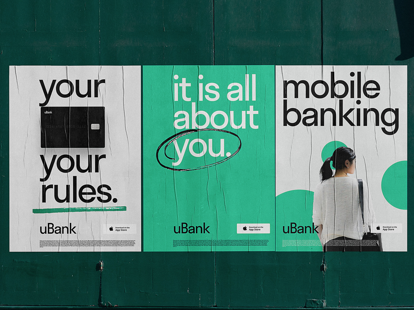
Consistency of product and promotional design solutions for a mobile banking service
Sophisticated Title Fonts
Typography has always been one of the crucial aspects of any interface design, covering the aspects of both beauty and readability. This year sees the trend of moving from “readability and simplicity first” to the more and more diverse choice of decorative fonts adding originality, mood, and elegance to the web or app layout. However, this design trend is also user-friendly and doesn’t hurt readability, as decorative and original fonts are usually applied to title text elements, which are of a quite big and therefore legible size.
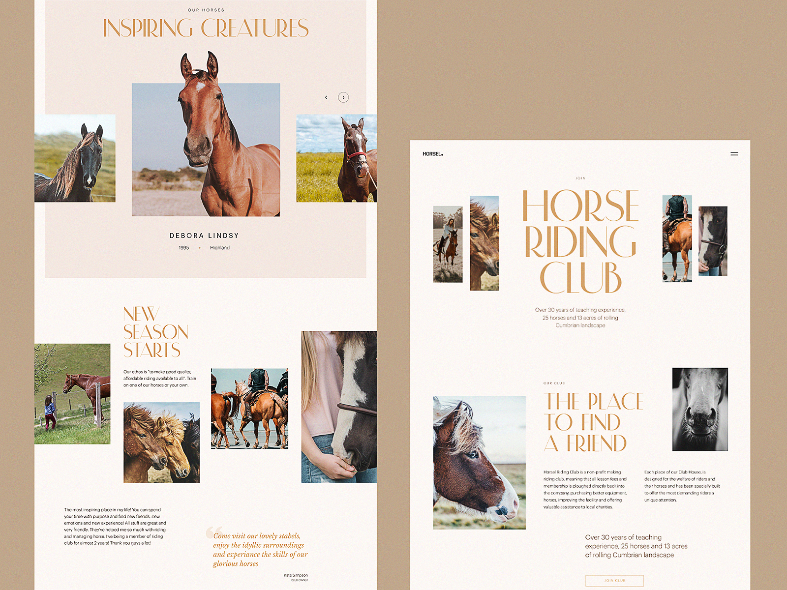
Website for a horse-riding club
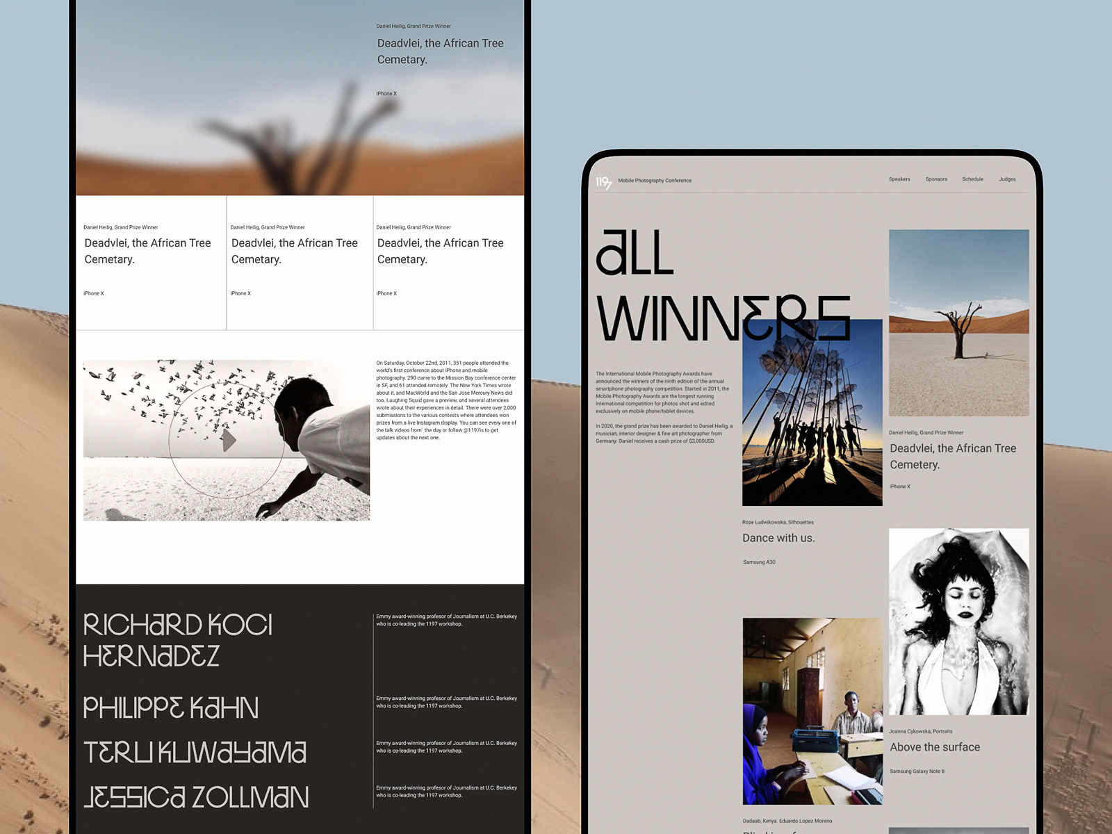

Website design concept for a photography contest
New-Level Animation
Motion integrated into user interfaces keeps playing a highly practical role and is aimed at setting higher levels of usability and interactivity as well as support the trend of well-crafted data visualization mentioned above. For the last year, this design sphere got a new bright sprint of evolution, featuring more and more creative experiments on UI animation, scroll animation, transitions, conceptual motion, etc. And in 2021 we are looking forward to an even higher level of creativity in the aspect of UI motion
Multilayered animation for Illuminating Radioactivity
Engaging and eye-pleasing animation for the login screen of the calorie calculator app
Loading animation for interior design website
Quotes App interactions
Animated Identity Elements
With more businesses going online, we can witness a more digitally-friendly approach to branding design as well. One of the hot trends this year is the animation of identity elements, making them more eye-catching, lively, and emotional in digital environments.
Animated brand mascot for ShipDaddy
Animated logo design for Uplyfe
Animated logo for a bakery brand
Emotional and lively animated logo for Gotikket service
Creative Use of Geometric Shapes
As one of the basic methods of visualization and composition, geometric shapes don’t lose their presence as functional or decorative elements of web and mobile interface design. This year we could see even more diverse examples of their integration in UI.
Elegant and eye-catching interactions based on geometric shapes for a designer’s website
3D Graphics
This year obviously continues and intensifies the integration of diverse 3D graphics into interfaces for web and mobile. As well, designers are getting more and more flexible to move from static to animated 3D elements to increase the level of their emotional appeal and user engagement.
Landing page with attractive and eye-pleasing 3D animation to promote an upcoming product
Prominent and Creatively Presented Photos
A couple of previous years witnessed custom graphics like 2D illustrations or 3D images overpoising photo content which was considered more traditional and conservative. This way designers got more flexible and adjustive in creating out-of-the-box layouts as there was a wave of negative feedback on the lack of originality in stock photos while producing custom photo content could be even more expensive and difficult to organize than getting custom graphics. This year, photo content seems to gets back on the scene, triumphantly and evolving. With more and more sophisticated compositions and attention to detail, creative collages and animation, sometimes even stock photos look super cool, let alone the fact that the production of custom photo content also diversified and got more affordable. So, now we are observing more and more designs with photos put in the center of attention: hero images that immediately set the mood and atmosphere, informative and catchy product images shown in a much bigger size than we used to see them before, stylish previews, banners, title images for blog posts, and so on and so forth.
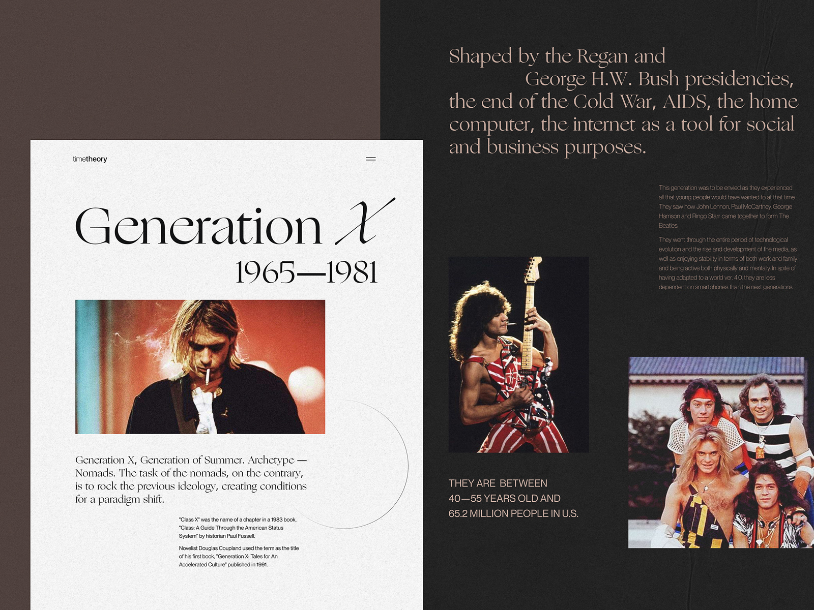
Web editorial devoted to different generations
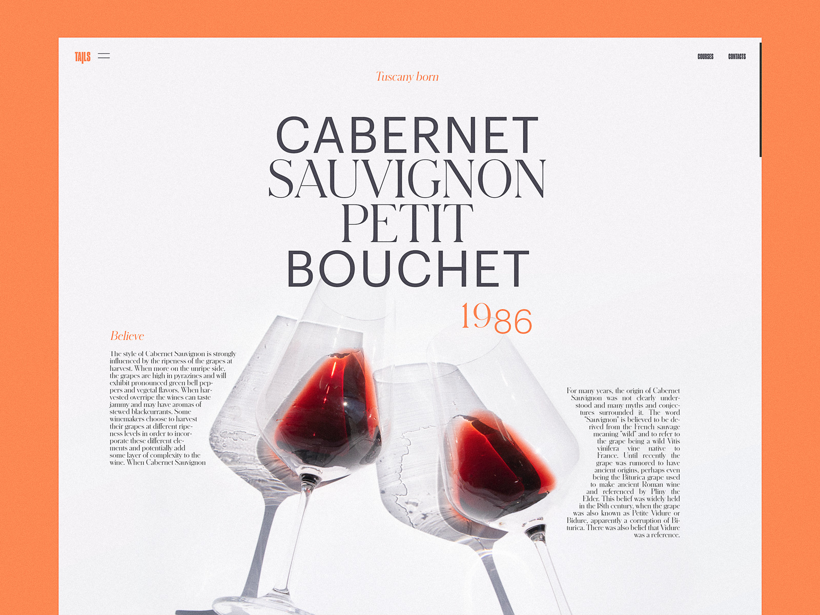
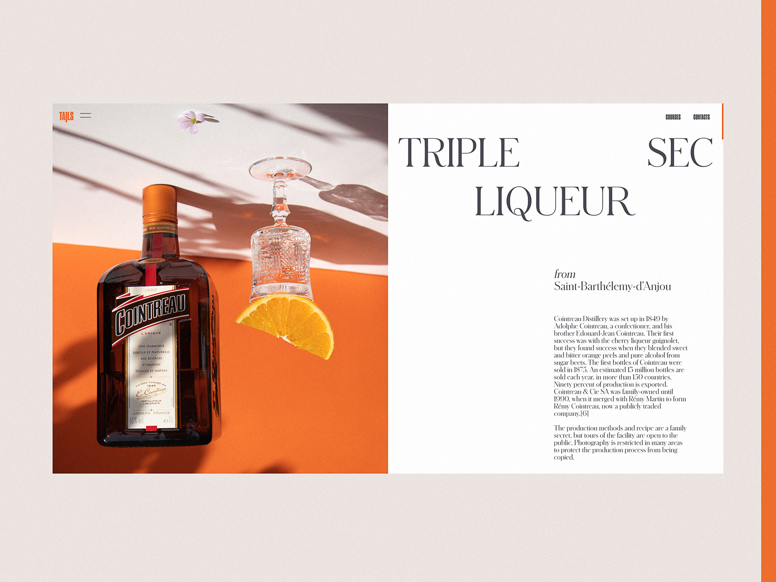
Bartending encyclopedia website
Ecommerce website selling home decor
Grid Experiments
Creative experiments with grids seem to be a non-stop trend for a couple of years, getting new expressions in 2020. The thought-out custom grid in user interfaces for web or mobile effectively supports the harmony of a layout and placement of the elements, also increasing a level of flexibility. It’s may also be the way to rethink the visual hierarchy and draw attention to the needed zones or interactive elements. Asymmetry, broken grids, and other experiments are getting even more daring and stylish this year.
Online editorial presenting the gallery of stories about the powerful women changing the world
The website design concept for a photography contest
Informative Illustrations
The trend of integrating custom graphics of all kinds into user interfaces also doesn’t lose its positions, with designers getting more and more focused on filling them with informative and meaningful messages rather than just decorative goals. From small graphic elements to memorable and emotional mascots, prominent hero illustrations and product images, 3D graphics, and animated stories – it seems, designers now are super armed for any educational, social, or business objective. Made in various styles, custom graphics effectively support the quick perception of the information on the page or screen.
Onboarding tutorial illustrations for Vertt car sharing service
Limited Color Palettes
With color being one of the vital factors of visual harmony, psychological influence, and attractive appearance for any interface, designers care a lot about color choice. As well, a color combination may become a solid basis of visual originality which is essential in terms of tight competition. So, designers never stop trying new uncommon combinations. Still, the major design trend at this perspective moving to 2021 echoes the tendency to minimalism and features implementing very limited or even monochrome palettes, not distracting users with a variety of colors and taking the most advantage of the chosen color or colors. For the last year, it resulted in a big number of elegant and super stylish designs, and we think it is going to progress in 2021.
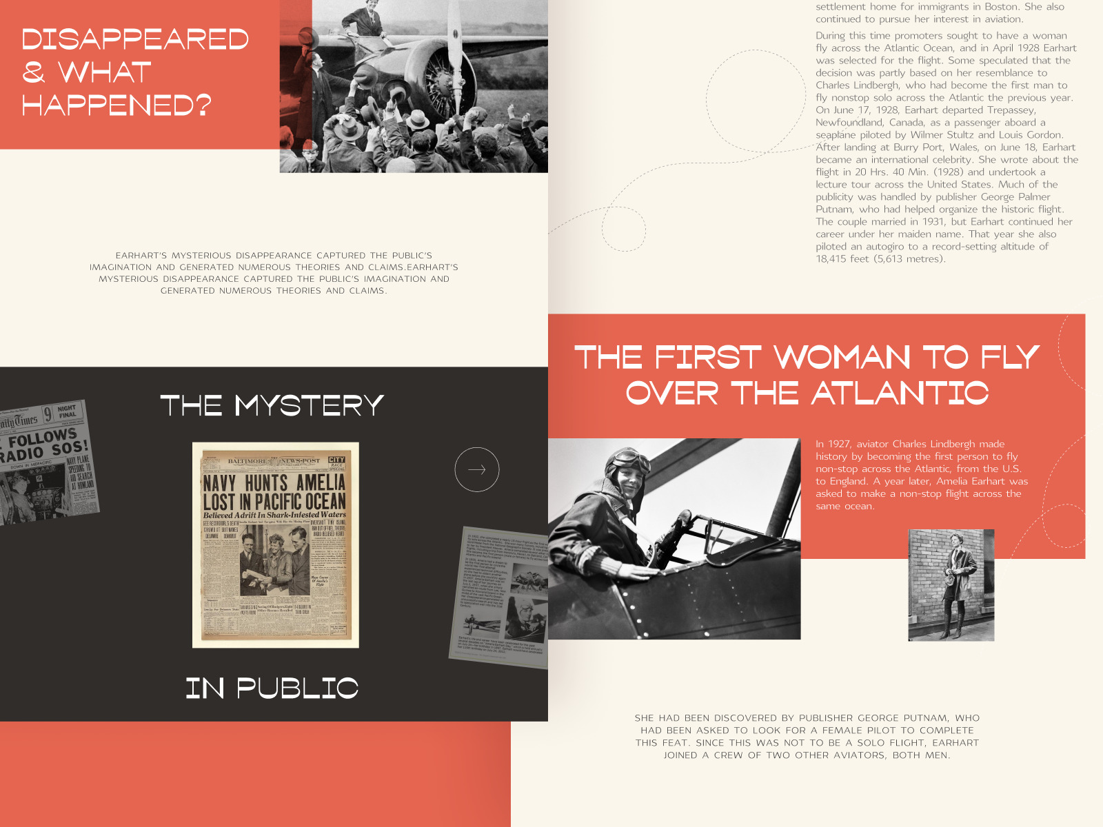
Web editorial about powerful women that changed the world
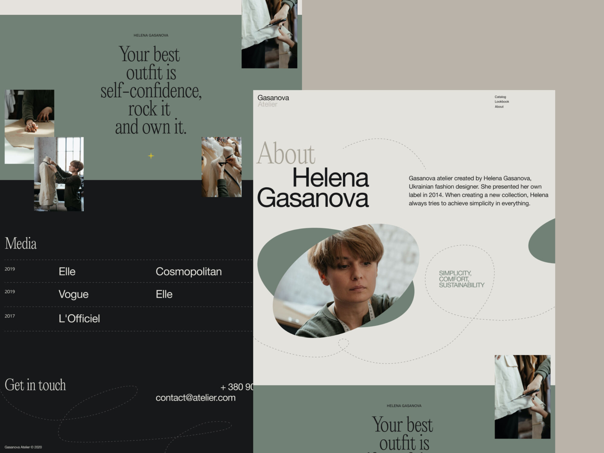
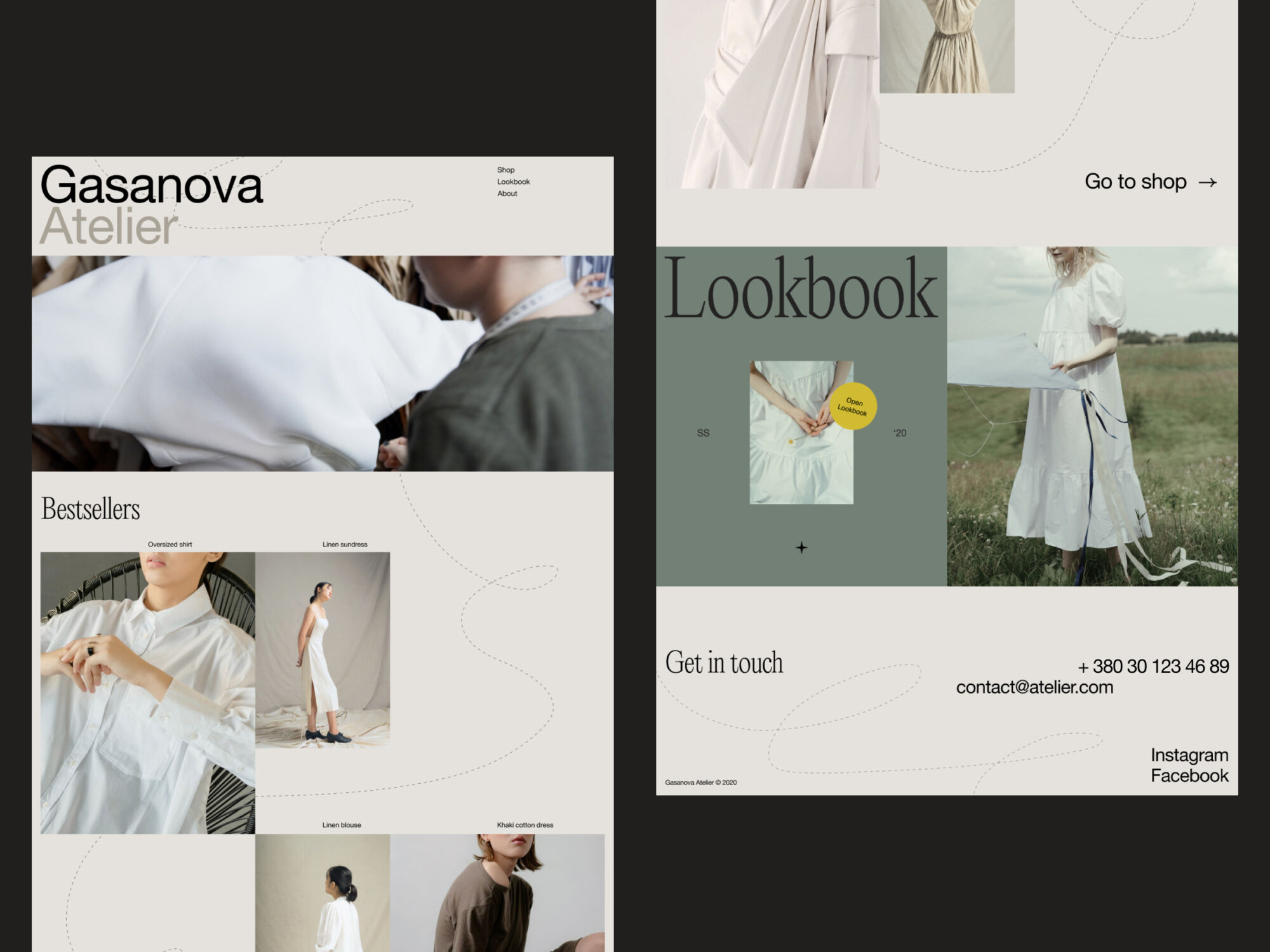
Website design for a fashion brand
Certainly, that’s only a part of the design trends in user experience design, evolving and developing day by day. Anyway, looking forward to seeing what’s next, we are totally ready for new creative challenges and out-of-the-box solutions for web and mobile interfaces.
Originally written for Tubik Blog
- English
- Ukrainian


